venus-loading
 Gmail For adobe
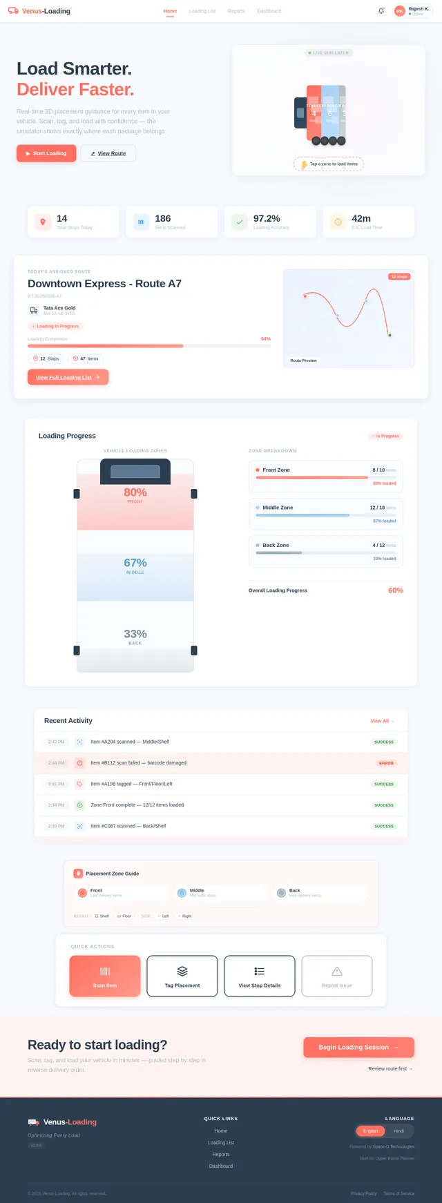
Designing Load Management for Upper Helping delivery drivers load 100+ stops without confusion Overview Product: Upper Route Planner Company: Space-O Technologies Role: UX/UI Designer (end-to-end) Platform: Driver mobile app + Admin dashboard Status: Live What is Upper? Upper is a route planning tool used by delivery businesses. Admins plan and assign routes Drivers receive routes on their phone The app guides navigation and captures proof of delivery This part worked well. But one critical step was missing: What happens before the driver starts driving — loading the vehicle. The Problem Drivers often handle 100+ deliveries per route. But loading those items into the vehicle was slow, confusing, and unstructured. What was going wrong? 1. Too many steps Drivers had to open each stop one by one Add details → go back → find next stop This repeated 100+ times → Created friction and wasted time 2. No guidance for loading order App showed stops in delivery order But loading works in reverse Drivers had to mentally reverse the list while working fast. 3. No tracking of item placement No way to note where items were kept Drivers had to search the entire vehicle during delivery 4. Small delays became big losses Even tiny inefficiencies scaled badly across fleets. Why this mattered Upper helped with: Planning routes Navigation Delivery tracking But loading was left to guesswork. This broke the flow between planning and execution. Goal Make loading: Faster Easier to follow Less dependent on memory Useful during delivery Research & Understanding 1. Looking at other tools I reviewed similar products in this space. What I found: All focused on route planning and delivery None helped with loading 👉 This confirmed a clear gap. 2. Understanding real-world behavior Loading follows a simple rule: Last delivery → loaded first (goes inside) First delivery → loaded last (near the door) This is how drivers naturally work. But the app didn’t support this at all. Key Insight The app was optimized for planning and delivery, but not for the real-world step in between. If we guide loading properly: Drivers save time during loading Drivers save even more time during delivery Design Approach Instead of adding more features, I focused on: Reducing steps Matching real-world behavior Making information useful later (not just during input) What I Designed 1. Loading order that matches real life I reversed the stop list. Top = load first Bottom = load last Now drivers don’t need to think — they just follow the list. 2. One screen instead of many Before: Open each stop separately After: All stops visible in one screen Tap to expand and add details Why this works: No constant back-and-forth Faster interaction Clear sense of progress 3. Quick placement tags Instead of typing notes, drivers select from simple options: Front / Middle / Back Shelf / Floor Left / Right Why: Faster than typing Consistent across users Easy to scan later 4. Built-in scanning Drivers can scan items while loading. Confirms correct item Prevents mistakes early Creates a record 5. Show loading info during delivery At each stop, drivers see: Item count Placement Scan status Example: “2 items — Back, Floor — Scanned ✓” This is where the real value shows. Design Decisions (What I considered) Decision: List structure Option 1: Keep delivery order Familiar But confusing during loading Option 2: Reverse order Matches real-world behavior Easier to follow 👉 Chose reverse order Decision: Input method Option 1: Free text Flexible Slow and inconsistent Option 2: Tags Fast Structured Easy to reuse 👉 Chose tags Decision: Interaction model Option 1: Separate screens per stop Familiar Too slow Option 2: Single scrollable screen Faster Less friction 👉 Chose single screen How it fits into the product Before: Plan route Send to driver Driver starts driving After: Plan route Send to driver Load vehicle (new step) Deliver Capture proof Track everything Impact Loading time reduced Before: ~40–60 min After: ~15–25 min → ~30 minutes saved per driver Faster deliveries Less searching at each stop Even small savings per stop add up Fleet-level impact For 20 drivers: Dozens of hours saved daily Thousands of hours saved yearly What I Learned Real-world workflows matter more than screens If something isn’t faster than the manual way, people won’t use it Small improvements at each step can create huge impact at scale What I’d Improve Next Observe drivers in real conditions Test with real constraints (gloves, lighting, time pressure) Explore visual layouts for smaller routes Final Thought This wasn’t just about designing a feature. It was about removing guesswork from a critical part of the workflow. Why this version works Clear story from start to finish Shows thinking, not just UI Easy to scan quickly Strong product mindset visible
Comments (0)
Sign in to leave a comment
Architecture
No comments yet. Be the first!