The Weight of a Well-Made Chair
8 min read
There is a particular satisfaction in sitting down on something built to outlast you. The Danish masters understood this—that a chair is not furniture but a promise kept in wood and joint.
 Iggy Kosovskiy
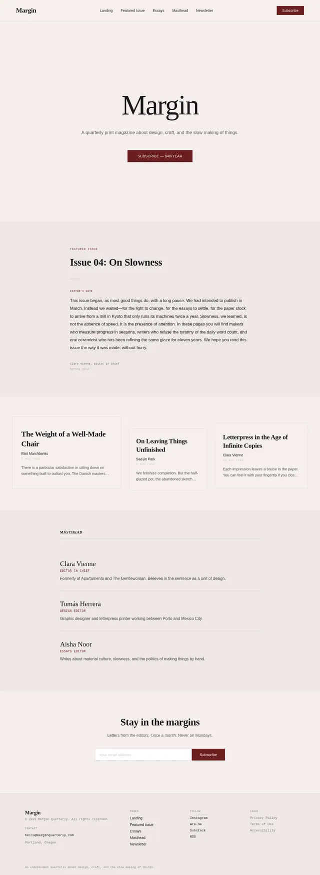
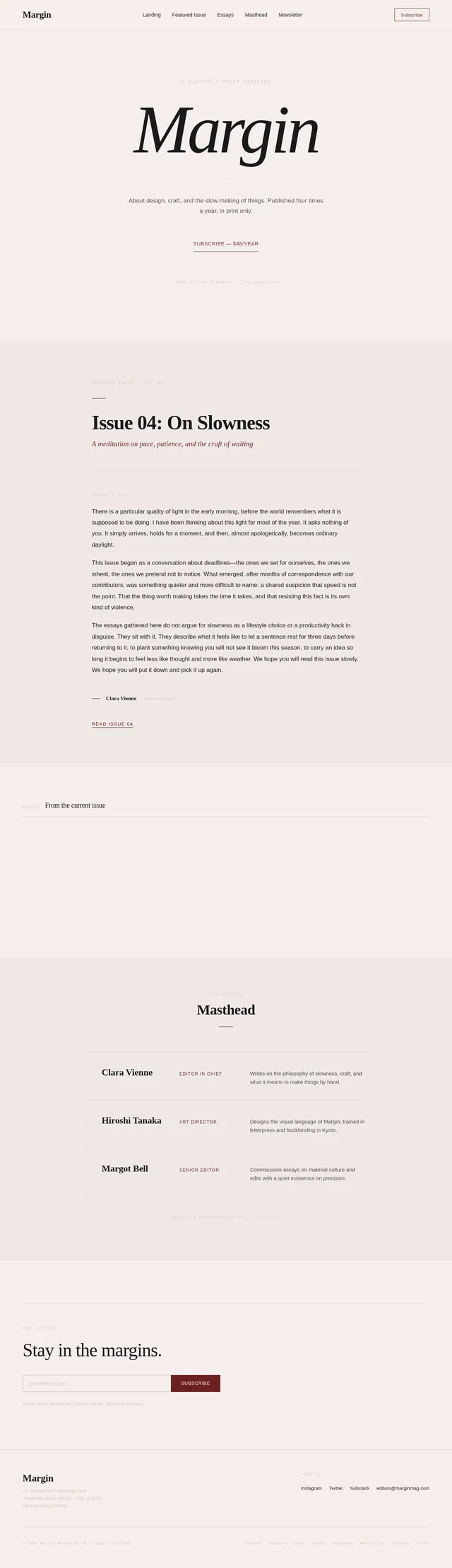
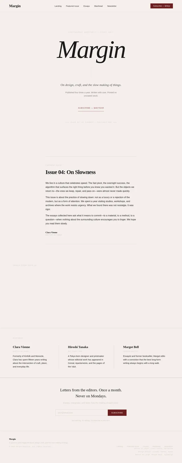
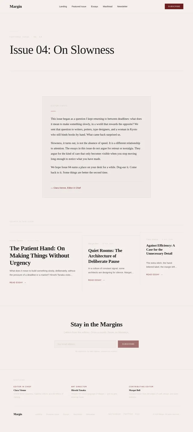
Build a landing page for "Margin" — an independent quarterly print magazine about design, craft, and the slow making of things. Style: editorial, restrained, confident. Think Apartamento meets The New Yorker. A reader, not a marketing site. Typography: serif display (Fraunces or similar) for headlines, clean sans-serif (Inter) for body, monospace for metadata and issue numbers. Palette: warm cream background (#F5EEEC), near-black text (#1A1A1A), single accent in deep oxblood (#6B1F1F). No gradients. No drop shadows. No rounded corners on cards. Sections in order: 1. Hero — magazine title set large in serif, tagline beneath, small "Subscribe — $48/year" link 2. Featured issue — "Issue 04: On Slowness" with an editor's note (3 short paragraphs of real copy, not lorem ipsum) 3. Three essay previews in an asymmetric magazine grid — each with title, author, reading time, and a 2-line excerpt 4. Masthead — meet the editors (3 names, roles, one-line bios) 5. Newsletter signup — single email field, "Subscribe" button, small line of copy beneath Tone: generous whitespace, left-aligned, never centered for body. Feels like flipping through a printed quarterly, not scrolling a tech site.
Sign in to leave a comment
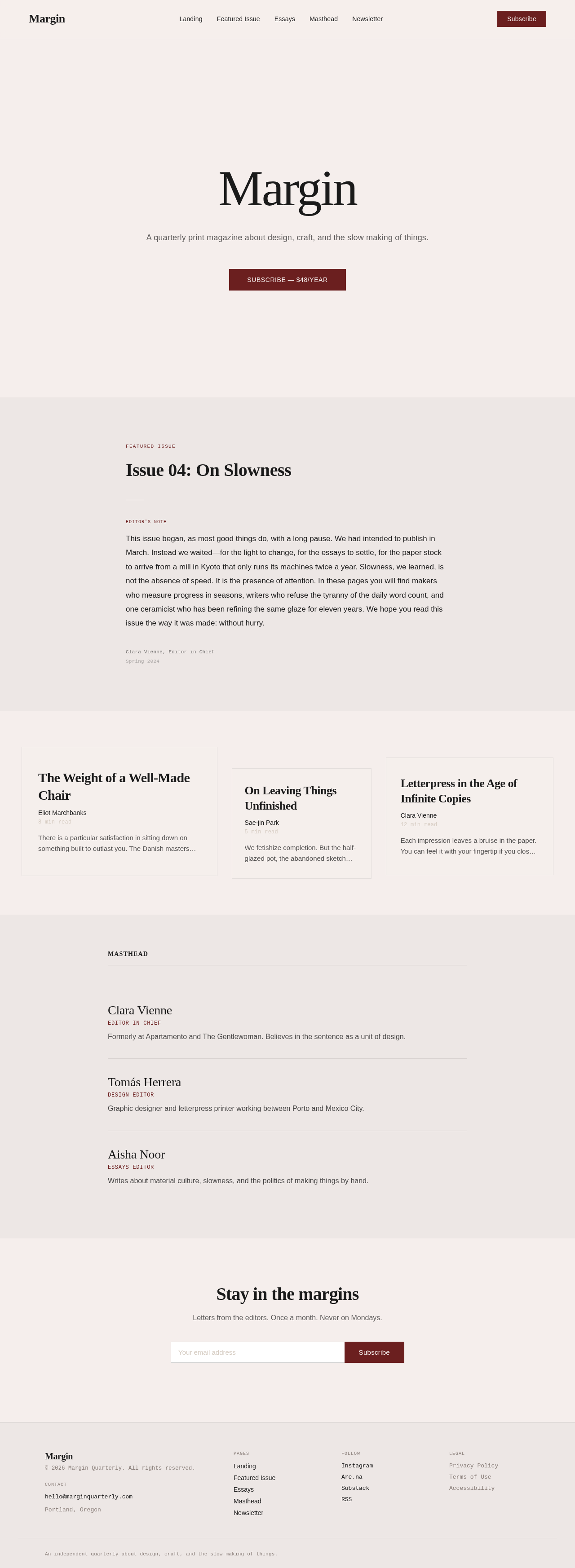
A quarterly print magazine about design, craft, and the slow making of things.
Subscribe — $48/yearFeatured Issue
Editor's Note
This issue began, as most good things do, with a long pause. We had intended to publish in March. Instead we waited—for the light to change, for the essays to settle, for the paper stock to arrive from a mill in Kyoto that only runs its machines twice a year. Slowness, we learned, is not the absence of speed. It is the presence of attention. In these pages you will find makers who measure progress in seasons, writers who refuse the tyranny of the daily word count, and one ceramicist who has been refining the same glaze for eleven years. We hope you read this issue the way it was made: without hurry.
8 min read
There is a particular satisfaction in sitting down on something built to outlast you. The Danish masters understood this—that a chair is not furniture but a promise kept in wood and joint.
5 min read
We fetishize completion. But the half-glazed pot, the abandoned sketch—these carry a tenderness that finished work cannot.
12 min read
Each impression leaves a bruise in the paper. You can feel it with your fingertip if you close your eyes—the ghost of pressure, of intention made physical.
Editor in Chief
Formerly at Apartamento and The Gentlewoman. Believes in the sentence as a unit of design.
Design Editor
Graphic designer and letterpress printer working between Porto and Mexico City.
Essays Editor
Writes about material culture, slowness, and the politics of making things by hand.
Letters from the editors. Once a month. Never on Mondays.
Thank you. Look for us in your inbox.
No comments yet. Be the first!