Stiqh world
 SAKSHI PATEL
Create me an alternative website for this website: stiqhworld.lovable.com


Comments (0)
Sign in to leave a comment
Project Tasks8
Implement BrandStory for Home
As a frontend developer, implement the BrandStory section for the Home page. This section uses a `useRef` and `useState(false)` with an `IntersectionObserver` (threshold: 0.2) to trigger a `bs--visible` CSS class when the section scrolls into view, enabling entrance animations. The layout is a two-column grid: the left column (`bs__image-col`) contains a lazy-loaded Unsplash image inside `bs__image-wrapper` plus a decorative `bs__accent-block` div; the right column (`bs__content-col`) displays a `bs__label` span, an `h2` with an `bs__title--accent` highlighted span, two body paragraphs, and a `bs__stats` row with three stat blocks each containing a `bs__stat-num` (200+, 50K+, 30+) and `bs__stat-label`. Implement all BEM-namespaced CSS from BrandStory.css covering the two-column layout, image overlay, accent block positioning, and stat row styling.
Implement Navbar for Home
As a frontend developer, implement the Navbar for the Home page. Note: this component may already exist from a previous page. The Navbar uses `useState(false)` for `scrolled` and `menuOpen`. A passive scroll listener in `useEffect` sets `scrolled` to true when `window.scrollY > 40`, toggling the `nb-nav--scrolled` class on the `nav` element. A `navLinks` array (Home, Products, Search, Cart, Account) is mapped to anchor elements with `nb-link` class. The `nb-actions` area contains a cart icon anchor (inline SVG bag icon linking to /Cart) and a hamburger `button` with three `span` children that toggles `menuOpen` state and applies `nb-hamburger--open` class. The mobile menu is shown via `nb-links--open` class on the links container. Implement all BEM CSS from Navbar.css covering fixed positioning, scroll-triggered background transition, desktop link layout, mobile hamburger animation, and responsive menu overlay.
Implement CategoriesSection for Home
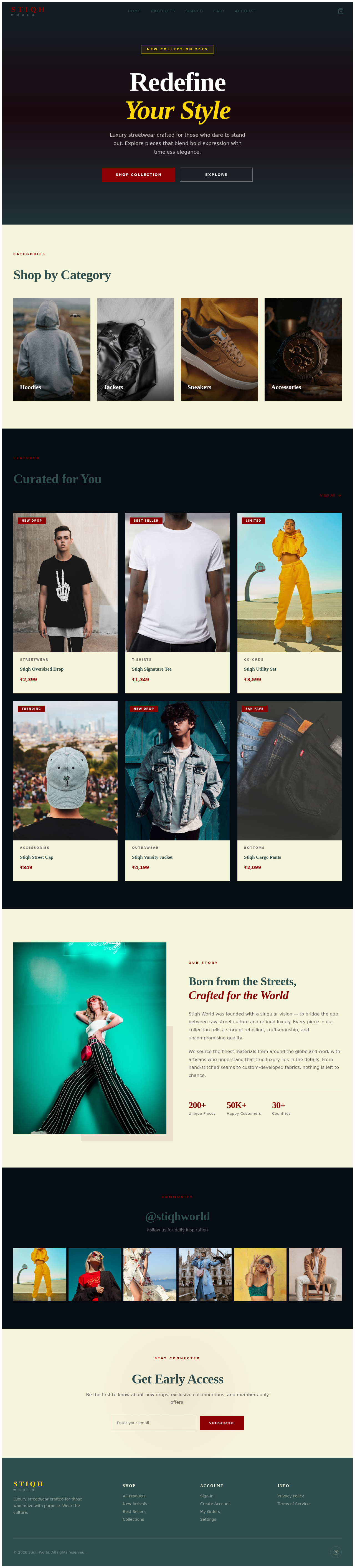
As a frontend developer, implement the CategoriesSection for the Home page. This is a stateless functional component that renders a static `categories` array (Hoodies, Jackets, Sneakers, Accessories) each with an Unsplash image, name, and piece count. The layout uses a `cats__grid` containing four `cats__card` anchor elements (linking to `/Products`) each with a `cats__card-img` image wrapper and a `cats__card-info` block displaying `cats__card-name` (h3) and `cats__card-count` span. All images use `loading='lazy'`. Implement all BEM CSS from CategoriesSection.css covering the grid layout, card hover effects, and image overlay transitions.
Implement FeaturedSection for Home
As a frontend developer, implement the FeaturedSection for the Home page. This component uses `useState(null)` for `hoveredId` to track which product card is hovered, toggling the `feat__card-quick--show` class to reveal a 'Quick View' overlay. It renders a static `products` array of 6 items (Shadow Oversized Hoodie, Urban Cargo Jacket, Midnight Runner V2, Ember Graphic Tee, Phantom Cargo Pants, Obsidian Chain Necklace) each with id, name, INR price, category, Unsplash image, and optional tag (Bestseller/New/Limited/Trending/null). The header row contains a `feat__label`, `feat__title`, and a 'View All' anchor with an inline SVG arrow icon linking to `/Products`. Each `feat__card` anchor links to `/Product` and renders `feat__card-img` with lazy-loaded image, conditional `feat__card-tag` badge, and the hover-controlled quick-view overlay, plus a `feat__card-body` with category and name. Implement all BEM CSS from FeaturedSection.css covering the product grid, tag badges, and hover quick-view animation.
Implement Footer for Home
As a frontend developer, implement the Footer section for the Home page. Note: this component may already exist from a previous page. The Footer (`ft`) is a stateless component with a `ft__container` split into `ft__top` and `ft__bottom`. The top row has four columns: `ft__brand` (STIQH WORLD logo text + tagline), and three `ft__links-group` columns (Shop linking to /Products, /Search, /Cart, /Checkout; Account linking to /Account, /Orders, /Login; Company linking to /Home, /Dashboard, /Analytics). The bottom row contains a copyright paragraph and a `ft__social` row with three anchor links (Instagram, Twitter, YouTube) each with inline SVG icons and `aria-label` attributes. Implement all BEM CSS from Footer.css covering the multi-column layout, link hover states, and social icon styles.
Implement HeroSection for Home
As a frontend developer, implement the HeroSection for the Home page. This component uses `useState(0)` for `offsetY` and attaches a passive scroll event listener in `useEffect` to implement a CSS parallax effect: the `hero__bg-image` div applies `transform: translateY(${offsetY * 0.35}px) scale(1.15)` as an inline style, creating a parallax scroll on the full-viewport background image. The section structure includes a `hero__bg-wrapper` containing the parallax image and a `hero__overlay` gradient div, plus a `hero__content` block with a `hero__badge` ('New Collection 2025'), an h1 with two `hero__title-line` spans (second has `--accent` modifier), a subtitle paragraph, and a `hero__cta-group` with two CTA anchors (`hero__btn--primary` linking to /Products, `hero__btn--secondary` linking to /Search). A `hero__scroll-hint` element at the bottom shows an animated `hero__scroll-line` and 'Scroll' label. Implement all BEM CSS from HeroSection.css covering full-viewport layout, parallax image, overlay gradient, badge, CTA button styles, and scroll hint animation.
Implement NewsletterSection for Home
As a frontend developer, implement the NewsletterSection for the Home page. This component uses `useState('')` for `email` and `useState(false)` for `submitted`. The `handleSubmit` handler prevents default, checks `email.trim()`, sets `submitted` to true, and clears the email field. When `!submitted`, a `nl__form` is rendered with a controlled email `input` (type='email', required, placeholder 'Enter your email') bound to `email` state via `onChange`, and a submit button. When `submitted` is true, a `nl__success` div is shown with a checkmark icon span and confirmation message. The section wrapper has `nl__container` and `nl__content` with a `nl__label`, `nl__title` ('Get Early Access'), and body text. Implement all BEM CSS from NewsletterSection.css covering centered layout, input/button row styling, success state transition, and responsive design.
Implement SocialFeed for Home
As a frontend developer, implement the SocialFeed section for the Home page. This is a stateless functional component rendering a static `posts` array of 6 objects (each with an Unsplash 500x500 image URL and alt text). The section has a `sf__header` with `sf__label` ('Community'), `sf__title` ('@stiqhworld'), and `sf__subtitle`. The `sf__grid` maps over posts to render anchor elements (`sf__item`) linking to `/Products`, each containing a lazy-loaded `img` and a `sf__item-overlay` div with an inline SVG heart icon (stroke white, strokeWidth 1.5) that appears on hover. Implement all BEM CSS from SocialFeed.css covering the 6-column/responsive grid layout, image aspect-ratio, hover overlay fade-in with heart icon centering.

RedefineYour Style
Luxury streetwear crafted for those who dare to stand out. Explore pieces that blend bold expression with timeless elegance.
Shop by Category



Curated for You
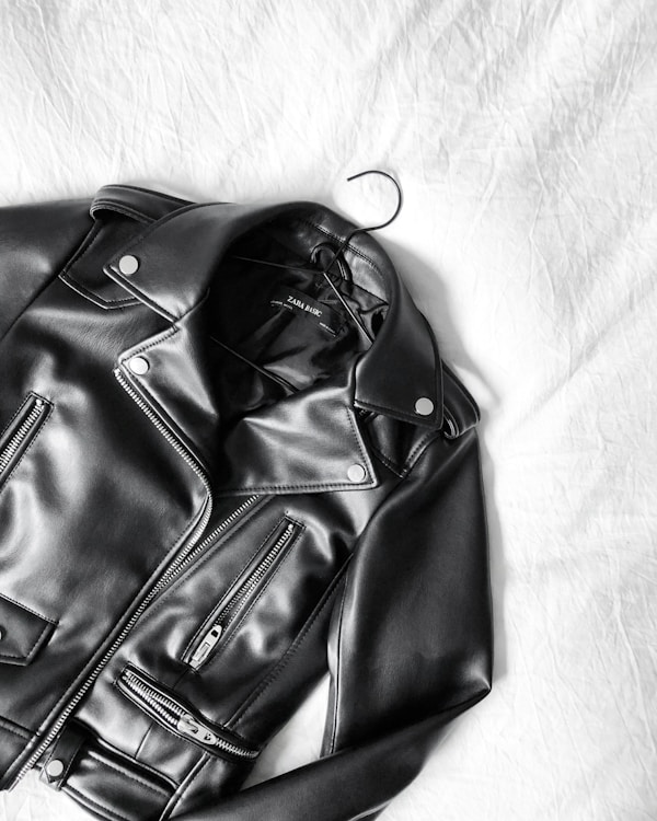
 New Drop
Stiqh Oversized Drop
₹2,399
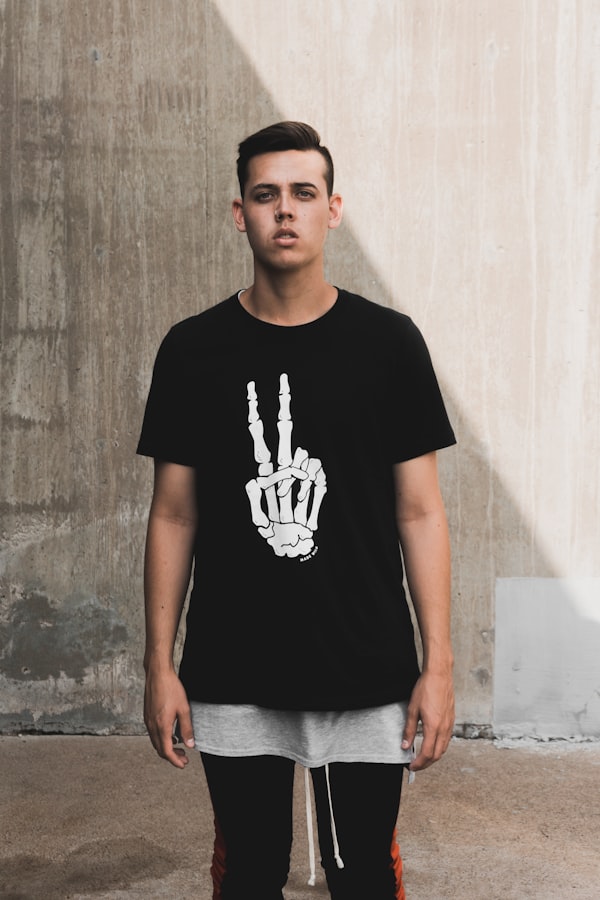
 Best Seller
Stiqh Signature Tee
₹1,349
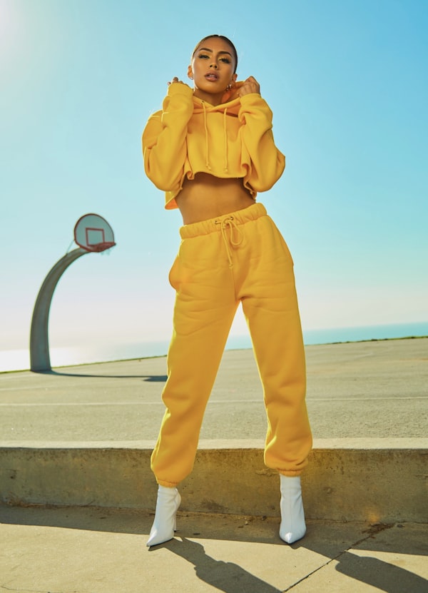 Limited
Stiqh Utility Set
₹3,599
 Trending
Stiqh Street Cap
₹849
 New Drop
Stiqh Varsity Jacket
₹4,199
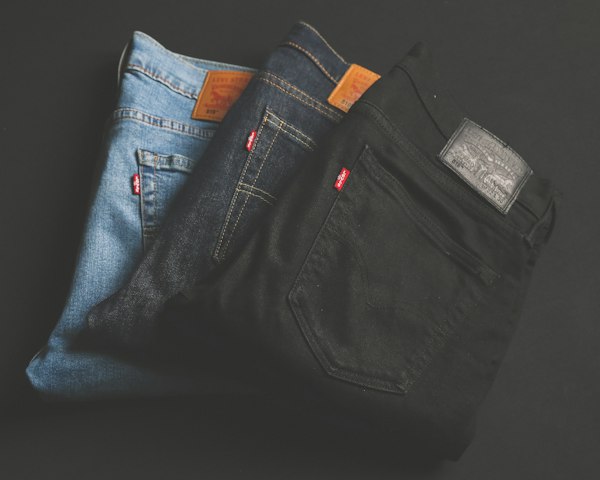 Fan Fave
Stiqh Cargo Pants
₹2,099

Born from the Streets,
Crafted for the World
Stiqh World was founded with a singular vision — to bridge the gap between raw street culture and refined luxury. Every piece in our collection tells a story of rebellion, craftsmanship, and uncompromising quality.
We source the finest materials from around the globe and work with artisans who understand that true luxury lies in the details. From hand-stitched seams to custom-developed fabrics, nothing is left to chance.
@stiqhworld
Follow us for daily inspiration


Get Early Access
Be the first to know about new drops, exclusive collaborations, and members-only offers.
No comments yet. Be the first!