work-flow
 Pacer
PacerI want to break down my new project/idea into a step-by-step user flow or process. My idea is: [Insert your project or idea description here]. Please divide the entire process into a logical sequence of steps, where each step represents a clear action, screen, or page (like a user journey map). Provide the output as a clean, sequential list of steps so I can easily convert them into a flowchart or diagram.

Comments (0)
Sign in to leave a comment
Project Tasks
2Implement Workflow Builder page
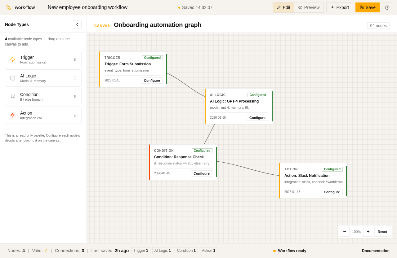
As a Frontend Developer, implement the approved Workflow Builder page design and the task-owned sections below. Implementation contract: - Outcome: Implement Workflow Builder page - Requirement sources: - src-0fa78d6d17e05e78 - src-f435bc232509d29a - src-98ad06c696a800bb - src-b27ac921554a325a - src-0badbe9834dea26a - src-ae0ed0454185a064 - src-1b7a45252bc7a46d - src-351e4b38431bce75 - src-2d6c50734d99aca2 - src-a76b08898a2fa104 - src-a8a8d656c341bccd - src-ac05742e9b31a8c8 - 1 additional source record(s) are retained in the structured implementation contract. - Owned behavior: - Rename workflow - Save workflow - Export or preview workflow - Discover node type - Drag node to canvas - Render canvas viewport with placed nodes and connections - Manage node selection and editing state - Provide inline configuration UI for trigger definition - Provide inline configuration UI for AI logic setup - Provide inline configuration UI for condition branching - Provide inline configuration UI for action/integration wiring - Support canvas zoom and pan navigation - Manage interactive workflow canvas with node placement, connection, and configuration. - Interfaces: - Provide workflow.canvas.interaction: Manage interactive workflow canvas with node placement, connection, and configuration. - State transitions: - Node selection and editing - Canvas zoom and pan - Failure and safety behavior: - Validation errors on node configuration Acceptance criteria: - The task-owned behavior is implemented and verified without undeclared mocks or downstream assumptions. - Workflow Builder page renders WorkflowBuilderHeader and NodeLibrary sections once - Header displays product logo, allows title editing, and provides save/export functionality - NodeLibrary shows node types with drag-to-canvas interaction - Design adheres to specified typography and color scheme - Responsive behavior as described - The Workflow Builder page must render the WorkflowCanvas section exactly once. - The canvas must display nodes and connections as per the initial state and allow users to interact with nodes through selection, editing, and configuration. - The design must adhere to the specified layout and typographic gestures, including Space Grotesk Bold 12px for node labels and Work Sans 14px for configuration card headings. - The canvas must support zoom and pan controls, and the node configuration regions must be accessible and functional. - The section must handle backend integration for node configuration persistence and validation. - Capability workflow.canvas.interaction implements Manage interactive workflow canvas with node placement, connection, and configuration. and is verified through its declared interfaces.
Implement Workflow Builder Footer
As a Frontend Developer, implement the approved Workflow Builder page design and the task-owned sections below. Implementation contract: - Outcome: Implement Workflow Builder Footer - Requirement sources: - src-cd654797a0d96963 - Owned behavior: - Display workflow statistics (node counts by type) - Show validation status and any configuration warnings - Indicate last saved time Acceptance criteria: - The task-owned behavior is implemented and verified without undeclared mocks or downstream assumptions. - The WorkflowBuilderFooter must render exactly once on the Workflow Builder page. - Display node count, validation status, connection health, and last saved timestamp as per the design contract. - Adhere to the specified design structure and theme. - No backend integration is required as the section is read-only. - Access is shared with all tech-savvy users.
No comments yet. Be the first!