voxlink-offline-communication
 Shiva Gupta
Build Step 1 of my Flutter app VoxLink. Goal Create a beautiful, modern, premium-looking UI/UX for an offline communication app. Do NOT implement Bluetooth, networking, encryption, database, login backend, mesh, voice or file transfer yet. This step is UI/UX only. Design Make VoxLink feel like a professional modern communication/security app. Style: - dark premium theme - clean minimal interface - smooth animations - rounded cards - subtle gradients - modern typography - excellent spacing - attractive icons - responsive Android layout - accessible contrast - no excessive decoration Suggested brand: - App name: VoxLink - Tagline: "Connect. Communicate. Offline." Use a consistent design system: - colors - typography - spacing - buttons - cards - icons - navigation Do not use random colors on different screens. Screens Create polished UI for: 1. Splash Screen 2. Welcome Screen 3. Create VoxLink Identity 4. Login / Unlock 5. Home 6. Chat 7. Nearby 8. Voice / Push-to-Talk 9. Files 10. Emergency / SOS 11. Profile 12. Settings Welcome Screen Show: VoxLink "Connect. Communicate. Offline." Buttons: Create VoxLink ID I already have an account Identity Screen Show: Create your VoxLink identity Display Name VoxLink ID preview Create Identity button For now use sample/demo data only for UI. Clearly keep demo data separate from future real implementation. Home Screen Create a premium dashboard. Show: Hello, [Name] VoxLink ID VX-XXXX-XXXX Connection status card: Offline Nearby devices: 0 Main cards: Chat Nearby Voice Files Emergency Bottom navigation: Home Chat Nearby Profile Chat Screen Create realistic empty-state UI: "No conversations yet" "Find a nearby VoxLink user to start communicating." Include: Search New Chat button Do NOT implement actual messaging yet. Nearby Screen Create a beautiful discovery interface. Show: Nearby VoxLink Scanning animation area Nearby device cards with: Name VoxLink ID Signal strength Connect button For now use clearly marked demo UI data only. Do NOT claim these are real devices. Voice Screen Create premium Push-to-Talk UI. Large circular microphone button. States: Hold to Talk Listening Transmitting UI only. Files Screen Show: Send Files Recent Transfers Empty state. UI only. Emergency Screen Create a clear SOS interface. Large SOS button. Show: "Emergency communication" "Send an SOS to nearby VoxLink devices." Do NOT implement actual emergency transmission. Profile Show: Profile photo placeholder Display name VoxLink ID Edit Profile Copy ID button. Settings Include: Account Security Notifications Appearance Bluetooth About VoxLink Navigation Use smooth navigation and transitions. Avoid unnecessary animations that reduce performance. Important Do NOT create fake functionality. Demo data must be clearly separated from real services. Do not add unnecessary packages unless required. Keep the code modular and ready for future real functionality. Use reusable widgets/components instead of duplicating UI code. At the end: 1. Run "flutter analyze" 2. Fix UI/code errors 3. Tell me which files were created/modified 4. Tell me what is UI-only 5. STOP Do not implement the next functionality stage until I say NEXT.

Comments (0)
Sign in to leave a comment
System Requirements
System Requirements Document for voxlink-offline-communication
1. Introduction
VoxLink is an offline communication application for Android, built in Flutter. This document specifies Step 1 of the product: a complete, polished, premium UI/UX layer for the VoxLink app. The intent of this step is to establish the visual identity, design system, navigation architecture, and screen inventory of an offline-first peer-to-peer communication tool, so that future functional stages (Bluetooth discovery, mesh networking, encryption, local storage, voice transmission, file transfer, and emergency signalling) can be implemented against a stable, modular, reusable interface foundation.
The audience for this step is the product owner and the Flutter implementation engineer. The audience for the eventual product is a person who needs to communicate when conventional infrastructure is unavailable — hikers, festival attendees, disaster-zone responders, protest participants, and remote job-site workers — and who therefore expects the app to read as dependable hardware rather than a social application.
This step is explicitly UI/UX only. No Bluetooth, networking, encryption, database, login backend, mesh, voice, or file transfer is implemented. All data shown is sample/demo data, clearly separated from future real implementation and clearly marked as such in the interface.
2. System Overview
VoxLink Step 1 delivers a single Flutter application with twelve polished screens, a single shared design system, a reusable component library, and a navigation architecture ready to accept real functionality in a later stage.
Current delivery. The app launches into a branded Splash Screen, hands off to an anonymous Welcome Screen, and offers two entry paths: creating a VoxLink identity or unlocking an existing one. From the Home dashboard, the user reaches Chat, Nearby, Voice / Push-to-Talk, Files, Emergency / SOS, Profile, and Settings. Bottom navigation exposes Home, Chat, Nearby, and Profile as persistent destinations. Every screen renders realistic content states — empty states, demo device rows, PTT states, SOS presentation — without performing any real communication, discovery, transmission, or persistence.
Actors. The single active human role in this step is the VoxLink User. There are no system, provider, or external actors in the current delivery, because no networking, discovery, or transmission is implemented.
Accepted behavior and ownership. All twelve screens are first-party application surfaces owned by the application. All access requirements are none in this step: the Welcome Screen, Splash Screen, Create VoxLink Identity, and Login / Unlock are anonymous entry surfaces, and the remaining screens are reachable UI surfaces in a UI-only build with no real authentication backend. No differentiated permissions, roles, or visibility controls exist in this step.
Narrow exclusions. This step does not implement: Bluetooth or any radio discovery, networking of any kind, encryption, any database or persistence layer, any login or authentication backend, mesh routing, voice capture or playback, file selection or transfer, or actual emergency transmission. It also does not implement any account-management capability beyond the UI of the identity and unlock screens.
2a. Product Interpretation and Delivery Boundary
VoxLink is delivered as a first-party Flutter application for Android. In this step, the entire product is the interface: the app owns every screen, every transition, and every visual state. There is no provider-owned surface, no external destination, and no headless delivery in the current scope.
The delivery boundary is drawn deliberately. The interface presents the shape of offline communication — a connection status panel, a scanning ring, a push-to-talk dial, an SOS control, a serial-number-style VoxLink ID — but performs none of it. Where the interface shows devices, transfers, or signal strength, those values are demo data and are labelled as demo data in the interface itself. The Nearby screen states that scanning is not active; demo device rows carry a visible DEMO chip. Nothing in the UI claims a capability the build does not have.
Access in this step is anonymous throughout. The Welcome Screen, Splash Screen, Create VoxLink Identity, and Login / Unlock are entry surfaces with no access requirement. Because no login backend exists, the Login / Unlock screen presents its unlock UI without performing verification, and the Home, Chat, Nearby, Voice / Push-to-Talk, Files, Emergency / SOS, Profile, and Settings screens are reachable UI surfaces rather than protected destinations. Establishing real identity continuity, protected destinations, and session ownership is deferred to a later stage.
Future stages — real identity creation and unlock, Bluetooth discovery, mesh communication, encrypted messaging, voice transmission, file transfer, and emergency signalling — are explicitly out of scope here and are recorded in Section 11 as future requirements. They must not be implemented until the user says NEXT.
2b. Source Content Inventory
Not applicable. No reference directive in this project declares a content_source; all product facts originate in the authoritative user requirement thread and the Planning Scope contract.
2c. Page Content and Component Coverage
The page inventory below is the closed, ordered page contract for this generation. Each page appears exactly once.
Splash Screen
- Information and state: VoxLink wordmark in Saira Condensed 700 at 56px on the
#0C0E10ground; a single amber hairline rule beneath the wordmark; no other content. - Primary action: None. The screen is a timed brand moment that hands off automatically.
- Supporting actions: None.
- Domain entities: Brand identity (app name, wordmark).
- Component responsibilities:
SplashScreencomposes the wordmark and the amber hairline; a fade-in of the wordmark over 400ms and a left-to-right sweep of the hairline; a 250ms fade-through handoff to the Welcome Screen. - States: Loading — wordmark fading in, hairline sweeping. Success — wordmark fully visible, handoff begins. Empty / Error / Recovery — not applicable; the splash has no data dependency and no failure mode in this step.
Welcome Screen
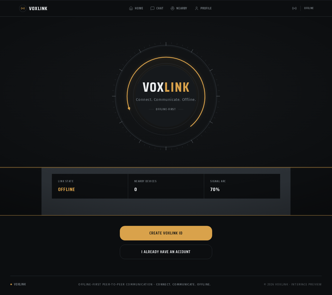
- Information and state: Full-bleed dark instrument face. A 420px tall concentric gauge occupies the upper two-thirds: outer tick ring, mid signal-arc ring, inner solid disc. The VoxLink wordmark sits inside the inner disc in Saira Condensed 700 at 52px. The tagline "Connect. Communicate. Offline." sits directly beneath the wordmark inside the dial, in Fira Sans 15px, tracked +0.04em, muted
#7A8288. A 1px amber rule runs the full viewport width between the gauge and the buttons. - Primary action: "Create VoxLink ID" — a solid amber
#D9A24Bblock, 56px tall, black text, full width. - Supporting actions: "I already have an account" — a 1px
#2A2F34outlined block, 56px tall,#ECEEF0text, full width, stacked beneath the primary button. - Domain entities: Brand identity; entry path selection.
- Component responsibilities:
WelcomeGaugerenders the tick ring, signal-arc ring, and inner disc, and animates a single slow amber sweep on entry that then holds at roughly 70% like a resting needle.PrimaryButtonandSecondaryButtonrender the two entry actions.BrandTaglinerenders the tagline inside the dial. - States: Loading — gauge sweep animating on entry. Success — gauge holds at rest, both buttons enabled. Empty — not applicable. Error / Recovery — not applicable; no data dependency in this step.
Create VoxLink Identity
- Information and state: Screen title "Create your VoxLink identity" in Saira Condensed 600, uppercase, tracked +0.06em, 26px. A Display Name text field. A VoxLink ID preview rendered in Saira Condensed 700 with tabular figures at 34px, letter-spaced like an engraved serial, in the
VX-XXXX-XXXXformat, with a hairline rule above and below it. ADEMOchip in 11px uppercase tracked amber-outlined text accompanies the previewed ID. - Primary action: "Create Identity" — solid amber block, 56px tall, black text.
- Supporting actions: Editing the Display Name field, which updates the previewed identity presentation.
- Domain entities: Display Name; VoxLink ID (preview only, demo data).
- Component responsibilities:
IdentityFormcomposes the title, the Display Name field, and the ID preview.VoxLinkIdBlockrenders the ID typographic furniture — hairline rules above and below, tabular figures, and theDEMOchip.PrimaryButtonrenders the Create Identity action. - States: Loading — not applicable in this step. Empty — Display Name field empty, ID preview showing the demo placeholder pattern. Success — Display Name populated, preview reflecting the entered name. Error — not applicable; no validation backend exists in this step. Recovery — not applicable.
Login / Unlock
- Information and state: Screen title in Saira Condensed 600, uppercase, tracked +0.06em, 26px. An unlock input surface for a returning user. A
DEMOchip indicating that no real authentication backend is present. - Primary action: An unlock action presented as a solid amber block, 56px tall, black text.
- Supporting actions: A return path to the Welcome Screen.
- Domain entities: Returning-user unlock intent (UI only).
- Component responsibilities:
UnlockFormcomposes the title, the unlock input surface, and the unlock action.DemoChipmarks the screen as demo-only.SecondaryButtonrenders the return path. - States: Loading — not applicable. Empty — unlock input surface presented with no value. Success — not reachable in this step; no verification is performed. Error — not applicable; no verification backend exists. Recovery — the return path to the Welcome Screen.
Home
- Information and state: A stacked instrument panel. Greeting row reading "Hello, [Name]". The VoxLink ID rendered in Saira Condensed 700 with tabular figures at 34px in
VX-XXXX-XXXXformat, with hairline rules above and below and a smallCOPY IDaction cut into the right end of the lower rule. A full-width connection status card at 28px radius showing the large state wordOFFLINE, a 3-arc signal gauge, andNEARBY DEVICES 0as a ruled data row. A 2-column grid of five function cards: Chat, Nearby, Voice, Files, and Emergency. Emergency spans both columns and is the only card carrying a red-orange#E4572Eleft rule. Bottom navigation with four items: Home, Chat, Nearby, Profile. - Primary action: Tapping any function card navigates to its screen.
- Supporting actions:
COPY IDon the VoxLink ID block; bottom-navigation tab selection. - Domain entities: Display Name; VoxLink ID; connection status (Offline); nearby device count (0); function destinations.
- Component responsibilities:
GreetingRowrenders the greeting.VoxLinkIdBlockrenders the ID with theCOPY IDaction.ConnectionStatusCardrenders the state word, the 3-arc signal gauge, and the ruledNEARBY DEVICES 0row, with a topographic contour texture at 6% opacity behind it.FunctionCardrenders each of the five cards, with the Emergency variant carrying the red-orange left rule.BottomNavBarrenders the four-item bar with a 2px amber indicator rail above the active item. - States: Loading — not applicable. Empty — the connection status card shows
OFFLINEandNEARBY DEVICES 0, which is the accepted resting state in this step. Success — the dashboard renders fully with all five function cards and the bottom navigation. Error — not applicable; no data dependency exists in this step. Recovery — not applicable.
Chat
- Information and state: Screen title in Saira Condensed 600, uppercase, tracked +0.06em, 26px. A search field. A realistic empty state reading "No conversations yet" with the supporting line "Find a nearby VoxLink user to start communicating." A
DEMOchip indicating that no messaging backend is present. - Primary action: "New Chat" button.
- Supporting actions: Typing into the search field.
- Domain entities: Conversation list (empty in this step); search query (UI only).
- Component responsibilities:
SearchFieldrenders the search input.EmptyStaterenders the "No conversations yet" headline and its supporting line.PrimaryButtonrenders the New Chat action.DemoChipmarks the screen as demo-only. - States: Loading — not applicable. Empty — the accepted and only content state: "No conversations yet" with the supporting line. Success — not reachable in this step; no messaging is implemented. Error — not applicable. Recovery — not applicable.
Nearby
- Information and state: Screen title "Nearby VoxLink" in Saira Condensed 600, uppercase, tracked +0.06em, 26px. A header line stating "Demo data — scanning not active". A scanning animation area built from two concentric arcs rotating continuously at 3s and 5s with opacity 0.5, plus a soft amber radial breathing at 4s. Nearby device cards presented as ruled rows: name and VoxLink ID on the left, a 5-bar signal column flush right, and a Connect pill. Every demo device row carries an amber-outlined
DEMOchip in 11px uppercase tracked text. - Primary action: "Connect" pill on each device row.
- Supporting actions: None beyond row interaction.
- Domain entities: Nearby device (name, VoxLink ID, signal strength) — demo data only; scanning state.
- Component responsibilities:
ScanningRingrenders the two concentric arcs and the amber radial breathing.DeviceRowrenders name, VoxLink ID, the 5-bar signal column, and the Connect pill as a ruled row.SignalBarsfills left-to-right in 90ms steps.DemoChipmarks every demo row.DemoNoticerenders the "Demo data — scanning not active" header line. - States: Loading — the scanning ring rotates continuously, which is the accepted resting state in this step. Empty — the scanning area is shown with demo device rows present; the interface never claims these are real devices. Success — demo device rows render with name, ID, signal strength, and Connect. Error — not applicable; no discovery backend exists. Recovery — not applicable.
Voice / Push-to-Talk
- Information and state: Screen title in Saira Condensed 600, uppercase, tracked +0.06em, 26px. A fixed readout block above the dial. A single 176px PTT dial centred on the screen, built from concentric stroked circles with a 2px bezel line and a 6px tick band. A state legend below the dial listing the three states: Hold to Talk, Listening, Transmitting. A
DEMOchip indicating that no voice capture or transmission is implemented. - Primary action: Pressing and holding the PTT dial.
- Supporting actions: None.
- Domain entities: PTT state (Hold to Talk, Listening, Transmitting) — UI only.
- Component responsibilities:
PttDialrenders the 176px dial, scales it to 0.97 in 120ms on press, and lights a 3px amber ring.PttReadoutrenders the fixed readout block above the dial.PttStateLegendrenders the three-state legend.DemoChipmarks the screen as demo-only. - States: Loading — not applicable. Empty — the dial rests in the Hold to Talk state. Success — pressing the dial transitions the presentation through Listening and Transmitting; the Transmitting state swaps the 3px ring to red-orange
#E4572Ewith a 1.2s rotating arc. Error — not applicable; no capture or transmission backend exists. Recovery — releasing the dial returns the presentation to Hold to Talk.
Files
- Information and state: Screen title "Send Files" in Saira Condensed 600, uppercase, tracked +0.06em, 26px. A "Recent Transfers" section header. An empty state for recent transfers. A
DEMOchip indicating that no file selection or transfer is implemented. - Primary action: A send-files action presented as a solid amber block, 56px tall, black text.
- Supporting actions: None.
- Domain entities: Recent transfer (empty in this step); file selection intent (UI only).
- Component responsibilities:
SectionHeaderrenders "Send Files" and "Recent Transfers".EmptyStaterenders the recent-transfers empty state.PrimaryButtonrenders the send-files action.DemoChipmarks the screen as demo-only. - States: Loading — not applicable. Empty — the accepted and only content state for Recent Transfers. Success — not reachable in this step; no transfer is implemented. Error — not applicable. Recovery — not applicable.
Emergency / SOS
- Information and state: Screen title in Saira Condensed 600, uppercase, tracked +0.06em, 26px. The text "Emergency communication" and "Send an SOS to nearby VoxLink devices." A 168px SOS dial built from concentric stroked circles with a 2px bezel line, a 6px tick band, and a hazard-tick bezel, carrying the red-orange
#E4572E. This screen is the single exception in the system: it is the only screen permitted to use#E4572E. ADEMOchip indicating that no emergency transmission is implemented. - Primary action: Pressing the large SOS button.
- Supporting actions: None.
- Domain entities: SOS intent (UI only).
- Component responsibilities:
SosDialrenders the 168px dial with the hazard-tick bezel in#E4572E.EmergencyCopyrenders "Emergency communication" and "Send an SOS to nearby VoxLink devices."DemoChipmarks the screen as demo-only. - States: Loading — not applicable. Empty — the SOS dial rests in its idle presentation. Success — not reachable in this step; no transmission is implemented. Error — not applicable. Recovery — not applicable.
Profile
- Information and state: A profile photo placeholder rendered as a machined disc with the user's initials in Saira Condensed 700. Display name. VoxLink ID rendered in Saira Condensed 700 with tabular figures at 34px in
VX-XXXX-XXXXformat, with hairline rules above and below and aCOPY IDaction cut into the right end of the lower rule. ADEMOchip indicating that the profile is demo data. - Primary action: "Edit Profile".
- Supporting actions: "Copy ID" button.
- Domain entities: Display name; VoxLink ID; profile photo placeholder.
- Component responsibilities:
ProfileDiscrenders the machined disc with initials.VoxLinkIdBlockrenders the ID with theCOPY IDaction.PrimaryButtonrenders Edit Profile.DemoChipmarks the profile as demo data. - States: Loading — not applicable. Empty — the profile disc renders initials from the demo display name. Success — display name and VoxLink ID render fully. Error — not applicable. Recovery — not applicable.
Settings
- Information and state: Grouped ruled rows with uppercase section headers in Saira Condensed 600, tracked +0.06em, and a 1px
#2A2F34rule between groups. The groups are: Account, Security, Notifications, Appearance, Bluetooth, and About VoxLink. ADEMOchip indicating that no settings are persisted. - Primary action: Tapping a settings row.
- Supporting actions: None.
- Domain entities: Settings group (Account, Security, Notifications, Appearance, Bluetooth, About VoxLink).
- Component responsibilities:
SettingsGrouprenders an uppercase section header and its ruled rows.SettingsRowrenders a single row with a 1.5px stroke line icon, a label, and a trailing affordance.DemoChipmarks the screen as demo-only. - States: Loading — not applicable. Empty — not applicable; all six groups are always present. Success — all six groups render with their ruled rows. Error — not applicable. Recovery — not applicable.
3. Functional Requirements
Each requirement below is a distinct story point with provenance, lifecycle facts, and observable acceptance.
FR-1 — Branded launch. As a VoxLink User, I should see a branded Splash Screen when the app launches, so that the product identity is established before any entry path is offered. (provenance: explicit; lifecycle: initiator = VoxLink User, trigger = app launch, observable result = VoxLink wordmark fades in over 400ms with a single amber hairline sweeping left-to-right beneath it, continuation = 250ms fade-through handoff to the Welcome Screen; failure/recovery = not applicable, no data dependency.)
FR-2 — Welcome entry. As a VoxLink User, I should see the VoxLink name, the tagline "Connect. Communicate. Offline.", and two entry buttons on the Welcome Screen, so that I can choose how to enter the app. (provenance: explicit; lifecycle: initiator = VoxLink User, trigger = arrival from Splash, observable result = the concentric gauge holds at rest with the wordmark and tagline inside the dial, and both "Create VoxLink ID" and "I already have an account" are presented as full-width 56px buttons; continuation = selecting either button; failure/recovery = not applicable.)
FR-3 — Create VoxLink identity. As a VoxLink User, I should be able to enter a Display Name and see a VoxLink ID preview with a Create Identity button, so that I can establish my identity presentation. (provenance: explicit; lifecycle: initiator = VoxLink User, trigger = selecting "Create VoxLink ID", observable result = the "Create your VoxLink identity" screen with a Display Name field, a VX-XXXX-XXXX ID preview in Saira Condensed 700 with tabular figures, and a Create Identity button; continuation = the identity presentation is established for the demo session; failure/recovery = not applicable, no validation backend exists in this step.)
FR-4 — Demo data separation on identity. As a VoxLink User, I should see that the identity preview uses sample/demo data, so that I am never misled into believing a real identity was created. (provenance: explicit; lifecycle: initiator = VoxLink User, trigger = viewing the identity preview, observable result = a DEMO chip in 11px uppercase tracked amber-outlined text accompanies the previewed ID; continuation = the user proceeds knowing the data is demo-only; failure/recovery = not applicable.)
FR-5 — Unlock presentation. As a VoxLink User, I should see an unlock UI when I indicate I already have an account, so that the returning-user path is represented. (provenance: explicit; lifecycle: initiator = VoxLink User, trigger = selecting "I already have an account", observable result = the Login / Unlock screen with an unlock input surface and an unlock action; continuation = the user can return to the Welcome Screen; failure/recovery = the return path to Welcome is always available; no verification is performed in this step.)
FR-6 — Home dashboard. As a VoxLink User, I should see a premium dashboard with my greeting, my VoxLink ID, a connection status card, and five function cards, so that I can orient myself and reach any part of the app. (provenance: explicit; lifecycle: initiator = VoxLink User, trigger = arriving at Home, observable result = "Hello, [Name]", the VoxLink ID in VX-XXXX-XXXX format, a connection status card showing OFFLINE and NEARBY DEVICES 0, and cards for Chat, Nearby, Voice, Files, and Emergency; continuation = selecting any card or bottom-navigation item; failure/recovery = not applicable.)
FR-7 — Bottom navigation. As a VoxLink User, I should see a four-item bottom navigation bar with Home, Chat, Nearby, and Profile, so that I can move between the primary destinations. (provenance: explicit; lifecycle: initiator = VoxLink User, trigger = selecting a bottom-navigation item, observable result = a 2px amber indicator rail slides between items in 180ms above the active item on a #16191C bar with a 1px top rule; continuation = the selected destination is displayed; failure/recovery = not applicable.)
FR-8 — Chat empty state. As a VoxLink User, I should see a realistic empty state on the Chat screen, so that I understand no conversations exist yet and how to start one. (provenance: explicit; lifecycle: initiator = VoxLink User, trigger = opening Chat, observable result = "No conversations yet" with the supporting line "Find a nearby VoxLink user to start communicating.", plus a search field and a New Chat button; continuation = the user can search or select New Chat; failure/recovery = not applicable; no actual messaging is implemented.)
FR-9 — Nearby discovery presentation. As a VoxLink User, I should see a discovery interface with a scanning animation area and nearby device cards, so that the discovery experience is represented. (provenance: explicit; lifecycle: initiator = VoxLink User, trigger = opening Nearby, observable result = "Nearby VoxLink" with two concentric arcs rotating at 3s and 5s, a soft amber radial breathing at 4s, and device cards showing Name, VoxLink ID, Signal strength, and a Connect button; continuation = the user can select Connect on a row; failure/recovery = not applicable; no real discovery is implemented.)
FR-10 — Demo device honesty. As a VoxLink User, I should see that nearby device rows are demo data and that scanning is not active, so that I am never told these are real devices. (provenance: explicit; lifecycle: initiator = VoxLink User, trigger = viewing the Nearby screen, observable result = the header states "Demo data — scanning not active" and every demo device row carries an amber-outlined DEMO chip in 11px uppercase tracked text; continuation = the user proceeds knowing the rows are demo-only; failure/recovery = not applicable.)
FR-11 — Push-to-Talk presentation. As a VoxLink User, I should see a premium Push-to-Talk UI with a large circular microphone button and the states Hold to Talk, Listening, and Transmitting, so that the voice interaction is
FR-11 — Push-to-Talk presentation. As a VoxLink User, I should see a premium Push-to-Talk UI with a large circular microphone button and the states Hold to Talk, Listening, and Transmitting, so that the voice interaction is represented. (provenance: explicit; lifecycle: initiator = VoxLink User, trigger = opening Voice / Push-to-Talk, observable result = a 176px PTT dial built from concentric stroked circles with a 2px bezel line and a 6px tick band, a fixed readout block above it, and a state legend below listing Hold to Talk, Listening, and Transmitting; continuation = pressing and holding the dial scales it to 0.97 in 120ms and lights a 3px amber ring, and the Transmitting state swaps that ring to red-orange #E4572E with a 1.2s rotating arc; failure/recovery = releasing the dial returns the presentation to Hold to Talk; no voice capture or transmission is implemented.)
FR-12 — Files presentation. As a VoxLink User, I should see a Files screen showing Send Files, Recent Transfers, and an empty state, so that the file-transfer experience is represented. (provenance: explicit; lifecycle: initiator = VoxLink User, trigger = opening Files, observable result = the "Send Files" screen title, a "Recent Transfers" section header, an empty state for recent transfers, and a send-files action presented as a solid amber block, 56px tall, black text; continuation = the user can select the send-files action; failure/recovery = not applicable; no file selection or transfer is implemented.)
FR-13 — Emergency / SOS presentation. As a VoxLink User, I should see a clear SOS interface with a large SOS button and the text "Emergency communication" and "Send an SOS to nearby VoxLink devices.", so that the emergency capability is represented without being performed. (provenance: explicit; lifecycle: initiator = VoxLink User, trigger = opening Emergency / SOS, observable result = a 168px SOS dial built from concentric stroked circles with a 2px bezel line, a 6px tick band, and a hazard-tick bezel carrying the red-orange #E4572E, together with the two required copy lines; continuation = the user can press the SOS button; failure/recovery = not applicable; no actual emergency transmission is implemented.)
FR-14 — Emergency colour exclusivity. As a VoxLink User, I should see the red-orange #E4572E used only on the Emergency / SOS screen, the Transmitting PTT state, and destructive settings rows, so that the alarm colour never loses its meaning. (provenance: explicit; lifecycle: initiator = VoxLink User, trigger = viewing any screen, observable result = #E4572E appears on exactly one element per screen and on no other screen in the app; continuation = the colour retains its single meaning; failure/recovery = not applicable.)
FR-15 — Profile presentation. As a VoxLink User, I should see a profile photo placeholder, my display name, my VoxLink ID, an Edit Profile action, and a Copy ID button, so that I can review and act on my identity presentation. (provenance: explicit; lifecycle: initiator = VoxLink User, trigger = opening Profile, observable result = a machined disc placeholder with the user's initials in Saira Condensed 700, the display name, the VoxLink ID in VX-XXXX-XXXX format with hairline rules above and below and a COPY ID action cut into the right end of the lower rule, and an Edit Profile action; continuation = the user can copy the ID or select Edit Profile; failure/recovery = not applicable.)
FR-16 — Settings groups. As a VoxLink User, I should see grouped settings rows for Account, Security, Notifications, Appearance, Bluetooth, and About VoxLink, so that the settings surface is complete. (provenance: explicit; lifecycle: initiator = VoxLink User, trigger = opening Settings, observable result = six groups with uppercase section headers in Saira Condensed 600 tracked +0.06em and a 1px #2A2F34 rule between groups; continuation = the user can tap a settings row; failure/recovery = not applicable; no settings are persisted.)
FR-17 — Demo data separation across the app. As a VoxLink User, I should see a DEMO chip wherever sample data is presented, so that demo data is always clearly separated from future real implementation. (provenance: explicit; lifecycle: initiator = VoxLink User, trigger = viewing any screen that presents sample data, observable result = an amber-outlined DEMO chip in 11px uppercase tracked text accompanies the demo content on the Identity, Login / Unlock, Home, Chat, Nearby, Voice / Push-to-Talk, Files, Emergency / SOS, Profile, and Settings screens; continuation = the user proceeds knowing the data is demo-only; failure/recovery = not applicable.)
FR-18 — No fake functionality. As a VoxLink User, I should never encounter a control that claims to perform a real action it does not perform, so that the interface never over-promises capability. (provenance: explicit; lifecycle: initiator = VoxLink User, trigger = interacting with any control, observable result = no messaging, discovery, transmission, persistence, or authentication is performed, and the Nearby header states "Demo data — scanning not active"; continuation = the user understands the build is UI-only; failure/recovery = not applicable.)
FR-19 — Consistent design system. As a VoxLink User, I should see one consistent design system across every screen, so that the app reads as a single professional product. (provenance: explicit; lifecycle: initiator = VoxLink User, trigger = navigating between screens, observable result = the same colours, typography, spacing, buttons, cards, icons, and navigation tokens are used everywhere, with no random colours on different screens; continuation = the user experiences a coherent product; failure/recovery = not applicable.)
FR-20 — Smooth, performant navigation. As a VoxLink User, I should experience smooth navigation and transitions without unnecessary animation cost, so that the app feels responsive. (provenance: explicit; lifecycle: initiator = VoxLink User, trigger = navigating between screens or switching tabs, observable result = page transitions use a 220ms shared-axis horizontal slide and tab switches a 160ms cross-fade, and nothing loops on a content screen except the scan and an active transmission; continuation = the destination is displayed; failure/recovery = not applicable.)
FR-21 — Modular, reusable implementation. As a VoxLink User, I should benefit from a modular codebase built from reusable widgets, so that future real functionality can be added without reworking the interface. (provenance: explicit; lifecycle: initiator = VoxLink User, trigger = any screen render, observable result = shared components such as PrimaryButton, SecondaryButton, VoxLinkIdBlock, DemoChip, EmptyState, SectionHeader, SignalBars, and BottomNavBar are reused rather than duplicated; continuation = future stages extend the same components; failure/recovery = not applicable.)
FR-22 — Step completion reporting. As a VoxLink User, I should receive a report of which files were created or modified and which parts of the build are UI-only, so that the scope of this step is unambiguous. (provenance: explicit; lifecycle: initiator = VoxLink User, trigger = completion of the step, observable result = flutter analyze is run, UI/code errors are fixed, and the created/modified file list and the UI-only inventory are reported; continuation = the step stops and the next functionality stage is not started until the user says NEXT; failure/recovery = analyzer errors are fixed before the report is delivered.)
VoxLink
Connect. Communicate. Offline.
VoxLink
Connect. Communicate. Offline.
No comments yet. Be the first!