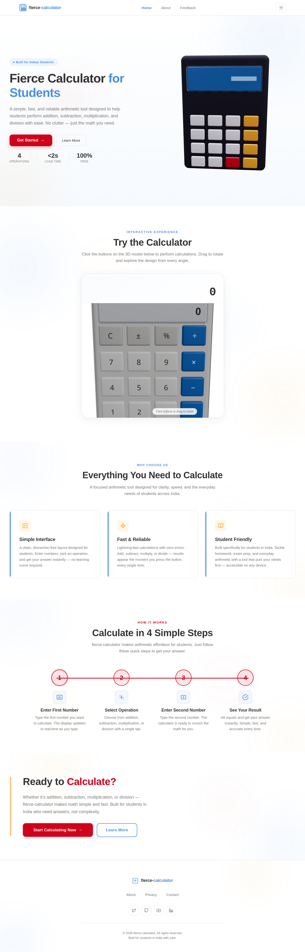
As a frontend developer, implement the Navbar section for the Home page. Build the `Navbar` component using `useState` (activeIndex, hoverIndex, mobileOpen, scrolled), `useEffect` (scroll listener setting `nb-scrolled` class at scrollY>10, resize listener, hover/active index sync), `useRef` (linkRefs array), and `useCallback` (updateIndicator). Render an animated sliding indicator that tracks hovered or active nav link using `getBoundingClientRect` delta math stored in `indicatorStyle` state. Implement an animated SVG logo using `framer-motion` `motion.path` with `pathLength` draw-on variants across 8 SVG paths (calcBodyPath, calcScreenPath, calcBtn1–6). Render `navLinks` array (Home, About, Feedback) with `motion` hover effects. Include mobile hamburger toggle with `AnimatePresence`-driven mobile menu. Apply `Navbar.css`. Note: this component may already exist from a previous page if shared.
As a Backend Developer, implement a FastAPI endpoint `POST /api/calculate` that accepts a JSON body with `operand1` (float), `operand2` (float), and `operator` (string: '+', '-', '*', '/') and returns the computed result. Include input validation (Pydantic models), error handling for division by zero, and a health-check endpoint `GET /api/health`. Expose CORS middleware to allow the frontend origin. Note: the CalculatorShowcase frontend task (5a409328) should depend on this API for server-side calculation support if needed.
As a Frontend Developer, set up the global theme and design system for the application. Create a CSS variables file (or theme config) that defines all color tokens from the SRD: primary (#4A90E2), primary_light (#A6C8FF), secondary (#F5A623), accent (#D0021B), highlight (#F8E71C), bg (#FFFFFF), surface (rgba(255,255,255,0.9)), text (#333333), text_muted (#777777), border (rgba(0,0,0,0.1)). Set up global CSS resets, typography scale, and import configuration for `framer-motion`, `@react-three/fiber`, and `@react-three/drei`. Ensure all section components can consume these tokens consistently.
As a frontend developer, implement the `HomeHero` section using `@react-three/fiber` Canvas, `@react-three/drei` (OrbitControls, RoundedBox, Environment), and `three`. Build `CalculatorButton` sub-component with `useRef`, `React.useState` for hover, and `useFrame` lerp scale animation (targetScale 1.08 on hover). Build `CalculatorBody` with `useRef` (groupRef, floatRef), `useFrame` for scroll-driven Y-axis rotation (`scrollFactor * 0.3`), sinusoidal floating (`sin(floatRef*0.6)*0.12`), and scroll-driven scale zoom (`1 + scrollFactor * 0.15`) all lerped smoothly. Render calculator body RoundedBox (bodyColor `#2C2C3A`), screen RoundedBox (screenColor `#1a3a5c`, emissive `#4A90E2`), and a 4×4 button grid with labels `[7,8,9,/],[4,5,6,*],[1,2,3,-],[0,.,=,+]` using `btnLight #E8E8EC`, `btnOrange #F5A623`, `btnRed #D0021B` colors. Wrap canvas in `motion` hero container with framer-motion entrance animations. Apply `HomeHero.css`.
As a frontend developer, implement the `CalculatorShowcase` section using `@react-three/fiber` Canvas with `useFrame`, `useThree`, `@react-three/drei` (RoundedBox, Text, OrbitControls), `framer-motion` (motion, AnimatePresence), and `three`. Define `BUTTON_ROWS` layout (5 rows including wide `0` button, C/±/% function keys, op keys). Build `CalcButton3D` with `useRef`, `useState` (hovered, pressed), `useRef` (targetScale, targetEmissive) and `useFrame` delta-lerp for scale (0.9 pressed, 1.05 hover, 1 default) and emissiveIntensity (0.35 hover). Handle `onPointerDown` with `stopPropagation`, 120ms press timeout, cursor changes on pointer over/out. Render `drei/Text` label at z=0.11. Implement full calculator logic with `useState`/`useCallback` for display string, operator state, and equals evaluation. Connect 3D button presses to calculator state. Wrap in framer-motion `AnimatePresence` for display transitions. Apply `CalculatorShowcase.css`.
As a frontend developer, implement the `FeatureHighlights` section using `framer-motion` (`motion`, `useInView`) and `useRef`. Define `features` array of 3 items (id: feature_card_1–3, titles: Simple Interface, Fast & Reliable, Student Friendly) each with inline SVG icons (rect+lines, lightning polygon, open-book paths). Implement `containerVariants` with `staggerChildren: 0.18` and `delayChildren: 0.1`, `cardVariants` with `opacity 0→1`, `y 28→0`, `rotate -1.5→0` on entrance, and `headerVariants` with `y 16→0`. Build `FeatureCard` component using `motion.div` with `variants={cardVariants}` and `whileHover` lifting `-6px` with box-shadow `rgba(74,144,226,0.12)`. Include left accent bar (`motion.div` scaleY 0.6→1) and top accent bar that expands on card hover. Use `useInView` with `once: true` on section ref to trigger container animation. Apply `FeatureHighlights.css`.
As a frontend developer, implement the `HowToUse` section using `framer-motion` (`motion`, `useInView`, `useMotionValue`, `useTransform`, `animate`) and `useRef`/`useEffect`/`useState`. Define `steps` array of 4 items (Enter First Number, Select Operation, Enter Second Number, See Your Result) each with `iconType` (input, operation, input2, result). Build `StepIcon` component with `motion.div` using `iconVariants` spring animation (rotate -90→0, scale 0.4→1, opacity 0→1, stiffness 200, damping 15) triggered by `isInView` prop, rendering 4 distinct SVG paths per iconType. Build `AnimatedNumber` with `useMotionValue`, `useTransform` (Math.round), `useState(displayVal)`, and `useEffect` triggering `animate(motionVal, target, {duration:0.8})` with `onUpdate` callback when `isInView`. Arrange 4-step layout with connector lines. Apply `HowToUse.css`.
As a frontend developer, implement the `CallToAction` section using `framer-motion` (`motion`, `useInView`, `AnimatePresence`) and `useState`/`useRef`/`useCallback`/`useEffect`. Define `PARTICLE_COLORS` array of 10 colors including `#D0021B`, `#F5A623`, `#4A90E2`, `#F8E71C`. Implement `generateParticles()` creating 10 particles with random angle offsets, distances 60–140px, sizes 5–11px, durations 0.5–0.9s. Build magnetic button effect via `handleMouseMove` computing dx/dy from button center, threshold 150px, pull factor `1 - distance/threshold`, max shift 12px stored in `btnOffset` state; set `isNear` and `glowIntensity` states. Implement `handleClick` spawning particles via `setParticles(generateParticles())` with `useEffect` cleanup timeout of 1000ms. Animate headline with `headlineVariants` (y 30→0, 0.6s), subtext with `subtextVariants` (y 24→0, delay 0.15s), buttons with `buttonsVariants` (y 20→0, delay 0.3s), all triggered by `useInView` with `margin: -60px`. Render `AnimatePresence` particle burst on click. Apply `CallToAction.css`.
As a frontend developer, implement the `Footer` section using `framer-motion` (`motion`, `useInView`) and `useRef`. Define `footerLinks` array (About, Privacy, Contact — all href `/Home`) and `socialIcons` array of 4 icons (Twitter, GitHub, YouTube, LinkedIn) each with SVG path data. Build `FooterLink` component with `motion.div` underline animating `width 0→100%` on `whileHover` over 0.3s easeInOut. Build `HoverableLink` using `motion.div` with `whileHover='hovered'`/`initial='idle'` variant group propagation. Implement `iconContainerVariants` with `staggerChildren: 0.1` and `staggerDirection: -1`, `iconVariant` with `opacity 0→1`, `x 20→0` over 0.4s. Apply `useInView` with `once: true, margin: -40px` on `footerRef`. Render parallax decorative background div with CSS custom property `--scroll` transform `translateY(calc(var(--scroll, 0) * -0.2px))`. Apply `Footer.css`. Note: this component may already exist from a previous page if shared.
As a Tech Lead, verify the end-to-end integration between the CalculatorShowcase frontend implementation (5a409328) and the Calculator Arithmetic backend API (backend-calc-api). Ensure that arithmetic operations triggered via 3D button presses correctly call `POST /api/calculate`, API responses (results and error messages such as division by zero) are handled and displayed in the calculator's 3D display, and the UI gracefully handles network errors or invalid inputs. Confirm CORS is correctly configured and data flows end-to-end.
No comments yet. Be the first!