shiny-do
 Soumil Jaiswal
to do app


Comments (0)
Sign in to leave a comment
System Requirements
System Requirements Document for shiny-do
1. Introduction
shiny-do is a personal to-do application built for exactly one person: its owner. The product exists so that a single individual can capture the tasks they need to do, keep one trustworthy list of what is still outstanding, mark items complete as they finish them, and remove items they no longer need. There is no team, no sharing, no collaboration, and no second user of any kind — the app is a private tool for the requester's own tasks.
The audience is therefore the solo task owner themselves: someone who wants a small, warm, low-stakes place to keep their own list current so nothing is forgotten. The product's success is measured by whether that one person can trust the list to show their own outstanding and finished tasks accurately.
2. System Overview
shiny-do is a single-user web application. One active human actor — the Solo Task Owner — uses it to manage their own personal tasks. The application owns all of the product's state: the personal task list, each task's title and completion status, and the timestamps shown alongside tasks.
Current delivery is a first-party custom web UI with five destinations: a public Landing page that introduces the personal to-do app, a Tasks page that shows the personal list of outstanding and completed tasks, a New Task page for capturing a new task, a Task Details page for changing a task to completed, and a Task Management page for removing a task from the list. All five destinations are reachable without an account, consistent with the confirmed single-user, personal scope.
The accepted behavior is deliberately narrow: capture a task, see the list of outstanding and completed tasks, mark a task complete, and remove a task. Nothing beyond that is in scope.
2a. Product Interpretation and Delivery Boundary
Delivery and access ownership. shiny-do is delivered as a first-party custom web application. The confirmed scope is a personal tool for one person managing their own tasks, and no account, sign-in, or identity step is required to use it. The Landing page is the anonymous public entry surface; the Tasks, New Task, Task Details, and Task Management destinations are all reachable directly as part of the same personal, single-user experience. No provider-owned or external surface owns any part of the product's behavior.
Current vs. future boundary. Everything described in this document is current. The product is a to-do app for personal task management, used by the requester alone. There is no future-horizon work defined in the accepted requirements.
Explicit exclusions. The app is for the requester's own personal tasks only. Team or shared-list usage is excluded: no shared lists, no collaborators, no assignment of tasks to other people, and no multi-user views. No dashboards for other people, no notifications to others, and no permissions or role differentiation exist, because there is only one user and one list.
2c. Page Content and Component Coverage
Landing
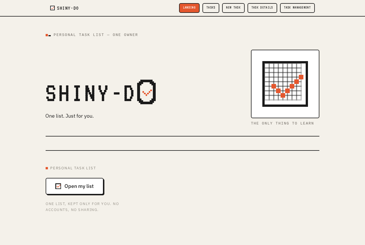
- Information and state: The public first impression of shiny-do. It explains that this is a personal to-do app for one person's own tasks, and it presents the product's identity — the wordmark, the single line of supporting copy, and the pixel-art checkbox illustration. No task data is shown here; the page is static and always available.
- Primary action: "Open my list" — takes the visitor into the Tasks page.
- Supporting actions: None beyond the primary entry action.
- Domain entities: None displayed; the page references the product itself and the concept of a personal task list.
- Component responsibilities:
- Oversized pixel wordmark "SHINY-DO" spanning the viewport width, with an accent-orange pixel checkmark inside the counter of the "O".
- A single line of body copy: "One list. Just for you."
- A 240px pixel-art checkbox illustration with a restrained 1Hz blink.
- A chunky bordered "Open my list" button with a 3px offset solid shadow.
- States:
- Loading: Not applicable — the page is static content.
- Empty: Not applicable — the page has no data-driven content.
- Success: The page renders fully with wordmark, copy, illustration, and entry button.
- Error: Not applicable — no data fetch occurs.
- Recovery: Not applicable.
- Reduced motion: The blinking checkmark renders statically with no blink.
Tasks
- Information and state: The revisitable personal task list. It shows the owner's outstanding tasks and their completed tasks, each as a full-width ruled row with a checkbox on the left, the task text in the middle, and a small mono timestamp on the right. A mono-uppercase status chip row ("OPEN", "DONE", "TODAY") filters or scopes the view, with the active chip filled in accent orange and the rest in ink outline.
- Primary action: Open a task to work with it — leading to Task Details for completion or Task Management for removal.
- Supporting actions: Add a new task (leading to New Task); toggle a task's checkbox directly from the row; switch the active status chip.
- Domain entities: Task (title, completion status, timestamp); the personal task list as a whole.
- Component responsibilities:
- Ruled task rows with 2px ink separators, a 28px square checkbox, task text, and a mono timestamp.
- Status chip row ("OPEN", "DONE", "TODAY") styled like a control panel.
- Entry point to New Task.
- Per-row entry points to Task Details and Task Management.
- States:
- Loading: A brief loading state while the personal list is retrieved.
- Empty: A friendly pixel character — a small pixel hand pointing at the "Add task" button — with a prompt to add the first task.
- Success: Outstanding and completed tasks render as ruled rows with correct checkbox states and timestamps.
- Error: If the list cannot be loaded, an ink-bordered message explains the failure and offers a retry.
- Recovery: Retry reloads the list; a failed completion or removal toggle reverts the row to its prior state and shows an inline message.
- Reduced motion: Checkbox stamp and strikethrough render as static final states.
New Task
- Information and state: A focused single-field capture form styled like a Macintosh dialog. It shows the task title field, the "Add task" button, and a "Cancel" text link. No list is shown; the page's only job is capturing one new task.
- Primary action: "Add task" — saves the task to the personal list and returns to Tasks.
- Supporting actions: "Cancel" — abandons the capture and returns to Tasks without saving.
- Domain entities: Task (title, creation timestamp, initial status of not complete).
- Component responsibilities:
- Task title input field.
- Chunky "Add task" button with 3px offset shadow.
- "Cancel" text link.
- States:
- Loading: Not applicable beyond the initial page render.
- Empty: The field starts empty with a placeholder inviting the task title.
- Success: The task is saved and appears in the Tasks list as an outstanding item.
- Error: If the title is blank or the save fails, an inline ink-bordered message explains the problem and the entered text is preserved.
- Recovery: The owner can correct the title and retry, or cancel without saving.
- Reduced motion: Button press renders as a static depressed state.
Task Details
- Information and state: A centered detail card for one task, showing the task title, a large checkbox, and a single "Mark complete" button. It reflects the task's current completion status.
- Primary action: "Mark complete" — changes the task to completed.
- Supporting actions: The large checkbox mirrors the completion action; navigating back returns to Tasks.
- Domain entities: Task (title, completion status, completion timestamp).
- Component responsibilities:
- Task title display.
- Large 28px square checkbox with pixel checkmark.
- "Mark complete" button with 3px offset shadow.
- States:
- Loading: A brief loading state while the task is retrieved.
- Empty: Not applicable — this page always targets a specific task.
- Success: The task is marked complete; the checkbox fills with accent orange, the title receives the accent strikethrough, and the task moves to the completed group on Tasks.
- Error: If the task cannot be loaded or the completion cannot be saved, an ink-bordered message explains the failure and offers a retry.
- Recovery: Retry re-attempts the completion; if the task no longer exists, the owner is returned to Tasks with an explanatory message.
- Reduced motion: The strikethrough and checkbox stamp render as static final states.
Task Management
- Information and state: A focused destination for removing a task from the personal list. It shows the task being managed and the removal control.
- Primary action: "Remove task" — deletes the task from the personal list.
- Supporting actions: "Cancel" — returns to Tasks without removing anything.
- Domain entities: Task (title, completion status).
- Component responsibilities:
- Task identification display.
- "Remove task" button with 3px offset shadow.
- "Cancel" text link.
- States:
- Loading: A brief loading state while the task is retrieved.
- Empty: Not applicable — this page always targets a specific task.
- Success: The task is removed and no longer appears on Tasks.
- Error: If the task cannot be loaded or the removal cannot be saved, an ink-bordered message explains the failure and offers a retry.
- Recovery: Retry re-attempts the removal; if the task no longer exists, the owner is returned to Tasks with an explanatory message.
- Reduced motion: Button press renders as a static depressed state.
3. Functional Requirements
FR-1 — Capture a personal task (provenance: explicit) As the Solo Task Owner, I should add a new task to my personal list so that I do not forget it.
- Trigger/input: From Tasks, I choose to add a task and land on New Task, where I enter a task title.
- Observable result: The task is saved to my personal list with an outstanding status and a creation timestamp, and it appears on Tasks.
- Access state: No account or sign-in is required; the destination is reachable directly.
- Failure/recovery: If the title is blank or the save fails, an inline message explains the problem, my entered text is preserved, and I can correct and retry or cancel.
- Continuation: I return to Tasks, where the new task appears among my outstanding items.
FR-2 — View my outstanding and completed tasks (provenance: explicit) As the Solo Task Owner, I should see my personal list of outstanding and completed tasks so that I have a trustworthy view of what remains and what is finished.
- Trigger/input: I open Tasks.
- Observable result: My tasks render as ruled rows with a checkbox, task text, and a mono timestamp, grouped or filterable by the "OPEN", "DONE", and "TODAY" status chips.
- Access state: No account or sign-in is required.
- Failure/recovery: If the list cannot be loaded, an ink-bordered message explains the failure and offers a retry.
- Continuation: From any row I can open Task Details to complete it, Task Management to remove it, or toggle its checkbox directly.
FR-3 — Mark a task complete (provenance: explicit) As the Solo Task Owner, I should change a task to completed so that my list reflects what I have finished.
- Trigger/input: From Tasks I open Task Details for a task, or toggle its checkbox directly from the row.
- Observable result: The task's status becomes completed; the checkbox fills with accent orange and shows the pixel checkmark, the title receives the accent strikethrough, and the task appears in the completed group on Tasks.
- Access state: No account or sign-in is required.
- Failure/recovery: If the completion cannot be saved, the row reverts to its prior state and an inline message explains the failure with a retry.
- Continuation: I return to Tasks, where the completed task is shown as done.
FR-4 — Remove a task from my list (provenance: explicit) As the Solo Task Owner, I should remove a task from my personal list so that items I no longer need stop cluttering it.
- Trigger/input: From Tasks I open Task Management for a task and choose "Remove task".
- Observable result: The task is deleted from my personal list and no longer appears on Tasks.
- Access state: No account or sign-in is required.
- Failure/recovery: If the removal cannot be saved, an ink-bordered message explains the failure and offers a retry; if the task no longer exists, I am returned to Tasks with an explanatory message.
- Continuation: I return to Tasks, which shows my remaining tasks.
FR-5 — Understand the product on first arrival (provenance: required_inference) As the Solo Task Owner, I should understand on arrival that shiny-do is a personal to-do app for my own tasks so that I can start using it.
- Trigger/input: I open Landing.
- Observable result: The page presents the "SHINY-DO" wordmark, the line "One list. Just for you.", the pixel-art checkbox illustration, and the "Open my list" button.
- Access state: Anonymous and public; no account or sign-in is required.
- Failure/recovery: Not applicable — the page is static content.
- Continuation: I choose "Open my list" and arrive at Tasks.
FR-6 — Keep one personal list current (provenance: explicit) As the Solo Task Owner, I should keep a single personal list current so that nothing is forgotten.
- Trigger/input: I return to Tasks at any time.
- Observable result: The list reflects my current outstanding and completed tasks, with accurate checkbox states and timestamps.
- Access state: No account or sign-in is required.
- Failure/recovery: If the list cannot be loaded, an ink-bordered message explains the failure and offers a retry.
- Continuation: I can add, complete, or remove tasks from this list.
4. User Personas
Solo Task Owner
Product context. The Solo Task Owner is the single person this app is built for. They confirmed that shiny-do is for themselves only — there is no team, no shared list, and no second user. They open the app for their own tasks, in their own time, with no one else watching or waiting.
Primary goal. Keep one trustworthy personal list of what they need to do, so that nothing is forgotten and they can see at a glance what is outstanding and what is finished.
Distinct accepted responsibilities. They capture new tasks, review their outstanding and completed tasks, mark tasks complete as they finish them, and remove tasks they no longer need. Their recurring responsibility is keeping the single personal list current.
Relevant inputs and decisions. They decide what to add, what to mark complete, and what to remove. Their inputs are task titles and completion or removal decisions. They do not assign tasks to anyone, share lists, or manage other people's work.
Interactions with other accepted participants. None. The Solo Task Owner is the only active human actor in the product; there are no collaborators, recipients, or counterparties.
Observable success. The list shows their own outstanding and finished tasks accurately, and every task they add, complete, or remove is reflected correctly the next time they look.
What makes this role distinct. The work is private and low-stakes: a personal ritual rather than a shared workflow. There is no coordination, no permissions, and no reporting to anyone else — the only person affected by any action is the owner themselves.
5. Core User Flows
Flow 1 — First arrival and entry into the personal list
- The Solo Task Owner opens shiny-do and lands on Landing.
- The page presents the "SHINY-DO" wordmark, the line "One list. Just for you.", the pixel-art checkbox illustration with its restrained 1Hz blink, and the "Open my list" button.
- The owner chooses "Open my list".
- The app takes them to Tasks, where their personal list is shown.
- Next step: They review their list, or add a task (Flow 2).
Flow 2 — Capturing a new task
- From Tasks, the Solo Task Owner chooses to add a task and arrives at New Task.
- They type a task title into the single field.
- They choose "Add task".
- The task is saved to their personal list with an outstanding status and a creation timestamp.
- The app returns them to Tasks, where the new task appears among their outstanding items.
- Failure/recovery: If the title is blank or the save fails, an inline ink-bordered message explains the problem, their entered text is preserved, and they can correct and retry — or choose "Cancel" to return to Tasks without saving.
- Next step: They continue reviewing their list, or open the new task (Flow 3 or Flow 4).
Flow 3 — Marking a task complete
- From Tasks, the Solo Task Owner opens Task Details for a task, or toggles its checkbox directly from the row.
- Task Details shows the task title, a large checkbox, and the "Mark complete" button.
- They choose "Mark complete" (or toggle the checkbox).
- The task's status becomes completed: the checkbox fills with accent orange and shows the pixel checkmark, and the title receives the accent strikethrough.
- The app returns them to Tasks, where the task now appears in the completed group.
- Failure/recovery: If the completion cannot be saved, the row reverts to its prior state and an inline message explains the failure with a retry. If the task no longer exists, they are returned to Tasks with an explanatory message.
- Next step: They continue with their remaining tasks, or remove a task (Flow 4).
Flow 4 — Removing a task from the list
- From Tasks, the Solo Task Owner opens Task Management for a task.
- The page shows the task being managed and the "Remove task" button.
- They choose "Remove task".
- The task is deleted from their personal list.
- The app returns them to Tasks, where the task no longer appears.
- Failure/recovery: If the removal cannot be saved, an ink-bordered message explains the failure and offers a retry. If the task no longer exists, they are returned to Tasks with an explanatory message. They can also choose "Cancel" to return to Tasks without removing anything.
- Next step: They continue with their remaining tasks.
Flow 5 — Reviewing the list on return
- The Solo Task Owner returns to Tasks at any time.
- The list loads and shows their current outstanding and completed tasks as ruled rows with checkboxes and mono timestamps.
- They switch between the "OPEN", "DONE", and "TODAY" status chips to scope the view, with the active chip filled in accent orange.
- Failure/recovery: If the list cannot be loaded, an ink-bordered message explains the failure and offers a retry.
- Next step: They add a task (Flow 2), complete a task (Flow 3), or remove a task (Flow 4).
6. Visuals, Colors and Theme
Muse and headline. Susan Kare — Charming clarity: one person's to-do list as a set of pixel-perfect, friendly artifacts. The register is private, low-stakes, and slightly playful: a tool you open for yourself, where every checkbox feels satisfying and every task feels like a small object you can pick up and put down. This is not enterprise productivity; it is a personal ritual with a sense of humor.
Color tokens (light mode).
| Role | Hex | Usage |
|---|---|---|
| Background | #F4F1EA | Warm paper-white ground |
| Surface | #FFFFFF | Pure white task tiles |
| Text | #1A1A1A | Ink-black text |
| Primary | #2B2B2B | Primary controls |
| Accent | #E4572E | Active checkbox, "add" button, selected tab, completed-task strikethrough |
| Muted | #8A857C | Secondary metadata and timestamps |
Proportion: ~70% paper ground, 20% ink, 8% white tiles, 2% accent. No blue anywhere; no gradients.
Typography.
- Headings: VT323, uppercase, wide tracking (0.08em), at large display sizes for the wordmark, page titles, and empty-state numerals.
- Body: IBM Plex Sans, regular weight, 1.6 line-height.
- Labels and status chips: IBM Plex Mono, small caps, uppercase.
- Scale (1.5 modular, mobile-first): display
clamp(40px, 8vw, 96px); h1 28px → 56px; h2 20px → 32px; body 16px → 18px; label 12px → 13px mono uppercase. Headlines always uppercase VT323; body always sentence-case IBM Plex Sans.
Shape language. Chunky-outline cards with 2px ink borders and 6px radii, close to the original Macintosh dialog box. Checkboxes are 28px squares with a 2px border; when checked they fill with accent orange and show a hand-drawn pixel checkmark. Buttons are rounded rectangles with a 2px ink border and a 3px offset solid shadow (no blur). Section rules are 2px ink lines, like window dividers. No soft shadows, no glass, no blurs.
Layout. A tidy, centered single-column grid on a paper ground, max-width 720px for task lists and 960px for the landing hero. The landing is a poster-like composition: an oversized pixel wordmark "SHINY-DO" spanning the viewport width, with a single large pixel-art checkbox illustration beside it. Tasks is a ruled list: each task is a full-width row with a checkbox on the left, task text in the middle, and a small mono timestamp on the right, separated by 2px ink rules. New Task is a focused single-field form styled like a Macintosh dialog: title, body field, a chunky "Add task" button, and a "Cancel" text link. Task Details is a centered detail card with the task title, a large checkbox, and a single "Mark complete" button. At 375px, the wordmark wraps to two lines and rows stack with the timestamp below the task text; at 768px and 1280px, the full row layout is preserved.
Imagery. Pixel icons and simple pictograms only — no photography, no 3D renders, no gradients. A small custom icon set drawn on a 16×16 grid: a checkbox, a pencil, a trash can, a clock, a star, a folder. The landing hero uses one large pixel-art checkbox illustration (48×48 grid) rendered as inline SVG with crisp edges. Empty states show a friendly pixel character — a small pixel hand pointing at the "Add task" button. All imagery is monochrome ink or accent orange on the paper ground.
Avoid. Any blue or indigo accent; Inter, Roboto, Arial, Helvetica, Open Sans, Lato, Poppins, and system-ui for headings or body; gradient blobs, glassmorphism, blurred shadows, and soft hover-lift cards; photography, 3D renders, and photographic hero imagery; centered SaaS hero layout with a blue CTA button; rounded-corner cards with 16px+ radii and blurred drop shadows; emoji as a substitute for the custom pixel icon set; decorative motion beyond the single 1Hz blink and the 2-frame checkbox stamp.
Readable text and controls stay whole at every viewport: headlines, wordmarks, labels, numbers, cards' text and controls stay entirely inside the viewport and their container at 375px, 768px, and 1280px, wrapping or scaling (for example font-size: clamp(...) with its mobile size) to fit, and no other element covers any part of them. Imagery, decoration, and motion may be cropped, bled off an edge, rotated, overlapped, or cut exactly as the direction asks, as long as they cover no readable text or control.
7. Signature Design Concept
The public entry is a poster, not a landing page. On warm paper (#F4F1EA), the wordmark SHINY-DO is set in VT323 at clamp(40px, 8vw, 96px), uppercase, spanning the full viewport width in ink black (#1A1A1A), with a single accent-orange (#E4572E) pixel checkmark sitting inside the counter of the "O". To the right — or below on mobile — sits a 240px pixel-art checkbox illustration rendered as inline SVG on a 48×48 grid, with a soft 1Hz blink. Beneath the wordmark, one line of IBM Plex Sans body copy reads "One list. Just for you." and a chunky bordered "Open my list" button with a 3px offset solid shadow sits ready. The composition is asymmetric, editorial, and unmistakably pixel-crafted: no gradient, no centered-SaaS layout, no blue button. The single accent checkmark inside the letterforms is the gesture no generic to-do app ships — it makes the product's one idea, a satisfying checkbox, the first thing the owner sees.
8. Interaction Model & Motion Direction
Interaction Model: Static Motion Tempo: restrained Hero Dimensionality: flat
Landing Hero Motion Brief.
- Focal subject: The oversized VT323 wordmark "SHINY-DO" with the accent-orange pixel checkmark inside the counter of the "O", paired with the 240px pixel-art checkbox illustration.
- Input → transformation → outcome thesis: The owner arrives on the paper ground and sees the wordmark and the blinking pixel checkmark; the single restrained loop — the checkmark blinking on and off at 1Hz, like a cursor — draws the eye to the product's one idea; the owner chooses "Open my list" and the app cuts instantly to Tasks.
- Motion vocabulary: Frame-by-frame micro animations only, in the spirit of early Macintosh UI. The checkbox "stamps" with a 2-frame pixel checkmark; completed task text slides 4px right as it gets struck through with a 2px accent line; buttons depress by 3px on press with the shadow collapsing to 0. Page transitions are instant cuts — no fades, no easing theatrics.
- Composed first frame: Warm paper ground, the full-width ink-black wordmark with the accent checkmark in the "O", the pixel-art checkbox illustration to the right (below on mobile) mid-blink, the line "One list. Just for you.", and the chunky "Open my list" button with its 3px offset shadow.
- Reduced-motion state: All states render statically with no blink; the checkbox stamp and strikethrough appear as final states; button presses show the depressed state without animation.
9. Non-Functional Requirements
NFR-1 — Single-user scope (provenance: explicit) The app is for the requester's own personal tasks only. Team or shared-list usage is excluded: no shared lists, no collaborators, no task assignment to other people, and no multi-user views.
NFR-2 — No account requirement (provenance: required_inference) The confirmed scope is a personal tool for one person managing their own tasks, and no account, sign-in, or identity step is required. All five destinations are reachable directly.
NFR-3 — No role or permission differentiation (provenance: required_inference) Because there is exactly one user and one list, there is no RBAC, no role-based visibility, and no permission control over shared product state.
NFR-4 — Responsive readability (provenance: explicit) Readable text and controls stay whole at 375px, 768px, and 1280px. Headlines, wordmarks, labels, numbers, cards' text, and controls stay entirely inside the viewport and their container, wrapping or scaling to fit, and no other element covers any part of them.
NFR-5 — Reduced motion (provenance: explicit)
With prefers-reduced-motion, all states render statically with no blink, and the checkbox stamp and strikethrough appear as final states.
NFR-6 — No blue or indigo (provenance: explicit) The palette is warm paper, ink, and one orange-red accent. No blue or indigo appears anywhere, and the generic indigo/blue-on-white SaaS template is forbidden for this project.
NFR-7 — No photography or 3D renders (provenance: explicit) Imagery is pixel icons and simple pictograms only. No photography, no 3D renders, no gradients.
NFR-8 — No decorative motion beyond the specified set (provenance: explicit) Motion is limited to the single 1Hz blink and the 2-frame checkbox stamp, plus the specified button press and strikethrough behaviors. No other decorative motion is added.
10. Tech Stack
- Frontend: React — a first-party custom web UI delivering the five destinations.
- Backend: Python / FastAPI — serves the personal task list and the capture, completion, and removal operations.
- Storage: A persistent store for the personal task list, holding each task's title, completion status, and timestamps.
- Containerization: Docker / docker-compose for local and deployment packaging.
[Default — not specified by user] Kubernetes is not required for this single-user application and is omitted.
11. Assumptions and Constraints
Assumptions.
- [Default — not specified by user] The personal task list persists between visits so the owner can return to a current list.
- [Default — not specified by user] Each task has a title, a completion status, and timestamps for creation and completion.
- [Default — not specified by user] The "TODAY" status chip scopes the list to tasks relevant to the current day; "OPEN" and "DONE" scope it to outstanding and completed tasks respectively.
Constraints.
- The app is for the requester's own personal tasks only; team or shared-list usage is excluded.
- No account, sign-in, or identity step is required.
- No RBAC, role-based visibility, or permission controls exist.
- The palette is warm paper, ink, and one orange-red accent; no blue or indigo.
- Imagery is pixel icons and pictograms only; no photography, 3D renders, or gradients.
- Motion is limited to the single 1Hz blink and the 2-frame checkbox stamp, plus the specified button press and strikethrough behaviors.
12. Glossary
- Solo Task Owner: The single active human user of shiny-do — the person managing their own personal tasks.
- Personal task list: The one list of tasks owned by the Solo Task Owner; the app's authoritative state.
- Task: A single item on the personal list, with a title, a completion status, and timestamps.
- Outstanding task: A task that has not yet been marked complete.
- Completed task: A task that has been marked complete, shown with the accent strikethrough.
- Status chip: The mono-uppercase control-panel row ("OPEN", "DONE", "TODAY") that scopes the Tasks view, with the active chip filled in accent orange.
- Pixel checkmark: The hand-drawn 2-frame checkmark that stamps into a checkbox when a task is completed.
- Paper ground: The warm paper-white background (
#F4F1EA) on which the app's surfaces sit.
Personal task list — one owner
SHINY-DO
One list. Just for you.
Personal task list — one owner
SHINY-DO
One list. Just for you.
No comments yet. Be the first!