retro-games
create a saas application that contains different retro games with proper controls

Comments (0)
Sign in to leave a comment
System Requirements
System Requirements Document for retro-games
1. Introduction
retro-games is a browser-delivered SaaS application that hosts a collection of different retro games and lets people play them with proper controls. The product intent is narrow and deliberate: a multi-user, web-delivered arcade where a visitor can arrive, browse a catalogue of distinct retro titles, launch one, and immediately operate it through controls that are legible, tactile, and obviously operable — an on-screen control deck plus matching keyboard input.
The audience is broad and casual: people who grew up with 8-bit and 16-bit machines, and people who romanticise them. They are not expected to read instructions before playing. The product must therefore make the controls self-evident at first glance and let the game canvas be the only loud thing on the page.
The emotional register is nostalgic delight, not corporate productivity. The application should feel like a well-kept cabinet of playable artefacts.
2. System Overview
retro-games is a single first-party web application with three current destinations: a public Landing page, a Games catalogue, and a Game Play session surface. All three are anonymously reachable; no account, sign-in, or identity establishment is required or accepted for the current product.
The only accepted active human actor is the Player. The Player browses the catalogue, selects a title, launches it, and operates it through the on-screen control deck and the physical keyboard. The application itself owns game hosting, catalogue presentation, the playable session surface, and the control mapping between on-screen controls, keyboard keys, and the running game.
Current accepted behavior is limited to: hosting multiple different retro games, presenting them for selection, and making each one playable with proper controls. There is no accepted account system, no accepted social or multiplayer capability, no accepted payment or subscription flow, no accepted leaderboard persistence, and no accepted administrative or moderation surface. Where the shell displays score and high-score presentation, that presentation is part of the play surface's visual language, not a separate accepted competitive or persistence feature.
2a. Product Interpretation and Delivery Boundary
Delivery ownership. retro-games is a first-party, browser-delivered SaaS application. The application owns the Landing page, the Games catalogue, and the Game Play session surface, including the on-screen control deck, the keyboard legend, and the mapping of both to the running game. The application is the sole owner of every accepted human-facing interaction in the current product.
Access ownership. All three current destinations are anonymously reachable. The Player is never asked to create an account, sign in, or establish identity in order to browse or play. This is a deliberate boundary, not an omission: nothing in the accepted behavior requires durable actor-specific state, a commitment bound to a particular participant, an entitlement, or a value transfer that would need to survive across sessions under a verified identity. Consequently no identity establishment, verification, invitation, provisioning, or account-management capability is part of the current product.
Current versus future. Current scope is exactly: multiple different retro games, a catalogue to browse and select from, and a playable session with proper controls. Anything beyond that — accounts, saved progress, competitive ranking, social features, commerce — is out of current scope and is not implemented, not implied by any page, and not required by any acceptance criterion in this document.
Explicit exclusions. The product does not include user accounts or authentication, does not include payments or subscriptions, does not include multiplayer or social interaction, does not include an administrative or content-management surface, and does not include any capability whose only justification is that similar products conventionally have it.
2c. Page Content and Component Coverage
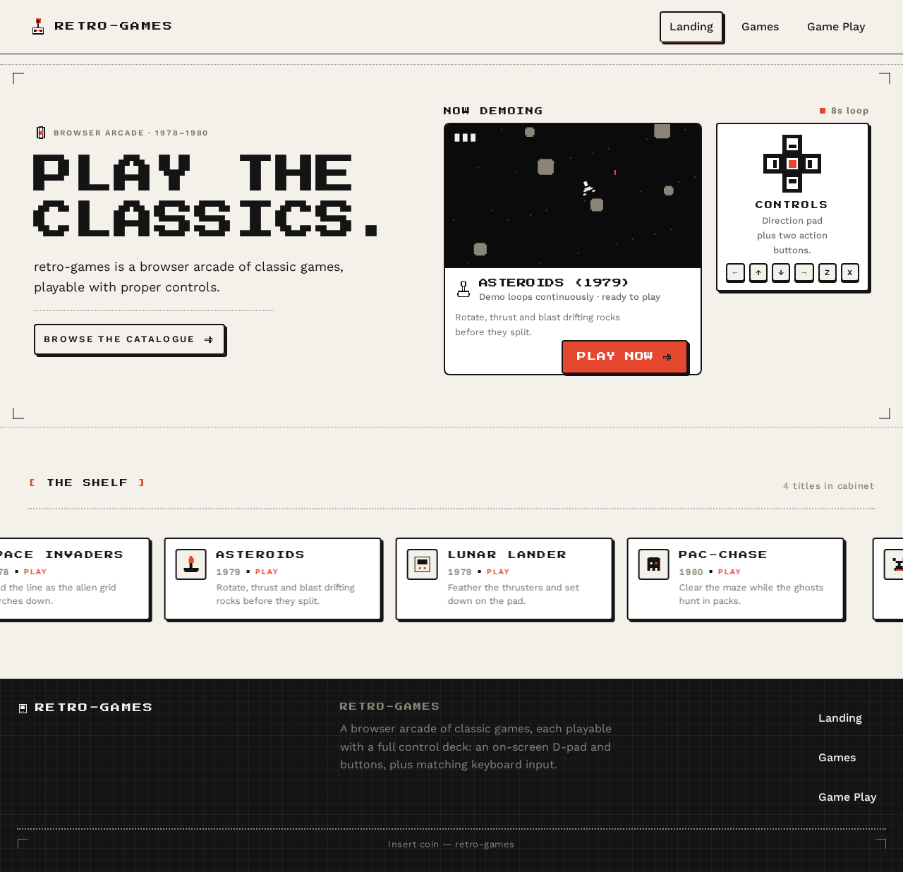
Landing
Purpose. Anonymous first impression: explain what retro-games is, who it is for, and what it does, before the Player enters the catalogue.
Information and state.
- Oversized all-caps headline
PLAY THE CLASSICS.set in Press Start 2P, left-aligned, spanning two stacked lines at 1280px and wrapping whole at 375px. - A short supporting line of Work Sans body copy stating that retro-games is a browser arcade of classic games playable with proper controls.
- A live, looping 8-second demo of the first game, running inside a white panel with a 2px
#141414border. - A pixel D-pad drawn beside the demo panel as a control affordance.
- A full-width marquee of game tiles scrolling continuously across the viewport.
Primary actions.
PLAY NOW— a single#E5482Fbutton cut into the bottom edge of the demo panel, carrying a hard 3px#141414offset shadow. Navigates to Game Play for the featured title.- Browse the catalogue — navigates to Games.
Supporting actions.
- Select any tile in the marquee to navigate to that title's Game Play session.
- Keyboard focus traversal across the headline, demo panel,
PLAY NOW, and marquee tiles.
Domain entities. Game (title, pixel icon, year, one-line blurb, cover frame), Featured Game (the title used for the looping demo).
Component responsibilities.
HeroTypeBlock— renders the headline and supporting copy; enforces the two-line maximum for Press Start 2P.DemoPanel— hosts the looping 8-second demo, the adjacent pixel D-pad affordance, and thePLAY NOWtab.GameTileMarquee— renders the full-bleed scrolling strip of game tiles; crosses the viewport edge by design.PixelIcon— 16×16 / 24×24 / 48×48 Kare-grid icons used as section markers and tile art.DottedRule/PixelCornerBracket— 1px dotted rules and pixel-corner brackets framing sections.
States.
- Loading: demo panel shows a static first frame with a pixel-corner bracket frame; marquee tiles render as outlined placeholders on the same grid.
- Empty: if no games are available, the demo panel is replaced by a pixel empty-state icon (cartridge) with the line "No games loaded yet." and the marquee is hidden;
PLAY NOWis disabled. - Success: demo loops continuously; marquee scrolls at 40px/s;
PLAY NOWis active. - Error: if the demo fails to start, the panel shows a static cover frame with the line "Demo unavailable — browse the catalogue." and the catalogue link remains fully operable.
- Recovery: the Player can always proceed to Games regardless of demo state; no Landing failure blocks catalogue access.
Games
Purpose. The catalogue: browse the available retro games and select one to play.
Information and state.
- A dense tile grid of chunky-outline game cards: 4-up at 1280px, 2-up at 768px, 1-up at 375px.
- Each card shows a pixel icon, the game title, the release year, a one-line blurb, and a 16:9 pixel-art cover frame inside the card border.
- A
PLAYtab in#E5482Fcut into the bottom edge of each card, physically overlapping the card border. - Section label in Press Start 2P at 11–13px with 0.18em letterspacing.
Primary actions.
PLAYon any card — launches that title's Game Play session.- Select the card body — same destination as
PLAY.
Supporting actions.
- Keyboard traversal across the tile grid with a visible
#E5482Ffocus ring. - Return to Landing.
Domain entities. Game (title, year, blurb, pixel icon, cover frame, control scheme).
Component responsibilities.
GameTileGrid— responsive 12-column grid, 24px gutter at 1280px, single column at 375px.GameCard— 2px#141414border, 3px hard offset shadow, 4px/8px radius only; presses (translates 2px down, shadow shrinks to 1px) rather than lifts.PlayTab— the#E5482Ftab overlapping the card's bottom border.PixelIcon— per-title icon on the Kare grid.CoverFrame— 16:9 pixel-art frame, never photographic.
States.
- Loading: grid renders outlined card skeletons on the same grid and spacing; no layout shift on arrival.
- Empty: a centred pixel empty-state icon (floppy) with the line "No games in the cabinet yet." and a link back to Landing.
- Success: all available titles render as complete cards with title, year, blurb, cover, and
PLAYtab fully inside their containers at 375px, 768px, and 1280px. - Error: if the catalogue fails to load, the page shows a pixel alert icon with "Couldn't load the games." and a
TRY AGAINcontrol that re-requests the catalogue. - Recovery: retry re-fetches the catalogue in place; the Player is never stranded without a route back to Landing.
Game Play
Purpose. The playable session: the selected retro game is launched and operated through its proper controls.
Information and state.
- The game canvas centred in a white panel with a 2px
#141414border. - The game title and year displayed above the canvas.
- A control deck below the canvas: plus-shaped D-pad on the left, two beveled circular action buttons on the right at 1280px and 768px; stacked into two rows at 375px.
- A persistent keyboard-legend strip showing the physical key bound to each on-screen control.
- A score readout and high-score table set in Work Sans tabular numerals with dotted 2px row rules.
Primary actions.
- Operate the D-pad — directional input to the running game.
- Operate the action buttons — primary and secondary action input to the running game.
- Press the corresponding physical keyboard keys — identical input to the on-screen controls.
Supporting actions.
- Return to Games.
- Restart the current session.
- Exit the session back to the catalogue.
Domain entities. Game (title, year, control scheme), Session (running instance of a title), ControlBinding (on-screen control ↔ keyboard key ↔ game input), Score (current), HighScore (best recorded for the title in this session context).
Component responsibilities.
GameCanvasPanel— white panel, 2px#141414border, hosts the running game; the only saturated element on the page.ControlDeck— plus-shaped D-pad and two beveled circular action buttons, each with a 2px#141414border and a 3px hard offset shadow that shrinks to 1px when pressed.KeycapLegend— persistent strip mapping each on-screen control to its physical key; highlights the matching key as it is pressed.ScoreReadout— tabular numerals; digits tick over one frame at a time like a mechanical counter.HighScoreTable— tabular numerals with dotted 2px row rules.SessionControls— restart and exit.
States.
- Loading: the canvas panel shows a pixel loading frame (cartridge icon) with the title name; the control deck renders fully and is inert until the game is ready.
- Empty: not applicable — Game Play is only reachable with a selected title; if reached without one, the page shows a pixel empty-state with "Pick a game first." and a link to Games.
- Success: the game runs; on-screen controls and keyboard input both register; the active control key is highlighted in
#E5482F; the score updates. - Error: if the game fails to start, the panel shows a pixel alert icon with "This game didn't start." and
TRY AGAINplus a link back to Games. - Recovery:
TRY AGAINre-launches the same title in place;Restartresets the current session;Exitreturns to Games with the catalogue state preserved.
3. Functional Requirements
FR-1 — Host multiple different retro games (explicit) As a Player, I should find more than one distinct retro game available in the application, so that the product is a collection rather than a single title.
- Trigger/input: the Player opens the application.
- Observable result: the Games catalogue lists multiple distinct titles, each with its own title, year, blurb, pixel icon, and cover frame.
- Access state: anonymous; no identity required.
- Failure/recovery: if the catalogue fails to load, a retry control re-requests it in place.
- Continuation: the Player selects any listed title to play it.
FR-2 — Browse the catalogue of retro games (explicit) As a Player, I should browse the available retro games in a catalogue, so that I can see what is on offer before choosing.
- Trigger/input: the Player navigates to Games from Landing or from a Game Play session.
- Observable result: a responsive tile grid renders every available title as a chunky-outline card with pixel icon, title, year, one-line blurb, 16:9 pixel-art cover, and a
PLAYtab cut into the bottom edge. - Access state: anonymous.
- Failure/recovery: on load failure, a pixel alert state with
TRY AGAINre-fetches the catalogue. - Continuation: the Player selects a card to launch that title.
FR-3 — Select a game to play (explicit) As a Player, I should select a specific retro game from the catalogue, so that the application launches that title.
- Trigger/input: the Player activates a card's
PLAYtab or the card body, by pointer or keyboard. - Observable result: the application navigates to Game Play for the selected title, which is named above the canvas.
- Access state: anonymous.
- Failure/recovery: if the selected title fails to launch, the Game Play page shows a pixel alert with
TRY AGAINand a link back to Games. - Continuation: the Player operates the game's controls.
FR-4 — Play a retro game with proper on-screen controls (explicit) As a Player, I should operate the selected retro game through an on-screen control deck, so that I can actually play it.
- Trigger/input: the Player presses the plus-shaped D-pad or the beveled circular action buttons.
- Observable result: the running game receives the corresponding input; the pressed control translates 2px down and its hard shadow shrinks from 3px to 1px; the active control key is highlighted in
#E5482F. - Access state: anonymous.
- Failure/recovery: if the game fails to start, the panel shows a pixel alert with
TRY AGAIN; the control deck remains visible and inert until the game is ready. - Continuation: the Player continues playing, restarts, or exits to Games.
FR-5 — Play a retro game with proper keyboard controls (explicit) As a Player, I should operate the selected retro game with the physical keyboard, so that I can play with the input method I prefer.
- Trigger/input: the Player presses the physical key bound to an on-screen control.
- Observable result: the running game receives the same input as the equivalent on-screen control; the matching keycap in the persistent legend strip highlights as the key is pressed.
- Access state: anonymous.
- Failure/recovery: if a key press is not bound, nothing is sent to the game and no legend entry highlights.
- Continuation: the Player continues playing with either input method, interchangeably.
FR-6 — See the control mapping at all times during play (explicit) As a Player, I should see which physical key corresponds to each on-screen control while I play, so that I can learn the controls without leaving the game.
- Trigger/input: the Player is on Game Play.
- Observable result: a persistent keyboard-legend strip is visible below the control deck, mapping each on-screen control to its physical key, and highlighting the matching key as it is pressed.
- Access state: anonymous.
- Failure/recovery: the legend is static content and remains visible even if the game fails to start.
- Continuation: the Player uses the legend to switch between on-screen and keyboard input.
FR-7 — See the current score and the best score during play (explicit) As a Player, I should see my current score and the best score for the title I am playing, so that I can judge how I am doing.
- Trigger/input: the Player is on Game Play and the game reports a score change.
- Observable result: the score readout updates in Work Sans tabular numerals, ticking over one digit per frame like a mechanical counter; the high-score table shows the best recorded value with dotted 2px row rules.
- Access state: anonymous.
- Failure/recovery: if no score has been recorded, the high-score table shows a pixel empty-state row rather than a blank region.
- Continuation: the Player continues playing or restarts the session.
FR-8 — Restart or exit a play session (explicit) As a Player, I should be able to restart the current game or leave it and return to the catalogue, so that I am never stuck in a session.
- Trigger/input: the Player activates
RestartorExiton the Game Play page. - Observable result:
Restartresets the current session in place;Exitreturns to Games with the catalogue state preserved. - Access state: anonymous.
- Failure/recovery: if
Restartfails to re-launch, the panel shows the pixel alert state withTRY AGAIN;Exitremains operable. - Continuation: the Player picks another title or resumes play.
FR-9 — Understand what the product is before playing (explicit) As a Player, I should understand what retro-games is and what it does on arrival, so that I can decide to start playing.
- Trigger/input: the Player opens the application at the Landing page.
- Observable result: an oversized
PLAY THE CLASSICS.headline, a short supporting line, a looping 8-second demo of the first game, and aPLAY NOWbutton are all visible and fully inside the viewport at 375px, 768px, and 1280px. - Access state: anonymous.
- Failure/recovery: if the demo fails to start, the panel shows a static cover frame with "Demo unavailable — browse the catalogue." and the catalogue link remains operable.
- Continuation: the Player activates
PLAY NOWor browses the catalogue.
4. User Personas
Player
Product context. The Player is the sole accepted active human actor in retro-games. They arrive at a browser-delivered arcade of classic games, most often casually and without prior instruction, expecting to be playing within seconds. They may be returning to titles they grew up with, or encountering 8-bit and 16-bit games for the first time. They are not a power user of the product's chrome; they are a player of its games.
Primary goal. To browse the available retro games, launch one, and play it with controls that work immediately and are obviously operable.
Distinct accepted responsibilities.
- Understanding what the product is on arrival, from the Landing page, without reading a manual.
- Browsing the catalogue and comparing titles by their icon, title, year, and one-line blurb.
- Selecting a specific title to launch.
- Operating the running game through the on-screen control deck — the plus-shaped D-pad and the two beveled circular action buttons.
- Operating the running game through the physical keyboard, using the persistent keycap legend to learn and confirm the mapping.
- Reading the current score and the best score for the title being played.
- Restarting a session or exiting back to the catalogue.
Relevant inputs and decisions.
- Which title to play, decided from the catalogue cards.
- Which input method to use at any moment — on-screen controls, keyboard, or a mix.
- Whether to restart the current session or exit to the catalogue.
- Whether to continue playing or pick a different title.
Interactions with other accepted participants. None. The Player is the only accepted active human actor; there is no counterparty, recipient, or co-participant in any accepted capability. The application itself is the only other actor, and it acts as the host and input-mapping system.
Observable success. The Player can open the application, reach the catalogue, launch any listed retro game, and operate it with working, appropriate controls — on-screen and via keyboard — with the control mapping visible at all times and the score readable during play.
Constraints carried from source. No account, sign-in, or identity establishment is required at any point. All three destinations are anonymously reachable.
5. Core User Flows
Flow 1 — Arriving and understanding the product (Player)
- The Player opens retro-games in a browser and lands on Landing.
- The Player sees the oversized
PLAY THE CLASSICS.headline, the short supporting line, and the looping 8-second demo of the first game running inside its white panel. - The Player sees the pixel D-pad drawn beside the demo panel and the
PLAY NOWbutton cut into the panel's bottom edge with its hard 3px shadow. - The Player sees the full-width marquee of game tiles scrolling across the viewport.
- Decision: the Player either activates
PLAY NOWto launch the featured title, selects a tile in the marquee, or follows the catalogue link to browse everything. - Observable result: the Player reaches either a Game Play session for the chosen title or the Games catalogue.
- Failure/recovery: if the demo fails to start, the panel shows a static cover frame with "Demo unavailable — browse the catalogue." The Player can still reach the catalogue; nothing on Landing blocks progress.
- Continuation: the Player proceeds to browse or play.
Flow 2 — Browsing the catalogue and choosing a game (Player)
- The Player arrives at Games, either from Landing or by exiting a play session.
- The Player sees the tile grid of chunky-outline cards — 4-up at 1280px, 2-up at 768px, 1-up at 375px — each showing a pixel icon, title, year, one-line blurb, a 16:9 pixel-art cover frame, and an
#E5482FPLAYtab overlapping the card's bottom border. - The Player compares titles by reading the cards.
- Decision: the Player selects a title by activating its
PLAYtab or its card body, by pointer or by keyboard traversal with the visible#E5482Ffocus ring. - Observable result: the application navigates to Game Play for the selected title, which is named above the canvas.
- Failure/recovery: if the catalogue fails to load, the page shows a pixel alert icon with "Couldn't load the games." and a
TRY AGAINcontrol that re-fetches the catalogue in place. If the catalogue is genuinely empty, a pixel empty-state icon with "No games in the cabinet yet." and a link back to Landing is shown. - Continuation: the Player plays the selected title, or returns to the catalogue to choose another.
Flow 3 — Playing a game with the on-screen control deck (Player)
- The Player arrives at Game Play for a selected title.
- The Player sees the game canvas centred in a white panel with a 2px
#141414border, the title and year above it, and the control deck below it — plus-shaped D-pad on the left, two beveled circular action buttons on the right at 1280px and 768px, stacked into two rows at 375px. - The Player sees the persistent keyboard-legend strip below the control deck.
- Action: the Player presses the D-pad to move, and the action buttons to act.
- Observable result: the running game receives the input; the pressed control translates 2px down and its hard shadow shrinks from 3px to 1px; the active control key is highlighted in
#E5482F. - Observable result: the score readout updates in tabular numerals, ticking over one digit per frame; the high-score table shows the best recorded value with dotted 2px row rules.
- Failure/recovery: if the game fails to start, the panel shows a pixel alert icon with "This game didn't start." and
TRY AGAINplus a link back to Games. The control deck remains visible and inert until the game is ready. - Continuation: the Player keeps playing, restarts the session, or exits to Games.
Flow 4 — Playing a game with the keyboard (Player)
- The Player is on Game Play with a title running.
- The Player reads the persistent keyboard-legend strip to find the physical key bound to each on-screen control.
- Action: the Player presses a bound physical key.
- Observable result: the running game receives the same input as the equivalent on-screen control, and the matching keycap in the legend strip highlights as the key is pressed.
- Observable result: the Player can switch freely between keyboard and on-screen controls mid-session; both produce identical input.
- Failure/recovery: if a key press is not bound to any control, nothing is sent to the game and no legend entry highlights — the Player can consult the legend and try the correct key.
- Continuation: the Player continues playing with either input method.
Flow 5 — Restarting or exiting a session (Player)
- The Player is on Game Play and wants to start over or stop.
- Decision: the Player activates
RestartorExit. - Observable result (Restart): the current session resets in place and the game begins again; the score readout resets.
- Observable result (Exit): the application returns to Games with the catalogue state preserved.
- Failure/recovery: if
Restartfails to re-launch the title, the panel shows the pixel alert state withTRY AGAIN;Exitremains operable so the Player is never stuck. - Continuation: the Player picks another title from the catalogue or resumes play.
6. Visuals, Colors and Theme
Muse and headline. Susan Kare — Charming clarity, pixel-perfect: the original Macintosh icon voice, rebuilt for a retro arcade SaaS. The shell is warm paper, near-black, and one alert-orange; the games are the only saturated thing on screen.
Colour tokens — light mode
| Role | Hex | Usage |
|---|---|---|
| Background | #F4F1EA | Warm paper ground, like a Macintosh case |
| Surface | #FFFFFF | Game cards, panels, the canvas panel |
| Text | #141414 | Type, 1px pixel borders, hard offset shadows |
| Primary | #141414 | Primary structural colour; borders, shadows, headline |
| Accent | #E5482F | Primary CTA, active control key, focus ring — never a background wash |
| Muted | #8A8578 | Metadata, scores, key hints |
Game canvases are permitted their own colours. The shell stays monochrome plus one accent.
Typography
- Headings: Press Start 2P, all-caps, small sizes with very wide tracking, used as signage rather than prose. Headline
clamp(28px, 6vw, 56px)with0.02emtracking. Section labels 11–13px with0.18emletterspacing. Never more than two lines of it in a row. - Body: Work Sans at 400/500/600, 16–18px, 1.6 line-height. Tabular numerals for scores, timers, and high-score tables.
- Scale: 1.333 modular on a 4px baseline — 56 / 42 / 28 / 21 / 18 / 16 / 13 / 11.
- Control legend: 13px.
Shape language
Grid-honest and chunky. 4px and 8px radii only — nothing pill-shaped, nothing soft-focus. Cards, control pads, and buttons carry a 2px solid #141414 border with a 3px hard offset shadow in #141414 (a printed-pixel drop, not a blur). Icons are drawn on a 16×16 or 24×24 pixel grid with 1px strokes and no anti-aliased curves. The D-pad is a true plus shape; buttons are circles with a visible keycap bevel. Rules are 1px solid #141414 or dotted 2px for score table rows. No gradients, no glass, no blur.
Layout
12-column grid with a 24px gutter at 1280px, collapsing to a single column at 375px.
- Landing: left-aligned type block, then a horizontal filmstrip of game tiles that scrolls by design.
- Games: dense tile grid of chunky-outline cards — 4-up at 1280px, 2-up at 768px, 1-up at 375px — each card showing a pixel icon, title, year, one-line blurb, and a
PLAYbutton cut into the bottom edge. - Game Play: canvas centred in a white panel with a 2px border; below it a control deck — D-pad left, action buttons right at 1280px and 768px, stacked into two rows at 375px — plus a persistent keyboard-legend strip.
Every control, label, and score stays entirely inside its container at all three widths. Only the filmstrip and marquee may cross an edge, and both become scrollable with whole items under prefers-reduced-motion.
Imagery
Pixel icons and pictograms drawn on the Kare grid — joystick, cartridge, floppy, coin, alien, paddle, ghost, high-score star — each 24×24 or 48×48 with 1px strokes and a two-colour maximum. Game covers are rendered as 16:9 pixel-art frames inside the card border, never photographic. Decorative 1px dotted rules and small pixel-corner brackets frame sections. No stock photography, no 3D renders, no illustration that is not on the pixel grid.
7. Signature Design Concept
The cabinet, not the dashboard.
The public entry is composed as a physical arcade cabinet face rather than a SaaS hero. On the warm #F4F1EA paper ground, an oversized PLAY THE CLASSICS. headline in Press Start 2P sits left-aligned and spans two stacked lines at 1280px, wrapping whole at 375px. To its right at 1280px — below it at 375px — sits one large white panel with a 2px #141414 border containing a live, playable 8-second demo of the first game running on a loop. A pixel D-pad is drawn beside the demo, and a single #E5482F PLAY NOW button is cut into the bottom edge of the panel, its hard 3px shadow visible.
Beneath both, a full-width marquee of game tiles scrolls left-to-right across the viewport, crossing the edge by design and stopping and wrapping to whole items under reduced motion.
The signature moves that carry the concept through the product:
- The control deck as real pixel furniture. A plus-shaped D-pad and two beveled circular action buttons, each with a 2px
#141414border and a 3px hard offset shadow that shrinks to 1px when pressed, plus a live keycap legend that highlights the matching physical key as it is pressed. - The catalogue as cartridges. Chunky-outline tiles whose bottom edge is cut by an
#E5482FPLAYtab that physically overlaps the card border, like a sticker slapped on a cartridge. - The score as a mechanical counter. Work Sans tabular numerals with dotted 2px row rules, where the active score ticks over one digit per frame.
- The marquee as a shelf. A full-bleed strip of pixel game icons that crosses the viewport edge by design and, under
prefers-reduced-motion, stops and wraps into whole rows. - The icon set as the only iconography. A 16×16 pixel set drawn on the Kare grid — joystick, cartridge, coin, ghost, star, floppy — used as section markers, empty-state art, and control affordances instead of any line-icon library.
No centred stack, no gradient, no floating cards, no blue.
8. Interaction Model & Motion Direction
Interaction Model: Static Motion Tempo: restrained Hero Dimensionality: flat
Landing Hero Motion Brief
Focal subject. The live, looping 8-second demo of the first game running inside its white bordered panel, with the pixel D-pad drawn beside it and the #E5482F PLAY NOW tab cut into the panel's bottom edge.
Input → transformation → outcome thesis. The Player arrives on the warm paper ground and the demo is already running — no input is required to see the product working. The Player's first input is either activating PLAY NOW (which launches the featured title's Game Play session) or selecting a tile in the marquee (which launches that title). The transformation is from spectator to player: the demo panel is the promise, and the PLAY NOW tab is the door.
Motion vocabulary. Frame-based and mechanical, never eased theatrically. Menu tiles step in on a 6-step stagger with no fade. The cursor is a 1px pixel arrow. Buttons depress by translating 2px down as their hard shadow shrinks from 3px to 1px. Score digits tick over one frame at a time like a mechanical counter. The marquee strip scrolls continuously at 40px/s. No parallax, no float, no bounce, no particles.
Composed first frame. At 1280px: the PLAY THE CLASSICS. headline occupies the left of the viewport in two stacked lines of Press Start 2P at #141414; the white demo panel with its 2px border sits to the right, the demo already running, the pixel D-pad beside it, the #E5482F PLAY NOW tab overlapping the panel's bottom edge with its 3px hard shadow visible. Beneath both, the marquee of game tiles is mid-scroll, crossing the viewport edge. At 375px: the headline wraps whole above the demo panel, which sits full-width below it; the marquee remains full-bleed and scrollable.
Reduced-motion state. Under prefers-reduced-motion, the marquee stops entirely and wraps into whole rows so every tile is fully readable without scrolling motion. The demo panel holds a static first frame rather than looping. Tile stagger, button depression, and score ticking are suppressed; all controls remain fully operable and all content remains whole and inside its container.
9. Non-Functional Requirements
NFR-1 — Responsive integrity at three widths (explicit, from the creative direction)
Every headline, wordmark, label, number, item image, card, and control stays entirely inside the viewport and its container at 375px, 768px, and 1280px, wrapping or scaling (for example font-size: clamp(...) with its mobile size) to fit. No other element covers any part of them. Crops, bleeds, and off-edge placement are reserved for decoration only — shapes, textures, rules, and background art. The one exception is moving content: marquees, tickers, carousels, and horizontally scrollable rows may cross the viewport or container edge by design, judged by whether they actually move or scroll and whether every item becomes fully readable as it passes.
NFR-2 — Reduced-motion compliance (explicit, from the creative direction)
Under prefers-reduced-motion, the marquee stops and shows whole items, wrapping into rows or sitting in a horizontally scrollable row (overflow-x: auto) whose further items are reached by scrolling. Tile stagger, button depression animation, and score ticking are suppressed. All content remains whole and all controls remain operable.
NFR-3 — Control legibility and operability (explicit, from "proper controls")
The on-screen control deck and the keyboard legend must be legible and operable at all three target widths. The D-pad is a true plus shape; action buttons are circles with a visible keycap bevel. Every control carries a 2px #141414 border and a 3px hard offset shadow that shrinks to 1px when pressed. The active control key is highlighted in #E5482F.
NFR-4 — Focus visibility (explicit, from the creative direction)
Keyboard focus is indicated by an #E5482F focus ring on every interactive element, including catalogue cards, the PLAY tabs, the control deck, and the session controls.
NFR-5 — Anonymous access (explicit, from the planning scope access contract) All three current destinations — Landing, Games, and Game Play — are anonymously reachable. No account creation, sign-in, or identity verification is required or offered.
NFR-6 — No forbidden visual patterns (explicit, from the creative direction)
The shell uses no Bootstrap blue or indigo primaries (#0057FF, #2563EB, #6366F1) on white, no Inter, Roboto, Arial, Helvetica, Poppins, or system-ui for headings or body, no gradient-blob heroes, no glassmorphism, no frosted panels, no soft blurred shadows, no uniform grid of identical hover-lift cards, no rounded pill buttons, and no radii above 8px. No photographic or 3D-rendered imagery appears inside the shell; every graphic is on the pixel grid.
NFR-7 — Score and timer numerals (explicit, from the creative direction) Scores, timers, and high-score tables use Work Sans tabular numerals so digits do not shift horizontally as values change.
10. Tech Stack
- Frontend: React — a browser-delivered single-page application with three routes: Landing, Games, and Game Play.
- Game runtime: browser-native canvas rendering for the retro titles, driven by the application's input-mapping layer that translates on-screen control presses and physical key presses into identical game input.
- Styling: CSS with the token set defined in Section 6 —
#F4F1EAground,#FFFFFFsurfaces,#141414text/borders/shadows,#E5482Faccent,#8A8578muted; Press Start 2P for headings, Work Sans for body; 4px and 8px radii only; 2px borders with 3px hard offset shadows. - Backend: Python / FastAPI — serves the catalogue of available retro games and their metadata (title, year, blurb, pixel icon, cover frame, control scheme).
- Storage: a lightweight persistent store for the game catalogue and per-title metadata. No user-account storage is required, because no identity is established.
- Containerisation: Docker and docker-compose for local and single-host deployment of the frontend and API together.
Kubernetes is not required: the deployment shape is a single web application with a small catalogue API, with no accepted requirement for horizontal scale, multi-region distribution, or orchestrated workloads.
11. Assumptions and Constraints
Assumptions.
- A-1 (required_inference) — The catalogue is populated with multiple distinct retro titles at launch; the exact titles, their years, and their blurbs are content decisions, not product-scope decisions.
- A-2 (required_inference) — Each retro title exposes a control scheme that maps cleanly onto a plus-shaped D-pad plus two action buttons, which is the control deck the creative direction specifies. Titles requiring a materially different control surface are out of the current control-deck design.
- A-3 (required_inference) — The high-score table reflects the best score recorded for the title in the current session context. No cross-session or cross-player persistence is assumed, because no identity is established.
- A-4 (required_inference) — The looping demo on Landing uses the first game in the catalogue as the featured title.
Constraints.
- C-1 (explicit) — The application is browser-delivered and multi-user; it is a SaaS product, not a downloadable client.
- C-2 (explicit) — The application contains multiple different retro games, not a single title.
- C-3 (explicit) — Each retro game must be playable with proper controls: an on-screen control deck and matching keyboard input, with the mapping visible during play.
- C-4 (explicit) — All three destinations are anonymously reachable; no account, sign-in, or identity establishment is part of the current product.
- C-5 (explicit) — The shell is warm paper, near-black, and one alert-orange. Game canvases are the only saturated elements on screen.
- C-6 (explicit) — The generic indigo/blue-on-white SaaS template is forbidden for this project.
- C-7 (explicit) — Readable text and needed content stay whole at every viewport; only moving content may cross an edge, and it must remain scrollable and whole under reduced motion.
Out of current scope. User accounts and authentication; payments and subscriptions; multiplayer and social features; administrative and content-management surfaces; cross-session progress persistence; leaderboards shared between players.
12. Glossary
- Player — The sole accepted active human actor. A person who browses the retro-games catalogue, launches a title, and plays it.
- Retro game — A classic 8-bit or 16-bit era title hosted by the application and playable in the browser.
- Catalogue — The collection of available retro games presented on the Games page.
- Game Play — The playable session surface where a selected retro game runs and is operated.
- Control deck — The on-screen control furniture below the game canvas: a plus-shaped D-pad and two beveled circular action buttons.
- Keycap legend — The persistent strip on Game Play mapping each on-screen control to its physical keyboard key, highlighting the matching key as it is pressed.
- Proper controls — Controls that are legible, tactile, and obviously operable at every supported viewport, available both on-screen and via the physical keyboard, with the mapping visible during play.
- Kare grid — The 16×16 or 24×24 pixel grid on which all icons and pictograms in the shell are drawn, with 1px strokes and no anti-aliased curves.
- Hard offset shadow — A 3px
#141414shadow with no blur, which shrinks to 1px when the element is pressed. - Marquee — The full-bleed strip of game tiles on Landing that scrolls continuously at 40px/s and crosses the viewport edge by design.
- Session — A running instance of a retro game on the Game Play page, from launch until restart or exit.
Browser arcade · 1978–1980
Play theclassics.
retro-games is a browser arcade of classic games, playable with proper controls.
Browse the catalogue[ THE SHELF ]
4 titles in cabinet
Browser arcade · 1978–1980
Play theclassics.
retro-games is a browser arcade of classic games, playable with proper controls.
Browse the catalogue[ THE SHELF ]
4 titles in cabinet
No comments yet. Be the first!