project-011f2327
 Diya Trivedi
build a simplesingle page calculator

Comments (0)
Sign in to leave a comment
System Requirements
project-011f2327 System Requirements Document
Introduction (Updated)
This document outlines the system requirements for project-011f2327, focusing on the development of a simple single-page calculator application. The project aims to deliver a straightforward and efficient user experience, as per the pre-resolved design direction.
System Overview
The project-011f2327 calculator application is designed to perform basic arithmetic operations on a simple single-page layout. The application will be accessible via web browsers and will provide users with a clean and intuitive interface for performing calculations.
Functional Requirements as Story Points
- As a User, I should be able to perform addition, subtraction, multiplication, and division operations.
- As a User, I should be able to clear the current input to start a new calculation.
- As a User, I should be able to view the result of my calculation immediately after pressing the equals button.
- As a User, I should be able to use a backspace function to correct my input before performing a calculation.
User Personas
- User: The primary user of the application who needs to perform basic arithmetic calculations quickly and efficiently.
Core User Flows
- User opens the calculator application -> enters numbers and selects an operation -> presses equals to view the result -> clears input to start a new calculation if needed.
Visuals Colors and Theme
- primary: #3498db (a calming blue for the main interface)
- primary_light: #85c1e9 (a lighter blue for hover states)
- secondary: #e74c3c (a contrasting red for error messages or alerts)
- accent: #f1c40f (a vibrant yellow for buttons and active states)
- highlight: #f39c12 (an orange for hover states and notifications)
- bg: #ecf0f1 (a light grey for the background)
- surface: rgba(255, 255, 255, 0.9) (a white for card/panel backgrounds)
- text: #2c3e50 (a dark blue for primary text)
- text_muted: #7f8c8d (a grey for secondary text)
- border: rgba(44, 62, 80, 0.2) (a subtle border color)
Signature Design Concept
The homepage of the calculator will feature a simple single-page layout with an interactive design where the calculator buttons appear to "press down" with a subtle animation when clicked, providing tactile feedback. The interface will have a minimalist aesthetic, focusing on ease of use and clarity. The calculator will have a digital display that animates numbers as they are entered, creating a dynamic and engaging user experience.
Landing Hero Motion Brief
The landing page will feature a continuous loop animation where numbers and operations appear to float into the calculator's display, demonstrating the input and calculation process. This animation will be built using motion/react to ensure smooth transitions and interactions. The animation will show numbers entering the display, the calculator performing an operation, and the result being displayed, all in a seamless loop.
Interaction Model & Motion Direction
The intended interaction model for the landing page is "animated," with moderate scroll-triggered reveals and hover transitions. The calculator buttons will have spring physics to enhance user interaction, providing a polished and responsive feel.
Non-Functional Requirements
- The application must load within 2 seconds on a standard broadband connection.
- The application should be responsive and function correctly on both desktop and mobile devices.
- The application must handle up to 100 concurrent users without performance degradation.
Tech Stack
- Frontend: React for Web
- Backend: Not applicable (client-side only application)
- Database: Not applicable (no data persistence required)
Assumptions and Constraints
- The application will be used primarily in India, and the design should consider local user preferences.
- The application will not require user authentication or data storage.
Glossary
- Single-page application: An application that interacts with the user by dynamically rewriting the current page rather than loading entire new pages from the server.
- Responsive design: An approach to web design that makes web pages render well on a variety of devices and window or screen sizes.
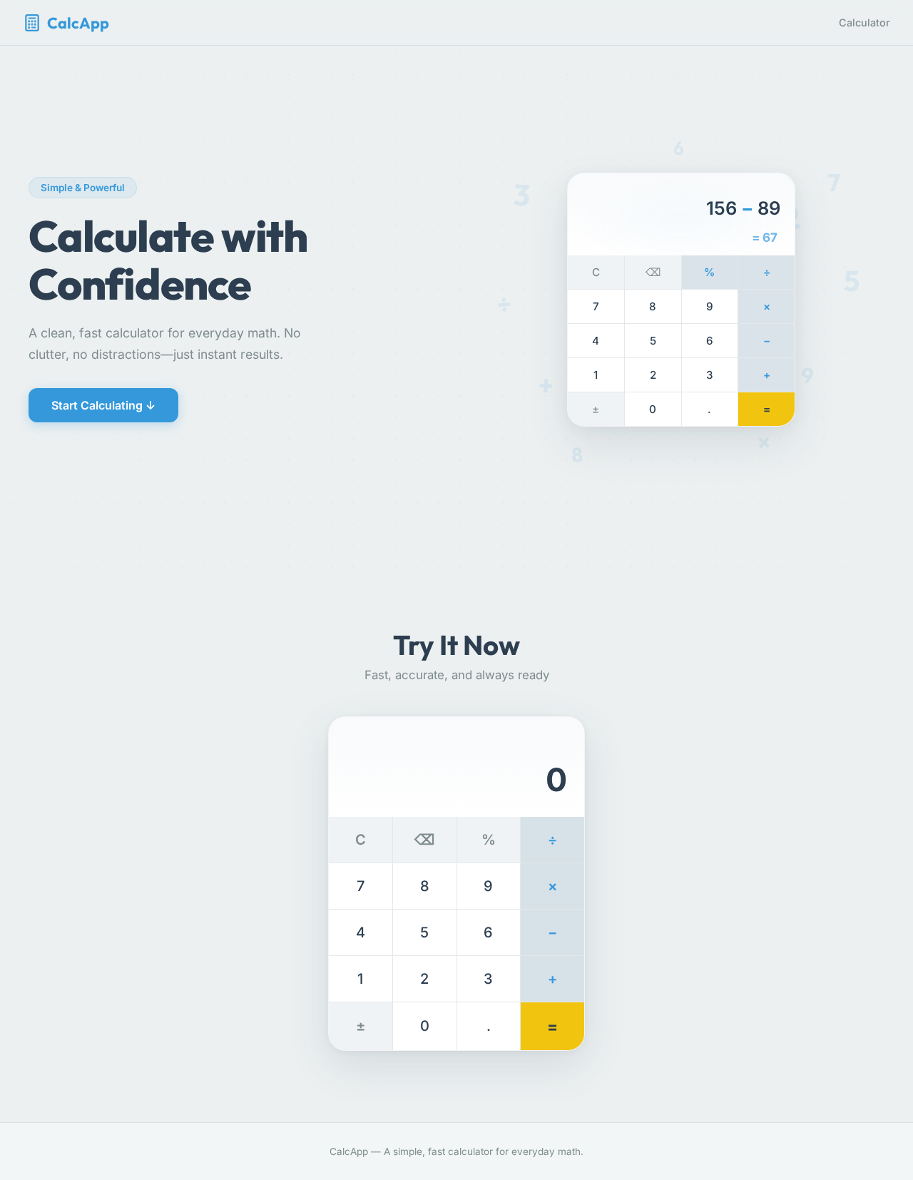
Calculate with Confidence
A clean, fast calculator for everyday math. No clutter, no distractions—just instant results.
Try It Now
Fast, accurate, and always ready
Calculate with Confidence
A clean, fast calculator for everyday math. No clutter, no distractions—just instant results.
Try It Now
Fast, accurate, and always ready
No comments yet. Be the first!