plasma-polished
 Tamim Not
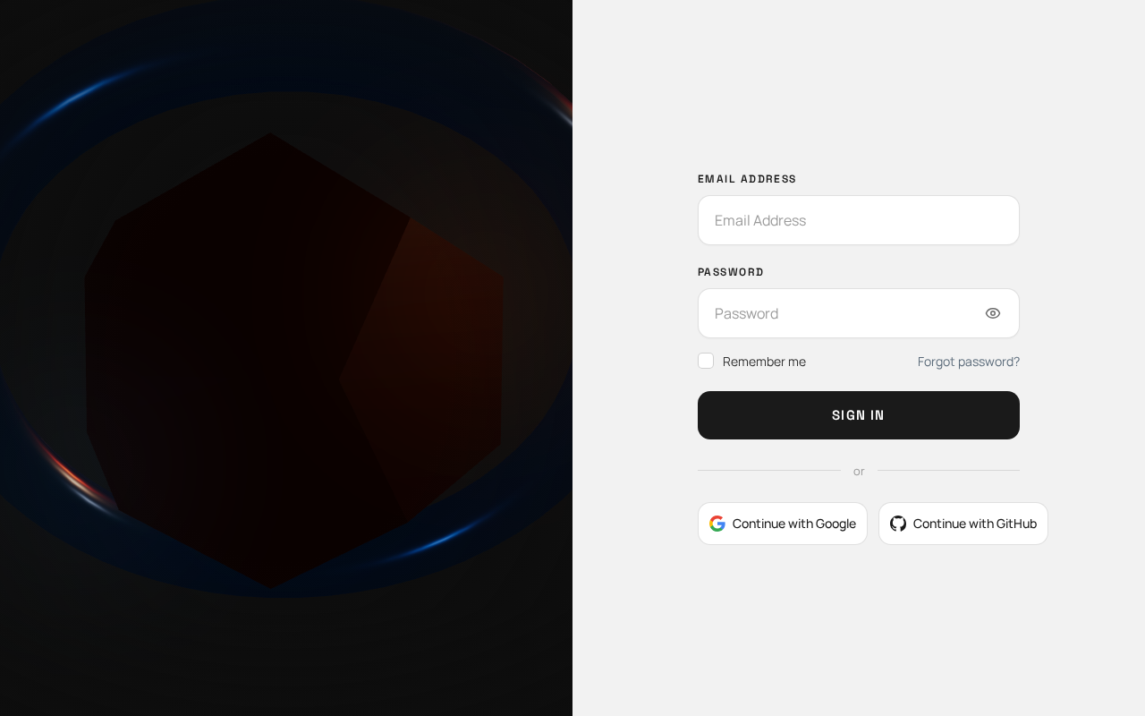
Create a polished, modern, premium Sign In page that closely matches the provided reference image. IMPORTANT: Preserve the exact overall layout and visual hierarchy of the reference. Do not redesign or significantly change the structure. Layout Create a full-width authentication page divided into two equal vertical sections: Left section — Image - Take up approximately 50% of the screen width. - Use a large, immersive futuristic/technology-themed image similar in mood to the reference. - The image should fill the entire left section from edge to edge. - Use a cinematic, dark, atmospheric visual with subtle orange/red and blue lighting. - Do not add text, cards, buttons, or UI elements over the image. - Keep the image visually dominant and clean. Right section — Sign In Form - Take up approximately 50% of the screen width. - Use a clean off-white / very light gray background. - Keep the form vertically centered with generous horizontal padding. - The form should occupy approximately 80–85% of the right panel width. Form Structure At the top: Label: “Email Address” Below it, create a large rounded input field: - Placeholder: “Email Address” - White/light background - Thin light-gray border - Rounded corners - Comfortable vertical padding - Clean modern typography Next: Label: “Password” Below it, create another large rounded password input: - Placeholder: “Password” - Include a small eye visibility icon on the right side. - Match the exact size, border, radius, and spacing of the email field. Below the password field, create a horizontal row: Left side: - Small square checkbox - Text: “Remember me” Right side: - Text link: “Forgot password?” - Use a subtle blue/gray accent color. Primary Button Below the remember/forgot-password row: Create a large full-width button: - Text: “Sign In” - Dark charcoal/black background - White text - Rounded corners - Approximately the same height and width proportions as the reference - Medium/semibold typography - No gradient - No icon Divider Below the Sign In button: Create a horizontal divider with: “or” centered between two thin horizontal lines. Keep the divider subtle and light gray. Social Login Buttons Below the divider, create two equal-width buttons side by side: Left button: - Google icon - Text: “Continue with Google” Right button: - GitHub icon - Text: “Continue with GitHub” Both buttons should: - Have a white/light background - Have a thin light-gray border - Have rounded corners - Have consistent height - Have centered icon and text - Match the visual style of the reference. Visual Style - Minimal and premium SaaS authentication design. - Clean, sophisticated typography. - Neutral white/off-white form area. - Dark charcoal primary button. - Subtle blue accent for the “Forgot password?” link. - Very light gray borders. - Soft rounded corners. - Generous spacing. - No unnecessary decorations. - No large numbers. - No dates or years. - No extra text. - No additional cards. - No orange abstract shapes. - No gradients in the form section. - No unnecessary animations or illustrations. Responsive Behavior On desktop: - Maintain the 50/50 split-screen layout. On smaller screens: - Stack the sections vertically. - Keep the image section visually prominent but reduce its height. - Keep the form comfortable and easy to use. - Preserve the same typography, spacing, button styles, and visual hierarchy. Critical Instruction Follow the provided reference image as closely as possible. Do not introduce a different layout, different form structure, different colors, extra sections, or additional decorative elements. The final result should feel like a faithful, polished recreation of the reference—not a new interpretation of it.

Comments (0)
Sign in to leave a comment
System Requirements
System Requirements Document for plasma-polished
1. Introduction
The "plasma-polished" project aims to create a polished, modern, premium Sign In page that closely matches a provided reference image. The page is designed for a technology-driven audience, emphasizing a sleek and futuristic aesthetic. The primary audience is users who need to sign in using email/password or social login options.
2. System Overview
This document outlines the requirements for a Sign In page that features a full-width layout divided into two equal vertical sections: an image section and a form section. The page is intended to provide a seamless and visually appealing authentication experience, adhering closely to the provided reference image. The design emphasizes a cinematic, futuristic theme with a clean, minimal form section.
2a. Product Interpretation and Delivery Boundary
The Sign In page is a public entry surface with no initial access restrictions. It supports user authentication via email/password and social login options (Google and GitHub). The page must maintain the specified visual hierarchy and layout, with responsive behavior for smaller screens. The application manages user identity and session continuity, ensuring secure credential submission and provider callbacks.
2b. Source Content Inventory
Not applicable as no explicit content source directive was provided.
2c. Page Content and Component Coverage
Sign In
-
Image Section
- Full-width, immersive futuristic/technology-themed image
- Cinematic, dark, atmospheric visual with subtle orange/red and blue lighting
- No overlaid text or UI elements
-
Form Section
- Off-white/very light gray background
- Vertically centered form with generous horizontal padding
- Form occupies 80–85% of the right panel width
Form Components
-
Email Address Input
- Label: "Email Address"
- Large rounded input field with placeholder "Email Address"
- White/light background, thin light-gray border, rounded corners
-
Password Input
- Label: "Password"
- Large rounded input field with placeholder "Password"
- Eye visibility icon on the right side
-
Remember Me and Forgot Password Row
- Small square checkbox with text "Remember me"
- Text link "Forgot password?" with subtle blue/gray accent color
-
Primary Button
- Full-width button with text "Sign In"
- Dark charcoal/black background, white text, rounded corners
-
Divider
- Horizontal divider with "or" centered between two thin horizontal lines
-
Social Login Buttons
- Side-by-side buttons for Google and GitHub login
- White/light background, thin light-gray border, rounded corners
3. Functional Requirements
- As a Sign-in user, I should be able to enter my email and password to sign in, with the option to toggle password visibility. (explicit)
- As a Sign-in user, I should be able to select "Remember me" to persist my session across visits. (explicit)
- As a Sign-in user, I should be able to click "Forgot password?" to initiate a password recovery process. (explicit)
- As a Sign-in user, I should be able to sign in using Google or GitHub credentials. (explicit)
- As a Sign-in user, I should see a visually consistent and responsive Sign In page that matches the reference image. (explicit)
4. User Personas
- Sign-in user
- Responsible for entering credentials, selecting session persistence, recovering passwords, and using social login options.
5. Core User Flows
-
Email/Password Sign In
- User navigates to the Sign In page.
- User enters email and password.
- User optionally selects "Remember me."
- User clicks "Sign In."
- Application verifies credentials and grants access.
-
Forgot Password
- User clicks "Forgot password?"
- Application initiates password recovery process.
-
Social Login
- User clicks "Continue with Google" or "Continue with GitHub."
- Application redirects to the respective provider for authentication.
- Upon successful authentication, the application grants access.
6. Visuals Colors and Theme
- Muse: Gleb Kuznetsov
- Palette:
- Background: #0D0D0D
- Surface: #F2F2F2
- Text: #FFFFFF
- Primary: #1A1A1A
- Accent: #FF4500
- Muted: #CCCCCC
- Typography:
- Headings: Space Grotesk
- Body: Manrope
- Scale: 1.333 modular
7. Signature Design Concept
The Sign In page features a split-screen layout with a full-bleed cinematic image on the left and a clean, minimal form section on the right. The image uses volumetric lighting with subtle orange/red and blue accents, while the form section maintains a neutral off-white background with rounded input fields and a dark charcoal primary button.
8. Interaction Model & Motion Direction
- Interaction Model: Animated
- Motion Tempo: Cinematic
- Hero Dimensionality: WebGL
- Landing Hero Motion Brief:
- Focal subject: Immersive futuristic image
- Input: User scroll
- Transformation: Subtle parallax effect
- Outcome: Enhanced depth perception
9. Non-Functional Requirements
- The Sign In page must load within 2 seconds on a standard broadband connection. (required_inference)
- The page must be accessible and usable on devices with varying screen sizes, maintaining the specified visual hierarchy. (explicit)
10. Tech Stack
- Frontend: React
- Backend: Python/FastAPI
- Storage: Appropriate database for user credentials
- Deployment: Docker, Kubernetes (if required)
11. Assumptions and Constraints
- The Sign In page will not include additional decorative elements beyond those specified.
- The application will manage user identity and session continuity securely.
12. Glossary
- Sign-in user: A user who interacts with the Sign In page to authenticate themselves.
- Responsive behavior: The ability of the page to adapt its layout to different screen sizes.
No comments yet. Be the first!