plasma-polished
 Tamim Not
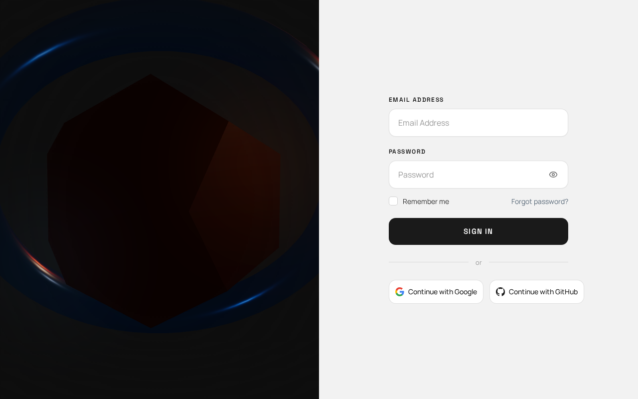
Create a polished, modern, premium Sign In page that closely matches the provided reference image. IMPORTANT: Preserve the exact overall layout and visual hierarchy of the reference. Do not redesign or significantly change the structure. Layout Create a full-width authentication page divided into two equal vertical sections: Left section — Image - Take up approximately 50% of the screen width. - Use a large, immersive futuristic/technology-themed image similar in mood to the reference. - The image should fill the entire left section from edge to edge. - Use a cinematic, dark, atmospheric visual with subtle orange/red and blue lighting. - Do not add text, cards, buttons, or UI elements over the image. - Keep the image visually dominant and clean. Right section — Sign In Form - Take up approximately 50% of the screen width. - Use a clean off-white / very light gray background. - Keep the form vertically centered with generous horizontal padding. - The form should occupy approximately 80–85% of the right panel width. Form Structure At the top: Label: “Email Address” Below it, create a large rounded input field: - Placeholder: “Email Address” - White/light background - Thin light-gray border - Rounded corners - Comfortable vertical padding - Clean modern typography Next: Label: “Password” Below it, create another large rounded password input: - Placeholder: “Password” - Include a small eye visibility icon on the right side. - Match the exact size, border, radius, and spacing of the email field. Below the password field, create a horizontal row: Left side: - Small square checkbox - Text: “Remember me” Right side: - Text link: “Forgot password?” - Use a subtle blue/gray accent color. Primary Button Below the remember/forgot-password row: Create a large full-width button: - Text: “Sign In” - Dark charcoal/black background - White text - Rounded corners - Approximately the same height and width proportions as the reference - Medium/semibold typography - No gradient - No icon Divider Below the Sign In button: Create a horizontal divider with: “or” centered between two thin horizontal lines. Keep the divider subtle and light gray. Social Login Buttons Below the divider, create two equal-width buttons side by side: Left button: - Google icon - Text: “Continue with Google” Right button: - GitHub icon - Text: “Continue with GitHub” Both buttons should: - Have a white/light background - Have a thin light-gray border - Have rounded corners - Have consistent height - Have centered icon and text - Match the visual style of the reference. Visual Style - Minimal and premium SaaS authentication design. - Clean, sophisticated typography. - Neutral white/off-white form area. - Dark charcoal primary button. - Subtle blue accent for the “Forgot password?” link. - Very light gray borders. - Soft rounded corners. - Generous spacing. - No unnecessary decorations. - No large numbers. - No dates or years. - No extra text. - No additional cards. - No orange abstract shapes. - No gradients in the form section. - No unnecessary animations or illustrations. Responsive Behavior On desktop: - Maintain the 50/50 split-screen layout. On smaller screens: - Stack the sections vertically. - Keep the image section visually prominent but reduce its height. - Keep the form comfortable and easy to use. - Preserve the same typography, spacing, button styles, and visual hierarchy. Critical Instruction Follow the provided reference image as closely as possible. Do not introduce a different layout, different form structure, different colors, extra sections, or additional decorative elements. The final result should feel like a faithful, polished recreation of the reference—not a new interpretation of it.

Comments (0)
Sign in to leave a comment
No comments yet. Be the first!