meteor-pixel
 Kavish Gojo
Build a pixel-exact, fully responsive React/Tailwind hero named **Apogee**. Do NOT approximate, simplify, substitute, round, or “improve” specified values. ## STACK Vite 5 + React 18.3 + TypeScript 5.5 + Tailwind 3.4 + PostCSS/Autoprefixer. Use `lucide-react@0.446`, ONLY `ChevronDown`, `Menu`, `X`. `"type":"module"`. Scripts: `dev:vite`, `build:vite build`, `lint:eslint .`, `preview:vite preview`, `typecheck:tsc --noEmit -p tsconfig.app.json`. Alias `@/*` → `src/*`. Files: `index.html`, `src/main.tsx`, `src/App.tsx`, `src/index.css`, `src/components/Hero.tsx`. `App.tsx` returns only `<Hero />`. `main.tsx` uses `createRoot` + `<StrictMode>` and imports `./App.tsx` + `./index.css`. `tailwind.config.js`: `content:['./index.html','./src/**/*.{js,ts,jsx,tsx}'], theme:{extend:{}}, plugins:[]` ## HTML/FONT Title `Apogee`, viewport `width=device-width, initial-scale=1.0`, root `root`, module `/src/main.tsx`. Exact font: `https://db.onlinewebfonts.com/c/13ab13418f633c1b0516fed6e30bedbc?family=Suisse+Int%27l` ## GLOBAL CSS Use Tailwind directives, reset `margin/padding:0`, `box-sizing:border-box`, body font `'Suisse Intl',-apple-system,BlinkMacSystemFont,sans-serif`, antialiasing. Animations, all with `cubic-bezier(0.16,1,0.3,1)` + `forwards`: - `fade-up`: opacity 0, translateY(24px) → opacity 1, translateY(0), `.8s` - `fade-down`: translateY(-16px) → 0, `.7s` - `fade-left`: translateX(-20px) → 0, `.8s` - `fade-right`: translateX(20px) → 0, `.8s` - `fade-scale`: scale(.92) → 1, `.9s` - `bar-grow`: scaleY(0), opacity 0 → scaleY(1), opacity 1, `.6s` Classes: `.animate-fade-up/down/left/right/scale`, `.animate-bar-grow`. Every animated element has `opacity-0` in markup. NO JS animation state, IntersectionObserver, or animation libraries. ## HERO Section: `relative w-full h-screen overflow-hidden bg-[#080A19]` First child is EXACT video: `https://d8j0ntlcm91z4.cloudfront.net/user_38xzZboKViGWJOttwIXH07lWA1P/hf_20260813_092641_de52eb87-daf2-41db-92cb-7a56eae012a5.mp4` with `absolute inset-0 w-full h-full object-cover`, `autoPlay loop muted playsInline`. No gradient overlay. Content: `relative z-10 h-full flex flex-col`, then `<Nav />`, then: `flex-1 flex items-center py-8` inside: `w-full max-w-[1800px] mx-auto px-5 sm:px-8 md:px-[82px] flex flex-col lg:flex-row lg:items-center lg:justify-between gap-10 lg:gap-12` Copy max-width `593px`. ### COPY H1: Animate `delay=300`, up. `text-white text-[36px] sm:text-[52px] md:text-[64px] lg:text-[72px] font-normal leading-[0.95] mb-5 sm:mb-8` **Elevate your essential data to new heights** P: Animate `delay=500`, up. `text-white/80 text-[16px] sm:text-[18px] md:text-[20px] font-[450] leading-[1.3] max-w-[370px] mb-7 sm:mb-10` **Advanced reasoning systems and predictive models built for the unknown** CTA row: Animate `delay=700`, up; `flex flex-wrap gap-3 sm:gap-4`. Book: `h-[46px] sm:h-[51px] px-5 sm:px-[27px] bg-[#E9E9E9] rounded-[12px] text-[#0A0707] text-[14px] sm:text-[15.5px] font-[450] leading-[15.5px] transition-opacity hover:opacity-90` Talk: `h-[46px] sm:h-[51px] px-5 sm:px-[27px] rounded-[12px] border border-white text-white text-[14px] sm:text-[15.5px] font-[450] leading-[15.5px] transition-opacity hover:opacity-80` ## ANIMATE HELPER Props: `children`, `delay=0`, `className=''`, `direction='up'`; map up/down/left/right/scale → matching animation class. Render: `<div className={\`opacity-0 ${directionClass} ${className}\`} style={{animationDelay:\`${delay}ms\`}}>{children}</div>` ## REVENUE CARD Animate delay `900`, scale, class: `w-full max-w-[405px] mx-auto lg:mx-0` Shell: `w-full rounded-[24px] sm:rounded-[33px] bg-[rgba(17,16,15,0.35)] backdrop-blur-[20px] p-5 sm:p-8 pb-5 sm:pb-6` Label: **Revenue Growth** `text-white text-[16px] sm:text-[20px] font-[450] leading-[20px] mb-3 sm:mb-4` Amount: `$14,205,890` white + `.00` separately `text-white/20`; both `text-[28px] sm:text-[46px] font-[450] leading-[1]`; wrapper `mb-2 sm:mb-3`. Delta: `flex items-center gap-[10px] mb-6 sm:mb-8` Badge `+32.4%`: `px-[6px] py-[7px] bg-white/20 rounded-[6px] text-white text-[12px] sm:text-[14px] font-[450] leading-[14px]` Caption: `vs. previous period ($10.7M)` → `text-white/80 text-[12px] sm:text-[14px] font-[450] leading-[14px] opacity-70` ### CHART Exact: `const BAR_HEIGHTS=[23,40,53,40,33,14,7,17,75,65,88,75,65,47,33,88,4,7,9,14,95,65,79,37,7,40,17,20,62,47,92,72];` `const maxHeight=Math.max(...BAR_HEIGHTS);` Bars container: `flex items-end gap-[1.5px] h-[80px] sm:h-[100px]` For each bar: `isProjected=i>=28` `heightPercent=(h/maxHeight)*100` class `flex-1 rounded-[0.5px] animate-bar-grow origin-bottom` style: `height:${heightPercent}%` `backgroundColor:isProjected?'rgba(255,255,255,0.1)':'white'` `animationDelay:${1100+i*30}ms` Gridlines: absolute full height, 5 lines at `20%,40%,60%,80%,100%`, `w-px bg-white/10`. Axis exactly: `['10:00','12:00','14:00','16:00','16:00']` with `flex justify-between mt-3`, text `text-[9px] sm:text-[10px] font-[450] leading-[10px] text-white/80`; index >=3 has opacity `.4`. ## NAV `Nav` comes AFTER `Hero` in `Hero.tsx` (function declarations allow this). State `isOpen`; useEffect locks body scroll when open and restores it on close/unmount. Nav: `w-full max-w-[1800px] mx-auto px-5 sm:px-8 md:px-[82px] pt-[20px] sm:pt-[30px] flex items-center justify-between relative z-50` ### LOGO Animate down delay `0`. Icon `28×28`, sm `32×32`, white exact supplied Apogee SVG path: `M 256 256 L 178 256 C 150.386 256 128 233.614 128 206 L 128 256 L 0 256 L 0 192 C 0 156.654 28.654 128 64 128 C 99.346 128 128 156.654 128 192 L 128 128 L 256 128 L 256 128 Z M 78 0 C 105.614 0 128 22.386 128 50 L 128 0 L 256 0 L 256 64 C 256 99.346 227.346 128 192 128 C 156.654 128 128 99.346 128 64 L 128 128 L 0 128 L 0 0 Z` Wordmark `Apogee`: `text-white text-[22px] sm:text-[26px] font-[450] leading-none tracking-[-0.02em]`, icon/text gap `10px`. ### DESKTOP NAV (`lg+`) Center pill Animate down delay `100`, hidden below lg: `h-[52px] px-6 flex items-center gap-[30px] bg-[rgba(10,7,7,0.35)] rounded-[11px] backdrop-blur-[17px]` Items Platform + ChevronDown `10×10` with gap `5px`, Pricing, Resources, Blog. Text: `text-white/80 text-[14px] font-[450] leading-[14px]`. Auth pill Animate down delay `200`: `h-[52px] p-[3px] bg-[rgba(0,0,0,0.35)] rounded-[13px] backdrop-blur-[17px] flex items-center gap-[5px]` Inner buttons `h-[46px] px-6 rounded-[11px]`; Login white; Book demo `bg-[#E9E9E9] text-[#0A0707]`. ### MOBILE NAV (`<lg`) Hamburger Animate down delay `100`: `w-[44px] h-[44px] flex items-center justify-center rounded-[11px] bg-[rgba(10,7,7,0.35)] backdrop-blur-[17px]` Menu/X are ALWAYS mounted, absolutely stacked, cross-fade with opacity + rotate + scale, duration 300ms. Overlay ALWAYS mounted: `lg:hidden fixed inset-0 z-40 transition-all duration-500 ease-[cubic-bezier(0.32,0.72,0,1)]` Open `visible`, closed `invisible`. Backdrop: `absolute inset-0 bg-[#080A19]/90 backdrop-blur-[24px] transition-opacity duration-500`, open opacity 100, closed 0. Panel: `absolute top-[76px] sm:top-[86px] left-4 right-4 sm:left-6 sm:right-6 bg-[rgba(17,16,15,0.6)] backdrop-blur-[30px] rounded-[20px] border border-white/[0.06] p-6 sm:p-8` Open: `opacity-100 translate-y-0 scale-100`; closed: `opacity-0 -translate-y-4 scale-[0.97]`. Links Platform/Pricing/Resources/Blog: `flex items-center justify-between px-4 py-4 rounded-[12px] text-white/90 text-[18px] font-[450] hover:bg-white/[0.06] transition-all duration-300` Open → opacity 100/translateX 0; closed → opacity 0/translateX -3; delays `100/150/200/250ms`. Platform has ChevronDown `16×16`. Divider: `h-px bg-white/10 my-5`. CTAs: flex column gap `12px`, transition delay `350ms`. Book: `w-full h-[50px] bg-[#E9E9E9] rounded-[12px] text-[#0A0707] text-[15px] font-[450]` Login: `w-full h-[50px] rounded-[12px] border border-white/30 text-white text-[15px] font-[450]` ## RESPONSIVE / EXACT BOX MODEL - Base/sm/md/lg breakpoints: 0/640/768/1024. - Container padding: `20/32/82px`. - Nav top padding: `20/30px`. - Hero vertical padding: `32px`. - Copy/card gap: `40px` mobile, `48px` lg. - Card width: max `405px`; centered mobile, left aligned lg. - H1 margin bottom: `20/32px`. - Subhead margin bottom: `28/40px`. - CTA gap: `12/16px`. - CTA height: `46/51px`; horizontal padding `20/27px`. - Card radius `24/33px`. - Card padding top/left/right `20/32px`; bottom `20/24px`. - Card chart height `80/100px`. - Mobile panel top `76/86px`, side inset `16/24px`, padding `24/32px`. - Mobile link padding `16px`; gap `4px`; divider margin `20px`; CTA gap `12px`, height `50px`. ## COLORS / RULES Section/backdrop `#080A19`; light buttons `#E9E9E9`; dark button text `#0A0707`; nav glass `rgba(10,7,7,.35)`; auth glass `rgba(0,0,0,.35)`; card `rgba(17,16,15,.35)`; panel `rgba(17,16,15,.6)`; projected bars `rgba(255,255,255,.1)`; active bars white; gridlines `white/10`; panel border `white/[.06]`; `.00` `white/20`; secondary text `white/80`. Blur: nav `17px`, card `20px`, backdrop `24px`, panel `30px`. Animation timeline: `0 logo`, `100 nav/hamburger`, `200 auth`, `300 h1`, `500 subhead`, `700 CTA`, `900 card`, `1100+i*30 bars`. Total ~2630ms. ## FINAL NON-NEGOTIABLES Exact video URL. Exact 32 bars. `maxHeight` must use `Math.max`. Bars 28–31 projected. Duplicate final `16:00`. `.00` separate span. `font-[450]` everywhere except H1. No JS animation/observer. Mobile overlay never unmounts. Menu/X never unmount. Body scroll cleanup required. All animated elements start `opacity-0`. Hero CTA padding MUST be `20px/27px`. Desktop nav pill MUST have 24px horizontal padding + 30px gaps. Auth pill MUST have 3px outer padding + 5px gap. Revenue card MUST have asymmetric bottom padding `20/24px`. Verify every specified spacing/value before completion.


Comments (0)
Sign in to leave a comment
System Requirements
System Requirements Document for meteor-pixel
1. Introduction
The project "meteor-pixel" aims to create a pixel-exact, fully responsive hero section named Apogee using React and Tailwind CSS. The design is inspired by Susan Kare's pixel-perfect aesthetic, focusing on precision and clarity. The target audience includes developers and users who appreciate a retro-friendly, pixel-art design.
2. System Overview
The system will deliver a single-page application featuring a hero section with precise styling and animations. It will use a specified tech stack and adhere to strict design and implementation guidelines. The hero section will serve as the public entry point, with additional navigation to other destinations.
2a. Product Interpretation and Delivery Boundary
The product will be delivered as a web application using Vite, React, TypeScript, and Tailwind CSS. The hero section will be the main focus, with pixel-perfect design and animations. The application will not include any additional features or pages beyond those specified. The navigation will link to other inferred destinations, but these are not part of the current implementation scope.
2b. Source Content Inventory
- Font Source: Suisse Intl
- Video Source: Hero Background Video
2c. Page Content and Component Coverage
Landing
- Hero Section: Full-screen, pixel-perfect design with a specified background video.
- Video: Auto-play, loop, muted, no gradient overlay.
- Content: Includes navigation and main content area with specified animations and styling.
- Navigation: Includes links to Platform, Pricing, Resources, Blog, and Login.
- Animations: CSS-based with specified delays and easing functions.
- Responsive Design: Adheres to specified breakpoints and spacing.
3. Functional Requirements
-
As a developer, I should be able to build the Apogee hero section using the specified tech stack and configuration.
- Provenance: Explicit
- Lifecycle: Initiated by developer, completed upon successful build and deployment.
- Acceptance: Verified by pixel-perfect adherence to design specifications.
-
As a user, I should see a pixel-perfect hero section with specified animations and content.
- Provenance: Explicit
- Lifecycle: Initiated upon page load, completed when all animations and content are displayed correctly.
- Acceptance: Verified by visual inspection against design specifications.
-
As a user, I should be able to navigate to Platform, Pricing, Resources, Blog, and Login from the hero section.
- Provenance: Required Inference
- Lifecycle: Initiated by user interaction, completed upon navigation to the selected destination.
- Acceptance: Verified by successful navigation to each destination.
4. User Personas
- Developer: Responsible for implementing the hero section according to specifications.
- User: Interacts with the hero section and navigates to other destinations.
5. Core User Flows
-
Developer Flow:
- Start development environment using specified scripts.
- Implement hero section using React and Tailwind CSS.
- Verify pixel-perfect design and animations.
- Deploy application for user access.
-
User Flow:
- Load the application and view the hero section.
- Observe animations and content as specified.
- Use navigation to access Platform, Pricing, Resources, Blog, and Login.
6. Visuals Colors and Theme
- Muse: Susan Kare
- Palette:
- Background: #080A19
- Surface: #E9E9E9
- Text: #FFFFFF
- Primary: #0A0707
- Accent: #E9E9E9
- Muted: #FFFFFF
- Typography:
- Headings: Press Start 2P
- Body: VT323
- Scale: 1.25 modular
7. Signature Design Concept
The hero section will feature a full-bleed video with pixel-perfect animated elements layered over it, creating an immersive experience. The design will incorporate charming pixel art icons and retro-inspired typography to enhance the visual theme.
8. Interaction Model & Motion Direction
- Interaction Model: Static
- Motion Tempo: Restrained
- Hero Dimensionality: Flat
- Landing Hero Motion Brief: The hero section will feature frame-by-frame micro animations and blink effects, maintaining a retro charm.
9. Non-Functional Requirements
- Performance: The application must load quickly and perform smoothly on all supported devices.
- Accessibility: The design must be accessible to users with disabilities, adhering to WCAG standards.
10. Tech Stack
- Frontend: Vite 5, React 18.3, TypeScript 5.5, Tailwind CSS 3.4
- Build Tools: PostCSS/Autoprefixer
- Icons: lucide-react@0.446 (ChevronDown, Menu, X)
11. Assumptions and Constraints
- The hero section is the primary focus and must adhere to pixel-perfect design specifications.
- Navigation links are placeholders for future destinations, not part of the current implementation.
- The specified tech stack and configuration are mandatory.
12. Glossary
- Pixel-Perfect: Design that matches the specified layout and styling exactly, without any deviations.
- Hero Section: The main visual area of a webpage, typically the first thing a user sees.
- Responsive Design: Design that adjusts to different screen sizes and orientations.
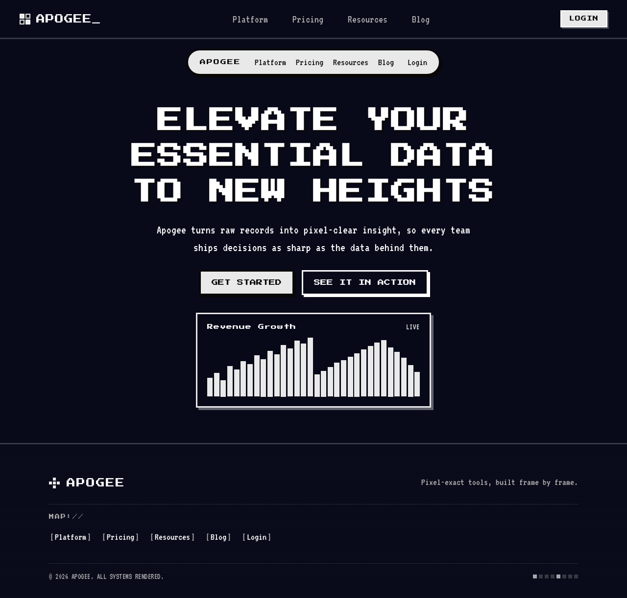
Elevate your essential data to new heights
Apogee turns raw records into pixel-clear insight, so every team ships decisions as sharp as the data behind them.
Elevate your essential data to new heights
Apogee turns raw records into pixel-clear insight, so every team ships decisions as sharp as the data behind them.
No comments yet. Be the first!