meteor-pixel
 Kavish Gojo
Build a pixel-exact, fully responsive React/Tailwind hero named **Apogee**. Do NOT approximate, simplify, substitute, round, or “improve” specified values. ## STACK Vite 5 + React 18.3 + TypeScript 5.5 + Tailwind 3.4 + PostCSS/Autoprefixer. Use `lucide-react@0.446`, ONLY `ChevronDown`, `Menu`, `X`. `"type":"module"`. Scripts: `dev:vite`, `build:vite build`, `lint:eslint .`, `preview:vite preview`, `typecheck:tsc --noEmit -p tsconfig.app.json`. Alias `@/*` → `src/*`. Files: `index.html`, `src/main.tsx`, `src/App.tsx`, `src/index.css`, `src/components/Hero.tsx`. `App.tsx` returns only `<Hero />`. `main.tsx` uses `createRoot` + `<StrictMode>` and imports `./App.tsx` + `./index.css`. `tailwind.config.js`: `content:['./index.html','./src/**/*.{js,ts,jsx,tsx}'], theme:{extend:{}}, plugins:[]` ## HTML/FONT Title `Apogee`, viewport `width=device-width, initial-scale=1.0`, root `root`, module `/src/main.tsx`. Exact font: `https://db.onlinewebfonts.com/c/13ab13418f633c1b0516fed6e30bedbc?family=Suisse+Int%27l` ## GLOBAL CSS Use Tailwind directives, reset `margin/padding:0`, `box-sizing:border-box`, body font `'Suisse Intl',-apple-system,BlinkMacSystemFont,sans-serif`, antialiasing. Animations, all with `cubic-bezier(0.16,1,0.3,1)` + `forwards`: - `fade-up`: opacity 0, translateY(24px) → opacity 1, translateY(0), `.8s` - `fade-down`: translateY(-16px) → 0, `.7s` - `fade-left`: translateX(-20px) → 0, `.8s` - `fade-right`: translateX(20px) → 0, `.8s` - `fade-scale`: scale(.92) → 1, `.9s` - `bar-grow`: scaleY(0), opacity 0 → scaleY(1), opacity 1, `.6s` Classes: `.animate-fade-up/down/left/right/scale`, `.animate-bar-grow`. Every animated element has `opacity-0` in markup. NO JS animation state, IntersectionObserver, or animation libraries. ## HERO Section: `relative w-full h-screen overflow-hidden bg-[#080A19]` First child is EXACT video: `https://d8j0ntlcm91z4.cloudfront.net/user_38xzZboKViGWJOttwIXH07lWA1P/hf_20260813_092641_de52eb87-daf2-41db-92cb-7a56eae012a5.mp4` with `absolute inset-0 w-full h-full object-cover`, `autoPlay loop muted playsInline`. No gradient overlay. Content: `relative z-10 h-full flex flex-col`, then `<Nav />`, then: `flex-1 flex items-center py-8` inside: `w-full max-w-[1800px] mx-auto px-5 sm:px-8 md:px-[82px] flex flex-col lg:flex-row lg:items-center lg:justify-between gap-10 lg:gap-12` Copy max-width `593px`. ### COPY H1: Animate `delay=300`, up. `text-white text-[36px] sm:text-[52px] md:text-[64px] lg:text-[72px] font-normal leading-[0.95] mb-5 sm:mb-8` **Elevate your essential data to new heights** P: Animate `delay=500`, up. `text-white/80 text-[16px] sm:text-[18px] md:text-[20px] font-[450] leading-[1.3] max-w-[370px] mb-7 sm:mb-10` **Advanced reasoning systems and predictive models built for the unknown** CTA row: Animate `delay=700`, up; `flex flex-wrap gap-3 sm:gap-4`. Book: `h-[46px] sm:h-[51px] px-5 sm:px-[27px] bg-[#E9E9E9] rounded-[12px] text-[#0A0707] text-[14px] sm:text-[15.5px] font-[450] leading-[15.5px] transition-opacity hover:opacity-90` Talk: `h-[46px] sm:h-[51px] px-5 sm:px-[27px] rounded-[12px] border border-white text-white text-[14px] sm:text-[15.5px] font-[450] leading-[15.5px] transition-opacity hover:opacity-80` ## ANIMATE HELPER Props: `children`, `delay=0`, `className=''`, `direction='up'`; map up/down/left/right/scale → matching animation class. Render: `<div className={\`opacity-0 ${directionClass} ${className}\`} style={{animationDelay:\`${delay}ms\`}}>{children}</div>` ## REVENUE CARD Animate delay `900`, scale, class: `w-full max-w-[405px] mx-auto lg:mx-0` Shell: `w-full rounded-[24px] sm:rounded-[33px] bg-[rgba(17,16,15,0.35)] backdrop-blur-[20px] p-5 sm:p-8 pb-5 sm:pb-6` Label: **Revenue Growth** `text-white text-[16px] sm:text-[20px] font-[450] leading-[20px] mb-3 sm:mb-4` Amount: `$14,205,890` white + `.00` separately `text-white/20`; both `text-[28px] sm:text-[46px] font-[450] leading-[1]`; wrapper `mb-2 sm:mb-3`. Delta: `flex items-center gap-[10px] mb-6 sm:mb-8` Badge `+32.4%`: `px-[6px] py-[7px] bg-white/20 rounded-[6px] text-white text-[12px] sm:text-[14px] font-[450] leading-[14px]` Caption: `vs. previous period ($10.7M)` → `text-white/80 text-[12px] sm:text-[14px] font-[450] leading-[14px] opacity-70` ### CHART Exact: `const BAR_HEIGHTS=[23,40,53,40,33,14,7,17,75,65,88,75,65,47,33,88,4,7,9,14,95,65,79,37,7,40,17,20,62,47,92,72];` `const maxHeight=Math.max(...BAR_HEIGHTS);` Bars container: `flex items-end gap-[1.5px] h-[80px] sm:h-[100px]` For each bar: `isProjected=i>=28` `heightPercent=(h/maxHeight)*100` class `flex-1 rounded-[0.5px] animate-bar-grow origin-bottom` style: `height:${heightPercent}%` `backgroundColor:isProjected?'rgba(255,255,255,0.1)':'white'` `animationDelay:${1100+i*30}ms` Gridlines: absolute full height, 5 lines at `20%,40%,60%,80%,100%`, `w-px bg-white/10`. Axis exactly: `['10:00','12:00','14:00','16:00','16:00']` with `flex justify-between mt-3`, text `text-[9px] sm:text-[10px] font-[450] leading-[10px] text-white/80`; index >=3 has opacity `.4`. ## NAV `Nav` comes AFTER `Hero` in `Hero.tsx` (function declarations allow this). State `isOpen`; useEffect locks body scroll when open and restores it on close/unmount. Nav: `w-full max-w-[1800px] mx-auto px-5 sm:px-8 md:px-[82px] pt-[20px] sm:pt-[30px] flex items-center justify-between relative z-50` ### LOGO Animate down delay `0`. Icon `28×28`, sm `32×32`, white exact supplied Apogee SVG path: `M 256 256 L 178 256 C 150.386 256 128 233.614 128 206 L 128 256 L 0 256 L 0 192 C 0 156.654 28.654 128 64 128 C 99.346 128 128 156.654 128 192 L 128 128 L 256 128 L 256 128 Z M 78 0 C 105.614 0 128 22.386 128 50 L 128 0 L 256 0 L 256 64 C 256 99.346 227.346 128 192 128 C 156.654 128 128 99.346 128 64 L 128 128 L 0 128 L 0 0 Z` Wordmark `Apogee`: `text-white text-[22px] sm:text-[26px] font-[450] leading-none tracking-[-0.02em]`, icon/text gap `10px`. ### DESKTOP NAV (`lg+`) Center pill Animate down delay `100`, hidden below lg: `h-[52px] px-6 flex items-center gap-[30px] bg-[rgba(10,7,7,0.35)] rounded-[11px] backdrop-blur-[17px]` Items Platform + ChevronDown `10×10` with gap `5px`, Pricing, Resources, Blog. Text: `text-white/80 text-[14px] font-[450] leading-[14px]`. Auth pill Animate down delay `200`: `h-[52px] p-[3px] bg-[rgba(0,0,0,0.35)] rounded-[13px] backdrop-blur-[17px] flex items-center gap-[5px]` Inner buttons `h-[46px] px-6 rounded-[11px]`; Login white; Book demo `bg-[#E9E9E9] text-[#0A0707]`. ### MOBILE NAV (`<lg`) Hamburger Animate down delay `100`: `w-[44px] h-[44px] flex items-center justify-center rounded-[11px] bg-[rgba(10,7,7,0.35)] backdrop-blur-[17px]` Menu/X are ALWAYS mounted, absolutely stacked, cross-fade with opacity + rotate + scale, duration 300ms. Overlay ALWAYS mounted: `lg:hidden fixed inset-0 z-40 transition-all duration-500 ease-[cubic-bezier(0.32,0.72,0,1)]` Open `visible`, closed `invisible`. Backdrop: `absolute inset-0 bg-[#080A19]/90 backdrop-blur-[24px] transition-opacity duration-500`, open opacity 100, closed 0. Panel: `absolute top-[76px] sm:top-[86px] left-4 right-4 sm:left-6 sm:right-6 bg-[rgba(17,16,15,0.6)] backdrop-blur-[30px] rounded-[20px] border border-white/[0.06] p-6 sm:p-8` Open: `opacity-100 translate-y-0 scale-100`; closed: `opacity-0 -translate-y-4 scale-[0.97]`. Links Platform/Pricing/Resources/Blog: `flex items-center justify-between px-4 py-4 rounded-[12px] text-white/90 text-[18px] font-[450] hover:bg-white/[0.06] transition-all duration-300` Open → opacity 100/translateX 0; closed → opacity 0/translateX -3; delays `100/150/200/250ms`. Platform has ChevronDown `16×16`. Divider: `h-px bg-white/10 my-5`. CTAs: flex column gap `12px`, transition delay `350ms`. Book: `w-full h-[50px] bg-[#E9E9E9] rounded-[12px] text-[#0A0707] text-[15px] font-[450]` Login: `w-full h-[50px] rounded-[12px] border border-white/30 text-white text-[15px] font-[450]` ## RESPONSIVE / EXACT BOX MODEL - Base/sm/md/lg breakpoints: 0/640/768/1024. - Container padding: `20/32/82px`. - Nav top padding: `20/30px`. - Hero vertical padding: `32px`. - Copy/card gap: `40px` mobile, `48px` lg. - Card width: max `405px`; centered mobile, left aligned lg. - H1 margin bottom: `20/32px`. - Subhead margin bottom: `28/40px`. - CTA gap: `12/16px`. - CTA height: `46/51px`; horizontal padding `20/27px`. - Card radius `24/33px`. - Card padding top/left/right `20/32px`; bottom `20/24px`. - Card chart height `80/100px`. - Mobile panel top `76/86px`, side inset `16/24px`, padding `24/32px`. - Mobile link padding `16px`; gap `4px`; divider margin `20px`; CTA gap `12px`, height `50px`. ## COLORS / RULES Section/backdrop `#080A19`; light buttons `#E9E9E9`; dark button text `#0A0707`; nav glass `rgba(10,7,7,.35)`; auth glass `rgba(0,0,0,.35)`; card `rgba(17,16,15,.35)`; panel `rgba(17,16,15,.6)`; projected bars `rgba(255,255,255,.1)`; active bars white; gridlines `white/10`; panel border `white/[.06]`; `.00` `white/20`; secondary text `white/80`. Blur: nav `17px`, card `20px`, backdrop `24px`, panel `30px`. Animation timeline: `0 logo`, `100 nav/hamburger`, `200 auth`, `300 h1`, `500 subhead`, `700 CTA`, `900 card`, `1100+i*30 bars`. Total ~2630ms. ## FINAL NON-NEGOTIABLES Exact video URL. Exact 32 bars. `maxHeight` must use `Math.max`. Bars 28–31 projected. Duplicate final `16:00`. `.00` separate span. `font-[450]` everywhere except H1. No JS animation/observer. Mobile overlay never unmounts. Menu/X never unmount. Body scroll cleanup required. All animated elements start `opacity-0`. Hero CTA padding MUST be `20px/27px`. Desktop nav pill MUST have 24px horizontal padding + 30px gaps. Auth pill MUST have 3px outer padding + 5px gap. Revenue card MUST have asymmetric bottom padding `20/24px`. Verify every specified spacing/value before completion.


Comments (0)
Sign in to leave a comment
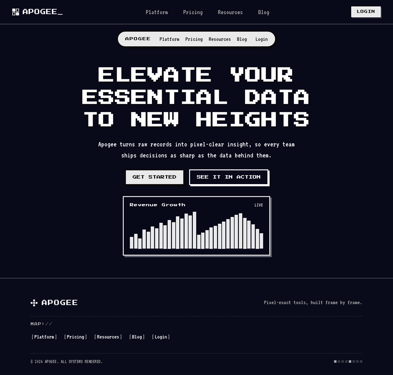
Elevate your essential data to new heights
Apogee turns raw records into pixel-clear insight, so every team ships decisions as sharp as the data behind them.
Elevate your essential data to new heights
Apogee turns raw records into pixel-clear insight, so every team ships decisions as sharp as the data behind them.
No comments yet. Be the first!