Design
The Principles of Minimal Design in Modern Web Interfaces
Exploring how flat, minimal aesthetics with soft colors and clean typography create authentic and timeless user experiences that stand out.
 Nirmal Panchal
create a unique minimal rich design blog card.

Sign in to leave a comment
The meta-design project aims to create a unique, minimal, and rich design blog card that stands out with clean visuals and subtle interactivity. This document outlines the requirements, design principles, and technical specifications for the project.
As requested by Nirmal Panchal from India, the design will avoid gradient styling to ensure the blog card does not resemble AI-generated visuals. Instead, the focus will be on flat, minimal aesthetics with soft colors, clean typography, and subtle hover effects.
The meta-design project will deliver a visually appealing and functional blog card design that adheres to modern design principles. The system will prioritize simplicity, usability, and elegance while ensuring the design is responsive and accessible across devices.
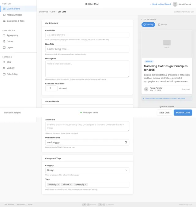
The blog card will serve as a reusable component for showcasing blog content, with features such as title, description, author details, and interactive elements.
The theme will be flat and minimal, avoiding gradients or overly complex visuals. The design will emphasize clarity and simplicity, ensuring the blog card feels authentic and timeless.
Interactive Blog Card with Dynamic Micro-Interactions
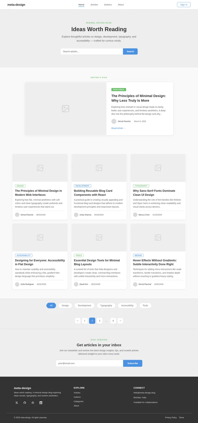
The homepage will feature a grid of blog cards that are visually clean and minimal. Each blog card will have the following standout features:
Flat Design with Subtle Depth:
Hover Effects:
Interactive Elements:
Dynamic Content:
Micro-Interactions:
This design concept ensures the blog card is visually engaging while maintaining a clean and minimal aesthetic.
This document outlines the updated requirements for the meta-design project, ensuring the blog card aligns with Nirmal's vision of a clean, minimal, and rich design.
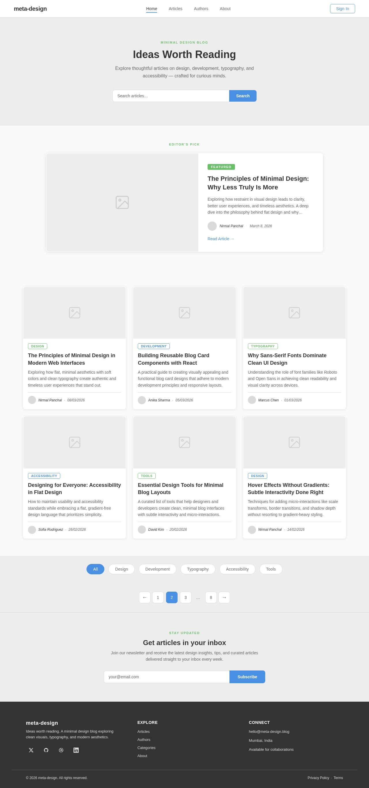
Explore thoughtful articles on design, development, typography, and accessibility — crafted for curious minds.
Editor’s Pick
Exploring how restraint in visual design leads to clarity, better user experiences, and timeless aesthetics. A deep dive into the philosophy behind flat design and why stripping away excess creates more meaningful interfaces.
Exploring how flat, minimal aesthetics with soft colors and clean typography create authentic and timeless user experiences that stand out.
A practical guide to creating visually appealing and functional blog card designs that adhere to modern development principles and responsive layouts.
Understanding the role of font families like Roboto and Open Sans in achieving clean readability and visual clarity across devices.
How to maintain usability and accessibility standards while embracing a flat, gradient-free design language that prioritizes simplicity.
A curated list of tools that help designers and developers create clean, minimal blog interfaces with subtle interactivity and micro-interactions.
Techniques for adding micro-interactions like scale transforms, border transitions, and shadow depth without resorting to gradient-heavy styling.
STAY UPDATED
Join our newsletter and receive the latest design insights, tips, and curated articles delivered straight to your inbox every week.
No comments yet. Be the first!