


The meta-design philosophy is rooted in a simple idea: great design does not need to shout. It communicates through whitespace, restraint, and intentional typography. In a landscape saturated with gradients, animations, and visual noise, flat and minimal design stands out precisely because it refuses to compete.
This post explores the core principles that guide the meta-design approach — from color palette decisions to the micro-interactions that make a blog card feel alive without relying on flashy effects. Whether you are building your first design system or refining an existing one, these principles apply universally.
Why Flat Design Still Wins in 2026
Flat design is often misunderstood as "boring" or "unfinished." In reality, it demands far more discipline than its gradient-heavy counterpart. Every pixel must earn its place. The #F9F9F9 background, the 1px solid #DADADA border — these are not lazy defaults. They are deliberate choices that create a calm, readable environment for the content to breathe.
Research consistently shows that users spend more time reading content on low-distraction interfaces. When the visual layer does not compete with the editorial layer, comprehension improves. This is the foundation of the meta-design card system.
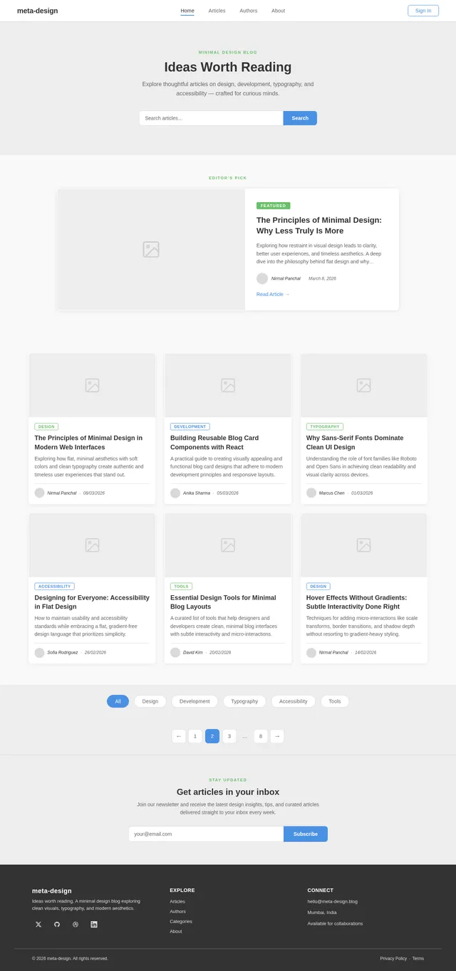
Figure 1: The meta-design card grid — clean, minimal, and intentional.
Color as a Communication Tool
The meta-design palette was chosen not for aesthetics alone, but for semantic clarity. The accent color #4A90E2 signals interactivity: links, focus rings, active states, and primary actions. The soft green #6ABF69 is reserved for positive indicators — success states, featured labels, and category chips that denote creativity.
"Avoid gradients not because they are wrong, but because they mask the underlying intent of your design. A flat color tells the truth; a gradient tells a story you may not mean to tell."— Nirmal Panchal, meta-design SRD
Applying Color with Restraint
In practice, restraint means limiting your palette to three functional roles: background, text, and accent. Any additional color should justify its own existence. Use the following checklist before introducing a new color to your system:
- Does it serve a semantic purpose (error, success, info)?
- Does it pass WCAG AA contrast requirements against its background?
- Is it consistent with the existing accent family (e.g., a tint or shade of
#4A90E2)? - Would removing it degrade user comprehension, or just visual variety?
Typography as Structure
Typography in meta-design is not decorative — it is structural. The type scale moves from 12px metadata at the base, through 14px body descriptions, up to 18px card titles, and finally 36px hero headlines. Each step in the scale has a single, unambiguous job.
Font weight plays an equally important role. Body copy sits at font-weight: 300 to feel light and readable at scale. Headings jump to 700 to anchor the hierarchy. The gap between these two weights creates the visual rhythm that guides the reader's eye down the page without needing decorative elements.
Line-Height and Paragraph Spacing
A line-height: 1.8 on body text is not arbitrary. Studies in reading ergonomics suggest that 1.5–1.8 line-height provides optimal vertical rhythm for paragraph-length reading. Combined with a margin-bottom: 24px paragraph gap, the eye can cleanly separate and re-enter each thought without fatigue.
Figure 2: Type scale diagram showing the meta-design hierarchy from metadata to headline.
Micro-Interactions: Subtle but Essential
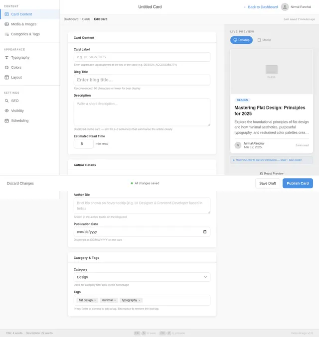
The meta-design card system uses micro-interactions not as decoration, but as feedback. When a user hovers over a card, the scale(1.05) transform communicates "this is clickable" without requiring an underline, a button, or explicit affordance text. The border transitioning from transparent to 1px solid #4A90E2 reinforces this signal with a color cue tied to the interactive palette.
These interactions are implemented entirely in CSS using transition properties — no JavaScript required. This keeps the component lightweight and ensures the interaction degrades gracefully on devices that do not support hover states, such as touchscreens. You can read more about this approach on the MDN guide to CSS transitions.
- Define the default state with explicit values for all transitioned properties.
- Apply transitions on the base rule, not the hover rule, so both enter and exit are animated.
- Keep durations between 150ms and 300ms to feel responsive without being jarring.
- Use
easeorease-outtiming functions — avoid linear for UI transitions.
Ultimately, the meta-design system succeeds because it respects the reader. Every decision — from the soft #DADADA dividers to the italic author metadata — is made in service of clarity. The interface disappears, and the content takes center stage. That is the highest compliment any design can receive.
No comments yet. Be the first!