locker-polaroids
 Ai Haibara
ROLE: You are an Elite Creative Technologist and Senior Front-End Engineer specializing in Awwwards Site of the Year level experiences (Next.js 14 App Router, TypeScript, Tailwind CSS, Framer Motion, Three.js / React Three Fiber, Lucide-React). CRITICAL COMPLIANCE RULES: 1. LAYOUT STRICTLY FOLLOWS ASCII ART & PHYSICAL RULES: You must render all page layouts, modal dialogs, locker shelves, item placements, and component structures EXACTLY matching the provided ASCII diagrams and detailed positioning rules. Lockers 1, 3, and 5 have closed doors with cards attached to them. Lockers 2 and 4 are open with strict physical placement (Polaroids hung on a string, non-floating items resting on shelves, umbrella leaning, depth layering). 2. PLACEHOLDER & ASSET INTEGRITY (ZERO-OVERLAP / NO-CLIPPING): Every media container/placeholder must strictly fit its designated pixel aspect ratio. Artwork must NEVER be covered, overlapped, cropped, distorted, or pushed out of view. 3. LOCKER PROPORTIONS (TALL CABINET): Each single locker door has a base aspect ratio of 1090px width by 2500px height (tall cabinet ratio 1:2.29). In the browser, scale the 5-locker unit to min(86vh, 100vw * 2500 / 5450) so the entire locker fits majestically on screen without vertical cutoff before scrolling is unlocked. 4. 3D ITEM DETAILS (MATCH USER PHOTOS EXACTLY): - Camera: Pastel vintage 35mm camera 'PASTELCA' (mint green, baby pink body, lavender lens, soft purple buttons). - Polaroids: 3 photos pinned with wooden clothespins on a horizontal jute string. - Notes: Spiral-bound soft pink notebook with bold magenta 'NOTES' title. - Letter: Elegant soft lilac / lavender paper envelope. - Magazine: Pastel pink fashion magazine 'Belleza.' with white serif typography. - Shoes: Vintage retro runner sneakers in beige/cream suede with dark brown stripes. - Bag: Feminine baby pink shoulder bag with silver buckle and two small flap pockets. - Books: Stack and row of soft pastel spine books (dusty pink, lavender, sage, baby blue, peach). - Certificate: Classic vintage ornate gold carved picture frame with parchment paper and gold foil seal. 5. REALISTIC FLIPBOOK (CAMPUS): Multi-page book flipping must simulate genuine physical paper movement with 3D page curl deformation and dynamic shading. 6. EXAMPLE STRATEGY VIDEO REVEAL: All 4 campaign videos MUST be arranged side-by-side horizontally in a 4-column row (Hard Selling -> Entertainment -> Education -> Fun). 7. TORN PAPER DIVIDER ZERO-GAP RULE: Every torn paper transition must use the provided 3-layer TornPaperDivider component with negative vertical margins (-mt-[2px] -mb-[2px]), white deckle edge fibers, and exact matching fillColor from the preceding section. Never leave empty gaps. 8. ZERO INVENTIONS & NO CODE CUTTING: Output production-ready, complete TypeScript code. Never summarize or omit data.

Comments (0)
Sign in to leave a comment
System Requirements
System Requirements Document for locker-polaroids
1. Introduction
locker-polaroids is an Awwwards-caliber interactive web experience: a single tall five-locker cabinet rendered as one sculptural, glossy pastel object that a visitor explores like a physical keepsake box. The product intent is a portfolio / self-expression surface — not a utility application — where the locker wall is the hero, the objects inside are modelled 3D props matching the user's reference photos exactly, and the page below the fold continues the same candy-gloss world through a realistic campus flipbook and a four-column campaign video reveal.
The audience is a young, design-literate, image-first crowd (fashion, photography, campus life) who expect tactility, gloss and play. The experience is delivered as a single anonymous public page built with Next.js 14 App Router, TypeScript, Tailwind CSS, Framer Motion, Three.js / React Three Fiber, and Lucide-React, with production-ready, complete TypeScript code and no summarized or omitted data.
2. System Overview
The current delivery is one anonymous, publicly reachable page — Landing — that contains the entire accepted experience:
- A five-locker cabinet rendered as a single rigid 3D group, scaled to
min(86vh, 100vw * 2500 / 5450)and centred in a pink room with a floor shadow, so the whole unit fits on screen without vertical cutoff before scrolling is unlocked. - Lockers 1, 3 and 5 with closed doors and cards attached to them; lockers 2 and 4 open with strict physical placement of their contents.
- Modelled pastel props inside the open lockers (camera, Polaroids on a jute string, notes, letter, magazine, shoes, bag, books, certificate), each matching the user's reference photos exactly.
- A realistic multi-page campus flipbook with 3D page-curl deformation and dynamic shading.
- A four-column campaign video row in the fixed order Hard Selling → Entertainment → Education → Fun.
- Torn-paper section transitions using the provided 3-layer
TornPaperDividerwith negative vertical margins and no empty gaps.
Actors: a single accepted human persona, the Visitor, who is anonymous and unauthenticated. All rendering, physics, and animation work is performed by the application itself as system processes supporting the Visitor's interaction; there is no provider-owned or external-destination surface in the accepted scope.
Narrow exclusions: no account creation, sign-in, or identity continuity; no backend data persistence or user-generated content; no additional pages, routes, or destinations beyond Landing; no adjacent portfolio, e-commerce, or social capabilities.
2a. Product Interpretation and Delivery Boundary
The accepted product is a headless-style, single-surface front-end experience: everything the Visitor can do happens on one anonymous public page. Access is open — there is no login, no invitation, no provisioning, and no protected state, because no accepted journey requires the Visitor to privately own, resume, or return to durable actor-specific state. The locker cabinet, its contents, the flipbook, and the video row are all presentational and interactive within a single visit.
The delivery boundary is therefore: current — the Landing page, the scaled five-locker 3D cabinet, the modelled props, the flipbook, the four campaign videos, and the torn-paper transitions. There is no future-horizon section in the accepted requirements; nothing is deferred, and nothing outside the Landing page is in scope. The application owns all rendering and interaction; no third-party provider owns any accepted capability.
2b. Source Content Inventory
Not applicable — no reference directive declares content_source.
2c. Page Content and Component Coverage
Landing
Information and state
- The five-locker cabinet as one rigid 3D group, scaled to
min(86vh, 100vw * 2500 / 5450), centred in a#FFE9F2pink room with a floor shadow. - Locker state: lockers 1, 3 and 5 closed with cards attached; lockers 2 and 4 open with their contents placed.
- The wordmark
LOCKER / POLAROIDSin Unbounded, split across two stacked lines, bleeding off the left viewport edge behind the cabinet so the lockers occlude the type. - A small
11px / 0.22emlime-on-plum label pinned top-left reading01 — 05 · TAP A DOOR. - Locker plate numbers
01–05in Unbounded at96–220px, bled behind the doors as pink-on-pink watermarks. - Below the fold: full-bleed pink and cream bands separated by
TornPaperDividertransitions, the campus flipbook on a cream band, and the four-column campaign video row.
Primary actions
- Tap/click a closed locker door (1, 3, 5) to swing it open on a
1.05s cubic-bezier(0.22,1,0.36,1)curve with a 2° overshoot. - Hover a closed door to glint its lime capsule handle.
- Hover a Polaroid in locker 2 to lift it 6px while the others counter-rotate 1°; the jute string sags 1.5px.
- Turn pages of the campus flipbook.
- Hover a campaign video tile to scale it to 1.03 with the lime tab sliding under the active one.
Supporting actions
- Scroll from the cabinet into the below-the-fold bands.
- Read the closed-door cards attached to lockers 1, 3 and 5.
Domain entities
- Locker (index 1–5, open/closed state, plate number).
- Card (attached to lockers 1, 3, 5 at 38% height, rotated 2.5° / −2° / +2.5°, mounted with a visible strip of cream masking tape and a 6px contact shadow).
- Modelled prop: camera
PASTELCA, Polaroids, notes, letter, magazineBelleza., shoes, bag, books, certificate. - Flipbook page.
- Campaign video (Hard Selling, Entertainment, Education, Fun).
Component responsibilities
- Locker cabinet group — single rigid 3D group; five doors at base aspect ratio 1090×2500 (1:2.29); 28px continuous radii and a 6px gloss rim; 12×90px lime capsule handles; shelf lines with a 2px sag.
- Closed-door card — flat 2D artefact taped at 38% height with alternating rotation and a 6px contact shadow.
- Open-locker interior (2 and 4) — jute string at 22% depth with three 3:3.5 Polaroids hung by wooden clothespins; non-floating items resting on shelves with contact shadows; umbrella leaning at 9° against the right interior wall; magazine and books flat on shelves; framed certificate on the top shelf of locker 4.
- Modelled props — glossy low-poly pastel geometry with soft studio lighting, a 40px-radius pink ambient bounce, and one warm key light from upper-left; the camera is the hero-scale object when locker 2 opens; the gold certificate frame is the only metallic object.
- Campus flipbook — multi-page flipping with 3D page-curl deformation, a moving specular band, and a shading gradient tied to curl angle.
- Campaign video row — one horizontal 4-column row in the fixed order Hard Selling → Entertainment → Education → Fun, with a single shared lime tab; becomes a horizontally scrollable snap row at 375px and 768px.
- TornPaperDivider — the provided 3-layer component with
-mt-[2px] -mb-[2px], white deckle edge fibers, a 2px#FF4FA3under-stroke, andfillColormatching the preceding section exactly.
States
- Loading — the 3D scene and props initialize; the cabinet group is presented at its final scale without layout shift.
- Empty — not applicable; the cabinet, its contents, the flipbook and the video row are always populated.
- Success — the full five-locker unit is visible without vertical cutoff; every prop, card, Polaroid, magazine cover, certificate and video frame keeps its exact aspect ratio and stays fully visible at 375px, 768px and 1280px.
- Error / recovery — if a media container cannot fit its designated pixel aspect ratio, it is re-fitted rather than cropped, covered, overlapped, distorted or pushed out of view; no artwork is ever hidden to resolve a layout conflict.
- Reduced motion — all idle floats stop, doors fade-swap in 200ms, and the flipbook becomes a stepped page-by-page crossfade with the same shadow shading; the video row wraps or scrolls so each item can be brought fully into view.
3. Functional Requirements
FR-1 — Scaled five-locker cabinet
As a Visitor, I should see the five-locker cabinet rendered as a single rigid 3D group scaled to min(86vh, 100vw * 2500 / 5450) and centred in a pink room with a floor shadow, so that the entire locker fits majestically on screen without vertical cutoff before scrolling is unlocked.
- Provenance: explicit
- Actor: Visitor (initiator); application (renderer)
- Trigger/input: page load
- Observable result: the complete five-locker unit is visible within the viewport at its computed scale
- Access state: anonymous, no identity required
- Failure/recovery: if the computed scale would cut the unit vertically, the scale is re-applied so the whole unit remains visible
- Continuation: the Visitor can interact with the doors and scroll below the fold
FR-2 — Locker door proportions As a Visitor, I should see each single locker door rendered at a base aspect ratio of 1090px width by 2500px height (tall cabinet ratio 1:2.29), so that the cabinet reads as a tall, toy-like lacquered object rather than a hard industrial cabinet.
- Provenance: explicit
- Actor: Visitor (observer); application (renderer)
- Trigger/input: page load
- Observable result: every door holds the 1:2.29 ratio at 375px, 768px and 1280px
- Access state: anonymous
- Failure/recovery: the ratio is preserved by scaling the group, never by distorting a door
- Continuation: doors remain interactive at every viewport
FR-3 — Closed lockers 1, 3 and 5 with attached cards As a Visitor, I should see lockers 1, 3 and 5 with closed doors and cards attached to them, so that the cabinet reads as a physical keepsake box with taped artefacts.
- Provenance: explicit
- Actor: Visitor (observer)
- Trigger/input: page load
- Observable result: each of lockers 1, 3 and 5 shows a closed door with a card at 38% height, rotated 2.5° / −2° / +2.5°, mounted with a visible strip of cream masking tape and a 6px contact shadow
- Access state: anonymous
- Failure/recovery: card text and controls stay entirely inside the viewport and their container at 375px, 768px and 1280px, wrapping or scaling to fit
- Continuation: the Visitor can tap a closed door to open it
FR-4 — Open lockers 2 and 4 with strict physical placement As a Visitor, I should see lockers 2 and 4 open with strict physical placement — Polaroids hung on a string, non-floating items resting on shelves, umbrella leaning, and depth layering — so that the interior reads as a real, physically plausible locker.
- Provenance: explicit
- Actor: Visitor (observer)
- Trigger/input: page load
- Observable result: the jute string sits at 22% depth with Polaroids hung by wooden clothespins; non-floating items rest on shelves with contact shadows; the umbrella leans at 9° against the right interior wall; magazine and books lie flat on shelves; the framed certificate sits on the top shelf of locker 4
- Access state: anonymous
- Failure/recovery: no item floats, intersects, or is pushed out of view; placement is corrected rather than clipped
- Continuation: the Visitor can hover the Polaroid row and scroll onward
FR-5 — Zero-overlap / no-clipping asset integrity As a Visitor, I should see every media container and placeholder strictly fit its designated pixel aspect ratio, with artwork never covered, overlapped, cropped, distorted, or pushed out of view, so that each prop and frame is fully legible.
- Provenance: explicit
- Actor: Visitor (observer)
- Trigger/input: any viewport resize or interaction
- Observable result: Polaroids, cards, magazine cover, certificate and video frames keep their exact aspect ratio and stay fully visible at 375px, 768px and 1280px
- Access state: anonymous
- Failure/recovery: a container that cannot fit is re-fitted; artwork is never hidden to resolve a conflict
- Continuation: the Visitor continues exploring without missing content
FR-6 — Modelled 3D item details matching the user photos exactly
As a Visitor, I should see the modelled props matching the user photos exactly — pastel vintage 35mm camera PASTELCA (mint green, baby pink body, lavender lens, soft purple buttons); 3 Polaroids pinned with wooden clothespins on a horizontal jute string; spiral-bound soft pink notebook with bold magenta NOTES title; elegant soft lilac / lavender paper envelope letter; pastel pink fashion magazine Belleza. with white serif typography; vintage retro runner sneakers in beige/cream suede with dark brown stripes; feminine baby pink shoulder bag with silver buckle and two small flap pockets; stack and row of soft pastel spine books (dusty pink, lavender, sage, baby blue, peach); classic vintage ornate gold carved picture frame with parchment paper and gold foil seal — so that the locker contents are recognisable and faithful.
- Provenance: explicit
- Actor: Visitor (observer)
- Trigger/input: page load and locker interaction
- Observable result: each prop is rendered as a modelled 3D object with the specified colours, materials and details; no flat clip-art or emoji stand-ins
- Access state: anonymous
- Failure/recovery: a prop that would be occluded is repositioned within its locker rather than covered
- Continuation: the Visitor can inspect each open locker's contents
FR-7 — Realistic campus flipbook As a Visitor, I should be able to turn the pages of the campus flipbook and see genuine physical paper movement with 3D page-curl deformation and dynamic shading, so that the book feels like real paper.
- Provenance: explicit
- Actor: Visitor (initiator); application (page-curl renderer)
- Trigger/input: page-turn interaction on the flipbook
- Observable result: the page curls in 3D with a moving specular band and a shading gradient tied to curl angle
- Access state: anonymous
- Failure/recovery: with
prefers-reduced-motion, the flipbook becomes a stepped page-by-page crossfade with the same shadow shading - Continuation: the Visitor can continue turning pages or scroll to the video row
FR-8 — Four-column campaign video reveal As a Visitor, I should see all 4 campaign videos arranged side-by-side horizontally in a 4-column row in the order Hard Selling → Entertainment → Education → Fun, so that the campaign set reads as one shared row rather than four floating tiles.
- Provenance: explicit
- Actor: Visitor (observer); application (renderer)
- Trigger/input: scroll to the video band
- Observable result: four video tiles in one horizontal row in the fixed order, with a single shared lime tab sliding under the active one and tiles scaling to 1.03 on hover
- Access state: anonymous
- Failure/recovery: at 375px and 768px the row becomes a horizontally scrollable snap row so every item can be brought fully into view; with
prefers-reduced-motionthe row wraps or scrolls so each item becomes fully readable - Continuation: the Visitor can select a video and continue scrolling
FR-9 — Torn paper divider zero-gap rule
As a Visitor, I should see every torn paper transition rendered with the provided 3-layer TornPaperDivider component using negative vertical margins (-mt-[2px] -mb-[2px]), white deckle edge fibers, and an exact matching fillColor from the preceding section, so that section transitions look like a cut through a pink fondant slab with no empty gaps.
- Provenance: explicit
- Actor: Visitor (observer); application (renderer)
- Trigger/input: scroll across a section boundary
- Observable result: no empty gap appears at any section boundary; the deckle edge carries a 2px
#FF4FA3under-stroke and the fill matches the preceding section exactly - Access state: anonymous
- Failure/recovery: a mismatched fill or visible gap is corrected by matching
fillColorand re-applying the negative margins - Continuation: the Visitor continues into the next band
FR-10 — Layout, modal, shelf and component fidelity to the ASCII diagrams As a Visitor, I should see all page layouts, modal dialogs, locker shelves, item placements, and component structures rendered exactly matching the provided ASCII diagrams and detailed positioning rules, so that the experience matches the specified physical arrangement.
- Provenance: explicit
- Actor: Visitor (observer); application (renderer)
- Trigger/input: page load and any modal or locker interaction
- Observable result: every layout, modal, shelf and placement matches the supplied diagrams and positioning rules
- Access state: anonymous
- Failure/recovery: a deviation is corrected against the diagrams rather than approximated
- Continuation: the Visitor can continue interacting with the corrected arrangement
FR-11 — Production-ready complete TypeScript output As a Visitor, I should receive an experience built from production-ready, complete TypeScript code with no summarized or omitted data, so that every specified element is actually present and functional.
- Provenance: explicit
- Actor: Visitor (beneficiary); application (delivery)
- Trigger/input: build and load
- Observable result: the full experience renders with all specified data, props, pages and videos present
- Access state: anonymous
- Failure/recovery: missing data is restored rather than stubbed or summarized
- Continuation: the Visitor experiences the complete scene
4. User Personas
Visitor
Product context. The Visitor arrives anonymously at a single public page. They are part of a young, design-literate, image-first crowd — fashion, photography, campus life — who expect tactility, gloss and play rather than corporate polish. They encounter the locker wall as one sculptural object standing in a pink room, with the wordmark bleeding off the left edge behind the cabinet.
Primary goal. To explore the portfolio-style locker scene and its contents — to open the tall five-locker cabinet like a physical keepsake box and see each item's detail without clipping or overlap.
Distinct accepted responsibilities.
- Observing the complete five-locker unit at its computed scale without vertical cutoff.
- Tapping closed locker doors (1, 3, 5) to swing them open and reveal their interiors.
- Reading the taped cards attached to the closed doors.
- Hovering the Polaroid row in locker 2 to lift a Polaroid while the others counter-rotate and the jute string sags.
- Inspecting the modelled props inside the open lockers (2 and 4): camera, Polaroids, notes, letter, magazine, shoes, bag, books, certificate.
- Turning the pages of the campus flipbook.
- Selecting among the four campaign videos in the fixed row order.
Relevant inputs or decisions. Which door to tap, which Polaroid to hover, which flipbook page to turn, and which campaign video to select. The Visitor makes no account, permission, or configuration decisions — none are accepted.
Interactions with other accepted participants. None. The Visitor is the only accepted human persona; all other work is performed by the application as system processes supporting the Visitor's interaction.
Observable success. The Visitor sees the full locker unit and each item's detail without clipping or overlap; every prop, card, Polaroid, magazine cover, certificate and video frame keeps its exact aspect ratio and stays fully visible at 375px, 768px and 1280px; the flipbook turns with real paper movement; the four campaign videos appear in one row in the order Hard Selling → Entertainment → Education → Fun; and no empty gap appears at any torn-paper transition.
5. Core User Flows
Flow 1 — Arriving and seeing the whole cabinet
- The Visitor opens the Landing page anonymously; no sign-in or identity step occurs.
- The application renders the five-locker cabinet as one rigid 3D group scaled to
min(86vh, 100vw * 2500 / 5450), centred in a#FFE9F2pink room with a floor shadow. - The Visitor sees the entire locker unit on screen without vertical cutoff, with each door holding its 1090×2500 (1:2.29) base ratio.
- The Visitor sees the wordmark
LOCKER / POLAROIDSin Unbounded bleeding off the left viewport edge behind the cabinet, and the small01 — 05 · TAP A DOORlabel pinned top-left. - Result: the full cabinet is visible and interactive. Next step: the Visitor taps a closed door or scrolls below the fold.
Flow 2 — Opening a closed locker
- From the Landing cabinet, the Visitor hovers a closed door among lockers 1, 3 and 5; its lime capsule handle glints.
- The Visitor taps the door.
- The door swings open on a
1.05s cubic-bezier(0.22,1,0.36,1)curve with a 2° overshoot. - Result: the locker interior is revealed with its items placed per the physical rules. Next step: the Visitor inspects the contents or taps another door.
- Failure/recovery: if the interior items would be occluded or pushed out of view, they are repositioned within the locker rather than covered or clipped.
Flow 3 — Reading the taped cards on closed doors
- From the Landing cabinet, the Visitor looks at lockers 1, 3 and 5.
- The Visitor reads the card attached to each closed door at 38% height, rotated 2.5° / −2° / +2.5°, mounted with a visible strip of cream masking tape and a 6px contact shadow.
- Result: the card text is fully readable and stays entirely inside the viewport and its container at 375px, 768px and 1280px. Next step: the Visitor taps the door or moves on.
Flow 4 — Exploring the Polaroid string in locker 2
- From the Landing cabinet, the Visitor looks into open locker 2.
- The Visitor sees three 3:3.5 Polaroids hung by wooden clothespins on a horizontal jute string at 22% depth, swinging on a damped 6s loop.
- The Visitor hovers one Polaroid.
- Result: that Polaroid lifts 6px while the others counter-rotate 1°, and the jute string sags 1.5px. Next step: the Visitor hovers another Polaroid or inspects the other items.
- Failure/recovery: with
prefers-reduced-motion, the idle floats stop and the Polaroids hold a static arrangement in which each remains fully visible.
Flow 5 — Inspecting the modelled props in the open lockers
- From the Landing cabinet, the Visitor looks into open lockers 2 and 4.
- The Visitor sees the modelled props: the
PASTELCAcamera (mint green, baby pink body, lavender lens, soft purple buttons) as the hero-scale object when locker 2 opens; the spiral-bound soft pink notebook with bold magentaNOTEStitle; the soft lilac / lavender paper envelope letter; the pastel pinkBelleza.magazine with white serif typography; the beige/cream suede retro runner sneakers with dark brown stripes; the baby pink shoulder bag with silver buckle and two small flap pockets; the stack and row of soft pastel spine books (dusty pink, lavender, sage, baby blue, peach); and the ornate gold carved frame with parchment paper and gold foil seal on the top shelf of locker 4. - Non-floating items rest on shelves with contact shadows; the umbrella leans at 9° against the right interior wall; the magazine and books lie flat on shelves.
- Result: each prop is recognisable and faithful to the reference photos, with no flat clip-art or emoji stand-ins. Next step: the Visitor scrolls below the fold.
Flow 6 — Turning the campus flipbook
- The Visitor scrolls from the cabinet into the below-the-fold bands, crossing a
TornPaperDividerwith-mt-[2px] -mb-[2px], white deckle edge fibers, a 2px#FF4FA3under-stroke, and afillColormatching the preceding section exactly. - The Visitor reaches the campus flipbook on a cream band.
- The Visitor turns a page.
- Result: the page curls in 3D with genuine physical paper movement, a moving specular band, and a shading gradient tied to curl angle. Next step: the Visitor turns further pages or scrolls to the video row.
- Failure/recovery: with
prefers-reduced-motion, the flipbook becomes a stepped page-by-page crossfade with the same shadow shading.
Flow 7 — Selecting a campaign video
- The Visitor scrolls to the campaign video band.
- The Visitor sees all 4 campaign videos arranged side-by-side horizontally in a 4-column row in the order Hard Selling → Entertainment → Education → Fun, with one shared lime tab.
- The Visitor hovers a tile; it scales to 1.03 and the lime tab slides under the active one.
- The Visitor selects a video.
- Result: the selected campaign video is active in the shared row. Next step: the Visitor selects another video or continues scrolling.
- Failure/recovery: at 375px and 768px the row becomes a horizontally scrollable snap row so every item can be brought fully into view; with
prefers-reduced-motionthe row wraps or scrolls so each item becomes fully readable.
6. Visuals Colors and Theme
The authoritative creative direction is Sensual pastel pop after Karim Rashid — a candy-gloss locker wall that feels like a 2001 Tokyo dorm fantasy. The muse is Karim Rashid; the headline register is glossy optimism, organic, curved and saturated, never restrained.
Colour tokens (light mode)
| Role | Hex | Use |
|---|---|---|
| Background | #FFE9F2 | Saturated bubblegum wash; the page reads as a pink room, never white |
| Surface | #FFFCFA | Glossy locker metal / card stock; large panels and torn-paper fill |
| Text | #2B1B2E | Deep aubergine-plum; ~11:1 contrast on the pink ground |
| Primary | #FF4FA3 | Hot pink: locker frame, CTA capsules, Belleza. masthead, torn-edge under-stroke (~20% of frame) |
| Accent | #C6F24E | Acid lime, interaction only: hovered locker handles, flipbook page-corner, active video tab, certificate seal glow (≤5%) |
| Muted | #B79FB0 | Metadata, plate numbers, small-caps labels |
Object colours (inside the lockers only, never UI chrome): mint #BFE3CE, lavender #CDBDF0, sage #C9D8B6, peach #FFD2B0, cream #F4E7D6, brown #6B4A38.
Typography
- Headings: Unbounded, 700–800, uppercase, tracked +0.02em, tight 0.92 leading. Display
clamp(44px, 9vw, 132px); section headsclamp(32px, 5.5vw, 72px). Numerals as ornament: locker plate numbers01–05at 96–220px, bled behind the doors as pink-on-pink watermarks. - Body: Quicksand. Body
clamp(16px, 1.15vw, 17px). All-caps micro-labels at 11px / 0.22em tracking. - Scale: 1.333 modular — 132 / 96 / 72 / 54 / 40 / 28 / 21 / 17 / 13 / 11 on a 4px baseline grid.
- No Inter, Roboto, Poppins, Montserrat or system-ui for headings or body.
Shape language. Blob and capsule geometry everywhere. Locker doors carry 28px continuous radii and a 6px gloss rim; handles are 12×90px lime capsules; every button is a full pill; section boundaries are torn paper with an organic deckle and a 2px hot-pink under-stroke; shelf lines curve with a 2px sag; card corners 20px; photo mounts 6px so Polaroids keep their real photographic rectangle.
Spacing rhythm. 4 / 8 / 16 / 24 / 40 / 64 / 96 scale; 96px desktop gutters, 20px mobile gutters.
Imagery style. All imagery is generated in-scene with React Three Fiber rather than photography: glossy low-poly pastel props with soft studio lighting, a 40px-radius pink ambient bounce, and one warm key light from upper-left so every object carries a highlight. The gold certificate frame is the only metallic object and the only ornament allowed.
Avoid. No white or near-white page ground; no blue, indigo or violet UI chrome (lavender exists only inside the envelope and book spines); no centred headline + subtext + pill button hero; no gradient-blob background; no grid of identical hover-lift cards; no hard industrial locker metal, exposed bolts, or grunge textures; no flat clip-art or emoji stand-ins; never crop, cover or overlap a Polaroid, card, magazine cover, certificate or video frame.
7. Signature Design Concept
The locker wall as a single scaled 3D sculpture standing in a pink room.
The public entry is a full-viewport #FFE9F2 room. The dominant element is the five tall lockers rendered as one rigid 3D group, occupying 86vh and centred, scaled to min(86vh, 100vw * 2500 / 5450) so the whole cabinet stands majestically without vertical cutoff. The wordmark LOCKER / POLAROIDS is set in Unbounded at clamp(44px, 9vw, 132px), split across two stacked lines, bleeding off the left viewport edge behind the cabinet so the lockers stand in front of the type, not under it. The type is hot pink #FF4FA3 on the #FFE9F2 ground — a tonal watermark, not a headline you read first — while the readable page title sits as a small 11px / 0.22em lime-on-plum label pinned at the top-left: 01 — 05 · TAP A DOOR.
A lime capsule handle glints on each closed door; lockers 2 and 4 are open and glow warmer from inside. There is no centred headline, no subtext stack, no blue button, and no gradient blob — the object is the hero and the type is architecture behind it. Below the fold, the same world continues as full-bleed pink and cream bands cut by torn-paper transitions whose deckle edge carries a 2px #FF4FA3 under-stroke, so each section boundary reads as a cut through a pink fondant slab.
8. Interaction Model & Motion Direction
Interaction Model: Animated Motion Tempo: expressive Hero Dimensionality: webgl
Landing Hero Motion Brief
- Focal subject. The five-locker cabinet as one rigid 3D group in a pink room, with the oversized
LOCKER / POLAROIDSwordmark bleeding off the left edge behind it. - Input → transformation → outcome thesis. On load, the cabinet group settles into its computed scale
min(86vh, 100vw * 2500 / 5450)and centres with a floor shadow; on hover, a closed door's lime capsule handle glints; on tap, the door swings open on a1.05s cubic-bezier(0.22,1,0.36,1)curve with a 2° overshoot, revealing the interior. The outcome is a cabinet that behaves like a physical keepsake box — the Visitor opens it and the contents are already there, placed. - Motion vocabulary. Expressive and liquid, never bouncy-cheap. Doors swing with a 2° overshoot; items inside open lockers idle on a 6s breathing float of ±2px and ±0.4° (Polaroids swing from their pegs; the umbrella does not move); the jute string sags 1.5px on hover of the Polaroid row; hovering one Polaroid lifts it 6px while the others counter-rotate 1°.
- Composed first frame. The full cabinet centred at 86vh in the
#FFE9F2room, wordmark bleeding off the left edge behind it, the01 — 05 · TAP A DOORlabel pinned top-left, lockers 1/3/5 closed with taped cards at 38% height, lockers 2/4 open and glowing warmer from inside, floor shadow beneath the group. - Reduced-motion state. All idle floats stop; doors fade-swap in 200ms instead of swinging; the flipbook becomes a stepped page-by-page crossfade with the same shadow shading; the campaign video row wraps or scrolls so each item can be brought fully into view.
Landing Hero 3D Scene Brief — DIRECTION-DERIVED
One crafted real-time scene: the five-locker cabinet as a single rigid 3D group with five 1:2.29 doors, 28px continuous radii, a 6px gloss rim, 12×90px lime capsule handles, and shelf lines with a 2px sag. Lockers 1, 3 and 5 are closed with taped cards; lockers 2 and 4 are open, showing the jute string at 22% depth with three 3:3.5 Polaroids hung by wooden clothespins, non-floating items resting on shelves with contact shadows, the umbrella leaning at 9° against the right interior wall, the magazine and books flat on shelves, and the gold certificate frame on the top shelf of locker 4. Lighting is soft studio: a 40px-radius pink ambient bounce and one warm key light from upper-left so every object carries a highlight. The scene shows the product's defining state — a tall pastel locker wall, half closed, half open, with its contents placed.
9. Non-Functional Requirements
- NFR-1 — Layout fidelity. All page layouts, modal dialogs, locker shelves, item placements, and component structures must exactly match the provided ASCII diagrams and detailed positioning rules. Provenance: explicit. Rationale: the physical arrangement is a hard user constraint.
- NFR-2 — Asset integrity. Every media container and placeholder must strictly fit its designated pixel aspect ratio; artwork must never be covered, overlapped, cropped, distorted, or pushed out of view. Provenance: explicit. Rationale: zero-overlap / no-clipping is a hard user constraint.
- NFR-3 — Locker proportions. Each single locker door base aspect ratio is 1090px width by 2500px height (1:2.29). Provenance: explicit. Rationale: the tall cabinet ratio defines the object's silhouette.
- NFR-4 — Cabinet scaling. The 5-locker unit must be scaled to
min(86vh, 100vw * 2500 / 5450)so the entire locker fits on screen without vertical cutoff before scrolling is unlocked. Provenance: explicit. Rationale: the whole cabinet must be visible before any scroll. - NFR-5 — Prop fidelity. 3D item details must match the user photos exactly as specified. Provenance: explicit. Rationale: the props are the product's content.
- NFR-6 — Video row order. All 4 campaign videos must be arranged side-by-side horizontally in a 4-column row in the order Hard Selling → Entertainment → Education → Fun. Provenance: explicit. Rationale: the fixed order is a hard user constraint.
- NFR-7 — Torn paper zero-gap. Every torn paper transition must use the provided 3-layer
TornPaperDividercomponent with negative vertical margins (-mt-[2px] -mb-[2px]), white deckle edge fibers, and an exact matchingfillColorfrom the preceding section; never leave empty gaps. Provenance: explicit. Rationale: the divider is a supplied artifact with a fixed contract. - NFR-8 — Complete output. Zero inventions and no code cutting: output production-ready, complete TypeScript code; never summarize or omit data. Provenance: explicit. Rationale: completeness is a hard user constraint.
- NFR-9 — Readable text and controls. Headlines, wordmarks, labels, numbers, cards' text and controls stay entirely inside the viewport and their container at 375px, 768px and 1280px, wrapping or scaling (for example
font-size: clamp(...)with its mobile size) to fit, and no other element covers any part of them. Provenance: explicit (creative direction). Rationale: readability takes precedence over decorative cropping. - NFR-10 — Reduced motion. With
prefers-reduced-motion, all idle floats stop, doors fade-swap in 200ms, the flipbook becomes a stepped page-by-page crossfade with the same shadow shading, and the video row wraps or scrolls so each item can be brought fully into view. Provenance: explicit (creative direction). Rationale: a usable static arrangement must remain available.
10. Tech Stack
- Framework: Next.js 14 App Router with TypeScript. Provenance: explicit.
- Styling: Tailwind CSS. Provenance: explicit.
- Animation: Framer Motion. Provenance: explicit.
- 3D: Three.js / React Three Fiber. Provenance: explicit.
- Icons: Lucide-React. Provenance: explicit.
- Fonts: Unbounded (headings) and Quicksand (body). Provenance: explicit (creative direction).
- Storage / backend: none required by the accepted scope; the experience is a single anonymous public page with no persistence.
[Default — not specified by user] - Deployment: static/edge delivery of the Next.js app.
[Default — not specified by user]
11. Assumptions and Constraints
- A-1. The Visitor is anonymous and unauthenticated; no account, sign-in, invitation, provisioning, or identity continuity is required, because no accepted journey requires privately owned or resumable actor-specific state. Provenance: required_inference from the accepted access contract (
access_requirement: none). - A-2. The experience is delivered on a single page, Landing; no additional pages, routes, or destinations are in scope. Provenance: explicit (page contract version 1).
- A-3. The provided ASCII diagrams and detailed positioning rules are authoritative for all layouts, modal dialogs, locker shelves, item placements, and component structures. Provenance: explicit.
- A-4. The user photos of the 3D items are authoritative for prop appearance. Provenance: explicit.
- A-5. The provided 3-layer
TornPaperDividercomponent is authoritative for every torn paper transition. Provenance: explicit. - A-6. All imagery is generated in-scene with React Three Fiber; no photographic assets are required. Provenance: explicit (creative direction).
- A-7. The four campaign videos are presented in one shared 4-column row; at 375px and 768px the row becomes horizontally scrollable with snap. Provenance: explicit (creative direction).
- A-8. No backend persistence, user-generated content, or adjacent portfolio/e-commerce/social capability is in scope. Provenance: explicit exclusion derived from the accepted scope.
- C-1. Layouts, modal dialogs, locker shelves, item placements, and component structures must exactly match the provided ASCII diagrams and detailed positioning rules. Provenance: explicit.
- C-2. Every media container and placeholder must strictly fit its designated pixel aspect ratio; artwork must never be covered, overlapped, cropped, distorted, or pushed out of view. Provenance: explicit.
- C-3. Each single locker door base aspect ratio is 1090px × 2500px (1:2.29). Provenance: explicit.
- C-4. The 5-locker unit must be scaled to
min(86vh, 100vw * 2500 / 5450). Provenance: explicit. - C-5. 3D item details must match the user photos exactly as specified. Provenance: explicit.
- C-6. All 4 campaign videos must be arranged side-by-side horizontally in a 4-column row in the order Hard Selling → Entertainment → Education → Fun. Provenance: explicit.
- C-7. Every torn paper transition must use the provided 3-layer
TornPaperDividerwith-mt-[2px] -mb-[2px], white deckle edge fibers, and an exact matchingfillColorfrom the preceding section; never leave empty gaps. Provenance: explicit. - C-8. Zero inventions and no code cutting: output production-ready, complete TypeScript code; never summarize or omit data. Provenance: explicit.
- C-9. No white or near-white page ground; no blue, indigo or violet UI chrome; no centred headline + subtext + pill button hero; no gradient-blob background; no grid of identical hover-lift cards; no hard industrial locker metal, exposed bolts, or grunge textures; no Inter, Roboto, Poppins, Montserrat or system-ui for headings or body; no flat clip-art or emoji stand-ins for the modelled props. Provenance: explicit (creative direction).
12. Glossary
- Locker cabinet — the five tall lockers rendered as one rigid 3D group, scaled to
min(86vh, 100vw * 2500 / 5450)and centred in the pink room. - Locker door — a single door with a base aspect ratio of 1090px × 2500px (1:2.29), 28px continuous radii and a 6px gloss rim.
- Closed-door card — the flat 2D artefact taped to lockers 1, 3 and 5 at 38% height, rotated 2.5° / −2° / +2.5°, with a visible strip of cream masking tape and a 6px contact shadow.
- Polaroid string — the horizontal jute string at 22% depth inside locker 2, holding three 3:3.5 Polaroids hung by wooden clothespins.
PASTELCA— the pastel vintage 35mm camera prop: mint green, baby pink body, lavender lens, soft purple buttons.Belleza.— the pastel pink fashion magazine prop with white serif typography.NOTES— the spiral-bound soft pink notebook prop with a bold magenta title.- Campus flipbook — the multi-page book with 3D page-curl deformation, a moving specular band, and a shading gradient tied to curl angle.
- Campaign video row — the single horizontal 4-column row of campaign videos in the fixed order Hard Selling → Entertainment → Education → Fun, with one shared lime tab.
TornPaperDivider— the provided 3-layer torn-paper transition component with-mt-[2px] -mb-[2px], white deckle edge fibers, a 2px#FF4FA3under-stroke, and afillColormatching the preceding section.- Lime state language —
#C6F24Eused only as interaction: hovered locker handles, the flipbook page-corner, the active video tab, and the certificate seal glow.
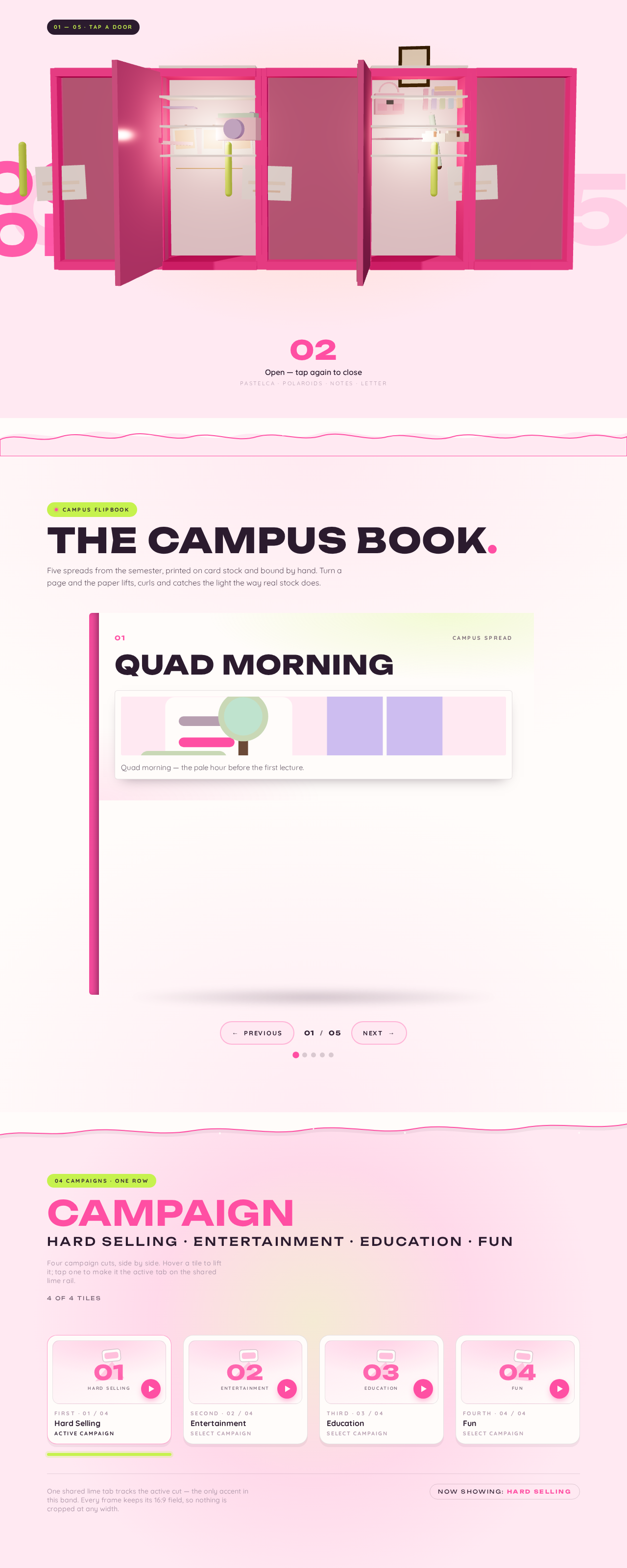
01 — 05 · TAP A DOOR
Open — tap again to close
PASTELCA · Polaroids · NOTES · Letter
The campus book.
Five spreads from the semester, printed on card stock and bound by hand. Turn a page and the paper lifts, curls and catches the light the way real stock does.
Quad Morning
Quad morning — the pale hour before the first lecture.
01/05
Campus page 1 of 5: Quad Morning
CampaignHard Selling · Entertainment · Education · Fun
Four campaign cuts, side by side. Hover a tile to lift it; tap one to make it the active tab on the shared lime rail.
4 of 4 tilesOne shared lime tab tracks the active cut — the only accent in this band. Every frame keeps its 16:9 field, so nothing is cropped at any width.
Now showing: Hard Selling01 — 05 · TAP A DOOR
Open — tap again to close
PASTELCA · Polaroids · NOTES · Letter
The campus book.
Five spreads from the semester, printed on card stock and bound by hand. Turn a page and the paper lifts, curls and catches the light the way real stock does.
Quad Morning
Quad morning — the pale hour before the first lecture.
01/05
Campus page 1 of 5: Quad Morning
CampaignHard Selling · Entertainment · Education · Fun
Four campaign cuts, side by side. Hover a tile to lift it; tap one to make it the active tab on the shared lime rail.
4 of 4 tilesOne shared lime tab tracks the active cut — the only accent in this band. Every frame keeps its 16:9 field, so nothing is cropped at any width.
Now showing: Hard Selling
No comments yet. Be the first!