crystal-video
 monish raj
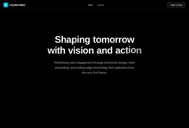
Recreate this hero section exactly. Here are the complete specifications: Video Background: Full-screen background video, absolutely positioned, covering the entire viewport (object-cover) Video URL: https://d8j0ntlcm91z4.cloudfront.net/user_38xzZboKViGWJOttwIXH07lWA1P/hf_20260403_050628_c4e32401-fab4-4a27-b7a8-6e9291cd5959.mp4 Autoplay, loop, muted, playsInline NO dark overlay, NO gradient overlay, NO semi-transparent layer on top of the video. The video plays raw with no dimming whatsoever. Typography (CRITICAL - must be applied globally): Import the Google Font Inter via a <link> tag in index.html: <link rel="preconnect" href="https://fonts.googleapis.com"> <link rel="preconnect" href="https://fonts.gstatic.com" crossorigin> <link href="https://fonts.googleapis.com/css2?family=Inter:wght@300;400;500;600&display=swap" rel="stylesheet"> Set the body font-family in CSS to: 'Inter', sans-serif Apply -webkit-font-smoothing: antialiased and -moz-osx-font-smoothing: grayscale on the body Also extend the Tailwind config to set fontFamily: { sans: ['Inter', 'sans-serif'] } so all Tailwind font-sans usage picks up Inter automatically Navbar: Wrapped in horizontal page padding: px-6 md:px-12 lg:px-16 with pt-6 top padding The navbar bar itself uses the .liquid-glass class and has rounded-xl, px-4 py-2, flex layout with items-center justify-between Left: Logo text "VEX" - text-2xl font-semibold tracking-tight Center (hidden on mobile, visible md+): Links "Story", "Investing", "Building", "Advisory" - text-sm, gap-8, hover transitions to gray-300 Right: "Start a Chat" button - bg-white text-black px-6 py-2 rounded-lg text-sm font-medium, hover to gray-100 Hero Content (Bottom of viewport): Container: same horizontal padding as navbar, flex column filling remaining height, content pushed to bottom with flex-1 flex flex-col justify-end, bottom padding pb-12 lg:pb-16 On large screens: 2-column grid (lg:grid lg:grid-cols-2 lg:items-end) Left Column - Main content: Heading: "Shaping tomorrow\nwith vision and action." (literal line break between "tomorrow" and "with") Responsive sizes: text-4xl md:text-5xl lg:text-6xl xl:text-7xl font-normal, mb-4 Inline style: letterSpacing: '-0.04em' Character-by-character entrance animation: Each character starts at opacity: 0 and translateX(-18px), then transitions to opacity: 1 and translateX(0). Each character gets a staggered delay calculated as: (lineIndex * lineLength * charDelay) + (charIndex * charDelay) where charDelay = 30ms. The whole animation starts after 200ms initial delay. Each character transition is 500ms. Spaces render as \u00A0 (non-breaking space) Subheading: "We back visionaries and craft ventures that define what comes next." text-base md:text-lg text-gray-300 mb-5 Fade-in animation: starts at 800ms delay, 1000ms duration Buttons row: flex-wrap with gap-4 "Start a Chat" - bg-white text-black px-8 py-3 rounded-lg font-medium "Explore Now" - liquid-glass border border-white/20 text-white px-8 py-3 rounded-lg font-medium, hover transitions to white bg + black text Fade-in animation: starts at 1200ms delay, 1000ms duration Right Column - Tag: Aligned to bottom-right on large screens (flex items-end justify-start lg:justify-end) Glass card: liquid-glass border border-white/20 px-6 py-3 rounded-xl Text: "Investing. Building. Advisory." - text-lg md:text-xl lg:text-2xl font-light Fade-in animation: starts at 1400ms delay, 1000ms duration Liquid Glass CSS (place in global CSS): .liquid-glass { background: rgba(0, 0, 0, 0.4); background-blend-mode: luminosity; backdrop-filter: blur(4px); -webkit-backdrop-filter: blur(4px); border: none; box-shadow: inset 0 1px 1px rgba(255, 255, 255, 0.1); position: relative; overflow: hidden; } .liquid-glass::before { content: ''; position: absolute; inset: 0; border-radius: inherit; padding: 1.4px; background: linear-gradient(180deg, rgba(255,255,255,0.3) 0%, rgba(255,255,255,0.1) 20%, rgba(255,255,255,0) 40%, rgba(255,255,255,0) 60%, rgba(255,255,255,0.1) 80%, rgba(255,255,255,0.3) 100%); -webkit-mask: linear-gradient(#fff 0 0) content-box, linear-gradient(#fff 0 0); -webkit-mask-composite: xor; mask-composite: exclude; pointer-events: none; } FadeIn component: A wrapper that starts with opacity: 0 and transitions to opacity: 1 after a configurable delay (ms) using a setTimeout + React state. Transition duration is also configurable. Uses inline transitionDuration style and Tailwind's transition-opacity class. AnimatedHeading component: Splits text by \n into lines, then each line into individual characters. Each character is an inline-block <span> with CSS transitions on opacity and transform (translateX). Animation triggers via React state after the initial delay. Color scheme: Black background, white text, gray-300 for secondary text, white/20 for borders. No purple, no indigo. Stack: React + TypeScript, Tailwind CSS, Vite. No extra UI libraries needed. Icons from lucide-react if needed (none currently used in the hero).
Comments (0)
Sign in to leave a comment
Project Tasks
No tasks generated yet.
Tasks will appear here as requirements are defined.
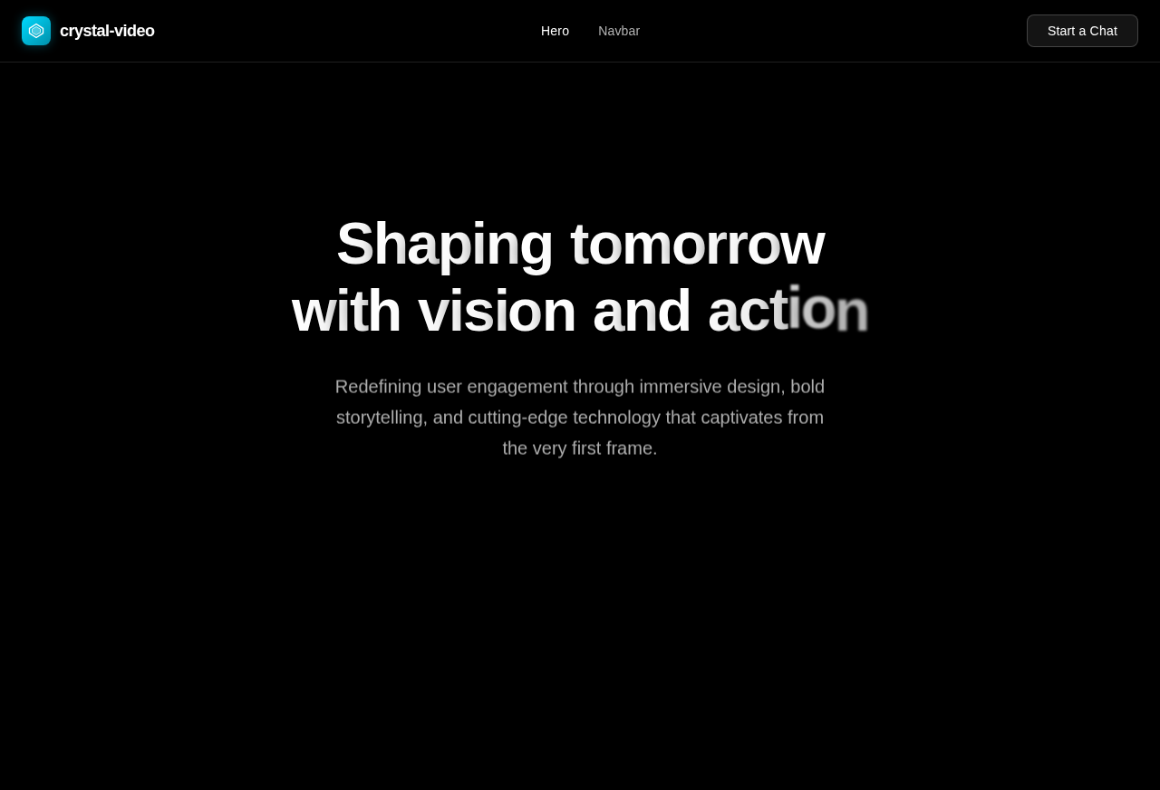
Shaping tomorrowwith vision and action
Redefining user engagement through immersive design, bold storytelling, and cutting-edge technology that captivates from the very first frame.
Investing. Building. Advisory.
No comments yet. Be the first!