crystal-video
 monish raj
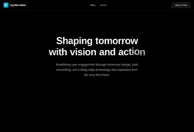
Recreate this hero section exactly. Here are the complete specifications: Video Background: Full-screen background video, absolutely positioned, covering the entire viewport (object-cover) Video URL: https://d8j0ntlcm91z4.cloudfront.net/user_38xzZboKViGWJOttwIXH07lWA1P/hf_20260403_050628_c4e32401-fab4-4a27-b7a8-6e9291cd5959.mp4 Autoplay, loop, muted, playsInline NO dark overlay, NO gradient overlay, NO semi-transparent layer on top of the video. The video plays raw with no dimming whatsoever. Typography (CRITICAL - must be applied globally): Import the Google Font Inter via a <link> tag in index.html: <link rel="preconnect" href="https://fonts.googleapis.com"> <link rel="preconnect" href="https://fonts.gstatic.com" crossorigin> <link href="https://fonts.googleapis.com/css2?family=Inter:wght@300;400;500;600&display=swap" rel="stylesheet"> Set the body font-family in CSS to: 'Inter', sans-serif Apply -webkit-font-smoothing: antialiased and -moz-osx-font-smoothing: grayscale on the body Also extend the Tailwind config to set fontFamily: { sans: ['Inter', 'sans-serif'] } so all Tailwind font-sans usage picks up Inter automatically Navbar: Wrapped in horizontal page padding: px-6 md:px-12 lg:px-16 with pt-6 top padding The navbar bar itself uses the .liquid-glass class and has rounded-xl, px-4 py-2, flex layout with items-center justify-between Left: Logo text "VEX" - text-2xl font-semibold tracking-tight Center (hidden on mobile, visible md+): Links "Story", "Investing", "Building", "Advisory" - text-sm, gap-8, hover transitions to gray-300 Right: "Start a Chat" button - bg-white text-black px-6 py-2 rounded-lg text-sm font-medium, hover to gray-100 Hero Content (Bottom of viewport): Container: same horizontal padding as navbar, flex column filling remaining height, content pushed to bottom with flex-1 flex flex-col justify-end, bottom padding pb-12 lg:pb-16 On large screens: 2-column grid (lg:grid lg:grid-cols-2 lg:items-end) Left Column - Main content: Heading: "Shaping tomorrow\nwith vision and action." (literal line break between "tomorrow" and "with") Responsive sizes: text-4xl md:text-5xl lg:text-6xl xl:text-7xl font-normal, mb-4 Inline style: letterSpacing: '-0.04em' Character-by-character entrance animation: Each character starts at opacity: 0 and translateX(-18px), then transitions to opacity: 1 and translateX(0). Each character gets a staggered delay calculated as: (lineIndex * lineLength * charDelay) + (charIndex * charDelay) where charDelay = 30ms. The whole animation starts after 200ms initial delay. Each character transition is 500ms. Spaces render as \u00A0 (non-breaking space) Subheading: "We back visionaries and craft ventures that define what comes next." text-base md:text-lg text-gray-300 mb-5 Fade-in animation: starts at 800ms delay, 1000ms duration Buttons row: flex-wrap with gap-4 "Start a Chat" - bg-white text-black px-8 py-3 rounded-lg font-medium "Explore Now" - liquid-glass border border-white/20 text-white px-8 py-3 rounded-lg font-medium, hover transitions to white bg + black text Fade-in animation: starts at 1200ms delay, 1000ms duration Right Column - Tag: Aligned to bottom-right on large screens (flex items-end justify-start lg:justify-end) Glass card: liquid-glass border border-white/20 px-6 py-3 rounded-xl Text: "Investing. Building. Advisory." - text-lg md:text-xl lg:text-2xl font-light Fade-in animation: starts at 1400ms delay, 1000ms duration Liquid Glass CSS (place in global CSS): .liquid-glass { background: rgba(0, 0, 0, 0.4); background-blend-mode: luminosity; backdrop-filter: blur(4px); -webkit-backdrop-filter: blur(4px); border: none; box-shadow: inset 0 1px 1px rgba(255, 255, 255, 0.1); position: relative; overflow: hidden; } .liquid-glass::before { content: ''; position: absolute; inset: 0; border-radius: inherit; padding: 1.4px; background: linear-gradient(180deg, rgba(255,255,255,0.3) 0%, rgba(255,255,255,0.1) 20%, rgba(255,255,255,0) 40%, rgba(255,255,255,0) 60%, rgba(255,255,255,0.1) 80%, rgba(255,255,255,0.3) 100%); -webkit-mask: linear-gradient(#fff 0 0) content-box, linear-gradient(#fff 0 0); -webkit-mask-composite: xor; mask-composite: exclude; pointer-events: none; } FadeIn component: A wrapper that starts with opacity: 0 and transitions to opacity: 1 after a configurable delay (ms) using a setTimeout + React state. Transition duration is also configurable. Uses inline transitionDuration style and Tailwind's transition-opacity class. AnimatedHeading component: Splits text by \n into lines, then each line into individual characters. Each character is an inline-block <span> with CSS transitions on opacity and transform (translateX). Animation triggers via React state after the initial delay. Color scheme: Black background, white text, gray-300 for secondary text, white/20 for borders. No purple, no indigo. Stack: React + TypeScript, Tailwind CSS, Vite. No extra UI libraries needed. Icons from lucide-react if needed (none currently used in the hero).
Comments (0)
Sign in to leave a comment
System Requirements
System Requirements Document (SRD)
Project Name: crystal-video
1. Introduction
The crystal-video project is a cutting-edge platform designed to deliver an immersive and visually stunning user experience. This document outlines the system requirements for the hero section of the platform, as specified by Monish Raj from India. The focus is on creating a seamless, responsive, and visually captivating interface that adheres strictly to the provided specifications.
2. System Overview
The crystal-video project aims to redefine user engagement through a meticulously designed hero section. The hero section features a full-screen video background, precise typography, and staggered animations to captivate users. The design emphasizes minimalism, clarity, and responsiveness, ensuring a premium experience across devices.
The system will be built using modern web technologies, including React, TypeScript, Tailwind CSS, and Vite, to ensure high performance and maintainability.
3. Functional Requirements
The following are the functional requirements for the hero section of the crystal-video project:
- As a User, I should see a full-screen video background that plays automatically, loops, is muted, and has no overlays or dimming.
- As a User, I should experience globally applied typography using the "Inter" font family with smooth rendering.
- As a User, I should see a responsive navbar with a liquid-glass effect, containing a logo, navigation links, and a "Start a Chat" button.
- As a User, I should see a hero content area with a heading, subheading, and buttons, all animated with precise timing and effects.
- As a User, I should see a glass card with a tagline aligned to the bottom-right on large screens.
4. User Personas
1. General User
- Description: Visitors to the platform who interact with the hero section.
- Goals: To experience a visually stunning and responsive interface.
- Needs: Smooth animations, clear typography, and intuitive navigation.
5. Visuals Colors and Theme
Color Palette
| Element | Hex Code | Description |
|---|---|---|
| Background | #000000 | Pure black for a sleek, modern look. |
| Text | #FFFFFF | Crisp white for high contrast. |
| Secondary Text | #B3B3B3 | Gray-300 for subtle emphasis. |
| Border | #FFFFFF33 | White with 20% opacity for borders. |
| Accent | #E0E0E0 | Light gray for hover effects. |
6. Signature Design Concept
Hero Section: "Raw Elegance in Motion"
The hero section of crystal-video is designed to leave a lasting impression with its bold and dynamic presentation.
Key Features:
-
Video Background:
- A full-screen video plays seamlessly in the background, creating an immersive atmosphere.
- The video URL is: Video Link.
-
Typography:
- The "Inter" font family is applied globally for a clean and modern aesthetic.
- The heading features a character-by-character entrance animation, creating a sense of anticipation and engagement.
-
Liquid Glass Navbar:
- The navbar uses a liquid-glass effect, adding depth and sophistication.
- It includes a logo, navigation links, and a "Start a Chat" button, all styled for clarity and responsiveness.
-
Hero Content:
- The heading, "Shaping tomorrow\nwith vision and action," animates with staggered delays for each character.
- The subheading and buttons fade in sequentially, guiding the user's focus naturally.
-
Glass Card:
- Positioned at the bottom-right, the glass card displays the tagline, "Investing. Building. Advisory."
- The liquid-glass effect and fade-in animation enhance its visual appeal.
This design concept ensures that users are immediately drawn into the platform's vision and purpose.
7. Non-Functional Requirements
- Performance: The hero section must load within 2 seconds on a standard broadband connection.
- Responsiveness: The design must adapt seamlessly to all screen sizes, from mobile to desktop.
- Accessibility: While adhering to the exact specifications, basic accessibility practices (e.g., semantic HTML) will be maintained.
- Scalability: The system should support future enhancements without significant rework.
8. Tech Stack
-
Frontend:
- React (for web development)
- Tailwind CSS (for styling)
- Vite (for fast builds and development)
-
Backend:
- Not applicable for the hero section.
-
Database:
- Not applicable for the hero section.
-
AI Models:
- Not applicable for the hero section.
-
Orchestration:
- Docker (for local development)
9. Assumptions and Constraints
- The video URL provided will remain accessible and stable.
- The hero section will not include additional accessibility features unless explicitly requested.
- The design will strictly adhere to the provided specifications without deviation.
- The platform will be hosted on a modern web server capable of serving video content efficiently.
10. Glossary
- Hero Section: The prominent section at the top of a webpage, designed to capture user attention.
- Liquid Glass: A design effect that mimics the appearance of frosted or blurred glass.
- Typography: The style and appearance of text.
- Responsive Design: A design approach that ensures a website looks and functions well on all devices.
- Viewport: The visible area of a web page on a user's screen.
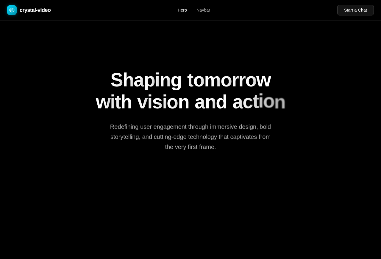
Shaping tomorrowwith vision and action
Redefining user engagement through immersive design, bold storytelling, and cutting-edge technology that captivates from the very first frame.
Investing. Building. Advisory.
No comments yet. Be the first!