verdant-blog
 Monin Modi
create a blog website with 2 pages only and simple design
Comments (0)
Sign in to leave a comment
Project Tasks7
Implement Theme & Structure
As a user I want to be able to use the frontend with the correct visual theme so that the app matches the mock-design pages exactly. Apply the verdant-blog design system: Forest Green (#228B22) primary, Soft Beige (#F5F5DC) background, Warm Gold (#DAA520) accent, Charcoal Gray (#333333) text. Configure Lora (serif) as primary font and Open Sans as secondary font. Set up global CSS custom properties/tokens, remove unused scaffold pages (login, signup, welcome, dashboard/*), and ensure the base layout structure mirrors the mock designs. This task must be completed independently before all other page tasks.
Build Homepage Page
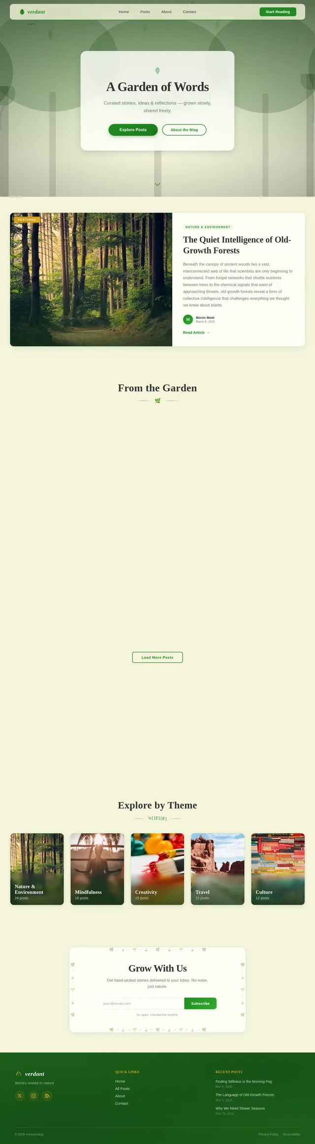
As a user I want to be able to use the frontend for the Homepage so that I can view the blog landing experience as designed. Implement the Homepage based on the existing JSX design (Homepage v2). Sections include: NavBar (floating sticky, frosted-glass, hamburger on mobile), HeroForest (full-viewport living forest animation with parallax layers, swaying SVG leaves, bird animation, frosted-glass content card with CTA buttons), FeaturedPost (two-column editorial spotlight), BlogPreviewGrid (responsive masonry-inspired 3-column grid with 'From the Garden' heading, 6 cards, Load More), NatureQuoteBanner (full-width dark forest-green accent band with pull quote), CategoryBrowse (horizontal scrollable category tiles — Nature & Environment, Mindfulness, Creativity, Travel, Culture — with snap-scroll on mobile and dot indicators), NewsletterSignup (centered form with leaf-border illustration, success state), Footer (dark forest-floor, three-column, warm-gold accents). User flow entry point: Homepage → Browse Previews → Interact Elements → Secondary Page.
Build Secondary Page
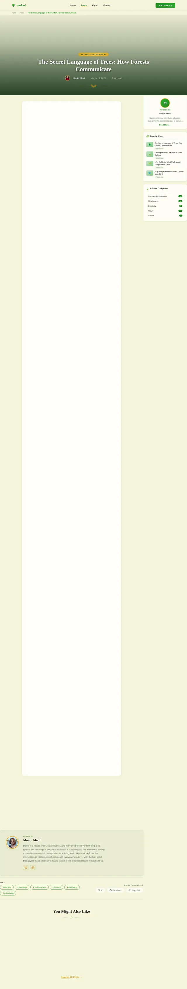
As a user I want to be able to use the frontend for the Secondary Page so that I can read full blog article content. Implement the Secondary Page based on the existing JSX design (Secondary Page v2). Sections include: NavBar (same as Homepage, with breadcrumb trail 'Home → Posts → [Article Title]'), ArticleHero (full-width 21:9 hero image with forest-green gradient scrim, warm-gold category chip, large Lora article title using clamp(), author avatar + meta row, decorative leaf-sprig SVG divider), ArticleBody (frosted-glass surface, max-width 680px, Lora body text, styled blockquotes/lists/headings, IntersectionObserver fade-in), PullQuoteBanner (dark forest-green accent band mid-article), AuthorBio (frosted-glass card, circular photo, bio, social links), TagsAndShare (tag chips + share icons strip), RelatedPosts ('You Might Also Like' with 3 cards, staggered fade-in), Sidebar (sticky 300px, hidden on mobile — Author mini-card, Popular Posts, Browse Categories widgets), BackToTop (fade-in after 600px scroll, smooth scroll), Footer (identical to Homepage footer). User flow: Secondary Page → Read Content → Navigate Back.
Implement Blog Posts API
As a user I want to be able to use the backend API for blog posts so that the Homepage and Secondary Page can fetch and display real content. Implement FastAPI endpoints: GET /api/posts (list with pagination, category filter, featured flag) for the BlogPreviewGrid and FeaturedPost sections; GET /api/posts/{slug} (single post detail) for the ArticleHero and ArticleBody sections; GET /api/categories (list with post counts) for the CategoryBrowse section; GET /api/posts/related/{slug} (3 related posts) for the RelatedPosts section. Use MySQL with a posts table (id, title, slug, excerpt, content, category, author_id, featured, published_at, read_time, thumbnail_url). Return all fields needed by the frontend design components.
Implement Newsletter Signup API
As a user I want to be able to use the backend API for newsletter signup so that I can subscribe via the NewsletterSignup section on the Homepage. Implement FastAPI endpoint: POST /api/newsletter/subscribe accepting an email address, validating format, storing in MySQL subscribers table, and returning a success response that triggers the animated leaf sprout success state in the frontend. Include duplicate-email handling and basic anti-spam validation.
Connect Frontend to APIs
As a user I want to be able to use the frontend with live data so that all pages display real blog content from the backend. Wire up API calls in the Homepage (BlogPreviewGrid, FeaturedPost, CategoryBrowse, NewsletterSignup) and Secondary Page (ArticleHero, ArticleBody, RelatedPosts, Sidebar widgets) to the FastAPI endpoints. Use fetch or axios with loading states and error boundaries. Seed the MySQL database with realistic sample posts (minimum 6 posts across the 5 categories: Nature & Environment, Mindfulness, Creativity, Travel, Culture) so all sections render correctly. Ensure responsive behavior and animations remain intact with dynamic data.
Ensure Responsive & Accessible UI
As a user I want to be able to use the website seamlessly on both desktop and mobile devices so that the experience is consistent and accessible. Audit both Homepage and Secondary Page at 375px (mobile), 768px (tablet), and 1280px+ (desktop) breakpoints. Verify: mobile snap-scroll carousel with dot indicators on CategoryBrowse, stacking layouts on FeaturedPost/AuthorBio, Sidebar hidden on mobile, ArticleHero clamp() title scaling, hamburger nav drawer, touch-friendly tap targets (min 44x44px). Validate WCAG 2.1 AA compliance: color contrast ratios, alt text on all images, keyboard navigation, focus states. Test on Chrome, Firefox, Safari, Edge.
No comments yet. Be the first!