Dental-system
 Jatin Yadav
Create a AI-Powered Dental Clinic Operating System as centralized SaaS platform


Comments (0)
Sign in to leave a comment
Project Tasks227
Implement Navbar for Login
As a frontend developer, implement the Navbar section for the Login page. This component may already exist from previous pages — reuse or reference the existing Navbar if available. The Navbar uses three useState hooks: `scrolled` (scroll-position tracking via window.scroll listener), `menuOpen` (hamburger toggle), and `dark` (theme toggle). It applies a `data-theme` attribute to `document.documentElement` on theme change and adds a `nav-scrolled` class when scrollY > 12. It renders the DentFlow AI brand with an `Activity` icon from lucide-react, a `NAV_LINKS` array mapped to anchor tags (Dashboard, Appointments, Patients, Analytics), a theme toggle button switching between `Moon` and `Sun` icons, Log in and Get Started CTA links, and a mobile `Menu`/`X` burger button that conditionally renders a `.nav-mobile` dropdown. Import from `../styles/Navbar.css`.
Implement Auth & RBAC API
As a Backend Developer, implement authentication and role-based access control (RBAC) API endpoints using FastAPI. Include: JWT token issuance/refresh/revocation, session management, MFA support (TOTP + SMS), AES-256 encryption at rest, TLS enforcement, audit logging of auth events, and role/permission assignment endpoints. Roles include: Super Administrator, Practice Owner, Office Manager, Receptionist, Treatment Coordinator, Orthodontist/Doctor, Clinical Assistant, Billing & Insurance Specialist, HR Manager, Marketing Manager, Patient Portal User. Endpoints: POST /auth/login, POST /auth/logout, POST /auth/refresh, POST /auth/mfa/verify, GET/POST/PUT /roles, GET/PUT /users/{id}/permissions. HIPAA-compliant session expiry and audit trail required.
Database Schema & Migrations
As a Backend Developer, design and implement PostgreSQL database schema with Alembic migrations for all modules: users, roles, permissions, patients, appointments, emr_records, soap_notes, prescriptions, treatment_plans, diagnoses, imaging_scans, videos, billing_invoices, payments, insurance_claims, inventory_items, purchase_orders, audit_logs, workflow_definitions, workflow_executions, staff, compliance_records, messages, notification_history. Redis schema for session storage and caching. Include indexes for common query patterns, foreign key constraints, soft-delete patterns, and HIPAA-required audit timestamps (created_at, updated_at, deleted_at, created_by, updated_by).
AWS S3 Storage Integration
As a DevOps Engineer, configure AWS S3 storage integration: create S3 buckets for imaging scans, video uploads, documents/attachments, and avatar images with separate access policies per bucket. Implement pre-signed URL generation for secure file uploads/downloads. Configure bucket-level server-side encryption (AES-256), versioning for medical records, and lifecycle policies for cost management. Set up CORS policies for browser-based uploads. Implement S3 client wrapper in FastAPI backend with retry logic. Configure CloudFront CDN for imaging/video delivery.
CI/CD Pipeline Setup
As a DevOps Engineer, set up CI/CD pipeline for the dental clinic SaaS platform: configure GitHub Actions (or equivalent) workflows for: (1) frontend build (React + Vite/CRA) with lint, type-check, unit tests, and production build artifact; (2) backend build (Python FastAPI) with pytest, ruff lint, mypy type check; (3) Docker image build and push to ECR; (4) staging deployment with smoke tests; (5) production deployment with blue-green or rolling strategy to AWS ECS/EKS. Environment-specific configs for dev/staging/prod. Secrets management via AWS Secrets Manager. Note: docker-compose and k8s chart are already done — this task covers the automated pipeline only.
Global State & Theme Context
As a Frontend Developer, implement global state management and ThemeContext for the React SPA. Create a ThemeContext provider (dark/light) with localStorage persistence under 'dentflow-theme' key and document.documentElement data-theme attribute sync — resolving the current inconsistency where theme is managed independently per component. Implement a centralized AuthContext (current user, role, permissions). Implement a NotificationsContext for global alert state. Create a shared useTheme hook, useAuth hook, and usePermissions hook consumed across all pages. Ensure ThemeContext is the single source of truth referenced by all pages (replacing per-component localStorage reads). This is a prerequisite for all frontend section tasks that use ThemeContext.
Environment Configuration & Secrets Management
As a DevOps Engineer, set up environment configuration and secrets management for all deployment tiers: (1) Define .env.example with all required environment variables (DATABASE_URL, REDIS_URL, AWS_ACCESS_KEY_ID, AWS_SECRET_ACCESS_KEY, S3_BUCKET_*, JWT_SECRET, JWT_EXPIRY, SMTP_HOST/PORT/USER/PASS, TWILIO_ACCOUNT_SID/AUTH_TOKEN, STRIPE_SECRET_KEY, AI_SERVICE_API_KEY, FRONTEND_URL, ALLOWED_ORIGINS, SENTRY_DSN); (2) Configure AWS Secrets Manager integration for production secrets retrieval at app startup; (3) Set up environment-specific config classes in FastAPI (BaseSettings via pydantic-settings) for dev/staging/prod; (4) Configure frontend .env.* files (VITE_API_BASE_URL, VITE_WS_URL, VITE_ENVIRONMENT) for React build; (5) Document all env vars in README with type, required flag, and example value; (6) Add secret rotation runbook for JWT_SECRET and API keys. Note: docker-compose is already done — this task covers secrets management layer only.
Implement LoginHero for Login
As a frontend developer, implement the LoginHero section for the Login page. The component uses a `dark` useState hook initialized to `true` and a MutationObserver on `document.documentElement` watching the `data-theme` attribute to stay in sync with the Navbar's theme toggle. It renders a `.lhr-root` section with three decorative background orbs (`.lhr-orb--1/2/3`), a `.lhr-content` div containing: a badge with an animated `.lhr-badge-dot` and 'Clinic Operating System' text, an `<h1>` headline with an accented `<span>` for 'Clinic Dashboard', a subheadline paragraph describing HIPAA-compliant EMR/AI workflows, and a `.lhr-benefits` row mapping a `BENEFITS` array (EMR Access 📋, Patient Records 🦷, AI Assistance 🤖, HIPAA Compliant 🔒) to `.lhr-benefit-pill` spans, plus a decorative `.lhr-divider`. Import from `../styles/LoginHero.css`.
Implement LoginForm for Login
As a frontend developer, implement the LoginForm section for the Login page. This is the most complex section: it manages eight useState hooks — `email`, `password`, `remember`, `showPw` (Eye/EyeOff toggle), `loading`, `success`, `bannerMsg`, `errors` (field-level validation object), and `theme` (initialized from `localStorage.getItem('dentflow-theme')`). On theme change it persists to localStorage and sets `data-theme` on `document.documentElement`. The `validate()` function enforces email regex and password min-length-6 rules, setting per-field error strings. `handleSubmit` calls validate, sets loading for 1600ms then flips success. `handleSso` also triggers a 1600ms loading then success state. On success it renders a `.lf-success-overlay` with a `ShieldCheck` icon, 'Welcome back!' text, and redirect message. The main form renders a `.lf-card` with: a `.lf-icon-box` containing `ShieldCheck`, a theme toggle button (Sun/Moon), an SSO button with `Building2` icon, a divider, email field with `Mail` icon and inline error, password field with `Lock` icon and `Eye`/`EyeOff` toggle button and inline error, a remember-me checkbox, a submit button with `LogIn` icon and loading spinner state, and a banner for error messages with `AlertCircle`. Import from `../styles/LoginForm.css` and lucide-react icons.
Implement LoginSecondaryActions for Login
As a frontend developer, implement the LoginSecondaryActions section for the Login page. The component uses a `dark` useState hook initialized to `true`, reading from `localStorage.getItem('dentflow-theme')` on mount and persisting back on change via a separate useEffect that also sets `data-theme` on `document.documentElement`. It renders a `.lsa-root` section with: a signup prompt paragraph linking to `/Signup` via `.lsa-signup-link`, a three-part divider row (`.lsa-divider-line` + `.lsa-divider-text` 'or' + line), a `UserPlus` icon anchor button linking to `/PatientPortal` with class `.lsa-patient-btn`, a `HelpCircle` icon anchor linking to `#help` with class `.lsa-help-link`, and a `.lsa-theme-row` containing a label and a toggle button that conditionally applies `.lsa-theme-toggle--light` class and displays a moon 🌙 or sun ☀️ emoji knob. Import from `../styles/LoginSecondaryActions.css`.
Implement LoginSecurityBadges for Login
As a frontend developer, implement the LoginSecurityBadges section for the Login page. This is a purely static presentational component with no state or effects. It renders a `.lsb-root` section containing a `.lsb-badges-row` that maps a `badges` array of four entries — HIPAA Compliant (`Shield`), AES-256 Encrypted (`Lock`), TLS 1.2+ (`Globe`), SOC 2 Type II (`Server`) — to `.lsb-badge` spans each with a `.lsb-badge-icon` wrapper around the lucide-react icon (strokeWidth 2.2), separated by `.lsb-divider` spans between items using `React.Fragment` with key. Below the badges row, a `.lsb-tagline` paragraph reads 'Your clinic data is protected with enterprise-grade security and full regulatory compliance.' Import from `../styles/LoginSecurityBadges.css`.
Implement SignupHero for Signup
As a frontend developer, implement the SignupHero section for the Signup page. This component manages its own local theme state (useState initialized by reading data-theme attribute or localStorage 'dentflow-theme'), with a useEffect that persists theme to localStorage and sets document.documentElement data-theme attribute. It renders an sh-root section containing three decorative orbs (sh-orb--1/2/3), a theme toggle button (Sun/Moon + label text), an HIPAA-Compliant Platform badge with an animated sh-badge-dot, an h1 with sh-headline-accent span, a subheadline paragraph referencing 500+ clinics / 30-day free trial / HIPAA compliance, and an sh-actions div with a 'Start Free Trial' CTA anchor (sh-cta with arrow) and a 'Already have an account? Sign in' login link. A trustBadges array (500+ Clinics, 99.9% Uptime, 30-Day Free Trial) is rendered as sh-trust items separated by sh-trust-divider spans.
Implement SignupForm for Signup
As a frontend developer, implement the SignupForm section for the Signup page. This is a multi-step form (STEPS array: clinic, role, account) with step index managed by useState. State includes: clinicName, ownerName, email, role (selected from ROLES dropdown with 12 options), password, confirmPassword, showPassword, showConfirm (Eye/EyeOff toggles), termsAccepted, submitted, errors, and touched objects. useCallback is used for toggleTheme and validateStep. The evaluateStrength utility computes password strength (weak/fair/good/strong) based on length, case mix, digits, and special chars, rendering a strength meter. Step 1 collects clinic name (Building2 icon), owner name (User icon), and email (Mail icon) with inline validation. Step 2 renders a role selector (Users icon) from the ROLES array. Step 3 collects password and confirm password (Lock/ShieldCheck icons) with show/hide toggles, strength indicator, and terms checkbox. Navigation uses ChevronRight/ChevronLeft buttons with validateStep gating progression. On final submit, sets submitted state to true and shows a success state.
Implement SignupBenefits for Signup
As a frontend developer, implement the SignupBenefits section for the Signup page. This component consumes ThemeContext from PatientManagement (with a fallback to dark if context is unavailable) to derive the dark boolean. It renders an sb-root section with a decorative sb-decor--glow div, an sb-inner div containing a label ('Why DentFlow'), an h2 heading, a subtitle paragraph, and an sb-grid mapping the benefits array (three items: HIPAA Compliant with Shield icon, 30-Day Free Trial with Clock icon, Instant Access with Zap icon). Each benefit is an sb-card with sb-icon-wrap, sb-card-title h3, sb-card-desc paragraph, and an sb-accent-line decorative element.
Implement SignupSecurity for Signup
As a frontend developer, implement the SignupSecurity section for the Signup page. This component manages its own local theme state (useState initialized from localStorage 'dentflow-theme'), with a useEffect persisting theme to localStorage and setting document.documentElement data-theme. It renders an sc-root section with a sc-glow decorative div and sc-inner containing: a sc-badges row that maps the badges array (AES-256 Encrypted with Lock icon, TLS 1.2+ with Shield icon, SOC 2 Type II with FileCheck icon, HIPAA Compliant with HeartPulse icon) separated by sc-sep spans, each badge showing a 16px icon and label. Below the badges is an sc-theme-row with an sc-theme-label displaying current mode text and an sc-toggle button (sc-light modifier when light) containing an sc-theme-knob with Sun or Moon icon (size 12).
Implement Footer for Signup
As a frontend developer, implement the Footer section for the Signup page. This stateless functional component computes the current year via new Date().getFullYear(). It renders an ftr-root footer with a decorative ftr-glow div and ftr-inner containing ftr-top with: an ftr-brand-col (Activity icon + DentOS brand name + 'Clinic Operating System' sub, tagline paragraph, and an ftr-status role=status div with animated ftr-status-dot, status text 'All systems operational', and '99.98% uptime' meta). An ftr-links nav contains four columns — Clinical (Dashboard, Appointments, Patient Management, EMR, SOAP Notes), Operations (Billing, Insurance, Scheduling, Inventory, Reporting), Platform (Analytics, AI Consultation, Patient Portal, System Settings, Audit Logs), and Meta (Profile, User Management, Communication) — each rendered as ftr-link-list ul items. Note: this Footer component may already exist from a previous page — reuse if available.
Implement TopBar for Dashboard
As a frontend developer, implement the TopBar section for the Dashboard page. This component uses ThemeContext from UserManagement for dark/light theme switching via Sun/Moon toggle icons. Implement useState hooks for `query`, `notifOpen`, and `menuOpen` states. Build a search input with Stethoscope brand logo, Search icon, and keyboard shortcut badge (⌘K). Implement a NOTIFICATIONS dropdown (3 hardcoded items with dot color classes: tb-d-blue, tb-d-teal, tb-d-cyan) and a USER_MENU dropdown with links to Profile, Dashboard, SystemSettings, and AuditLogs using Lucide icons (User, LayoutDashboard, Settings, Shield, LogOut). Add a tb-overlay div that closes both dropdowns on click. useEffect adds/removes Escape key listener to close dropdowns. Note: TopBar component may already exist from previous pages — reuse if available.
Patient Management CRUD API
As a Backend Developer, implement RESTful API endpoints for Patient Management using FastAPI + PostgreSQL. Endpoints include: GET/POST /patients, GET/PUT/DELETE /patients/{id}, GET/POST /patients/{id}/medical-history, GET/POST /patients/{id}/allergies, GET/POST /patients/{id}/insurance, GET/POST /patients/{id}/emergency-contacts, GET/POST /patients/{id}/documents, GET/POST /patients/{id}/imaging, GET/POST /patients/{id}/communications, GET /patients/{id}/treatment-history. Support search/filter/sort/pagination. HIPAA-compliant data handling, audit logging on all mutations. Used by: PatientManagement, PatientDetailPanel, PatientCheckin, EMR pages.
Inventory Management API
As a Backend Developer, implement Inventory API: GET/POST /inventory/items, GET/PUT/DELETE /inventory/items/{id}, GET /inventory/alerts (low-stock, expiry, reorder), GET/POST /inventory/purchase-orders, GET/PUT /inventory/purchase-orders/{id}, GET /inventory/forecasting/{item_id} (30/60/90 day projections), GET /inventory/overview (KPIs: total SKUs, stock value, low stock count, fulfillment rate), GET /inventory/vendors. Support stock status computation (ok/low/critical), expiry monitoring, batch tracking, and AI-assisted forecasting data endpoints. Used by: Inventory, Dashboard alert widgets.
User & Staff Management API
As a Backend Developer, implement User and Staff Management API: GET/POST /users, GET/PUT/DELETE /users/{id}, POST /users/{id}/assign-role, GET/PUT /users/{id}/permissions, GET/POST /staff, GET/PUT/DELETE /staff/{id}, GET /staff/compliance, POST /staff/onboard, GET /staff/directory (filterable/searchable), GET/POST /staff/{id}/tasks, PUT /staff/{id}/status. Support bulk actions (assign role, change department, reset password, deactivate, export). Staff compliance tracking (certification expiry, compliance score). Used by: UserManagement, StaffManagement pages.
Audit Logs API
As a Backend Developer, implement Audit Logs API: GET /audit-logs (paginated, filterable by actor, action, resource type, severity, result, date range), GET /audit-logs/{id} (full log entry with before/after values, user agent, session info), GET /audit-logs/summary (total activities, critical events, data changes, user access, last 24h), POST /audit-logs/export (CSV download). HIPAA-required retention of 6 years. Support action types: CREATE, READ, UPDATE, DELETE, LOGIN, LOGOUT, EXPORT, PERMISSION_CHANGE. Severity levels: Info, Warning, Critical. Used by: AuditLogs page, EMR (EMRAuditLog) section.
Workflow Automation Engine API
As a Backend Developer, implement Workflow Engine API: GET/POST /workflows, GET/PUT/DELETE /workflows/{id}, POST /workflows/{id}/activate, POST /workflows/{id}/pause, POST /workflows/{id}/trigger (manual run), GET /workflows/executions (live execution monitor with status: running/queued/completed/failed), GET /workflows/audit-log (sortable, filterable workflow history), GET /workflows/templates (library of pre-built templates), GET /workflows/overview (KPIs: active count, daily triggers, avg exec time, success rate, failed count). Support trigger types: schedule, event, API, manual. Used by: WorkflowEngine page.
System Settings API
As a Backend Developer, implement System Settings API: GET/PUT /settings/general (clinic name, timezone, language, date/time format, maintenance mode), GET/PUT /settings/security (password policy, session management, MFA config, TLS settings), GET/POST/DELETE /settings/api-keys, GET/PUT /settings/compliance (audit logging, encryption, log retention, backup frequency), GET/PUT /settings/integrations (SMTP, SMS gateway, AWS S3, Stripe, AI service config), GET/POST /settings/webhooks, GET/DELETE /settings/webhooks/{id}, GET /settings/database/stats, POST /settings/database/vacuum. Require Super Administrator role. Used by: SystemSettings page.
User Profile API
As a Backend Developer, implement User Profile API: GET/PUT /profile (personal info, contact info, preferences), PUT /profile/password (change password with strength validation), GET/POST /profile/mfa (2FA setup/verify), GET /profile/sessions (active sessions list), DELETE /profile/sessions/{id} (revoke session), PUT /profile/avatar (upload to S3 via FileReader), GET /profile/preferences (theme, language, notifications, reminder timing), PUT /profile/preferences. Support account deletion request and data export (GDPR-adjacent). Used by: Profile page sections.
Redis Caching & Session Store
As a DevOps Engineer/Backend Developer, configure Redis for session storage and API response caching: implement session store with TTL-based expiry matching security policy (configurable timeout), cache dashboard KPI aggregations (5-min TTL), cache analytics chart data (15-min TTL), cache inventory stock status (2-min TTL). Implement cache invalidation strategies on mutations. Configure Redis Sentinel or Cluster for high availability. Set up Redis connection pooling in FastAPI. Document cache key namespacing conventions (e.g., session:{user_id}, kpi:{clinic_id}:{period}).
Design System & Shared Components
As a Frontend Developer, establish the shared design system and component library for the dental clinic SaaS: (1) CSS custom properties for color palette (professional blues, teals, coral), typography scale, spacing, border-radius, shadow tokens for both dark and light themes; (2) shared UI components: Button (variants: primary, secondary, ghost, danger), Badge/Chip, Input, Select, Textarea, Modal/Overlay, Toast/Notification, Avatar, ProgressBar, Spinner, Pagination, Tabs, Accordion; (3) shared layout components: PageWrapper, SectionCard, DataTable skeleton; (4) shared lucide-react icon usage conventions. Ensure all components respect ThemeContext. This prevents duplication across 28 pages and establishes design consistency.
API Client & Auth Interceptors
As a Frontend Developer, implement a centralized API client layer for the React SPA: configure Axios (or fetch wrapper) with base URL from environment variable, automatic JWT token attachment from AuthContext, 401 response interceptor to trigger token refresh or redirect to /Login, error normalization (standardized error shape for toast/banner display), request/response logging in development, and TypeScript interfaces for all API response shapes. Implement API service modules per domain: authApi, patientApi, appointmentsApi, emrApi, billingApi, insuranceApi, imagingApi, videoApi, communicationApi, inventoryApi, analyticsApi, auditLogsApi, workflowApi, staffApi, settingsApi, portalApi, profileApi. Used by all frontend pages that consume backend data.
Database Seed Data
As a Backend Developer, create database seed scripts for development and staging environments: seed realistic dental clinic data including 5 staff users (doctor, receptionist, billing specialist, office manager, super admin) with hashed passwords, 20 patients with demographics/medical history/insurance, 50 appointments across the next 30 days, 10 treatment plans with phases and cost breakdowns, 30 SOAP notes (mix of draft/pending/approved), 15 prescriptions, 20 imaging scan records, 100 audit log entries, 10 inventory items with stock levels, 5 workflows (appointment reminder, inventory alert, SOAP approval, follow-up, patient check-in). Seed scripts use Alembic/SQLAlchemy and can be reset via a make seed command.
Signup & Clinic Registration API
As a Backend Developer, implement user registration and clinic onboarding API endpoints: POST /auth/register (create new clinic account with owner details, clinic name, role — returns JWT + session), POST /auth/verify-email (email verification token), GET /auth/check-email (availability check), POST /auth/resend-verification. Validate clinic name uniqueness, enforce password strength rules (min 8 chars, uppercase, digit, symbol), hash passwords with bcrypt, auto-assign Practice Owner role to first user, create default clinic configuration record, and emit audit log entry. HIPAA-compliant — no PHI in registration flow. Used by: Signup page (SignupForm).
FastAPI Security Middleware Layer
As a Backend Developer, implement production-grade FastAPI middleware and security layers: (1) CORS middleware configured for frontend origin(s) with allowed methods/headers; (2) TLS enforcement middleware redirecting HTTP to HTTPS; (3) Rate limiting middleware (slowapi or custom Redis-backed) with per-endpoint limits (e.g., /auth/login: 10/min, general API: 200/min per IP); (4) Request ID middleware injecting X-Request-ID header for distributed tracing; (5) Security headers middleware (X-Content-Type-Options, X-Frame-Options, Strict-Transport-Security, Content-Security-Policy); (6) Global exception handler normalizing unhandled exceptions to RFC 7807 Problem Details JSON; (7) Request logging middleware for audit trail integration. Register all middleware in FastAPI app factory. Document rate limit headers and error response shapes.
Monitoring & Observability Stack
As a DevOps Engineer, set up application monitoring and observability: (1) Integrate Sentry SDK into FastAPI backend (error tracking, performance tracing, request sampling) and React frontend (error boundary reporting, session replay); (2) Configure AWS CloudWatch metrics and log groups for ECS task metrics (CPU, memory, request count, error rate); (3) Set up structured JSON logging in FastAPI using structlog with fields: request_id, user_id, endpoint, duration_ms, status_code — shipped to CloudWatch Logs; (4) Create CloudWatch dashboard with alarms for: API p95 latency > 2s, error rate > 1%, Redis memory > 80%, DB connection pool exhaustion; (5) Configure uptime monitoring (AWS Route53 health checks or external) with PagerDuty/SNS alert routing; (6) Add /health and /readiness endpoints to FastAPI returning DB + Redis connectivity status. Note: k8s chart is already done — this task covers observability instrumentation only.
Implement Sidebar for Dashboard
As a frontend developer, implement the Sidebar section for the Dashboard page. Uses useState hooks for `collapsed`, `clinicOpen`, `clinic`, and `role` states. Render a collapsible sidebar (ChevronLeft toggle) with a multi-clinic switcher (CLINICS array: Northgate Dental, Lakeside Ortho, Metro Smile Center with initials badges) and a ROLES dropdown (Office Manager, Orthodontist, Receptionist, Billing Specialist, Super Admin). Render 5 NAV groups (Overview, Clinical, Front Office, Business, Administration) with labeled nav items, Lucide icons, and badge indicators (e.g., PatientCheckin badge '6', Communication badge '3', AIConsultation badge 'AI'). Include a QUICK actions bar at the bottom with 4 icon-only shortcut buttons (CalendarPlus, Plus, Bell, Search). activePage prop highlights the current route (default: 'Dashboard'). Note: Sidebar component may already exist from previous pages — reuse if available.
Implement ProfileHeader for Profile
As a frontend developer, implement the ProfileHeader section for the Profile page. This section renders a card with breadcrumb navigation (Dashboard → Profile → Personal Information using ChevronRight icons), an interactive avatar with hover overlay (Camera icon + 'Change' text) that triggers a hidden file input (fileInputRef) for image upload via FileReader API, and user identity display showing name, role (Orthodontist / Doctor), department (Clinical Department), and a verified/active badge. State includes avatarSrc (null default, set via readAsDataURL) and editMode (useState). The avatar supports keyboard accessibility (Enter key triggers handleAvatarClick). Uses lucide-react icons: User, Edit2, X, Camera, ChevronRight, Shield, Building2, CheckCircle. Styles live in ProfileHeader.css with ph-root, ph-card, ph-breadcrumbs, ph-avatar-wrap, ph-avatar-overlay, ph-identity class structure.
Implement PatientWelcomeBanner for PatientPortal
As a frontend developer, implement the PatientWelcomeBanner section for the PatientPortal page. This section renders a full-width welcome banner with decorative glows (pwb-glow-left, pwb-glow-right), a patient avatar displaying initials 'SJ', a dynamic time-based greeting using getTimeGreeting() that updates every 60 seconds via setInterval in useEffect, and the patient name 'Sarah Johnson'. Includes a datetime bar with Clock icon showing live formatted date and MRN-204817. Renders three status chips: 'Appointment in 13 days' (Calendar icon, pwb-chip-upcoming), 'Fluoride treatment due' (pwb-chip-reminder with animated dot), and 'Oral health: Good' (Heart icon, pwb-chip-health). Right side renders two info cards — APPOINTMENT card (Jul 8, 2026 — 10:30 AM, Routine Cleaning & Exam with Calendar icon) and CLINIC_CONTACT card ((555) 829-4400, Dental-system Patient Line with Phone icon) — plus action buttons for Message Care Team (MessageSquare icon) and Manage Appointments (Bell icon). Uses useState for greeting and currentDate, useEffect with 60s interval cleanup. Lucide icons: Calendar, Phone, MessageSquare, Heart, Clock, Bell.
Implement PatientSearchFilter for PatientManagement
As a frontend developer, implement the PatientSearchFilter section for the PatientManagement page. This section renders a multi-faceted search and filter toolbar using useState for searchQuery, statusFilter, dateRange, insuranceFilter, sortBy, viewMode, and an advanced filters panel toggle. Includes a debounced search input with lucide-react Search/X icons, dropdown selectors for STATUS_OPTIONS (All/Active/Inactive/Pending/Archived), DATE_RANGE_OPTIONS (Last 7 Days through Overdue), INSURANCE_OPTIONS (Delta Dental, MetLife, Cigna, etc.), and SORT_OPTIONS (Name A-Z, Last Visit, Next Appt). Features a SlidersHorizontal advanced filters panel that expands/collapses, view mode toggle buttons (LayoutList, LayoutGrid, Columns) for list/card/grid views, an active filter chips display with individual X removal, a RotateCcw reset-all button, and a Check confirmation indicator. Theme syncing is implemented via localStorage ('dentflow-theme') and MutationObserver on document.documentElement[data-theme], with light/dark CSS variable switching in PatientSearchFilter.css. This is the entry point for the PatientManagement page and chains from the Dashboard TopBar task.
Implement PatientListView for PatientManagement
As a frontend developer, implement the PatientListView section for the PatientManagement page. This section consumes ThemeContext from the PatientManagement page via useContext and renders a sortable, multi-view patient roster. The PATIENTS array contains 8 mock records (Maria Alvarez, James Chen, Priya Sharma, Robert Kimani, Emily Watson, Carlos Mendez, Aisha Okafor, David Lindstrom) with fields: id, name, age, avatarGradient (plv-av-blue/teal/violet/pink/amber/green/rose/slate CSS classes), initials, lastVisit, nextAppointment (nullable), insurance status, and insuranceLabel. State includes viewMode (list/card/grid toggled via LayoutList and Grid3x3 icons) and sortBy (name/recent/next/age) using SORT_OPTIONS. Sorting logic uses localeCompare for name, date comparison for lastVisit/nextAppointment, and numeric sort for age. Each patient row/card renders initials avatar, name, age, last visit date, next appointment (or '—' if null), insurance badge, and action icons: Eye (view), Edit3 (edit), MessageSquare (message), CalendarPlus (schedule). An empty state with SearchX icon and Users icon for zero-results is included. Styles live in PatientListView.css.
Implement PatientDetailPanel for PatientManagement
As a frontend developer, implement the PatientDetailPanel section for the PatientManagement page. This section renders a slide-in detail panel for MOCK_PATIENT (Maria Alvarez, #MRN-48291) with useState for activeTab, visible (panel open/close with X button), and theme synced via localStorage ('dentflow-theme') and a Sun/Moon toggle. The panel header displays patient name, age, gender, status badge, primaryDentist, and action buttons: Camera/Upload (photo), Printer, Download, Plus. Six tabs are rendered using the TABS config — overview (User icon), medical (Heart, count 4), insurance (Shield), documents (FileText, count 3), imaging (Image, count 6), communications (MessageSquare, count 12) — each tab showing a count badge when non-null. The Overview tab renders: contact info section (Phone, Mail, MapPin, Calendar icons for dob/phone/email/address), allergy chips (AlertTriangle icon for Penicillin/Latex), condition chips (Activity icon), emergency contact (Carlos Alvarez/Spouse), and recentVisits list (date, type, provider, notes with ChevronRight). The Medical History tab maps medicalHistory array (Mild Periodontitis/Bruxism/Seasonal Allergies/Impacted Wisdom Teeth) with diagnosed date, Managed/Active/Resolved status pill, and notes. The Insurance tab shows provider, memberId, groupNumber, coverageType, effectiveDate, annualMax, deductibleRemaining, and orthoCoverage fields using Shield icon. Documents (FileText) and Imaging (Image/Camera) tabs render placeholder grids. Communications tab (MessageSquare) shows count-12 thread list placeholder. Lucide icons used throughout: X, Phone, MapPin, Mail, Calendar, Heart, Shield, AlertTriangle, Activity, FileText, Image, MessageSquare, User, Clock, ChevronRight, Pill, Stethoscope. Styles in PatientDetailPanel.css.
Implement SchedulingControls for Scheduling
As a frontend developer, implement the SchedulingControls section for the Scheduling page. This section renders a full toolbar with: (1) a date navigator with ChevronLeft/ChevronRight buttons and a formatted date label computed by formatDateLabel() based on current view (month/week/day/list), (2) a VIEWS toggle row using Grid3X3, Calendar, Clock, and List icons from lucide-react with active state highlighting, (3) two MultiSelectDropdown components — one for staff (STAFF_OPTIONS with 6 providers including color-coded dots) and one for chairs (CHAIR_OPTIONS with 5 entries), each using useRef for outside-click detection and useEffect for event listener cleanup, (4) an availability filter row with three pill toggles (Booked/Available/Blocked) using scc-dot-* and scc-pill-* CSS classes, and (5) action buttons for Download, Printer, and Plus (new appointment). State includes useState for open dropdown, selected staff/chairs, active view, current date (navigated via navigateDate()), and selected availability filters. Imports MultiSelectDropdown.css and SchedulingControls.css. Note: TopBar and Sidebar components from Dashboard page may already exist.
Implement SchedulingCalendar for Scheduling
As a frontend developer, implement the SchedulingCalendar section for the Scheduling page. This section renders a multi-view calendar (month/week/day/list) driven by useState for activeView and currentDate. The APPOINTMENTS array contains 13+ hardcoded entries with fields: patient, type, status (confirmed/pending/completed/cancelled), duration, chair, doctor, dayOffset, hourIndex, and initials. Views include: (1) Week view with a 7-column grid using WEEK_DAYS, time slots from HOURS array (7AM–6PM), appointment cards with GripVertical drag handle, MoreHorizontal menu, and status color coding; (2) Day view imported from DayView.css showing a single-day column timeline; (3) Month view with MONTH_DAY_LABELS header and day cells showing appointment count badges; (4) List view showing appointments in a flat scrollable list. Each appointment card shows patient initials avatar, patient name, procedure type, Clock/User/Armchair icons with chair and doctor info, and action buttons (X, Check, RefreshCw). useCallback is used to memoize appointment filtering. Imports DayView.css and SchedulingCalendar.css.
Implement SchedulingDetails for Scheduling
As a frontend developer, implement the SchedulingDetails section for the Scheduling page. This section renders a slide-in appointment detail panel with three tabs (Appointment, Patient Info, Treatment Notes) controlled by activeTab useState. The APPOINTMENT_DATA object contains full appointment details: id APT-4821, patient Maria Alvarez (PT-2103), procedure Composite Restoration Tooth #30, doctor, assistant, chair, date, timeStart/timeEnd, duration, notes, smsReminder, emailReminder, patientPhone, patientEmail, patientDob, patientInsurance, treatmentPlan, treatmentHistory, allergies, and alertNotes. State includes: selectedDoctor (from STAFF_DOCTORS array), selectedAssistant (from STAFF_ASSISTANTS array), selectedChair (from CHAIRS array), notes textarea, smsReminder and emailReminder toggles, and theme (dark/light persisted to localStorage under key 'dentflow-theme'). useEffect syncs theme to document.documentElement data-theme attribute. Lucide icons used: X (close), Clock, User, Calendar, Stethoscope, MessageSquare, Phone, Mail, Sun/Moon (theme toggle), Hash, MapPin, ClipboardList, AlertCircle. renderAppointmentTab() renders time block, dropdowns for doctor/assistant/chair, notes textarea, and reminder toggles. Imports SchedulingDetails.css.
Implement CommunicationHeader for Communication
As a frontend developer, implement the CommunicationHeader section for the Communication page. This section renders the top header of the Communication Hub using `useContext(ThemeContext)` from UserManagement page for dark/light theme toggling via a Sun/Moon icon button. It manages `useState` for `searchQuery` and `activeFilters` ({ staffToPatient, staffToStaff }). The controls row includes two toggle filter buttons with `ch-filter-active` class toggling and `aria-pressed` attributes, using Users and UserCheck lucide icons (size 14). The search bar includes a Search icon, a controlled text input with placeholder 'Search messages, contacts, or keywords...', and a clear (X) button that resets `searchQuery`. Bulk action buttons (Archive, CheckCheck icons) are also present in the controls row. Apply all `ch-*` CSS class names from CommunicationHeader.css. Note: ThemeContext is imported from UserManagement page — ensure that context provider wraps this component.
Implement BillingHeader for Billing
As a frontend developer, implement the BillingHeader section for the Billing page. Build the bh-root header component with: (1) breadcrumb navigation using lucide-react icons (LayoutDashboard, DollarSign, ChevronRight) linking to /Dashboard and /Billing routes; (2) main header row with bh-title-block containing h1 'Billing & Insurance', three status badges (bh-badge--queue showing '12 In Queue', bh-badge--pending showing '7 Pending Approval', bh-badge--approved showing 'HIPAA Compliant') each with animated bh-badge-dot; (3) bh-actions with three buttons — primary 'Generate Invoice' (PlusCircle icon), secondary 'Submit Claim' (Send icon), ghost 'View Statements' (FileText icon); (4) bh-meta bar with Clock 'Last synced: 2 min ago', RefreshCw billing status, and ShieldCheck HIPAA indicator. Apply BillingHeader.css styles. Note: TopBar/Sidebar components already exist from Dashboard page.
Implement ReportingHeader for Reporting
As a frontend developer, implement the ReportingHeader section for the Reporting page. This section renders a `<section className="rh-root">` containing a left panel with breadcrumb navigation (Dental-system / Reporting), an `<h1>` title with accent span ('Reports & Analytics'), and a subtitle paragraph. The right panel includes a theme toggle button that reads/writes `dentflow-theme` from localStorage via `useState` + `useEffect`, toggling between dark/light modes and setting `data-theme` on `document.documentElement`. A 'Generate Report' button with a 📄 icon is also present. Below the header, a horizontal tabs row maps over the `reportCategories` array (7 items: patient, appointment, revenue, treatment, inventory, staff, system — each with emoji icon and count badge) using `activeTab` state and `setActiveTab` handler to toggle `rh-tab--active` class. Import `ReportingHeader.css` for all styles.
Implement InventoryHeader for Inventory
As a frontend developer, implement the InventoryHeader section for the Inventory page. Build the full header using React with useState (activeFilter, sortValue, viewMode, searchValue, lastSync, syncing) and useEffect for a 2-minute sync timer interval. Render: (1) breadcrumb nav with links to /Dashboard and /WorkflowEngine; (2) title block with Package icon badge and 'Inventory Management' h1; (3) action buttons for Add Item (Plus), Import (Upload), and Export (FileBarChart); (4) a sync button (RefreshCw) that triggers handleSync() — sets syncing=true, shows 'Syncing...', resets after 1200ms; (5) a stats bar mapping STATS array (1,284 Total SKUs / $48.6K Stock Value / 23 Low Stock / 7 Critical Alerts / 98.2% Fulfillment) with ih-stat-indigo/teal/amber/red/green color classes; (6) filter pill tabs from FILTER_CATEGORIES with colored dot indicators; (7) search input with Search icon; (8) view toggle (LayoutGrid / List icons); and (9) sort dropdown from SORT_OPTIONS with ChevronDown. Apply ih-root, ih-glow, ih-container, ih-breadcrumb, ih-top-row, ih-title-block, ih-icon-badge CSS classes from InventoryHeader.css. Note: Navbar/TopBar/Sidebar may already exist from Dashboard page tasks.
Implement StaffManagementHeader for StaffManagement
As a frontend developer, implement the StaffManagementHeader section for the StaffManagement page. This section renders a full-featured page header using React useState and useContext (ThemeContext from UserManagement). Implement breadcrumb navigation with Home and ChevronRight icons linking to /Dashboard. Render the title row with 'Staff Management' heading, a live staff count badge (42 Staff Members) with a status dot, and a theme toggle button using Sun/Moon icons from lucide-react that calls toggleThemeFn from ThemeContext. Build the smh-toolbar with a search input wrapped in smh-search-wrap with a Search icon and an X clear button bound to handleClearSearch (clears searchTerm state). Render three filter pill groups for STATUS_FILTERS (['All','Active','On Leave','Pending']), ROLE_FILTERS (['All Roles','Doctor','Assistant','Hygienist','Receptionist','Manager']), and DEPT_FILTERS (['All Depts','Clinical','Front Desk','Admin','Billing','Lab']), each tracking active selection via useState. Include a view mode toggle with LayoutList, Table2, and Grid3X3 icons bound to viewMode state. Apply StaffManagementHeader.css styles throughout. Note: ThemeContext may already exist from Dashboard/UserManagement pages.
Implement UserManagementHeader for UserManagement
As a frontend developer, implement the UserManagementHeader section for the UserManagement page. Build the `UserManagementHeader` component featuring: (1) breadcrumb navigation with `topPages` array linking to Dashboard and SystemSettings using regex-based label formatting (`/([A-Z])/g` replace); (2) title row with `umh-title` h1 and `umh-count-badge` showing '48 users'; (3) descriptive subtitle paragraph for super admin access context; (4) `useState` theme toggle persisted to `localStorage` under key `dentflow-theme` with `useEffect` syncing to `document.documentElement.setAttribute('data-theme', theme)`; (5) action buttons — theme toggle (☀️/🌙 emoji swap), 'Add User' primary CTA linking to `/UserManagement`, and 'Import Staff' secondary button linking to `/StaffManagement`; (6) `umh-divider` HR separator. Apply all `umh-*` CSS classes from `UserManagementHeader.css`.
Implement WorkflowEngineHeader for WorkflowEngine
As a frontend developer, implement the WorkflowEngineHeader section for the WorkflowEngine page. This section renders a full page header with: (1) a breadcrumb nav linking to /Dashboard with ChevronRight separator and 'Workflow Engine' current label; (2) an 'Engine Running' status pill with an animated status dot; (3) a title row with a Zap-icon 'Automation' tag, h1 with highlighted 'Automation' span, and descriptive subtitle about dental clinic automation; (4) stat chips displaying Active (24, green), Runs Today (1,284, blue), and Success Rate (98.7%, purple) with dividers; (5) action buttons for 'Create Workflow' (Plus icon, primary), 'Import Template' (Download icon, secondary), and an AuditLogs anchor link (BookOpen icon); (6) a filter/search bar with useState hooks for activeFilter ('active'), triggerType ('all'), categoryType ('all'), and searchQuery, rendering filter pills (All, Active, Paused, Draft), trigger-type dropdown, category dropdown, and a Search-icon search input with SlidersHorizontal advanced filter button. Uses WorkflowEngineHeader.css.
Implement SystemSettingsHeader for SystemSettings
As a frontend developer, implement the SystemSettingsHeader section for the SystemSettings page. Build the header component using lucide-react icons (LayoutDashboard, Settings, Save, CheckCircle, Shield, Puzzle, Lock, FileCheck, Wrench). Implement: (1) breadcrumb nav with Dashboard link and current 'System Settings' label using LayoutDashboard and Settings icons; (2) main header row with ssh-title-group containing h1 with ssh-title-accent span and subtitle text describing dental clinic platform configuration; (3) ssh-actions area with a status pill showing 'All Systems Operational' with ssh-status-dot indicator and a Save All Changes button that conditionally applies ssh-btn-active or ssh-btn-disabled class based on hasChanges useState (initialized false); (4) scope tags row rendering SCOPE_TAGS array (General, Security, Compliance, Integrations, Advanced) each with unique css class (ssh-tag-general, ssh-tag-security, etc.) and corresponding lucide icon. Component imports SystemSettingsHeader.css. Note: TopBar/Sidebar components from Dashboard page may already exist.
Implement AuditLogsHeader for AuditLogs
As a frontend developer, implement the AuditLogsHeader section for the AuditLogs page. This section renders a tabbed category navigation using LOG_CATEGORIES data (All Activities, User Access, Data Changes, System Events, Security Events) with per-category counts (e.g., 12847, 3421). Uses useState for activeTab and theme, and useEffect to persist theme to localStorage under 'dentflow-theme' and apply data-theme attribute to both .au-root and document.documentElement. Renders inline SVG icons (users, edit, server, shield, list) via a getTabIcon() switch function. Displays a lastUpdated timestamp formatted with toLocaleString in 'en-US' locale (short month, day, year, time with seconds, 12h). Includes a toggleTheme() button for dark/light switching. All tab styles driven by AuditLogsHeader.css.
Appointments & Scheduling API
As a Backend Developer, implement appointment and scheduling API endpoints: GET/POST /appointments, GET/PUT/DELETE /appointments/{id}, GET /appointments/slots (available slots by provider/date/chair), POST /appointments/{id}/confirm, POST /appointments/{id}/cancel, POST /appointments/{id}/reschedule, GET /scheduling/calendar (week/month/day view), GET /scheduling/chair-utilization. Support reminder triggers (SMS/email) and follow-up scheduling. Integrates with WorkflowEngine for automated reminders. Used by: Appointments, Scheduling, PatientCheckin, Dashboard pages.
EMR & Clinical Records API
As a Backend Developer, implement Electronic Medical Records API: GET/POST /emr/patients/{id}/consultations, GET/POST /emr/patients/{id}/diagnoses, GET/POST /emr/patients/{id}/prescriptions, GET/POST /emr/patients/{id}/treatment-plans, GET/POST /emr/patients/{id}/soap-notes, GET/PUT /emr/soap-notes/{id}/approve, GET /emr/patients/{id}/audit-history, GET/POST /emr/patients/{id}/attachments. Full audit trail per HIPAA. Support approval workflow for SOAP notes (draft → pending → approved). Used by: EMR, SOAPNotes, AIConsultation, TreatmentPlanning pages.
Billing & Payments API
As a Backend Developer, implement Billing API endpoints: GET/POST /billing/invoices, GET/PUT /billing/invoices/{id}, POST /billing/invoices/{id}/send, GET/POST /billing/payments, GET /billing/payments/history, GET /billing/metrics (KPI summary: revenue, outstanding, paid), GET/POST /billing/claims, GET/PUT /billing/claims/{id}, POST /billing/claims/{id}/resubmit, GET /billing/reports/financial. Support payment method tracking (Card, Cash, Bank Transfer, Check), invoice status lifecycle (draft → sent → paid/overdue), and CSV/PDF export. Used by: Billing, Insurance pages.
Communication & Messaging API
As a Backend Developer, implement Communication API: GET/POST /communication/messages, GET /communication/messages/{thread_id}, POST /communication/messages/{thread_id}/send, GET /communication/contacts, GET/POST /communication/notifications, POST /communication/notifications/bulk-send, GET /communication/notification-history, POST /communication/attachments (file upload to S3). Support staff-to-patient and staff-to-staff messaging, SMS/email notification dispatching (via integrated SMS gateway and SMTP), document sharing, and message threading. WebSocket or polling endpoint for real-time updates. Used by: Communication, PatientPortal (CommunicationHub), Dashboard pages.
Imaging & Diagnostics API
As a Backend Developer, implement Imaging API: GET/POST /imaging/scans, GET/PUT/DELETE /imaging/scans/{id}, POST /imaging/scans/upload (multipart to S3), GET /imaging/scans/{id}/ai-insights, GET /imaging/browser (filterable list by type: panoramic, cbct, bitewing, periapical, cephalometric, intraoral, clinical_photo), GET /imaging/comparative (compare two scans), POST /imaging/scans/{id}/annotations. Integrate with AWS S3 for storage. AI insights endpoint returns confidence %, anomalies, diagnosis. Used by: Imaging, EMR (ImagingAttachments), PatientPortal pages.
Video Monitoring API
As a Backend Developer, implement Video Monitoring API: POST /video/upload (multipart video upload to S3), GET /video/patient/{id}/gallery (filterable by type/phase), GET /video/patient/{id}/timeline (progress milestones), GET/POST /video/patient/{id}/treatment-notes, GET /video/comparative (before/after comparison metadata). Support video metadata (type, phase, duration, size, uploadedBy, caseId), progress milestone tracking (completed/active/future), and AI summary generation endpoint. Enforce patient-scoped access. Used by: VideoMonitoring, PatientPortal (VideoMonitoringSection) pages.
Integrate Signup Frontend-Backend
As a Tech Lead, verify end-to-end integration between the Signup frontend (SignupHero, SignupForm, SignupBenefits, SignupSecurity, Footer) and the Signup & Clinic Registration API. Ensure multi-step form submits to POST /auth/register, email availability check fires on blur, password strength validation aligns with backend rules, successful registration redirects to login or dashboard with JWT stored, and error states (duplicate email, weak password) surface correctly in the UI.
Integrate Login Frontend-Backend
As a Tech Lead, verify end-to-end integration between the Login frontend (Navbar, LoginHero, LoginForm, LoginSecurityBadges, LoginSecondaryActions) and the Auth & RBAC API. Ensure form submission calls POST /auth/login, JWT is stored in AuthContext, MFA challenge flow (TOTP/SMS) renders correctly, SSO button triggers the correct OAuth redirect, remember-me persists session TTL, and failed login (wrong credentials, locked account) surfaces inline error states. Validate redirect to role-appropriate dashboard post-login.
HIPAA Audit Logging Middleware
As a Backend Developer, implement automatic HIPAA-compliant audit logging middleware for FastAPI: create a middleware/decorator that intercepts all mutating requests (POST, PUT, PATCH, DELETE) on PHI-touching endpoints (patients, emr, soap-notes, prescriptions, imaging, billing) and automatically writes audit log entries including: actor (user_id, role from JWT), action type (CREATE/UPDATE/DELETE), resource type + ID, before/after values (captured via SQLAlchemy event listeners or response diffing), IP address, user agent, session ID, timestamp, and result status. Integrate with the Audit Logs API storage. Exempt health-check and public endpoints. Ensure 6-year retention policy is enforced at the database constraint level. This is a cross-cutting concern required for HIPAA compliance across all backend APIs.
RBAC Permission Enforcement Middleware
As a Backend Developer, implement role-based access control enforcement as FastAPI dependencies and decorators: (1) require_permission(module, level) dependency factory that checks JWT role against permission matrix (11 roles × 8+ modules); (2) require_role(*roles) dependency for endpoint-level role gating; (3) Patient data scoping middleware — for Patient Portal User role, automatically inject patient_id filter on all /portal/* and /patients/* queries so users can only access their own records; (4) Owner-scoped clinic filtering middleware — inject clinic_id from JWT on all multi-tenant queries; (5) Field-level permission masking for sensitive fields (SSN, full insurance ID — mask for Receptionist role); (6) Permission matrix configuration loaded from database (roles/permissions tables) with Redis cache (TTL 5 min) for performance; (7) 403 Forbidden responses with structured error body including required_permission field. Integrate with Auth RBAC API. Used by all API endpoints.
Implement DashboardWelcome for Dashboard
As a frontend developer, implement the DashboardWelcome section for the Dashboard page. Uses ThemeContext for dark/light theming, useState for `role` (doctor/receptionist/admin/billing) and `currentTime`, and useEffect with a 10-second interval setInterval to keep currentTime updated via `new Date()`. Render a role-switcher UI that maps to ROLE_CONFIG entries — each config contains a label, icon (Stethoscope, UserPlus, Sparkles, Receipt), contextual title, description string, and 3 CTA buttons with `variant` classes (primary, outline, ghost) and Lucide icons (CalendarPlus, ClipboardList, UserPlus, Receipt). Display a formatted date string using toLocaleDateString with weekday/month/day/year options, plus a Clock and Calendar icon for live time display. ArrowRight icon used on CTA links.
Implement DashboardKPIs for Dashboard
As a frontend developer, implement the DashboardKPIs section for the Dashboard page. Uses useState for `period` (default 'This Month') and `periodOpen` for the dropdown. Render a PERIODS dropdown (Today, This Week, This Month, This Quarter, This Year) with aria-expanded and role=menu accessibility attributes. Render 4 KPI cards from the KPIS array — Revenue (DollarSign icon, dkp-card--revenue), Patient Visits (Users icon, dkp-card--patients), Chair Utilization (CalendarCheck icon, dkp-card--utilization), AI Tasks Processed (Sparkles icon, dkp-card--ai) — each with a `live` badge indicator, trend direction (TrendingUp/TrendingDown/Minus icons), trend value string, and compare label with change delta. Cards use CSS class variants for color theming.
Implement DashboardQueue for Dashboard
As a frontend developer, implement the DashboardQueue section for the Dashboard page. Uses ThemeContext for dark/light theming (Sun/Moon icons) and useState/useEffect for active tab management. Render ROLE_TABS (doctor=Patient Queue 🩺, receptionist=Appointments 📋, coordinator=Pending Treatments 🦷) as tab switchers. Each tab maps to a list of patient entries — PATIENT_QUEUE (5 patients), APPOINTMENTS (4+ entries), and a third coordinator dataset. Each entry renders: initials avatar with AVATAR_COLORS (dq-av-blue/teal/violet/pink/amber/cyan), patient name, procedure detail, time + timeLabel, status badge (in-progress/waiting/confirmed/pending with statusLabel), optional MessageCircle icon for `hasMsg`, and an action button (Start Consult, Call Patient, View Chart, Confirm, Check In, Verify Insurance). Use Play, CheckCircle, FileText, ArrowRight icons for status and action affordances.
Implement DashboardCharts for Dashboard
As a frontend developer, implement the DashboardCharts section for the Dashboard page. Registers Chart.js modules (CategoryScale, LinearScale, PointElement, LineElement, BarElement, Title, Tooltip, Legend, Filler) via ChartJS.register. Uses ThemeContext for isLight toggling text/grid colors. useState manages `range` (3m/6m/1y/all), `animKey` for chart re-animation, and `revenueData`. useEffect regenerates chart data via `generateRevenueData(monthsMap[range])` on range change — a function that generates labels and sinusoidal treatment/hygiene/imaging datasets. `generateDemographicsData` returns age-group (0-12 to 65+) bar chart data with male/female/other arrays. Render a `<Line>` chart for revenue breakdown and a `<Bar>` chart for patient demographics. Include TIME_RANGES tab switcher (3 Mo, 6 Mo, 1 Yr, All), revenue total sum display with TrendingUp/TrendingDown, patient total count, and Download button. `handleRangeChange` increments animKey to re-animate on range switch.
Implement DashboardAlerts for Dashboard
As a frontend developer, implement the DashboardAlerts section for the Dashboard page. Uses ThemeContext and useState for `activeFilter` (all/critical/warning/info), dismissed alert IDs set, and snooze dropdown state per alert. Render FILTERS tab bar (All, Critical, Warnings, Info) filtering ALERTS_DATA array of 6 alerts — 2 critical (Package/ShieldAlert icons: inventory below threshold, HIPAA audit overdue), 2 warning (Clock/Bell icons: insurance claim pending, unapproved SOAP notes), 2 info (Info icons: maintenance window, AI model update). Each alert card shows: severity icon with SEVERITY_TO_ICON_CLASS color variants (dal-icon-critical/warning/info/success), alert text, time ago, action links (href to /Inventory, /AuditLogs, /Insurance, /SOAPNotes, /SystemSettings, /AIConsultation), an X dismiss button, and a MoreHorizontal button that opens SNOOZE_OPTIONS dropdown (30 min, 2 hrs, Until tomorrow). Dismissed alerts removed from view. Bell icon in section header.
Implement DashboardQuickActions for Dashboard
As a frontend developer, implement the DashboardQuickActions section for the Dashboard page. Uses ThemeContext to compute `isLight` and applies `dqa-light` class conditionally on the root section. Renders 4 QUICK_ACTIONS cards from a static array — New Appointment (CalendarPlus, /Appointments), New Patient (UserPlus, /PatientManagement), Generate Invoice (Receipt, /Billing), Upload Imaging (ScanLine, /Imaging). Each card is an anchor tag with class `dqa-card dqa-card--{id}`, containing: a colored icon wrapper `dqa-card-icon dqa-card-icon--{id}`, a body with label and description text, and a CTA button `dqa-card-btn dqa-card-btn--{id}` with btnText and ArrowRight icon in `dqa-card-btn-arrow` span. Section header includes title 'Quick Actions' and subtitle 'Frequently used workflows at your fingertips'.
Implement ProfileTabs for Profile
As a frontend developer, implement the ProfileTabs section for the Profile page. This section renders a desktop tab bar (ptabs-bar with role='tablist') with four tabs — Personal Information (User icon), Contact Information (Phone icon), Preferences (Settings icon), Security (Shield icon) — and a responsive mobile dropdown (ptabs-mobile-toggle with aria-haspopup and aria-expanded) that shows a ptabs-mobile-menu listbox. State includes activeTab (useState 'personal') and mobileOpen (useState false). A useEffect with a mousedown listener on dropdownRef closes the dropdown on outside click. handleTabSelect sets active tab, closes mobile menu, and performs smooth scrollIntoView targeting section slots (.pr-slot-personalinformation, .pr-slot-contactinformation, .pr-slot-preferencessettings, .pr-slot-accountsecurity). ChevronDown rotates via ptabs-open class. Uses lucide-react: User, Phone, Settings, Shield, ChevronDown. Styles in ProfileTabs.css.
Implement UpcomingAppointmentCard for PatientPortal
As a frontend developer, implement the UpcomingAppointmentCard section for the PatientPortal page. Renders a card displaying appointment details: date (Wednesday, July 9, 2026), time (10:30 AM), duration (60 min), doctor (Dr. Aisha Patel, Orthodontist), type (Teeth Cleaning & Checkup), location (Dental-system Clinic — Suite 204), address, status badge ('Confirmed' with animated status dot), and daysUntil countdown ('In 14 days'). Uses useState for showCancelModal (boolean) and cancelled (boolean). When cancelled is true, renders a cancellation confirmation view with a checkmark, cancellation message, and 'Book New Appointment' anchor linking to /Appointments. Cancel flow: clicking 'Cancel Appointment' opens a modal overlay (uac-modal) with confirm/back buttons; handleCancelConfirm sets cancelled=true and closes modal. Also renders a 'Reschedule' button (RotateCcw icon) and 'View Details' link (ChevronRight icon). Info grid uses uac-info-block pattern with Calendar, Clock, User, MapPin icons. Lucide icons: Calendar, Clock, User, MapPin, ChevronRight, RotateCcw, X, Timer.
Implement QuickActionGrid for PatientPortal
As a frontend developer, implement the QuickActionGrid section for the PatientPortal page. Renders a 4-card action grid (qag-grid, role='list') with a section header containing a label dot and title 'What would you like to do today?'. Each card (qag-card) is an anchor tag with variant-specific class (qag-card--book, qag-card--records, qag-card--message, qag-card--video) and a decorative accent bar (qag-card-accent). Cards: (1) 'Book Appointment' linking to /Appointments with Calendar icon, no badge; (2) 'View Medical Records' linking to /EMR with FileText icon and 'HIPAA Secure' badge (qag-card-badge--secure); (3) 'Message Clinic' linking to /Communication with MessageSquare icon and '2 New' badge (qag-card-badge--new); (4) 'Upload Progress Video' linking to /VideoMonitoring with Video icon, no badge. Each card renders qag-icon-wrap with variant class, qag-card-title, qag-card-desc, conditional badge, and a CTA label. Static component with no state — maps over actions array. Lucide icons: Calendar, FileText, MessageSquare, Video.
Implement RecentMedicalRecords for PatientPortal
As a frontend developer, implement the RecentMedicalRecords section for the PatientPortal page. Renders a list of 5 medical record entries (RECORDS array) covering types: consultation, diagnosis, prescription, imaging-xray, imaging-cbct. Uses useState for expandedId (accordion expand/collapse) and activeTab (filter tabs). Each record row displays: date, dateTime, type icon (Stethoscope for consultation, Activity for diagnosis, Pill for prescription, Scan for imaging), typeLabel badge, provider name and role, status badge (completed/reviewed/active with color coding), and a ChevronDown/ChevronRight toggle. On expand, renders detail panel with summary, clinical notes, location, reference number (e.g., CONS-20260620-001), and follow-up date. Filter tabs allow filtering by record type. 'View Full Records' CTA links to /EMR (ExternalLink icon). Lucide icons: FileText, ChevronDown, ChevronRight, ExternalLink, Activity, Pill, Scan, Stethoscope, FlaskConical. HIPAA-sensitive display — all data is static mock data.
Implement CommunicationHub for PatientPortal
As a frontend developer, implement the CommunicationHub section for the PatientPortal page. Renders a two-panel messaging UI: left panel lists conversation threads (threads array: Dental-system Clinic, Dr. Sarah Mitchell, Billing Department, Dr. James Ortega) with avatar initials, role, preview text, timestamp, and unread badge counts. Uses useState for activeThread (selected thread id) and searchQuery (thread search filtering). Right panel renders the active conversation messages from conversationMap keyed by thread id, showing message bubbles differentiated by from='patient' vs from='clinic', with sender initials, message text, timestamp, and read receipt icons (CheckCheck for read, Check for unread). Bottom of right panel has a message input (textarea or input) with Paperclip attachment button and Send button that appends new patient messages to the conversation via setMessages. New messages from patient show immediately with current time. Search input filters thread list by name. Unread counts update on thread selection. Lucide icons: Search, Send, Paperclip, MessageSquare, CheckCheck, Check.
Implement VideoMonitoringSection for PatientPortal
As a frontend developer, implement the VideoMonitoringSection for the PatientPortal page. Displays a video library of 6 treatment progress videos (INITIAL_VIDEOS) with Unsplash thumbnails, titles, phase labels (Consultation, Active Treatment, Progress Check, Post-Treatment, Completion), date, size, duration, and progress bar. Uses useState for: videos (array), activeVideo (selected video for lightbox/preview overlay), showForm (upload form toggle), dragOver (drag-and-drop highlight), selectedFile, uploadProgress (0–100 integer), uploading (boolean), uploadDone (boolean), and form ({ title, phase, description }). useRef for fileInputRef (hidden file input trigger). Stats bar shows totalSize (video count), totalMB (sum of sizes), and phases (unique phase count) using Layers, HardDrive, Tag icons. Upload form (toggled by 'Upload Video' button with Upload icon) renders drag-and-drop zone that handles onDrop/onDragOver/onDragLeave events via handleDrop and handleFileChange, a phase selector from PHASE_OPTIONS, title and description inputs, and a simulated upload progress bar (setInterval increments uploadProgress to 100, then sets uploadDone=true). Active video overlay (activeVideo !== null) renders full-screen lightbox with Play icon, video metadata, and X close button. Video cards render with Film icon, ChevronRight link, phase badge, and progress indicator. PHASE_OPTIONS dropdown filters or tags uploads. Lucide icons: Video, Upload, Play, Calendar, HardDrive, Tag, Film, X, CheckCircle, Clock, Layers, ChevronRight.
Implement ContactsList for Communication
As a frontend developer, implement the ContactsList section for the Communication page. This section renders a filterable, searchable contacts sidebar using a hardcoded `CONTACTS` array of 8+ contacts (doctors, patients, staff) with fields: id, name, role, roleType, avatarInitials, avatarImg (Unsplash URLs), online status, lastMessage, timestamp, unread count, and category. State includes `useState` for search query, selected category filter, active contact ID, and a sort/filter panel toggle (SlidersHorizontal icon). `useMemo` is used to derive filtered and sorted contact lists based on search query and category. Each contact card renders: avatar image with online indicator dot, name, role badge, last message preview truncated, timestamp, and unread badge count. Category tabs (All, Doctors, Patients, Staff) filter the list. Bulk new-message (MessageSquare) and archive (Archive) action buttons appear in the header. Apply all CSS classes from ContactsList.css.
Implement MessageThread for Communication
As a frontend developer, implement the MessageThread section for the Communication page. This section renders a scrollable conversation thread using a hardcoded `messages` array of 7 messages with fields: id, sender, senderRole (doctor/staff), initials, sent (boolean), text, timestamp, date, status (null/read/delivered), and optional attachment ({ type: 'image'|'file', name, url, size }). Uses `useContext(ThemeContext)` from UserManagement for theme. Uses `useState` and `useEffect` for scroll-to-bottom behavior on message load. Sent messages align right with `mt-sent` class; received messages align left with `mt-received`. Each message renders an avatar with initials, message bubble, timestamp, and delivery status icons (Check for delivered, CheckCheck for read via lucide-react). Attachments render as image thumbnails (ImageIcon) or file cards (FileText + Paperclip) showing name and size. An empty state with MessageSquare icon is shown when no messages exist. Apply all `mt-*` CSS classes from MessageThread.css.
Implement NotificationHistory for Communication
As a frontend developer, implement the NotificationHistory section for the Communication page. This section renders a collapsible notification history panel using a hardcoded `notifications` array of 8 items with fields: id, type (sms/email/read/document/call), event, detail, recipient, time, status (sent/success/pending), and icon (lucide-react component reference). State includes `useState` for `expanded` (collapse/expand panel toggle with ChevronDown/ChevronRight icons), `theme` (dark/light, persisted to `localStorage` key 'dentflow-theme' via `useEffect`, with Sun/Moon toggle button), and `visibleCount` (initially 5, incremented by 5 on 'Load More' click via `loadMore()`). A `useEffect` sets `document.documentElement.setAttribute('data-theme', theme)` on theme change. `visibleItems` is sliced from `notifications` array. Each notification row renders the lucide icon component, event title, detail text, recipient name, timestamp, and a colored `statusBadge()` function output (switch on sent/success/pending). A 'Load More' button (ChevronDown) appears when `hasMore` is true. Apply all CSS classes from NotificationHistory.css. Note: this component manages its own local theme state independently of ThemeContext.
Implement BillingMetrics for Billing
As a frontend developer, implement the BillingMetrics section for the Billing page. Build a grid of 6 KPI cards defined in the KPI_CARDS constant array using useRef and useEffect hooks. Each card (revenue, outstanding, paid, submitted, approved, pending) renders: variant-based CSS class (bh-badge--revenue etc.), lucide icon (DollarSign, AlertCircle, CheckCircle, FileText, ShieldCheck, Clock), value label, trend badge with trendDir ('up'/'warn') coloring, substat text, and a Sparkline canvas component. The Sparkline component uses useRef(canvasRef) and useEffect to draw on an HTML canvas with devicePixelRatio scaling, plotting sparkData arrays with per-card sparkColor and sparkFill gradient values (e.g., '#4E7CC2' for revenue, '#f59e0b' for pending). Apply BillingMetrics.css styles.
Implement InvoiceManagement for Billing
As a frontend developer, implement the InvoiceManagement section for the Billing page. Build a stateful component with: (1) theme toggling via useState (dark/light) persisted to localStorage under 'dentflow-theme' key, applied as data-theme attribute on documentElement, toggled via Sun/Moon lucide icons; (2) invoice creation form with useState(formData) tracking patient name, serviceDate, dynamic lineItems array (add/remove via addLineItem/removeLineItem handlers), and taxRate — with real-time subtotal/tax/total calculation; (3) invoices list state initialized with 5 mock invoices (INV-2025-001 through INV-2025-005) with statuses: paid, sent, overdue, draft; (4) search/filter/sort controls via useState (searchTerm, filterStatus, sortBy); (5) pagination with currentPage state and itemsPerPage=5; (6) row actions using Plus, Search, Eye, Edit2, Send, Download, Trash2 lucide icons. Apply InvoiceManagement.css styles.
Implement ClaimsTracking for Billing
As a frontend developer, implement the ClaimsTracking section for the Billing page. Build a stateful component using useState and useMemo with: (1) CLAIMS_DATA array of 4+ claims (CLM-2024-0891, CLM-2024-0876, CLM-2024-0854, etc.) each containing patient info, provider, amount, insurance company, lineItems array (CDT codes like D0330/D7210/D7220/D6010), documents array (PDF/DCM files with sizes), and communications log (email/call/fax entries); (2) expandable row UI using ChevronDown/ChevronRight icons to reveal lineItems, documents (Paperclip icon), and communications (MessageSquare icon) sub-panels; (3) status badges with icons — Submitted (Send), In Progress (Loader), Approved (CheckCircle), Denied (XCircle), flagged (AlertCircle); (4) search (Search icon), Filter dropdown, Download, and RefreshCw controls; (5) action buttons per row: Phone, Eye, FileDown, MessageSquare, Plus for new claim. Apply ClaimsTracking.css styles.
Implement PaymentHistory for Billing
As a frontend developer, implement the PaymentHistory section for the Billing page. Build a stateful component using useState and useMemo with: (1) PAYMENT_DATA array of 13+ transactions (TXN-2024-0891 through TXN-2024-0880) with fields: id, date, time, amount, method (Card/Cash/Bank Transfer/Check), patient, invoice ref, status (Completed/Pending/Failed/Refunded), and notes; (2) payment method icons — CreditCard, Banknote, Building2, FileText; (3) sortable columns using ArrowUpDown/ArrowUp/ArrowDown icons with useMemo-derived sorted list; (4) search (Search) and Filter controls; (5) summary KPI bar with TrendingUp, DollarSign, Percent icons showing collection stats; (6) pagination using ChevronLeft/ChevronRight; (7) row actions: Eye (view detail), ReceiptText (receipt), FileDown (download); (8) BarChart3 analytics panel. Apply PaymentHistory.css styles.
Implement FinancialReports for Billing
As a frontend developer, implement the FinancialReports section for the Billing page. Build a stateful component using useState, useEffect, and useRef with Chart.js integration (react-chartjs-2). Includes: (1) ChartJS.register() call for CategoryScale, LinearScale, BarElement, LineElement, PointElement, ArcElement, Title, Tooltip, Legend, Filler; (2) REPORT_TEMPLATES array of 6 cards (revenue, ar, insurance, payment, pnl, custom) rendered with variant colorClass/iconClass, lastGenerated timestamp, and badge labels (Scheduled/Ready/Custom) using icons DollarSign, Clock, Shield, CreditCard, TrendingUp, Settings; (3) QUICK_FILTERS array ['This Week', 'This Month', 'Last 30 Days', 'Last Quarter', 'YTD'] as filter tabs; (4) Bar chart for REVENUE_MONTHS/REVENUE_DATA/COLLECTION_DATA; (5) Line chart for CLAIM_MONTHS/CLAIM_APPROVED/CLAIM_DENIED; (6) Doughnut chart for revenue breakdown; (7) KPI_ITEMS summary strip with change indicators; (8) scheduled report management with Bell, Calendar, X, CheckCircle, ChevronDown controls. Apply FinancialReports.css styles.
Implement ReportingFilters for Reporting
As a frontend developer, implement the ReportingFilters section as an `<aside className="rf-root">` sidebar component. It manages six independent state variables: `startDate`, `endDate`, `selectedReportTypes` (multi-select array toggled via `toggleItem` helper), `selectedMetrics` (multi-select array), `selectedDataSource` (single-select defaulting to 'all'), and `selectedExportFormat` (defaulting to 'pdf'). It also manages a `theme` state reading from localStorage `dentflow-theme` with `useEffect` syncing to `document.documentElement`. Static data arrays include `reportTypes` (6 items: Revenue, Appointments, Patient Demographics, Treatment Outcomes, Insurance Claims, Staff Performance), `metricsOptions` (8 items), `dataSources` (5 items), and `exportFormats` (PDF, CSV, Excel). A `resetAll` function resets all filter state to defaults. A `hasActiveFilters` boolean drives a reset button visibility. `getDataSourceLabel` derives the current source label. Import `ReportingFilters.css`.
Implement ReportingSummaryCards for Reporting
As a frontend developer, implement the ReportingSummaryCards section using `useState`, `useEffect`, and `useMemo` from React. It renders a grid of metric cards from the `metricCards` array (5 cards: Total Patients '12,847', Total Revenue '$1,284,590', Appointments '3,842', Treatment Plans '1,256', Inventory Items '3,420'). Each card contains an inline SVG icon, a label, a primary value, a trend indicator showing direction ('up'/'neutral') and percentage, and a sparkline array (20 data points per card) rendered as a mini SVG polyline or canvas visualization. Theme state is read from localStorage `dentflow-theme` and synced via `useEffect` to `document.documentElement` `data-theme`. Import `ReportingSummaryCards.css`.
Implement ReportingCharts for Reporting
As a frontend developer, implement the ReportingCharts section using `chart.js` and `react-chartjs-2`. Register Chart.js modules: `CategoryScale`, `LinearScale`, `PointElement`, `LineElement`, `BarElement`, `ArcElement`, `Title`, `Tooltip`, `Legend`, `Filler`. Render three chart types: (1) A `Line` chart for revenue trend using `revenueMonths` (12 months) with `revenueValues` and `revenueProjected` datasets; (2) A `Bar` chart for patient volume using `patientMonths` (6 months) with `newPatients` and `returningPatients` stacked datasets; (3) A `Doughnut` chart for appointment breakdown using `appointmentLabels` (6 categories: Check-ups, Cleanings, Restorative, Cosmetic, Ortho Consults, Emergency) and `appointmentValues`. A fourth `Bar` chart uses `outcomeLabels` (6 items) and `outcomeValues` for treatment outcomes. The `makeOptions` factory function generates theme-aware Chart.js config with dynamic `textColor` and `gridColor` based on `isLight` boolean. Theme state syncs to localStorage and `document.documentElement`. Colors adapt: `primaryColor` (#4f46e5 light / #818cf8 dark), `secondaryColor`, `accentColor`, `highlightColor`. Import `ReportingCharts.css`.
Implement ReportingTables for Reporting
As a frontend developer, implement the ReportingTables section using `useState` from React. It manages tabbed data tables across four datasets: `patientData` (8 rows: id, name, lastVisit, totalVisits, status — with Active/Inactive/Completed status badges), `appointmentData` (8 rows: date, time, provider, patient, type, status — with Confirmed/Pending/Cancelled badges), `revenueData` (8 rows: date, amount, source, status — with Paid/Partial/Unpaid badges), and `treatmentData` (partial data visible: patient, treatment, startDate, completion percentage as progress bar, status). The component uses tab state to switch between table views. Each table supports sorting and/or pagination state. Status values render color-coded badge spans. Completion fields render inline progress bars. The component imports `ReportingTables.css` (14115 chars of styles) indicating substantial table styling including responsive layouts, sticky headers, and row hover states.
Implement ReportingExportActions for Reporting
As a frontend developer, implement the ReportingExportActions section as a `<section className="rex-root">`. It manages `previewOn` boolean state (toggled via `togglePreview`) and `theme` state initialized from `document.documentElement.getAttribute('data-theme')`. The `setPageTheme` function updates both component state, localStorage `dentflow-theme`, and `document.documentElement` `data-theme`. A theme toggle button renders with `rex-theme-slider` and two `rex-theme-option` spans (🌙/☀️) with active class toggling. An `rex-bar` action bar contains: an Export Report button (`handleExport` → console.log), a Schedule Report button (`handleSchedule` → console.log), a Print button (`handlePrint` → `window.print()`), an Email Report button (`handleEmail` → console.log), and a Download CSV button (`handleDownloadCsv` → console.log). Each button uses SVG icons with `rex-btn__icon` class. A preview panel toggled by `previewOn` renders a table of `previewData` (5 rows: metric, value, change percentage, amount) with `rex-preview` styles. Import `ReportingExportActions.css`.
Implement InventoryStockOverview for Inventory
As a frontend developer, implement the InventoryStockOverview section for the Inventory page. Render a 4-card grid (iso-grid) using the CARDS data array, with useState(hovered) driving hover effects via onMouseEnter/onMouseLeave. Each card uses variant class iso-card--{primary|secondary|accent|highlight} and contains: (1) iso-card-glow overlay; (2) icon from lucide-react (DollarSign, AlertTriangle, Clock, RefreshCw) in iso-card-icon; (3) large value display and label/sublabel; (4) a TrendIcon sub-component rendering TrendingUp, TrendingDown, or Minus based on type prop; (5) a progress bar with dynamic width% and descriptive label; (6) a 3-stat footer row (Active Items / Avg Value, Critical / Warning / Urgent, <7 Days / <30 Days / At Risk Value, Orders Placed / Fulfilled / Pending). Cards with pulse='warn'/'danger'/'ok' should render a pulse animation indicator. Apply iso-root, iso-container, iso-card CSS classes from InventoryStockOverview.css.
Implement InventoryStockDetails for Inventory
As a frontend developer, implement the InventoryStockDetails section for the Inventory page. Build a full data table using useState (search, filter, sort, selected rows, pagination, expandedRow) and useMemo for filtered/sorted INVENTORY_DATA (12+ items: Composite Resin A2, Nitrile Gloves, Lidocaine 2%, Dental Bur Kit HP4, Alginate Impression, Surgical Masks, Prophy Paste Mint, Epinephrine 1:100k, Digital X-Ray Sensor, Suction Tips, Bonding Agent 7th Gen, etc.). Implement: (1) toolbar with Search input (Search icon), Filter button (Filter icon), Download (Download icon), and Add Item (Plus icon); (2) sortable column headers using ArrowUpDown icon for Name, SKU, Category, Qty, Reorder Level, Expiry, Batch, Vendor, Last Updated; (3) stock status badges (ok/low/critical) computed from qty vs reorderLevel; (4) expiry warning badges for items expiring soon; (5) per-row action buttons Edit2, Trash2, Eye icons; (6) row expand to show batch/vendor details with Clock icon; (7) pagination controls with ChevronLeft/ChevronRight and page count; (8) Package icon empty state. Apply isd- prefixed CSS classes from InventoryStockDetails.css.
Implement InventoryPurchaseOrders for Inventory
As a frontend developer, implement the InventoryPurchaseOrders section for the Inventory page. Render a purchase orders list using useState for expandedOrder and activeTab/filter. Map over PURCHASE_ORDERS (6 orders: PO-2024-0891 Patterson Dental pending, PO-2024-0887 Henry Schein delivered, PO-2024-0879 Dentsply Sirona processing, PO-2024-0865 Ultradent cancelled, PO-2024-0902 Hu-Friedy Group pending, PO-2024-0856 3M ESPE delivered). Each order card shows: (1) status badge (pending/delivered/processing/cancelled) with ShoppingCart, CheckCircle, Truck, XCircle icons; (2) vendor name, category, order date, expected delivery; (3) delivery progress bar using deliveryProgress% value; (4) total cost formatted as currency; (5) expandable items list showing name, qty, price per line item using Package icon; (6) action buttons Eye (view), CheckCircle (approve), XCircle (cancel); (7) Plus button to create new PO. Apply ipo- prefixed CSS classes from InventoryPurchaseOrders.css.
Implement InventoryAlerts for Inventory
As a frontend developer, implement the InventoryAlerts section for the Inventory page. Manage INITIAL_ALERTS array (6 alerts: a1 Composite Resin critical low-stock, a2 Lidocaine expiry critical, a3 Nitrile Gloves warning reorder, a4 Alginate Impression warning expiry, a5 Fluoride Varnish warning low-stock, a6 X-Ray Film info auto-reorder) using useState for alerts list (supporting dismiss via X button) and an activeFilter state for severity tabs (all/critical/warning/info). Each alert card renders: (1) severity icon — AlertTriangle for critical, AlertCircle for warning, Info for info — with matching color class; (2) type icon — AlertTriangle (low-stock), Clock (expiry), ShoppingCart (reorder), Bell (general); (3) Zap badge for critical severity; (4) title, desc, item/SKU/quantity/threshold/expiry/supplier metadata fields; (5) timestamp and location tags; (6) action buttons per alert.actions array: 'Reorder' (ShoppingCart), 'View' (Eye), 'Acknowledge' (CheckCircle); (7) X dismiss button removing alert from state; (8) RefreshCw refresh control; (9) ChevronRight expand for full details. Apply ia- prefixed CSS classes from InventoryAlerts.css.
Implement InventoryForecasting for Inventory
As a frontend developer, implement the InventoryForecasting section for the Inventory page. Integrate react-chartjs-2 Line chart with Chart.js, registering CategoryScale, LinearScale, PointElement, LineElement, Title, Tooltip, Legend, and Filler plugins via ChartJS.register(). Use useState for selectedItem (default 'composite-resin'), forecastRange ('30'/'60'/'90'), and showProjection toggle. Use useEffect and useRef for chart instance management. Map FORECAST_ITEMS (4 items: Composite Resin A2 urgent/indigo, Nitrile Exam Gloves soon/cyan, Prophy Paste Mint soon/purple, Lidocaine 2% Carpules pink) — each with data30/data60/data90 actuals and proj30/proj60/proj90 projections, depleteIn days, reorderQty, reorderDate, urgency, and urgencyLabel. Render: (1) item selector pills with colored dots; (2) forecast range tabs (30/60/90 days); (3) Line chart with two datasets — actual stock depletion (solid line) and projected (dashed line with Filler for area); (4) urgency badge per item (urgent=red Zap, soon=amber AlertTriangle); (5) reorder recommendation cards showing reorderDate, reorderQty, ShoppingCart CTA; (6) Brain icon AI forecast label; (7) summary stats (currentStock, dailyUsage, depleteIn). Apply if- prefixed CSS classes from InventoryForecasting.css.
Implement StaffDirectory for StaffManagement
As a frontend developer, implement the StaffDirectory section for the StaffManagement page. This section renders a searchable, filterable staff table/grid using React useState, useMemo, useCallback, useRef, useEffect, and useContext (ThemeContext). Define STAFF_DATA array of 12+ staff members with fields: id, name, role, department, email, phone, status ('active'/'onleave'/'inactive'), compliance ('green'/'yellow'/'red'), initials, and avatarColor. Implement useMemo-derived filtered/sorted staff list based on search term and active filters. Render rows with avatar circles using avatarColor backgrounds showing initials, staff name, role, department, email, phone, status badges, compliance indicators, and action buttons using Eye, Edit, UserX, and Download icons from lucide-react. Include a bulk-select checkbox column, a Users summary count header, and a Sun/Moon theme toggle. Add a Filter toggle panel and an X clear-filters button. Implement mobile card view via MobileCard.css alongside StaffDirectory.css table layout. Wire Download to export handler with toast feedback.
Implement StaffDetailPanel for StaffManagement
As a frontend developer, implement the StaffDetailPanel section for the StaffManagement page. This section is a slide-in detail/edit panel using React useState, useEffect, and useCallback. Define ROLE_OPTIONS array (8 roles: dentist, hygienist, assistant, receptionist, office_manager, billing_specialist, hr_manager, admin) each with value, label, and desc. Define PERMISSION_MODULES array (10 modules: emr, scheduling, billing, imaging, prescriptions, patients, inventory, reporting, communication, admin) with id, label, and emoji icon. Initialize DEFAULT_STAFF object with name, role, roleValue, department, email, phone, address, hireDate, employeeId, salaryBand, status, and avatarUrl. Initialize DEFAULT_TASKS (5 tasks with done state) and DEFAULT_PERMISSIONS object. Render tabbed panel with tabs for Profile (User icon), Role & Permissions (Briefcase/Shield icons), and Tasks (ClipboardList icon). Profile tab shows avatar, contact fields (Mail, Phone, MapPin icons), employment info (Calendar, Clock, DollarSign, Building2 icons), and status badge. Role tab shows role selector cards and permission module toggles. Tasks tab shows checklist with done/undone toggle. Include Save (Save icon), Reset Password (KeyRound), Invite (UserPlus), and Deactivate (ShieldOff) action buttons. Show AlertCircle for unsaved changes. Apply StaffDetailPanel.css.
Implement StaffComplianceTracking for StaffManagement
As a frontend developer, implement the StaffComplianceTracking section for the StaffManagement page. This section renders a compliance dashboard using React useState and useEffect. Define STAFF_COMPLIANCE array with 6 staff members each having id, name, role, initials, a numeric score (0-100), and an items array of certification objects with cert name, expiry date, and status ('expired'/'due'/'upcoming'). Implement getStatusIcon() helper that maps status strings to AlertTriangle (expired), Clock (due), or CheckCircle2 (upcoming) icons with corresponding CSS badge/item class names. Render a summary stats bar showing counts of expired, due, and upcoming items across all staff. Render each staff member as an expandable accordion card (ChevronDown toggle) showing their compliance score as a colored progress ring or bar, and listing their certification items with status badges and expiry dates. Include a RefreshCw refresh button, Calendar and ClipboardList icons for section context, and ArrowRight links for remediation actions. Add Sun/Moon theme toggle. Apply StaffComplianceTracking.css throughout.
Implement StaffActions for StaffManagement
As a frontend developer, implement the StaffActions section for the StaffManagement page. This section renders a quick-actions panel using React useState, useEffect, and useRef. Manage three state variables: dialog (confirmation modal state with title, desc, onConfirm), exportOpen (boolean for export format dropdown), and toast (auto-dismissing notification string, cleared via setTimeout in useEffect after 3000ms). Implement a useEffect with mousedown event listener on document that closes the export dropdown when clicking outside exportRef. Define exportFormats array with three entries: CSV (FileSpreadsheet), Excel/xlsx (FileText), and JSON (FileJson). Render a section header with a dot-tag labeled 'Quick Actions', an h2 'Staff Operations' title, and a subtitle. Render an sa-grid of action cards: 'Onboard New Staff' (UserPlus, sa-card--primary) calling confirmAction with onboard workflow message; 'Schedule Management' (CalendarClock); 'Performance Review' (BarChart3); and an 'Export Staff Data' card that toggles the exportOpen dropdown showing the three exportFormats with their icons. Each card uses onClick with confirmAction() which sets dialog state, keyboard accessible via onKeyDown Enter handler. Render a modal dialog overlay with title, desc, confirm (CheckCircle2) and cancel (X) buttons calling dialog.onConfirm or closing. Render a toast notification with AlertTriangle or CheckCircle2 icon and X dismiss button. Apply StaffActions.css.
Implement UserSearchFilter for UserManagement
As a frontend developer, implement the `UserSearchFilter` component with rich multi-filter UI. Features: (1) `searchQuery` text input state with controlled input; (2) multi-select dropdown filters for `roleOptions` (12 roles), `departmentOptions` (8 departments), and `statusOptions` (4 statuses) — each using `toggleOption` setter pattern with `prev.includes(value)` toggling; (3) `sortValue` state with 7 `sortFields` options (name_asc, name_desc, email_asc, email_desc, role_asc, created_desc, created_asc); (4) `viewMode` toggle between 'table' and grid; (5) `openDropdown` and `openSort` booleans controlling dropdown visibility; (6) `activeFilterCount` derived from sum of selected arrays lengths; (7) `clearAllFilters` resetting all state; (8) `handleOutsideClick` via `useCallback` using `filterRef` and `sortRef` with `document.addEventListener('mousedown', ...)` cleanup. Apply `usf-*` CSS classes from `UserSearchFilter.css`.
Implement PermissionsPanel for UserManagement
As a frontend developer, implement the `PermissionsPanel` component with a role-based permission matrix. Features: (1) `ROLES` array of 5 roles (super_admin, office_manager, doctor, receptionist, billing_specialist) with id, name, description; (2) `MODULES` array of 8 clinic modules (patient_mgmt, scheduling, emr, billing, imaging, communication, analytics, inventory) each with icon emoji and 4 `PERMISSION_LEVELS` (read, write, delete, approve); (3) `DEFAULT_PERMISSIONS` object mapping each role to per-module permission arrays; (4) `useState` for `selectedRole`, `permissions` (initialized from DEFAULT_PERMISSIONS), and `hasChanges` dirty flag; (5) `useCallback`-wrapped toggle handler flipping individual permission checkboxes in the matrix grid; (6) save/reset actions using `useCallback`; (7) role selector tabs or dropdown at top; (8) permission matrix rendered as a grid with module rows × permission level columns. Apply `pp-*` CSS classes from `PermissionsPanel.css`.
Implement WorkflowEngineOverview for WorkflowEngine
As a frontend developer, implement the WorkflowEngineOverview section for the WorkflowEngine page. This section renders animated KPI cards with sparkline charts: (1) a Sparkline SVG component using linearGradient fills and polyline paths computed from SPARKLINE_DATA arrays (active, triggers, execTime, success, failed); (2) an AnimatedValue component using requestAnimationFrame with cubic ease-out interpolation (700ms duration) to animate numeric values on update, tracking from/to refs and cancelAnimationFrame cleanup; (3) five KPI cards (Active Workflows, Daily Triggers, Avg Exec Time, Success Rate, Failed Today) each with variant-based styling, Lucide icons (Workflow, Zap, Clock, CheckCircle, AlertTriangle), animated values with suffixes/decimals, trend indicators (TrendingUp/TrendingDown/Minus icons with percentage), and live sparkline charts; (4) a 'Live' indicator pill with pulsing dot and a manual refresh button using useState for updating state. Uses weo- CSS class prefix and WorkflowEngineOverview.css.
Implement WorkflowEngineRuleBuilder for WorkflowEngine
As a frontend developer, implement the WorkflowEngineRuleBuilder section for the WorkflowEngine page. This section renders a visual workflow rule builder with three panels: (1) a Triggers panel listing 5 trigger items (Appointment Reminder, Inventory Alert, Approval Chain, Task Assignment, Patient Check-in) with iconClass-based color variants, active state toggle via useState, and a '+' add trigger button; (2) a Flow Canvas panel displaying FLOW_NODES array as draggable cards — trigger-node, condition-node, and action-nodes — each with badge labels (t-badge, c-badge, a-badge CSS classes), connector lines with IF/THEN badges between nodes, tag chips, Edit3 icon edit buttons, and a DragHandle component (3 span dots); (3) an Actions panel listing 5 action items (Send Notification, Assign Task, Update Record, Send Email, Escalate) with inUse/seq state, iconClass variants, and add button; (4) a top toolbar with workflow name input, Play/Save/Eye/EyeOff buttons and a previewOn useState toggle. Uses wrb- CSS class prefix and WorkflowEngineRuleBuilder.css.
Implement WorkflowEngineExecutionMonitor for WorkflowEngine
As a frontend developer, implement the WorkflowEngineExecutionMonitor section for the WorkflowEngine page. This section renders a real-time execution monitor with: (1) INITIAL_EXECUTIONS array (5 executions: running, queued, completed, failed, running) rendered as execution cards with status badges, animated progress bars, step pipelines (Fetch/Filter/Send/Log/Done states: done/active/pending/failed), Play/Pause/Square/RotateCcw control buttons per execution, started time, and duration display; (2) useEffect + useRef for live execution simulation updating progress and log entries at intervals; (3) a live log panel rendering INITIAL_LOGS with level-based color coding (info, success, warning, error), Terminal icon header, auto-scroll ref behavior, Download and RefreshCw buttons; (4) a filter toolbar with Filter/LayoutList icons, status filter buttons (All, Running, Queued, Completed, Failed), and a ChevronRight detail expansion per row; (5) summary stat chips (Running, Queued, Completed, Failed counts). Uses wem- CSS class prefix and WorkflowEngineExecutionMonitor.css.
Implement WorkflowEngineTemplates for WorkflowEngine
As a frontend developer, implement the WorkflowEngineTemplates section for the WorkflowEngine page. This section renders a template library with: (1) a TEMPLATES array of at least 6 cards (Appointment Reminders, Inventory Alerts, Treatment Follow-ups, etc.) each with gradient iconBg, gradient accentBar, badge variants (wet-badge-popular, wet-badge-essential), trigger label, frequency, timeSaved, and clinicsUsing stats; (2) category filter tabs (All, Patient, Operations, etc.) using useState for activeCategory; (3) template cards with Eye (preview) and ArrowRight (use template) action buttons; (4) an expandable step-by-step preview modal/drawer triggered by Eye icon, displaying the steps array (name + desc) with Check/X close controls using useState for selectedTemplate; (5) a search/filter bar and a 'Browse All Templates' CTA. Uses wet- CSS class prefix and WorkflowEngineTemplates.css.
Implement WorkflowEngineAuditLog for WorkflowEngine
As a frontend developer, implement the WorkflowEngineAuditLog section for the WorkflowEngine page. This section renders a sortable, filterable workflow audit log table with: (1) ALL_WORKFLOWS array (8+ workflows: wf-001 through wf-008+) displayed in a data table with columns for workflow name/desc, trigger type badge (schedule/event/api/manual), last executed timestamp, execution count, status pill (active/paused/inactive), success rate with color coding, modifiedBy avatar initials with modifiedColor, and modified timestamp; (2) useMemo for filtered/sorted data derived from search query, status filter, trigger filter, and sort column/direction state via useState; (3) sort controls on column headers using ChevronUp/ChevronDown icons; (4) row action buttons (Eye detail, Edit3, Copy, Power/PowerOff toggle, Trash2 delete) with confirmation states; (5) pagination controls (ChevronLeft/ChevronRight) with page size selector; (6) top toolbar with Search input, Filter dropdown, Calendar date range picker, Download export button, and RefreshCw refresh; (7) an expandable row detail panel showing full workflow metadata. Uses weal- CSS class prefix and WorkflowEngineAuditLog.css.
Implement GeneralSettings for SystemSettings
As a frontend developer, implement the GeneralSettings section for the SystemSettings page. Build a collapsible card (expanded useState, toggled via gs-card-header click with keyboard support for Enter/Space) with a Settings lucide icon. Implement all form state with useState: clinicName ('Northgate Dental'), timezone (from TIMEZONES array of 13 entries), language (from LANGUAGES array of 10 entries), dateFormat (from DATE_FORMATS), timeFormat (from TIME_FORMATS), maintenanceMode (boolean toggle). Implement theme toggle (Sun/Moon icons) persisted to localStorage under key 'dentflow-theme', with useEffect that sets data-theme attribute on document.documentElement. Show AlertTriangle warning when maintenanceMode is true. Implement handleSave (alert confirmation) and handleReset (restore all defaults). ChevronDown icon rotates based on expanded state. Render select dropdowns for timezone, language, dateFormat, timeFormat with ChevronDown decoration. Imports GeneralSettings.css.
Implement IntegrationSettings for SystemSettings
As a frontend developer, implement the IntegrationSettings section for the SystemSettings page. Build using INTEGRATIONS_DATA array with 5 integration configs: SMTP (Email), SMS Gateway, AWS S3 Storage, Stripe/payment, and AI/Brain service. Each integration card (IntegrationCard component from IntegrationCard.css) renders: emoji logo with colored logoBg background, integration name/description, enabled toggle, connected status badge, lastUpdated timestamp, and collapsible fields form. Field types include text, password (with Eye/EyeOff visibility toggle via useState), and select (e.g. SMS provider dropdown with options array). Password fields with secret:true get show/hide toggle. Each card has a test-connection button triggering async simulation (Loader spinner → CheckCircle/XCircle) managed via useCallback. Cards support span:'half' and span:'full' grid layout for fields. Save button per card with Save icon. Imports both IntegrationCard.css and IntegrationSettings.css. Uses lucide icons: Plug, ChevronDown, Mail, MessageSquare, Cloud, CreditCard, Brain, Eye, EyeOff, Loader, CheckCircle, XCircle, AlertTriangle, Save, Zap.
Implement SecuritySettings for SystemSettings
As a frontend developer, implement the SecuritySettings section for the SystemSettings page. Build a complex security configuration panel with four subsections: (1) Password Policy — minLength (number input, useState 12), requireUppercase/Lowercase/Numbers/Special/preventReuse (boolean toggles via custom ToggleSwitch component from ToggleSwitch.css), expiryDays (useState 90); (2) Session Management — sessionTimeout (useState 30), concurrentSessions toggle, rememberDevice toggle; (3) MFA Configuration — mfaEnforced (useState true), mfaAdminOnly, mfaTOTP, mfaSMS toggles; (4) TLS settings with TLS_OPTIONS radio/select (tls12/tls13 values). Implement API Keys table rendering INITIAL_API_KEYS array (4 keys with id, name, masked value, created/lastUsed dates, status 'active'/'expiring') with rotate (RotateCw icon, rotatingKey useState with async simulation) and revoke (Trash2 icon, revokeTarget confirm modal useState) actions. Show Plus button to add new key. Toast notification system (toast/toastHiding useState with setTimeout fade-out at 280ms after 2800ms). X dismiss button on toast. Save button with Save icon. Uses lucide icons: Shield, Lock, Key, AlertTriangle, CheckCircle, RefreshCw, Trash2, Plus, Clock, Wifi, ShieldCheck, Eye, EyeOff, RotateCw, X, Save. Imports ToggleSwitch.css and SecuritySettings.css.
Implement ComplianceSettings for SystemSettings
As a frontend developer, implement the ComplianceSettings section for the SystemSettings page. Build a collapsible section (sectionOpen useState true) with ShieldCheck icon header, HIPAA Compliant badge with cs-hipaa-badge-dot pulse indicator, and ChevronDown rotation. Implement controls: auditLogging toggle (useState true), encryptionAtRest toggle (useState true), logRetention select ('2190' days default), backupFrequency select ('daily' default with options daily/weekly/monthly), backupRetention input ('90' days). Render COMPLIANCE_CHECKLIST array (8 items covering HIPAA Privacy Rule, Security Rule, AES-256 encryption, TLS 1.3, audit log retention 6yrs, BAA with AWS/Twilio, DR/backup plan RTO<4hrs, RBAC) in a nested collapsible (checklistOpen useState false) with Check icon and 'Compliant' status badge per item. ExternalLink icon for external reference links. RefreshCw icon for refresh action. Database and HardDrive icons for storage-related controls. Archive icon for retention policies. Imports ComplianceSettings.css.
Implement AdvancedSettings for SystemSettings
As a frontend developer, implement the AdvancedSettings section for the SystemSettings page. Build a collapsible panel (expanded useState false) with Settings2 icon. Implement four subsections: (1) Webhooks — render INITIAL_WEBHOOKS array (3 entries with url, event, active boolean) as a list; handleAddWebhook appends new entry with Date.now() id; handleDeleteWebhook filters by id; each row has Pencil edit and Trash2 delete icons and active toggle; Plus button to add; (2) Debug/System toggles — debugMode (useState false, Bug icon), updateCheck (useState true), rateLimit number input (useState 120, Gauge icon); (3) Database maintenance — DB_STATS array (4 stats: size 4.8GB, last vacuum 3d, fragmentation 12% with 'warn' status, active connections 24) displayed as stat cards with status-based coloring; handleDbAction simulates async vacuum/rebuild (dbRunning useState, 2200ms setTimeout) showing RefreshCw spinner then success toast; (4) Danger Zone — modal system (modal useState null, openModal function) for destructive actions (purge logs with purgeRange select '90days', factory reset) requiring confirmText input validation before enabling confirm button; RotateCcw, Eraser, Download, AlertTriangle, ShieldAlert icons. Toast system with toastRef timer (3500ms auto-dismiss, success/info/error types). ChevronUp/ChevronDown for expand states. Imports AdvancedSettings.css.
Implement AuditLogsFilters for AuditLogs
As a frontend developer, implement the AuditLogsFilters section for the AuditLogs page. This section renders a multi-dimensional filter panel with five distinct filter groups: date range (with CalendarIcon SVG), actor/user (actorOptions array of 10 dentist/staff names, with UserIcon SVG), action type (actionTypeOptions with color-coded dot indicators for Create/Read/Update/Delete/Login/Logout/Export/Permission Change using ActivityIcon SVG), resource type (resourceTypeOptions of 12 categories including EMR, Billing, Imaging with FolderIcon SVG), severity (Info/Warning/Critical with AlertIcon SVG), and result (Success/Failure with CheckIcon). Uses useState, useEffect, and useRef for dropdown open/close state, click-outside detection via mousedown listener on document. Each filter dropdown is an independently controlled multi-select with colored swatches. FilterIcon SVG used for the main filter toggle. All styles from AuditLogsFilters.css.
Implement LogSearchBar for AuditLogs
As a frontend developer, implement the LogSearchBar section for the AuditLogs page. This section renders a search input with debounced autocomplete (250ms delay via debounceRef) and persistent search history stored in localStorage under 'lsb-search-history'. Uses useState for query, showAutocomplete, showHistory, history, and filteredSuggestions; useRef for searchWrapRef (click-outside detection via mousedown on document) and debounceRef; useCallback for runSearch(). AUTOCOMPLETE_SUGGESTIONS contains 9 pre-defined entries typed as user/ip/action/resource with meta result counts (e.g., '1.2k results'). The dropdown shows either filtered autocomplete suggestions or recent history (up to 10 entries, deduplicated). Theme persisted to localStorage under 'dentflow-theme' with toggleTheme(). All styles from LogSearchBar.css.
Implement LogSummaryMetrics for AuditLogs
As a frontend developer, implement the LogSummaryMetrics section for the AuditLogs page. This section renders a horizontal row of 5 clickable metric badges (Total Activities: 4,287; Critical Events: 23; Data Changes: 1,852; User Access: 1,561; Last 24h: 347) using an emoji icon, colored dot indicator, count, and label. Uses useState for activeFilter (toggled on/off by handleBadgeClick matching filterTarget values: all/critical/data/access/recent) and theme. Each badge uses aria-pressed for accessibility. Critical events badge has a special lsm-badge__dot--critical and lsm-badge__count--critical CSS variant. Includes a toggleTheme button with ☀️/🌙 icon and localStorage persistence under 'dentflow-theme'. All styles from LogSummaryMetrics.css.
Implement CheckinHeader for PatientCheckin
As a frontend developer, implement the CheckinHeader section for the PatientCheckin page. This section renders a multi-step progress header using `stageLabels` array with 5 steps ('Check-In Confirmation', 'Patient Verification', 'Vitals Entry', 'Insurance & Consent', 'Review & Complete'). Implement `useState` for `theme` (persisted to `localStorage` under key `dentflow-theme`) and `useEffect` to sync `data-theme` attribute on `document.documentElement`. Render a theme toggle button with SVG sun/moon icons that calls `toggleTheme`. Render a `.ch-stage-row` showing current step badge with animated `.ch-stage-dot`, step fraction, and the current stage label from `stageLabels[currentStep - 1]`. Render a `.ch-progress-wrap` with `.ch-progress-fill` whose width is set inline to `progressPercent` (currentStep / totalSteps * 100%). Also render a patient identity block within `.ch-inner`. Apply all styles from `CheckinHeader.css`. Note: component may already exist from a previous PatientManagement page.
Implement AppointmentsHeader for Appointments
As a frontend developer, implement the AppointmentsHeader section for the Appointments page. This section renders a header with a title block ('Appointments') and subtitle describing clinic schedule management. Implements `useState` for `viewMode` ('calendar' | 'list') toggling via an `aph-toggle-group` button group with SVG calendar and list icons, each with `aria-pressed` accessibility attributes. Includes a 'Create Appointment' CTA button with a plus SVG icon. Consumes `ThemeContext` from `../pages/Appointments` via `useContext` for `theme` and `toggleTheme`. Applies `aph-root`, `aph-inner`, `aph-title-block`, `aph-actions`, `aph-toggle-btn`, `aph-toggle-btn--active`, `aph-cta`, and `aph-theme-toggle` CSS classes from `AppointmentsHeader.css`.
Implement EMRHeader for EMR
As a frontend developer, implement the EMRHeader section for the EMR page. Build the top-level patient header using the static PATIENT data object (name 'Sarah M. Thompson', id 'PT-2024-00842', blood type, allergies array, emergency contact). Implement the animated completeness progress bar using useState(barWidth) initialized to 0 and a useEffect with 300ms setTimeout that animates to PATIENT.completeness (92%). Render the breadcrumb nav with ChevronRight separators linking to /PatientManagement. Build three action buttons (Print Record with Printer icon, Export PDF with FileDown icon, Share with Patient with Share2 icon) with ghost/export/primary variants. Render the patient card with avatar initials 'ST', patient identity block showing age/gender meta with User icon, phone with Phone icon, email with Mail icon, address with MapPin icon. Display allergies as pill badges with AlertTriangle icon. Show last_visit and next_appt with Calendar and Clock icons. Display emergency contact block with Heart icon. Apply emh-root, emh-glow, emh-inner, emh-top-row, emh-patient-card, emh-avatar, emh-patient-identity, emh-patient-name-row, emh-patient-meta CSS classes from EMRHeader.css.
Implement ConsultationHeader for AIConsultation
As a frontend developer, implement the ConsultationHeader section for the AIConsultation page. Build the <header className='ch-root'> component with three recording states ('recording' | 'paused' | 'completed') managed via useState. Implement a live elapsed-time counter using setInterval inside a useEffect that starts/stops based on status, formatted by formatElapsed() with HH:MM:SS or MM:SS output. Render a patient avatar with initials 'JD', patient name 'Jane Doe', and appointment detail string. Include dynamic status badge using statusClass and statusLabel maps, an animated ch-recording-dot with ch-recording-dot--paused and ch-recording-dot--idle modifier classes, handlePauseResume and handleEndConsultation button handlers, and a theme toggle that reads/writes 'dentflow-theme' from localStorage and sets data-theme on documentElement. Apply ConsultationHeader.css styles.
Implement TreatmentPlanningHeader for TreatmentPlanning
As a frontend developer, implement the TreatmentPlanningHeader section for the TreatmentPlanning page. Build the header component using React with useState hooks managing activeView (list/kanban/timeline), searchVal, statusVal, dateFrom, and dateTo state. Render a breadcrumb nav with Home and ChevronRight lucide icons linking to /Dashboard. Implement the title row with a Stethoscope icon, page title, subtitle, and three STAT_PILLS (24 Active Plans, 7 Pending Review, 3 Require Action) rendered with status-specific CSS modifiers (active, pending, review) and animated dot indicators. Include a 'New Plan' CTA button with Plus icon linking to /TreatmentPlanning. Build a controls row with a Search-icon-prefixed input, a status dropdown using STATUS_OPTIONS (All Statuses, Active, Pending Review, Draft, Completed, On Hold), date-from/date-to inputs with CalendarDays icons, and a VIEW_OPTIONS toggle button group (List/Kanban/Timeline with LayoutList/Columns/GitBranch icons) that updates activeView state. Apply all TreatmentPlanningHeader.css styles (9627 chars) for layout, pill colors, and responsive behavior.
Implement ImagingHeader for Imaging
As a frontend developer, implement the ImagingHeader section for the Imaging page. This section renders a full page header with: (1) a breadcrumb nav using ChevronRight icons linking to /Dashboard and /PatientManagement; (2) an h1 title 'Imaging & Diagnostics' with an ih-title-accent span; (3) a subtitle paragraph describing X-rays, CBCT, clinical photos, and AI diagnostics; (4) an actions bar with a theme toggle button (Moon/Sun icons from lucide-react) that reads/writes 'dentflow-theme' to localStorage and sets data-theme on document.documentElement; (5) a view mode radio group (Grid3X3/List icons) controlling ih-view-btn--active state; (6) a modality select dropdown; (7) a date range select dropdown; (8) an Upload button. State hooks: useState for theme, viewMode, modality, dateRange. useEffect syncs theme to localStorage and DOM. CSS class prefix: ih-*.
Implement VideoMonitoringHeader for VideoMonitoring
As a frontend developer, implement the VideoMonitoringHeader section for the VideoMonitoring page. Build the header component using React useState to manage three filter dropdowns: dateFilter (FILTER_DATE_OPTIONS: All Dates, Last 7/30/90 Days, Custom Range), phaseFilter (FILTER_PHASE_OPTIONS: All Phases, Initial Exam, Active Treatment, Mid-Treatment, Retention, Completed), and typeFilter (FILTER_TYPE_OPTIONS: All Types, Intraoral, Extraoral, X-Ray Review, Consultation, Progress Check). Render a breadcrumb nav using lucide-react icons (Home, ChevronRight) linking to /Dashboard and /PatientManagement. Include a title row with a vmh-icon-badge wrapping a Video icon, h1 page title 'Video Monitoring & Treatment Progress', and subtitle text. Render a vmh-patient-badge anchor (linking to /PatientManagement) displaying patient avatar initials 'ST', patient name 'Sarah M. Thompson', patient ID 'PT-2024-0847', phase 'Active Treatment', and an ArrowRight icon. Style with VideoMonitoringHeader.css. This component may share navigation patterns with PatientManagement page components.
Implement InsuranceHero for Insurance
As a frontend developer, implement the InsuranceHero section for the Insurance page. Build a two-column hero layout using the `ih-root` / `ih-container` CSS structure. Left column includes: an eyebrow badge with `ih-eyebrow-dot` pulse indicator and 'Insurance Management Module' label; an `h1` headline with `.ih-headline-accent` gradient span for '& Claims Processing'; a subheadline paragraph; a CTA group with primary link to `/Insurance` (ArrowRight icon) and secondary link to `/Billing` (PlayCircle icon); and a trust badges row rendering three `TRUST_BADGES` items (HIPAA/Shield, ACA Compliant/CheckCircle, SOC 2/Lock) with variant-specific class modifiers (`ih-trust-badge--hipaa`, `--aca`, `--soc`). Right column (truncated in JSX) likely contains the `STATS` array rendered as metric cards (FileCheck, TrendingUp, Shield, BarChart3 icons with values 98%, 3.2x, $0, 40%) and `CALLOUTS` array (3 feature cards with blue/coral/teal icon variants). Import `InsuranceHero.css` (7785 chars). No state or hooks required — purely static presentational component. Depends on Billing page tasks for page-level chaining.
Implement AnalyticsFilterBar for Analytics
As a frontend developer, implement the AnalyticsFilterBar section for the Analytics page. This section uses ThemeContext from Analytics page (with theme and toggleTheme), and manages multiple state hooks: activePreset (date preset selection among 'this-month', 'last-3-months', 'year-to-date'), activeMetric (tabs: revenue/patients/appointments/treatment/operational/ai-usage), activeRoleFilter (all/office-manager/doctor/billing/super-admin), filterOpen (dropdown toggle), customModalOpen (custom date range modal), customStart/customEnd (date inputs). Implements useEffect for Escape key listener to close dropdowns/modal and click-outside detection using filterRef. Includes handleCustomApply for applying custom date range (sets activePreset to 'custom'), handleExport for CSV download using Blob/URL.createObjectURL generating analytics-{metric}-{date}.csv file. Uses lucide-react icons: Download, FileText, ChevronDown, Calendar, X, Check, Sun, Moon, Filter. Renders DATE_PRESETS buttons, METRIC_TABS navigation, ROLE_FILTERS dropdown, theme toggle (Sun/Moon icons), export button, and custom date range modal with start/end date inputs. Note: ThemeContext is provided by the Analytics page wrapper.
Insurance & Claims API
As a Backend Developer, implement Insurance API: GET/POST /insurance/claims, GET/PUT /insurance/claims/{id}, POST /insurance/claims/{id}/submit, GET /insurance/coverage/{patient_id}, GET/POST /insurance/documents, GET /insurance/reports (trend, approval rate, doughnut breakdown), GET /insurance/overview (metrics: total claims, pending, approved, rejected). Support claim status lifecycle (submitted → in-progress → approved/denied → resubmitted). Coverage tracking per patient plan (Delta Dental, Cigna, MetLife, Aetna, Guardian). Used by: Insurance, Billing pages.
Treatment Planning API
As a Backend Developer, implement Treatment Planning API: GET/POST /treatment-plans, GET/PUT/DELETE /treatment-plans/{id}, GET/POST /treatment-plans/{id}/phases, PUT /treatment-plans/{id}/phases/{phase_id}, GET /treatment-plans/{id}/cost-breakdown, POST /treatment-plans/{id}/approve, GET /treatment-plans/queue (filterable list with status/priority). Support plan lifecycle (draft → in-review → approved → in-progress → completed), phase progress tracking, ADA procedure codes with insurance coverage computation, and payment plan options. Used by: TreatmentPlanning pages.
Prescriptions API
As a Backend Developer, implement Prescriptions API: GET/POST /prescriptions, GET/PUT/DELETE /prescriptions/{id}, POST /prescriptions/{id}/approve, POST /prescriptions/{id}/fill, GET /prescriptions/patient/{id} (patient prescription history), GET /prescriptions/audit-trail/{id}. Support prescription lifecycle (draft → pending → approved → filled), audit trail entries (issued/approved/filled/viewed), refill tracking, allergy contraindication checking, and STAT/controlled drug flags. Used by: Prescriptions, EMR (EMRPrescriptions) pages.
Analytics & Reporting API
As a Backend Developer, implement Analytics and Reporting API: GET /analytics/metrics (revenue, patients, appointments, treatment, operational, AI-usage KPIs with trend data), GET /analytics/charts/revenue (time-series by range: 7D/30D/90D/1Y), GET /analytics/charts/patient-acquisition-funnel, GET /analytics/charts/treatment-outcomes, GET /analytics/operational-kpis, GET /analytics/ai-usage, GET /reports (filterable: patient, appointment, revenue, treatment, inventory, staff), GET /reports/{type}/export (CSV/PDF), GET /reports/summary-cards. Support date range filtering, role-based metric scoping, and paginated tabular data. Used by: Analytics, Reporting pages.
Dashboard & KPI Aggregation API
As a Backend Developer, implement Dashboard API: GET /dashboard/kpis (revenue, patient visits, chair utilization, AI tasks processed — filterable by period: today/week/month/quarter/year), GET /dashboard/alerts (inventory alerts, HIPAA audit alerts, SOAP approval alerts), GET /dashboard/queue/{role} (patient queue, appointments, pending treatments by role), GET /dashboard/quick-stats (appointment overview, revenue summary, patient stats, inventory alerts). Real-time data with Redis caching for performance. Used by: Dashboard page.
AI Consultation & SOAP API
As a Backend Developer, implement AI Consultation API: POST /ai/transcription/start (initiate live speech-to-text session), POST /ai/transcription/stop, GET /ai/transcription/{session_id} (streaming transcript entries), POST /ai/soap/generate (generate SOAP note from transcript), POST /ai/soap/{note_id}/regenerate-section, GET /ai/assistance/suggestions (real-time clinical suggestions: observations, treatments, follow-ups, imaging, diagnoses), POST /ai/consultation/save (save consultation with approval workflow). Integrate with speech-to-text service. Support confidence scoring per transcript entry. Session-scoped to patient appointment. Used by: AIConsultation, SOAPNotes pages.
AI Imaging Diagnostics API
As a Backend Developer/AI Engineer, implement AI Imaging Diagnostics API: POST /ai/imaging/analyze/{scan_id} (run AI diagnostic analysis returning anomalies, confidence %, diagnosis text, region annotations), GET /ai/imaging/insights/{scan_id} (fetch cached AI insights), POST /ai/imaging/comparative-analysis (compare two scans with AI annotations). Integrate with imaging AI model service. Return structured insights: anomalies array, confidenceLevel (high/medium/low), diagnosis, measurement tools results (CEJ to alveolar crest, crown height, bone level, furcation). Used by: Imaging (ImagingAIInsights, ImagingAnalysis) pages.
Patient Check-In API
As a Backend Developer, implement Patient Check-In API: POST /checkin/verify (verify patient by phone/email/ID), GET /checkin/patient/{id}/summary (pre-populated check-in data: demographics, appointment, insurance, consent status), POST /checkin/vitals (submit vitals: blood pressure, temperature, heart rate, weight, height), PUT /checkin/insurance/{patient_id} (update insurance during check-in), GET/POST /checkin/consent-forms (list required forms, record completion), POST /checkin/complete (finalize check-in, update appointment status to checked-in, trigger workflows). Used by: PatientCheckin page.
Patient Portal API
As a Backend Developer, implement Patient Portal API (patient-scoped, role=Patient Portal User): GET /portal/dashboard (welcome data, upcoming appointment, quick stats), GET /portal/appointments (upcoming + history), POST /portal/appointments/book, POST /portal/appointments/{id}/cancel, GET /portal/medical-records (recent records: consultations, diagnoses, prescriptions, imaging), GET /portal/messages/threads, GET /portal/messages/{thread_id}, POST /portal/messages/{thread_id}/send, GET /portal/videos (treatment progress gallery), POST /portal/videos/upload. All endpoints enforce patient-own-data scoping. HIPAA-compliant. Used by: PatientPortal page.
Integrate Patient Management Frontend-Backend
As a Tech Lead, verify end-to-end integration between PatientManagement frontend (PatientListView, PatientSearchFilter, PatientDetailPanel) and the Patient Management CRUD API. Ensure patient list renders from API with search/filter/sort working, PatientDetailPanel loads full patient record including tabs (overview, medical, insurance, documents, imaging, communications), and mutations (edit, update) persist correctly. Validate RBAC — receptionist vs doctor permission scoping on patient data access.
Integrate Scheduling Frontend-Backend
As a Tech Lead, verify end-to-end integration between the Scheduling frontend (SchedulingControls, SchedulingCalendar, SchedulingDetails) and the Appointments & Scheduling API. Ensure calendar views (month/week/day/list) render real appointments from API, provider and chair multi-select filters apply as API params, appointment detail panel loads full appointment data with editable staff/chair dropdowns persisting changes, availability filter (Booked/Available/Blocked) maps to API status query, and navigation controls fetch adjacent date windows from API.
WebSocket Real-Time Notification Service
As a Backend Developer, implement a WebSocket/SSE real-time notification service for the SPA: (1) WebSocket endpoint WS /ws/{user_id} (JWT-authenticated handshake, per-user connection management with Redis pub/sub for horizontal scaling); (2) event types: new_message (Communication), appointment_reminder, workflow_execution_update, alert_triggered (inventory/SOAP/compliance), dashboard_kpi_refresh; (3) connection heartbeat (ping/pong every 30s) with automatic reconnect support; (4) Server-Sent Events fallback endpoint GET /sse/events (for environments blocking WebSocket); (5) broadcast utility for workflow engine and communication API to push events to connected clients. Integrate with Redis pub/sub channel dentflow:events:{user_id}. Used by: Communication (real-time messaging), WorkflowEngine (live execution monitor), Dashboard (live KPI updates).
Implement PersonalInformation for Profile
As a frontend developer, implement the PersonalInformation section for the Profile page. This section renders an editable form card with fields: firstName, lastName, dateOfBirth, gender (GENDER_OPTIONS select), preferredLanguage (LANGUAGE_OPTIONS select), and specialty (SPECIALTY_OPTIONS select — 13 dental roles). State includes formValues (INITIAL_VALUES: Dr. Sarah Mitchell, 1985-03-14, female, en, orthodontics), editMode, errors, touched, and saving (useState). VALIDATION_RULES enforce required fields, min length, date range/age checks (max 120 years, no future dates). getDisplayLabel maps option values to labels; formatDate converts ISO to display. useCallback wraps handleSave (simulated async with setTimeout), handleCancel (reset draft), handleChange (clear field error on change). Success/error toast shown with CheckCircle/AlertCircle icons. Edit3, X, Save icons for edit/cancel/save actions. Stethoscope icon decorates the specialty field. Styles in PersonalInformation.css with ChevronDown for custom select styling.
Implement ContactInformation for Profile
As a frontend developer, implement the ContactInformation section for the Profile page. This section renders an editable card with fields: email (with emailVerified Shield badge), primaryPhone, secondaryPhone, street/city/state/zip address fields, emergencyContactName, and emergencyContactPhone. State includes formData and draftData (both initialized from INITIAL_DATA), isEditing, errors, showSuccess, and saving (useState). validateForm checks email regex, phone/address min lengths, and ZIP regex (^\d{5}(-\d{4})?$). handleEdit copies formData to draftData; handleSave runs validation then simulates 700ms async save before committing draft to formData and showing a 3500ms success toast; handleCancel resets draft. handleChange clears individual field errors on input. Icons: Mail, Phone, MapPin, AlertCircle, Edit2, Save, X, CheckCircle, Shield from lucide-react. Read-only view shows verified email badge. Styles in ContactInformation.css.
Implement PreferencesSettings for Profile
As a frontend developer, implement the PreferencesSettings section for the Profile page. This section renders a preferences card with: a Theme toggle (dark/light with Sun/Moon icons, prs-theme-btn active state), a Language select (6 LANGUAGES options using Globe icon), Notification toggles (emailReminders, smsAlerts, inAppNotifs — each using a custom Toggle component with prs-toggle/prs-toggle-track/prs-toggle-knob CSS from Toggle.css), a Reminder Timing select (5 REMINDER_OPTIONS with Clock icon), and a Communication Frequency segmented control (3 FREQUENCY_OPTIONS with Zap icon). State: theme, language, emailReminders, smsAlerts, inAppNotifs, reminderTiming, frequency, toastMsg, toastVisible (all useState). showToast displays a 2800ms auto-dismissing toast. handleToggle uses useCallback and flips boolean state while triggering toast. handleTheme, handleLanguage, handleReminder, handleFrequency each update state and call showToast. Notification channel icons: Mail, MessageSquare, Smartphone. Styles in PreferencesSettings.css and Toggle.css.
Implement AccountSecurity for Profile
As a frontend developer, implement the AccountSecurity section for the Profile page. This section renders three sub-panels: (1) Password Change form with currentPassword, newPassword, confirmPassword inputs each having show/hide toggles (Eye/EyeOff icons), a real-time password strength meter (getStrength function scoring 0–4 based on length ≥8, ≥12, uppercase, digits, symbols — returns label Weak/Fair/Good/Strong + hint text), passwordsMatch/passwordsMismatch indicators, and a 700ms simulated save with pwToast feedback; (2) Two-Factor Authentication panel with twoFAEnabled toggle (Shield icon, Key icon for setup flow, ChevronRight CTA); (3) Active Sessions list rendered from ACTIVE_SESSIONS array (4 entries: MacBook Pro, iPhone 15 Pro, Windows Workstation, iPad Air) each showing DeviceIcon component (Monitor or Smartphone based on icon field), browser, OS, IP, location (MapPin), lastActivity (Clock), and a Trash2 revoke button (disabled for isCurrent session) with sessionToast feedback and session removal via setSessions filter. RefreshCw icon for refresh action. LogOut for sign out all. Styles in AccountSecurity.css and DeviceIcon.css.
Implement MessageInput for Communication
As a frontend developer, implement the MessageInput section for the Communication page. This section renders the message composition toolbar using `useContext(ThemeContext)` from UserManagement. State includes `useState` for `message` (string), `showEmoji` (boolean), and `attachment` (file object or null). Uses `useRef` for `inputRef` (textarea), `fileInputRef` (hidden file input), `emojiPanelRef`, and `emojiBtnRef`. A `useEffect` auto-resizes the textarea up to 120px height based on `scrollHeight`. Two additional `useEffect` hooks handle outside-click and Escape-key dismissal of the emoji panel. The emoji panel renders a 40-emoji grid (`EMOJI_LIST` constant) using SmilePlus toggle button. File attachment uses a hidden `<input type='file'>` triggered by the Paperclip button, with validation for `MAX_FILE_SIZE_MB = 25` and `ALLOWED_EXTENSIONS` list (pdf, doc, docx, jpg, jpeg, png, gif, xlsx, csv, txt). Attached file shows a preview chip with FileText icon, filename, and X remove button. `handleSend` fires on Send button click or Enter key (Shift+Enter for newline), logs to console, then resets state. Apply all CSS classes from MessageInput.css.
Implement UserRolesTable for UserManagement
As a frontend developer, implement the `UserRolesTable` component rendering a paginated, sortable data table of 13+ users from the `initialUsers` array. Each user object includes: id, name, email, role, department, status (active/inactive/pending/suspended), lastLogin timestamp, phone, joined date, and permissions count. Features: (1) table rows displaying all user fields with status badge styling per status value; (2) `useState` managing selected rows, sort column/direction, and pagination; (3) per-row actions (edit, deactivate, view permissions); (4) checkbox selection per row for bulk actions integration; (5) column header click sorting; (6) status-conditional CSS class application (e.g., `active`, `pending`, `suspended`, `inactive`); (7) permissions count display. Apply `urt-*` CSS classes from `UserRolesTable.css`.
Implement AuditLogsTable for AuditLogs
As a frontend developer, implement the AuditLogsTable section for the AuditLogs page. This section renders a full-featured paginated data table using SAMPLE_LOGS (5+ entries with fields: id, timestamp, timezone, user, userId, initials, avatarClass, action, resourceType, resourceId, resourceDetails, result, ipAddress, status, details including clinic/role/sessionId/duration/userAgent/failureReason). Uses useState for pagination and useMemo for derived/filtered row data. Supports PAGE_SIZES of [20, 50, 100] rows per page. Columns include timestamp+timezone, user avatar (initials with avatarClass a/b/c/d color variants), action badge (READ/UPDATE/CREATE/ACCESS), resourceType+resourceId, result (success/failure), ipAddress, and status (info/critical). Critical failure rows styled distinctly. Expandable row detail or row-click triggers LogDetailModal. All styles from AuditLogsTable.css.
Implement PatientVerification for PatientCheckin
As a frontend developer, implement the PatientVerification section for the PatientCheckin page. This section renders a patient identity verification form with three method tabs (`verificationMethods` array: phone 📱, email ✉️, ID 🪪) managed by `useState` `activeMethod`. Implement `inputValue`, `status` (null | 'loading' | 'success' | 'error'), and `verifiedPatient` state hooks. Dynamically compute `getPlaceholder()`, `getLabel()`, `getHint()`, `getInputType()`, and `getInputMode()` based on `activeMethod`. Implement `formatValue()` for auto-formatting phone numbers in `(555) 123-4567` format using regex digit extraction. On verify click, simulate an async API call via `setTimeout` that transitions `status` through 'loading' → 'success'/'error' and populates `verifiedPatient`. Render appropriate loading spinner, success confirmation card, and error messaging states. Apply all styles from `PatientVerification.css`. Includes theme toggle synced to `dentflow-theme` localStorage key.
Implement VitalsEntry for PatientCheckin
As a frontend developer, implement the VitalsEntry section for the PatientCheckin page. This section renders an interactive vitals entry form using `vitalFields` config array (bloodPressure, temperature, heartRate, weight, height) with Lucide React icons (Heart, Thermometer, Activity, Ruler, Weight). Manage `values` object state for all five fields, `units` object state for fields with unit selectors (temperature: '°F'/'°C', weight: 'lbs'/'kg', height: 'ft/in'/'cm'), and `activeVoice` state for per-field voice input toggle. Implement `hasUnitSelector(field)` helper to conditionally render unit toggle buttons. Implement `getVitalStatus(key, val)` function that validates ranges per field (e.g., heartRate 60–100 bpm, temperature 97–99.5°F) and returns 'ok', 'warn', or 'empty' for conditional CSS status indicators. Implement `handleVoiceToggle(key)` to activate/deactivate per-field voice mode. Apply all styles from `VitalsEntry.css`. Includes theme toggle synced to `dentflow-theme` localStorage.
Implement InsuranceVerification for PatientCheckin
As a frontend developer, implement the InsuranceVerification section for the PatientCheckin page. This section renders an insurance card with view and edit modes controlled by `isEditing` state. Pre-populate `insurance` and `form` state from `initialInsurance` object (provider: 'Delta Dental of California', planType, memberId, groupNumber). Render a `.iv-summary` displaying four insurance fields when `hasInsurance` is true. In edit mode, render input fields for provider and memberId plus a `<select>` dropdown populated from `planOptions` array (8 plan types including PPO Premium, HMO Dental, Medicaid Dental, etc.). Implement `handleVerify()` with client-side validation requiring provider and memberId, then update `insurance` state and set `feedback` to success. Implement `handleCancel()` to reset form to current insurance values. Render a `.iv-insurance-badge--active` verified badge and `feedback` banner for error/success states. Render header with SVG credit card icon and 'Step 3 of 5' label. Apply all styles from `InsuranceVerification.css`.
Implement ConsentForms for PatientCheckin
As a frontend developer, implement the ConsentForms section for the PatientCheckin page. This section renders a list of 6 consent forms from the `consentForms` config array (HIPAA Privacy Notice 🔒, Clinic Privacy Policy 📄, Treatment Consent 🦷, Financial Responsibility 💳, Photography Release 📸, Communication Preferences 📧) with `required` flags. Manage `completedForms` state object keyed by form ID, initialized to all false via `useState`. Implement `toggleForm(formId)` wrapped in `useCallback` to toggle individual form completion. Compute `completedCount`, `totalCount`, `progressPct`, and `allCompleted` derived values. Display a progress bar showing forms completed percentage. Render each form card with icon, title, description, PDF link button (`pdfLabel`), required/optional badge, and a checkmark toggle button. Show a timestamp string using `new Date().toLocaleTimeString()` for completion tracking. Apply all styles from `ConsentForms.css`. Includes theme toggle with `useCallback` and `dentflow-theme` localStorage sync.
Implement AppointmentsSidebar for Appointments
As a frontend developer, implement the AppointmentsSidebar section for the Appointments page. This section renders a multi-filter sidebar with: date range inputs (`dateFrom`, `dateTo` state), appointment type checkboxes from `appointmentTypes` array (6 types: Initial Consult, Follow-Up, Imaging, Treatment, Emergency, Consultation) with `toggleType` useCallback handler, status filter chips from `statusFilters` array (Confirmed, Pending, Completed, Cancelled) with colored dot indicators and `toggleStatus` handler, and quick filter buttons from `quickFilterOptions` (My Patients/42, Today/8, Upcoming/27) with emoji icons and counts. Implements `appliedFilters` state built via `useEffect` that computes active filter tags each with `onRemove` callbacks. `handleReset` clears all state. Consumes `ThemeContext` from `../pages/Appointments`. Applies `apsb-*` CSS classes from `AppointmentsSidebar.css` including `apsb-filter-chip__dot--confirmed/pending/completed/cancelled` dot variants.
Implement CalendarView for Appointments
As a frontend developer, implement the CalendarView section for the Appointments page. This section renders a weekly calendar grid using `WEEKDAYS` array and `TIME_SLOTS` array (19 half-hour slots from 8:00 AM to 5:00 PM). Uses `useState` for current week navigation and `useMemo` to compute the 7-day week window starting from `CURRENT_DAY`. Renders mock `APPOINTMENTS` array (15+ entries) with patient name, appointment type, and status 'booked', positioned within the grid by matching `date` and `time`. Highlights today's column using `CURRENT_DATE`/`CURRENT_MONTH`/`CURRENT_YEAR` constants. Consumes `ThemeContext` from `../pages/Appointments`. Applies `cv-*` CSS classes from `CalendarView.css` for the grid layout, time-slot rows, appointment event cards, and week navigation controls.
Implement SlotSelection for Appointments
As a frontend developer, implement the SlotSelection section for the Appointments page. This section renders a slot selection panel with `availableSlots` array (9 slots across AM/PM, providers Dr. Sarah Chen, Dr. James Park, Dr. Maria Rodriguez, Dr. Emily Tran) each containing `id`, `time`, `ampm`, `provider`, `specialty`, `chair`, `duration`, and `available` boolean fields. Implements `useState` for `selectedSlotId` and `slots` array. `handleSelectSlot` toggles selection and guards against unavailable slots. `selectedSlot` computed from `slots.find`. `formatDate()` utility formats today's date with full weekday/month/year via `toLocaleDateString`. Renders a header row with clock emoji icon, title 'Select a Time Slot', and formatted date subtitle. Slot cards show time badge, provider name, specialty, chair assignment, duration, and selected/unavailable visual states. Consumes `ThemeContext`. Applies `sls-*` CSS classes from `SlotSelection.css`.
Implement AppointmentDetails for Appointments
As a frontend developer, implement the AppointmentDetails section for the Appointments page. This section renders a detailed appointment form with: a patient search input (`searchTerm` state, `searchRef`) that filters the `patients` mock array (8 patients with `id`, `name`, `mrn`, `initials`) and displays a dropdown (`dropdownOpen` state, `dropdownRef`) with `useEffect` mousedown click-away handler to close it; `selectedPatient` display card with initials avatar and MRN, with `clearPatient` action; an `appointmentType` select dropdown (12 dental procedure types); a `notes` textarea; and a collapsible optional fields section (`showOptional` toggle) containing `insurance`, `insuranceProvider`, `emergencyContact`, `emergencyPhone`, and `reasonCode` inputs. `saved` state triggers a save confirmation. Consumes `ThemeContext` from `../pages/Appointments`. Applies `apd-*` CSS classes from `AppointmentDetails.css`.
Implement EMRPatientInfo for EMR
As a frontend developer, implement the EMRPatientInfo section for the EMR page. Build a multi-panel patient information component with four collapsible accordion panels using useState for open/closed state and a ChevronIcon SVG component that rotates on open (epi-chevron-open class). Implement the interactive dental chart using TOOTH_DATA array (32 teeth with statuses: normal, crown, missing, implant) — render a custom ToothIcon SVG for each tooth, apply status-based CSS classes, and split into upper/lower arch rows. Build the Medical History panel displaying MEDICAL_DATA allergies (AlertTriangle icon), conditions (Activity icon), and medications (Pill icon) as lists. Build the Dental History panel with DENTAL_DATA treatments list (FileText icon), lastVisit/nextScheduled dates, and periodontalStatus badge. Build the Insurance panel displaying INSURANCE_DATA with a coverage percentage bar (coveragePct: 80), policy/group/member IDs with CreditCard icon, annual max/deductible fields, and coverageTypes list. Build the Emergency Contacts panel rendering EMERGENCY_CONTACTS array with initials avatars, relation badges, phone (Phone icon), and address (MapPin icon). Include Edit2 action buttons on each panel header. Apply epi- prefixed CSS classes from EMRPatientInfo.css.
Implement EMRConsultationHistory for EMR
As a frontend developer, implement the EMRConsultationHistory section for the EMR page. Build a sortable, filterable consultation timeline using CONSULTATIONS array (6 records with ids c001–c006). Implement useState for activeFilter and sortKey, and useMemo to derive filtered+sorted consultations. Render filter tabs for status values (completed, pending) using CheckCircle, AlertCircle, XCircle icons for status badges. Implement sort controls using ArrowUpDown icon with ChevronUp/ChevronDown indicators for date and specialty columns. Render each consultation card showing date/time with Clock icon, doctor name with User icon, specialty badge, complaint text, duration with Activity icon, status pill, and tags array as chip badges. Include expandable notes section toggled by ChevronDown/ChevronUp with FileText icon. Add action buttons per card: Eye (view), Edit3 (edit), Trash2 (delete). Include a Plus button in the section header to add new consultation. Apply ech- prefixed CSS classes from EMRConsultationHistory.css.
Implement EMRSOAPNotes for EMR
As a frontend developer, implement the EMRSOAPNotes section for the EMR page. Build an interactive SOAP notes editor using INITIAL_NOTES array (3 notes: note-001 pending by Dr. Maria Rivera, note-002 approved by Dr. James Okonkwo, note-003 by Dr. Priya Sharma). Implement useState for selected note, edit mode, and draft text; useRef for textarea auto-resize; useEffect for textarea height adjustment. Render a note selector sidebar/list showing provider initials avatar, role, timestamp, and status badge (pending/approved/Clock icons for CheckCircle/AlertCircle). Display the selected note's four SOAP quadrants (Subjective, Objective, Assessment, Plan) as labeled read-only panels or editable textareas when in edit mode. Include action buttons: RotateCcw (discard changes), History (version history), Plus (new note), ClipboardList (templates), Check (approve note). Apply status-based styling for pending vs approved notes. Add a provider dropdown using ChevronDown for note creation. Apply esnp- prefixed CSS classes from EMRSOAPNotes.css.
Implement EMRDiagnoses for EMR
As a frontend developer, implement the EMRDiagnoses section for the EMR page. Build a filterable, sortable diagnoses list using INITIAL_DIAGNOSES array (7 diagnoses with ICD codes K02.9, K05.10, M26.20, K08.101, K12.0, K03.81, K09.0). Implement useState for diagnoses array, statusFilter, severityFilter, sortBy, and toast notification state. Use useMemo to derive filtered+sorted diagnoses based on STATUS_FILTERS ('All','Active','Monitoring','Resolved'), SEVERITY_FILTERS ('All','High','Medium','Low'), and SORT_OPTIONS (date_desc, date_asc, severity, icd). Build the SeverityBar sub-component rendering 3 severity pips (SEVERITY_PIPS map: High=3, Medium=2, Low=1) with ediag-severity-pip/ediag-pip-filled classes. Render each diagnosis row with ICD code badge, name, sub-description, date with FileText icon, status pill, SeverityBar, notes count badge, and action buttons: Edit2, CheckCircle (resolve), Trash2 (delete). Implement handleResolve to update status to 'Resolved' in state. Show a timed toast notification (2800ms via setTimeout) on actions via showToast(). Include a Plus button to add new diagnosis. Apply ediag- prefixed CSS classes from EMRDiagnoses.css.
Implement EMRPrescriptions for EMR
As a frontend developer, implement the EMRPrescriptions section for the EMR page. Build a prescription management panel using ALL_PRESCRIPTIONS array (6 prescriptions: rx001–rx006 with statuses active, expired, discontinued). Implement useState for activeFilter controlled by FILTER_OPTIONS tabs ('All','Active','Expired','Discontinued'). Build getStatusConfig() helper returning icon and styling config per status: active=CheckCircle, expired=XCircle, discontinued=Clock. Render filter tab bar with prescription count per status. Render each prescription card displaying: Pill icon with medName and medType, dosage and frequency fields, startDate/endDate range, prescriber initials avatar with prescriberRole label, status badge from getStatusConfig, refillsLeft counter (highlighted when 0), and instructions note. Include per-card action buttons: Eye (view details), RefreshCw (request refill, disabled when refillsLeft=0), Archive (archive/discontinue). Add a Plus button in section header for new prescription. Apply erx- prefixed CSS classes from EMRPrescriptions.css.
Implement EMRImagingAttachments for EMR
As a frontend developer, implement the EMRImagingAttachments section for the EMR page. Build a media gallery with lightbox viewer using ALL_FILES array (6 files: X-Ray, CBCT, Photo, Document types). Implement useState for activeFilter, lightboxFile (selected file for preview), lightboxIndex, and uploadModalOpen. Implement useCallback for file deletion handler. Render FILTER_TABS ('All','X-Ray','CBCT','Photo','Document') filtering the file grid. Build FileTypeBadge sub-component rendering type labels with eia-type-badge--{cls} modifier classes (xray, cbct, photo, document). Build ThumbPlaceholder sub-component using iconMap (CBCT→Scan, Document→FileText) for files without hasImage. Render thumbnail grid: image files show img with Unsplash URLs, non-image files show ThumbPlaceholder. Per-card actions: Eye (open lightbox), Download, Trash2 (delete), Share2. Implement full lightbox overlay with ZoomIn/ZoomOut controls, ChevronLeft/ChevronRight navigation between image files, X close button, file metadata (name, type, date with Calendar icon, size with HardDrive icon, description). Build upload modal triggered by Plus/Upload button showing UPLOAD_TYPES selector and FolderOpen drag-drop zone. Apply eia- prefixed CSS classes from EMRImagingAttachments.css.
Implement EMRAuditLog for EMR
As a frontend developer, implement the EMRAuditLog section for the EMR page. Build a paginated, filterable audit trail table using AUDIT_DATA array (7+ entries with ids AUD-001 through AUD-007+). Implement useState for sort column/direction, active action filters, search text, and current page. Use useMemo to derive filtered+sorted+paginated audit entries. Render column headers with sort controls using ChevronUp/ChevronDown/ChevronsUpDown icons for timestamp, user, action, and recordId columns. Build action filter chips for actionKey values (created=FilePlus, approved=FileCheck, modified=FileEdit, uploaded=Upload, viewed=Eye, deleted=Trash2) with X dismiss button per active filter. Render each audit row with: formatted timestamp, user avatar with initials and userColor class (eal-av-indigo, eal-av-purple, eal-av-cyan, eal-av-teal, eal-av-pink), action badge with corresponding icon, recordId with FileText icon, recordName, and summary text truncated with expand toggle. Include pagination controls using ChevronLeft/ChevronRight with page count display. Add ShieldCheck icon in section header and a Download button for audit export. Include AlertTriangle badge for sensitive actionKey='deleted' entries. Apply eal- prefixed CSS classes from EMRAuditLog.css.
Implement PatientContext for AIConsultation
As a frontend developer, implement the PatientContext sidebar section for the AIConsultation page. Render an <aside className='pctx-root'> with a static patientData object (name: 'Michael Chen', MRN-18472, age 42, chiefComplaint, medicalHistory array, allergies with severity levels, imaging links, and vitals). Implement accordion-style collapsible panels using openSections state (object keyed by section id) initialized from sections[].defaultOpen flags, toggled via toggleSection(). Render five accordion panels: Chief Complaint, Medical History, Allergies (with severity badges for 'severe'/'mild'), Recent Imaging (with /Imaging links), and Vital Signs (bp/hr/temp). Include a pctx-theme-bar with theme toggle button using 'dentflow-theme' localStorage key, dynamically rendering ☀️/🌙 icons. Derive patient initials from name split. Apply PatientContext.css styles.
Implement ConsultationControls for AIConsultation
As a frontend developer, implement the ConsultationControls section for the AIConsultation page. Build the component with recordingState ('idle' | 'recording' | 'paused') and aiStatus ('ready' | 'listening' | 'processing' | 'error') state. Implement a 12-bar mic visualizer (MIC_BAR_COUNT=12) stored in micBars state, animated via setInterval at 120ms intervals using micIntervalRef when recording — bars randomized between 0.08–0.98 while active, decayed by 0.7x when paused, reset to 0.01–0.09 when idle. Apply cc-root--recording and cc-root--paused dynamic root class modifiers. Implement handleStop() which sets aiStatus to 'processing' then resets to 'ready' after 1800ms timeout. Implement handleCheckpoint() with a 2-second checkpointSaved flash state. Conditionally render Start/Pause/Stop buttons based on recordingState. Include noiseFilterOn toggle. Apply ConsultationControls.css styles.
Implement LiveTranscription for AIConsultation
As a frontend developer, implement the LiveTranscription section for the AIConsultation page. Render a scrollable transcript feed from transcriptData array (7 entries with id, speaker 'doctor'/'patient', label, time, text, confidence 'high'/'medium'). Manage entries state with useState initialized from transcriptData. Implement inline editing: editingId and editText state, activated per-entry, with save/cancel handlers that update entries array in place. Implement autoScroll state that uses bottomRef.current.scrollIntoView({behavior:'smooth'}) via useEffect whenever entries change. Render isRecording toggle with live indicator. Apply speaker-specific styling via speaker class ('doctor' vs 'patient'). Apply confidence badge styling for 'high'/'medium'. Use bodyRef for scroll container and bottomRef as scroll anchor. Apply LiveTranscription.css styles with 'dental-system-theme' localStorage key.
Implement AIAssistance for AIConsultation
As a frontend developer, implement the AIAssistance panel section for the AIConsultation page. Render 6 suggestion cards from the suggestions array with categories: 'observation', 'treatment', 'followup', 'imaging', 'diagnosis'. Implement activeCategory filter state (default 'all') with a category pill bar using the categories array (All, Observations, Treatment, Follow-up, Imaging, Diagnosis). Filter displayed cards via activeCategory. Manage insertedIds as a Set in state; handleInsert(id) adds to the Set to mark cards as inserted (idempotent). Render isGenerating boolean state with a loading indicator. Implement collapsed state that hides/shows the panel body. Render each card with tag badge using tagClass (aa-card-tag--observation, --treatment, --followup, --imaging, --diagnosis), source attribution line, and an Insert button disabled when id is in insertedIds. Apply AIAssistance.css styles.
Implement SOAPNoteGeneration for AIConsultation
As a frontend developer, implement the SOAPNoteGeneration section for the AIConsultation page. Render 4 SOAP cards from soapSections array (Subjective 'S' indigo, Objective 'O' cyan, Assessment 'A' pink, Plan 'P' green) each with accentColor, letter badge, aiContent pre-filled text, humanContent editable field, and status ('draft'). Manage sections state as array clone of soapSections via useState. Implement per-card inline editing: editingId state activates a textarea for humanContent, with save updating sections array. Implement per-card AI regeneration via loadingStates object keyed by section id, simulating async delay. Track generatedCount (initialized to 4). Include a global regenerate-all action. Implement theme toggle with 'dentflow-theme' localStorage key. Apply snp-card__soap-tag--s/--o/--a/--p tag classes and dynamic accent border colors. Apply SOAPNoteGeneration.css styles.
Implement TreatmentPlanQueue for TreatmentPlanning
As a frontend developer, implement the TreatmentPlanQueue section for the TreatmentPlanning page. Build a plan queue list/grid using React with useState hooks for view toggling (LayoutGrid/List icons). Render 5 static PLANS entries (TP-2241 Maria Gonzalez, TP-2238 James Thornton, TP-2235 Sophie Nakamura, TP-2231 David Okafor, TP-2225 Amelia Foster) each with avatar initials and avatarColor (indigo, teal, rose, amber, green), status badges (In Progress, Approved, In Review, Draft, Completed), priority badges (High, Critical, Medium, Low), treatment focus label, next appointment date, progress bar with numeric percentage, phases complete indicator (e.g. '2 of 3'), assigned dentist, and creation date. Each plan card includes an expandable preview list (3 phase items with label+detail) toggled by ChevronRight. Render action buttons using Eye, Edit2, Share2, Calendar, and MoreVertical lucide icons. Include status icons: Activity for active, CheckCircle for completed, AlertCircle for review/critical states. Apply TreatmentPlanQueue.css styles (16814 chars) for card layout, color-coded status/priority badges, progress bar animations, and responsive grid/list toggle.
Implement PlanDetailPanel for TreatmentPlanning
As a frontend developer, implement the PlanDetailPanel section for the TreatmentPlanning page. Build a detail panel component using React with useState (animated) and useRef (rootRef) hooks, triggering an entrance animation via useEffect on mount. Render the PATIENT object (Marcus T. Delgado, PT-2024-00847) with avatar initials 'MD', DOB, phone (Phone icon), email (Mail icon), address (MapPin icon), and insurance (Shield icon). Display the PLAN object (TP-2024-1183, Comprehensive Orthodontic & Restorative Treatment Plan) with a 35% progress bar, 87 health score indicator, coordinator name, priority badge, estimated duration, and creation date. Render 4 OBJECTIVES as a checklist with CheckCircle icons (obj-1 through obj-4 covering malocclusion correction, crown restoration, periodontal stabilization, and whitening). Display the CLINICAL_NOTE block with full text, author avatar ('MR' initials), author name (Dr. Maria Rivera, DDS, MS), and timestamp. Render 4 PHASES (ph-1 through ph-4: Periodontal Stabilization completed, Orthodontic Alignment active, Restorative Procedures pending, Retention & Whitening pending) as a mini-timeline with status icons. Include Edit3 and XCircle action buttons and ClipboardCheck/Activity stat icons. Apply PlanDetailPanel.css styles (17537 chars) for slide-in animation, section layout, and status color coding.
Implement PlanPhaseTimeline for TreatmentPlanning
As a frontend developer, implement the PlanPhaseTimeline section for the TreatmentPlanning page. Build an interactive phase timeline using React with useState and useRef hooks for expand/collapse state and scroll-based animation triggers via useEffect. Render 4 PHASES (Comprehensive Assessment completed 100%, Initial Treatment completed 100%, Progressive Adjustment active 58%, and a 4th pending phase) as vertically stacked timeline nodes. Each phase node displays: phase number badge, phase name, status badge (completed/active/pending) with CheckCircle/Activity/Circle lucide icons, duration label, and a progress bar animated to the phase's progress value. Implement expand/collapse toggle per phase using ChevronDown with rotation animation. Expanded state reveals: a description paragraph, a milestones checklist (4 items each with done/undone state using CheckCircle vs Circle icons), an appointments row showing 3-4 appointment chips with label, date, and status color (done=green, scheduled=blue, pending=gray) using Calendar icon, and a stats row (appts count, duration, cost, notes count) using Clock and Activity icons. Apply PlanPhaseTimeline.css styles (14784 chars) for vertical connector lines, animated progress fills, status color theming, and staggered entrance animations.
Implement PlanCostBreakdown for TreatmentPlanning
As a frontend developer, implement the PlanCostBreakdown section for the TreatmentPlanning page. Build a cost breakdown component using React with useState hooks for collapsed (section toggle), editMode (inline cost editing), selectedPay (payment option selection: 'full'/'plan3'/'plan6'), procedures (array with editCost field for live editing), and notes (textarea). Use useRef (barsInitRef) and useEffect with a 300ms setTimeout to animate insurance coverage bar widths (barWidths state keyed by procedure id). Render 6 PROCEDURES in a table (D0210 FMX $285, D0180 Periodontal Eval $175, D4341 SRP $890, D2392 Composite $340, D2740 Crown $1450, D6010 Implant $3200) grouped by phase, each row showing procedure name, ADA code, cost (editable input in editMode), insurance coverage percentage, and an animated horizontal bar. Compute and display totalCost, insuranceCovered, and patient responsibility dynamically. Render 3 PAYMENT_OPTIONS (Pay in Full with 3% discount, 3-Month Plan, 6-Month Plan with 2.9% fee) as selectable cards with DollarSign/CreditCard icons and computed per-month amounts. Include Edit3/Save toggle buttons, a StickyNote textarea for notes, and a FileText/List view switcher. Apply PlanCostBreakdown.css styles (14201 chars) for animated bars, edit mode highlighting, payment card selection states, and collapsed panel transition.
Implement PlanCoordinationActions for TreatmentPlanning
As a frontend developer, implement the PlanCoordinationActions section for the TreatmentPlanning page. Build a coordination actions panel using React with useState hooks for selectedSlot (appointment slot selection), noteText (textarea content), and showToast (success notification visibility). Render 4 AVAILABLE_SLOTS (Mon Jun 30 9:00 AM Chair 2, Tue Jul 1 2:30 PM Chair 1, Wed Jul 2 10:15 AM Chair 3, Thu Jul 3 4:00 PM Chair 2) as selectable slot cards with Calendar and Clock icons; clicking a slot sets selectedSlot state and triggers a booking action. Render 4 APPROVAL_STEPS as a vertical stepper (Treatment plan created=done, Cost estimate reviewed=done, Doctor review pending=pending, Patient consent obtained=waiting) using CheckCircle2, AlertCircle, and Circle lucide icons with step connector lines. Render 8 QUICK_LINKS as a grid of icon+label cards (Patient EMR→/EMR, Insurance→/Insurance, Billing→/Billing, SOAP Notes→/SOAPNotes, Prescriptions→/Prescriptions, Communication→/Communication, Appointments→/Appointments, Patient Portal→/PatientPortal) each with per-item iconBg/iconColor theming. Include a notes textarea with 3 NOTE_TEMPLATES (Post-Op Care, Next Review, Insurance Note) as insert buttons that append template text to noteText. Show a toast notification (showToast) on successful action using Zap icon. Apply PlanCoordinationActions.css styles (16459 chars) for slot card selection states, stepper connector styling, quick-link grid layout, and toast animation.
Implement ImagingBrowser for Imaging
As a frontend developer, implement the ImagingBrowser section for the Imaging page. This section renders a filterable imaging library with: (1) a scanTypes tab bar (all, panoramic, cbct, bitewing, periapical, cephalometric, intraoral, clinical_photo) using Image/Scan icons; (2) a search input with Search icon; (3) a SlidersHorizontal filter panel toggle; (4) grid/list view toggle (Grid3X3/List); (5) an imagingData array of 6+ records each with id, patientName, patientInitials, patientMrn, scanType, scanCategory, date, status badge (new/pending/reviewed), tooth region, modality, and imageUrl from Unsplash; (6) card actions: Eye (view), GitCompare (compare), Sparkles (AI insights), Trash2 (delete); (7) Upload and FilterX controls; (8) Calendar/User/Clock metadata display per card. Imports ThemeContext from '../pages/UserManagement'. CSS class prefix: ib-*.
Implement ImagingAnalysis for Imaging
As a frontend developer, implement the ImagingAnalysis section for the Imaging page. This section renders a full scan viewer and analysis panel with: (1) a scanData object (id SCN-2026-1842, type Panoramic X-Ray, patient Maria Rodriguez, referringDoctor, quality fields); (2) a toolbar with activeTool state ('pan' default) and tool buttons: ZoomIn, ZoomOut, RotateCw, Ruler, PenTool, Crosshair, Move, Plus, Maximize2 icons; (3) showAnnotations toggle (Eye/EyeOff); (4) ChevronLeft/ChevronRight navigation between scans; (5) an aiSuggestions array (4 items) each with severity ('warn'/'good'), confidence %, region, and HTML text with <strong> tags; (6) measurementTools array (4 items: CEJ to Alveolar Crest, Clinical Crown Height, Interproximal Bone Level, Furcation Involvement) with value and normal range; (7) annotationChips array (caries, restoration, bone-loss, impaction, anomaly) with color swatches; (8) activeAnnotation state for chip selection; (9) theme toggle persisted to localStorage. Icons from lucide-react. CSS class prefix: ia-*.
Implement ImagingComparative for Imaging
As a frontend developer, implement the ImagingComparative section for the Imaging page. This section renders a side-by-side or slider-based scan comparison view with: (1) mode state ('slider' default) toggling between Columns2 (side-by-side) and ChevronsLeftRight (slider) modes; (2) sliderPos state (0-100) controlled by a draggable divider using useRef and useCallback with pointer/mouse event handlers for drag interaction; (3) an ANNOTATIONS array (4 items: progression, concern, improvement, stable types) each with label, desc, region — rendered as annotation chips; (4) AI_INSIGHTS array (3 items) using TrendingDown, AlertTriangle, TrendingUp icons with label, text, and highlights badge arrays; (5) action buttons: Download, FileText, Share2, Printer; (6) SlidersHorizontal panel; (7) Sparkles AI insights panel; (8) theme toggle persisted to localStorage. useRef for the comparison container. CSS class prefix: ic-*.
Implement ImagingAIInsights for Imaging
As a frontend developer, implement the ImagingAIInsights section for the Imaging page. This section renders an AI-powered diagnostic insights feed with: (1) aiInsightsData array (4 items) each with id, scanType, scanName, patientName, patientMRN, scanDate, thumbnail (Unsplash URL), diagnosis text, anomalies string array, confidence % (67–94), and confidenceLevel ('high'/'medium'); (2) insights state initialized from aiInsightsData; (3) dismissedIds state as a Set for card dismissal via X button; (4) entered state for animation (useRef + useCallback for intersection/entry tracking); (5) dismiss handler filtering insights by id and updating dismissedIds; (6) confidence badge color logic (high=green, medium=amber); (7) anomaly chip tags rendered per insight; (8) Brain and ShieldAlert icons for AI branding; (9) Eye/EyeOff toggle for showing/hiding dismissed insights; (10) theme toggle (Sun/Moon) persisted to localStorage with data-theme on documentElement. CSS class prefix: iai-*.
Implement PatientVideoUpload for VideoMonitoring
As a frontend developer, implement the PatientVideoUpload section for the VideoMonitoring page. Build a multi-state upload component using React useState (dragOver, selectedFile, videoType, treatmentPhase, notes, uploadState: idle|uploading|processing|ready, progress 0-100, processingStep) and useRef (intervalRef, fileInputRef). Implement drag-and-drop handlers (handleDragOver, handleDragLeave, handleDrop) with useCallback for a drop zone that accepts video/* files only. Support click-to-browse via a hidden file input and handleBrowseClick. Display a selected file preview with formatBytes() utility showing file size in B/KB/MB/GB. Render a VIDEO_TYPES select (Progress Video, Consultation Recording, Diagnostic Video, Pre-Treatment Assessment, Post-Treatment Review) and TREATMENT_PHASES select (Initial Examination through Follow-Up Care). Implement simulateUpload() using setInterval to animate progress bar through uploading→processing→ready states. Display lucide-react icons: Upload, Video, X, CheckCircle, Loader, FileVideo, ChevronRight, FolderOpen. Use useEffect for cleanup of intervalRef on unmount. Style with PatientVideoUpload.css.
Implement VideoGallery for VideoMonitoring
As a frontend developer, implement the VideoGallery section for the VideoMonitoring page. Build a gallery component using React useState (search query, active filters, view mode: grid|list, current page, selected video for modal/detail) and useMemo for filtered/paginated VIDEO_DATA (9+ entries with id, title, patient, date, duration, type, phase, thumbnail URL from Unsplash, notes). Implement a search bar filtering by title/patient/notes and filter controls for type (Diagnostic, Progress, Consultation) and phase (Initial Assessment, Active Treatment, Treatment Planning, Retention Phase, Diagnostic Phase, Completion). Toggle between LayoutGrid and List view modes. Render video cards with thumbnail images, Play overlay button, Download/Trash2/Share2/Eye action icons, Calendar date, Clock duration, Tag type, and User patient name badges. Implement pagination with ChevronLeft/ChevronRight controls. Include a lightbox/detail modal triggered by card click showing full metadata and FileVideo placeholder. Use lucide-react icons: Video, Search, Play, Download, Trash2, Share2, Filter, Calendar, Clock, Tag, User, LayoutGrid, List, ChevronLeft, ChevronRight, X, FileVideo, Eye. Style with VideoGallery.css.
Implement ProgressTimeline for VideoMonitoring
As a frontend developer, implement the ProgressTimeline section for the VideoMonitoring page. Build a vertical timeline component using React useState (expandedMilestone: null | milestone id) to toggle accordion expansion of milestone detail panels. Render four milestone entries from static milestones array: 'Initial Consultation' (Jan 15 2025, 3 videos, completed), 'Week 4 Progress Check' (Feb 19 2025, 5 videos, completed), 'Midpoint Review' (Mar 26 2025, 4 videos, active), and 'Final Adjustment Phase' (May 15 2025, 0 videos, future). Each milestone displays date, phase label, videoCount badge, status indicator (completed/active/future styles), description text, and a ChevronDown toggle icon that rotates on expand. When expanded, render the allVideos array as thumbnail image cards using Unsplash URLs. Future milestones with empty allVideos show a placeholder state. Style connector lines between milestones and status-specific color coding via ProgressTimeline.css.
Implement ComparativeAnalysis for VideoMonitoring
As a frontend developer, implement the ComparativeAnalysis section for the VideoMonitoring page. Build a video comparison component using React useState (compMode: 'side-by-side'|'slider'|'fade', beforeIdx: 0, afterIdx: 2, isPlaying, isSynced, progress: 28, sliderPos: 50, fadeVal: 50) and useRef (sliderRef, isDragging). Render COMPARISON_MODES tab switcher with ArrowLeftRight (Slider), Layers (Side-by-Side), and Blend (Fade) icons. Render VIDEO_OPTIONS_BEFORE (3 entries: Initial Assessment Mar 2024, Month 3 Check Jun 2024, Mid-Treatment Sep 2024) and VIDEO_OPTIONS_AFTER (3 entries: Month 6 Progress Sep 2024, Debond Preparation Dec 2024, Post-Treatment Final Jan 2025) as selectable video cards showing label, date, duration, phase, and notes. In 'slider' mode, implement draggable divider using handleSliderMouseDown/handleSliderMouseMove/handleSliderMouseUp on sliderRef with isDragging ref tracking; sliderPos controls clip-path reveal percentage. In 'fade' mode, render a range input controlling fadeVal opacity overlay. In 'side-by-side' mode, display both video panels. Include playback controls: Play/Pause, SkipBack, SkipForward, RefreshCw sync toggle, and a progress bar. Use ChevronLeft/ChevronRight for before/after video navigation. Style with ComparativeAnalysis.css.
Implement TreatmentNotes for VideoMonitoring
As a frontend developer, implement the TreatmentNotes section for the VideoMonitoring page. Build a clinical notes component using React useState (observations textarea: pre-filled patient response text, phaseStatus: 'Phase 2 - Active Treatment', progressPct: 65, theme: 'dark'|'light' initialized from localStorage key 'dentflow-theme'). Use useEffect to persist theme to localStorage and apply data-theme attribute to document.documentElement on theme change. Render a tn-header with title 'Clinical Treatment Notes' and a theme toggle button showing Sun/Moon lucide icons with 'Light'/'Dark' label. Build a tn-grid layout containing: a Video Metadata Card displaying videoMetadata object fields (date '2026-06-18', duration '12:45', type 'Orthodontic Progress', uploadedBy 'Dr. Sarah Chen', caseId 'CASE-2024-001'); a Clinical Observations textarea bound to observations state; an AI Summary panel displaying static aiSummary string with a Zap icon and handleGenerateAI() alert handler; a milestones checklist rendering 4 milestone objects with Check icons for completed and Clock icons for pending items; action buttons handleSaveNotes() (Save icon), handleGenerateAI() (Zap icon), and handleAttachEMR() (Link icon) each showing alert confirmations. Style with TreatmentNotes.css supporting both dark and light themes.
Implement InsuranceOverview for Insurance
As a frontend developer, implement the InsuranceOverview section for the Insurance page. Uses `useState(false)` for `animated` and `useEffect` with a 120ms `setTimeout` to trigger CSS entry animations on mount. Renders four `PRIMARY_METRICS` cards (iov-metric-card with coral/blue/teal/purple `cardVariant` modifiers) each showing an icon, value (1,284 / 247 / 94.2% / 4.3d), label, description, trend badge rendered via `TrendIcon` component (TrendingUp/TrendingDown/Minus from lucide-react), and an animated progress bar driven by `barPct`. Also renders a `CLAIM_BREAKDOWN` section with five status rows (Approved/Pending/In Review/Rejected/Resubmitted) with colored percentage bars. Includes a `REVENUE_ITEMS` panel (Collected MTD $142,880, Pending Recovery $38,450, Write-offs YTD $9,200) with variant styling (green/coral). Header area includes eyebrow dot, title 'Claims & Coverage Overview', subtitle, and a refresh button (RefreshCw). Import `InsuranceOverview.css` (8943 chars). Section is independent of other Insurance sections and can be built in parallel.
Implement ClaimsManagement for Insurance
As a frontend developer, implement the ClaimsManagement section for the Insurance page. Uses `useState` for search query, active filters, selected claim (for detail modal), and current pagination page; uses `useMemo` to derive filtered/paginated `ALL_CLAIMS` array (10+ claim records with fields: id, patient, initials, plan, service, amount, covered, patient_responsibility, status, submitted, processed, provider, notes, color). Renders a toolbar with Search input (Search icon), Plus button for new claim, Download/FileDown export actions. Renders a claims table with avatar initials colored via `AVATAR_COLORS` array, status badges (approved/pending/rejected/submitted variants), formatted currency amounts, and action buttons (Eye detail view, RefreshCw resubmit, FileDown download). Implements a detail modal triggered by Eye icon showing full claim info: patient header, service details, amount breakdown (DollarSign), insurance plan (Shield), provider, notes, and processed date. Pagination with ChevronLeft/ChevronRight controls and page count. Modal dismisses via X button or backdrop click. Import `ClaimsManagement.css` (16072 chars).
Implement CoverageTracking for Insurance
As a frontend developer, implement the CoverageTracking section for the Insurance page. Uses `useState` for the selected patient plan card (defaults to first). Renders a list/grid of `PATIENT_PLANS` (5 entries: Delta Dental/Maria Garcia, Cigna/James Okonkwo, MetLife/Sarah Chen, Aetna/Robert Nguyen, Guardian/...) with `status` variants ('good' / 'warning'). Each plan card shows: carrier name, patient name, status icon (CheckCircle for good, AlertTriangle for warning from lucide-react), and a selection highlight. Selected plan detail panel renders: plan name header with Shield icon, three `coverageBars` (e.g. Annual Maximum, Preventive Care, Basic Restorative) with animated fill percentage bars and used/limit labels, a pills row of benefit info (Deductible, Deductible Met, Co-Pay, Benefits Left) with color variants (blue/green/coral), and a conditional `alert` banner (AlertTriangle icon) for warning-status plans showing near-limit messaging. Import `CoverageTracking.css` (9995 chars). Independent of ClaimsManagement and can be built in parallel.
Implement DocumentationHub for Insurance
As a frontend developer, implement the DocumentationHub section for the Insurance page. Uses `useState` for search query, active type filter, active status filter, and current pagination page; uses `useCallback` for filter/search handlers. Renders a toolbar with Search input (Search icon), Filter dropdown (Filter icon) for document type (EOB, Claim Form, Pre-Authorization, Consent Form, Invoice, Imaging, Verification), status filter, and Upload button. Renders a paginated document table/grid from `ALL_DOCUMENTS` (12+ records) showing: file type icon (FileText for pdf, FileSpreadsheet for xlsx, Image for img, generic for docx), document name, type label, size, uploadDate (Calendar icon), patient name and ID (User icon), status badge (approved/pending/review/rejected), and action buttons (Eye preview, Download, Trash2 delete). Pagination controls with ChevronLeft/ChevronRight and page indicators. Includes a `FolderOpen` empty-state for no results. Import `DocumentationHub.css` (14341 chars). Independent of ClaimsManagement and CoverageTracking — can be built in parallel.
Implement InsuranceReporting for Insurance
As a frontend developer, implement the InsuranceReporting section for the Insurance page. Registers Chart.js modules (CategoryScale, LinearScale, PointElement, LineElement, BarElement, ArcElement, Title, Tooltip, Legend, Filler) via `ChartJS.register`. Uses `useState` for active report tab and `useRef`/`useEffect` for chart lifecycle management. Renders three Chart.js chart types via react-chartjs-2: (1) `Line` chart for `claimTrendData` — 12-month claims submitted vs approved with blue/green datasets, filled areas, custom tooltip styling, and grid color theming; (2) `Bar` chart for `approvalRateData` — per-carrier approval rates (Delta Dental/Cigna/Aetna/BlueCross/United Health/MetLife) with dark-themed bar colors; (3) `Doughnut` chart for claim status distribution. Includes summary KPI cards with TrendingUp/TrendingDown/DollarSign/CheckCircle/Clock/AlertTriangle icons. Export controls with FileDown and FileText buttons for PDF/CSV report download. All charts use responsive:true, maintainAspectRatio:false, dark-themed axes and tooltip configs. Import `InsuranceReporting.css` (8654 chars).
Implement InsuranceCTA for Insurance
As a frontend developer, implement the InsuranceCTA section for the Insurance page. Purely static presentational component with no state or hooks. Renders decorative glow divs (`icta-glow-left`, `icta-glow-right`, `icta-glow-center`) for background ambiance. Inside `icta-container`: an animated badge with `icta-badge-dot` pulse and 'Ready to Transform Your Workflow' label; an `h2` headline with `icta-headline-accent` gradient span; a subtext paragraph with bolded '73%' and 'full compliance' highlights. Renders `stats` array (4 items: 73% Faster Claims, 99.2% Compliance Rate, 4.8h Avg Processing, $0 Claim Rejections) as `icta-stat` blocks with value/suffix/label and `icta-stat-divider` separators between items using React.Fragment keys. Two CTA buttons: primary link to `/Billing` (Zap icon, 'Start Processing Claims') and secondary link to `/Dashboard` (FileText icon, 'View Documentation'). Trust items row (Shield/HIPAA, CheckCircle/SOC 2, Clock/Real-Time Processing, TrendingUp/AES-256 Encrypted) with `icta-trust-sep` separators via React.Fragment. Import `InsuranceCTA.css` (5986 chars).
Implement AnalyticsMetricsGrid for Analytics
As a frontend developer, implement the AnalyticsMetricsGrid section for the Analytics page. This section uses ThemeContext from Analytics page and renders a grid of KPI metric cards. Implements a custom Sparkline SVG component using buildSparklinePath() which calculates normalized (x,y) coordinates from data arrays, renders a path with gradient fill (linearGradient with stopOpacity 0.2 to 0.02) and a stroke line. Metric cards include: Total Revenue ($574,200, +12.4%), Patient Count (1,370, +5.8%), Appt. Utilization (85%, +3.2%), Treatment Completion (94%, +2.1%), and additional metrics from sparklineData[4-7]. Each card shows icon (emoji), iconClass variants (amg-icon-secondary, amg-icon-highlight), label, value, trend with TrendingUp/TrendingDown lucide icons, compare text (vs last month), and a Sparkline SVG with sparkColor. Uses useState for hover/expand state and ExternalLink/Download icons from lucide-react. Unique linearGradient IDs derived from sparkColor hex value (color.replace('#','')).
Implement AnalyticsChartsSection for Analytics
As a frontend developer, implement the AnalyticsChartsSection for the Analytics page. This is the most complex section, integrating Chart.js via react-chartjs-2 with full ChartJS registration (CategoryScale, LinearScale, BarElement, PointElement, LineElement, Filler, Tooltip, Legend). Renders multiple chart panels: (1) Revenue Line/Bar chart with GLOBAL_RANGES (7D/30D/90D/1Y) time selector using REVENUE_DATA keyed by range with revenue and expenses datasets; (2) Patient Acquisition Funnel using FUNNEL_STEPS with percentage-width bars and CSS classes acs-funnel--primary/secondary/accent/teal/amber; (3) Treatment Outcomes stacked Bar chart using TREATMENT_MONTHS and TREATMENT_DATA (success/complication arrays); (4) Operational KPIs section displaying KPI_METRICS cards (Chair Utilization 87%, Staff Efficiency 92%, Avg Visit Time 42m, No-Show Rate 4.1% with up/down trends) and OPERATIONAL_METRICS progress bars with CSS fill classes acs-fill-primary/secondary/accent/teal; (5) AI Usage metrics panel using AI_METRICS array with FileCheck, Mic, Brain, Cpu lucide icons and iconClass variants acs-ai-icon--blue, etc. Uses useState for activeRange, per-chart time range selectors (CHART_TIME_RANGES 7D/30D/90D), and useCallback for chart data computation. Uses useRef for chart instances. Download button on each chart panel triggers PNG export via chart canvas toBase64Image().
Implement AnalyticsDetailedReports for Analytics
As a frontend developer, implement the AnalyticsDetailedReports section for the Analytics page. This is the largest section, using ThemeContext and implementing a multi-report tabbed data table system. Uses REPORTS array with keys revenue/patients/appointments/treatment/operational defining columns and rich data rows (e.g., revenue rows include treatment, category, revenue, patients, avgPatient, trend/trendPct, margin, paymentMethod, source, monthly arrays). State hooks: useState for activeReport (tab selection), search query, sort column/direction, current page, rows-per-page, and expandedRow for inline detail panel. Uses useMemo for filtered/sorted/paginated data computation. Renders: report tab switcher, Search input with Search lucide icon, column header sort controls (ChevronDown), paginated table rows with TrendingUp/TrendingDown/Minus trend icons, row expand toggle showing expanded detail panel with paymentMethod, source, and monthly sparkline data. Pagination controls with ChevronLeft/ChevronRight and page count. Download button (Download icon) exports current filtered view as CSV. FileText icon used for report header. X icon closes expanded rows. All 7 columns rendered per revenue report: Treatment Type, Category, Revenue (formatted $), Patients, Avg/Patient, Trend (icon + %), Margin (%).
Implement SOAPNotesHeader for SOAPNotes
As a frontend developer, implement the SOAPNotesHeader section for the SOAPNotes page. This section renders a full patient context header with breadcrumb navigation (Dashboard → SOAP Notes → PT-00482 — SN-2026-0849), an avatar with online indicator, patient info block (name, DOB, patientId, provider, department), appointment metadata (date, time, duration, location via lucide icons: Calendar, Clock, MapPin), a STATS row with 5 metadata chips (Note ID, Note Type, Provider, Last Modified, Completeness with snh-teal-color/snh-green-color/snh-amber-color classes), TAGS badges (Orthodontics, Follow-up, HIPAA), and an action bar with Save, Print, Archive, and MoreHorizontal buttons. State: `currentStatus` cycles through STATUS_CONFIG ('draft' → 'pending' → 'approved') via `cycleStatus()`, each with distinct icon (FileText, AlertCircle, CheckCircle) and className (snh-status-draft/pending/approved). `saved` boolean triggers a 3-second save confirmation via `handleSave()`. `handlePrint()` calls `window.print()`. Note: Navbar/shared layout may already exist from prior pages.
Implement PrescriptionsHeader for Prescriptions
As a frontend developer, implement the PrescriptionsHeader section for the Prescriptions page. This section renders a two-row header using `ph-root` layout. The top row contains a `ph-icon-wrap` with a Lucide `Pill` icon, a title group with h1 'Prescriptions' and subtitle text, and a 'New Prescription' CTA button with a `Plus` icon. The bottom row contains a controlled search input (`ph-search-wrap`) with a `Search` icon, a clearable `X` button that appears conditionally when `searchValue` is non-empty via `useState`, and a `ph-filters` row of status toggle buttons generated from the `STATUS_FILTERS` array (keys: all, draft, pending, approved, filled with counts 48/7/12/21/8). Each filter button applies dynamic `ph-active` and per-status `activeClass` CSS classes based on `activeFilter` state via `useState`. Below filters, a `ph-stats-row` renders four stat chips from the `STATS` array with per-status color classes (`ph-sv-draft`, `ph-sv-pending`, `ph-sv-approved`, `ph-sv-filled`). Imports `PrescriptionsHeader.css`.
Integrate Dashboard KPIs Frontend-Backend
As a Tech Lead, verify end-to-end integration between the Dashboard frontend (DashboardKPIs, DashboardQueue, DashboardAlerts, DashboardCharts) and the Dashboard & KPI Aggregation API. Ensure KPI cards display live data for the selected period, role-based queue data populates correctly per user role, alerts reflect real inventory/SOAP/compliance states, and charts render time-series data from the API. Validate ThemeContext and AuthContext integration across all Dashboard sections.
Integrate Billing Frontend-Backend
As a Tech Lead, verify end-to-end integration between the Billing frontend (BillingHeader, BillingMetrics, InvoiceManagement, PaymentHistory, ClaimsTracking, FinancialReports) and the Billing & Payments API. Ensure invoice CRUD persists with correct status lifecycle, payment history reflects real transactions, claims expand to show line items and communications from API, KPI metrics aggregate correctly, and chart data feeds from reporting API. Test CSV/PDF export flows.
Integrate Inventory Frontend-Backend
As a Tech Lead, verify end-to-end integration between the Inventory frontend (InventoryHeader, InventoryStockOverview, InventoryStockDetails, InventoryAlerts, InventoryPurchaseOrders, InventoryForecasting) and the Inventory Management API. Ensure stock table loads from API with computed status badges, alerts reflect real low-stock/expiry conditions, purchase orders CRUD persists with delivery progress, forecasting chart renders AI-projected depletion data, and dismiss/acknowledge actions call API endpoints.
Integrate Workflow Engine Frontend-Backend
As a Tech Lead, verify end-to-end integration between the WorkflowEngine frontend (WorkflowEngineHeader, WorkflowEngineOverview, WorkflowEngineRuleBuilder, WorkflowEngineTemplates, WorkflowEngineExecutionMonitor, WorkflowEngineAuditLog) and the Workflow Automation Engine API. Ensure KPI overview loads real counts, rule builder saves workflow definitions to API, templates library fetches from API, execution monitor polls live execution status, audit log table uses API with sort/filter/search, and activate/pause/delete actions persist correctly.
Integrate Staff Management Frontend-Backend
As a Tech Lead, verify end-to-end integration between the StaffManagement frontend (StaffManagementHeader, StaffDirectory, StaffDetailPanel, StaffActions, StaffComplianceTracking) and the User & Staff Management API. Ensure staff directory loads from API with filter/search/sort, detail panel saves profile/role/permission/task changes, compliance tracking reflects real certification expiry dates, onboard action creates user via API, and export downloads staff data CSV from API.
Integrate Patient Portal Frontend-Backend
As a Tech Lead, verify end-to-end integration between the PatientPortal frontend (PatientWelcomeBanner, QuickActionGrid, UpcomingAppointmentCard, RecentMedicalRecords, CommunicationHub, VideoMonitoringSection) and the Patient Portal API. Ensure welcome banner shows real appointment countdown, upcoming appointment loads from API with cancel/reschedule flow, medical records list reflects patient's actual records, messaging hub sends/receives real messages, and video upload triggers S3 storage via API. Enforce patient-scoped data access.
Integrate System Settings Frontend-Backend
As a Tech Lead, verify end-to-end integration between the SystemSettings frontend (SystemSettingsHeader, GeneralSettings, SecuritySettings, ComplianceSettings, IntegrationSettings, AdvancedSettings) and the System Settings API. Ensure all settings panels load from API, save actions persist changes with success toast, API key table reflects real keys with rotate/revoke working, integration test-connection calls backend verification endpoints, webhook CRUD persists, and database vacuum/stats load from backend health endpoints.
Integrate Reporting Frontend-Backend
As a Tech Lead, verify end-to-end integration between the Reporting frontend (ReportingHeader, ReportingSummaryCards, ReportingCharts, ReportingTables, ReportingFilters, ReportingExportActions) and the Analytics & Reporting API. Ensure summary KPI cards load from API, chart datasets respond to filter sidebar selections (date range, report type, metric, data source), report tables paginate API results with correct tab switching, and export actions (PDF, CSV, Excel) trigger server-side report generation. Test all 7 report category tabs.
Background Task Queue Service
As a Backend Developer, implement an async background task queue using ARQ (or Celery with Redis broker) for long-running and deferred operations: (1) AI SOAP note generation jobs (triggered by POST /ai/soap/generate — offloaded from request cycle); (2) AI imaging analysis jobs (triggered by POST /ai/imaging/analyze); (3) Email dispatch jobs (SMTP via SendGrid/SES for appointment reminders, notification history); (4) SMS dispatch jobs (Twilio/SNS gateway); (5) PDF report generation jobs (triggered by export endpoints); (6) Workflow engine execution runner (scheduled and event-triggered workflow jobs); (7) Video processing post-upload (thumbnail generation, metadata extraction). Implement job retry logic (3 attempts, exponential backoff), dead-letter queue, and job status tracking endpoint GET /jobs/{job_id}/status. Configure worker process deployment in Docker. Used by: AI Consultation API, AI Imaging API, Workflow Engine API, Communication API, Reporting API.
Implement ProfileActions for Profile
As a frontend developer, implement the ProfileActions section for the Profile page. This section renders an actions bar with: a demo edit-mode toggle bar (pa-demo-bar with pa-demo-toggle switch, pa-demo-switch, pa-on CSS) for simulating edit state; a pa-divider; a primary row (pa-primary-row, revealed via pa-visible class when editMode=true) with Save button (Loader spinner during isSaving, CheckCircle on savedSuccess after 1400ms simulate + 2200ms auto-reset) and Cancel button (X icon); and a secondary row with Download Data button (FileDown/Download icons, opens showDownloadModal — confirms with 1600ms downloadStarted simulate) and Delete Account button (Trash2/ShieldAlert icons, opens showDeleteModal — requires typing CONFIRM_PHRASE='DELETE' into confirmInput, isConfirmValid gates the confirm button, AlertTriangle warning). State: editMode, hasChanges, isSaving, savedSuccess, showDeleteModal, showDownloadModal, confirmInput, downloadStarted (all useState). useCallback wraps handleEditToggle. Modal overlays use Lock icon for security emphasis. Styles in ProfileActions.css.
Implement RoleAssignmentModal for UserManagement
As a frontend developer, implement the `RoleAssignmentModal` component as a full-screen overlay modal. Features: (1) `visible` boolean state toggled via `open()` and `close()` `useCallback` functions; (2) `selectedUser` state from `users` array (5 users with id, name, email); (3) `selectedRole` state from `roles` array (11 roles with id, name, desc); (4) `assignmentType` state toggling between 'single' and bulk assignment; (5) `confirmed` boolean for a confirmation step before submitting; (6) `handleOverlayClick` checking `e.target === e.currentTarget` for backdrop dismiss; (7) `handleKeyDown` via `useEffect` listening for `Escape` key to close, with `document.body.style.overflow = 'hidden'` while open and cleanup on unmount; (8) theme persistence via `localStorage`; (9) trigger button to open modal rendered outside the overlay. Apply `ram-*` CSS classes from `RoleAssignmentModal.css`.
Implement BulkActionsBar for UserManagement
As a frontend developer, implement the `BulkActionsBar` component as a contextual action bar that appears when users are selected. Features: (1) `selectedCount` state (default 2) and `selectAll` boolean state; (2) conditional render — returns `null` when `selectedCount === 0`; (3) `handleSelectAll` checkbox handler toggling `selectAll` and setting `selectedCount` to 24 (total) or 0; (4) `handleCancel` resetting both `selectedCount` to 0 and `selectAll` to false; (5) `handleAction(actionId)` logging bulk action to console; (6) `bulkActions` array of 5 actions: 'Assign Role' (🛡), 'Change Department' (🏢), 'Reset Password' (🔑), 'Deactivate' (⏸, `danger: true`), 'Export' (📥, `primary: true`); (7) dynamic button class composition with `bab-btn--danger` and `bab-btn--primary` modifiers; (8) left section with checkbox + count label, center with action buttons, right with 'Clear selection' and ✕ close button. Apply `bab-*` CSS classes from `BulkActionsBar.css`.
Implement LogDetailModal for AuditLogs
As a frontend developer, implement the LogDetailModal section for the AuditLogs page. This section renders a modal overlay displaying full log entry detail using MOCK_LOG_ENTRY (fields: id, timestamp, user_id/name/role, ip_address, user_agent, session_id, device_info, action, resource_type/id/name, before_value/after_value JSON strings, result_status, http_status_code, response_time_ms, error_message). Uses useState for theme, logEntry (null = closed), and copied; useEffect for 80ms delayed mount of log entry and theme sync to localStorage/'dentflow-theme'. Uses ACTION_ICONS map (CREATE/UPDATE/DELETE/LOGIN/LOGOUT/ERROR/READ each with icon character and CSS class like ldm-icon--create/update/delete/error) and STATUS_LABELS/STATUS_BADGE maps for badge styling (success/failed/denied/pending/error variants). handleCopy() uses navigator.clipboard with textarea fallback and 1800ms copied feedback. handleOpen/handleClose via useCallback. Renders before/after JSON diff section. All styles from LogDetailModal.css.
Implement CheckinSummary for PatientCheckin
As a frontend developer, implement the CheckinSummary section for the PatientCheckin page. This section renders a read-only review panel using static `summaryData` object containing patient (name, MRN, DOB, age, gender, phone, email, address, emergencyContact), appointment (date, time, provider Dr. Elena Rodriguez, type, chair, reason), vitals (bloodPressure, heartRate, temperature, respiratoryRate, oxygenSaturation, weight, notes), insurance (provider Delta Dental, plan, groupNumber, subscriberID, coverage 80%/50%, verified flag), and consentForms array (5 forms with signed status). Implement `fields` array of 14 completion-tracking items and `useMemo` for derived completedCount and completion percentage. Manage `theme` state synced to `dentflow-theme` localStorage, applying `data-theme` to both `document.documentElement` and `.pa-root` element. Render `themeIconMap` (dark: '☀️', light: '🌙') in theme toggle. Render signed consent count badge (e.g., '4 of 5 signed') and a photo release 'not signed' indicator. Apply all styles from `CheckinSummary.css`.
Implement ConfirmationFlow for Appointments
As a frontend developer, implement the ConfirmationFlow section for the Appointments page. This section renders a two-step confirmation wizard. Step progress indicator uses `cf-step` and `cf-step__connector` elements with `cf-step--active` and `cf-step--done` conditional classes driven by `confirmed` state. In the unconfirmed state, renders a 'Review Appointment' card displaying `appointmentData` fields (date, time, provider, patient, type, location, notes) with an edit mode (`editing` state) that reveals an `editData` form via `setEditData` with `handleSaveEdits` / `handleCancelEdit` handlers. `handleConfirm` sets `confirming` to true, simulates a 1400ms async delay via `setTimeout`, generates a random `confirmationId` ('APT-' + 6-digit number), then sets `confirmed` true. Post-confirmation renders a success state with the confirmation ID and a `handleStartNew` reset action. Consumes `ThemeContext`. Applies `cf-*` CSS classes from `ConfirmationFlow.css`.
Implement ApprovalActions for AIConsultation
As a frontend developer, implement the ApprovalActions section for the AIConsultation page. Render an <div className='aa-root'> with a status bar displaying 'Saving...' (with aa-status--saving dot), 'Saved' (with aa-status--saved checkmark), or 'Ready to save' based on saveStatus state ('idle' | 'saving' | 'saved'). Implement triggerSave() which sets saveStatus to 'saving' then transitions to 'saved' after 1400ms. Implement handleApprove() and handleCancelConsult() that set confirmAction ('approve' | 'cancel') and open showConfirm modal dialog. Implement handleDraft() calling triggerSave('draft'), handlePrint() calling window.print(), and handleAddToEMR() calling triggerSave('emr'). Render confirmation dialog with dismissDialog() and confirmDialog() handlers — confirmDialog triggers triggerSave('approve') for approve action. Render five action buttons: Approve & Save (primary), Save as Draft (outline-accent), Cancel Consultation (destructive), Print Notes, Add to EMR. Include theme toggle with 'dentflow-theme' localStorage key. Apply ApprovalActions.css styles.
Implement SOAPNoteEditor for SOAPNotes
As a frontend developer, implement the SOAPNoteEditor section for the SOAPNotes page. This section renders a rich multi-section SOAP note editor with four accordion-style panels: Subjective (sne-badge--s), Objective (sne-badge--o), Assessment (sne-badge--a, pre-approved), and Plan (sne-badge--p). Each section has a letter badge, title, subtitle, a contenteditable/textarea with `defaultContent` pre-populated (clinical dental content), `isApproved` flag, and `lastModified` attribution. Toolbar includes formatting buttons: Bold, Italic, List, Minus (divider), and RotateCcw (undo) via lucide-react. Global action row includes Save (with Lock icon when approved), Eye (preview), Download, and Send buttons. State managed via `useState` and `useCallback` hooks — `editing` state per section, content state per key. Section-level approval badge (CheckCircle green / AlertCircle amber) reflects `isApproved`. Import from '../styles/SOAPNoteEditor.css'. Implements Edit3 toggle per section to enter/exit edit mode.
Implement SOAPSectionBreakdown for SOAPNotes
As a frontend developer, implement the SOAPSectionBreakdown section for the SOAPNotes page. This section renders four expandable SOAP reference cards (S, O, A, P) using SOAP_CARDS data array. Each card displays: a letter badge (color-coded per SOAP section), section name, emoji icon (🗣️, 🔬, 🩺, 📋), short description, tag chips (e.g. 'Chief Complaint', 'Pain Scale', 'History', 'Allergies'), an expanded definition paragraph, and a bulleted examples list. Expansion is toggled via `useState` with a ChevronDown icon (rotates on expand). BookOpen icon used in the section header. Import from '../styles/SOAPSectionBreakdown.css'. Cards are independent of the editor but serve as an educational/reference sidebar component.
Implement ApprovalWorkflow for SOAPNotes
As a frontend developer, implement the ApprovalWorkflow section for the SOAPNotes page. This section renders a doctor approval panel with dynamic `currentStatus` state ('draft' | 'approved' | 'rejected') initialized to APPROVAL_STATUS='draft'. StatusIcon and badge classes are derived from statusConfig map (AlertCircle/CheckCircle/XCircle with aw-draft/aw-approved/aw-rejected CSS classes). Reviewer card shows Dr. Elena Vasquez avatar (initials 'EV'), role, and specialty. TIMESTAMPS list renders three timeline rows (Note Created, Last Modified, Submitted for Review) each with lucide icon. CHANGE_LOG renders a 4-entry activity log with type-coded icons (create, edit, submit) and actor/time metadata. Approve button calls `handleApprove()` setting status to 'approved'. Reject flow: first click shows a textarea for `rejectReason` via `setShowRejectField(true)`; second click (with non-empty reason) calls `handleReject()` setting status to 'rejected'. Attest checkbox (`attestChecked` state) gates the Approve button. Import from '../styles/ApprovalWorkflow.css'.
Implement AuditTrail for SOAPNotes
As a frontend developer, implement the AuditTrail section for the SOAPNotes page. This section renders a full HIPAA-compliant audit log timeline with AUDIT_ENTRIES array (6 entries: created, edited ×2, system-routed, rejected, re-edited). Each entry shows: actor avatar (initials + avatarClass like at-avatar--dr / at-avatar--sys / at-avatar--np), actor name and role, action badge (at-badge--created/edited/system/rejected), description with embedded HTML strong tags, relativeTime, exactTime (shown on hover/expand), optional `changes` array rendering old→new field diffs, and optional `note` block (rejection feedback styled as at-note--rejection). Filter button triggers `useState` filter panel. Download button for export. ChevronDown expands individual entries. RefreshCw for refresh. ShieldCheck icon in header indicating HIPAA compliance. Entries are filtered/displayed via `useState` for active filter category. Import from '../styles/AuditTrail.css'.
Implement RelatedActions for SOAPNotes
As a frontend developer, implement the RelatedActions section for the SOAPNotes page. This section renders a three-group action panel using ACTION_GROUPS array: 'Quick Links' (ra-group-dot--quick) with View Patient EMR (→ /EMR), View Imaging (→ /Imaging), View Treatment Plan (→ /TreatmentPlanning) as ra-btn--secondary links; 'Follow-Up Options' (ra-group-dot--followup) with Schedule Follow-Up (→ /Appointments), Create Prescription (→ /Prescriptions), Send Patient Message (→ /Communication) as ra-btn--primary links; 'Integration Actions' (ra-group-dot--integration) with Export SOAP to PDF (Download icon, ra-btn--teal, href: null), Print Note (Printer icon, ra-btn--teal, href: null), Archive Note (Archive icon, ra-btn--danger, href: null). `handleClick(e, action)` prevents default for null-href actions. Each action card shows lucide icon, title, desc, and ChevronRight arrow. Section header uses Zap icon with ra-header-icon. Bottom bar includes Save (Save icon), Send, and Trash2 quick-action buttons. Import from '../styles/RelatedActions.css'.
Implement PatientContextCard for Prescriptions
As a frontend developer, implement the PatientContextCard section for the Prescriptions page. This section renders a collapsible patient context card using `pcc-root` layout. The card header displays a `pcc-avatar` with initials ('SM'), patient name ('Sarah Mitchell'), formatted DOB via `formatDate()` helper, MRN badge, and a `pcc-badges` row showing allergy count (3 allergies: Penicillin, Sulfa drugs, Latex) with a warning dot class `pcc-allergy--warn` and active Rx count with an emoji icon. A `ChevronDown` toggle button (`pcc-toggle`) rotates via `pcc-toggle--open` CSS class and controls `expanded` state via `useState`. The expandable `pcc-detail` panel (toggled via `pcc-detail--open` class) reveals structured detail rows showing gender, blood type, a table of 2 current medications (Amoxicillin 500mg, Ibuprofen 600mg) with sig/status/rx columns, and a 3-row medication history table with lastFilled dates and course status. Imports `PatientContextCard.css`.
Implement PrescriptionsList for Prescriptions
As a frontend developer, implement the PrescriptionsList section for the Prescriptions page. This section renders a filterable, interactive list of 6 prescription rows from the `PRESCRIPTIONS` array using `PrescriptionsList.css` and `PrescriptionRow.css`. Each prescription row displays drug name + dosage, frequency, route, issued date with `Calendar` icon, prescriber with `User` icon, refills with `FileText` icon, and a color-coded status badge from `STATUS_LABELS` (draft/pending/approved/filled). Rows use Lucide icons: `Edit3`, `CheckCircle`, `PackageCheck`, `Trash2`, `ArrowRight`, `Clock`. The list implements `useState` for active filter state and a search/filter mechanism tied to the `FILT` constants (truncated in source but referencing the STATUS_FILTERS pattern). Rows are expandable to show full `instructions` and `indication` fields. Imports both `PrescriptionRow.css` and `PrescriptionsList.css`.
Implement IssuePrescriptionForm for Prescriptions
As a frontend developer, implement the IssuePrescriptionForm section for the Prescriptions page. This section renders a collapsible prescription issue form controlled by `isOpen` state via `useState`. The form contains: a drug search input with `Search` icon that filters the `DENTAL_DRUGS` array (20 dental drugs with categories) via `drugQuery` state and displays a keyboard-navigable dropdown (`showDrugDropdown`, `highlightedIdx` states, handled via `useRef` and `useEffect` for click-outside detection); a dosage field with a `UNIT_OPTIONS` select (mg, ml, tablets, capsules, drops, puffs, units, mcg); a `FREQUENCY_OPTIONS` select (11 options from once_daily to at_bedtime); a duration input; a free-text instructions textarea; and a refills counter with `Plus`/`Minus` Lucide buttons incrementing `form.refills` state. Form state is managed via a `DEFAULT_FORM` object spread into `useState`. A `Send` icon submit button triggers `setSubmitted(true)` showing a `CheckCircle` success state. Imports `IssuePrescriptionForm.css`.
Integrate EMR Frontend-Backend
As a Tech Lead, verify end-to-end integration between the EMR frontend (EMRHeader, EMRPatientInfo, EMRConsultationHistory, EMRDiagnoses, EMRSOAPNotes, EMRPrescriptions, EMRImagingAttachments, EMRAuditLog) and the EMR & Clinical Records API. Ensure all panels load patient-scoped data from API, SOAP note approval workflow transitions correctly (draft→pending→approved), diagnosis CRUD persists, imaging attachments upload to S3 and display, and audit trail reflects all mutations with correct actor/timestamp.
Integrate Insurance Frontend-Backend
As a Tech Lead, verify end-to-end integration between the Insurance frontend (InsuranceHero, InsuranceOverview, ClaimsManagement, CoverageTracking, DocumentationHub, InsuranceReporting, InsuranceCTA) and the Insurance & Claims API. Ensure claims table loads from API with real status, coverage tracking reflects patient plan data with animated bars, documentation hub uploads to S3, reporting charts use API time-series data, and claim detail modal shows full claim from backend.
Integrate Imaging Frontend-Backend
As a Tech Lead, verify end-to-end integration between the Imaging frontend (ImagingHeader, ImagingBrowser, ImagingAnalysis, ImagingAIInsights, ImagingComparative) and the Imaging & Diagnostics API + AI Imaging API. Ensure scan browser loads from API with correct filter tabs, scan upload goes to S3 via pre-signed URL, AI insights panel fetches real diagnostic results with confidence scores, comparative view loads two scan records, and annotations persist. Test RBAC — only authorized roles can access AI insights.
Integrate Analytics Frontend-Backend
As a Tech Lead, verify end-to-end integration between the Analytics frontend (AnalyticsFilterBar, AnalyticsMetricsGrid, AnalyticsChartsSection, AnalyticsDetailedReports) and the Analytics & Reporting API. Ensure KPI metrics load from API with correct trend data, chart datasets respond to date preset and role filter selections, detailed report tables paginate API results with correct sort/search, and CSV export downloads server-side filtered data. Validate metric tab switching fetches the correct API endpoint.
Integrate Communication Frontend-Backend
As a Tech Lead, verify end-to-end integration between the Communication frontend (CommunicationHeader, ContactsList, MessageThread, MessageInput, NotificationHistory) and the Communication & Messaging API. Ensure contacts list loads from API, message threads render real conversation history, sending a message persists to API and appears in thread, file attachments upload to S3 via API, notification history reflects real dispatched notifications, and real-time updates work via polling or WebSocket.
Integrate Treatment Planning Frontend-Backend
As a Tech Lead, verify end-to-end integration between the TreatmentPlanning frontend (TreatmentPlanningHeader, TreatmentPlanQueue, PlanDetailPanel, PlanPhaseTimeline, PlanCostBreakdown, PlanCoordinationActions) and the Treatment Planning API. Ensure plan queue loads from API with correct status/priority badges, detail panel shows full plan with phases and objectives, cost breakdown computes from ADA procedure codes with live insurance coverage from API, phase progress persists, and appointment slot booking integrates with Appointments API.
Integrate Video Monitoring Frontend-Backend
As a Tech Lead, verify end-to-end integration between the VideoMonitoring frontend (VideoMonitoringHeader, VideoGallery, PatientVideoUpload, ProgressTimeline, ComparativeAnalysis, TreatmentNotes) and the Video Monitoring API. Ensure gallery loads patient videos from API, upload flow sends file to S3 via pre-signed URL and creates metadata record, progress timeline reflects real milestone data, comparative analysis loads two real video records, and treatment notes save to API with AI summary generation.
Email & SMS Gateway Integration
As a Backend Developer, implement email and SMS gateway service integrations: (1) Email — configure SendGrid or AWS SES client with SMTP fallback; implement send_email(to, subject, template_id, context) utility supporting HTML templates for: appointment confirmation, appointment reminder (24h/2h before), prescription notification, SOAP note approval request, patient portal welcome, password reset; (2) SMS — configure Twilio or AWS SNS client; implement send_sms(to, message) utility for: appointment reminders, check-in confirmation, 2FA OTP delivery; (3) Template management system with Jinja2 templates stored in /templates/email/ and /templates/sms/; (4) Delivery status tracking (sent/delivered/failed) written to notification_history table; (5) Rate limiting per recipient (max 3 SMS/hour); (6) Unsubscribe/opt-out handling. Expose as internal service consumed by background task queue. Used by: Communication API, Workflow Engine, Auth (MFA SMS), Patient Check-In.
Speech-to-Text Service Integration
As a AI Engineer, integrate a speech-to-text service for live consultation transcription: (1) Evaluate and integrate AWS Transcribe Medical (HIPAA-eligible) or Deepgram for real-time streaming transcription; (2) Implement WebSocket streaming pipeline: client audio chunks → FastAPI WebSocket → STT service → transcript events → client; (3) Implement POST /ai/transcription/start that opens a streaming session and returns session_id + WebSocket URL; (4) Implement confidence scoring normalization (map provider-specific confidence to high/medium/low thresholds); (5) Implement dental vocabulary custom language model or medical terminology boost (dentist, periodontal, endodontic, orthodontic terms); (6) Implement session-scoped transcript storage in Redis (TTL 24h) with periodic PostgreSQL persistence; (7) HIPAA BAA required with chosen provider — document compliance requirement. Used by: AI Consultation API (POST /ai/transcription/start, GET /ai/transcription/{session_id}).
LLM Integration for SOAP Generation
As a AI Engineer, integrate a Large Language Model for SOAP note generation and clinical AI assistance: (1) Configure LLM client (OpenAI GPT-4o, AWS Bedrock Claude, or Azure OpenAI) with HIPAA-compliant API endpoint and BAA; (2) Implement prompt engineering pipeline for SOAP generation from transcript: system prompt with dental clinical context, few-shot examples per SOAP section (S/O/A/P), structured output parsing to section objects with confidence scores; (3) Implement POST /ai/soap/generate consuming transcript + patient context → returning structured SOAP note JSON; (4) Implement POST /ai/soap/{note_id}/regenerate-section for targeted section regeneration; (5) Implement GET /ai/assistance/suggestions generating real-time clinical suggestion cards (observations, treatment options, follow-up, imaging, diagnosis) from partial transcript; (6) Implement prompt caching for repeated clinic/patient context preambles to reduce token costs; (7) Implement LLM response validation and fallback for malformed outputs. Used by: AI Consultation API, SOAPNotes page.
AI Imaging Model Service Integration
As a AI Engineer, integrate AI/ML imaging diagnostic model service: (1) Configure integration with dental imaging AI provider (e.g., Pearl AI, Overjet, or custom model on AWS SageMaker) — implement model inference client with HIPAA BAA; (2) Implement POST /ai/imaging/analyze/{scan_id} pipeline: fetch scan from S3 → send to model inference endpoint → parse structured response (anomalies array, confidence score, diagnosis text, region bounding boxes/annotations) → store results in imaging_ai_insights table → return to caller; (3) Implement result caching: GET /ai/imaging/insights/{scan_id} serves cached results from DB, triggers async re-analysis if stale (>30 days); (4) Implement POST /ai/imaging/comparative-analysis: compare two scans using model or heuristic delta analysis returning progression annotations; (5) Implement confidence threshold filtering (suppress low-confidence results below 0.4); (6) Add model version tracking in insights records for audit trail. Used by: Imaging & Diagnostics API, AI Imaging Diagnostics API.
Integrate Dashboard Charts Frontend-Backend
As a Tech Lead, verify end-to-end integration between the Dashboard Charts frontend (DashboardCharts, DashboardKPIs, DashboardQuickActions, DashboardWelcome, DashboardQueue, DashboardAlerts) and the Dashboard & KPI Aggregation API. Ensure revenue and demographics chart data loads from API, TIME_RANGES selector fetches correct date windows from backend, role-based queue data populates per authenticated user role, alert cards reflect real inventory/SOAP/audit states from API, KPI cards display live period-filtered data, and quick-action links respect RBAC visibility. Note: depends on frontend section tasks DashboardCharts (41809e68), DashboardKPIs (a2651553), DashboardQueue (a084814f), DashboardAlerts (39f6e94f), DashboardWelcome (0150fdfc).
Implement CheckinActions for PatientCheckin
As a frontend developer, implement the CheckinActions section for the PatientCheckin page. This section renders the final action bar with three primary interactions. Manage `showCancelModal`, `showToast`, `toastMessage`, `completing`, and `savingDraft` state hooks. Implement `handleSaveDraft()` which sets `savingDraft` to true, simulates 800ms async save via `setTimeout`, then shows toast with message 'Check-in draft saved successfully'. Implement `handleComplete()` which sets `completing` to true, simulates 1000ms async completion, then shows toast 'Patient check-in completed successfully'. Implement `handleCancel()` to open `.cac-cancel-modal` and `confirmCancel()` to dismiss it and show 'Check-in cancelled' toast. Toast auto-dismisses after 3500ms via `useEffect` watching `showToast`. Theme toggle reads from `dental-system-theme` localStorage key (note: different key from other sections). Render SVG sun/moon theme toggle, divider line `.cac-divider`, action button group `.cac-actions` with Save Draft/Complete/Cancel buttons showing loading spinners during async states. Apply all styles from `CheckinActions.css`.
Implement PrescriptionDetails for Prescriptions
As a frontend developer, implement the PrescriptionDetails section for the Prescriptions page. This section renders a detailed prescription view for RX-2024-00847 (Amoxicillin 500mg) using `PRESCRIPTION_DATA` object. The layout includes: a header with `Pill` icon, RX ID badge, `approvalStatus` chip, `isStat` and `isFilled` boolean badges, and `Printer`/`Download` action buttons. A dosage breakdown table renders 6 parameter rows (Dose, Frequency, Route, Duration, Total Qty, Refills) from `dosageBreakdown` array. A collapsible instructions panel (5 bullet points) is toggled via `ChevronDown`/`ChevronUp` icons and `useState`. A contraindications section uses `AlertTriangle` icons to list 3 contraindication strings. An audit trail timeline renders 4 entries from `auditTrail` array, each with a dot colored via `AUDIT_DOT_CLASS` map (issued/approved/filled/viewed) and icon from `AUDIT_ICONS` map using `FileText`, `CheckCircle`, `Package`, `Eye` Lucide components. Additional Lucide imports: `Stethoscope`, `ShieldCheck`, `Info`, `Activity`, `User`, `Clock`. Imports `PrescriptionDetails.css`.
Integrate Appointments Frontend-Backend
As a Tech Lead, verify end-to-end integration between the Appointments frontend (AppointmentsHeader, CalendarView, SlotSelection, AppointmentDetails, ConfirmationFlow, AppointmentsSidebar) and the Appointments & Scheduling API. Ensure available slots are fetched dynamically, appointment creation flow persists to the database with confirmation ID, calendar view renders real appointment data, sidebar filters apply API-side, and reminders are triggered via the workflow engine. Test reschedule and cancel flows.
Integrate AI Consultation Frontend-Backend
As a Tech Lead, verify end-to-end integration between the AIConsultation frontend (ConsultationHeader, ConsultationControls, LiveTranscription, PatientContext, AIAssistance, SOAPNoteGeneration, ApprovalActions) and the AI Consultation & SOAP API. Ensure live transcription streams from speech-to-text service, AI suggestions update in real-time during recording, SOAP sections generate from transcript, approval flow saves to EMR, and patient context loads from patient API. Test complete consultation lifecycle from start to EMR save.
Integrate SOAP Notes Frontend-Backend
As a Tech Lead, verify end-to-end integration between the SOAPNotes frontend (SOAPNotesHeader, SOAPNoteEditor, ApprovalWorkflow, AuditTrail, SOAPSectionBreakdown, RelatedActions) and the EMR & Clinical Records API (SOAP note endpoints). Ensure note editing persists, approval workflow transitions correctly with reviewer attribution, audit trail entries reflect all actions (created/edited/submitted/approved/rejected), and status cycling (draft→pending→approved) triggers correct API calls.
Integrate Audit Logs Frontend-Backend
As a Tech Lead, verify end-to-end integration between the AuditLogs frontend (AuditLogsHeader, LogSummaryMetrics, LogSearchBar, AuditLogsFilters, AuditLogsTable, LogDetailModal) and the Audit Logs API. Ensure table loads paginated entries from API, all filter dimensions (actor, action, resource, severity, result, date range) apply as API query params, search results use debounced API calls, metric badges reflect real counts, and log detail modal fetches full entry with before/after diff. Test export endpoint triggers download.
Integrate User Management Frontend-Backend
As a Tech Lead, verify end-to-end integration between the UserManagement frontend (UserManagementHeader, UserSearchFilter, UserRolesTable, PermissionsPanel, RoleAssignmentModal, BulkActionsBar) and the User & Staff Management API + Auth RBAC API. Ensure user table loads from API with correct status badges, permission matrix saves role-permission mappings, role assignment modal persists changes, bulk actions (assign role, deactivate, export) call correct API batch endpoints, and filter/search use API query params.
Integrate Profile Frontend-Backend
As a Tech Lead, verify end-to-end integration between the Profile frontend (ProfileHeader, ProfileTabs, PersonalInformation, ContactInformation, PreferencesSettings, AccountSecurity, ProfileActions) and the User Profile API. Ensure all form sections load from API, edits persist with optimistic UI updates, avatar upload goes to S3 via API, password change endpoint validates and updates, MFA setup flow completes correctly, active sessions list reflects real sessions with revoke working, and account delete/data export trigger correct API calls.
Integrate Prescriptions Frontend-Backend
As a Tech Lead, verify end-to-end integration between the Prescriptions frontend (PrescriptionsHeader, PrescriptionsList, PrescriptionDetails, IssuePrescriptionForm, PatientContextCard) and the Prescriptions API. Ensure prescriptions list loads from API with correct status filters, issuing a prescription persists to API with drug search validated against drug list, audit trail reflects real entries, approval/fill actions transition status via API, and patient context card loads allergy/medication data from patient API to flag contraindications.
Integrate Patient Check-In Frontend-Backend
As a Tech Lead, verify end-to-end integration between the PatientCheckin frontend (CheckinHeader, PatientVerification, VitalsEntry, InsuranceVerification, ConsentForms, CheckinSummary, CheckinActions) and the Patient Check-In API. Ensure patient verification resolves a real patient record, summary pre-populates from API data, vitals submission persists to patient record, insurance update saves to patient API, consent form completion status tracks via API, and check-in completion triggers workflow engine notifications.
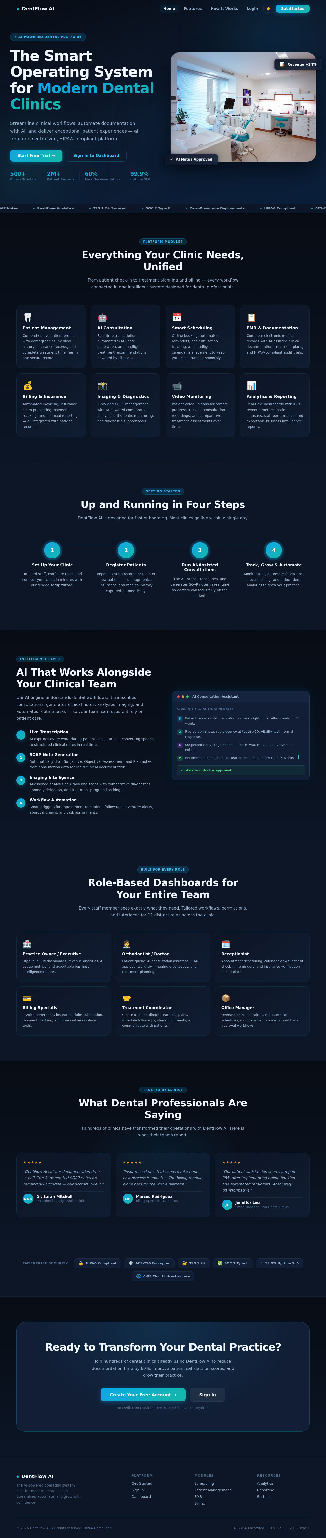
The Smart Operating System for Modern Dental Clinics
Streamline clinical workflows, automate documentation with AI, and deliver exceptional patient experiences — all from one centralized, HIPAA-compliant platform.

Everything Your Clinic Needs, Unified
From patient check-in to treatment planning and billing — every workflow connected in one intelligent system designed for dental professionals.
Patient Management
Comprehensive patient profiles with demographics, medical history, insurance records, and complete treatment timelines in one secure record.
AI Consultation
Real-time transcription, automated SOAP note generation, and intelligent treatment recommendations powered by clinical AI.
Smart Scheduling
Online booking, automated reminders, chair utilization tracking, and intelligent calendar management to keep your clinic running smoothly.
EMR & Documentation
Complete electronic medical records with AI-assisted clinical documentation, treatment plans, and HIPAA-compliant audit trails.
Billing & Insurance
Automated invoicing, insurance claim processing, payment tracking, and financial reporting — all integrated with patient records.
Imaging & Diagnostics
X-ray and CBCT management with AI-powered comparative analysis, orthodontic monitoring, and diagnostic support tools.
Video Monitoring
Patient video uploads for remote progress tracking, consultation recordings, and comparative treatment assessments over time.
Analytics & Reporting
Real-time dashboards with KPIs, revenue metrics, patient statistics, staff performance, and exportable business intelligence reports.
Up and Running in Four Steps
DentFlow AI is designed for fast onboarding. Most clinics go live within a single day.
Set Up Your Clinic
Onboard staff, configure roles, and connect your clinic in minutes with our guided setup wizard.
Register Patients
Import existing records or register new patients — demographics, insurance, and medical history captured automatically.
Run AI-Assisted Consultations
The AI listens, transcribes, and generates SOAP notes in real time so doctors can focus fully on the patient.
Track, Grow & Automate
Monitor KPIs, automate follow-ups, process billing, and unlock deep analytics to grow your practice.
AI That Works Alongside Your Clinical Team
Our AI engine understands dental workflows. It transcribes consultations, generates clinical notes, analyzes imaging, and automates routine tasks — so your team can focus entirely on patient care.
Live Transcription
AI captures every word during patient consultations, converting speech to structured clinical notes in real time.
SOAP Note Generation
Automatically draft Subjective, Objective, Assessment, and Plan notes from consultation data for rapid clinical documentation.
Imaging Intelligence
AI-assisted analysis of X-rays and scans with comparative diagnostics, anomaly detection, and treatment progress tracking.
Workflow Automation
Smart triggers for appointment reminders, follow-ups, inventory alerts, approval chains, and task assignments.
Role-Based Dashboards for Your Entire Team
Every staff member sees exactly what they need. Tailored workflows, permissions, and interfaces for 11 distinct roles across the clinic.
Practice Owner / Executive
High-level KPI dashboards, revenue analytics, AI usage metrics, and exportable business intelligence reports.
Orthodontist / Doctor
Patient queue, AI consultation assistant, SOAP approval workflow, imaging diagnostics, and treatment planning.
Receptionist
Appointment scheduling, calendar views, patient check-in, reminders, and insurance verification in one place.
Billing Specialist
Invoice generation, insurance claim submission, payment tracking, and financial reconciliation tools.
Treatment Coordinator
Create and coordinate treatment plans, schedule follow-ups, share documents, and communicate with patients.
Office Manager
Oversee daily operations, manage staff schedules, monitor inventory alerts, and track approval workflows.
What Dental Professionals Are Saying
Hundreds of clinics have transformed their operations with DentFlow AI. Here is what their teams report.
"DentFlow AI cut our documentation time in half. The AI-generated SOAP notes are remarkably accurate — our doctors love it."
"Insurance claims that used to take hours now process in minutes. The billing module alone paid for the whole platform."
"Our patient satisfaction scores jumped 28% after implementing online booking and automated reminders. Absolutely transformative."
Ready to Transform Your Dental Practice?
Join hundreds of dental clinics already using DentFlow AI to reduce documentation time by 60%, improve patient satisfaction scores, and grow their practice.
No credit card required. Free 30-day trial. Cancel anytime.
No comments yet. Be the first!