test-123
 Moksh Nahar
Build a standalone pixel-accurate recreation of the Palomar Labs marketing landing page: fixed navbar + full-viewport video hero only. No other sections. Match this spec exactly. Do not invent extra copy, buttons, gradients, overlays, or decorative blobs. Stack React + TypeScript + Vite Tailwind CSS lucide-react icons: ChevronDown, ArrowRight, Triangle Single App.tsx with Navbar, Hero, TrustedBy Exact assets and URLs (do not change) Background video (must be this exact CloudFront URL): https://d8j0ntlcm91z4.cloudfront.net/user_38xzZboKViGWJOttwIXH07lWA1P/hf_20260820_010308_b1636845-4c15-4ab6-b0c9-9a29bfb0c6e3.mp4 Fonts in index.html: <link href="https://db.onlinewebfonts.com/c/0e6de1ec911a2e267ff136bbdd384a44?family=Helvetica+Neue+Light" rel="stylesheet"> <link href="https://fonts.googleapis.com/css2?family=Playfair+Display:wght@700&family=Oswald:wght@500&family=Montserrat:wght@700&family=Roboto+Slab:wght@600&family=Raleway:wght@700&display=swap" rel="stylesheet"> Page title: Palomar - One Unified System for LLMs Color tokens (Tailwind theme.extend.colors.brand) dark: #2d3a2e green: #3d5a3e light: #f5f3ef cream: #faf8f5 Font families (Tailwind theme.extend.fontFamily) helvetica-neue: "Helvetica Neue Light", Helvetica, Arial, sans-serif playfair: "Playfair Display", serif oswald: "Oswald", sans-serif montserrat: "Montserrat", sans-serif roboto-slab: "Roboto Slab", serif raleway: "Raleway", sans-serif Body: font-family: 'Helvetica Neue Light', Helvetica, Arial, sans-serif; with antialiasing. Global * { margin:0; padding:0; box-sizing:border-box; }. html { scroll-behavior: smooth; }. Root app wrapper: font-helvetica-neue. Background of the hero section: bg-brand-cream (#faf8f5). Animations (global CSS, exact) @keyframes fade-up { from { opacity: 0; transform: translateY(20px); } to { opacity: 1; transform: translateY(0); } } @keyframes fade-down { from { opacity: 0; transform: translateY(-12px); } to { opacity: 1; transform: translateY(0); } } .animate-fade-up { animation: fade-up 0.8s cubic-bezier(0.16, 1, 0.3, 1) both; } .animate-fade-down { animation: fade-down 0.7s cubic-bezier(0.16, 1, 0.3, 1) both; } .stagger-1 { animation-delay: 0ms; } .stagger-2 { animation-delay: 120ms; } .stagger-3 { animation-delay: 240ms; } .stagger-4 { animation-delay: 360ms; } .stagger-5 { animation-delay: 480ms; } .stagger-6 { animation-delay: 600ms; } 1) Navbar Fixed top-0 left-0 right-0 z-50. Transition duration-300. If window.scrollY > 20: bg-brand-cream/90 backdrop-blur-md shadow-sm Else: bg-transparent Inner container: max-w-7xl mx-auto px-6 lg:px-8. Bar: relative flex items-center h-16 md:h-20. Desktop left links (hidden md:flex items-center gap-8, animate-fade-down stagger-1) All: text-sm text-brand-dark tracking-wide uppercase hover:opacity-70 transition-opacity Button: Solutions + ChevronDown w-3.5 h-3.5, flex items-center gap-1 Anchor: Plans Anchor: News Center logo (absolute centered) absolute left-1/2 -translate-x-1/2 flex items-center gap-2 animate-fade-down stagger-2 Lucide Triangle: w-5 h-5 text-brand-dark fill-brand-dark Text Palomar: text-xl text-brand-dark tracking-tight font-helvetica-neue Desktop CTA (right) hidden md:inline-flex items-center ml-auto px-5 py-2.5 bg-brand-dark text-white text-sm tracking-wide uppercase rounded-full hover:bg-brand-green transition-colors animate-fade-down stagger-3 Label: Try It Free Mobile hamburger (md:hidden, ml-auto, z-50, w-10 h-10, aria-label="Toggle menu") Two 2px bars (w-6 h-[2px] bg-brand-dark rounded) with transition-all duration-300 ease-[cubic-bezier(0.68,-0.6,0.32,1.6)]: Top bar at top-[6px]. Open: rotate-45 translate-y-[5px] Bottom bar at top-[13px]. Open: -rotate-45 When open, lock document.body.style.overflow = 'hidden'. Mobile overlay (md:hidden) fixed inset-0 bg-brand-cream z-40 Transition duration-500 ease-[cubic-bezier(0.22,1,0.36,1)] Open: opacity-100 pointer-events-auto Closed: opacity-0 pointer-events-none Inner column: flex flex-col items-center justify-center h-full gap-8, same 500ms ease, delay-100 Open: translate-y-0 opacity-100 Closed: -translate-y-8 opacity-0 Links (each text-3xl text-brand-dark tracking-tight): Solutions, Plans, News CTA: mt-4 inline-flex items-center px-8 py-3.5 bg-brand-dark text-white text-lg tracking-wide rounded-full → Try It Free Clicking any item closes the menu. No dropdown panel for Solutions — it is a button on desktop and a simple link on mobile. 2) Hero section.relative.w-full.h-screen.min-h-[700px].overflow-hidden.bg-brand-cream Video layer div.absolute.inset-0 wrapping <video>: src = the CloudFront URL above autoPlay muted loop playsInline class: w-full h-full object-cover object-bottom No dark overlay, no gradient, no poster image Content column (sits on top of video, left-aligned, not vertically centered) relative z-10 flex flex-col items-start max-w-7xl mx-auto pt-28 md:pt-36 px-6 lg:px-8 Announcement pill Anchor, inline-flex items-center gap-2 px-4 py-2 rounded-full border border-brand-dark/15 bg-white/60 backdrop-blur-sm hover:bg-white/80 transition-colors mb-5 md:mb-6 animate-fade-up stagger-3 Text text-sm text-brand-dark: Live for everyone today! Offering $1MM in credits. ArrowRight w-3.5 h-3.5 text-brand-dark Headline h1 classes: text-left text-3xl sm:text-4xl md:text-5xl lg:text-6xl text-brand-dark leading-[1.05] tracking-tight max-w-4xl font-helvetica-neue animate-fade-up stagger-4 Exact copy with a line break only from sm and up: One unified system to build, test, ship, and observe LLMs Implementation: first line, then <br className="hidden sm:block" />, then a space, then test, ship, and observe LLMs. On <640px it wraps naturally as one block. No subtitle, no primary CTA in the hero body. 3) Trusted by (inside Hero, under headline) Wrapper: w-full mt-8 md:mt-10 animate-fade-up stagger-5 Label: text-left text-xs tracking-[0.25em] uppercase text-brand-dark/50 mb-6 md:mb-8 font-helvetica-neue → Backed by Logo row: flex flex-wrap items-center justify-start gap-6 md:gap-12 lg:gap-16 animate-fade-up stagger-6 Five wordmarks as text (not images), text-lg md:text-xl lg:text-2xl text-brand-dark/80 whitespace-nowrap: Meridian — font-playfair (Playfair Display 700) STELLEX — font-oswald uppercase (Oswald 500) Luminar — font-montserrat (Montserrat 700) OVERLAND — font-roboto-slab uppercase (Roboto Slab 600) Kinetic — font-raleway (Raleway 700) Responsive rules (must match) < md (768px): hamburger + full-screen cream overlay; hide desktop links and CTA; nav height h-16; hero padding pt-28 px-6; logo gaps gap-6; headline text-3xl then sm:text-4xl md+: three left links, centered logo, right pill CTA; nav h-20; hero pt-36; logo gaps md:gap-12 lg+: container px-8; headline lg:text-6xl; logo gaps lg:gap-16 Hero always h-screen with min-h-[700px] Content always left-aligned (items-start, text-left, justify-start) Video always object-cover object-bottom so the bottom of the footage stays framed Visual character Quiet, editorial, cream/forest. Light Helvetica Neue, not heavy Inter/SF. Centered triangle + Palomar wordmark. Frosted white pill over a full-bleed landscape video. Wordmark “logos” in mixed display fonts, not SVG brand files. Entrance: nav fades down (stagger 0 / 120 / 240ms); pill, headline, backed-by fade up (240 / 360 / 480 / 600ms). Do not add Footer, extra sections, search, language switcher, social icons, video controls, mute button, overlay scrim, second headline, hero “Get started” button, Solutions mega-menu content, or any other video URL. Implement this as one working page that looks identical on desktop and mobile.

Comments (0)
Sign in to leave a comment
System Requirements
System Requirements Document for test-123
1. Introduction
The project aims to create a standalone, pixel-accurate recreation of the Palomar Labs marketing landing page. This page will feature a fixed navbar and a full-viewport video hero section, using React, TypeScript, Vite, and Tailwind CSS. The design will adhere strictly to the specified assets, styles, and animations without adding any extra elements. The target audience is site visitors who will interact with the page's navigation and hero content.
2. System Overview
This document outlines the requirements for delivering a precise recreation of the Palomar Labs marketing landing page. The page will include a fixed navbar and a full-viewport video hero section, with no additional sections. The implementation will use React, TypeScript, Vite, and Tailwind CSS, ensuring pixel-perfect accuracy to the specified design. The page will be responsive, providing a seamless experience on both desktop and mobile devices.
2a. Product Interpretation and Delivery Boundary
The product is a standalone marketing landing page with a fixed navbar and a full-viewport video hero section. It will not include any additional sections, such as footers, search bars, or social icons. The page will use specified assets and URLs, including a CloudFront video URL and font URLs, without modification. The design will follow a quiet, editorial aesthetic inspired by Jony Ive, with a focus on precision and functionality.
2b. Source Content Inventory
- Background Video URL: CloudFront Video
- Font URLs:
2c. Page Content and Component Coverage
Landing
-
Navbar
- Fixed position with transition effects
- Responsive design with desktop and mobile variations
- Includes links: Solutions, Plans, News, and a CTA button "Try It Free"
- Mobile hamburger menu with overlay and scroll lock
-
Hero Section
- Full-viewport video background with specified CloudFront URL
- Left-aligned content column with announcement pill and headline
- "Trusted by" section with text wordmarks for Meridian, STELLEX, Luminar, OVERLAND, and Kinetic
3. Functional Requirements
- As a Site Visitor, I should see a fixed navbar that transitions based on scroll position, ensuring a consistent navigation experience. (explicit)
- As a Site Visitor, I should interact with a full-viewport video hero section that plays automatically without controls, providing an immersive experience. (explicit)
- As a Site Visitor, I should be able to use the responsive mobile menu, which overlays the screen and locks scrolling when open, ensuring usability on mobile devices. (explicit)
- As a Site Visitor, I should see the exact announcement copy and headline with specified line-break behavior, maintaining the intended design. (explicit)
- As a Site Visitor, I should see the "Trusted by" section with specified text wordmarks, reinforcing brand credibility. (explicit)
4. User Personas
- Site Visitor: Interacts with the landing page, using the navigation, announcement link, and responsive mobile menu. The visitor views the hero content and engages with the page's interactive elements.
5. Core User Flows
-
Site Visitor Navigation Flow
- Trigger: Visitor lands on the page.
- Action: Interacts with the navbar links (Solutions, Plans, News) or the "Try It Free" CTA.
- Outcome: Navigation transitions smoothly based on scroll position.
-
Site Visitor Hero Interaction Flow
- Trigger: Visitor views the hero section.
- Action: Observes the autoplaying video and reads the announcement and headline.
- Outcome: Engages with the hero content without additional interactions.
-
Site Visitor Mobile Menu Flow
- Trigger: Visitor clicks the mobile hamburger icon.
- Action: Mobile menu overlays the screen, locking scroll.
- Outcome: Visitor selects a menu item, closing the menu and restoring scroll.
6. Visuals Colors and Theme
- Muse: Jony Ive
- Palette:
- Background: #faf8f5
- Surface: #f5f3ef
- Text: #2d3a2e
- Primary: #3d5a3e
- Accent: #f5f3ef
- Muted: #e0e0e0
- Typography:
- Headings: Helvetica Neue Light
- Body: Helvetica Neue Light
- Scale: 64/32/24/16
- Shape Language: Soft continuous curves, precise alignments
- Layout: Generous whitespace, centralized logo
7. Signature Design Concept
The landing page will feature a fixed navbar with smooth transition effects and a full-viewport video hero with a light cream background. The design will be minimalistic, with an elegant Helvetica Neue text for all navigation and headings, and a centered logo with minimalist iconography.
8. Interaction Model & Motion Direction
- Interaction Model: Animated
- Motion Tempo: Restrained
- Hero Dimensionality: Layered_2d
- Landing Hero Motion Brief: The hero section will feature a full-bleed video with a light cream background. The navbar will reveal on scroll with smooth transition effects, and the hero content will fade in with restrained motion.
9. Non-Functional Requirements
- Performance: The page must load quickly and perform smoothly on both desktop and mobile devices.
- Accessibility: The design must be accessible, with appropriate contrast and text sizes.
10. Tech Stack
- Frontend: React, TypeScript, Vite
- Styling: Tailwind CSS
- Icons: lucide-react
11. Assumptions and Constraints
- Assumptions: The specified assets and URLs will be available at runtime.
- Constraints: The page will not include any additional sections or elements beyond those specified.
12. Glossary
- Navbar: The fixed navigation bar at the top of the page.
- Hero Section: The full-viewport video section at the top of the page.
- CTA: Call to Action, a button prompting user interaction.
- Responsive Design: Design that adapts to different screen sizes and devices.
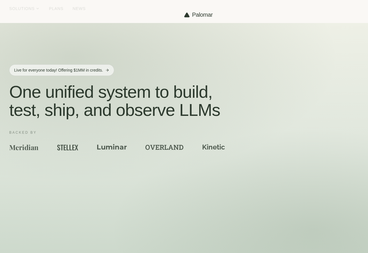
One unified system to build,
test, ship, and observe LLMs
Backed by
One unified system to build,
test, ship, and observe LLMs
Backed by
No comments yet. Be the first!