test-1
 Dhruv Mehta
**Recreate this exact single-page SaaS hero. Do not invent extra sections, extra pages, extra images, or extra copy. Implement only what is specified. Stack: one `index.html`, one `styles.css`, one `main.js`. No frameworks.** ### What this page is A single full-viewport landing hero for **Meridian — Revenue Intelligence for SaaS**. No footer, no extra sections, no scroll on desktop. White page with a full-bleed looping background video of painterly navy/orange mountains. UI is sharp-cornered (radius `0` everywhere). Type is Inter. Layout is a 3-row column: top nav, left-aligned hero, bottom-left lede. Page title: `Meridian — Revenue Intelligence for SaaS` `html lang="en"` `meta viewport width=device-width, initial-scale=1.0` --- ### Exact assets (use these URLs, do not substitute) **Google Fonts — Inter only, weights 300, 400, 500, 600, 700:** ``` https://fonts.googleapis.com https://fonts.gstatic.com (preconnect, crossorigin) https://fonts.googleapis.com/css2?family=Inter:wght@300;400;500;600;700&display=swap ``` **Background video (mandatory CloudFront URL, do not replace):** ``` https://d8j0ntlcm91z4.cloudfront.net/user_38xzZboKViGWJOttwIXH07lWA1P/hf_20260808_075824_7c8a2ef3-826c-43ca-81a1-162429faa306.mp4 ``` `<video class="bg-video" autoplay muted loop playsinline>` with one `<source type="video/mp4">`. No poster. No controls. There are **no other image/video assets**. Logo and arrows are inline SVG. --- ### Design tokens (`:root`) ``` --bg: #ffffff --text: #0a0a0a --muted: #1a1a1a --blue: #006cd2 --blue-dark: #0053a3 --headline-muted: #6b7378 --glass: rgba(0, 0, 0, 0.13) --glass-blur: 18px --glass-light: rgba(255, 255, 255, 0.28) --radius: 0 --font: "Inter", "Helvetica Neue", Helvetica, Arial, sans-serif --pad-x: clamp(20px, 3.52vw, 64px) --nav-top: clamp(16px, 2.05vw, 28px) --btn-icon: 36px --btn-pad-y: 12px --btn-pad-x: 22px ``` Global: `box-sizing: border-box`, all margins/paddings 0. `html, body { height: 100%; overflow: hidden }` `body`: Inter, `--bg`, `--text`, `-webkit-font-smoothing: antialiased`, `-moz-osx-font-smoothing: grayscale` Links inherit color, no underline. Buttons inherit font, no border, pointer cursor. --- ### Page shell `.page` is `position: relative; width: 100%; height: 100vh; height: 100dvh; display: flex; flex-direction: column; overflow: hidden` Padding: `var(--nav-top) var(--pad-x) clamp(28px, 4.9vw, 48px)` `.bg` is `position: absolute; inset: 0; z-index: 0; background: #ffffff; pointer-events: none; overflow: hidden` `.bg-video` is `position: absolute; inset: 0; width: 100%; height: 100%; object-fit: cover` `.nav`, `.hero`, `.lede`, `.mobile-menu` are `position: relative; z-index: 1` --- ### Header / nav 3-column CSS grid: `1fr auto 1fr`, items vertically centered. **Left — glass pill of links** (`.nav__links`, `aria-label="Primary"`): - Links (all `href="#"`): `Platform` · `Solutions` · `Company` · `Pricing` - Flex row, `gap: clamp(22px, 2.6vw, 32px)`, `justify-self: start` - Padding `24px 34px` - Background `var(--glass)`, `backdrop-filter: blur(18px)` (+ `-webkit-`), `border-radius: 0` - Link type: `clamp(13px, 1.37vw, 15px)`, weight `500`, tracking `-0.01em`, color `#0a0a0a`, `line-height: 1`, nowrap, `padding-bottom: 2px` - Hover: color `#006cd2`, `translateY(-2px)`, 0.22s `cubic-bezier(0.16, 1, 0.3, 1)` - Underline bar `::after`: 3px tall, `#006cd2`, `bottom: -6px`, full width, `scaleX(0)` from left, hover `scaleX(1)`, 0.28s same easing **Center — logo** (`<a class="logo" href="#" aria-label="Meridian">`): Inline SVG, `viewBox="0 0 42 34"`, rendered width `clamp(30px, 3.2vw, 38px)`, `fill: currentColor` (`#0a0a0a`). Six parallelograms: ``` <polygon points="12,0 30,0 33.2,3.2 15.2,3.2" /> <polygon points="14.6,5.6 32.6,5.6 35.8,8.8 17.8,8.8" /> <polygon points="17.2,11.2 35.2,11.2 38.4,14.4 20.4,14.4" /> <polygon points="3.2,16.8 21.2,16.8 24.4,20 6.4,20" /> <polygon points="5.8,22.4 23.8,22.4 27,25.6 9,25.6" /> <polygon points="8.4,28 26.4,28 29.6,31.2 11.6,31.2" /> ``` Hover: `scale(1.1)`, 0.35s `cubic-bezier(0.16, 1, 0.3, 1)` Each polygon: `transform-box: fill-box; transform-origin: left center` Entrance `mark-in` 0.5s same easing, `backwards`: from `opacity 0` + `translate3d(-12px, 8px, 0)` Delays: 0.04 / 0.09 / 0.14 / 0.19 / 0.24 / 0.29s **Right — nav Book Demo** (`.btn.btn--nav`, `justify-self: end`): - Label `Book Demo` + 36×36 icon square - Arrow SVG `viewBox="0 0 20 20"`, path `M4 10h10.2M10.4 5.6 15.2 10l-4.8 4.4`, stroke currentColor, width 1.7, round caps/joins, no fill. CSS sizes the svg to 14×14. - Background `#006cd2`, text white - Icon square `#0053a3`, white arrow - Hover icon: white bg, blue arrow - Hover wipe `::before` fill `#004a96` (see buttons) - Entrance: `wipe-right` 0.65s, delay 0.16s, `backwards` **Burger** (hidden on desktop, shown ≤820px): - 36×36, 3 bars: 18×1.5px, `#0a0a0a`, gap 5px - Hover: scale 1.08; bars turn `#006cd2`; first and third bars shrink to 14px - `aria-label="Open menu"`, `aria-expanded="false"`, `aria-controls="mobile-menu"` - JS toggles `.is-open`, `aria-expanded`, label Open/Close, and `hidden` on `#mobile-menu`. Escape and any menu link close it. There is **no X-transform CSS** for `.is-open` — bars stay 3 lines. **Mobile menu** (`#mobile-menu`, `hidden` by default): - Same 4 links + same Book Demo button - Column, gap 1.25rem, padding `1.25rem 0 0.5rem` - Links wrap: padding `16px 20px`, glass bg + 18px blur, column gap 0.9rem, font 1.05rem / 500 Nav link entrance (`link-in` 0.55s, `backwards`): from `opacity 0` + `translate3d(-16px, 0, 0)` Delays: Platform 0.02s, Solutions 0.08s, Company 0.14s, Pricing 0.2s Burger uses `link-in` 0.5s delay 0.16s --- ### Buttons (shared) All `.btn`: - `inline-flex`, align center, **height 58px**, `border-radius: 0` - Padding `12px 10px 12px 22px`, gap 18px - Font 16px / 500 / tracking `-0.015em` / line-height 1 / nowrap - `::before` absolute inset 0, `scaleX(0)` from left, hover `scaleX(1)`, 0.4s `cubic-bezier(0.16, 1, 0.3, 1)`, `pointer-events: none` - Label and icon `z-index: 1` above the wipe **`.btn--nav`:** blue `#006cd2` / white; icon `#0053a3`; wipe `#004a96` **`.btn--light`:** white bg / `#006cd2` text; icon `#006cd2` with white arrow; wipe `#e8f2fb` **`.btn--ghost`:** padding `12px 26px` (no icon); color `#0a0a0a`; bg `rgba(255,255,255,0.55)`; blur 24px; wipe `rgba(255,255,255,0.78)` at z-index 0. Hover keeps same 0.55 white + 24px blur. --- ### Hero (left column, not centered) `.hero { margin-top: clamp(52px, 10.15vh, 92px); max-width: none }`

Comments (0)
Sign in to leave a comment
System Requirements
System Requirements Document for test-1
1. Introduction
The project aims to recreate an exact single-page SaaS hero for "Meridian — Revenue Intelligence for SaaS." The page is designed to be a full-viewport landing hero with a looping background video, sharp-cornered UI, and specific typography. The implementation will use only HTML, CSS, and JavaScript without any frameworks, adhering strictly to the provided specifications.
2. System Overview
The system delivers a single-page landing hero for Meridian, focusing on revenue intelligence for SaaS. It is designed for public visitors who can access the page anonymously. The page features a full-bleed video background, a three-row layout with navigation, a hero section, and a lede. The design adheres to strict constraints, including the use of specified assets and design tokens.
2a. Product Interpretation and Delivery Boundary
The product is a single-page application with no additional sections or pages. It uses specified assets, including a background video and Google Fonts. The page is accessible to public visitors without requiring any account or login. The implementation is limited to one index.html, one styles.css, and one main.js file, with no frameworks allowed.
2b. Source Content Inventory
- Google Fonts: Inter font family at weights 300, 400, 500, 600, 700.
- Background Video: Mandatory CloudFront URL for the video asset.
- Design Tokens: Specified in the
:rootCSS.
2c. Page Content and Component Coverage
Landing
-
Background Video
- Full-bleed, looping video of painterly navy/orange mountains.
<video class="bg-video" autoplay muted loop playsinline>with one<source type="video/mp4">.
-
Navigation
- Three-column CSS grid:
1fr auto 1fr. - Left: Glass pill of links (
Platform,Solutions,Company,Pricing). - Center: Inline SVG logo.
- Right:
Book Demobutton with arrow icon. - Burger menu for ≤820px widths.
- Three-column CSS grid:
-
Hero Section
- Left-aligned content with oversized typography.
- No additional images or sections.
-
Lede
- Bottom-left aligned text.
3. Functional Requirements
- As a Site visitor, I should be able to view the full-viewport landing hero with a looping background video. [explicit]
- As a Site visitor, I should be able to navigate using the links
Platform,Solutions,Company,Pricing, andBook Demo. [explicit] - As a Site visitor, I should see the navigation transform into a burger menu at widths of 820px or less. [explicit]
- As a Site visitor, I should be able to toggle the burger menu to access navigation links and the
Book Demobutton. [explicit]
4. User Personas
- Site visitor: Interacts with the landing hero, views the Meridian SaaS positioning, and uses navigation or demo-entry actions.
5. Core User Flows
-
Landing Page Access
- Trigger: Public visitor accesses the page.
- Action: View the full-viewport landing hero with a looping video.
- Outcome: Visitor sees the navigation, hero section, and lede.
-
Navigation Interaction
- Trigger: Visitor interacts with navigation links.
- Action: Click on
Platform,Solutions,Company,Pricing, orBook Demo. - Outcome: Navigation link is highlighted, and the visitor is directed to the respective section or action.
-
Responsive Navigation
- Trigger: Visitor accesses the page on a device ≤820px wide.
- Action: Burger menu is displayed.
- Outcome: Visitor can toggle the menu to access navigation links and the
Book Demobutton.
6. Visuals Colors and Theme
- Muse: Tobias van Schneider
- Palette: Background #f5f5f5, surface #ffffff, text #0a0a0a, primary #ff3c00, accent #ff3c00, muted #6b6b6b.
- Typography: Headings Playfair Display, body Source Sans Pro.
- Shape Language: Sharp corners, asymmetric editorial grids.
- Imagery: Full-bleed video of painterly mountains.
7. Signature Design Concept
The landing hero features a full-bleed video background with left-aligned hero text. The oversized Playfair Display headline spans the viewport, with a bold orange accent for interactive elements. The editorial grid layout with sharp corners and minimal UI chrome creates a sophisticated and memorable visual impact.
8. Interaction Model & Motion Direction
- Interaction Model: Static
- Motion Tempo: Restrained
- Hero Dimensionality: Flat
- Landing Hero Motion Brief: The logo and nav links have slow entrance animations, creating a sophisticated feel. The video background provides an immersive experience.
9. Non-Functional Requirements
- The page must load quickly and efficiently, using the specified assets and design tokens.
- The design must be responsive, adapting to different screen sizes without losing functionality or visual integrity.
10. Tech Stack
- HTML: For structuring the page.
- CSS: For styling, using the specified design tokens.
- JavaScript: For interactive elements like the burger menu.
11. Assumptions and Constraints
- The page will be implemented using only HTML, CSS, and JavaScript, with no frameworks.
- The design and functionality are limited to what is specified, with no additional sections or features.
12. Glossary
- SaaS: Software as a Service.
- Hero: The main visual section of a webpage, typically the first thing a visitor sees.
- Burger Menu: A menu icon that expands to show navigation links on smaller screens.
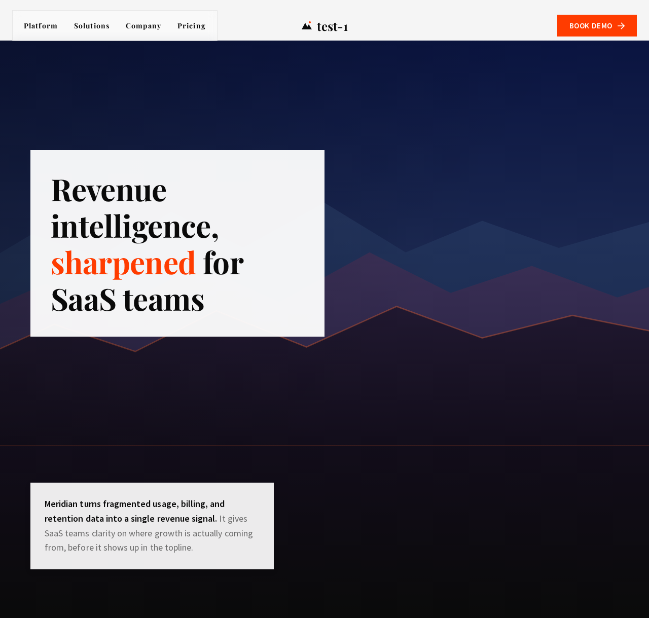
Revenue intelligence, sharpened for SaaS teams
Meridian turns fragmented usage, billing, and retention data into a single revenue signal. It gives SaaS teams clarity on where growth is actually coming from, before it shows up in the topline.
Revenue intelligence, sharpened for SaaS teams
Meridian turns fragmented usage, billing, and retention data into a single revenue signal. It gives SaaS teams clarity on where growth is actually coming from, before it shows up in the topline.
No comments yet. Be the first!