test-1
 Dhruv Mehta
**Recreate this exact single-page SaaS hero. Do not invent extra sections, extra pages, extra images, or extra copy. Implement only what is specified. Stack: one `index.html`, one `styles.css`, one `main.js`. No frameworks.** ### What this page is A single full-viewport landing hero for **Meridian — Revenue Intelligence for SaaS**. No footer, no extra sections, no scroll on desktop. White page with a full-bleed looping background video of painterly navy/orange mountains. UI is sharp-cornered (radius `0` everywhere). Type is Inter. Layout is a 3-row column: top nav, left-aligned hero, bottom-left lede. Page title: `Meridian — Revenue Intelligence for SaaS` `html lang="en"` `meta viewport width=device-width, initial-scale=1.0` --- ### Exact assets (use these URLs, do not substitute) **Google Fonts — Inter only, weights 300, 400, 500, 600, 700:** ``` https://fonts.googleapis.com https://fonts.gstatic.com (preconnect, crossorigin) https://fonts.googleapis.com/css2?family=Inter:wght@300;400;500;600;700&display=swap ``` **Background video (mandatory CloudFront URL, do not replace):** ``` https://d8j0ntlcm91z4.cloudfront.net/user_38xzZboKViGWJOttwIXH07lWA1P/hf_20260808_075824_7c8a2ef3-826c-43ca-81a1-162429faa306.mp4 ``` `<video class="bg-video" autoplay muted loop playsinline>` with one `<source type="video/mp4">`. No poster. No controls. There are **no other image/video assets**. Logo and arrows are inline SVG. --- ### Design tokens (`:root`) ``` --bg: #ffffff --text: #0a0a0a --muted: #1a1a1a --blue: #006cd2 --blue-dark: #0053a3 --headline-muted: #6b7378 --glass: rgba(0, 0, 0, 0.13) --glass-blur: 18px --glass-light: rgba(255, 255, 255, 0.28) --radius: 0 --font: "Inter", "Helvetica Neue", Helvetica, Arial, sans-serif --pad-x: clamp(20px, 3.52vw, 64px) --nav-top: clamp(16px, 2.05vw, 28px) --btn-icon: 36px --btn-pad-y: 12px --btn-pad-x: 22px ``` Global: `box-sizing: border-box`, all margins/paddings 0. `html, body { height: 100%; overflow: hidden }` `body`: Inter, `--bg`, `--text`, `-webkit-font-smoothing: antialiased`, `-moz-osx-font-smoothing: grayscale` Links inherit color, no underline. Buttons inherit font, no border, pointer cursor. --- ### Page shell `.page` is `position: relative; width: 100%; height: 100vh; height: 100dvh; display: flex; flex-direction: column; overflow: hidden` Padding: `var(--nav-top) var(--pad-x) clamp(28px, 4.9vw, 48px)` `.bg` is `position: absolute; inset: 0; z-index: 0; background: #ffffff; pointer-events: none; overflow: hidden` `.bg-video` is `position: absolute; inset: 0; width: 100%; height: 100%; object-fit: cover` `.nav`, `.hero`, `.lede`, `.mobile-menu` are `position: relative; z-index: 1` --- ### Header / nav 3-column CSS grid: `1fr auto 1fr`, items vertically centered. **Left — glass pill of links** (`.nav__links`, `aria-label="Primary"`): - Links (all `href="#"`): `Platform` · `Solutions` · `Company` · `Pricing` - Flex row, `gap: clamp(22px, 2.6vw, 32px)`, `justify-self: start` - Padding `24px 34px` - Background `var(--glass)`, `backdrop-filter: blur(18px)` (+ `-webkit-`), `border-radius: 0` - Link type: `clamp(13px, 1.37vw, 15px)`, weight `500`, tracking `-0.01em`, color `#0a0a0a`, `line-height: 1`, nowrap, `padding-bottom: 2px` - Hover: color `#006cd2`, `translateY(-2px)`, 0.22s `cubic-bezier(0.16, 1, 0.3, 1)` - Underline bar `::after`: 3px tall, `#006cd2`, `bottom: -6px`, full width, `scaleX(0)` from left, hover `scaleX(1)`, 0.28s same easing **Center — logo** (`<a class="logo" href="#" aria-label="Meridian">`): Inline SVG, `viewBox="0 0 42 34"`, rendered width `clamp(30px, 3.2vw, 38px)`, `fill: currentColor` (`#0a0a0a`). Six parallelograms: ``` <polygon points="12,0 30,0 33.2,3.2 15.2,3.2" /> <polygon points="14.6,5.6 32.6,5.6 35.8,8.8 17.8,8.8" /> <polygon points="17.2,11.2 35.2,11.2 38.4,14.4 20.4,14.4" /> <polygon points="3.2,16.8 21.2,16.8 24.4,20 6.4,20" /> <polygon points="5.8,22.4 23.8,22.4 27,25.6 9,25.6" /> <polygon points="8.4,28 26.4,28 29.6,31.2 11.6,31.2" /> ``` Hover: `scale(1.1)`, 0.35s `cubic-bezier(0.16, 1, 0.3, 1)` Each polygon: `transform-box: fill-box; transform-origin: left center` Entrance `mark-in` 0.5s same easing, `backwards`: from `opacity 0` + `translate3d(-12px, 8px, 0)` Delays: 0.04 / 0.09 / 0.14 / 0.19 / 0.24 / 0.29s **Right — nav Book Demo** (`.btn.btn--nav`, `justify-self: end`): - Label `Book Demo` + 36×36 icon square - Arrow SVG `viewBox="0 0 20 20"`, path `M4 10h10.2M10.4 5.6 15.2 10l-4.8 4.4`, stroke currentColor, width 1.7, round caps/joins, no fill. CSS sizes the svg to 14×14. - Background `#006cd2`, text white - Icon square `#0053a3`, white arrow - Hover icon: white bg, blue arrow - Hover wipe `::before` fill `#004a96` (see buttons) - Entrance: `wipe-right` 0.65s, delay 0.16s, `backwards` **Burger** (hidden on desktop, shown ≤820px): - 36×36, 3 bars: 18×1.5px, `#0a0a0a`, gap 5px - Hover: scale 1.08; bars turn `#006cd2`; first and third bars shrink to 14px - `aria-label="Open menu"`, `aria-expanded="false"`, `aria-controls="mobile-menu"` - JS toggles `.is-open`, `aria-expanded`, label Open/Close, and `hidden` on `#mobile-menu`. Escape and any menu link close it. There is **no X-transform CSS** for `.is-open` — bars stay 3 lines. **Mobile menu** (`#mobile-menu`, `hidden` by default): - Same 4 links + same Book Demo button - Column, gap 1.25rem, padding `1.25rem 0 0.5rem` - Links wrap: padding `16px 20px`, glass bg + 18px blur, column gap 0.9rem, font 1.05rem / 500 Nav link entrance (`link-in` 0.55s, `backwards`): from `opacity 0` + `translate3d(-16px, 0, 0)` Delays: Platform 0.02s, Solutions 0.08s, Company 0.14s, Pricing 0.2s Burger uses `link-in` 0.5s delay 0.16s --- ### Buttons (shared) All `.btn`: - `inline-flex`, align center, **height 58px**, `border-radius: 0` - Padding `12px 10px 12px 22px`, gap 18px - Font 16px / 500 / tracking `-0.015em` / line-height 1 / nowrap - `::before` absolute inset 0, `scaleX(0)` from left, hover `scaleX(1)`, 0.4s `cubic-bezier(0.16, 1, 0.3, 1)`, `pointer-events: none` - Label and icon `z-index: 1` above the wipe **`.btn--nav`:** blue `#006cd2` / white; icon `#0053a3`; wipe `#004a96` **`.btn--light`:** white bg / `#006cd2` text; icon `#006cd2` with white arrow; wipe `#e8f2fb` **`.btn--ghost`:** padding `12px 26px` (no icon); color `#0a0a0a`; bg `rgba(255,255,255,0.55)`; blur 24px; wipe `rgba(255,255,255,0.78)` at z-index 0. Hover keeps same 0.55 white + 24px blur. --- ### Hero (left column, not centered) `.hero { margin-top: clamp(52px, 10.15vh, 92px); max-width: none }`

Comments (0)
Sign in to leave a comment
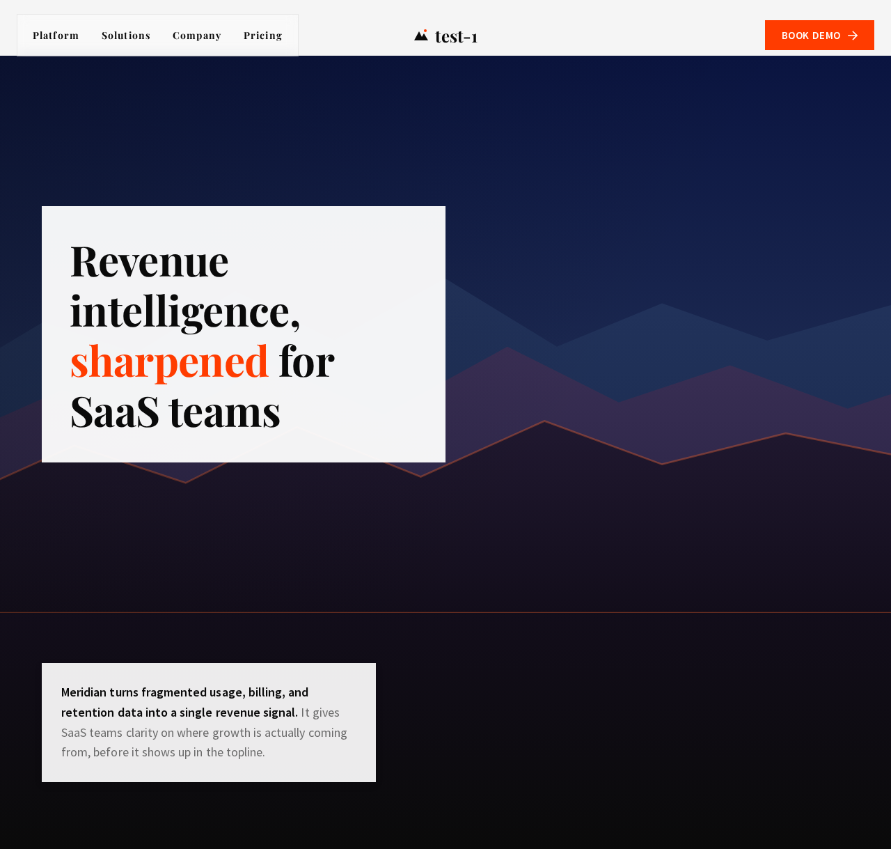
Revenue intelligence, sharpened for SaaS teams
Meridian turns fragmented usage, billing, and retention data into a single revenue signal. It gives SaaS teams clarity on where growth is actually coming from, before it shows up in the topline.
Revenue intelligence, sharpened for SaaS teams
Meridian turns fragmented usage, billing, and retention data into a single revenue signal. It gives SaaS teams clarity on where growth is actually coming from, before it shows up in the topline.
No comments yet. Be the first!