sweet-build
 Wolverine Xman
Build me a website for a Backery called Pastries use React js and use this prompt for ui design and a real Saas business project built with all features complete the website both frontend backend and database as Supabase **Build a single-page React + TypeScript landing page for a travel app called "Wandor" using Vite, Tailwind CSS, and lucide-react. The page is a full-viewport hero section with a looping background video, a frosted-glass prompt card, and a navigation bar.** **Fonts (load in index.html `<head>`):** - Google Fonts link: `https://fonts.googleapis.com/css2?family=Special+Elite&family=Geist:wght@400;500;600;700&display=swap` - Include preconnect to fonts.googleapis.com and fonts.gstatic.com (crossorigin). - Body / UI font: "Geist" (sans-serif), weights 400/500/600/700. - Logo font: "Special Elite" (typewriter serif), used only for the wordmark. - Page title: `Wandor — Where will you go next?` **Tailwind config (tailwind.config.js) — extend theme:** - `fontFamily.sans`: `['Geist', 'sans-serif']` - `fontFamily.display`: `['Special Elite', 'serif']` - Custom colors under key `wandor`: - `dark: '#0a0a0a'` - `text: '#1a1a1a'` - `muted: '#767676'` - `prompt: '#905831'` (a brown/terracotta) **Global CSS (index.css):** - Standard Tailwind directives (base/components/utilities). - `body`: `font-family: 'Geist', sans-serif; overflow-x: hidden; background: #fff;` **Layout — single `<section>` that fills the viewport:** - Section: `relative min-h-svh w-full overflow-hidden`. **Background video (z-0):** - `<video>` absolutely positioned `inset-0 w-full h-full object-cover z-0`. - Exact `src`: `https://pollen-batch-41236914.figma.site/_components/v2/f0ee2dae7671c170c34f12e31c4cb41418976c98/769c564298c132f7919405cd9f17c1b1231f341d.769c5642.mp4` - Attributes: `autoPlay muted loop playsInline`. **Top gradient overlay (z-1):** - Absolutely positioned `inset-x-0 top-0 h-[687px] pointer-events-none z-[1]`. - Inline style background: `linear-gradient(180deg, rgba(255,255,255,1) 0%, rgba(255,255,255,0) 100%)` — a white-to-transparent vertical fade covering the top 687px so the nav and headline read clearly over the video. **Content wrapper (z-2):** - `relative z-[2] max-w-[1360px] mx-auto`. **Navigation bar:** - `<nav>`: `flex items-center justify-between px-20 pt-6 pb-4` (mobile: `px-6 pt-5`). - Left: wordmark `<span className="font-display text-[40px] text-black leading-none select-none">wandor</span>` (mobile: `text-[32px]`). - Center: absolutely centered group `absolute left-1/2 -translate-x-1/2 flex gap-8` (hidden on mobile via `max-md:hidden`). Three buttons: "Discover", "Pricing", "FAQs". Each button: `bg-transparent border-none cursor-pointer font-sans text-[15px] font-medium uppercase text-wandor-text tracking-[0.04em] transition-opacity hover:opacity-55`. - Right: flex group `flex items-center gap-8`: - "Login" button (hidden on mobile): `bg-transparent border-none cursor-pointer font-sans text-[15px] font-semibold uppercase text-[#292929] tracking-[0.04em] transition-opacity hover:opacity-55`. - "Plan My Trip" button: `bg-wandor-dark text-[#fafafa] border-none cursor-pointer font-sans text-[15px] font-medium uppercase tracking-[0.04em] px-5 py-3.5 rounded-full transition-all hover:bg-[#333] active:scale-95`. **Hero body:** - Container: `flex flex-col items-center px-6 pt-16 pb-24 text-center`. - Headline `<h1>`: `font-sans text-[clamp(40px,6vw,68px)] font-medium text-wandor-text leading-[1.05] tracking-[-0.04em] max-w-[820px] mb-5`. Text: "Where will you go next?" - Subtitle `<p>`: `font-sans text-xl font-medium text-wandor-muted leading-relaxed max-w-[500px] mb-10`. Text: "Tell our AI where you're going and what you love. We'll create a personalized itinerary for you." **Liquid glass prompt card:** - Wrapper `<div>`: `relative w-[701px] max-md:w-[calc(100vw-48px)] min-h-[208px] bg-white/[0.06] border-[3px] border-white rounded-[44px] shadow-[0_0_4px_0_rgba(0,0,0,0.15)] overflow-hidden backdrop-blur-[20px]`. This is the liquid-glass effect: very low-opacity white fill, thick white border, heavy backdrop blur, soft shadow, large pill radius. - Prompt text `<p>`: absolutely positioned `left-[29px] top-[57px] -translate-y-1/2 w-[609px] max-md:w-[calc(100%-58px)] font-sans text-xl max-md:text-[17px] font-medium text-wandor-prompt leading-relaxed break-words`. Text: "I'm planning a 7-day trip to Japan in October. I love food, hidden cafes, scenic hikes, and want to avoid crowds...." (note the trailing "...."). - "Plan My Trip" CTA button inside card: `absolute bottom-[21px] right-[21px] w-[156px] h-14 bg-black border-none rounded-[44px] shadow-[0_0_2px_0_rgba(0,0,0,0.05)] cursor-pointer flex items-center justify-center font-sans text-base font-medium text-[#fafafa] uppercase tracking-[0.02em] transition-all hover:bg-[#333] active:scale-95`. Text: "Plan My Trip". - Hidden file input: `<input ref={fileInputRef} type="file" accept="image/*,.pdf" className="hidden" />`. - Upload button: `absolute left-[21px] top-[137px] w-11 h-11 bg-transparent border border-white/70 rounded-full cursor-pointer flex items-center justify-center backdrop-blur-[14px] transition-transform hover:scale-105 focus-visible:outline-2 focus-visible:outline-white focus-visible:outline-offset-2`. `aria-label="Upload inspiration"`. On click, trigger the hidden file input via a ref. Inside, render the lucide-react `Upload` icon: `<Upload className="w-[18px] h-[18px] text-wandor-text flex-shrink-0" />`. **Interactions / animations:** - All buttons use `transition-opacity` / `transition-all` / `transition-transform` with `hover:opacity-55`, `hover:bg-[#333]`, `hover:scale-105`, and `active:scale-95` for tactile micro-interactions. - The glass card and upload button use `backdrop-blur-[20px]` / `backdrop-blur-[14px]` for the liquid-glass frosted effect over the video. - The video autoplays muted and loops continuously for ambient motion. - The top white-to-transparent gradient overlay ensures the nav and headline remain legible over the video. **Responsive behavior:** - At `max-width: 760px` (Tailwind `max-md`): nav padding shrinks to `px-6 pt-5`, logo drops to 32px, center nav links and Login button hide, glass card becomes `calc(100vw - 48px)` wide with prompt text at 17px and width `calc(100%-58px)`. **App structure:** - `src/App.tsx` imports `Hero` from `@/components/Hero` and renders it inside a wrapping `<div>`. - `Hero.tsx` contains all the markup above plus a `NavButton` helper component for the centered links. - Use the `@/` path alias (maps to `src/`) configured in `vite.config.ts` via `resolve.alias`.


Comments (0)
Sign in to leave a comment
Architecture
No Services Diagrams Yet
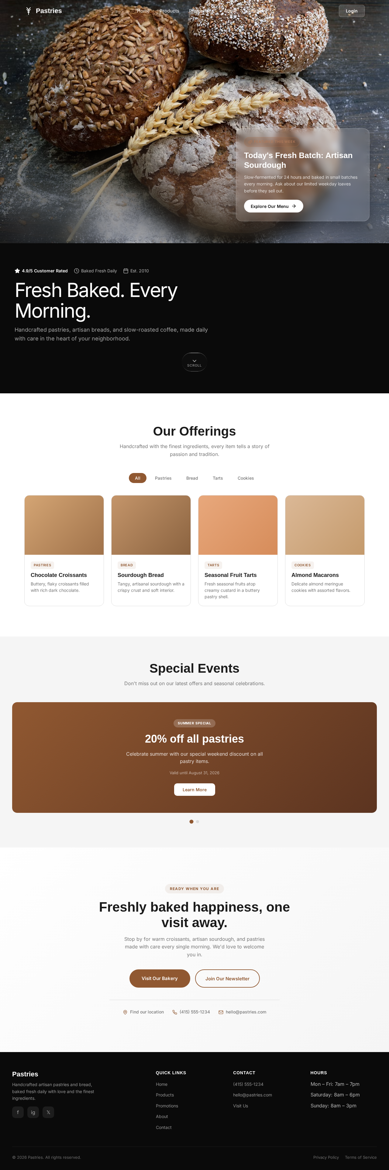
Today's Fresh Batch: Artisan Sourdough
Slow-fermented for 24 hours and baked in small batches every morning. Ask about our limited weekday loaves before they sell out.
Fresh Baked. Every Morning.
Handcrafted pastries, artisan breads, and slow-roasted coffee, made daily with care in the heart of your neighborhood.
Our Offerings
Handcrafted with the finest ingredients, every item tells a story of passion and tradition.
Chocolate Croissants
Buttery, flaky croissants filled with rich dark chocolate.
Sourdough Bread
Tangy, artisanal sourdough with a crispy crust and soft interior.
Seasonal Fruit Tarts
Fresh seasonal fruits atop creamy custard in a buttery pastry shell.
Almond Macarons
Delicate almond meringue cookies with assorted flavors.
Special Events
Don't miss out on our latest offers and seasonal celebrations.
20% off all pastries
Celebrate summer with our special weekend discount on all pastry items.
Valid until August 31, 2026Freshly baked happiness, one visit away.
Stop by for warm croissants, artisan sourdough, and pastries made with care every single morning. We'd love to welcome you in.
Today's Fresh Batch: Artisan Sourdough
Slow-fermented for 24 hours and baked in small batches every morning. Ask about our limited weekday loaves before they sell out.
Fresh Baked. Every Morning.
Handcrafted pastries, artisan breads, and slow-roasted coffee, made daily with care in the heart of your neighborhood.
Our Offerings
Handcrafted with the finest ingredients, every item tells a story of passion and tradition.
Chocolate Croissants
Buttery, flaky croissants filled with rich dark chocolate.
Sourdough Bread
Tangy, artisanal sourdough with a crispy crust and soft interior.
Seasonal Fruit Tarts
Fresh seasonal fruits atop creamy custard in a buttery pastry shell.
Almond Macarons
Delicate almond meringue cookies with assorted flavors.
Special Events
Don't miss out on our latest offers and seasonal celebrations.
20% off all pastries
Celebrate summer with our special weekend discount on all pastry items.
Valid until August 31, 2026Freshly baked happiness, one visit away.
Stop by for warm croissants, artisan sourdough, and pastries made with care every single morning. We'd love to welcome you in.
No comments yet. Be the first!