storm-daily
 nadia mirza
PROMPT: Create a polished six-page digital and printable daily planner The planner should feel like a handcrafted autumn stationery collection: warm, tactile, calm, cozy, and highly functional. Use an original hand-painted watercolor and gouache art direction inspired by fall botanicals and cozy seasonal objects. The artwork must be newly created—not copied from a reference image. VISUAL DIRECTION - Warm cream and parchment paper backgrounds - Burnt orange, terracotta, ochre, chestnut brown, muted olive, sage green, and subtle plum accents - Soft paper texture, delicate borders, dashed writing rules, restrained shadows, and rounded paper panels - Elegant editorial serif typography for headings - Clean, highly legible sans-serif typography for labels - Occasional handwritten-style accent text - Refined and cozy rather than childish, cartoonish, or overly decorative - Generous whitespace and clearly defined writing areas - Accessible contrast and an organized visual hierarchy - No emojis - No prefilled personal answers, example tasks, meetings, habits, books, goals, or reflection responses CORE FUNCTIONAL REQUIREMENT This must be a genuinely blank write-in planner. Every section should begin empty and allow the person to write, type, or check items off. Use blank ruled fields, empty checkboxes, unselected trackers, empty tables, and subtle instructional placeholders only. Create six separate but visually coordinated pages


Comments (0)
Sign in to leave a comment
System Requirements
System Requirements Document for storm-daily
1. Introduction
storm-daily is a polished digital and printable daily planner designed as a six-page coordinated stationery set. It is intended for a Planner User who wants to create a personal daily plan in a warm, calm, tactile, and highly functional environment.
The planner shall use an original autumn-inspired watercolor and gouache visual language, drawing from fall botanicals and cozy seasonal objects without copying any reference artwork. It shall provide genuinely blank write-in planning surfaces: every user-entered section begins empty and supports writing, typing, or checking items off.
2. System Overview
storm-daily delivers a coordinated six-page daily planner document through a first-party digital interface and a printable planner layout.
The current system includes:
- A public Landing page that introduces the planner’s purpose and visual character.
- A Planner Pages workspace containing the six separate planner pages.
- Blank digital fields, empty checkboxes, unselected trackers, empty tables, and subtle instructional placeholders.
- A print-ready visual treatment so the planner can be used on paper as well as digitally.
- Original watercolor and gouache-style decorative artwork created specifically for storm-daily.
The Planner User is the only active human persona. No account, login, role-based access, differentiated permissions, collaboration, sharing, notifications, task suggestions, prefilled planning content, or external provider workflow is included in the current scope.
The six planner pages are a single coordinated planner collection. They are separate printable and usable planner pages presented within the Planner Pages destination.
2a. Product Interpretation and Delivery Boundary
storm-daily is a blank daily-planning tool and printable stationery collection, not a pre-populated productivity system.
The application provides an anonymous, self-directed experience. A Planner User may enter the planner from the public Landing page and move to the Planner Pages destination to complete the six blank planner pages digitally or print them for handwritten use.
The current scope is limited to the requested six-page planner, its coordinated visual system, and blank write-in interactions. The system shall not infer or generate the user’s tasks, appointments, habits, goals, books, reflections, or personal answers.
The product shall not introduce account management, saved historical planner libraries, team workflows, preset templates containing personal examples, automated recommendations, or adjacent productivity features unless explicitly requested in a future requirement.
2c. Page Content and Component Coverage
Landing
-
Purpose and information
- Present storm-daily as a polished digital and printable six-page daily planner.
- Communicate the handcrafted autumn stationery character through original watercolor and gouache-inspired artwork.
- Explain that the planner is blank by design and intended for personal write-in planning.
- Avoid prefilled personal examples, tasks, meetings, habits, books, goals, and reflection responses.
-
Primary action
- Provide a clear action that opens the Planner Pages destination.
-
Supporting content
- Briefly state that the planner can be completed digitally or printed.
- Use concise descriptive copy only; it shall not become an example plan or personal planning prompt with filled answers.
-
Visual components
- Warm cream or parchment background.
- Original hand-painted-style autumn botanical and cozy seasonal-object artwork.
- Editorial serif heading treatment.
- Legible sans-serif supporting labels and navigation text.
- Restrained handwritten-style accent text where appropriate.
-
States and recovery
- Loading state: preserve the warm paper-like visual shell while planner content initializes.
- Success state: the Planner Pages destination opens and presents the six blank coordinated planner pages.
- Error state: if planner content cannot load, show a plain-language retry option without introducing additional product destinations.
- Recovery: retry returns the user to the available planner content.
Planner Pages
-
Purpose and information
- Present exactly six separate but visually coordinated blank planner pages.
- Treat each planner page as a printable page and a digital write-in surface.
- Maintain a consistent autumn stationery system across all six pages while allowing each page to have its own layout arrangement.
-
Planner page collection
- Provide six distinct planner pages in one coordinated collection.
- Ensure every section on every planner page begins empty.
- Do not prefill personal answers, tasks, meetings, habits, books, goals, reflection responses, or any equivalent example content.
- Use only subtle instructional placeholders where clarification is necessary.
-
Write-in fields
- Provide blank ruled fields for typed or handwritten entries.
- Preserve clear writing areas, generous whitespace, and readable line spacing.
- Keep placeholders subtle and non-personal; they shall not provide completed examples.
-
Checkable items
- Provide empty checkboxes that the Planner User may check off digitally or on a printed page.
- All checkboxes shall be unchecked when the planner opens or prints.
-
Trackers and tables
- Provide unselected trackers and empty tables where these formats are used.
- Do not preselect tracker values or populate table cells with personal planning content.
- Ensure digital controls visibly reflect a user’s current entry or checked state.
-
Print treatment
- Format each of the six planner pages for clear standalone printing.
- Preserve writing areas, dashed rules, borders, labels, and visual hierarchy in print.
- Avoid decorative elements that reduce usability or writing space.
-
Navigation and continuity
- Allow the Planner User to move between the six planner pages within the planner collection.
- Keep the active planner page visually identifiable.
- Preserve a cohesive view for reviewing or continuing work across the six pages during the current use session.
-
States and recovery
- Empty state: all fields, tables, trackers, and checkboxes are blank or unselected.
- Edited state: entered text and checked items are visibly represented on the relevant planner page.
- Print-ready state: the six pages render as separate coordinated print surfaces.
- Loading state: show a minimal paper-like loading treatment without sample planning content.
- Error state: if an interaction cannot be applied, retain unaffected visible planner content and present a concise retry or continuation message.
- Recovery: the user may retry the affected interaction or continue working in the available blank or completed sections.
3. Functional Requirements
FR-01 — Deliver a Six-Page Daily Planner
As a Planner User, I should be able to access a polished daily planner consisting of exactly six separate but visually coordinated planner pages so that I can use a complete daily planning set digitally or in print.
- Provenance: explicit
- Trigger/input: The Planner User opens the planner from the Landing page.
- Access state: Anonymous public access; no account is required.
- System behavior: The system shall present exactly six planner pages within the Planner Pages destination.
- Observable result: The Planner User can identify and use six separate coordinated planner pages.
- Failure and recovery: If the planner cannot load, the system shall provide a retry path and shall not replace unavailable content with invented sample planner entries.
- Continuation: The Planner User may move among the six pages, complete them digitally, or use their print-ready layouts.
Acceptance criteria
- The planner contains exactly six separate planner pages.
- The six planner pages share a coherent visual system.
- The system does not add a seventh planner page, a supplemental planner page, or an unrelated planning destination.
- Each planner page is suitable for digital use and printing.
FR-02 — Provide a Genuinely Blank Write-In Experience
As a Planner User, I should be able to begin with completely blank planner sections so that I can make the planner personal to my own day.
- Provenance: explicit
- Trigger/input: The Planner User opens any planner page.
- Access state: Anonymous public access.
- System behavior: Every planner section shall begin empty.
- Observable result: No personal answers, tasks, meetings, habits, books, goals, or reflection responses are prefilled.
- Failure and recovery: If planner content resets or fails to render, the system shall restore the blank state rather than inserting examples or assumed content.
- Continuation: The Planner User may add their own content through writing, typing, or checking items off.
Acceptance criteria
- All write-in fields begin blank.
- All checkboxes begin empty and unchecked.
- All trackers begin unselected.
- All tables begin empty.
- The planner contains no prefilled personal answers or example planning content.
- Any placeholder text is subtle, instructional, and non-personal.
FR-03 — Support Blank Ruled Writing Fields
As a Planner User, I should be able to write or type into blank ruled fields so that I can capture my own planning information.
- Provenance: explicit
- Trigger/input: The Planner User selects or writes within a ruled field.
- Access state: Anonymous public access.
- System behavior: The planner shall provide blank ruled writing areas appropriate for typing digitally and writing by hand when printed.
- Observable result: The selected field accepts or visually accommodates the user’s own entry without displaying prefilled example text.
- Failure and recovery: If text input cannot be applied, the system shall preserve the unaffected planner layout and allow the user to retry the entry.
- Continuation: The Planner User may continue completing other blank planner sections or print the page.
Acceptance criteria
- Ruled fields are visually blank before use.
- Ruled fields provide clearly defined writing space.
- Digital text entry is readable against the paper-inspired background.
- Printed ruled fields remain legible and usable for handwriting.
FR-04 — Support Empty Checkboxes
As a Planner User, I should be able to check off empty checkbox items so that I can visibly mark items as complete.
- Provenance: explicit
- Trigger/input: The Planner User checks or unchecks an empty checkbox.
- Access state: Anonymous public access.
- System behavior: The system shall provide empty checkboxes that can be checked off digitally and marked manually after printing.
- Observable result: A checked item visibly changes from its original unchecked state.
- Failure and recovery: If the check action fails, the checkbox shall remain visibly unchanged and the user shall be able to retry.
- Continuation: The Planner User may continue checking items or return a checked item to an unchecked state.
Acceptance criteria
- All checkboxes begin unchecked.
- A checked state is visually distinguishable from an unchecked state.
- Checkbox controls remain legible in the digital and printed formats.
- Checkboxes are not pre-completed.
FR-05 — Support Unselected Trackers and Empty Tables
As a Planner User, I should be able to use unselected trackers and empty tables so that I can record my own planning information in structured formats.
- Provenance: explicit
- Trigger/input: The Planner User selects tracker values or enters information into table cells.
- Access state: Anonymous public access.
- System behavior: The planner shall present trackers in an unselected state and tables without prefilled entries.
- Observable result: The Planner User can see their own selections or entries while unused tracker values and table cells remain blank.
- Failure and recovery: If a selection or entry cannot be applied, the relevant control remains available for retry and unrelated planner content remains intact.
- Continuation: The Planner User may continue completing the current page, move to another planner page, or print the collection.
Acceptance criteria
- Tracker values are unselected when first presented.
- Tables contain no example rows or personal data.
- The planner does not infer or add information to a tracker or table.
- Structured fields preserve their blank, legible presentation in print.
FR-06 — Support Digital and Printable Use
As a Planner User, I should be able to use the planner digitally and print its pages so that I can choose the format that best suits my planning practice.
- Provenance: explicit
- Trigger/input: The Planner User views the Planner Pages destination or uses a standard print pathway.
- Access state: Anonymous public access.
- System behavior: The system shall render the planner as usable digital write-in pages and as clear printable pages.
- Observable result: The six planner pages retain their separate layouts, writing areas, and visual hierarchy in both formats.
- Failure and recovery: If print rendering is unavailable, the system shall keep the digital planner available and permit the user to retry printing through the available environment.
- Continuation: The Planner User may continue digital planning or print the planner pages for handwriting.
Acceptance criteria
- All six planner pages are visually distinct in print.
- Paper-like styling does not obscure labels, dashed rules, tables, trackers, or checkboxes.
- Writing areas remain sufficiently clear for handwritten use.
- The digital version remains usable without printing.
FR-07 — Apply the Required Handcrafted Autumn Visual Direction
As a Planner User, I should experience a warm, tactile, calm, cozy, and highly functional planner so that daily planning feels like using a refined handcrafted autumn stationery collection.
- Provenance: explicit
- Trigger/input: The Planner User views the Landing page or any Planner Pages content.
- Access state: Anonymous public access.
- System behavior: The system shall apply the specified visual direction consistently across the Landing page and six planner pages.
- Observable result: The interface and print layout visibly use warm parchment surfaces, autumn colors, original artwork, readable typography, and organized writing areas.
- Failure and recovery: If decorative artwork is unavailable, core planner content, labels, writing fields, and contrast shall remain usable.
- Continuation: The Planner User may proceed into the planner without decorative treatment preventing access to blank planning content.
Acceptance criteria
- Artwork is newly created and is not copied from a reference image.
- Artwork is inspired by fall botanicals and cozy seasonal objects.
- The planner uses warm cream and parchment paper backgrounds.
- The planner uses burnt orange, terracotta, ochre, chestnut brown, muted olive, sage green, and subtle plum accents.
- The planner uses soft paper texture, delicate borders, dashed writing rules, restrained shadows, and rounded paper panels.
- Headings use elegant editorial serif typography.
- Labels use clean, highly legible sans-serif typography.
- Handwritten-style accent text is occasional and restrained.
- The planner remains refined and cozy rather than childish, cartoonish, or overly decorative.
- The layout provides generous whitespace, clearly defined writing areas, accessible contrast, and an organized visual hierarchy.
- The planner contains no emojis.
4. User Personas
Planner User
- Provenance: required_inference from Planning Scope.
- Product context: The Planner User uses storm-daily to create a personalized daily plan in a blank digital or printed planner.
- Primary goal: Complete a personal daily planning set using six coordinated pages that can be typed into, written on, and checked off.
- Distinct responsibilities:
- Open the planner and review the six-page collection.
- Add personal entries to blank ruled fields.
- Check empty checkboxes as items are completed.
- Select their own tracker values.
- Fill empty table cells with their own planning information.
- Print the planner pages when a paper-based planning experience is preferred.
- Relevant inputs and decisions:
- Determines what information to enter.
- Decides which items to mark complete.
- Decides which tracker values to select.
- Chooses whether to use the planner digitally, in print, or both.
- Interactions with other accepted participants: None. The Planner User completes a self-directed personal planning activity.
- Observable success: The Planner User has a completed, personalized daily plan represented in a warm, calm, legible layout that remains usable digitally and in print.
- Constraints: The Planner User must never receive prefilled personal planning content, example answers, automated recommendations, or assumed personal data.
5. Core User Flows
Flow 1 — Enter the Planner
- The Planner User arrives at the Landing page.
- The Landing page presents storm-daily as a handcrafted autumn-inspired digital and printable daily planner.
- The Planner User reviews the concise explanation that the planner is blank and intended for personal write-in use.
- The Planner User selects the action to open the planner.
- The system opens Planner Pages.
- The Planner User sees the six separate, visually coordinated planner pages in their blank initial state.
- If the planner content fails to load, the system presents a retry option without displaying fabricated example entries.
- After retrying successfully, the Planner User continues to the six blank planner pages.
Flow 2 — Complete Blank Write-In Areas Digitally
- The Planner User opens Planner Pages.
- The Planner User selects one of the six planner pages.
- The system displays blank ruled fields, empty checkboxes, unselected trackers, and empty tables as applicable to that page.
- The Planner User types their own planning information into an available blank ruled field or table cell.
- The system visibly reflects the user-entered content in the selected field.
- The Planner User continues entering their own content into other available blank sections.
- If an entry cannot be applied, the system leaves unaffected content visible and gives the Planner User an opportunity to retry.
- The Planner User continues working on the current planner page or moves to another planner page.
Flow 3 — Check Off an Item
- The Planner User opens a planner page in Planner Pages.
- The Planner User identifies an empty unchecked checkbox associated with their own entered item.
- The Planner User selects the checkbox.
- The system changes the checkbox to a visible checked state.
- The Planner User may continue checking other items or uncheck the item if needed.
- If the interaction fails, the checkbox remains in its prior visible state and the Planner User may retry.
Flow 4 — Use a Tracker or Table
- The Planner User opens a planner page containing an unselected tracker or empty table.
- The Planner User reviews the blank tracker values or empty table cells.
- The Planner User selects their own tracker value or enters their own information in the table.
- The system visibly reflects the user’s selection or entry.
- The Planner User continues filling the current structure, proceeds to another planner page, or leaves unused values unselected and cells empty.
- If a selection or entry fails, unrelated planner content remains available and the Planner User may retry.
Flow 5 — Print the Planner
- The Planner User opens Planner Pages and reviews the six coordinated planner pages.
- The Planner User chooses to print using the available print pathway in their environment.
- The system renders the six planner pages as separate print-ready pages.
- The Planner User prints the planner.
- The printed pages retain blank writing areas, empty checkboxes, unselected trackers, empty tables, labels, dashed rules, and accessible hierarchy.
- The Planner User writes on the printed planner by hand and marks items manually.
- If printing cannot be completed, the Planner User can continue using the digital planner and retry the print action later.
6. Visuals Colors and Theme
storm-daily shall present a refined, cozy autumn stationery system that feels hand-crafted, tactile, calm, and highly functional.
Design Intent
- Muse: Hand-painted autumn stationery, fall botanicals, and quiet cozy seasonal objects.
- Headline: A warm, blank daily planner designed to feel like a carefully made autumn paper collection.
- The experience shall feel editorial and tactile rather than cartoonish, childish, noisy, or overly decorative.
- Original artwork shall be created for storm-daily and shall not be copied from a reference image.
Color Tokens
| Role | Color | Usage |
|---|---|---|
| Warm cream background | #F7F0E3 | Primary page background |
| Parchment surface | #EDE0C7 | Paper panels and print surfaces |
| Burnt orange | #B9572E | Primary seasonal accent |
| Terracotta | #C97854 | Secondary accent, borders, and soft emphasis |
| Ochre | #B7832F | Warm highlight and decorative detail |
| Chestnut brown | #5B3928 | Primary body text and high-contrast heading tone |
| Muted olive | #70704A | Secondary structural accent |
| Sage green | #A3AA80 | Soft supporting accent |
| Subtle plum | #73525E | Restrained emphasis and accent typography |
| Writing-rule neutral | #BBAF9D | Dashed writing rules and subtle table lines |
| Soft shadow | rgba(91, 57, 40, 0.14) | Restrained panel depth |
Typography
- Heading font family:
Cormorant Garamond, Georgia, serif. - Body and label font family:
Inter, Arial, sans-serif. - Handwritten accent font family:
Caveat, cursive; use sparingly for decorative or small supportive accents only. - Heading scale:
- Display: 48 px digital / proportionally scaled for print.
- Page title: 32 px.
- Section heading: 22 px.
- Supporting heading: 18 px.
- Body scale:
- Standard label and body text: 14–16 px.
- Small metadata or subtle placeholders: no smaller than 12 px when digitally rendered.
- Headings shall remain elegant and editorial without compromising readability.
- Labels shall remain clean and highly legible.
- Placeholder text shall be visually subordinate to user-entered content.
Surface and Shape Language
- Use warm cream and parchment paper-like surfaces.
- Apply soft, subtle paper texture without reducing text readability or print clarity.
- Use delicate borders in muted autumn tones.
- Use dashed writing rules for blank write-in areas.
- Use rounded paper panels with restrained corner radii, approximately 12–18 px in digital presentation.
- Use restrained shadows only to separate surfaces gently; shadows shall not create a heavy card-based interface.
- Preserve generous whitespace around planner sections and writing areas.
Imagery Style
- Artwork shall resemble original hand-painted watercolor and gouache compositions.
- Artwork may include abstracted fall botanicals and cozy seasonal objects.
- Decorative imagery shall frame or support content, never crowd or obscure writable space.
- Imagery shall be calm, refined, softly layered, and non-cartoonish.
- No emojis shall appear in the interface, planner pages, placeholders, labels, or decorative content.
Accessibility and Hierarchy
- Use chestnut brown or another sufficiently dark approved tone for primary readable text on cream and parchment surfaces.
- Maintain accessible contrast for headings, labels, input text, borders, and checkbox states.
- Do not rely on color alone to communicate checked versus unchecked states or selected versus unselected tracker values.
- Establish a clear hierarchy among page titles, section labels, writing areas, supporting instructional placeholders, and interactive controls.
7. Signature Design Concept
The Autumn Paper Folio
The Landing page shall present storm-daily as a layered parchment folio resting within a quiet field of original watercolor and gouache autumn botanicals. The folio opens visually onto the first impression of the six coordinated planner pages, with delicate dashed rules, blank checkboxes, and empty writing surfaces visible as compositional elements rather than filled planning examples.
The concept shall use only accepted planner content:
- A refined planner title in editorial serif type.
- A concise description of the blank digital and printable daily planner.
- A clear action to enter the Planner Pages destination.
- Original fall botanical and cozy seasonal-object artwork arranged around, not over, the writing surfaces.
- Blank ruled fields and empty planning structures shown without sample personal content.
The effect should resemble a carefully assembled seasonal stationery set: tactile, spacious, functional, and calm.
8. Interaction Model & Motion Direction
Interaction Model: Animated
Motion Tempo: restrained
Hero Dimensionality: layered_2d
Landing Hero Motion Brief
- Focal subject: A layered parchment planner folio surrounded by original watercolor and gouache autumn botanicals and understated cozy seasonal objects.
- Input → transformation → outcome thesis: The Planner User selects the entry action; the closed or stacked paper folio subtly separates into a visible set of blank planner surfaces; the user arrives at the six-page Planner Pages collection ready to personalize.
- Motion vocabulary: Gentle paper lift, soft fade, subtle watercolor bloom, small layered shifts, and restrained settling motion. Motion shall feel tactile and quiet rather than playful, bouncy, or cinematic.
- Composed first frame: A warm cream background supports a parchment planner folio with editorial title typography, a concise blank-planner description, original autumn artwork, and a prominent entry action. Decorative elements frame the content while preserving clear visual hierarchy.
- Reduced-motion state: Display the fully composed parchment folio and entry action without animated separation, watercolor movement, parallax, or layered transitions. All content and the primary entry action remain immediately available.
9. Non-Functional Requirements
NFR-01 — Visual Quality
- Provenance: explicit
- The planner shall appear polished, warm, tactile, calm, cozy, and highly functional.
- The interface shall remain refined rather than childish, cartoonish, or overly decorative.
NFR-02 — Original Artwork
- Provenance: explicit
- Watercolor and gouache-style artwork shall be newly created for storm-daily.
- Artwork shall not be copied from a reference image.
- Artwork shall be inspired by fall botanicals and cozy seasonal objects.
NFR-03 — Blank Content Integrity
- Provenance: explicit
- Every planner section shall begin empty.
- The system shall not prefill personal answers, example tasks, meetings, habits, books, goals, or reflection responses.
- Only subtle instructional placeholders are permitted.
NFR-04 — Readability and Accessibility
- Provenance: explicit
- The planner shall provide accessible contrast and an organized visual hierarchy.
- Writing areas shall be clearly defined and generously spaced.
- Labels shall use highly legible sans-serif typography.
- Decorative texture and artwork shall not impair readability or writing usability.
NFR-05 — Print Usability
- Provenance: explicit
- Each of the six planner pages shall remain clear and usable when printed.
- Printed layouts shall preserve blank writing areas, dashed rules, empty checkboxes, unselected trackers, and empty tables.
- Decorative elements shall not compromise handwriting space.
NFR-06 — Emoji Exclusion
- Provenance: explicit
- The system shall not use emojis in any current user-facing content, planner surface, label, placeholder, or decorative context.
10. Tech Stack
The source material does not prescribe implementation technologies. The following items are implementation defaults and shall not alter product scope.
-
Frontend: React for the digital planner interface.
[Default — not specified by user] -
Styling and print rendering: Responsive CSS with dedicated print styles for the six planner pages.
[Default — not specified by user] -
Artwork assets: Original digital watercolor and gouache-style illustrations produced specifically for storm-daily.
[Default — not specified by user] -
Optional backend: No backend service is required for the current anonymous, self-directed planner scope unless implementation needs demand one.
_[Default —
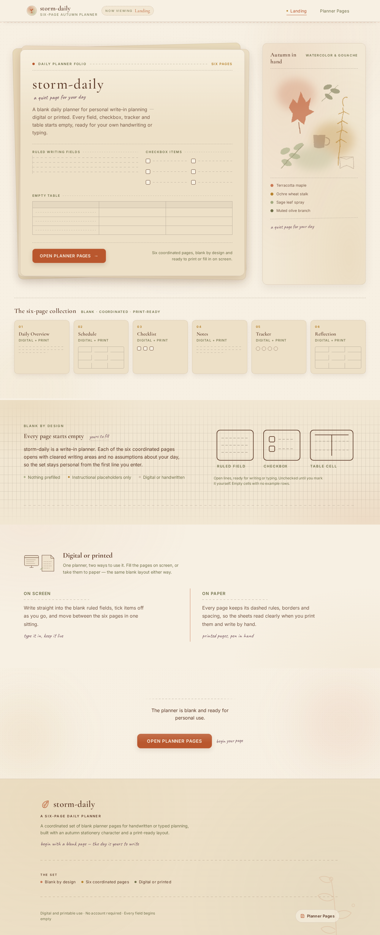
storm-dailya quiet page for your day
A blank daily planner for personal write-in planningdigital or printed. Every field, checkbox, tracker and table starts empty, ready for your own handwriting or typing.
Ruled writing fields
Checkbox items
Empty table
Six coordinated pages, blank by design and ready to print or fill in on screen.
The six-page collection
01
Daily Overview
Digital + print
02
Schedule
Digital + print
03
Checklist
Digital + print
04
Notes
Digital + print
05
Tracker
Digital + print
06
Reflection
Digital + print
Every page starts empty
yours to fillstorm-daily is a write-in planner. Each of the six coordinated pages opens with cleared writing areas and no assumptions about your day, so the set stays personal from the first line you enter.
- Nothing prefilled
- Instructional placeholders only
- Digital or handwritten
Digital or printed
One planner, two ways to use it. Fill the pages on screen, or take them to paper — the same blank layout either way.
Write straight into the blank ruled fields, tick items off as you go, and move between the six pages in one sitting.
type it in, keep it liveEvery page keeps its dashed rules, borders and spacing, so the sheets read clearly when you print them and write by hand.
printed pages, pen in handThe planner is blank and ready for personal use.
storm-dailya quiet page for your day
A blank daily planner for personal write-in planningdigital or printed. Every field, checkbox, tracker and table starts empty, ready for your own handwriting or typing.
Ruled writing fields
Checkbox items
Empty table
Six coordinated pages, blank by design and ready to print or fill in on screen.
The six-page collection
01
Daily Overview
Digital + print
02
Schedule
Digital + print
03
Checklist
Digital + print
04
Notes
Digital + print
05
Tracker
Digital + print
06
Reflection
Digital + print
Every page starts empty
yours to fillstorm-daily is a write-in planner. Each of the six coordinated pages opens with cleared writing areas and no assumptions about your day, so the set stays personal from the first line you enter.
- Nothing prefilled
- Instructional placeholders only
- Digital or handwritten
Digital or printed
One planner, two ways to use it. Fill the pages on screen, or take them to paper — the same blank layout either way.
Write straight into the blank ruled fields, tick items off as you go, and move between the six pages in one sitting.
type it in, keep it liveEvery page keeps its dashed rules, borders and spacing, so the sheets read clearly when you print them and write by hand.
printed pages, pen in handThe planner is blank and ready for personal use.
No comments yet. Be the first!