Start somewhere warm.
₹499
Shop Morning Krishna Bhutiya
have to make webiste of socks of starbucks brand it should feel and look like starbucks own socks website which should include all the ordering detilas and add to cart options and all the varities of shocks also if some dicount or offer use starbucks brand laungage and identity,fonts and all i have sended u the shocks images use that and also some text which u can use also Perfect. I’d take the project one step further and make the **Starbucks → Socks translation** feel like an actual design concept, not just “Starbucks socks.” The current Starbucks direction is especially useful here: Starbucks is emphasizing **coffee, craft, connection, warmth, belonging and everyday rituals**, and its 2026 strategy continues to focus on restoring the welcoming coffeehouse experience. ([Starbucks][1]) # STARBUCKS × SOCKS ## Product Website Concept ### 1. Core Concept **Original Starbucks** > Coffee + Craft + Connection **New product** > Comfort + Craft + Connection So the conceptual transformation is: **Coffeehouse → Everyday life** **Cup → Step** **Coffee ritual → Daily movement** **Warm drink → Warm feet** **Moment of connection → Moment of comfort** This works because Starbucks itself describes its customer promise around serving coffee **“with a moment of connection.”** ([Starbucks][1]) --- # 2. Product Name I would **not** call it simply “Starbucks Socks.” Give the product a small product identity. ## **STARBUCKS EVERYDAY** ### Product: **Everyday Socks** ### Tagline: > **A little warmth for every step.** This feels much more like a product extension. --- # 3. Brand Idea ### **A little warmth for every step.** The idea: Starbucks is part of people's everyday rituals — morning coffee, meeting someone, taking a break, sitting together. The sock takes that same feeling of **comfort and warmth** beyond the coffeehouse. ### Concept statement > **Inspired by the warmth of the coffeehouse, Starbucks Everyday brings comfort into the moments that keep you moving.** This is your **Concept → Context** explanation. --- # 4. Target Audience Don't make the target audience simply “everyone.” ### Primary audience **18–30-year-old urban, lifestyle-conscious consumers** People who: * enjoy coffee culture * value comfort * care about design * like lifestyle products * spend time studying/working in cafés * have daily routines and rituals * like subtle brand expressions ### Secondary audience People who already have an emotional connection with Starbucks and want to carry that feeling into everyday life. --- # 5. Product Range I suggest **3 sock variants** rather than one. ## 01 — MORNING **Colour:** Cream + Starbucks Green Inspired by: > The first coffee of the day. Pattern: ☕ subtle coffee-bean / steam-inspired pattern Copy: > **Start somewhere warm.** --- ## 02 — TOGETHER **Colour:** Green + Cream Inspired by: > Meeting someone over coffee. Pattern: Two connected elements / paired coffee beans / subtle linked pattern. Copy: > **Better together.** This directly connects to Starbucks' emphasis on human connection and belonging. ([Starbucks][1]) --- ## 03 — STAY AWHILE **Colour:** Coffee Brown + Cream Inspired by: > Sitting in a Starbucks coffeehouse and taking a break. Pattern: Soft coffee-ring / cup / steam-inspired graphics. Copy: > **Take your time.** This connects particularly well with Starbucks' current emphasis on welcoming coffeehouses where people can relax, gather and stay. ([Starbucks][2]) --- # 6. Product Features Keep the feature language **human**, rather than technical. Instead of: > 80% Cotton > 15% Polyester > 5% Elastane You can still provide the specifications, but the main communication should be: ### **Soft where it matters.** Comfort-focused fabric. ### **Made for the everyday.** Designed for repeated daily wear. ### **A little room to move.** Comfortable stretch. ### **Crafted to stay with you.** Durability. The technical information can sit underneath in a smaller **Details** section. --- # 7. WEBSITE STRUCTURE I would make the website approximately: **HOME → COLLECTION → PRODUCT → STORY → DETAILS → FOOTER** --- # 8. HOMEPAGE ## HERO SECTION Large lifestyle photograph of someone sitting in a warm café / walking outside with the socks visible. ### Main heading: # **A little warmth for every step.** ### Supporting text: > **Inspired by the warmth of the coffeehouse. Made for wherever the day takes you.** ### CTA: **SHOP EVERYDAY** This is the most important section. --- # 9. SECOND SECTION After the hero, don't immediately show products. Create an emotional transition. ### Heading: # **From your first coffee to your last step.** Supporting copy: > **Some moments are made for slowing down. Others are made for moving forward. Starbucks Everyday is made for both.** CTA: **EXPLORE THE COLLECTION** This makes the product feel like a lifestyle object. --- # 10. COLLECTION SECTION ### Heading: # **Made for the moments in between.** Then three cards: ### MORNING > **Start somewhere warm.** **SHOP MORNING** ### TOGETHER > **Better together.** **SHOP TOGETHER** ### STAY AWHILE > **Take your time.** **SHOP STAY AWHILE** --- # 11. PRODUCT DETAIL SECTION Imagine clicking **Morning**. The product page starts: # **MORNING** ### Subheading: > **For wherever your morning takes you.** Then large product image. ### Price ₹XXX ### Sizes S / M / L ### CTA **ADD TO BAG** Then: ### **A softer start.** > Made for early mornings, slow coffee and everything that comes after. --- # 12. PRODUCT STORY This is where your design project becomes stronger. ### Heading: # **It starts with comfort.** Copy: > **We believe the little things can change the way a day feels. A familiar cup. A warm place to sit. A moment with someone you know. Now, a little comfort for every step.** This is inspired by Starbucks' current communication around small moments, connection and belonging. ([Starbucks][3]) --- # 13. “WHY SOCKS?” SECTION This could be a really good conceptual section for your jury. ### Heading: # **Why socks?** Copy: > **Because comfort shouldn't stop at the coffeehouse door.** Then: > **Starbucks has always been part of everyday rituals. Morning routines. Midday breaks. Conversations that last a little longer. We wanted to take that feeling somewhere new — one step at a time.** This explains the **Concept → Context** beautifully. --- # 14. BRAND STORY SECTION ### Heading: # **The coffeehouse, wherever you are.** Copy: > **A familiar feeling can follow you. The warmth of a morning cup. The comfort of a place that feels like yours. The people who make an ordinary day feel a little better. Starbucks Everyday brings that feeling into something you can carry with you.** --- # 15. FINAL CTA Don't end with: > BUY NOW Instead: # **Where will your day take you?** **Find your pair.** This feels more experiential. --- # 16. FOOTER Keep it simple. **STARBUCKS EVERYDAY** > A little warmth for every step. **Shop** Everyday Morning Together Stay Awhile **About** Our Story Craft Care **Connect** Instagram Starbucks --- # 17. Website Tone of Voice This is VERY important for your assignment. Your website should follow this formula: ### Starbucks language **SHORT + WARM + HUMAN + EMOTIONAL** Not: > “Our socks are manufactured using premium-quality cotton material.” Instead: > **Soft where it matters.** Not: > “These socks are suitable for casual everyday use.” Instead: > **Made for the everyday.** Not: > “Purchase now.” Instead: > **Find your pair.** Not: > “Product specifications.” Instead: > **The details.** --- # 18. Your Website Vocabulary Build a small **brand vocabulary board**. ### USE MORE: **warm** **comfort** **moment** **together** **everyday** **craft** **care** **belong** **move** **stay** **little** **ritual** **step** **feel** **home** These words fit the emotional territory Starbucks is currently emphasizing. ([Starbucks][1]) ### AVOID: cheap best price discount super deal premium quality!!! crazy ultimate number one buy immediately Those would move the brand toward generic e-commerce language. --- # 19. Visual Direction ## Colour Palette Use Starbucks as the starting point, but don't make the entire website green. ### Primary **Starbucks Green** ### Supporting **Warm Cream** ### Secondary **Coffee Brown** ### Neutral **Off-white** ### Accent Very limited use of darker green / black. The current Starbucks experience is also being described through **warm, vibrant coffeehouses, comfortable seating, warmer lighting and plants**, so your visual direction can borrow that warmth rather than relying only on the green logo. ([Starbucks][2]) --- # 20. Typography Use a hierarchy like: ### HEADLINE Large, bold, simple. ### SUBHEAD Medium size, conversational. ### BODY Clean and highly readable. ### CTA Short, confident. For your presentation, I would show: **Typography hierarchy** > A LITTLE WARMTH > *for every step.* Then: > Inspired by the warmth of the coffeehouse. Made for wherever the day takes you. The important thing is: > **The sock should live inside a Starbucks-like moment.** Not simply: > **Here is a sock.** ### IDEA **A LITTLE WARMTH FOR EVERY STEP. ### Final concept in one line: # **STARBUCKS EVERYDAY** ## **A little warmth for every step.** This should be the foundation for the actual website design. can send u more shocks images tell me i will send u and then include that also in website


Sign in to leave a comment
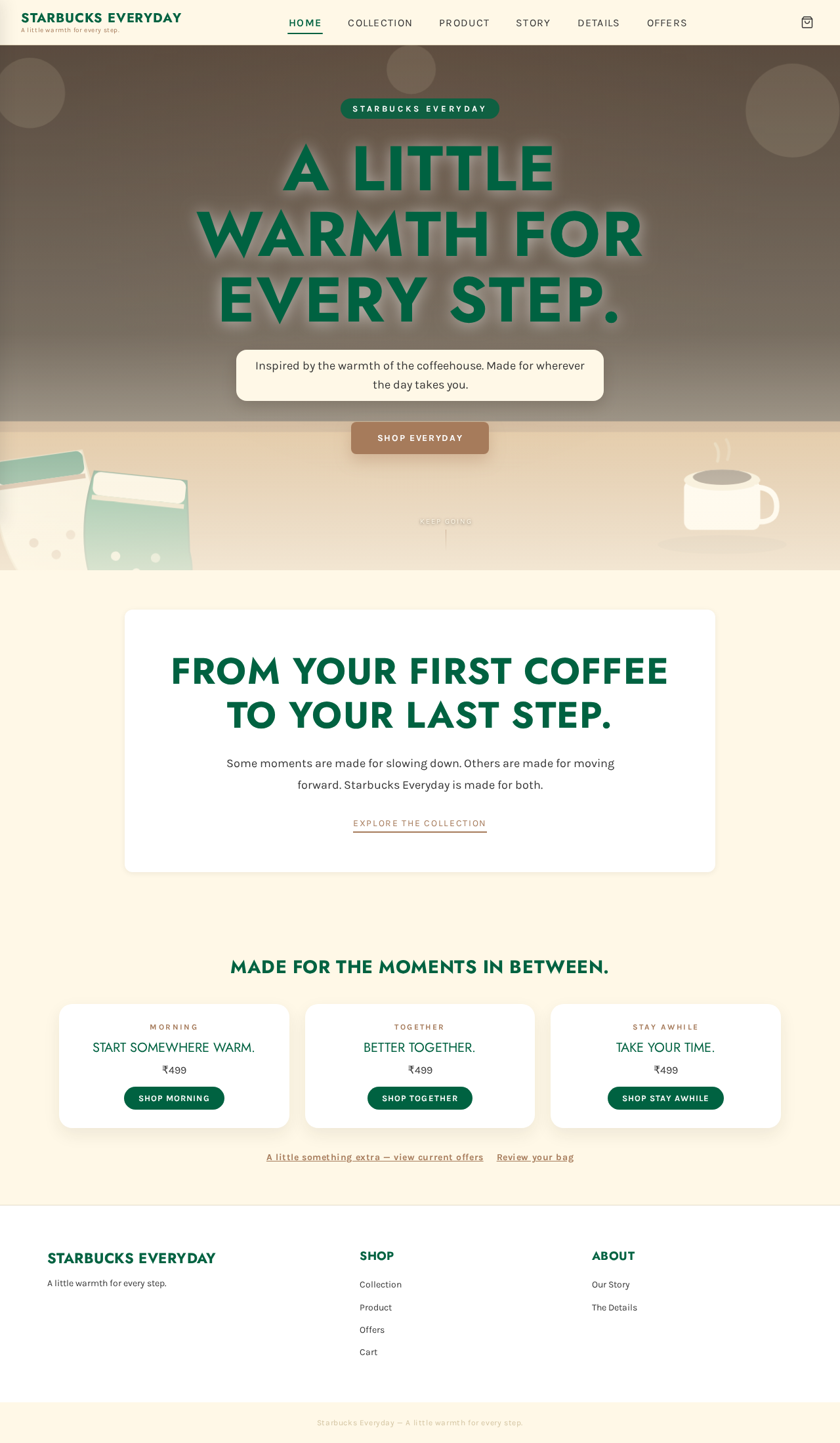
Some moments are made for slowing down. Others are made for moving forward. Starbucks Everyday is made for both.
Explore the CollectionStart somewhere warm.
₹499
Shop MorningBetter together.
₹499
Shop TogetherTake your time.
₹499
Shop Stay AwhileSome moments are made for slowing down. Others are made for moving forward. Starbucks Everyday is made for both.
Explore the CollectionStart somewhere warm.
₹499
Shop MorningBetter together.
₹499
Shop TogetherTake your time.
₹499
Shop Stay Awhile
No comments yet. Be the first!