single-page
 Diya Trivedi
create a project to buidl simple single page design

Comments (0)
Sign in to leave a comment
System Requirements
System Requirements Document for single-page
1. Introduction
single-page is a self-service design tool for building one simple single-page design inside a project. The product's intent is narrow and deliberate: a Designer creates a project, composes a single page's content and layout, and reviews the resulting page — nothing more. The design is limited to a single page per project; the product does not build multi-page sites, and it does not attempt to be a general-purpose site builder.
The audience is designers and design-adjacent builders who care about craft and who want to see their page move between a visual composition and the structure underneath it. The product treats one page two ways at once: as a designed composition and as a structured document. That duality is the product's organizing idea, and it shapes the landing entry, the editor, and the preview.
The product is delivered as a first-party web application with application-owned identity. A Designer enrolls themselves, returns to resume saved projects and designs, and works inside a project-scoped editor and preview.
2. System Overview
single-page is a first-party web application. Its current delivery consists of six custom pages owned by the application: Landing, Sign Up, Login, Projects, Project Editor, and Preview. The only active human actor is the Designer. There are no other accepted human personas, and no provider-owned or external destinations carry accepted product behavior.
The accepted behavior is: a Designer arrives at the Landing page, enrolls through Sign Up (or verifies through Login on return), creates and accesses projects on the Projects page, composes the single page's content and layout in the Project Editor, and reviews the resulting page in Preview. Identity is application-owned and is required for Projects, Project Editor, and Preview; Landing, Sign Up, and Login are anonymously reachable.
Narrow exclusions. The design is limited to a single page per project. The product does not provide multi-page sites, page collections, or page hierarchies. No adjacent capabilities — publishing pipelines, team collaboration, asset marketplaces, analytics, or account administration — are part of the current scope.
2a. Product Interpretation and Delivery Boundary
Delivery ownership. All accepted behavior is delivered by the first-party application. There is no provider-owned surface, no external destination, and no headless delivery in the current scope. The application owns the Designer's identity, the durable projects and designs, and every interaction surface.
Access ownership. Identity is application-owned. Landing, Sign Up, and Login are anonymously reachable: a visitor can read the Landing page and can enroll or verify without an existing session. Projects, Project Editor, and Preview require an established session, because each depends on durable, Designer-specific state — the Designer's own projects, the composition of a specific project's page, and the rendered result of that composition. The interaction that establishes access (Sign Up, Login) is deliberately anonymous and does not itself require access.
Current and future boundaries. Everything described in this document is current. No future-horizon requirements were accepted. The single-page constraint is a current hard constraint, not a staging decision.
2b. Source Content Inventory
Not applicable. No reference directive in the supplied material declares a content_source, so no source content inventory is produced.
2c. Page Content and Component Coverage
Landing
- Information and state. Anonymous public entry. Explains that the product helps a Designer create simple single-page designs inside projects. Presents the product's dual nature — the design on one half, the code on the other — as the page's own composition. No session state is read or required.
- Primary action. Proceed to Sign Up to begin creating a project.
- Supporting actions. Proceed to Login for a returning Designer.
- Domain entities. None persisted. The page presents product intent only.
- Component responsibilities.
- Split hero. A full-height 50/50 composition: left half warm paper with an oversized headline and the primary call to action; right half a deep ink panel carrying a monospace code block that shows the same page's structure. A 2px accent seam runs between the halves.
- Headline block. Three stacked, flush-left display lines in the heading face, tight leading, spanning nearly the full left half.
- Body line. A single line of body copy beneath the headline.
- Primary call to action. A rectangular button with a hard offset shadow, filled with the accent colour, leading to Sign Up.
- Secondary link. A quiet text link to Login.
- Code panel. A syntax-highlighted monospace block on the ink half, with a blinking accent caret, reading as a real editor rather than a prop.
- Section band. A short explanatory band below the fold describing the single-page constraint and the project-based workflow, alternating sides on the grid.
- States.
- Loading. Static content; no data fetch. The seam reveal plays once on load.
- Empty. Not applicable; the page has no collection.
- Success. Not applicable; the page performs no mutation.
- Error. Not applicable; no network-dependent content.
- Recovery. Not applicable.
- Reduced motion. The seam appears instantly and the hover link becomes a static accent outline.
Sign Up
- Information and state. Anonymous identity-access surface. Establishes a new Designer identity so the Designer can create and keep projects. Explains that an account is what makes projects and designs durable and resumable.
- Primary action. Submit enrollment details to establish the Designer's identity.
- Supporting actions. Move to Login if the Designer already has an identity.
- Domain entities. Designer identity (created on success).
- Component responsibilities.
- Enrollment form. Fields for the Designer's identifying details and credential, with inline validation messaging.
- Submit control. Rectangular button with the hard offset affordance; disabled while a submission is in flight.
- Cross-link. A link to Login for an already-enrolled Designer.
- Error region. A reserved area for submission-level errors, so the form does not shift when an error appears.
- States.
- Loading. Submit control shows an in-flight state; fields remain readable.
- Empty. Initial form state with no values entered.
- Success. Identity established; the Designer continues to Projects.
- Error. Field-level validation errors shown inline; submission-level errors (for example, an identity that already exists) shown in the error region with the form values preserved.
- Recovery. The Designer corrects the indicated field or switches to Login; no entered value is discarded on a recoverable error.
Login
- Information and state. Anonymous identity-access surface. Verifies a returning Designer so they can resume access to their saved projects and designs.
- Primary action. Submit credentials to verify the returning Designer.
- Supporting actions. Move to Sign Up if the Designer has no identity yet.
- Domain entities. Designer identity (verified on success).
- Component responsibilities.
- Verification form. Fields for the Designer's identifying detail and credential.
- Submit control. Rectangular button with the hard offset affordance; disabled while verification is in flight.
- Cross-link. A link to Sign Up.
- Error region. A reserved area for verification errors.
- States.
- Loading. Submit control shows an in-flight state.
- Empty. Initial form state with no values entered.
- Success. Identity verified; the Designer continues to Projects and their saved projects and designs are available again.
- Error. A verification failure is reported in the error region without revealing which element was wrong; the entered identifying detail is preserved.
- Recovery. The Designer retries, or switches to Sign Up; repeated failures do not lock the form.
Projects
- Information and state. Authenticated. The Designer's revisitable home for their projects. Each project holds exactly one single-page design. Shows the Designer's own projects only.
- Primary action. Create a new project.
- Supporting actions. Open an existing project in the Project Editor; open a project's Preview.
- Domain entities. Project (name, last-updated timestamp, page count fixed at 1), single-page design (owned by its project).
- Component responsibilities.
- Project list. A two-column list: project metadata on the left, a small hairline wireframe thumbnail of the project's page on the right.
- Project row metadata block. A monospace block carrying the project name, the updated date, and
page count: 1, set with tabular numerals. - Create control. A rectangular button with the hard offset affordance that creates a project and opens it in the Project Editor.
- Row actions. Controls to open the project in the Project Editor and to open its Preview.
- Empty state panel. Shown when the Designer has no projects yet, with the create control as the single obvious next step.
- States.
- Loading. The list region shows a loading state; the create control remains available.
- Empty. No projects yet: the empty state panel explains that a project holds one single-page design and offers creation.
- Success. The list shows the Designer's projects with their metadata and thumbnails; a newly created project appears at the top.
- Error. If the list cannot be loaded, an error message with a retry control replaces the list region; the create control remains available.
- Recovery. Retry reloads the list; a failed creation reports the failure and leaves the list unchanged.
Project Editor
- Information and state. Authenticated and project-scoped. Owns composition and editing of the single page's content and layout within one project. The page is always exactly one page; the editor never offers to add a second.
- Primary action. Edit the single page's content and layout.
- Supporting actions. Switch the structure pane between structure and code views; drag the seam to rebalance the panes; open Preview.
- Domain entities. Project, single-page design (content and layout), page structure tree.
- Component responsibilities.
- Split pane. A permanent split: canvas on the left, structure/code on the right, separated by a draggable accent seam. Both sides are live and editable.
- Canvas. The rendered composition of the single page, with selectable elements.
- Structure/code pane. The same page expressed as a structure tree and as a monospace code view, switchable by a tab control.
- Design\xe2\x86\x94code link. Hovering an element in the canvas outlines its matching node in the structure/code pane with an accent outline and a brief background wash; the reverse holds when hovering a node.
- Save state indicator. Shows whether the current composition is saved, saving, or failed to save.
- Preview control. Opens the Preview for the current project.
- Narrow-viewport behavior. At 375px the split stacks, the seam rotates to horizontal, and the structure/code pane collapses behind a tab.
- States.
- Loading. The editor loads the project's single-page design; the canvas and structure pane show a loading state until it resolves.
- Empty. A newly created project opens with an empty single page: the canvas shows an empty page frame and the structure pane shows the page's root node, with the canvas ready to accept the first element.
- Success. Edits are reflected in both panes simultaneously and the save state indicator confirms the composition is saved.
- Error. If the project cannot be loaded, an error message with a retry control replaces the editor; if a save fails, the save state indicator reports the failure and the Designer's unsaved edits remain in place.
- Recovery. Retry reloads the project; a failed save can be retried without losing the current composition.
Preview
- Information and state. Authenticated and project-scoped. Shows the resulting single-page design for review, rendered as the finished page rather than as an editing surface.
- Primary action. Review the rendered single page.
- Supporting actions. Return to the Project Editor to continue refining; switch the preview viewport width to check the page at different sizes.
- Domain entities. Project, single-page design (rendered).
- Component responsibilities.
- Rendered page. The single page rendered as a finished composition, without editing affordances.
- Viewport control. A control to render the page at the narrow, medium, and wide widths so the Designer can check how the page holds up.
- Return control. A control back to the Project Editor for the same project.
- Project context label. A small monospace label identifying the project being previewed.
- States.
- Loading. The rendered page region shows a loading state until the design resolves.
- Empty. If the project's page has no content yet, the preview renders the empty page frame and states that the page has no content yet, with the return control as the next step.
- Success. The rendered single page is displayed at the selected viewport width.
- Error. If the design cannot be loaded, an error message with a retry control replaces the rendered region.
- Recovery. Retry reloads the design; the return control always remains available.
3. Functional Requirements
Each requirement is stated as a story point with its provenance, lifecycle facts, and observable acceptance.
FR-1 — Create a project for building a simple single-page design. As a Designer, I should be able to create a project that holds a simple single-page design, so that I have a place to compose my page.
- Provenance: explicit.
- Actor: Designer. Trigger: the Designer activates the create control on the Projects page.
- Observable result: a new project exists, owned by the Designer, containing exactly one single-page design, and it appears in the Designer's project list with its name, updated date, and
page count: 1. - Access state: authenticated; the Designer must have an established identity.
- Failure/recovery: if creation fails, the failure is reported and the project list is unchanged; the Designer can retry.
- Continuation: the Designer opens the new project in the Project Editor.
FR-2 — The design is a single page. As a Designer, I should have my design limited to a single page within a project, so that the result stays simple and one-page.
- Provenance: explicit (hard constraint).
- Actor: Designer. Trigger: any interaction in the Project Editor or Preview.
- Observable result: the project's design consists of exactly one page; the editor offers no way to add, duplicate, or navigate to a second page, and the project metadata reports
page count: 1. - Access state: authenticated.
- Failure/recovery: not applicable; the constraint is structural and cannot enter a failure state.
- Continuation: the Designer continues composing the single page.
FR-3 — Self-service enrollment for the Designer before first creating a project. As a Designer without an identity, I should be able to enroll myself, so that I can create my first project.
- Provenance: required_inference.
- Actor: Designer. Trigger: the Designer chooses to begin from the Landing page and proceeds to Sign Up.
- Observable result: a Designer identity is established and the Designer continues to the Projects page, where project creation is available.
- Access state: anonymous entry; the enrollment interaction itself requires no prior identity.
- Failure/recovery: field-level validation errors are shown inline; a submission-level error (for example, an identity that already exists) is reported with the entered values preserved, and the Designer can correct the input or switch to Login.
- Continuation: the Designer creates their first project.
FR-4 — Returning verification for the Designer to resume access to saved projects and designs. As a returning Designer, I should be able to verify myself, so that I can resume access to my saved projects and designs.
- Provenance: required_inference.
- Actor: Designer. Trigger: the Designer proceeds to Login from the Landing page or from Sign Up.
- Observable result: the Designer's identity is verified and their saved projects and designs are available again on the Projects page.
- Access state: anonymous entry; the verification interaction itself requires no prior session.
- Failure/recovery: a verification failure is reported without revealing which element was wrong; the entered identifying detail is preserved and the Designer can retry or switch to Sign Up.
- Continuation: the Designer opens a saved project in the Project Editor.
FR-5 — Compose and edit the single page's content and layout within a project. As a Designer, I should be able to compose and edit the content and layout of my project's single page, so that I can produce the design I intend.
- Provenance: required_inference.
- Actor: Designer. Trigger: the Designer opens a project in the Project Editor and edits the canvas or the structure/code pane.
- Observable result: the single page's content and layout change, both panes reflect the change simultaneously, and the save state indicator confirms the composition is saved.
- Access state: authenticated and project-scoped.
- Failure/recovery: if the project cannot be loaded, an error with a retry control replaces the editor; if a save fails, the failure is reported and the Designer's unsaved edits remain in place so they can retry.
- Continuation: the Designer continues editing or opens Preview.
FR-6 — See the same page as a composition and as a structure. As a Designer, I should be able to see my page as a rendered composition and as its underlying structure, so that I can work on either side of the same page.
- Provenance: required_inference.
- Actor: Designer. Trigger: the Designer hovers an element in the canvas or a node in the structure/code pane, or switches the pane between structure and code views.
- Observable result: the matching node or element on the other side of the seam is outlined in the accent colour with a brief background wash, and the pane shows the page as a structure tree or as monospace code.
- Access state: authenticated and project-scoped.
- Failure/recovery: with reduced motion the link becomes a static accent outline; no failure state applies.
- Continuation: the Designer edits on whichever side they prefer.
FR-7 — Review the resulting single-page design. As a Designer, I should be able to review the resulting single-page design, so that I can judge the finished page.
- Provenance: required_inference.
- Actor: Designer. Trigger: the Designer opens Preview for a project.
- Observable result: the project's single page is rendered as a finished composition without editing affordances, at the viewport width the Designer selects.
- Access state: authenticated and project-scoped.
- Failure/recovery: if the design cannot be loaded, an error with a retry control replaces the rendered region; if the page has no content yet, the preview states this and offers the return control.
- Continuation: the Designer returns to the Project Editor to refine, or finishes.
FR-8 — Revisit and access saved projects. As a Designer, I should be able to revisit my projects and open any of them, so that I can resume work on a saved design.
- Provenance: required_inference.
- Actor: Designer. Trigger: the Designer opens the Projects page.
- Observable result: the Designer's own projects are listed with their metadata and wireframe thumbnails, and any project can be opened in the Project Editor or Preview.
- Access state: authenticated; only the Designer's own projects are shown.
- Failure/recovery: if the list cannot be loaded, an error with a retry control replaces the list region while the create control remains available.
- Continuation: the Designer opens a project and continues editing.
4. User Personas
Designer
Product context. The Designer is the sole active human actor in single-page. They arrive with a page in mind and want a workbench, not a marketing brochure: a place where one page can be composed and inspected without ceremony. They care about craft and about seeing their page move between a visual composition and the structure underneath it.
Primary goal. Produce and refine a simple single-page design inside a project until it is ready to use.
Distinct accepted responsibilities.
- Enroll themselves through Sign Up before creating a first project, or verify through Login to resume saved work.
- Create a project that holds exactly one single-page design.
- Compose and edit that page's content and layout in the Project Editor, working on either the canvas or the structure/code side.
- Keep the design to a single page; the Designer never manages a page collection.
- Review the resulting page in Preview at different viewport widths.
- Return to a saved project later and continue refining it.
Relevant inputs and decisions. The Designer decides what the page contains and how it is laid out; decides which side of the split to work on at any moment; decides when the page is finished enough to review; and decides, on review, whether to return to the editor or stop.
Interactions with other accepted participants. There are none. The Designer is the only accepted human actor, and no other participant is materially affected by the Designer's work in the current scope. The Designer's own returning self is the only counterparty: the identity established at Sign Up is what makes saved projects and designs resumable at Login.
Observable success. A finished, simple one-page design, held in a project the Designer can reopen, that renders in Preview as the composition the Designer intended.
Constraints carried from source. The design is limited to a single page. The Designer's work is durable and private to them: projects and designs are bound to the identity that created them.
5. Core User Flows
Flow A — First-time Designer enrolls and creates a first project
- The Designer arrives at the Landing page anonymously. The split hero presents the product's dual nature: the left half carries the oversized headline and the primary call to action, the right half carries the monospace code panel showing the same page's structure, with the accent seam between them.
- The Designer reads the headline and body line and activates the primary call to action, which leads to Sign Up.
- On Sign Up, the Designer enters their identifying details and credential and submits.
- If a field is invalid, the error appears inline and the Designer corrects it; if the identity already exists, the submission-level error appears in the reserved error region with the entered values preserved, and the Designer either corrects the input or follows the cross-link to Login.
- On success, the Designer's identity is established and they continue to Projects.
- Projects shows the empty state panel, because the Designer has no projects yet. The panel explains that a project holds one single-page design and offers the create control.
- The Designer activates the create control. A new project is created, owned by the Designer, containing exactly one single-page design, and it appears in the list with its name, updated date, and
page count: 1. - The Designer opens the new project, which lands in the Project Editor.
- The editor opens on an empty single page: the canvas shows an empty page frame and the structure pane shows the page's root node. The Designer composes the page's content and layout, working on the canvas or on the structure/code side, and the two panes stay in step.
- The Designer hovers an element in the canvas; its matching node outlines in accent on the other side of the seam. The Designer uses this link to move between the composition and its structure.
- The save state indicator confirms the composition is saved. If a save fails, the indicator reports the failure and the Designer's unsaved edits remain in place so they can retry.
- The Designer activates the Preview control and lands on Preview, where the single page renders as a finished composition.
- The Designer switches the viewport width to check the page at narrow, medium, and wide sizes. If the page has no content yet, the preview states this and offers the return control.
- The Designer returns to the Project Editor to refine, or stops. The project remains saved and resumable.
Flow B — Returning Designer resumes a saved project
- The Designer arrives at the Landing page and follows the secondary link to Login.
- On Login, the Designer enters their identifying detail and credential and submits.
- If verification fails, the error appears in the reserved error region without revealing which element was wrong; the entered identifying detail is preserved and the Designer retries, or follows the cross-link to Sign Up.
- On success, the Designer continues to Projects, where their saved projects and designs are available again.
- Projects lists the Designer's own projects, each row carrying the project metadata block — name, updated date,
page count: 1— on the left and a hairline wireframe thumbnail of the page on the right. If the list cannot be loaded, an error with a retry control replaces the list region while the create control remains available. - The Designer opens the project they want to continue, landing in the Project Editor.
- The editor loads the project's single-page design. If it cannot be loaded, an error with a retry control replaces the editor and the Designer retries.
- The Designer continues composing the page, moving between the canvas and the structure/code pane, and the save state indicator confirms each save.
- The Designer opens Preview to review the result, checks it at the viewport widths that matter, and returns to the editor to refine or stops.
Flow C — Designer reviews a project's page from the Projects list
- From Projects, the Designer activates a project row's Preview action instead of opening the editor.
- Preview renders that project's single page as a finished composition, with the project context label identifying the project and the viewport control available.
- The Designer checks the page at narrow, medium, and wide widths.
- If the design cannot be loaded, an error with a retry control replaces the rendered region and the Designer retries.
- The Designer uses the return control to go back to the Project Editor for that project and continues refining, or returns to Projects.
6. Visuals, Colors and Theme
The creative direction is authoritative for this section. Its muse is Adham Dannaway, and its headline idea is dual-nature composition: the design on one half, the code on the other.
Colour tokens (light mode).
| Role | Hex | Use |
|---|---|---|
| Background | #F4F1EC | Warm paper ground across the application |
| Surface | #FFFFFF | Crisp white panels and cards |
| Text | #14161A | Near-black ink for type and the dark "code half" insert |
| Primary | #14161A | Ink used for primary type, borders, and the hard offset shadow |
| Accent | #E4572E | Burnt vermilion: the dividing seam, active states, the CTA, and caret/selection marks in the code half |
| Muted | #8A8578 | Warm grey for metadata labels and hairlines |
| Hairline border | #E4DFD6 | 1px card and panel borders |
Proportion is roughly 70% paper/white, 20% ink, 10% accent. The two hero halves are paper white with ink type on the left and a deep ink panel with warm-white monospace on the right. There is exactly one accent colour; no second accent is introduced anywhere.
Typography.
- Headings: Space Grotesk, weights 500–700, tight tracking
-0.02em, sentence case — never all-caps for headlines. - Body: Inter Tight, weights 400/500, 17px with 1.6 leading.
- Labels: Inter Tight 500 at 11px, uppercase,
0.14emtracking, in muted warm grey. Caps are reserved for these 11px metadata labels only. - Code half: JetBrains Mono at 13–15px with a wide 1.6 line-height, so it reads as a real editor rather than a prop.
- Type scale, 1.25 modular: display
clamp(44px, 9vw, 128px)/ section headclamp(28px, 4vw, 52px)/ subhead 22px / body 17px / label 11px / mono 14px. Display line-height is 0.95, tight.
Shape language. Sharp rectangles and precise hairlines. The signature form is a 1px seam splitting a composition into two halves — one paper, one ink — with a 2px accent rule where they meet. Cards are crisp 4px-radius panels with 1px #E4DFD6 borders and no drop shadows; hover swaps the border to ink rather than lifting the card. Buttons are rectangles with a 2px ink border and a hard 3px ink offset shadow — a printed, not floating, affordance. Code blocks use square corners with a 1px inner hairline. No blobs, no pills, no glass.
Layout. A strict 12-column grid on a 1280 canvas with a visible 1px baseline rule between major sections. The hero is a true 50/50 split with the seam running full height. Below the fold, sections alternate sides — the feature list sits left and its rendered result sits right, then mirrored — so the eye zig-zags down the page. The Projects surface uses a two-column list: project metadata on the left, a small live wireframe thumbnail on the right. The Project Editor is a permanent split pane: canvas left, structure/code right, with a draggable seam. At 375px the split stacks into paper-over-ink, the seam rotates to horizontal, and the editor's code pane collapses behind a tab.
Imagery. The interface itself is the imagery. The hero's right half is a real, syntax-highlighted code panel showing the page's own structure; the left half is the rendered result of that structure. Elsewhere: hairline wireframe thumbnails of the Designer's pages on paper cards, small monospace metadata blocks (project name, updated date, page count: 1), and a single diagram showing the same page rendered as canvas and as tree. No stock photography, no decorative illustration, no 3D props.
Avoid. Blue–indigo primary on white — no #2563EB, #4F46E5, #6366F1 or neighbours anywhere in the UI. No Inter, Roboto, Arial, Helvetica, Open Sans, Lato, Poppins, or system-ui for headings or body. No gradient-blob heroes, glassmorphism panels, or grids of identical hover-lift cards. No centred headline + subtext + blue button composition. No rounded pill buttons and no soft drop shadows. No decorative 3D props, particles, or stock photography. No all-caps headlines. No second accent colour.
Readable text and controls. Headlines, wordmarks, labels, numbers, and card text and controls stay entirely inside the viewport and their container at 375px, 768px, and 1280px, wrapping or scaling (for example font-size: clamp(...) with its mobile size) to fit, and no other element covers any part of them. Imagery, decoration, and motion may be cropped, bled off an edge, rotated, overlapped, or cut exactly as the direction asks, as long as they cover no readable text or control. With prefers-reduced-motion, motion stops and shows whole items.
7. Signature Design Concept
The seam. The public entry is a printed spread, not a SaaS hero. A full-bleed 50/50 split runs the full viewport height with the seam dead centre. The left half is warm paper #F4F1EC carrying an oversized Space Grotesk headline set at clamp(44px, 9vw, 128px), flush left, in three stacked lines that span nearly the full half-width at 0.95 leading in ink #14161A. Beneath it sits a single line of body copy and one rectangular call to action with the hard 3px ink offset shadow and accent fill #E4572E. The right half is a deep ink #14161A panel carrying a warm-white JetBrains Mono code block that shows the same page's structure, with a blinking accent caret. The 2px accent seam sits between them and draws itself downward on load.
The concept is implementable with accepted content only: the headline states what the product does, the body line states the single-page constraint, the call to action leads to Sign Up, and the code panel shows the structure of the very page being looked at. There is no centred headline, no gradient blob, and no floating cards. The composition is the product's own promise — one page, two ways of seeing it — rendered as the first thing the Designer sees.
8. Interaction Model & Motion Direction
Interaction Model: Animated Motion Tempo: restrained Hero Dimensionality: layered_2d
Landing Hero Motion Brief.
- Focal subject. The seam and the two halves it divides: paper with oversized type on the left, ink with a live-looking monospace code panel on the right.
- Input → transformation → outcome thesis. On load, the seam draws downward over 400ms with a
cubic-bezier(0.2, 0.8, 0.2, 1)ease while the two halves fade in from opposite directions by 12px; the outcome is a composed printed spread with the seam as its spine. On hover of any element in the canvas half, its matching node in the code half outlines in accent with a 120ms background wash — the design\xe2\x86\x94code link is the interaction. - Motion vocabulary. One reveal on load; a 120ms accent wash on hover; a soft accent glow that tracks along the seam in the hero. No bounces, no parallax on scroll, no particles.
- Composed first frame. Before motion begins, the two halves are offset 12px from their final positions and the seam is not yet drawn; the headline, body line, call to action, and code panel are all present and readable in that frame.
- Reduced-motion state. With
prefers-reduced-motion, the seam appears instantly, the halves do not offset, and the hover link becomes a static accent outline.
9. Non-Functional Requirements
NFR-1 — Single-page constraint is structural. The product must not offer any way to create, add, duplicate, or navigate to a second page within a project. Project metadata reports page count: 1. Provenance: explicit hard constraint. Rationale: the user's stated design is a single page, and the constraint is what keeps the product simple.
NFR-2 — Application-owned identity and session continuity. Identity is application-owned. Landing, Sign Up, and Login are anonymously reachable; Projects, Project Editor, and Preview require an established session. A Designer's projects and designs are bound to the identity that created them and are not visible to any other identity. Provenance: required_inference, from the accepted need for durable, resumable projects and designs. Rationale: without continuity, a saved project could not be resumed, and without binding, a project could not be attributed to the correct Designer.
NFR-3 — No differentiated permissions. The product has exactly one active human role. There is no role-based visibility, no permission control over shared product state, and no administrative surface. Provenance: required_inference from the closed single-persona catalog. Rationale: no accepted behavior establishes differentiated control or visibility.
NFR-4 — Responsive integrity. Readable text and controls stay whole at 375px, 768px, and 1280px, inside the viewport and their container. The hero split stacks into paper-over-ink at 375px with the seam rotated to horizontal, and the editor's structure/code pane collapses behind a tab. Provenance: explicit creative direction. Rationale: the direction's layout rules and the readable-text rule are binding.
NFR-5 — Reduced-motion support. With prefers-reduced-motion, the seam appears instantly, the hover link becomes a static accent outline, and any moving or scrollable content stops and shows whole items. Provenance: explicit creative direction. Rationale: motion must never be the only way to perceive a state.
NFR-6 — Durable persistence. Projects and their single-page designs persist across sessions so a returning Designer can resume them. Provenance: required_inference, from the accepted returning-verification requirement. Rationale: resumability is the stated purpose of returning verification.
NFR-7 — Save-state truthfulness. The Project Editor must report whether the current composition is saved, saving, or failed to save, and must not discard unsaved edits on a recoverable save failure. Provenance: required_inference. Rationale: the Designer's composition is the product's only durable value, and its state must be observable.
10. Tech Stack
No technology choices were specified by the user. The following are coherent defaults for the accepted scope and are labeled as such.
- Frontend: React with a component-based single-page application structure.
[Default — not specified by user] - Backend: Python with FastAPI, serving the identity, project, and design endpoints the accepted flows require.
[Default — not specified by user] - Storage: A relational database for Designer identities, projects, and single-page designs, with the page composition stored as a structured document.
[Default — not specified by user] - Containerization: Docker with docker-compose for local development and a single deployable application image.
[Default — not specified by user] - Orchestration: Kubernetes is not required for the accepted scope and is not included.
[Default — not specified by user]
11. Assumptions and Constraints
Constraints (binding).
- The design is limited to a single page. This is an explicit hard constraint and applies to every project in the product.
- The palette, typography, shape language, layout, motion, and imagery rules in Section 6 are binding, including the prohibition on blue–indigo primaries and on the listed heading and body typefaces.
- Readable text and controls stay whole at every viewport; the readable-text rule takes precedence over any direction, requirement, or brief that would crop, clip, or cover them.
Assumptions (narrow, labeled).
- Assumption. A project holds exactly one single-page design, and the project is the unit the Designer creates, names, and reopens. This follows from the explicit single-page constraint combined with the accepted project-based workflow.
- Assumption. The Designer's identity is established by self-service enrollment, because no invitation or provisioning boundary was accepted.
[required_inference] - Assumption. The Landing page's code panel shows the structure of the page being presented, not a live editor for the visitor. This follows from the creative direction's imagery rule and introduces no new capability.
- Assumption. The Preview viewport control offers narrow, medium, and wide widths, matching the responsive breakpoints the direction names.
[Default — not specified by user]
Explicit exclusions.
- No multi-page sites, page collections, or page hierarchies.
- No provider-owned or external destinations carry accepted product behavior.
- No role-based permissions, administrative surfaces, or account-management capabilities beyond enrollment and returning verification.
- No publishing pipeline, team collaboration, asset marketplace, or analytics.
Future horizon. None. No future-horizon requirements were accepted.
12. Glossary
- Designer — The sole active human actor in single-page. Enrolls, creates projects, composes the single page, and reviews the result.
- Project — The Designer-owned container that holds exactly one single-page design. Carries a name, an updated date, and a page count fixed at 1.
- Single-page design — The one page a project holds: its content and its layout. The product's central artifact and its explicit scope limit.
- Project Editor — The authenticated, project-scoped surface that owns composition and editing of the single page, presented as a permanent split pane with a draggable accent seam.
- Canvas — The left side of the editor's split pane: the rendered composition of the single page, with selectable elements.
- Structure/code pane — The right side of the editor's split pane: the same page expressed as a structure tree or as monospace code, switchable by a tab control.
- Design\xe2\x86\x94code link — The interaction in which hovering an element in the canvas outlines its matching node in the structure/code pane in accent, and the reverse.
- Seam — The 2px accent rule that splits a composition into two halves. It runs full height in the landing hero and is draggable in the Project Editor.
- Preview — The authenticated, project-scoped surface that renders the project's single page as a finished composition for review.
- Save state indicator — The editor control that reports whether the current composition is saved, saving, or failed to save.
- Hard offset shadow — The 3px ink offset beneath buttons and cards that gives the printed, non-floating affordance the direction requires.
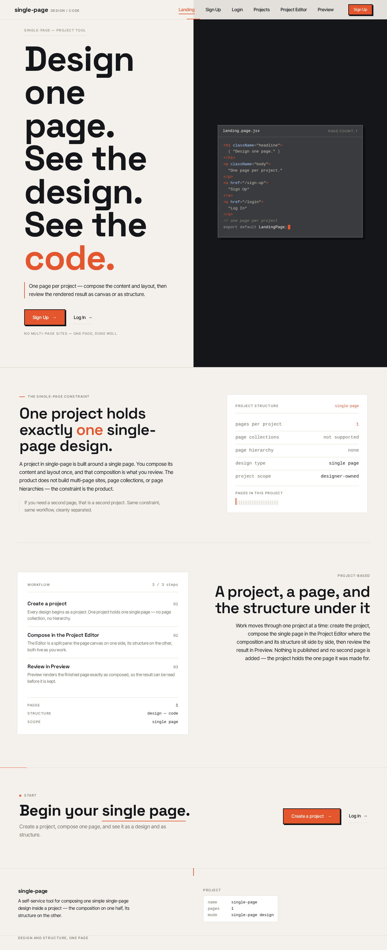
</h1></p></a></a>// one page per projectexport default LandingPage;One project holds exactly one single-page design.
A project in single-page is built around a single page. You compose its content and layout once, and that composition is what you review. The product does not build multi-page sites, page collections, or page hierarchies — the constraint is the product.
If you need a second page, that is a second project. Same constraint, same workflow, cleanly separated.
- Create a project01Every design begins as a project. One project holds one single page — no page collection, no hierarchy.
- Compose in the Project Editor02The Editor is a split pane: the page canvas on one side, its structure on the other, both live as you work.
- Review in Preview03Preview renders the finished page exactly as composed, so the result can be read before it is kept.
A project, a page, and the structure under it
Work moves through one project at a time: create the project, compose the single page in the Project Editor where the composition and its structure sit side by side, then review the result in Preview. Nothing is published and no second page is added — the project holds the one page it was made for.
Begin your single page.
Create a project, compose one page, and see it as a design and as structure.
</h1></p></a></a>// one page per projectexport default LandingPage;One project holds exactly one single-page design.
A project in single-page is built around a single page. You compose its content and layout once, and that composition is what you review. The product does not build multi-page sites, page collections, or page hierarchies — the constraint is the product.
If you need a second page, that is a second project. Same constraint, same workflow, cleanly separated.
- Create a project01Every design begins as a project. One project holds one single page — no page collection, no hierarchy.
- Compose in the Project Editor02The Editor is a split pane: the page canvas on one side, its structure on the other, both live as you work.
- Review in Preview03Preview renders the finished page exactly as composed, so the result can be read before it is kept.
A project, a page, and the structure under it
Work moves through one project at a time: create the project, compose the single page in the Project Editor where the composition and its structure sit side by side, then review the result in Preview. Nothing is published and no second page is added — the project holds the one page it was made for.
Begin your single page.
Create a project, compose one page, and see it as a design and as structure.
No comments yet. Be the first!