silver-todo
build a to-do with no design agents and just core logic


Comments (0)
Sign in to leave a comment
Project Tasks27
Implement Navbar for Home
As a frontend developer, implement the Navbar section for the Home page. Build the `Navbar` component using `useState` for `mobileOpen` and `dropdownOpen` states, and `useRef` for `dropdownRef` to handle click-outside detection via a `useEffect` event listener. Render a brand logo using `CheckSquare` from lucide-react with the 'silver-todo' branded text. Implement desktop nav links from the `navPages` array (Home, TaskList, TaskCard) with active state highlighting for 'Home'. Build the user avatar button that toggles a `framer-motion` `AnimatePresence` dropdown with `opacity/y/scale` animation (initial: opacity 0, y -6, scale 0.96) containing Settings and Sign Out items using `Settings` and `LogOut` lucide icons. Include a hamburger button for mobile. Note: this component may already exist from a previous page — reuse if available.
Task DB Model and Migration
As a Backend Developer, define the SQLAlchemy ORM model for the Task entity with fields: id (UUID or auto-increment int), title (string, required), description (text, optional), completed (boolean, default false), created_at (datetime), updated_at (datetime). Create the initial Alembic migration to generate the tasks table in MySQL/MariaDB. Include a seed script with sample tasks for development.
Theme and Design System Setup
As a Frontend Developer, configure the global theme and design system for the silver-todo application. Define CSS custom properties (or a theme config) for the full color palette: primary (#4A90E2), primary_light (#A6C8FF), secondary (#F5A623), accent (#50E3C2), highlight (#F8E71C), bg (#FFFFFF), surface (rgba(255,255,255,0.9)), text (#333333), text_muted (#777777), border (rgba(0,0,0,0.1)). Set up global base styles, typography, and shared utility classes. Configure framer-motion as a dependency for the flip card animations used in TaskCard and TaskListContainer.
Configure CORS and API Middleware
As a Backend Developer, configure FastAPI middleware for the application: set up CORS to allow requests from the React frontend origin (localhost:3000 for dev, production domain for prod), add request logging middleware, configure global exception handlers for 404/422/500 responses with consistent JSON error schemas, and set up API versioning prefix (e.g. /api/v1). Ensure the OpenAPI docs are accessible at /docs.
Implement HomeHeader for Home
As a frontend developer, implement the `HomeHeader` section for the Home page. Render a `<section className='hh-root'>` containing an animated headline that maps over `headlineWords` array (['Organize', 'your', 'day,', 'effortlessly.']) — each word is a `motion.span` using `wordVariants` with staggered `delay: 0.15 + i * 0.1`, `duration: 0.5`, blur filter animation (`filter: 'blur(6px)'` hidden → `blur(0px)` visible), and custom cubic-bezier ease `[0.25, 0.46, 0.45, 0.94]`. Render a `motion.p` subheadline and a `motion.p` description paragraph both using `fadeUp` variants with sequential delays (0.65 and 0.85). Render a `motion.span` accent line with `scaleX` animation from 0→1 at delay 1.05. All animations use `initial='hidden'` and `animate='visible'`.
Implement TaskInputSection for Home
As a frontend developer, implement the `TaskInputSection` for the Home page. Manage `task` string state, `isFocused` boolean state, and `showSuccess` boolean state via `useState`, plus an `inputRef` via `useRef`. Build a `<form>` with `handleSubmit` that guards on empty trim, triggers `setShowSuccess(true)`, clears input, then auto-hides success after 2200ms via `setTimeout`. Implement `handleKeyDown` for Enter-key submission (no shift). Render a focus-conditional CSS class `tis-input-wrapper--focused` on the wrapper. Use a `motion.input` with `whileFocus={{ scale: 1.005 }}` spring animation (stiffness 300, damping 25) and a `PenLine` icon. Render a `motion.button` submit with `whileHover={{ scale: 1.03 }}` and `whileTap={{ scale: 0.96 }}` conditionally applied only when `task.trim()` is truthy, with spring (stiffness 400, damping 20). Use `AnimatePresence` to show/hide a `tis-success-flash` `motion.div` with `CheckCircle` icon, animating `opacity/y/height` in and out.
Implement TaskListSection for Home
As a frontend developer, implement the `TaskListSection` for the Home page. Manage `tasks` array state initialized from `initialTasks` (5 hardcoded items with id/title/done fields). Implement `toggleTask(id)` to map and flip `done` boolean, and `deleteTask(id)` to filter out the task. Build a local `TaskCard` sub-component that receives `task`, `onToggle`, `onDelete` props and renders a 3D card-flip effect: a `motion.div` wrapper with `layout`, entry animation (`opacity 0, y 16` → `opacity 1, y 0`), and exit animation (`opacity 0, x -60, scale 0.95`) inside `AnimatePresence`. Inside, a `motion.div` with `animate={{ rotateY: isFlipped ? 180 : 0 }}` (duration 0.5, cubic-bezier `[0.4, 0, 0.2, 1]`) and `transformStyle: 'preserve-3d'`. Render a front face (`tls-card-front`) with a checkbox using `Check` lucide icon, task title with `tls-task-title--done` conditional class, and a delete button with `Trash2` icon. Render a back face (`tls-card-back`) showing a motivational message from the `motivationalMessages` array via `getMotivationalMessage(task.id % 6)`, plus the task name. Render the full list wrapped in `AnimatePresence`.
Implement Footer for Home
As a frontend developer, implement the `Footer` section for the Home page. Render a `motion.footer` with `initial={{ opacity: 0 }}`, `whileInView={{ opacity: 1 }}`, `viewport={{ once: true, margin: '-40px' }}`, and `transition={{ duration: 0.5, ease: 'easeOut' }}` scroll-triggered fade-in. Inside `ftr-inner`, render a copyright paragraph using `new Date().getFullYear()` with the `ftr-brand` span for 'silver-todo'. Render a `<nav aria-label='Footer navigation'>` that maps over `footerLinks` array ([Home /Home, TaskList /TaskList, Privacy /Privacy]) using `React.Fragment` with a `ftr-divider` span inserted between items (index > 0 check). Note: this component may already exist from a previous page — reuse if available.
Implement Navbar for TaskList
As a frontend developer, implement the Navbar section for the TaskList page. This component uses useState for mobileOpen toggle state and renders a responsive nav with: a CheckSquare lucide icon logo linking to /TaskList, desktop nav links mapping over a pages array ([Task List, Task Card]), a Plus icon 'New Task' button, a user avatar div, and a hamburger button with three nb-hamburger-line spans that toggles nb-open class. A separate nb-mobile-menu div conditionally renders nb-visible class, showing mobile nav links, a divider, and a mobile add button. Note: this Navbar component may already exist from the Home page (task fed342fe-336f-479c-a25d-ee2feb5d0802) — reuse or adapt as needed.
Tasks CRUD API Endpoints
As a Backend Developer, implement the FastAPI REST endpoints for task management: GET /tasks (list all tasks), POST /tasks (create a new task), GET /tasks/{id} (get single task), PUT /tasks/{id} (update task, including marking complete), DELETE /tasks/{id} (delete task). Each endpoint should return appropriate HTTP status codes and JSON responses. Include request/response Pydantic models for validation.
Implement TaskListHeader for TaskList
As a frontend developer, implement the TaskListHeader section for the TaskList page. Uses framer-motion with containerVariants (staggerChildren: 0.12, delayChildren: 0.15) and wordVariants (opacity 0→1, y 18→0, duration 0.5, cubic ease) to animate the title words ['Your', 'Tasks,', 'Organized.'] individually via whileInView with viewport once:true amount:0.6. The last word gets class tlh-title-accent, others get tlh-title-word. A subtitleVariants motion.p fades in with y:12→0, delay 0.55. A tlh-accent-bar decorative bar and tlh-dots section with six tlh-dot spans render as decorative elements.
Implement TaskListControls for TaskList
As a frontend developer, implement the TaskListControls section for the TaskList page. Uses useState for searchText, sortOpen (dropdown toggle), activeSort (default 'newest'), and filterActive. A useRef on sortRef and a useEffect add a mousedown outside-click listener to close the sort dropdown. The search field uses a Search lucide icon with a controlled input. A SlidersHorizontal filter toggle button conditionally shows a tlc-filter-badge span when filterActive is true. A sort dropdown trigger button shows ArrowUpDown icons and the activeSortLabel; AnimatePresence wraps a motion.div sort dropdown (opacity/y/-6/scale 0.96 animation) listing sortOptions ['newest','oldest','alphabetical'] with Check icon on active selection via handleSortSelect.
Implement TaskListContainer for TaskList
As a frontend developer, implement the TaskListContainer section for the TaskList page. Uses useState for tasks array (7 seeded tasks with id, text, completed, dueDate, tag fields), flippedCards (Set), and exitingCards (Set). Splits tasks into activeTasks and completedTasks via filter. toggleComplete and undoComplete both add taskId to flippedCards Set, then after 800ms setTimeout update the task's completed field and remove from flippedCards — creating a flip card animation. deleteTask uses exitingCards Set for exit animation. Renders task cards with Trash2, Calendar, RotateCcw, CheckCircle2, Sparkles, Clock, Circle, Star lucide icons. motivationalMessages array of 5 strings displays randomly on task completion. Uses AnimatePresence for task enter/exit transitions.
Implement TaskListFilters for TaskList
As a frontend developer, implement the TaskListFilters section for the TaskList page. Uses useState for active filter key (default 'all'). Renders three filter tab buttons from a filters array [{key:'all',label:'All',count:12},{key:'completed',label:'Completed',count:7},{key:'pending',label:'Pending',count:5}]. Each button conditionally applies tf-active class and aria-pressed. When isActive, renders a framer-motion span with layoutId='tf-underline' and spring transition (stiffness:500, damping:32) to animate the sliding underline indicator between tabs. A tf-divider renders below the tab row.
Implement TaskListEmpty for TaskList
As a frontend developer, implement the TaskListEmpty section for the TaskList page. Uses framer-motion containerVariants (staggerChildren:0.15, delayChildren:0.1) with initial='hidden' animate='visible' on the te-inner wrapper. itemVariants animate opacity 0→1, y:12→0 over 0.5s easeOut. iconVariants animate opacity 0→1 scale 0.6→1 over 0.55s with cubic ease. The icon area renders a te-icon-bg, te-icon-circle with ClipboardList lucide icon, and 6 te-dot spans positioned via inline styles from dotPositions array (using top/bottom/left/right/transform). Below the icon, a motion.div te-message shows 'No tasks yet' h2 and descriptor p. A Plus icon 'Add Your First Task' te-cta button and a te-tip motivational paragraph with te-tip-highlight span complete the empty state.
Implement Footer for TaskList
As a frontend developer, implement the Footer section for the TaskList page. Renders a ftr-footer with ftr-inner containing: a ftr-top row with ftr-brand (CheckSquare lucide icon + 'silver-todo' logo text + tagline paragraph) and ftr-nav with two ftr-nav-groups — 'Pages' group linking to /TaskList and /TaskCard, 'About' group with 'Get Started' and 'Manage Tasks' links. A ftr-divider separates top from ftr-bottom which shows dynamic copyright using new Date().getFullYear() and a 'Built with ♥ using React & FastAPI' ftr-built-with span with ftr-heart styled heart. Note: this Footer component may already exist from the Home page (task b149815d-1c2a-44b4-b0a8-96ccfec9b031) — reuse or adapt as needed.
Implement Navbar for TaskCard
As a frontend developer, implement the Navbar section for the TaskCard page. The component is shared with TaskList and Home pages — reuse the existing Navbar component if already built. It uses useState for mobileOpen toggle, renders nb-navbar with nb-inner layout containing: a nb-logo anchor linking to /TaskList with CheckSquare lucide icon and 'silvertodo' branding, nb-nav-links mapping over pages array ([Task List /TaskList, Task Card /TaskCard]), and nb-right containing a Plus icon 'New Task' button, nb-avatar div, and a hamburger button with three nb-hamburger-line spans that conditionally adds nb-open class. A separate nb-mobile-menu div conditionally adds nb-visible class and renders mobile nav links plus a mobile add button.
Integrate Home Page Tasks
As a Tech Lead, verify the end-to-end integration between the Home page frontend implementation (TaskInputSection, TaskListSection) and the Tasks backend API. Ensure the task creation form (POST /tasks) and task list display (GET /tasks) work correctly, API responses are handled properly in the UI, optimistic updates or loading states are in place, and error handling is visible to the user. Note: frontend tasks 1cb14cbb and c4dd46e6 depend on temp_backend_tasks_api.
Implement TaskCardHeader for TaskCard
As a frontend developer, implement the TaskCardHeader section for the TaskCard page. Uses useState for completed boolean (initially false from taskData). Renders a tch-header with tch-inner containing: a breadcrumb nav with ChevronLeft icon back-link to /TaskList and a tch-breadcrumb-current span. Below is tch-main with tch-title-area (h1 displaying taskData.title + Pencil icon edit button) and tch-meta row. The meta row contains a toggleable status button that calls handleToggleStatus on click — it conditionally applies tch-status--completed or tch-status--pending class and uses AnimatePresence with framer-motion to animate the tch-status-dot (scale+opacity) and label text (opacity+y) on state change. A priority indicator span conditionally applies tch-priority--high/medium/low class with a tch-priority-icon span and priority label text.
Implement TaskCardContainer for TaskCard
As a frontend developer, implement the TaskCardContainer section for the TaskCard page. Uses useState for shinePos ({x:50,y:50}) and useCallback for handleMouseMove and handleMouseLeave. handleMouseMove computes cursor position as percentage of card dimensions via getBoundingClientRect and updates shinePos; handleMouseLeave resets to {x:50,y:50}. Renders a tcc-section with motion.div tcc-card that has onMouseMove/onMouseLeave handlers and entry animation (opacity 0→1, y 24→0, 0.5s easeOut). Inside, a tcc-shine div uses CSS custom properties --shine-x and --shine-y from shinePos for the cursor-following radial gradient. tcc-content contains: a tcc-section-label with dot and text, a motion.div tcc-description-block (opacity fade-in delay 0.15s) with FileText icon and taskData.description paragraph, and a motion.div tcc-dates-row (delay 0.25s) with tcc-date-item entries for Calendar/created and Clock/due date with tcc-date-icon, tcc-date-label, tcc-date-value. Also displays Flag/priority and category metadata items.
Implement TaskCardFlipAnimation for TaskCard
As a frontend developer, implement the TaskCardFlipAnimation section for the TaskCard page. Uses useState for flipped boolean and celebrationIndex integer. celebrations array holds 4 objects with emoji, heading, message. handleFlip randomly picks a new celebrationIndex (Math.floor(Math.random()*4)) when flipping to back, then toggles flipped. handleReset calls e.stopPropagation() and sets flipped to false. Renders tfa-section with tfa-intro label/title/hint text. The tfa-perspective wrapper contains a motion.div tfa-card animated with rotateY: flipped?180:0, duration 0.65s cubic bezier ease, onClick handleFlip, keyboard accessible (Enter/Space). Front face (tfa-face tfa-front) shows category badge, h3 title, hr divider, description, metadata row with Clock/Calendar/Flag icons, and an ArrowLeftRight flip-hint. Back face (tfa-face tfa-back, backfaceVisibility hidden, rotateY 180deg) shows the randomly selected celebration emoji, heading, message, CheckCircle2, Star, Sparkles icons, and a RotateCcw reset button calling handleReset. Award icon used as decorative element.
Implement TaskCardActions for TaskCard
As a frontend developer, implement the TaskCardActions section for the TaskCard page. Uses useState for completeState boolean, deckey/editkey integers (for animation resets), and ripples object map. createRipple useCallback computes ripple position from getBoundingClientRect (size = max(width,height), x/y relative to click), adds a timestamped entry to ripples state keyed by btnId+Date.now(), then removes it after 600ms via setTimeout. Three action handlers (handleComplete, handleEdit, handleDelete) each call createRipple then update their respective state: handleComplete sets completeState true then resets after 1800ms, handleEdit/handleDelete increment their key counters. buttons array defines 3 entries: complete (CheckCircle, tca-btn--complete), edit (Pencil, tca-btn--edit), delete (Trash2, tca-btn--delete). Each rendered as motion.button with buttonVariants (hidden: opacity 0 y:12, visible: staggered delay i*0.1, 0.4s ease), whileInView viewport trigger, whileHover scale 1.02, whileTap scale 0.97. Ripple spans are rendered inside each button by filtering ripples by btnId.
Implement TaskCardMetadata for TaskCard
As a frontend developer, implement the TaskCardMetadata section for the TaskCard page. Pure display component with no local state. Defines rowVariants (hidden: opacity 0 x:-16, visible: staggered delay i*0.1, 0.4s ease) and tagHover variants (rest scale:1, hover scale:1.08 0.2s easeOut). Renders tmd-section with tmd-inner containing a motion.div tmd-card (whileInView visible, once:true margin:-40px). Four motion.div tmd-row entries each with custom index prop for stagger: Calendar icon + 'Created' label + metadata.created value; Clock icon + 'Modified' label + metadata.modified value; Tag icon + 'Tags' label + tmd-tags-wrap div mapping metadata.tags array as motion.span tmd-tag with tagHover variants (initial rest, whileHover hover); FolderOpen icon + 'Category' label + tmd-category-badge span with FolderOpen icon and metadata.category text. tmd-divider divs between each row.
Implement RelatedTasks for TaskCard
As a frontend developer, implement the RelatedTasks section for the TaskCard page. Uses useState for activeCategory (default 'All'). allCategories array: ['All','Work','Personal','Health','Learning']. relatedTasks array has 6 items with id, title, description, category, status (in-progress/completed/pending), href. statusIcons maps status to Clock/CheckCircle2/CircleDot lucide icons (size 12). cardVariants define hidden (opacity 0 y:20), visible (staggered delay i*0.06, 0.35s ease [0.4,0,0.2,1]), and exit (opacity 0 scale 0.95 0.2s) states. filteredTasks computed by filtering relatedTasks by activeCategory (or all if 'All'). Renders rlt-section with rlt-inner: rlt-header with h2 'Related Tasks' and subtitle paragraph. rlt-filters maps allCategories as buttons with rlt-filter-chip class plus active modifier when matching activeCategory, onClick sets activeCategory. Below, AnimatePresence wraps a grid/list mapping filteredTasks as motion.div cards with cardVariants, custom index, key=task.id. Each card shows title, description, category badge, status chip with icon and label, and ArrowRight link to task.href. Layers icon used in section header.
Implement Footer for TaskCard
As a frontend developer, implement the Footer section for the TaskCard page. This component is shared with Home and TaskList pages — reuse the existing Footer component if already built. Pure static component with no state. Computes currentYear via new Date().getFullYear(). Renders ftr-footer with ftr-inner containing ftr-top div: ftr-brand with ftr-logo (CheckSquare lucide icon in ftr-logo-icon span + 'silver-todo' text) and ftr-tagline paragraph. ftr-nav contains two ftr-nav-group divs: 'Pages' group with links to /TaskList and /TaskCard; 'About' group with two links to /TaskList. ftr-divider separates top from ftr-bottom which shows ftr-copyright span (dynamic year) and ftr-built-with span with ftr-heart span containing ♥ symbol.
Integrate TaskList Page
As a Tech Lead, verify the end-to-end integration between the TaskList page frontend implementation (TaskListContainer, TaskListFilters, TaskListControls) and the Tasks backend API. Ensure task listing (GET /tasks), mark-complete (PUT /tasks/{id}), and delete (DELETE /tasks/{id}) all work correctly. Verify the flip card animation triggers correctly on completion, filter/sort controls reflect real data from the API, and the empty state renders when no tasks exist. Note: frontend tasks 6d66e9b7, 81a53475, 0e82c9cc depend on temp_backend_tasks_api.
Integrate TaskCard Page
As a Tech Lead, verify the end-to-end integration between the TaskCard page frontend implementation (TaskCardHeader, TaskCardContainer, TaskCardActions, TaskCardFlipAnimation) and the Tasks backend API. Ensure task detail fetch (GET /tasks/{id}), status toggle (PUT /tasks/{id}), and delete (DELETE /tasks/{id}) work correctly. Verify the flip card animation and related tasks display function as expected with real data. Note: frontend tasks 2c7d9f9d, 49f65f16, d1a3e5c1 depend on temp_backend_tasks_api.
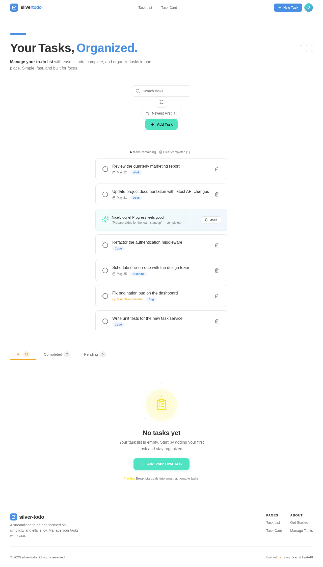
Manage your to-do list with ease — add, complete, and organize tasks in one place. Simple, fast, and built for focus.
- Review the quarterly marketing report
- Update project documentation with latest API changes
- Prepare slides for the team standup
- Refactor the authentication middleware
- Schedule one-on-one with the design team
- Fix pagination bug on the dashboard
- Write unit tests for the new task service
Pro tip: Break big goals into small, actionable tasks.
No comments yet. Be the first!