shiny-design
 Diya Trivedi
start a project to build simple singlepage design

Comments (0)
Sign in to leave a comment
System Requirements
Shiny-Design System Requirements Document
Introduction
The purpose of this document is to outline the system requirements for the "shiny-design" project. This project aims to create a simple, single-page design that meets the specified user needs.
System Overview
The "shiny-design" project is focused on developing a straightforward, single-page web application. The design will be minimalistic yet visually appealing, ensuring ease of navigation and a seamless user experience. The project will cater to a diverse user base, providing an intuitive interface that is both functional and aesthetically pleasing.
Functional Requirements
- As a User, I should be able to view all content on a single page without needing to navigate to other pages.
- As a User, I should be able to interact with elements on the page, such as buttons or links, to access additional information or perform actions.
- As a User, I should be able to experience smooth scrolling and transitions between sections on the page.
User Personas
- User: The primary persona for this project is a general user who seeks a simple and efficient way to access information on a single-page layout.
Core User Flows
- User opens the webpage -> User scrolls through content -> User interacts with elements (e.g., buttons, links) -> User accesses additional information or performs actions.
Visuals Colors and Theme
- primary: #3498db (a calming blue)
- primary_light: #85c1e9 (a lighter shade of blue for hover states)
- secondary: #e74c3c (a contrasting coral for emphasis)
- accent: #f1c40f (a vibrant yellow for call-to-action elements)
- highlight: #f39c12 (a warm orange for active indicators)
- bg: #ecf0f1 (a light grey for the background)
- surface: rgba(255, 255, 255, 0.9) (a soft white for card/panel backgrounds)
- text: #2c3e50 (a dark blue for primary text)
- text_muted: #95a5a6 (a muted grey for secondary text)
- border: rgba(44, 62, 80, 0.2) (a subtle dark blue for borders)
Signature Design Concept
The homepage will feature an interactive "living canvas" concept. As users scroll, the background will subtly change colors, creating a dynamic and engaging experience. The page will be divided into sections that appear as floating panels, each with a unique animation triggered by scrolling. Users can click on elements within these panels to reveal more information or perform actions. The design will leverage framer-motion for smooth animations and transitions, ensuring a polished and modern aesthetic.
Interaction Model & Motion Direction
The interaction model for the landing page will be "parallax." This approach will create a layered depth effect as users scroll, with decorative elements moving at different speeds to enhance the visual storytelling. The content will remain in the normal flow, providing a natural and intuitive scrolling experience.
Non-Functional Requirements
- The design must be responsive and accessible across various devices and screen sizes.
- The page should load quickly, with minimal latency, to ensure a smooth user experience.
- The design should adhere to web accessibility standards to accommodate users with disabilities.
Tech Stack
- Frontend: React for Web
- Backend: Not applicable for a static single-page design
- Database: Not applicable for a static single-page design
Assumptions and Constraints
- The project assumes a basic level of user interaction, focusing on simplicity and ease of use.
- The design will be constrained to a single-page layout, limiting the complexity of navigation and content organization.
Glossary
- Single-page design: A web design approach where all content is presented on one page, eliminating the need for multiple page navigation.
- Parallax: A scrolling technique that creates an illusion of depth by moving background images slower than foreground images.
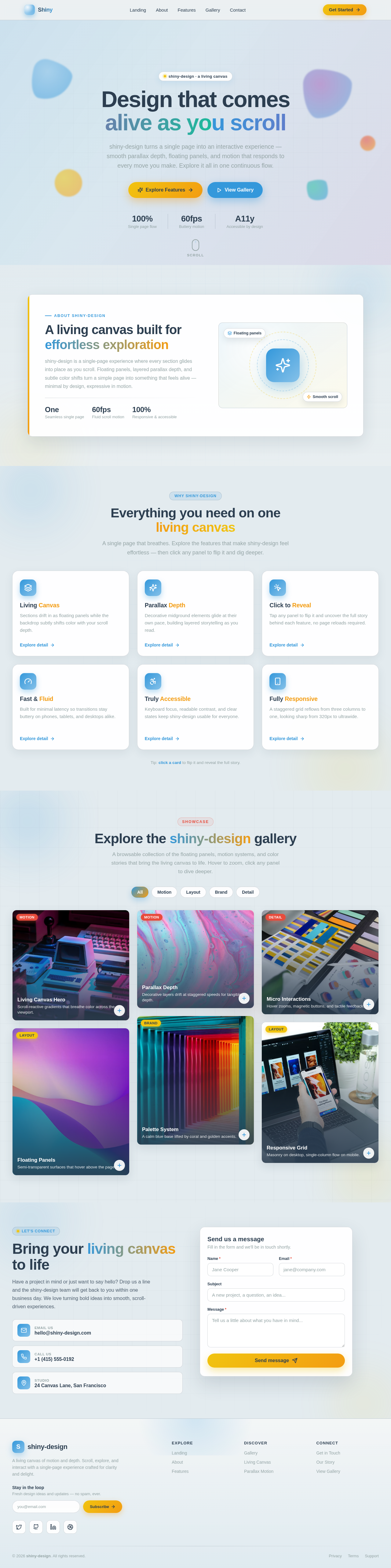
Design that comes
alive as you scroll
shiny-design turns a single page into an interactive experience — smooth parallax depth, floating panels, and motion that responds to every move you make. Explore it all in one continuous flow.
A living canvas built for effortless exploration
shiny-design is a single-page experience where every section glides into place as you scroll. Floating panels, layered parallax depth, and subtle color shifts turn a simple page into something that feels alive — minimal by design, expressive in motion.
Everything you need on one living canvas
A single page that breathes. Explore the features that make shiny-design feel effortless — then click any panel to flip it and dig deeper.
Living Canvas
Sections drift in as floating panels while the backdrop subtly shifts color with your scroll depth.
Explore detailLiving Canvas
Each panel is staged as an independent layer that animates into view on scroll. The ambient gradient warms and cools as you move down the page, turning a flat single-page layout into a depth-rich, living surface.
Parallax Depth
Decorative midground elements glide at their own pace, building layered storytelling as you read.
Explore detailParallax Depth
Background blobs, grids, and accent washes track scroll at 0.3 and 0.6 speeds, while your content stays in natural flow. The result is cinematic dimensionality without ever hijacking the scrollbar.
Click to Reveal
Tap any panel to flip it and uncover the full story behind each feature, no page reloads required.
Explore detailClick to Reveal
Every card flips on a 3D axis to expose a detail face packed with the context that matters. Interaction lives where the content is — open it, explore it, then flip it back with a single tap.
Fast & Fluid
Built for minimal latency so transitions stay buttery on phones, tablets, and desktops alike.
Explore detailFast & Fluid
Animations are GPU-accelerated and tuned for low overhead, keeping the experience instant. The single-page architecture loads once and responds the moment you reach for it.
Truly Accessible
Keyboard focus, readable contrast, and clear states keep shiny-design usable for everyone.
Explore detailTruly Accessible
Cards respond to keyboard focus and Enter activation, color choices respect contrast guidance, and motion stays purposeful. Accessibility is designed in from the first pixel, not bolted on later.
Fully Responsive
A staggered grid reflows from three columns to one, looking sharp from 320px to ultrawide.
Explore detailFully Responsive
The layout fluidly steps between three, two, and single-column grids as the viewport changes. Typography and spacing scale with clamp() so every breakpoint feels intentionally composed.
Tip: click a card to flip it and reveal the full story.
Explore the shiny-design gallery
A browsable collection of the floating panels, motion systems, and color stories that bring the living canvas to life. Hover to zoom, click any panel to dive deeper.



Bring your living canvas to life
Have a project in mind or just want to say hello? Drop us a line and the shiny-design team will get back to you within one business day. We love turning bold ideas into smooth, scroll-driven experiences.
Send us a message
Fill in the form and we'll be in touch shortly.
No comments yet. Be the first!