shiny-consulting
 Jamique Hawkins
Create a modern, high-end website for a consulting company that helps startups, agencies, and established brands identify hidden revenue opportunities and fix gaps in their business. This is NOT an e-commerce site. It is a consulting and strategy firm focused on uncovering where companies are leaving money on the table—through weak positioning, poor customer understanding, lack of emotional connection, or ineffective design. Brand Positioning: * We sit at the intersection of business strategy, psychology, and design * We help brands understand what their audience actually feels, wants, and responds to * We refine how brands communicate visually and emotionally to increase engagement and revenue * Tone: confident, intelligent, slightly mysterious, high-value * Audience: startups, creative agencies, and scaling brands aiming for elite-level positioning Color palette: Black, white, off-white, subtle grayscale * Typography: Modern serif + clean sans-serif mix * Style: Editorial, luxury, minimal, slightly brutalist * Lots of whitespace, bold statements, sharp layout * Subtle animations (hover reveals, text fades, smooth transitions) * No cheesy stock images—use abstract visuals, textures, or conceptual imagery ⸻ 🧠 CORE MESSAGE “We find what your brand is missing—and turn it into revenue.” Focus on: * Missed opportunities * Hidden inefficiencies * Emotional disconnect with customers * Underutilized brand identity * Weak design communication ⸻ 🧩 WEBSITE STRUCTURE 1. Hero Section * Bold headline: * “You’re Leaving Money on the Table.” * Subtext: * “We identify the gaps your brand can’t see—and turn them into growth.” * CTA: * “Book a Strategy Call” ⸻ 2. What We Do Explain simply but powerfully: * Revenue gap analysis * Customer psychology & behavior insights * Brand/design optimization * Experience refinement ⸻ 3. How We Think Position this as elite thinking: * We don’t guess—we diagnose * We combine data + human behavior + design * We focus on perception, not just product ⸻ 4. Services (keep it clean, not too many) * Brand Audit & Revenue Leak Analysis * Customer Insight & Positioning Strategy * Creative Direction & Design Optimization * Experience & Engagement Strategy ⸻ 5. Who It’s For * Early-stage startups trying to scale * Agencies looking to refine their clients’ results * Established brands aiming for premium positioning ⸻ 6. Results / Outcomes Instead of fake testimonials, use statements like: * “Clearer positioning” * “Higher customer engagement” * “Stronger brand perception” * “Increased conversion potential” ⸻ 7. Final CTA * “If you feel like your brand should be performing better—you’re right.” * Button: “Let’s Fix It” ⸻ ⚡ VIBE NOTES FOR THE BUILDER * Make it feel like a luxury consultancy, not a marketing agency * Slightly mysterious tone—don’t over-explain everything * Keep copy short, sharp, and impactful * Prioritize layout and typography over images * Make it feel like a $10K+ service, not cheap consulting
Comments (0)
Sign in to leave a comment
System Requirements
System Requirements Document (SRD) for shiny-consulting
1. Introduction
The shiny-consulting project is a modern, high-end website designed for a consulting company that specializes in helping startups, agencies, and established brands uncover hidden revenue opportunities and address inefficiencies in their business. The website will reflect the brand's positioning at the intersection of business strategy, psychology, and design, with a focus on creating an elite, luxury experience for its users.
This document outlines the system requirements for the shiny-consulting project, ensuring alignment with the brand's vision and goals. The website will cater to a U.S.-based audience, with a tone that is confident, intelligent, slightly mysterious, and high-value.
2. System Overview
The shiny-consulting website will serve as a digital platform to communicate the brand's core message: “We find what your brand is missing—and turn it into revenue.” It will highlight the company's expertise in identifying missed opportunities, addressing emotional disconnects with customers, and optimizing brand communication and design.
The website will feature a clean, editorial, and slightly brutalist design, with an emphasis on whitespace, bold typography, and subtle animations. It will avoid stock imagery, instead utilizing textured patterns to complement the brutalist style. The site will prioritize clarity, luxury, and a premium user experience.
Key features include:
- A bold and engaging homepage that captures attention immediately.
- Clear and concise sections explaining services, methodology, and target audience.
- Calls-to-action (CTAs) that encourage users to book strategy calls.
- A results-focused section that highlights outcomes without relying on testimonials.
3. Functional Requirements
- As a User, I should be able to view a bold headline and subtext in the hero section that communicates the brand's core message.
- As a User, I should be able to click a CTA button in the hero section to book a strategy call.
- As a User, I should be able to navigate through sections explaining the services offered by the company.
- As a User, I should be able to understand the company's methodology through a "How We Think" section.
- As a User, I should be able to view a list of services with clear descriptions.
- As a User, I should be able to identify if the services are relevant to me through a "Who It’s For" section.
- As a User, I should be able to see the potential outcomes of working with the company in a "Results / Outcomes" section.
- As a User, I should be able to interact with subtle animations and transitions throughout the site.
- As a User, I should be able to access a final CTA encouraging me to take action.
4. User Personas
1. Startup Founder
- Description: Early-stage entrepreneurs looking to scale their businesses and refine their brand positioning.
- Goals: Identify revenue opportunities, improve customer engagement, and establish a premium brand image.
- Pain Points: Limited resources, lack of clarity on customer psychology, and weak brand communication.
2. Agency Executive
- Description: Leaders of creative or marketing agencies seeking to enhance results for their clients.
- Goals: Refine client strategies, improve design and communication, and deliver measurable outcomes.
- Pain Points: Difficulty diagnosing gaps in client performance and aligning design with customer psychology.
3. Established Brand Manager
- Description: Managers of scaling or established brands aiming for elite-level positioning.
- Goals: Strengthen brand perception, increase customer loyalty, and optimize engagement strategies.
- Pain Points: Emotional disconnect with customers, underutilized brand identity, and missed revenue opportunities.
5. Visuals Colors and Theme
Color Palette
- Background: #F7F7F5 (Off-white with a subtle warmth)
- Surface: #EAEAEA (Soft gray for cards and sections)
- Text: #1A1A1A (Deep black for sharp, high-contrast typography)
- Accent: #CBA135 (Rich gold for luxury highlights and CTAs)
- Muted Tones: #B3B3B3 (Light gray for secondary text and subtle elements)
Typography
- Primary Font: Modern serif for headlines (e.g., Playfair Display)
- Secondary Font: Clean sans-serif for body text (e.g., Inter)
Style
- Editorial, luxury, minimal, and slightly brutalist, with textured patterns to add depth and sophistication.
6. Signature Design Concept
The shiny-consulting homepage will feature a textured, interactive canvas that evolves as users scroll. The landing page will open with a bold headline—“You’re Leaving Money on the Table”—set against a textured, abstract background that subtly shifts in response to mouse movement, creating a sense of depth and intrigue.
As users scroll, the textured patterns will transition between sections, with smooth fades and hover reveals adding a tactile, high-end feel. Key elements include:
- Dynamic Text Animations: Headlines and subtext will fade in with a slight delay, creating a cinematic effect.
- Interactive Patterns: Textured backgrounds will respond to user interactions, such as mouse movement or scrolling, to create a sense of immersion.
- Gold Accents: CTAs and key highlights will shimmer subtly when hovered over, reinforcing the luxury aesthetic.
- Whitespace and Brutalist Layouts: Sections will be sharply divided with clean lines, bold typography, and ample whitespace, ensuring clarity and focus.
This design concept will make the homepage unforgettable, setting the tone for the rest of the site.
7. Non-Functional Requirements
- The website must load within 3 seconds on a standard broadband connection.
- The design must be fully responsive and optimized for desktop, tablet, and mobile devices.
- Accessibility standards (WCAG 2.1) must be met to ensure usability for all users.
- The site must be SEO-friendly, with clean, semantic HTML and metadata.
- Animations and transitions must be smooth and lightweight to avoid performance issues.
8. Tech Stack
Frontend
- React for Web
Backend
- Python
- FastAPI
Database
- MySQL (with Alembic for migrations)
AI Tools
- GPT 5.4 for user-friendly responses
- Google Nano Banana for generating abstract visuals
Local Orchestration
- Docker
- docker-compose
Server-Side Orchestration
- Kubernetes
9. Assumptions and Constraints
- The primary audience is U.S.-based, so the default language and currency will be English and USD, respectively.
- The website will not include e-commerce functionality.
- The design will avoid stock images, relying instead on abstract visuals and textured patterns.
- The project timeline assumes a 3-month development cycle.
10. Glossary
- CTA: Call-to-Action, a prompt encouraging users to take a specific action (e.g., "Book a Strategy Call").
- WCAG: Web Content Accessibility Guidelines, a set of standards for ensuring web accessibility.
- Brutalist Design: A style characterized by bold, sharp layouts, minimal ornamentation, and a focus on typography and structure.
- Whitespace: Empty space in a design used to create focus and clarity.
- Responsive Design: A design approach that ensures the website looks and functions well on all devices.
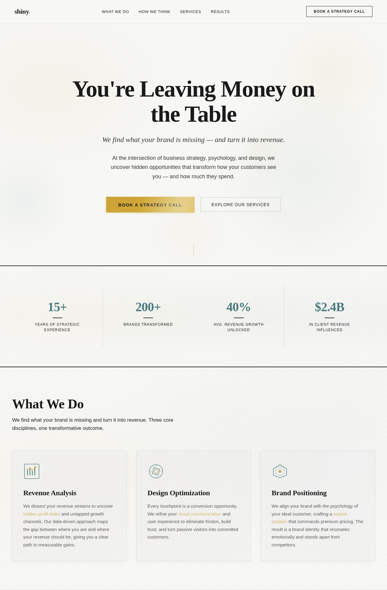
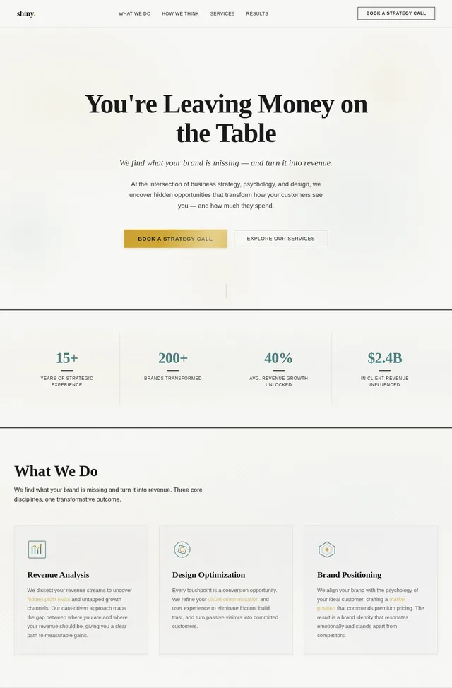
You're Leaving Money on the Table
We find what your brand is missing — and turn it into revenue.
At the intersection of business strategy, psychology, and design, we uncover hidden opportunities that transform how your customers see you — and how much they spend.
What We Do
We find what your brand is missing and turn it into revenue. Three core disciplines, one transformative outcome.
Revenue Analysis
We dissect your revenue streams to uncover hidden profit leaks and untapped growth channels. Our data-driven approach maps the gap between where you are and where your revenue should be, giving you a clear path to measurable gains.
Design Optimization
Every touchpoint is a conversion opportunity. We refine your visual communication and user experience to eliminate friction, build trust, and turn passive visitors into committed customers.
Brand Positioning
We align your brand with the psychology of your ideal customer, crafting a market position that commands premium pricing. The result is a brand identity that resonates emotionally and stands apart from competitors.
No comments yet. Be the first!