rapid-portfolio
Portfolio website with good UI,

Comments (0)
Sign in to leave a comment
System Requirements
System Requirements Document for rapid-portfolio
1. Introduction
rapid-portfolio is a personal portfolio website for its owner, Keyur. Its product intent is twofold and comes directly from the authoritative requirement thread:
- Build a portfolio website with good UI. The site must be a genuinely well-designed presentation surface, not a generic template.
- Present the owner's work and information, upgrading the previously made site at keyur53987.github.io. The existing personal site is the baseline for both content and interface; rapid-portfolio is the upgrade of that baseline in UI and in information.
The audience is the portfolio's visitors — recruiters, hiring managers, collaborators and peers who scan many portfolios and judge craft within seconds — plus the owner, who maintains and upgrades the presentation of their own work and profile.
The reference site keyur53987.github.io was declared as a content_source, structure_reference and visual_inspiration with supplemental authority, but it could not be fetched or inspected during evidence gathering. Its content, navigation structure and visual design are therefore unverified. The owner's work and information are treated as owner-supplied content at build time, and the visual direction upgrades whatever baseline exists rather than copying it. No facts are invented to fill the gap.
2. System Overview
rapid-portfolio is a single-surface, publicly reachable personal portfolio site. It is delivered as a custom first-party web UI. There is no account system, no sign-in, and no differentiated permissions: the site is anonymous and public by design, and every visitor sees the same content.
Actors
- Portfolio Owner — the person whose portfolio this is. Maintains and upgrades the presentation of their own work and profile.
- Visitor — recruiters, hiring managers, collaborators and peers who browse the owner's work and information to evaluate them.
Accepted behavior
- A public entry surface, Landing, presents the owner's work and information with the requested UI upgrade.
- Visitors browse the showcased work and profile details and can reach the owner through the contact block.
- The owner maintains the site's content and presentation as an ongoing responsibility.
Ownership and exclusions
- All accepted human-facing behavior is owned by the first-party Landing page.
- The reference site
keyur53987.github.iois a baseline reference only; it is not a destination inside rapid-portfolio and no content from it is asserted as verified. - No account creation, authentication, role-based visibility, admin console, CMS, blog engine, or e-commerce capability is part of the current scope.
2a. Product Interpretation and Delivery Boundary
rapid-portfolio is a public, anonymous, single-page portfolio. Delivery is first-party custom UI served as a static-style web experience; there is no provider-owned surface and no external destination that owns accepted behavior. Because no accepted journey requires a visitor to privately own or resume durable state, and no commitment, entitlement or value transfer must remain bound to a specific participant, no application-owned identity is introduced. The Landing page is reachable without any identity step, and no protected destination exists.
The current delivery horizon covers the Landing surface and its content: hero, work, about, writing, contact. The reference URL keyur53987.github.io is treated as an unverified baseline — its content is supplied by the owner at build time, and its UI is superseded by the editorial direction in this document rather than reproduced.
Future items (see Section 11) are explicitly out of current scope and must not appear in current pages or acceptance criteria.
2b. Source Content Inventory
The reference directive for keyur53987.github.io declares content_source, but the source was unverified — content not accessible or fetchable. No factual entities, collection items, fields, values, descriptions, dates, contacts, links or media references could be verified from it. Accordingly, no inventory of source facts is asserted here. The owner's work and information are owner-supplied at build time; the site must render whatever the owner supplies without inventing facts.
2c. Page Content and Component Coverage
Landing
The single public surface of rapid-portfolio. It is anonymous, publicly reachable, and presents the owner's work and information as one continuous editorial page.
Information and state
- Owner's name, presented as the hero statement.
- One-line positioning sentence describing what the owner does.
- A work list: each entry carries a project name, a role, and a year.
- An about block: the owner's profile information.
- A writing block: the owner's written pieces, when supplied.
- A contact block: the owner's email address.
- No loading state is required for first paint beyond standard document load; no empty state exists for the page itself. The work list, writing list and about block each have an empty state when the owner has supplied no items for that block.
Primary actions
- Scroll from the hero into the work list.
- Hover or focus a work row to preview its thumbnail.
- Open a work entry to view its detail.
- Reach the owner via the email link in the contact block.
Supporting actions
- Navigate between sections via the fixed top bar (
work,about,writing,contact). - Return to the top of the page.
Domain entities
- Owner profile — name, positioning sentence, portrait or hero image, about text, email address.
- Work entry — project name, role, year, optional thumbnail image, optional detail content.
- Writing entry — title, optional date, optional link or body.
- Section — one of work, about, writing, contact.
Component responsibilities
- Fixed top bar — owner's name in 13px uppercase Archivo at left; four lowercase nav words (
work,about,writing,contact) with a 2px accent underline that slides to the active section; sits on a 1px hairline. - Hero — 7/5 asymmetric split. Left 7 columns: owner's name in Playfair Display at ~140px, stacked over two lines, second line in vermilion italic, sitting on a 1px off-white rule that runs to the viewport edge; below it one 19px Archivo sentence and a rectangular text-plus-40px-rule
see the work ↓control. Right 5 columns: full-bleed monochrome portrait or hero work image, cropped to touch the top and right viewport edges, 0px radius, no shadow. - Section label — 13px uppercase Archivo, +0.18em tracking, preceded by a 24px vermilion rule; the only structural ornament.
- Work list — ruled editorial rows: project name in 40px Playfair, role/year in 13px uppercase Archivo right-aligned. Hovering or focusing a row crossfades a monochrome thumbnail into the right margin. No card grid, no hover-lift.
- Typographic plate — fallback for a work entry with no visual: project name set in Playfair over a flat accent or surface block.
- About block — 4-column metadata rail beside an 8-column body of profile text.
- Writing block — ruled rows in the same editorial rhythm as the work list.
- Contact block — full-bleed
let's talkset in Playfair across the viewport width, with the email address cut into the counter of one letter as a link, over a thin rule. - Image treatment — every image is a hard 0px-radius rectangle in warm duotone (ink #0E0E0E → off-white); at least one image bleeds off the grid edge.
States
- Loading — standard document load; type reveals are masked line by line on scroll rather than gated behind a spinner.
- Empty — a block with no owner-supplied items renders its section label and a short muted line stating that nothing has been published yet, rather than a blank gap or placeholder card.
- Success — the page renders the owner's name, positioning sentence, work rows, about text and contact link; hovering a work row crossfades its thumbnail into the right margin; the nav underline tracks the active section.
- Error — if a work entry's image fails to load, the entry falls back to its typographic plate; the row remains readable and openable.
- Recovery — if the email link cannot be resolved, the address is still rendered as selectable text so the visitor can copy it manually.
3. Functional Requirements
FR-1 — Public portfolio entry As a Visitor, I should land on a public portfolio page that presents the owner's work and information, so that I can evaluate the owner without any account or gate.
- Provenance: explicit (requirement: build a portfolio website with good UI; present the owner's work and information).
- Trigger: the visitor opens the site URL.
- Observable result: the Landing page renders the hero with the owner's name, the positioning sentence, and the work list.
- Access state: anonymous, no identity step.
- Failure/recovery: if the page fails to load, the visitor can reload; no partial-access state exists.
- Continuation: the visitor scrolls into the work list or uses the top bar.
- Owner: Landing (first-party page).
FR-2 — Hero statement As a Visitor, I should see the owner's name and a one-line description of what they do as the first thing on the page, so that I immediately understand who this is.
- Provenance: explicit (present the owner's information) with required_inference for the hero composition.
- Trigger: page load.
- Observable result: the owner's name renders in Playfair Display at ~140px over two lines, second line in vermilion italic, on a hairline rule; one 19px Archivo sentence sits below it.
- Access state: anonymous.
- Failure/recovery: if no portrait or hero image is supplied, the right 5 columns render a typographic plate instead of an image.
- Continuation: the visitor activates
see the work ↓or scrolls. - Owner: Landing (first-party page).
FR-3 — Browse the work list As a Visitor, I should browse the owner's work as a list of ruled editorial rows, so that I can scan projects quickly.
- Provenance: explicit (present the owner's work).
- Trigger: the visitor scrolls to or navigates to
work. - Observable result: each row shows the project name in 40px Playfair with role and year in 13px uppercase Archivo, right-aligned.
- Access state: anonymous.
- Failure/recovery: if no work entries are supplied, the block renders its section label and a short muted line stating nothing has been published yet.
- Continuation: the visitor hovers a row or opens an entry.
- Owner: Landing (first-party page).
FR-4 — Hover thumbnail preview As a Visitor, I should see a monochrome thumbnail appear in the right margin when I hover or focus a work row, so that I can preview a project without leaving the list.
- Provenance: required_inference (indispensable preview mechanic for the accepted ruled-row work list).
- Trigger: pointer hover or keyboard focus on a work row.
- Observable result: the row's thumbnail crossfades into the right margin over 400ms.
- Access state: anonymous.
- Failure/recovery: if the entry has no image, the margin shows its typographic plate; if the image fails to load, the plate is shown instead.
- Continuation: the visitor moves to another row or opens the entry.
- Owner: Landing (first-party page).
FR-5 — Open a work entry As a Visitor, I should open a work entry to see its detail, so that I can understand what the owner actually did.
- Provenance: explicit (present the owner's work).
- Trigger: the visitor activates a work row.
- Observable result: the entry's detail content is presented.
- Access state: anonymous.
- Failure/recovery: if an entry has no detail content, the row remains readable and the typographic plate carries the entry.
- Continuation: the visitor returns to the work list.
- Owner: Landing (first-party page).
FR-6 — Read the owner's profile As a Visitor, I should read the owner's about information, so that I can judge fit and background.
- Provenance: explicit (present the owner's information).
- Trigger: the visitor navigates to
aboutor scrolls to the block. - Observable result: the about block renders a 4-column metadata rail beside an 8-column body of profile text.
- Access state: anonymous.
- Failure/recovery: if no about text is supplied, the block renders its section label and a short muted line.
- Continuation: the visitor moves to
writingorcontact. - Owner: Landing (first-party page).
FR-7 — Read the owner's writing As a Visitor, I should read the owner's written pieces, so that I can see how the owner thinks.
- Provenance: explicit (present the owner's information).
- Trigger: the visitor navigates to
writingor scrolls to the block. - Observable result: writing entries render as ruled rows in the same editorial rhythm as the work list.
- Access state: anonymous.
- Failure/recovery: if no writing entries are supplied, the block renders its section label and a short muted line.
- Continuation: the visitor moves to
contact. - Owner: Landing (first-party page).
FR-8 — Contact the owner As a Visitor, I should reach the owner's email from the contact block, so that I can start a conversation.
- Provenance: explicit (present the owner's information) with required_inference for the contact affordance.
- Trigger: the visitor reaches the contact block and activates the email link.
- Observable result: the visitor's mail client opens addressed to the owner; the email address is rendered cut into the counter of one letter in the full-bleed
let's talkheadline. - Access state: anonymous.
- Failure/recovery: if the mail link cannot be resolved, the address remains selectable text the visitor can copy.
- Continuation: the visitor sends the message outside the site.
- Owner: Landing (first-party page).
FR-9 — Section navigation As a Visitor, I should move between work, about, writing and contact from a fixed top bar, so that I can reach any part of the page directly.
- Provenance: required_inference (indispensable navigation for the accepted single-page editorial structure).
- Trigger: the visitor activates a nav word.
- Observable result: the page moves to that section and the 2px accent underline slides to the active word.
- Access state: anonymous.
- Failure/recovery: if a section has no content, its nav word still resolves to the section label and its empty-state line.
- Continuation: the visitor continues reading or picks another section.
- Owner: Landing (first-party page).
FR-10 — Maintain and upgrade the portfolio As the Portfolio Owner, I should maintain and upgrade the presentation of my own work and profile, so that the site keeps representing me well.
- Provenance: explicit (upgrade UI and information of the previously made site).
- Trigger: the owner revises their work, profile, writing or presentation.
- Observable result: the updated content and presentation render on the Landing page.
- Access state: owner-side authoring is not an in-product surface in the current scope; the owner supplies content at build time.
- Failure/recovery: if a supplied item is missing or malformed, the affected block falls back to its empty state or typographic plate rather than breaking the page.
- Continuation: the owner republishes the site.
- Owner: Landing (first-party page) for the rendered result; authoring itself is outside the current product surface.
4. User Personas
Portfolio Owner
Product context. The owner is the person whose portfolio this is — the same person who previously built keyur53987.github.io. That earlier site is the baseline: rapid-portfolio exists to upgrade both its UI and its information. The owner is not a passive subject of the site; they are its author and its maintainer.
Primary goal. A polished, well-designed site that represents them accurately and confidently, and that they can keep upgrading as their work changes.
Distinct accepted responsibilities. The owner supplies and maintains the work entries (project name, role, year, optional image, optional detail), the profile information, the writing entries, and the contact address. The owner also owns the presentation decision — the site must read as authored, not templated.
Relevant inputs and decisions. Which projects to show and in what order; what role and year to attach to each; which image represents each project, or whether a project gets a typographic plate instead; what the positioning sentence says; what the about text says; what the contact address is.
Interactions with other accepted participants. The owner's content is what the Visitor reads. The owner's success is measured by whether a Visitor can quickly find and understand the work and profile, and can reach the owner.
Observable success. The Landing page renders the owner's name, positioning sentence, work rows, about text and contact link correctly; hovering a work row crossfades its thumbnail; the nav underline tracks the active section; the page reads as an editorial magazine cover rather than a generic SaaS template.
Constraints carried from source. The reference site's content could not be verified, so the owner supplies content at build time; nothing may be invented on the owner's behalf.
Visitor
Product context. The visitor is a recruiter, hiring manager, collaborator or peer who scans many portfolios a week and judges craft within the first three seconds. They arrive with no prior relationship to the site and no patience for friction.
Primary goal. Easily find and understand the owner's work and information.
Distinct accepted responsibilities. The visitor scans the hero, browses the work list, previews entries by hovering, opens entries that interest them, reads the about and writing blocks, and uses the contact block if they want to reach out.
Relevant inputs and decisions. Which work rows to preview and open; whether the profile and writing are worth reading further; whether to make contact.
Interactions with other accepted participants. The visitor is the audience for the owner's content and the initiator of any contact with the owner.
Observable success. The visitor reaches the work list without friction, sees a thumbnail on hover, opens an entry, and finds the email address in the contact block.
Constraints carried from source. The visitor is anonymous — no account, no gate, no sign-in stands between them and the portfolio.
5. Core User Flows
Flow A — Visitor evaluates the portfolio
- Starting context. The visitor opens the rapid-portfolio URL from a link, a message, or a search result. No account exists and none is requested.
- Entry. The Landing page renders. The visitor sees the owner's name in Playfair Display at ~140px over two lines, the second line in vermilion italic, sitting on a hairline rule that runs off the right edge of the viewport. Beside it, a full-bleed monochrome portrait or hero image touches the top and right edges.
- Orientation. The visitor reads the 19px Archivo positioning sentence below the name and understands what the owner does.
- Selection. The visitor activates
see the work ↓or scrolls. The work list appears as ruled editorial rows — project name in 40px Playfair, role and year in 13px uppercase Archivo, right-aligned. - Preview. The visitor hovers a row. A monochrome thumbnail crossfades into the right margin over 400ms. If the entry has no image, its typographic plate appears instead.
- Commitment. The visitor opens an entry that interests them and reads its detail.
- Continuation. The visitor returns to the list, or uses the fixed top bar to jump to
aboutorwriting. The 2px accent underline slides to the active word. - Outcome. The visitor reaches the contact block: a full-bleed
let's talkin Playfair across the viewport width, with the email address cut into the counter of one letter. - Handoff. The visitor activates the email link. Their mail client opens addressed to the owner. If the link cannot be resolved, the address remains selectable text they can copy.
- Failure and recovery. If a work image fails to load, the row falls back to its typographic plate and stays readable and openable. If a block has no owner-supplied content, it renders its section label and a short muted line rather than a blank gap.
Flow B — Owner maintains and upgrades the portfolio
- Starting context. The owner has revised their work, profile, writing or presentation, and wants the site to reflect it.
- Action. The owner updates the supplied content — work entries with project name, role, year and optional image; the positioning sentence; the about text; writing entries; the contact address.
- Decision. For each project, the owner decides whether it gets a monochrome image or a typographic plate.
- Observable result. The Landing page renders the updated hero, work rows, about block, writing block and contact block.
- Verification. The owner checks that hovering a work row crossfades the correct thumbnail, that the nav underline tracks the active section, and that the email address resolves from the contact block.
- Failure and recovery. If a supplied item is missing or malformed, the affected block falls back to its empty state or typographic plate rather than breaking the page.
- Continuation. The owner republishes the site. This is a recurring responsibility, not a one-time task.
6. Visuals Colors and Theme
The creative direction is authoritative for this section. It is editorial swagger after Tobias van Schneider — oversized type, black-and-one-hot-accent, a portfolio that reads like a magazine cover. The headline idea: this is not a company site, it is a person with taste.
Palette (dark mode)
| Role | Hex | Use |
|---|---|---|
| Background | #0E0E0E | Near-black ink ground; the dominant surface |
| Surface | #171717 | Panels lift only 5% — felt, not seen |
| Text | #F4F1EA | Warm off-white type; never pure #FFFFFF |
| Primary | #F4F1EA | Primary type and rule colour |
| Accent | #FF3B1F | Vermilion spot colour |
| Muted | #8A857C | Metadata, dates, captions |
Accent ratio target: 82% ground, 14% off-white type, 4% accent. The accent is used like a printer's spot colour: the owner's name in the hero, the active nav underline, one word per section label, link hovers, and the thin rule under the contact block. It must never appear twice in one viewport except in the hero.
Typography
- Headings: Playfair Display, weights 700–900, set at viewport-breaking sizes with
clamp(56px → 160px), leading 0.88–0.94, tracking -0.02em, sentence case, with the owner's name occasionally in italic for a magazine-cover gesture. Headings are the layout: they occupy whole columns and may overlap rules and images. - Body: Archivo 400/500 at 17–19px with 1.6 leading — a grotesque that is characterful but does not compete with the serif.
- Modular scale (1.5): 160 / 96 / 64 / 40 / 26 / 19 / 16 / 13.
- Micro-labels: 13px Archivo 600, uppercase, tracking +0.18em, always in muted or accent.
- Hard rule: no heading below 26px, no body above 19px.
Shape language
Sharp corners everywhere — 0px radius on cards, images, buttons and inputs. Structure comes from 1px hairlines (rgba(244,241,234,0.14)) and full-bleed colour blocks, not from shadows or rounding. Buttons are rectangular text-plus-rule, not pills. The only curve in the system is the italic swash of Playfair in the hero. Images are hard-cropped rectangles, occasionally bleeding off the right edge of the grid.
Layout
Asymmetric editorial grid: 12 columns, 24px gutters, 96px outer margin on desktop, 20px on mobile. The hero is a 7/5 split — a 7-column stacked headline against a 5-column full-bleed portrait or monochrome work image. Sections alternate rhythm: full-bleed type band, then a 4-column metadata rail beside an 8-column project list. Project entries are ruled rows that open on hover rather than cards. Navigation is a fixed top bar of four lowercase words (work, about, writing, contact) with a 2px accent underline that slides; no logo lockup, just the owner's name in 13px uppercase at left. The footer is one oversized let's talk set in Playfair across the full viewport width with the email cut into it.
Imagery
Large-scale monochrome work screenshots and one portrait, treated with a warm duotone (ink #0E0E0E → off-white) so they sit inside the palette instead of fighting it. Images are cropped hard and often bleed off-grid. No stock photography, no 3D blobs, no illustrations. Where a project has no visual, show a typographic plate: the project name set in Playfair over a flat accent or surface block.
7. Signature Design Concept
The magazine cover. The first screen is a 7/5 asymmetric split on near-black, composed as a cover rather than a landing page.
- Left 7 columns: the owner's name set in Playfair Display at ~140px, stacked over two lines, with the second line in vermilion
#FF3B1Fitalic, sitting on the baseline of a 1px off-white rule that runs to the viewport edge. Below it, one 19px Archivo sentence —Designer and developer building fast, considered interfaces.— and a rectangularsee the work ↓control made of text plus a 40px rule, with no button fill. - Right 5 columns: a full-bleed monochrome portrait or hero work image, cropped so it touches the top and right edges of the viewport, no radius, no shadow.
- Above it: a fixed 13px uppercase nav on a hairline.
No gradient, no centred stack, no blue button, no floating cards — it reads as a magazine cover, not a SaaS landing page.
Signature moves carried through the page:
- A 140px Playfair name in the hero with the second line in vermilion italic, sitting on a hairline rule that runs off the right edge of the viewport.
- Project list as ruled editorial rows (name in 40px Playfair, role/year in 13px uppercase Archivo) where hovering a row crossfades a monochrome thumbnail into the right margin — no card grid, no hover-lift.
- A full-bleed
let's talkset in Playfair across the entire viewport width in the footer, with the email address cut into the counter of one letter as a link. - Section labels as 13px uppercase Archivo with +0.18em tracking and a 24px vermilion rule before the first word, repeated as the only structural ornament.
- Every image is a hard 0px-radius rectangle treated in warm duotone, and at least one per page bleeds off the grid edge on purpose.
8. Interaction Model & Motion Direction
Interaction Model: Animated Motion Tempo: restrained Hero Dimensionality: flat
Landing Hero Motion Brief
- Focal subject. The owner's name in Playfair Display at ~140px, stacked over two lines, the second line in vermilion italic, resting on a 1px off-white rule that runs to the viewport edge; the full-bleed monochrome image in the right 5 columns.
- Input → transformation → outcome thesis. On load and on scroll, the headline lines are mask-revealed from the bottom with a clip-path, staggered 80ms apart, over 600–800ms with
cubic-bezier(0.16, 1, 0.3, 1). The rule extends to the viewport edge as the second line settles. The outcome is a composed first frame that reads as a magazine cover, with the name fully legible before any interaction. - Motion vocabulary. Slow and confident: 600–800ms for type reveals, 200ms for hover. Headlines mask-reveal line by line on scroll. Project rows swap a monochrome thumbnail into the right margin on hover with a 400ms crossfade. The nav underline slides, never fades. No bounce, no spring, no particles.
- Composed first frame. Near-black ground
#0E0E0E; the owner's name occupying the left 7 columns; the vermilion italic second line on the hairline rule; the 19px Archivo sentence and the text-plus-rulesee the work ↓control below; the full-bleed monochrome image touching the top and right viewport edges; the fixed 13px uppercase nav on a hairline above. - Reduced-motion state. Under
prefers-reduced-motion: reduce, all mask reveals and crossfades resolve instantly to their final state. The hero renders fully composed on first paint, the nav underline jumps rather than slides, and hover thumbnails appear without a crossfade. No content is hidden behind motion.
9. Non-Functional Requirements
NFR-1 — Public anonymous access. The Landing page must be reachable without any account, sign-in, or gate. Provenance: explicit (public portfolio) with required_inference for the absence of identity. Rationale: no accepted journey requires durable actor-specific state.
NFR-2 — First-paint legibility. The hero name and positioning sentence must be legible on first paint, before any scroll-triggered reveal completes. Provenance: required_inference. Rationale: visitors judge craft within three seconds; motion must not delay comprehension.
NFR-3 — Reduced-motion compliance. All motion must respect prefers-reduced-motion: reduce and resolve to final states without animation. Provenance: required_inference. Rationale: accessibility of the accepted motion design.
NFR-4 — Contrast. Off-white #F4F1EA on #0E0E0E and vermilion #FF3B1F on #0E0E0E must meet accessible contrast for their text sizes; muted #8A857C is reserved for metadata and captions, not body copy. Provenance: required_inference. Rationale: the palette is fixed by the creative direction, so legibility must be preserved within it.
NFR-5 — Image fallback integrity. Any image that fails to load must fall back to its typographic plate without breaking layout or removing the entry's readability. Provenance: required_inference. Rationale: the work list is the core content and must survive missing media.
NFR-6 — Responsive grid. The 12-column asymmetric grid must collapse to a 20px-margin mobile layout while preserving the hero's type hierarchy and the ruled-row work list. Provenance: required_inference. Rationale: the layout is specified for desktop and mobile margins.
NFR-7 — No invented content. The site must render only owner-supplied work, profile, writing and contact information; no placeholder facts may be presented as the owner's. Provenance: explicit (the reference content source was unverified). Rationale: the baseline site could not be inspected, so no facts may be fabricated.
10. Tech Stack
- React for the custom first-party UI. [Default — not specified by user]
- Static-style web delivery for the public Landing page; no server-side identity or session layer is required. [Default — not specified by user]
- CSS with custom properties for the palette, type scale and hairline tokens defined in Section 6. [Default — not specified by user]
- Playfair Display and Archivo as the heading and body typefaces, per the creative direction. Source-backed (creative direction).
No database, authentication provider, container orchestration or Kubernetes layer is required by any accepted requirement.
11. Assumptions and Constraints
Assumptions
- A-1. The owner supplies all portfolio content — work entries, profile text, writing entries and contact address — at build time. [Default — not specified by user; grounded in the unverified reference source]
- A-2. The reference site
keyur53987.github.ioremains unverifiable; no content, structure or visual detail from it is asserted. Its role is baseline reference only. - A-3. The site is a single public page; the four nav words are in-page section anchors, not separate routes.
- A-4. The owner's authoring workflow is outside the product surface in the current scope; the product owns the rendered result.
Constraints
- C-1. The palette, typefaces, shape language, layout and motion in Sections 6–8 are fixed by the creative direction and must not be substituted.
- C-2. The generic indigo/blue-on-white SaaS template is forbidden for this project.
- C-3. Blue, indigo or violet accents on white are forbidden; the ground is near-black and the only accent is
#FF3B1F. - C-4. Inter, Roboto, Arial, Helvetica, Open Sans, Lato, Poppins and
system-uiare forbidden for any text. - C-5. Gradient-blob heroes, glassmorphism, frosted panels and floating dashboard tiles are forbidden.
- C-6. A grid of identical rounded cards with hover-lift shadows is forbidden.
- C-7. Centred headline + subtext + filled CTA button compositions are forbidden.
- C-8. Rounded pill buttons, 12–24px card radii, and drop shadows on any surface are forbidden.
- C-9. Icon-per-skill badge walls and progress-bar skill meters are forbidden.
- C-10. Stock photography, 3D blobs, emoji decoration and playful illustration are forbidden.
- C-11. No account creation, authentication, role-based visibility, admin console, CMS, blog engine or e-commerce capability is in current scope.
Future (out of current scope)
- F-1. Any additional destination beyond the Landing page.
- F-2. Any in-product authoring or content-management surface for the owner.
- F-3. Any identity, account or permission system.
12. Glossary
- Landing — the single public, anonymous first-party page of rapid-portfolio; owner of all accepted human-facing behavior.
- Portfolio Owner — the person whose portfolio this is; author and maintainer of the site's content and presentation.
- Visitor — an anonymous public reader of the portfolio: recruiter, hiring manager, collaborator or peer.
- Work entry — a project presented in the work list, carrying a project name, role, year, and optional image or detail content.
- Typographic plate — the fallback visual for a work entry with no image: the project name set in Playfair over a flat accent or surface block.
- Section label — the 13px uppercase Archivo label with +0.18em tracking and a 24px vermilion rule that precedes each section.
- Hairline — a 1px rule at
rgba(244,241,234,0.14)used as the only structural divider. - Warm duotone — the image treatment mapping ink
#0E0E0Eto off-white so imagery sits inside the palette. - Baseline site —
keyur53987.github.io, the owner's previously made site, used as reference for content and as the UI to upgrade; its content was unverified.
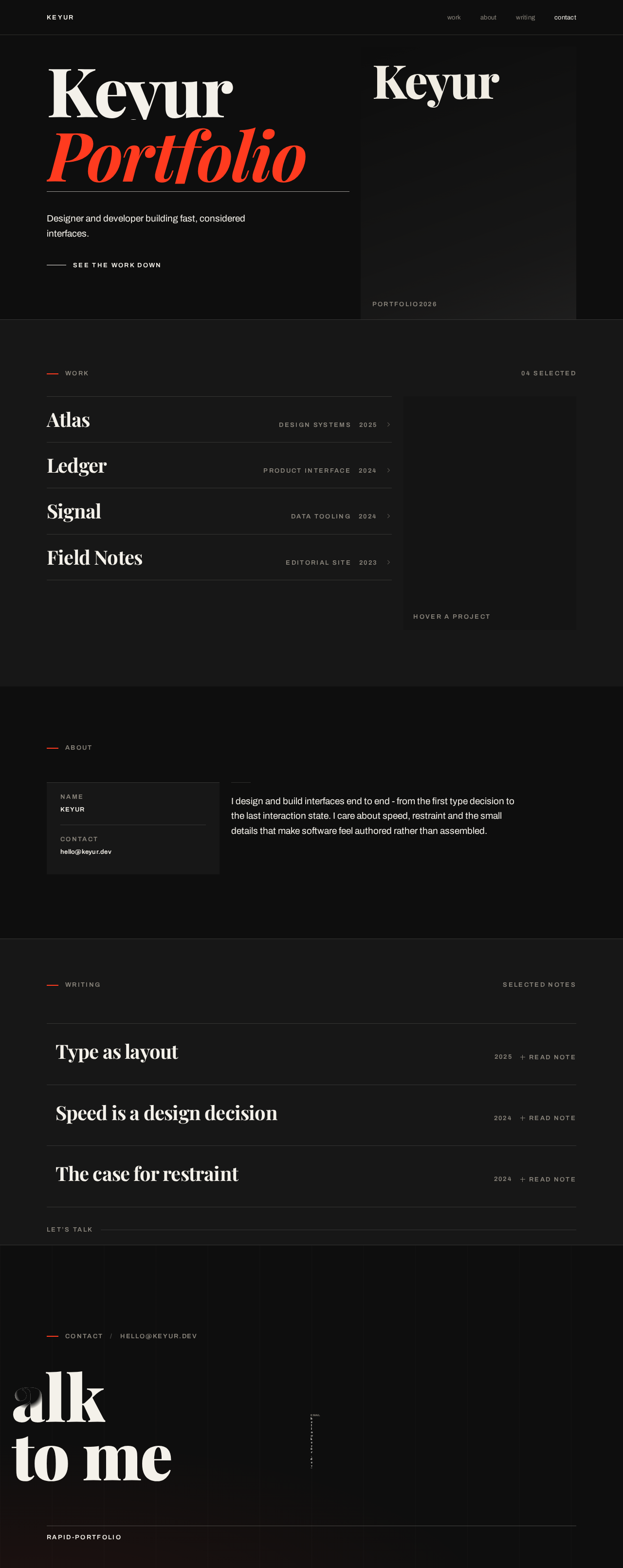
KeyurPortfolio
work
04 selectedDesign systems · 2025
A component library and token system built for a multi-product team, covering type scale, spacing, colour roles and interaction states.
Product interface · 2024
An accounting surface redesigned around a single ruled table, with inline editing and a summary rail that never leaves the viewport.
Data tooling · 2024
A monitoring console that trades dashboard tiles for one dense, scannable stream with keyboard-first navigation.
Editorial site · 2023
No further detail has been published for this project.
about
- name
- Keyur
- contact
- hello@keyur.dev
I design and build interfaces end to end - from the first type decision to the last interaction state. I care about speed, restraint and the small details that make software feel authored rather than assembled.
writing
Type as layout
Why the headline should carry the grid instead of sitting inside it.
Speed is a design decision
Performance is not an engineering afterthought; it is the first thing a visitor feels.
The case for restraint
One accent colour, one rule weight, one idea per screen.
KeyurPortfolio
work
04 selectedDesign systems · 2025
A component library and token system built for a multi-product team, covering type scale, spacing, colour roles and interaction states.
Product interface · 2024
An accounting surface redesigned around a single ruled table, with inline editing and a summary rail that never leaves the viewport.
Data tooling · 2024
A monitoring console that trades dashboard tiles for one dense, scannable stream with keyboard-first navigation.
Editorial site · 2023
No further detail has been published for this project.
about
- name
- Keyur
- contact
- hello@keyur.dev
I design and build interfaces end to end - from the first type decision to the last interaction state. I care about speed, restraint and the small details that make software feel authored rather than assembled.
writing
Type as layout
Why the headline should carry the grid instead of sitting inside it.
Speed is a design decision
Performance is not an engineering afterthought; it is the first thing a visitor feels.
The case for restraint
One accent colour, one rule weight, one idea per screen.
No comments yet. Be the first!