🎬 "The Broadcast Dimension" — A Living TV Station Control Room
Imagine opening purple-siaran and being greeted not by a flat webpage — but by a cinematic broadcast control room experience that feels alive.
🏠 Home / Viewer Page — Full-Screen Live Broadcast Experience:
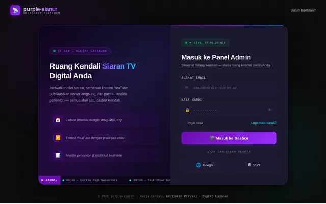
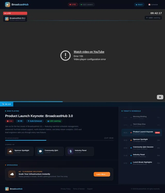
The viewer page is a full-bleed, edge-to-edge broadcast screen. The YouTube iframe occupies 100% of the viewport — no scrollbars, no chrome, just the broadcast. Overlaid at the bottom is a glowing neon ticker tape — a horizontal schedule ribbon that slides in from the right, showing upcoming programs in real time. The ticker uses JetBrains Mono font with a pulsing LIVE badge in vivid red that breathes (CSS pulse animation) to signal real broadcast status.
When a new program begins, the screen performs a channel-change transition: a brief horizontal static glitch effect (CRT scanline flash, ~300ms) before the new YouTube iframe fades in. It feels exactly like changing the channel on a real TV.
The schedule timeline at the bottom auto-rotates every 8 seconds — smoothly sliding left to reveal future programs — mimicking the look of a real broadcast network's on-screen guide.
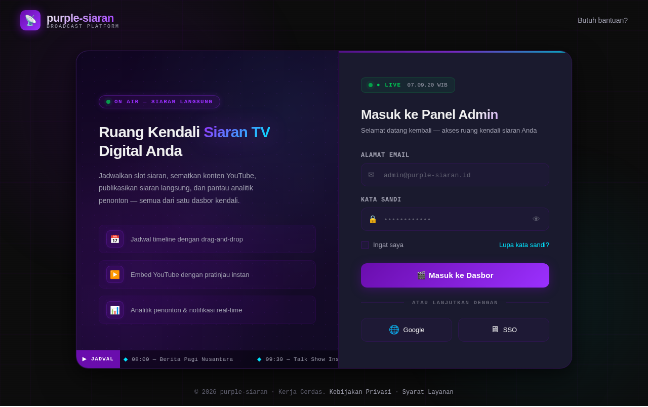
🖥️ Admin Panel — The Control Room Aesthetic:
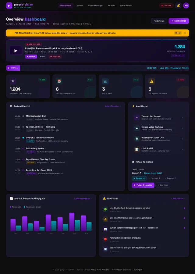
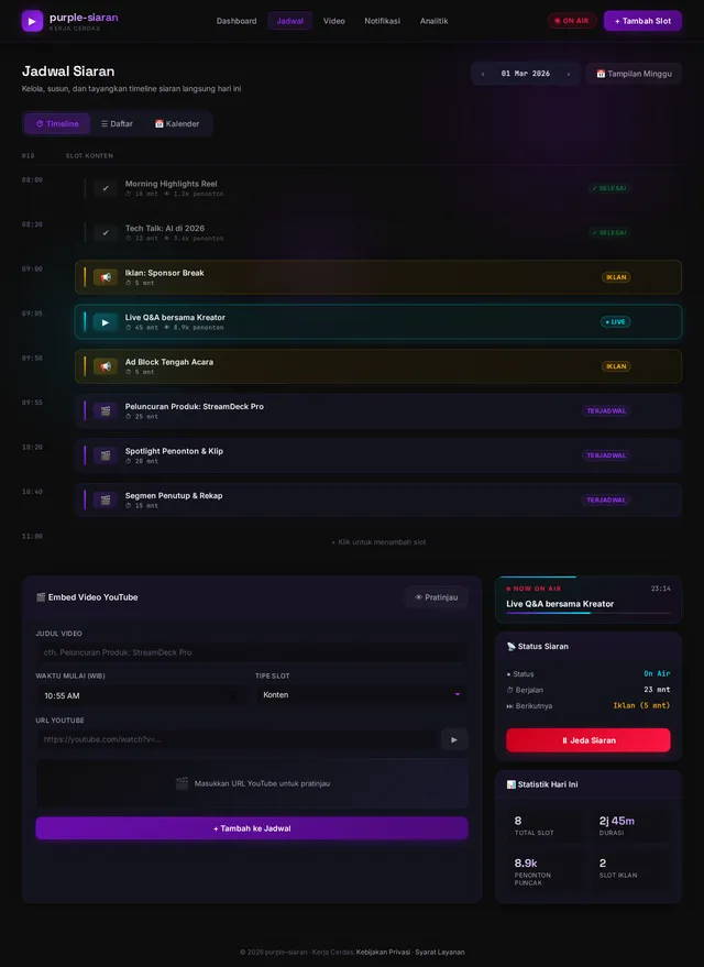
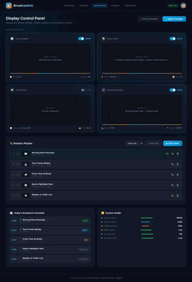
The admin dashboard looks and feels like a TV broadcast control room. Dark charcoal panels with glowing purple borders. The schedule timeline is presented as a horizontal swimlane timeline (like a DAW/video editor timeline) — each program slot is a draggable "clip" that snaps to time slots. Clips glow neon cyan when active/live, soft purple when scheduled, and grey when inactive.
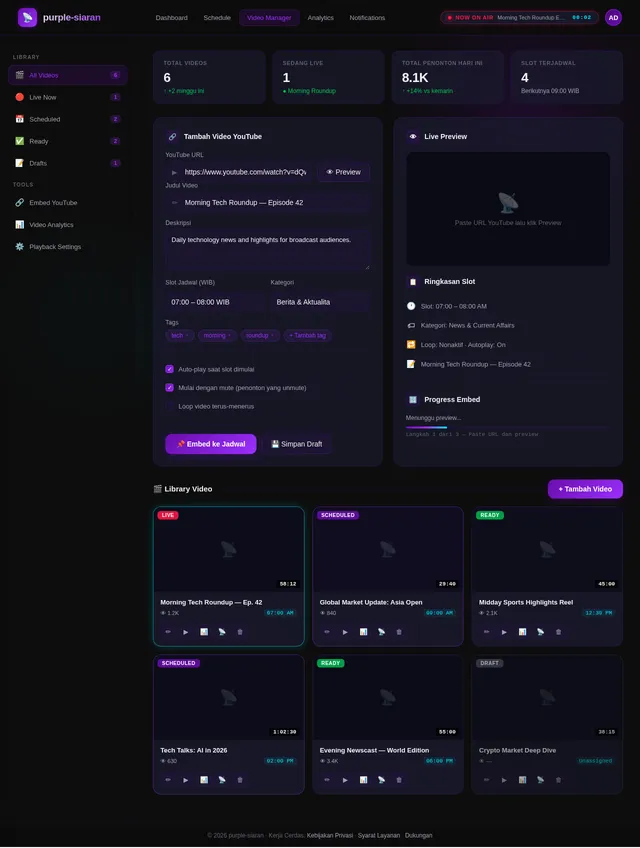
Hovering over a clip reveals a floating preview card — a mini YouTube thumbnail with program name, duration, and quick-action buttons (▶ Preview, ✏ Edit, ⏭ Skip Live). The preview card animates in with a smooth 3D flip from the clip.
The top of the admin panel features a "NOW ON AIR" monitor widget — a small glowing screen showing what's currently broadcasting, with a red ● LIVE dot and elapsed time counter ticking in real time.
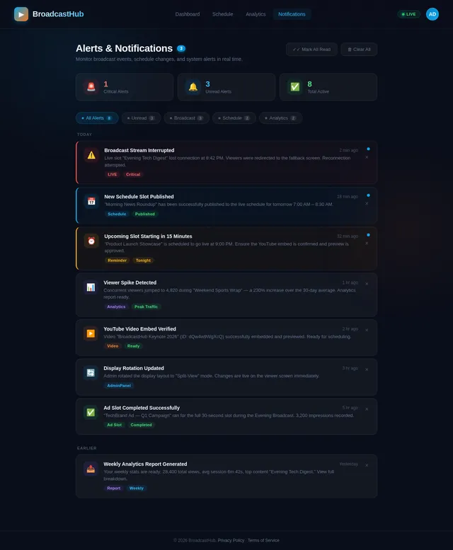
Notifications appear as broadcast-style alert banners that slide in from the top-right — styled like an urgent news chyron: yellow background, black bold text, with a countdown timer.
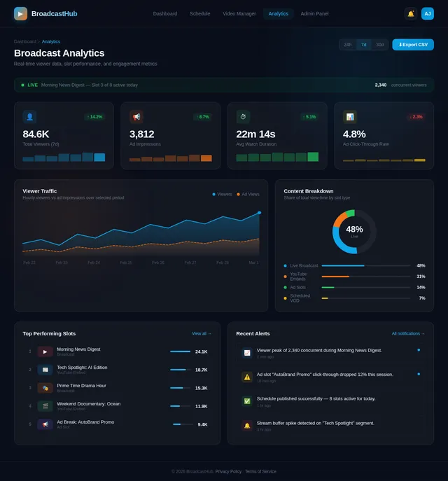
Analytics pages use waveform-style bar charts — bars that animate upward like audio equalizer levels when the page loads, reinforcing the broadcast/studio theme.
Every micro-interaction is deliberate: button clicks produce a subtle "click" of a broadcast switcher, transitions use cut/fade-to-black effects familiar from TV production, and the entire experience immerses the admin in the fantasy of running a real television station.

No comments yet. Be the first!