personal-website
 anas albaloshi
personal Website, like this website and how he build it, the design and structure also the animation https://www.seanhalpin.xyz/

Comments (0)
Sign in to leave a comment
System Requirements
System Requirements Document for personal-website
1. Introduction
This document specifies personal-website, a personal website for its owner, anas albaloshi. The product intent is a single, publicly reachable personal site whose design, structure and animation follow the reference website https://www.seanhalpin.xyz/. The site presents the owner's profile and work to visitors — peers, clients and recruiters — through an expressive, animated, single-page experience rather than a corporate template. The visual system is minimalist and pink-free, and the site offers both a light and a dark mode.
The audience is twofold: Website visitors who arrive anonymously to read the owner's profile and work and leave with a clear impression of the owner, and the Website owner, who keeps the site's content and structure current and shows profile, work and contact details to visitors.
The reference site's own structure, navigation, typography, colour and motion could not be verified from the source (all reference observations are marked unverified), so the reference is honoured as a directive for design character, structure and animation — an animated, personality-driven personal portfolio — while the concrete visual system is supplied by the project's creative direction (Sections 6–8).
2. System Overview
2a. Product Interpretation and Delivery Boundary
personal-website is a first-party, publicly accessible personal site. It is delivered as a React frontend served to anonymous visitors, backed by a shared FastAPI backend and a MariaDB database that hold the owner's site content (profile, work items and contact details) so the owner can keep them current.
Access ownership. The Landing page is public and requires no account: any visitor can open it and read the owner's profile and work. The owner's content-maintenance work is a first-party responsibility of the owner; because the owner must privately own and resume durable, owner-specific content state, the site establishes application-owned identity for the owner only (self-service first-use identity establishment and returning verification), marked required_inference. Visitors never authenticate. No differentiated roles, permissions or shared-state visibility controls exist beyond "owner may edit, visitor may read."
Current vs. future. Current scope is the animated public Landing experience plus the owner's ability to keep profile, work and contact content current. Nothing else — no blog engine, no comment system, no analytics dashboard, no e-commerce — is in scope. The reference site's unverified specifics are not imported as features.
Removed from scope. The user explicitly removed pink from the site's colour scheme; the minimalist light/dark palette in Sections 6–8 replaces it. The reference's unverified elements (navigation items, separate About/Projects/Contact pages, forms, menus) were never confirmed and are therefore not adopted as product scope.
2c. Page Content and Component Coverage
Landing
Information and state
- Owner identity block: the owner's name set as an oversized two-line display headline (Unbounded, 48px–128px, left aligned) over a full-width hero field in the minimalist neutral ground of the active theme.
- Profile/introduction copy (Quicksand body text) describing who the owner is.
- Work section: the owner's work items presented as large capsule blocks, each with a title and short description, expanding on hover.
- Contact details block: the owner's contact information as supplied in site content.
- Persistent state: content is loaded from the backend on page load; loading, empty and error states are handled (see below).
Primary actions
- Visitor scrolls through the animated sections (hero → profile → work → contact) with liquid-morph section transitions and scroll-driven blob drift.
- Visitor hovers a work capsule to expand it and read the full item.
- Visitor follows a contact detail (e.g. an email or link) to reach the owner.
- Visitor switches between light and dark mode; the chosen theme persists across visits and applies to every section.
Supporting actions
- Visitor uses the hero capsule CTA to jump to the work section.
- Visitor with
prefers-reduced-motionreceives the static arrangement (no drift, no morph, no cursor trail) with all content fully readable.
Domain entities
- Profile: owner name, headline, introduction text.
- Work item: title, short description, optional link, display order.
- Contact detail: label, value (e.g. email address or URL), display order.
Component responsibilities
- Hero field: full-width minimalist neutral ground for the active theme, oversized Unbounded name in two lines, glossy monochrome blob drifting behind the text, capsule CTA beneath the name; soft neutral cursor trail on pointer devices.
- Curved section dividers: soft curved edges between sections instead of straight lines.
- Profile section: readable body copy in Quicksand on the blush ground.
- Work capsule list: asymmetric two-column blocks at 768px and 1280px, single column at 375px; each capsule morphs open on hover with a soft bounce.
- Contact section: contact details as readable, tappable items.
- Motion layer: liquid morph on section change, scroll-driven blob drift, soft bounce on hover; fully disabled under reduced motion.
- Theme control: a light/dark mode toggle in the hero area, labelled for assistive technology, reflecting the active theme; the theme applies to all sections and all states.
States
- Loading: skeleton or placeholder blocks in the hero and work area while content is fetched; no layout shift of readable text.
- Empty: if no work items exist, the work section shows a short neutral message instead of an empty capsule list; if no contact details exist, the contact block is omitted.
- Success: all content renders; animations run; hover expansion works.
- Error: if content cannot be loaded, the page shows a readable fallback message and a retry control; the hero name and profile copy remain visible if cached/static fallback content exists.
- Recovery: retry re-fetches content without a full page reload; reduced-motion users always get the static, fully readable layout.
- Theme states: light mode and dark mode each render every section, state and control with readable contrast; the selected theme is remembered on return visits and defaults to the visitor's OS colour-scheme preference when no choice has been made.
3. Functional Requirements
FR-1 — Public personal site (explicit) As a Website visitor, I should open the personal website and see the owner's profile and work, so that I leave with a clear view of who the owner is.
- Trigger: visitor navigates to the site URL. Access: anonymous, no account.
- Observable result: the Landing page renders the hero, profile, work and contact sections in the visitor's active theme (light or dark).
- Failure/recovery: if content fails to load, a readable error with retry is shown; the visitor can retry.
- Continuation: visitor scrolls through sections and reaches contact details.
FR-2 — Reference-faithful design, structure and animation (explicit)
As a Website visitor, I should experience a site whose design, structure and animation follow the reference website https://www.seanhalpin.xyz/, so that the site carries the reference's animated, personality-driven character.
- Trigger: any visit. Observable result: animated sections, expressive typography and a non-corporate layout consistent with the reference directive and the creative direction.
- Constraint: this is a hard constraint; the reference's unverified specifics are not invented as features. The reference's design character is expressed through the minimalist, pink-free light/dark visual system in Sections 6–8.
- Failure/recovery: under
prefers-reduced-motion, a static but complete layout is shown.
FR-3 — Animated section experience (explicit, from reference directive) As a Website visitor, I should move through animated sections (liquid morph on section change, scroll-driven blob drift, soft bounce on hover), so that browsing the site feels alive and playful.
- Trigger: scrolling and hovering. Observable result: sections transition with liquid morph; the glossy blob drifts with scroll; work capsules bounce softly on hover.
- Failure/recovery: motion is disabled under reduced motion; content remains fully readable.
FR-4 — Work capsule expansion (explicit, from reference directive + creative direction) As a Website visitor, I should hover a work capsule and see it morph open to reveal the full item, so that I can read about a specific piece of work.
- Trigger: pointer hover/focus on a capsule. Observable result: capsule expands with a soft bounce and shows title and description.
- Failure/recovery: on touch devices, tap toggles expansion; keyboard focus triggers the same expansion.
FR-5 — Owner keeps content current (required_inference) As a Website owner, I should sign in to my own site and update my profile, work items and contact details, so that visitors always see current information.
- Trigger: owner establishes identity on first use (self-service) and verifies on return. Access: application-owned identity, owner only.
- Observable result: saved changes appear on the public Landing page on next load, in both light and dark mode.
- Failure/recovery: invalid credentials show a readable error and allow retry; failed saves preserve the owner's unsaved input and show an error.
- Continuation: owner returns to the public site to confirm the change.
FR-6 — Owner shows profile, work and contact details (required_inference) As a Website owner, I should have my profile, work items and contact details displayed to visitors, so that visitors can learn about me and reach me.
- Trigger: content saved by the owner. Observable result: the Landing page renders the owner's profile, ordered work items and contact details.
- Failure/recovery: missing sections degrade gracefully (empty-state message or omission) rather than breaking the page.
FR-7 — Minimalist, pink-free colour scheme (explicit) As a Website visitor, I should see a minimalist colour scheme with no pink anywhere in the site, so that the site reads as restrained and modern rather than candy-coloured.
- Trigger: any visit, in either theme. Observable result: every surface, text colour, accent, border, shadow, illustration and motion trail uses the minimalist palette in Section 6; no pink hue appears in the hero, sections, capsules, controls, states or imagery.
- Constraint: this is a hard constraint; pink is removed from the site's colour scheme and is not reintroduced by decoration, hover states, gradients or generated imagery.
- Failure/recovery: if a theme token or asset would introduce pink, it is replaced with the nearest neutral or accent token from the minimalist palette before release.
FR-8 — Light and dark mode (explicit) As a Website visitor, I should switch between a light and a dark mode, so that I can read the site comfortably in my preferred lighting.
- Trigger: the visitor uses the theme control, or arrives with an OS colour-scheme preference and no prior choice. Observable result: the whole site — hero, profile, work capsules, contact block, dividers, loading/empty/error states and controls — re-renders in the selected theme with readable contrast.
- Persistence: the visitor's explicit choice is remembered across visits and page reloads; with no explicit choice, the site follows the OS
prefers-color-schemesetting and updates if it changes. - Failure/recovery: if the stored preference cannot be read, the site falls back to the OS preference, then to light mode; the theme control always shows the active theme and remains keyboard operable.
4. User Personas
Website visitor
- Product context: an anonymous peer, client or recruiter who lands on the site from a link or search and has no account.
- Primary goal: quickly understand who the owner is and what they have made, and find a way to get in touch.
- Distinct responsibilities: scrolls the animated sections, expands work capsules to read details, follows a contact detail, and picks a light or dark mode. Never edits content.
- Inputs/decisions: decides which work item to expand and whether to make contact.
- Interactions: reads content authored by the Website owner; the owner's saved content is what the visitor sees.
- Observable success: the visitor has seen the profile, opened at least one work item, and can reach the owner via the contact block.
Website owner
- Product context: anas albaloshi, who owns and maintains the personal site and wants it to feel optimistic and playful rather than corporate.
- Primary goal: keep the site's profile, work and contact content current so visitors get an accurate, characterful impression.
- Distinct responsibilities: establishes owner identity on first use, verifies on return, edits profile/work/contact content, and confirms changes on the public page in both light and dark mode.
- Inputs/decisions: decides what work to feature, its order, and which contact details to publish.
- Interactions: authors the content that the Website visitor reads; the visitor's experience is the observable outcome of the owner's edits.
- Observable success: saved changes are visible on the public Landing page and render correctly in the animated layout.
5. Core User Flows
Flow A — Visitor reads the owner's profile and work
- Visitor opens the site URL in a browser (anonymous, no account).
- Landing loads in the visitor's active theme (remembered choice, otherwise the OS colour-scheme preference, otherwise light): the hero shows the owner's name in oversized Unbounded type over the minimalist neutral hero field, with the glossy blob drifting behind it.
- Visitor scrolls; sections transition with liquid morph and the blob drifts with scroll.
- Visitor reaches the work section and hovers a capsule; it morphs open with a soft bounce and reveals the item's title and description.
- Visitor continues to the contact block and follows a contact detail to reach the owner.
- At any point the visitor may use the theme control to switch between light and dark mode; the whole page re-renders in the new theme and the choice is remembered.
- Failure/recovery: if content fails to load, a readable error with a retry control appears; retry re-fetches without reload. If the visitor has reduced motion enabled, the static layout shows all content fully readable.
Flow B — Owner updates site content
- Owner opens the site and chooses to sign in (first use: self-service identity establishment; return: verification).
- Owner edits profile text, work items (title, description, order) and contact details.
- Owner saves; the backend persists the changes to MariaDB.
- Failure/recovery: invalid credentials show a readable error and allow retry; a failed save preserves unsaved input and shows an error.
- Owner returns to the public Landing page and confirms the updated content renders correctly in the animated layout, in both light and dark mode.
6. Visuals Colors and Theme
Muse: Karim Rashid — sensual pop minimalism for a personal site that moves. Headline: "Glossy curves, candy colour, a name that fills the screen."
Colour direction (user override): the site is minimalist and contains no pink. The candy palette is replaced by a restrained neutral system with a single cool accent, delivered in two themes. The glossy curves, capsule shapes, oversized type and motion language stay; only the colour changes.
Colour tokens (light mode)
- Background:
#FAFAF9(near-white warm neutral ground, holds most area) - Surface:
#FFFFFF - Text:
#141414(near-black ink) - Primary:
#141414(near-black — large type blocks and buttons) - On-primary:
#FAFAF9(text and icons on primary surfaces) - Accent:
#3F6B5A(muted deep green — active states only) - Muted:
#6B6B6B - Border:
#E4E4E1
Colour tokens (dark mode)
- Background:
#111111(near-black ground, holds most area) - Surface:
#1A1A1A - Text:
#F2F2F0(off-white ink) - Primary:
#F2F2F0(off-white — large type blocks and buttons) - On-primary:
#111111(text and icons on primary surfaces) - Accent:
#8FBFA8(soft sage — active states only) - Muted:
#9A9A9A - Border:
#2A2A2A
Theme behaviour: light and dark mode are both first-class; every token above is defined per theme and no component hard-codes a colour. The visitor's explicit choice is remembered; with no choice the site follows prefers-color-scheme. Both themes keep body text at a readable contrast against their ground.
Typography
- Headings: Unbounded — wide, rounded, semi-bold display; tight leading, mixed case, large sizes.
- Body: Quicksand.
- Scale (1.5 modular): display 48/64/96/128; headings 20/24/32; body 16/18. Use
clamp()with the mobile size so headlines stay whole at 375px, 768px and 1280px.
Shape language: capsule buttons, soft blobs, curved section edges, glossy highlights on primary surfaces.
Layout: single column at 375px; asymmetric two-column blocks at 768px and 1280px; curved section dividers; work items as large capsules that expand on hover.
Imagery: glossy 3D blobs rendered in monochrome neutral and the muted accent of the active theme; project shots inside rounded frames; no stock people; no pink imagery.
Avoid: no pink anywhere (user constraint); no blue or indigo accents; no grid of identical cards; no gradient-blob hero behind centred text; no system fonts; no candy or high-saturation colour blocking.
7. Signature Design Concept
The public entry is a full-width minimalist neutral field — near-white in light mode, near-black in dark mode — carrying the owner's name in two lines of oversized Unbounded type, left aligned, scaling from 48px to 128px. A glossy monochrome blob drifts slowly behind the text, and a capsule CTA sits under the name beside a light/dark theme control. Section dividers are soft curved edges rather than straight lines. Work items are capsules that morph open on hover. On pointer devices the cursor leaves a soft neutral trail across the hero. The concept recomposes only accepted content and controls — the name, the CTA, the theme control, the sections and the work capsules — and keeps all readable text and controls whole at every viewport. No pink appears in either theme.
8. Interaction Model & Motion Direction
Interaction Model: Animated Motion Tempo: expressive Hero Dimensionality: layered_2d
Landing Hero Motion Brief
- Focal subject: the oversized two-line owner name over the minimalist neutral hero field, with the glossy monochrome blob behind it.
- Thesis: as the visitor scrolls, the glossy blob drifts and sections morph with liquid transitions → the page feels alive and playful while staying restrained → the visitor reaches the work capsules and contact details with a clear impression of the owner.
- Motion vocabulary: liquid morph on section change, soft bounce on hover, scroll-driven blob drift, soft neutral cursor trail on the hero; theme switching cross-fades tokens rather than animating layout.
- Composed first frame: minimalist neutral hero field in the active theme, name in two left-aligned Unbounded lines, glossy monochrome blob resting behind the text, capsule CTA and theme control beneath.
- Reduced-motion state: static layout — no drift, no morph, no cursor trail, no theme cross-fade; all content fully readable and work items expanded by tap/focus.
9. Non-Functional Requirements
- Reference fidelity (explicit): design, structure and animation must follow
https://www.seanhalpin.xyz/; this is a hard constraint. - No pink (explicit): no pink hue appears anywhere in the site — hero, sections, capsules, controls, states, imagery or motion trails — in either theme.
- Light and dark mode (explicit): both themes are fully implemented for every page, section, state and control; the visitor's choice persists, and the OS
prefers-color-schemepreference is honoured when no choice exists. - Readability at every viewport (explicit, creative direction): headlines, labels, cards' text and controls stay entirely inside the viewport and their container at 375px, 768px and 1280px; imagery and decoration may bleed or overlap but never cover readable text or controls.
- Reduced motion (explicit, creative direction):
prefers-reduced-motionyields a usable static arrangement with all items fully readable. - Public accessibility (required_inference): the Landing page is reachable anonymously with no account.
- Owner content persistence (required_inference): owner edits persist in MariaDB and survive restarts.
- Performance (basic_default): the animated hero should not block first contentful paint; content loads before heavy motion initialises.
10. Tech Stack
- Frontend: React application UI (animated Landing page, owner content editing).
- Backend: shared FastAPI process for application APIs and domain modules (content read/write, owner identity).
- Database: MariaDB for application-owned persistent data (profile, work items, contact details, owner identity).
- Deployment: docker-compose with
frontend,backendanddatabaseservices; the shared backend is reused for all feature APIs.
11. Assumptions and Constraints
- A-1 (required_inference): The owner is a single individual; no multi-author or role-based permissions exist.
- A-2 (required_inference): Owner identity is application-owned, established self-service on first use and verified on return; visitors never authenticate.
- A-3 (explicit): The reference site's unverified specifics (navigation items, separate pages, forms) are not adopted as features; only its design/structure/animation character is followed.
- A-4 (basic_default): Content is authored in a single language; no localisation is required.
- A-5 (explicit): The creative direction's fonts, shape language and motion are authoritative for visuals; its palette is superseded by the user's minimalist, pink-free light/dark colour system in Section 6.
- A-6 (explicit): The visitor's theme choice is stored client-side only; it is a display preference, not an account or identity.
12. Glossary
- Landing: the single public page of the site presenting the owner's profile, work and contact details.
- Work capsule: a large capsule-shaped block representing one work item that morphs open on hover.
- Liquid morph: the section-transition animation in which shapes flow into one another.
- Blob drift: the scroll-driven slow movement of the glossy monochrome blob behind the hero text.
- Reduced motion: the OS-level
prefers-reduced-motionsetting that switches the site to a static layout. - Owner identity: the application-owned sign-in that lets the owner privately edit and resume site content.
- Light mode: the near-white minimalist theme using the light colour tokens.
- Dark mode: the near-black minimalist theme using the dark colour tokens; the visitor's choice persists and defaults to the OS
prefers-color-schemepreference.
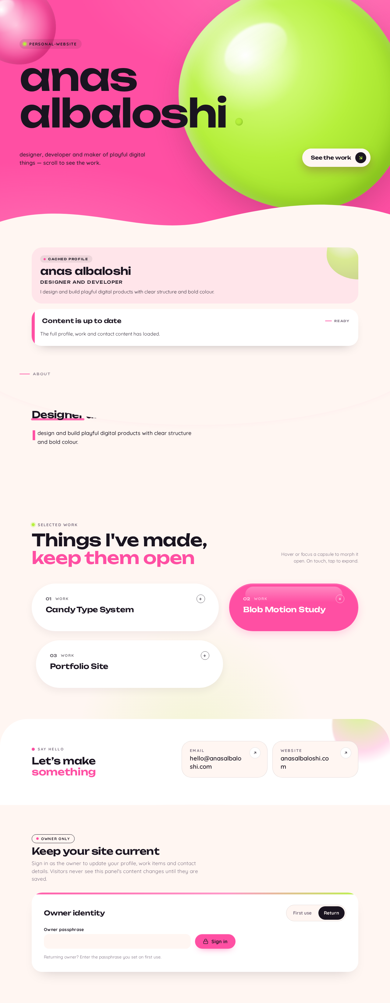
anas albaloshi
Designer and developer
I design and build playful digital products with clear structure and bold colour.
Content is up to date
ReadyContent loaded.
anas albaloshi
Designer and developer
I design and build playful digital products with clear structure and bold colour.
Things I've made, keep them open
Hover or focus a capsule to morph it open. On touch, tap to expand.
Let’s make something
Keep your site current
Sign in as the owner to update your profile, work items and contact details. Visitors never see this panel's content changes until they are saved.
Owner identity
Returning owner? Enter the passphrase you set on first use.
anas albaloshi
Designer and developer
I design and build playful digital products with clear structure and bold colour.
Content is up to date
ReadyContent loaded.
anas albaloshi
Designer and developer
I design and build playful digital products with clear structure and bold colour.
Things I've made, keep them open
Hover or focus a capsule to morph it open. On touch, tap to expand.
Let’s make something
Keep your site current
Sign in as the owner to update your profile, work items and contact details. Visitors never see this panel's content changes until they are saved.
Owner identity
Returning owner? Enter the passphrase you set on first use.
No comments yet. Be the first!