Imagery: No photography. Diagrams, ruled data tables, and colour-coded flow bars are the image.
Avoid: Rounded cards and soft shadows; gradient fills and glow effects; decorative icons without meaning; centred hero copy; blue primary accents; the generic indigo/blue-on-white SaaS template.
Readability constraint: Headlines, wordmarks, labels, numbers, and controls stay entirely inside the viewport and their container at 375px, 768px, and 1280px, wrapping or scaling (for example font-size: clamp(...) with its mobile size) to fit. No other element covers any part of them. Decoration may be cropped or bled off an edge; readable text and controls may not.
7. Signature Design Concept
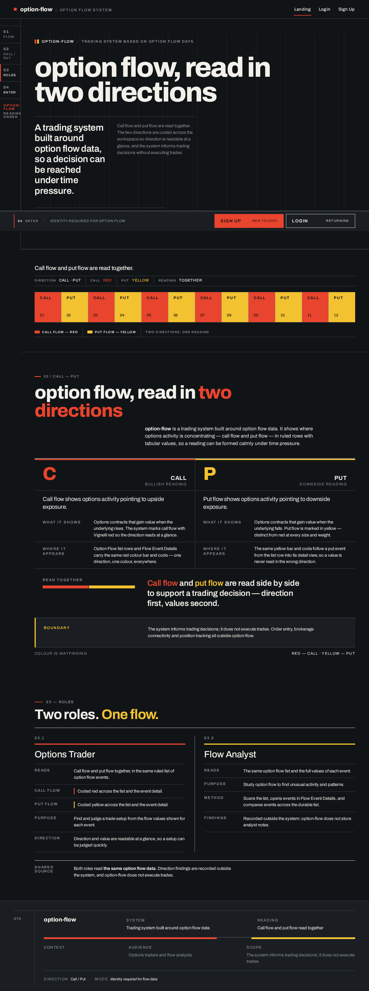
The public entry is a full-viewport dark grid: a 96px Archivo headline flush left across nine columns, sitting on a visible 12-column grid with red column rules. Beneath it, a live ruled flow strip runs as a transit line — call blocks in Vignelli red, put blocks in yellow — reading as the product's defining state: two directions of flow, side by side, instantly distinguishable. A fixed CTA bar at the base carries Sign Up and Login. A fixed left rail shows numbered section codes in small caps.
The concept recomposes only accepted content: the explanation of option flow, the two identity entries, and the call/put colour coding that the protected workspace uses. It introduces no new behaviour or destination.


No comments yet. Be the first!