mountainmamaofmaine-holistic
 Nebula Vibez
https://www.mountainmamaofmaine.com I would like to make a more modern design of my grandmothers website. Please review the information provided in the URL tediously so we keep the framework of the website and keep the story aligned with reality. Keep the same images provided but clean them up. I'd like to keep the warm and fuzzy hippy feeling so people understand the holistic nature of the website. Create me an optimized version of this website!


Comments (0)
Sign in to leave a comment
System Requirements
System Requirements Document for mountainmamaofmaine-holistic
1. Introduction
This document specifies the requirements for a modern, optimized redesign of Mountain Mama of Maine Natural Products (https://www.mountainmamaofmaine.com), a family-run Maine apothecary selling hand-made herbal balms, oils, and soaps. The redesign modernizes the presentation of the existing website while preserving its framework, its story as it actually happened, and its original photographs — cleaned up rather than replaced. The intent is to keep the warm, fuzzy, hippy feeling of the original so that visitors immediately understand the holistic, natural character of the products and the family behind them.
The audience is the people who already find this business: older rural New England customers, wellness-minded shoppers, fair-goers, and gift buyers who care about small-batch provenance and a real human story. The redesign serves them by making the same content easier and more pleasant to read on modern devices, without turning a handmade family business into a clinical storefront or a generic template.
2. System Overview
The product is a single-column, scroll-based public website that presents the Mountain Mama of Maine story, its product line with prices, its small-batch philosophy, its fair and sampling call to action, and its contact details. It is a content and storytelling site: there is no shopping cart, no checkout, and no dynamic product filtering, matching the source site, which has none.
The site is delivered as a modern front-end experience with three public destinations — Home, Gallery, and About — all anonymously reachable with no account required. The site owner maintains the content and imagery so that the framework and story stay aligned with the original reality.
2a. Product Interpretation and Delivery Boundary
This is a public, anonymous, read-and-browse website. Every destination is openly reachable; no visitor ever creates an account, signs in, or resumes private state. There is no application-owned identity, because nothing in the accepted requirements creates a durable, private, per-person relationship that must be bound to a verified individual. The only contact path is the visible email address and phone number, exactly as on the source site.
The delivery boundary is deliberately narrow. Current scope is the modernized presentation of the existing story, the existing product list with its existing prices, the existing images cleaned up, the existing alert banner behavior, the existing small-batch philosophy message, the existing fair/sampling call to action, and the existing contact details. Explicitly out of current scope: a shopping cart, checkout, payment, dynamic filtering, and any new stock photography or re-shot imagery. The original photographs are kept and cleaned, never replaced.
2b. Source Content Inventory
The following facts are preserved item-by-item from the authoritative content source (https://www.mountainmamaofmaine.com).
Site title: Mountain Mama of Maine Natural Products
Story and narrative content:
- "Yes, there really is a Mountain Mama. A walk through a field of St. John's Wort… started my interest in wildflowers and medicinal herbs. I had just moved to a farm in Maine…"
- "Centuries ago, women used herbs and essential oils for bath and beauty… Since your skin is the your largest organ it just makes sense to treat it naturally."
- "Each product is now hand produced by 'Mountain Daughter' with oversight from Mama… my daughter, Leah Gordon, has taken over Mountain Mama operations…"
- "You will notice that our prices have increased… April 2025 will see the first price increase in years."
Product list with prices:
- Calendula After Bath and Shower Oil – $20.00
- Calendula Soap – $6.00
- Come Sweet Sleep – $25.00
- Gardener's Relief Kit – $50.00
- Jewelweed Soap – $8.00
- Lavender Essential Oil – $20.00
- Mama's Mister – $12.00
- Mim's Amazing Magic – $35.00
- Northern Lights Aftershave – $12.00
- Oatmeal Cleansing Scrub – $8.50
- Oh My Aching... 2 oz. jar – $20.00
- Oh My Aching... 2.75 oz. hands-free stick – $24.00
- Soft as a Baby's Behind – $20.00
- St. John's Wort Oil – $12.00
Closing message: "GO GREEN! Each product is produced by hand in small lots to ensure freshness. Cleanse and soothe your skin, and then glow with all-natural ingredients. THANK YOU! We hope you enjoy our products… check our show schedules… sampling of our line."
Contact information:
- Location: Anson, ME 04911
- Phone: (207) 329-2415
- Email: info.mountainmamaofmaine@gmail.com
Imagery: At least one visible hero image labeled "Jan Edwards" (portrait or profile of Mountain Mama), plus existing product and fair photographs. These are the site's own photographs and are kept, cleaned up, not replaced.
Alert banner content: A timely notice regarding a Fryeburg Fair shipping closure.
2c. Page Content and Component Coverage
Home
- Information and state: The public entry surface. Presents the sticky alert strip, masthead, hero, the Mountain Mama story, the product catalogue, the small-batch philosophy band, the fairs and sampling call to action, and the contact footer. No loading state is required for static content; the page renders its final state directly.
- Primary actions: Read the alert; read the hero narrative; scroll into the story; browse the product catalogue; read the small-batch message; follow the fair/sampling call to action; reach the contact details.
- Supporting actions: Navigate to Gallery and About via the masthead capsule links; use the pinned phone number link; use the visible email link.
- Domain entities: Story narrative, product (name, price, category), alert notice, philosophy message, fair/sampling call to action, contact details (location, phone, email), hero portrait image.
- Component responsibilities:
- Sticky alert strip — terracotta ground with cream text, carries the Fryeburg Fair shipping pause notice; remains visible above the masthead.
- Masthead — wordmark "Mountain Mama of Maine" in Fraunces at left; capsule nav links (Story, Products, Fairs, Contact) that fill with sage on hover; phone number (207) 329-2415 pinned right as a terracotta text link; no hamburger above 768px.
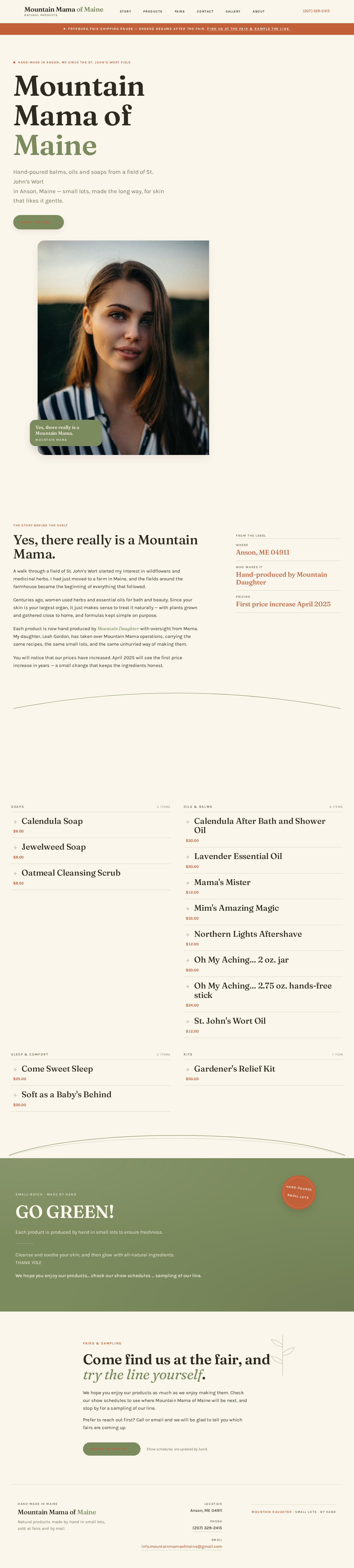
- Hero — split editorial layout: left 55% holds the headline "Mountain Mama of Maine" in Fraunces (44px mobile → 104px desktop) stacked over three lines with "Maine" in sage, a two-line lead, a capsule "Shop the line" button in sage with terracotta text, and a small terracotta eyebrow label; right 45% holds the cleaned Jan Edwards portrait in a 4:5 rounded frame bleeding off the top-right edge, with a sage caption card overlapping its lower-left corner reading "Yes, there really is a Mountain Mama."
- Story panel — two-column "recipe card": the Mountain Mama narrative on the left in 68ch measure; on the right a stacked set of sage-ruled fact rows ("Anson, ME 04911", "Hand-produced by Mountain Daughter", "First price increase April 2025") with terracotta values.
- Product catalogue — ruled price list, not cards: each item is a full-width row with the product name in Fraunces 22–30px, a dotted sage leader line, and the price in terracotta tabular Karla, separated by 1px sage hairlines; hovering a row tints the whole row surface sand and slides a small bottle thumbnail in from the left edge. Two columns of name/price rows at ≥768px, single column at 375px, grouped by category: Soaps, Oils & Balms, Sleep & Comfort, Kits.
- Small-batch band — full-bleed sage ground with the GO GREEN message set large in cream Fraunces, and a terracotta circular stamp ("hand-poured · small lots") rotated 8° overlapping the band's top edge.
- Fairs and sampling call to action — encourages fair attendance and product sampling, matching the source's community engagement section.
- Contact footer — location Anson, ME 04911; phone (207) 329-2415; email info.mountainmamaofmaine@gmail.com.
- Curved section dividers — a single wide arc divider drawn in sage on the oat ground marks the move from story into catalogue and from catalogue into fairs.
- States: Loading — not applicable (static content). Empty — not applicable. Success — the page renders the full story, catalogue, philosophy, call to action, and contact details. Error — if an image fails to load, the surrounding text and layout remain intact and readable. Recovery — no recovery interaction is required; the content is static.
Gallery
- Information and state: A dedicated destination for viewing the same existing images after cleanup. Presents the site's own photographs — the Jan Edwards portrait and the existing product and fair photos — colour-corrected to a consistent warm daylight grade, dust and scanner noise removed, backgrounds evened toward the oat ground, each cropped to a 4:5 or 1:1 frame with soft 24px corners.
- Primary actions: View the cleaned-up photographs.
- Supporting actions: Navigate back to Home or to About via the masthead.
- Domain entities: Photograph (the site's own images), caption.
- Component responsibilities:
- Masthead — same as Home, for consistent navigation.
- Image grid — the cleaned photographs presented in rounded frames; where a photo is weak, it is presented small and documentary rather than enlarged.
- Caption treatment — sage caption cards where a photograph needs identification.
- States: Loading — not applicable (static content). Empty — not applicable; the gallery presents the existing images. Success — all cleaned images render in their frames. Error — if an image fails to load, its frame and caption remain, and the rest of the gallery stays usable. Recovery — no recovery interaction is required.
About
- Information and state: A destination for communicating the site's warm, hippy, holistic character and keeping that presentation aligned with the grandmother's original site. Presents the Mountain Mama story in full, the family facts, and the holistic philosophy.
- Primary actions: Read the full story; read the family facts; understand the holistic, natural character of the products.
- Supporting actions: Navigate back to Home or to Gallery via the masthead; reach the contact details.
- Domain entities: Story narrative, family facts (Anson, ME 04911; hand-produced by Mountain Daughter; first price increase April 2025), philosophy message, contact details.
- Component responsibilities:
- Masthead — same as Home, for consistent navigation.
- Story panel — the Mountain Mama narrative in 68ch measure with generous leading.
- Fact rows — sage-ruled fact rows with terracotta values, as on Home.
- Philosophy band — the GO GREEN small-batch message in cream Fraunces on sage ground.
- Contact footer — location, phone, and email.
- States: Loading — not applicable (static content). Empty — not applicable. Success — the full story, facts, philosophy, and contact details render. Error — if an image fails to load, the text remains intact and readable. Recovery — no recovery interaction is required.
3. Functional Requirements
FR-1 — Modernized presentation of the existing site As a Site Visitor / Reader, I should see a more modern design of the existing Mountain Mama of Maine website, so that the same content is easier and more pleasant to read on modern devices.
- Provenance: explicit
- Lifecycle: Trigger — the visitor opens the site. Input — none. Observable result — the site renders with the modernized layout, typography, and palette. Access state — anonymous, no account. Failure/recovery — if a resource fails to load, the remaining content stays readable. Continuation — the visitor scrolls into the story and catalogue.
- Acceptance: The site presents the existing content in a modernized design; the original framework is recognizable.
FR-2 — Preserved website framework As a Site Owner / Content Maintainer, I should have the existing website framework kept, so that the modernized site still reflects the original structure and story.
- Provenance: explicit
- Lifecycle: Trigger — the site is built and maintained. Input — the original site's section order and hierarchy. Observable result — the site follows the original framework: alert banner, headline and hero narrative, product catalogue, mission/philosophy, community engagement, contact/footer. Access state — anonymous. Failure/recovery — if a section is missing, the framework is incomplete and must be restored. Continuation — the owner reviews the site against the original.
- Acceptance: The section order and hierarchy match the source structure.
FR-3 — Story aligned with reality As a Site Visitor / Reader, I should read the Mountain Mama story exactly as it happened, so that I can trust the family history and the product provenance.
- Provenance: explicit
- Lifecycle: Trigger — the visitor reads the story. Input — the source narrative. Observable result — the story content matches the source facts: the St. John's Wort field, the move to a Maine farm, the herbal and essential-oil tradition, Leah Gordon as "Mountain Daughter" with oversight from Mama, and the April 2025 price increase. Access state — anonymous. Failure/recovery — if any story detail drifts from the source, it must be corrected. Continuation — the visitor moves into the product catalogue.
- Acceptance: Every story statement matches the source content inventory.
FR-4 — Same images kept and cleaned up As a Site Visitor / Reader, I should see the same images from the original site, cleaned up, so that the site still shows the real Mountain Mama and the real products.
- Provenance: explicit
- Lifecycle: Trigger — the visitor views the hero, gallery, or product imagery. Input — the site's own photographs. Observable result — the images are the original photographs, colour-corrected to a consistent warm daylight grade, with dust and scanner noise removed, backgrounds evened toward the oat ground, and each cropped to a 4:5 or 1:1 frame with soft 24px corners. Access state — anonymous. Failure/recovery — if an image fails to load, its frame and caption remain. Continuation — the visitor continues browsing.
- Acceptance: No image is replaced or re-shot; no stock photography is introduced.
FR-5 — Warm, fuzzy, hippy feeling preserved As a Site Visitor / Reader, I should feel the warm, fuzzy, hippy character of the site, so that I understand the holistic nature of the products.
- Provenance: explicit
- Lifecycle: Trigger — the visitor experiences the site's palette, typography, and tone. Input — the warm oat-cream ground, sage green, terracotta accent, Fraunces and Karla typography, and the unhurried pacing. Observable result — the site reads as warm, holistic, and handmade rather than clinical or luxury. Access state — anonymous. Failure/recovery — if the presentation drifts toward clinical or generic, it must be corrected. Continuation — the visitor explores the story and products.
- Acceptance: The palette, typography, and tone match the creative direction; no blue or indigo appears anywhere.
FR-6 — Optimized version of the website As a Site Owner / Content Maintainer, I should have an optimized version of the website, so that the site performs well and presents the content cleanly.
- Provenance: explicit
- Lifecycle: Trigger — the site is built and served. Input — the existing content and images. Observable result — the site loads efficiently, the layout is responsive at 375px, 768px, and 1280px, and the content is presented cleanly. Access state — anonymous. Failure/recovery — if the layout breaks at a viewport, it must be corrected. Continuation — the owner reviews the site across viewports.
- Acceptance: The site is responsive and presents the content cleanly at all three viewports.
FR-7 — Alert banner for the Fryeburg Fair shipping pause As a Site Visitor / Reader, I should see the timely alert about the Fryeburg Fair shipping closure, so that I know shipping is temporarily paused.
- Provenance: explicit
- Lifecycle: Trigger — the visitor opens the site. Input — the alert notice. Observable result — a sticky terracotta strip with cream text appears above the masthead carrying the Fryeburg Fair shipping pause notice. Access state — anonymous. Failure/recovery — if the notice is not applicable, the strip is not shown. Continuation — the visitor reads the rest of the page.
- Acceptance: The alert strip is visible above the masthead and carries the shipping closure notice.
FR-8 — Product catalogue with names and prices As a Site Visitor / Reader, I should browse the product list with names and prices, so that I know what is available and what it costs.
- Provenance: explicit
- Lifecycle: Trigger — the visitor scrolls to the catalogue. Input — the product list. Observable result — each product appears as a full-width ruled row with the name in Fraunces, a dotted sage leader line, and the price in terracotta tabular Karla, grouped by category (Soaps, Oils & Balms, Sleep & Comfort, Kits). Access state — anonymous. Failure/recovery — if a product is missing, it must be restored from the source list. Continuation — the visitor reads the small-batch message and the fair call to action.
- Acceptance: All fourteen products from the source list appear with their exact names and prices.
FR-9 — Small-batch philosophy message As a Site Visitor / Reader, I should read the GO GREEN small-batch message, so that I understand the freshness and natural-ingredient commitment.
- Provenance: explicit
- Lifecycle: Trigger — the visitor scrolls to the philosophy band. Input — the GO GREEN message. Observable result — a full-bleed sage band with the message set large in cream Fraunces, with a terracotta circular stamp ("hand-poured · small lots") rotated 8° overlapping the band's top edge. Access state — anonymous. Failure/recovery — if the message is missing, it must be restored. Continuation — the visitor moves to the fair call to action.
- Acceptance: The GO GREEN message appears in full on the sage band.
FR-10 — Fairs and sampling call to action As a Site Visitor / Reader, I should be encouraged to attend fairs and sample the line, so that I can meet the makers and try the products.
- Provenance: explicit
- Lifecycle: Trigger — the visitor reaches the community engagement section. Input — the call to action. Observable result — the visitor is prompted to check show schedules and sample the line. Access state — anonymous. Failure/recovery — if the call to action is missing, it must be restored. Continuation — the visitor reaches the contact footer.
- Acceptance: The call to action appears and references fairs and sampling.
FR-11 — Contact details As a Site Visitor / Reader, I should reach the contact details, so that I can get in touch.
- Provenance: explicit
- Lifecycle: Trigger — the visitor reaches the footer. Input — the contact details. Observable result — the footer shows Anson, ME 04911; (207) 329-2415; and info.mountainmamaofmaine@gmail.com, with the email as a visible link. Access state — anonymous. Failure/recovery — if a detail is missing, it must be restored. Continuation — the visitor can email or call.
- Acceptance: All three contact details appear exactly as in the source.
FR-12 — Gallery of cleaned-up images As a Site Visitor / Reader, I should view the cleaned-up photographs in a dedicated gallery, so that I can see the real Mountain Mama and the real products.
- Provenance: required_inference
- Lifecycle: Trigger — the visitor opens the Gallery. Input — the site's own photographs. Observable result — the cleaned images render in rounded frames with captions where needed. Access state — anonymous. Failure/recovery — if an image fails to load, its frame and caption remain. Continuation — the visitor returns to Home or About.
- Acceptance: The gallery presents the site's own cleaned images; no stock photography appears.
FR-13 — About page with the full story and holistic character As a Site Visitor / Reader, I should read the full story and understand the holistic character on a dedicated About page, so that I can appreciate the family and the philosophy.
- Provenance: required_inference
- Lifecycle: Trigger — the visitor opens About. Input — the story narrative and family facts. Observable result — the full story, the sage-ruled fact rows, the philosophy band, and the contact footer render. Access state — anonymous. Failure/recovery — if the story is incomplete, it must be restored. Continuation — the visitor returns to Home or Gallery.
- Acceptance: The About page presents the full story and the holistic character.
FR-14 — Navigation between destinations As a Site Visitor / Reader, I should navigate between Home, Gallery, and About, so that I can move between the story, the images, and the products.
- Provenance: required_inference
- Lifecycle: Trigger — the visitor uses the masthead capsule links. Input — a navigation selection. Observable result — the selected destination renders. Access state — anonymous. Failure/recovery — if a link fails, the visitor can use the browser back button. Continuation — the visitor continues browsing.
- Acceptance: The masthead links reach Home, Gallery, and About.
4. User Personas
Site Visitor / Reader
A person who arrives at the modernized site to read the grandmother's story and browse the existing imagery, seeking to understand the holistic, warm, hippy nature of the site. This persona is the reason the site exists: they are the fair-goer, the wellness-minded shopper, the gift buyer, or the older rural New England customer who already trusts a handmade Maine apothecary. Their recurring responsibility is reading the narrative content and viewing the cleaned-up photos. Their primary goal is to understand the story as it aligns with reality and to feel the warm, holistic tone. Their inputs are the story text, the product list with prices, the small-batch message, the fair call to action, and the contact details. They interact with the Site Owner / Content Maintainer only indirectly, through the content the owner maintains. Their observable success is understanding the story as it happened and feeling the warm, holistic character of the site.
Site Owner / Content Maintainer
The person (the requester acting for the grandmother's site) responsible for keeping the modernized site's framework and story aligned with the original reality and for maintaining the same images in cleaned-up form. This persona is distinct from the visitor because their work is custodial rather than exploratory: they compare the modernized site against the original, verify that the story facts have not drifted, confirm that the images are the same ones cleaned rather than replaced, and check that the warm, holistic presentation is intact. Their primary goal is an optimized, modern site that still reflects the original story and imagery. Their inputs are the original site's content, the source images, and the creative direction. They interact with the Site Visitor / Reader by presenting content the visitor can trust. Their observable success is a site whose framework, story, and imagery remain faithful to the original while presenting a modern, optimized experience.
5. Core User Flows
Flow 1 — Site Visitor / Reader reads the story and browses the products
- The visitor opens the site at the Home page. The sticky terracotta alert strip is visible above the masthead, carrying the Fryeburg Fair shipping pause notice.
- The visitor sees the split hero: the headline "Mountain Mama of Maine" in Fraunces with "Maine" in sage, the two-line lead, the capsule "Shop the line" button, and the terracotta eyebrow label. The cleaned Jan Edwards portrait sits in its 4:5 rounded frame bleeding off the top-right edge, with the sage caption card reading "Yes, there really is a Mountain Mama."
- The visitor scrolls into the story panel. The Mountain Mama narrative appears on the left in 68ch measure; the sage-ruled fact rows appear on the right with terracotta values: "Anson, ME 04911", "Hand-produced by Mountain Daughter", "First price increase April 2025".
- The visitor continues past the curved sage arc divider into the product catalogue. Each product appears as a full-width ruled row with the name in Fraunces, a dotted sage leader line, and the price in terracotta tabular Karla, grouped by category: Soaps, Oils & Balms, Sleep & Comfort, Kits.
- The visitor hovers a row. The whole row tints surface sand and a small bottle thumbnail slides in from the left edge.
- The visitor continues past the second arc divider into the small-batch band. The GO GREEN message appears large in cream Fraunces on the sage ground, with the terracotta circular stamp ("hand-poured · small lots") rotated 8° overlapping the band's top edge.
- The visitor reaches the fairs and sampling call to action and is prompted to check show schedules and sample the line.
- The visitor reaches the contact footer and sees Anson, ME 04911; (207) 329-2415; and info.mountainmamaofmaine@gmail.com.
- Failure/recovery: If an image fails to load, its frame and caption remain and the surrounding text stays readable. The visitor can continue scrolling.
- Continuation: The visitor can navigate to Gallery or About via the masthead capsule links, or email or call using the contact details.
Flow 2 — Site Visitor / Reader views the cleaned-up images in the Gallery
- The visitor opens the Gallery from the masthead capsule links.
- The cleaned photographs render in rounded frames: the Jan Edwards portrait and the existing product and fair photos, colour-corrected to a consistent warm daylight grade, with dust and scanner noise removed, backgrounds evened toward the oat ground, and each cropped to a 4:5 or 1:1 frame with soft 24px corners.
- Where a photo is weak, it is presented small and documentary rather than enlarged.
- Failure/recovery: If an image fails to load, its frame and caption remain, and the rest of the gallery stays usable.
- Continuation: The visitor returns to Home or About via the masthead.
Flow 3 — Site Visitor / Reader reads the full story on the About page
- The visitor opens About from the masthead capsule links.
- The full Mountain Mama narrative renders in 68ch measure with generous leading.
- The sage-ruled fact rows appear with terracotta values: "Anson, ME 04911", "Hand-produced by Mountain Daughter", "First price increase April 2025".
- The GO GREEN small-batch message appears in cream Fraunces on the sage ground.
- The contact footer shows Anson, ME 04911; (207) 329-2415; and info.mountainmamaofmaine@gmail.com.
- Failure/recovery: If an image fails to load, the text remains intact and readable.
- Continuation: The visitor returns to Home or Gallery via the masthead.
Flow 4 — Site Owner / Content Maintainer verifies fidelity to the original
- The owner opens the modernized site and compares it against the original at https://www.mountainmamaofmaine.com.
- The owner checks the framework: alert banner, headline and hero narrative, product catalogue, mission/philosophy, community engagement, contact/footer — all present in the original order.
- The owner checks the story facts against the source: the St. John's Wort field, the move to a Maine farm, the herbal and essential-oil tradition, Leah Gordon as "Mountain Daughter" with oversight from Mama, and the April 2025 price increase.
- The owner checks the product list: all fourteen products with their exact names and prices.
- The owner checks the images: the same photographs, cleaned up, not replaced; no stock photography.
- The owner checks the presentation: the warm oat-cream ground, sage green, terracotta accent, Fraunces and Karla typography, and the unhurried pacing; no blue or indigo anywhere.
- Failure/recovery: If any fact, product, image, or presentation detail has drifted, the owner corrects it against the source.
- Continuation: The owner confirms the site is an optimized, modern version that still reflects the original story and imagery.
6. Visuals Colors and Theme
The creative direction is Humane technology — warm herbal craft, held in soft modern form, with Yves Béhar as the muse. The headline idea: a family-run Maine apothecary's herbal lineage presented with modern craft rather than a dusty table layout or a cold template — soft forms wrapped around serious substance, warm materials, wellbeing-first pacing.
Palette (light mode):
- Background:
#FBF6EC(warm oat-cream ground, never pure white) - Surface:
#F2E8D8(surface sand) - Text:
#2E2A22(soft brown-black, not grey) - Primary:
#7C8B5E(sage green — dominant brand colour: section grounds, story panel, buttons, moss-line rules) - Accent:
#C2603A(terracotta — single hot accent, used sparingly: price figures, alert banner strip, small-batch stamps, hover underlines) - Muted:
#8C7F6A(clay-grey — secondary copy, captions, dividers)
Rough proportion: 60% oat cream, 25% sage, 10% surface sand, 5% terracotta. No blue anywhere.
Typography:
- Headings: Fraunces at optical size large, weight 500–600 with soft "wonk" on display cuts; sentence case; tight-ish leading (1.02–1.08) for the big lines; generous leading for story paragraphs.
- Body: Karla at 400/500 with slightly open tracking and a 1.65 line-height.
- Labels: all-caps Karla 700 at 11–12px with 0.14em tracking for labels, prices, and section eyebrows.
- Scale: 1.333 modular, mobile → desktop via clamp: display 44px→104px, h2 32px→56px, h3 22px→30px, lead 18px→21px, body 16px→17px, label 11px→12px.
Shape language: Soft organic-modern — 20–32px radii on cards and image frames, capsule buttons and pills, gently curved section dividers (a single wide SVG arc between the story and catalogue, not a wave cliché), and hairline 1px sage rules instead of heavy borders. Product jars and bottles sit in rounded "shelf" frames with a soft warm shadow (0 12px 28px rgba(46,42,34,0.08)) — no hard drop shadows, no glossy bevels.
Layout: Single-column scroll preserved from the original framework, widened into an editorial rhythm: sticky top alert strip → masthead → hero → the Mountain Mama story → product catalogue (two columns of name/price rows at ≥768px, single column at 375px, grouped by category: Soaps, Oils & Balms, Sleep & Comfort, Kits) → small-batch/philosophy band on sage → fairs & sampling call-to-action → contact footer. Max content measure 68ch for prose, 1200px for the catalogue grid. Generous 96–140px section spacing; a 12-column grid underneath with 24px gutters at 1280px.
Imagery: The site's own photographs only, cleaned up: the Jan Edwards portrait as the hero, plus the existing product and fair photos colour-corrected to a consistent warm daylight grade, dust and scanner noise removed, backgrounds evened toward the oat ground, and each image cropped to a 4:5 or 1:1 frame with soft 24px corners. No new stock photography, no illustration of the product, no 3D renders. Where a photo is weak, it is presented small and documentary rather than enlarged.
Avoid: Blue or indigo anywhere, including link colours and focus rings — focus uses a 2px terracotta outline offset 2px. Pure #FFFFFF grounds, glassmorphism, gradient blobs, or floating 3D product renders. Identical hover-lift card grids for products — the catalogue is a ruled list, not tiles. Replacing or re-shooting the original images, or adding stock photography of strangers. Inter, Roboto, Poppins, Montserrat, or system-ui for headings or body. Clinical pharmacy whites, apothecary clichés (mortar-and-pestle icons, kraft-paper textures), or cartoon hippy stickers. Auto-playing carousels, marquees, or any motion that runs without the user's scroll. Adding a shopping cart, checkout, or dynamic filtering — the source has none; the flow stays read → browse → attend a fair or email.
7. Signature Design Concept
The public entry (Home) is built as a warm editorial herb-shelf. The masthead reads as a horizontal shelf: the wordmark "Mountain Mama of Maine" in Fraunces sits left, and the nav is a row of capsule links (Story, Products, Fairs, Contact) that fill with sage on hover — no hamburger above 768px, with the phone number (207) 329-2415 pinned right as a terracotta text link. Above it, the sticky terracotta alert strip carries the Fryeburg Fair shipping pause in cream text.
Below, the hero splits: left 55% holds "Mountain Mama of Maine" set in Fraunces at 44px mobile → 104px desktop, stacked over three lines with the word "Maine" in sage, sitting above a two-line lead and a capsule "Shop the line" button in sage with terracotta text, plus a small terracotta eyebrow label. Right 45% is the cleaned Jan Edwards portrait in a 4:5 rounded frame that bleeds off the top-right edge of the viewport, with a sage caption card overlapping its lower-left corner reading "Yes, there really is a Mountain Mama." Nothing is centred, nothing floats on a gradient.
The story is told as a two-column "recipe card": the narrative on the left in 68ch measure, and on the right a stacked set of sage-ruled fact rows — "Anson, ME 04911", "Hand-produced by Mountain Daughter", "First price increase April 2025" — with terracotta values, so the family facts read like a label. A single wide sage arc divider marks the move into the catalogue, where each product is a full-width ruled row with the name in Fraunces, a dotted sage leader line, and the price in terracotta tabular Karla; hovering a row tints the whole row surface sand and slides a small bottle thumbnail in from the left edge. A second arc divider leads into the full-bleed sage small-batch band, where the GO GREEN message sits large in cream Fraunces and a terracotta circular stamp ("hand-poured · small lots") rotated 8° overlaps the band's top edge. The page closes with the fairs and sampling call to action and the contact footer.
8. Interaction Model & Motion Direction
Interaction Model: Animated Motion Tempo: restrained Hero Dimensionality: layered_2d
Landing Hero Motion Brief
- Focal subject: The cleaned Jan Edwards portrait in its 4:5 rounded frame, bleeding off the top-right edge of the viewport, with the sage caption card overlapping its lower-left corner.
- Input → transformation → outcome thesis: As the visitor arrives and scrolls, each section enters with a 400–600ms ease-out reveal (opacity + 12px rise, one element at a time), and the hero portrait slowly scales to 1.05 over 8s — so the page breathes at a wellbeing pace, revealing the story, catalogue, and philosophy in sequence rather than all at once.
- Motion vocabulary: Restrained and breathing — 400–600ms ease-out reveals, a slow 1.05 scale on the hero portrait over 8s, hover states that warm the terracotta underline rather than lifting cards. No bounce, no parallax stacks, no particles.
- Composed first frame: The sticky terracotta alert strip above the masthead; the wordmark and capsule nav; the split hero with the headline, lead, capsule button, and eyebrow label on the left and the portrait in its rounded frame on the right; the sage caption card overlapping the portrait's lower-left corner.
- Reduced-motion state: With
prefers-reduced-motion, everything renders in its final state with no transform — the hero portrait sits at its final scale, sections appear without reveals, and all content remains fully readable.
9. Non-Functional Requirements
- NFR-1 — Responsive layout: The site must present its content cleanly at 375px, 768px, and 1280px. Headlines, wordmarks, labels, numbers, cards' text, and controls must stay entirely inside the viewport and their container at all three viewports, wrapping or scaling (for example
font-size: clamp(...)with its mobile size) to fit. Provenance: explicit (optimized version). Rationale: the modernized site must work on modern devices. - NFR-2 — Readable text and controls: No readable text or control may be cropped, clipped, covered, or run off an edge. Imagery, decoration, and motion may be cropped, bled off an edge, rotated, overlapped, or cut as the creative direction asks, as long as they cover no readable text or control. Provenance: explicit (creative direction). Rationale: accessibility and legibility.
- NFR-3 — Reduced motion: With
prefers-reduced-motion, everything renders in its final state with no transform. Provenance: explicit (creative direction). Rationale: accessibility. - NFR-4 — Focus visibility: Focus uses a 2px terracotta outline offset 2px; no blue or indigo focus rings. Provenance: explicit (creative direction). Rationale: accessibility and brand consistency.
- NFR-5 — Image fidelity: The site's own photographs are kept and cleaned up; no stock photography, no re-shot imagery, no 3D renders. Provenance: explicit. Rationale: the user requires the same images, cleaned up.
- NFR-6 — Content fidelity: The story, product names, prices, philosophy message, and contact details must match the source content inventory exactly. Provenance: explicit. Rationale: the user requires the story to stay aligned with reality.
- NFR-7 — No commerce: No shopping cart, checkout, payment, or dynamic filtering. Provenance: explicit (source has none; creative direction confirms). Rationale: the source site has no commerce and the user did not request any.
10. Tech Stack
- Frontend: React (single-page application) with a modern build toolchain, delivering the three public destinations (Home, Gallery, About).
- Styling: CSS with the specified palette, Fraunces and Karla typography, and the soft organic-modern shape language.
- Backend: A small Python/FastAPI service to serve the site's content and images, extending a single shared backend process rather than introducing separate services.
- Storage: Static content and images served from the backend; no database is required for the current read-only, anonymous site.
- Deployment: Docker and docker-compose for local and simple deployment. Kubernetes is not required for this static, low-traffic site.
11. Assumptions and Constraints
- Assumption: The site is public and anonymous; no account, sign-in, or private state is required. This follows from the source site's static, read-only nature and the absence of any accepted requirement for identity.
- Assumption: The product list, prices, story text, philosophy message, and contact details are fixed content taken from the source content inventory and are not edited by visitors.
- Assumption: The alert banner content (Fryeburg Fair shipping pause) is a timely notice that may be updated by the Site Owner / Content Maintainer.
- Constraint: The existing website framework must be kept.
- Constraint: The story must remain aligned with reality.
- Constraint: The same images provided must be kept (cleaned up, not replaced).
- Constraint: The warm and fuzzy hippy feeling must be preserved so the holistic nature is understood.
- Constraint: No shopping cart, checkout, or dynamic filtering — the source has none.
- Constraint: No blue or indigo anywhere, including link colours and focus rings.
- Constraint: No stock photography, no re-shot imagery, no 3D renders.
12. Glossary
- Mountain Mama: Jan Edwards, the grandmother whose story and products the site presents.
- Mountain Daughter: Leah Gordon, Jan Edwards' daughter, who has taken over Mountain Mama operations and hand-produces each product with oversight from Mama.
- Small-batch: Products produced by hand in small lots to ensure freshness.
- GO GREEN: The site's environmental and production message about small-batch, natural, fresh products.
- Fryeburg Fair: The fair whose schedule triggers the temporary shipping closure notice in the alert banner.
- Holistic: The warm, natural, whole-person character of the products and the site, which the redesign must preserve.
- Ruled price list: The catalogue presentation where each product is a full-width row with a name, a dotted sage leader line, and a terracotta price, separated by 1px sage hairlines — not a card grid.
Fryeburg Fair shipping pause — orders resume after the fair. Find us at the fair & sample the line.
MountainMama ofMaine
Hand-poured balms, oils and soaps from a field of St. John’s Wortin Anson, Maine — small lots, made the long way, for skin that likes it gentle.

Yes, there really is a Mountain Mama.
Yes, there really is a Mountain Mama.
A walk through a field of St. John’s Wort started my interest in wildflowers and medicinal herbs. I had just moved to a farm in Maine, and the fields around the farmhouse became the beginning of everything that followed.
Centuries ago, women used herbs and essential oils for bath and beauty. Since your skin is your largest organ, it just makes sense to treat it naturally — with plants grown and gathered close to home, and formulas kept simple on purpose.
Each product is now hand produced by Mountain Daughter with oversight from Mama. My daughter, Leah Gordon, has taken over Mountain Mama operations, carrying the same recipes, the same small lots, and the same unhurried way of making them.
You will notice that our prices have increased. April 2025 will see the first price increase in years — a small change that keeps the ingredients honest.
Everything we hand-pour
14 items, made in small lots
Soaps
3 items- Calendula Soap$6.00
- Jewelweed Soap$8.00
- Oatmeal Cleansing Scrub$8.50
Oils & Balms
8 items- Calendula After Bath and Shower Oil$20.00
- Lavender Essential Oil$20.00
- Mama's Mister$12.00
- Mim's Amazing Magic$35.00
- Northern Lights Aftershave$12.00
- Oh My Aching... 2 oz. jar$20.00
- Oh My Aching... 2.75 oz. hands-free stick$24.00
- St. John's Wort Oil$12.00
Sleep & Comfort
2 items- Come Sweet Sleep$25.00
- Soft as a Baby's Behind$20.00
Kits
1 item- Gardener's Relief Kit$50.00
Come find us at the fair, and try the line yourself.
We hope you enjoy our products as much as we enjoy making them. Check our show schedules to see where Mountain Mama of Maine will be next, and stop by for a sampling of our line.
Prefer to reach out first? Call or email and we will be glad to tell you which fairs are coming up.
Fryeburg Fair shipping pause — orders resume after the fair. Find us at the fair & sample the line.
MountainMama ofMaine
Hand-poured balms, oils and soaps from a field of St. John’s Wortin Anson, Maine — small lots, made the long way, for skin that likes it gentle.
Yes, there really is a Mountain Mama.
Yes, there really is a Mountain Mama.
A walk through a field of St. John’s Wort started my interest in wildflowers and medicinal herbs. I had just moved to a farm in Maine, and the fields around the farmhouse became the beginning of everything that followed.
Centuries ago, women used herbs and essential oils for bath and beauty. Since your skin is your largest organ, it just makes sense to treat it naturally — with plants grown and gathered close to home, and formulas kept simple on purpose.
Each product is now hand produced by Mountain Daughter with oversight from Mama. My daughter, Leah Gordon, has taken over Mountain Mama operations, carrying the same recipes, the same small lots, and the same unhurried way of making them.
You will notice that our prices have increased. April 2025 will see the first price increase in years — a small change that keeps the ingredients honest.
Everything we hand-pour
14 items, made in small lots
Soaps
3 items- Calendula Soap$6.00
- Jewelweed Soap$8.00
- Oatmeal Cleansing Scrub$8.50
Oils & Balms
8 items- Calendula After Bath and Shower Oil$20.00
- Lavender Essential Oil$20.00
- Mama's Mister$12.00
- Mim's Amazing Magic$35.00
- Northern Lights Aftershave$12.00
- Oh My Aching... 2 oz. jar$20.00
- Oh My Aching... 2.75 oz. hands-free stick$24.00
- St. John's Wort Oil$12.00
Sleep & Comfort
2 items- Come Sweet Sleep$25.00
- Soft as a Baby's Behind$20.00
Kits
1 item- Gardener's Relief Kit$50.00
Come find us at the fair, and try the line yourself.
We hope you enjoy our products as much as we enjoy making them. Check our show schedules to see where Mountain Mama of Maine will be next, and stop by for a sampling of our line.
Prefer to reach out first? Call or email and we will be glad to tell you which fairs are coming up.
No comments yet. Be the first!