motionnnn-siteeee
 prisha jain
Build a single full-viewport hero section in React + TypeScript + Vite + Tailwind CSS, using `lucide-react` for icons. The component is a character-figurine carousel called "TOONHUB". **Fonts (load in `index.html` head):** ```html <link rel="preconnect" href="https://fonts.googleapis.com" /> <link rel="preconnect" href="https://fonts.gstatic.com" crossorigin /> <link href="https://fonts.googleapis.com/css2?family=Anton&family=Inter:wght@400;500;600;700&display=swap" rel="stylesheet" /> ``` Body font: `'Inter', sans-serif`. Display font (huge ghost text + bottom-right link): `'Anton', sans-serif`. **Image data (4 items, exact URLs and colors):** ```ts const IMAGES = [ { src: 'https://fifth-gentle-45902158.figma.site/_components/v2/4de492f6d9cf8244ad5293233e5c6f52407d42fc/1.02464a56.png', bg: '#F4845F', panel: '#F79B7F' }, { src: 'https://fifth-gentle-45902158.figma.site/_components/v2/4de492f6d9cf8244ad5293233e5c6f52407d42fc/2.b977faab.png', bg: '#6BBF7A', panel: '#85CC92' }, { src: 'https://fifth-gentle-45902158.figma.site/_components/v2/4de492f6d9cf8244ad5293233e5c6f52407d42fc/3.4df853b4.png', bg: '#E882B4', panel: '#ED9DC4' }, { src: 'https://fifth-gentle-45902158.figma.site/_components/v2/4de492f6d9cf8244ad5293233e5c6f52407d42fc/4.4457fbce.png', bg: '#6EB5FF', panel: '#8DC4FF' }, ]; ``` Preload all 4 images on mount via `new Image()`. **State & logic:** - `activeIndex` (0–3), `isAnimating` boolean lock, `isMobile` (`window.innerWidth < 640`, updated on resize). - `navigate('next' | 'prev')`: ignore if animating; set `isAnimating=true`; bump `activeIndex` `(prev+1)%4` or `(prev+3)%4`; release lock after `650ms`. - Roles derived from activeIndex: `center=activeIndex`, `left=(activeIndex+3)%4`, `right=(activeIndex+1)%4`, `back=(activeIndex+2)%4`. **Layout structure:** Outer `<div>` has `backgroundColor: IMAGES[activeIndex].bg`, transition `background-color 650ms cubic-bezier(0.4,0,0.2,1)`, `fontFamily: 'Inter, sans-serif'`, `relative w-full overflow-hidden`. Inside, a `relative w-full` div with `height: 100vh; overflow: hidden`. 1. **Grain overlay** (`absolute inset-0 pointer-events-none`, zIndex 50): SVG fractalNoise data URI, `baseFrequency=0.9`, `numOctaves=4`, opacity 0.08 inside SVG, container `opacity: 0.4`, `backgroundSize: 200px 200px`, repeat. 2. **Giant ghost text "3D SHAPE"** (`absolute inset-x-0 flex items-center justify-center pointer-events-none select-none`, zIndex 2, `top: 18%`): font Anton, `fontSize: clamp(90px, 28vw, 380px)`, weight 900, color white, opacity 1, lineHeight 1, uppercase, letterSpacing `-0.02em`, whiteSpace nowrap. 3. **Top-left brand label "TOONHUB"** (`absolute top-6 left-4 sm:left-8`, zIndex 60): `text-xs font-semibold uppercase`, white, opacity 0.9, letterSpacing `0.18em`. 4. **Carousel** (`absolute inset-0`, zIndex 3): map all 4 IMAGES; each item is `position:absolute`, `aspectRatio: '0.6 / 1'`, with role-based styles below. Inside, an `<img>` `width:100%; height:100%; objectFit:contain; objectPosition:bottom center; draggable=false`. Per-role style: - **center**: `transform: translateX(-50%) scale(${isMobile?1.25:1.68})`, no blur, opacity 1, zIndex 20, `left:50%`, `height: isMobile?'60%':'92%'`, `bottom: isMobile?'22%':0`. - **left**: `translateX(-50%) scale(1)`, blur 2px, opacity 0.85, zIndex 10, `left: isMobile?'20%':'30%'`, `height: isMobile?'16%':'28%'`, `bottom: isMobile?'32%':'12%'`. - **right**: same as left but `left: isMobile?'80%':'70%'`. - **back**: `translateX(-50%) scale(1)`, blur 4px, opacity 1, zIndex 5, `left:50%`, `height: isMobile?'13%':'22%'`, `bottom: isMobile?'32%':'12%'`. Transition on each item: `transform 650ms cubic-bezier(0.4,0,0.2,1), filter 650ms ..., opacity 650ms ..., left 650ms ...`. `willChange: transform, filter, opacity`. 5. **Bottom-left text + nav buttons** (`absolute bottom-6 left-4 sm:bottom-20 sm:left-24`, zIndex 60, `maxWidth:320px`): - `<p>` "TOONHUB FIGURINES" — bold uppercase, tracking-widest, `mb-2 sm:mb-3 text-base sm:text-[22px]`, white, opacity 0.95, letterSpacing `0.02em`. - `<p>` (hidden on mobile, `hidden sm:block`): "The artwork is stunning, shipped fully prepared. The finish is a vision, the 3D craft is flawless. Many thanks! Wishing you the win. Order now." — `text-xs sm:text-sm`, white, opacity 0.85, lineHeight 1.6, `mb-4 sm:mb-5`. - Two circular buttons (`w-12 h-12 sm:w-16 sm:h-16`, transparent bg, 2px white border, white icon): `ArrowLeft` and `ArrowRight` from lucide-react, size 26, strokeWidth 2.25. On hover: scale 1.08 + bg `rgba(255,255,255,0.12)`. Transition `transform 150ms, background-color 150ms`. Click triggers `navigate('prev')` / `navigate('next')`. 6. **Bottom-right link "DISCOVER IT"** (`absolute bottom-6 right-4 sm:bottom-20 sm:right-10`, zIndex 60): `<a>` flex items-center, font Anton, `fontSize: clamp(20px, 4vw, 56px)`, weight 400, white, opacity 0.95→1 on hover (200ms), letterSpacing `-0.02em`, lineHeight 1, uppercase, no underline. Followed by `ArrowRight` (`w-5 h-5 sm:w-8 sm:h-8`, strokeWidth 2.25). **Behavior summary:** clicking arrows rotates roles; background color, image positions, scales, blurs, and opacities all crossfade simultaneously over 650ms with `cubic-bezier(0.4,0,0.2,1)`. The character images sit at the bottom of the screen overlapping the giant "3D SHAPE" text behind them.

Comments (0)
Sign in to leave a comment
System Requirements
System Requirements Document for motionnnn-siteeee
1. Introduction
The project "motionnnn-siteeee" aims to create a single full-viewport hero section for a web application. This section will feature a character-figurine carousel called "TOONHUB," built using React, TypeScript, Vite, and Tailwind CSS. The target audience is creative and youthful individuals who appreciate playful and interactive web experiences.
2. System Overview
The system will deliver a dynamic and interactive hero section that showcases a carousel of character figurines. The carousel will use vibrant colors, bold typography, and playful animations to engage users. The section will be implemented as a single page with no additional navigation or sub-pages. The project will adhere to the specified design and technical constraints, ensuring a cohesive and visually appealing user experience.
2a. Product Interpretation and Delivery Boundary
The product will be delivered as a single-page application with a full-viewport hero section. The page will be publicly accessible without requiring user authentication. The design will incorporate the specified fonts, images, and animations, with no additional pages or features beyond the carousel and its interactive elements.
2b. Source Content Inventory
- Images: Four exact URLs for carousel images with specified background and panel colors.
- Fonts: Anton and Inter fonts loaded via Google Fonts.
- Icons: Arrow icons from
lucide-react.
2c. Page Content and Component Coverage
Landing
- Background: Dynamic background color based on the active carousel image, transitioning over 650ms.
- Grain Overlay: SVG fractalNoise overlay with specified opacity and size.
- Giant Ghost Text: "3D SHAPE" in Anton font, positioned centrally with specified styling.
- Brand Label: "TOONHUB" label in the top-left corner with specified styling.
- Carousel: Four images with role-based transformations and animations.
- Center Image: Larger scale, no blur, highest z-index.
- Left/Right Images: Smaller scale, slight blur, lower z-index.
- Back Image: Smallest scale, most blur, lowest z-index.
- Bottom-left Text and Navigation: "TOONHUB FIGURINES" title, description (hidden on mobile), and navigation buttons.
- Bottom-right Link: "DISCOVER IT" link with hover effects.
3. Functional Requirements
- As a Carousel viewer, I should see a full-viewport hero section with a character-figurine carousel, so that I can interact with the carousel and view different figurines. (explicit)
- As a Carousel viewer, I should be able to navigate through the carousel using previous and next buttons, so that I can view all available figurines. (explicit)
- As a Carousel viewer, I should see the background color and carousel images transition smoothly over 650ms, so that the experience feels dynamic and engaging. (explicit)
- As a Carousel viewer, I should see the "TOONHUB" label and "DISCOVER IT" link with specified styling, so that the branding is consistent and recognizable. (explicit)
4. User Personas
- Carousel viewer: Engages with the TOONHUB carousel, navigates through figurines, and interacts with the hero section elements.
5. Core User Flows
-
Viewing the Carousel:
- The Carousel viewer accesses the landing page.
- The hero section loads with preloaded images and fonts.
- The viewer sees the carousel with the first figurine in the center position.
- The viewer observes the dynamic background color and animations.
-
Navigating the Carousel:
- The viewer clicks the "next" or "prev" button.
- The carousel transitions to the next or previous figurine.
- The background color and image positions update smoothly.
- The viewer can continue navigating through all four figurines.
-
Interacting with Branding Elements:
- The viewer sees the "TOONHUB" label in the top-left corner.
- The viewer hovers over the "DISCOVER IT" link and observes the hover effect.
- The viewer can click the link to explore further, if applicable.
6. Visuals Colors and Theme
- Muse: Jessica Walsh
- Palette: Background #F4845F, Surface #FFFFFF, Text #FFFFFF, Primary #F4845F, Accent #E882B4, Muted #F79B7F
- Typography: Headings in Anton, Body in Inter
- Shape Language: Bold color fields, overlapping shapes
- Layout: Full-viewport, dynamic with interactive elements
- Motion: Expressive with bouncy scale-ins and color flips on hover
7. Signature Design Concept
The landing page features a dynamic carousel with oversized ghost text "3D SHAPE" in the background. The vibrant color shifts and interactive figurines create a playful and engaging experience. The "TOONHUB" label and "DISCOVER IT" link add to the bold and youthful design.
8. Interaction Model & Motion Direction
- Interaction Model: Animated
- Motion Tempo: Expressive
- Hero Dimensionality: Layered_2d
- Landing Hero Motion Brief: The focal subject is the carousel, with transformations and color transitions creating an engaging and dynamic experience. The motion vocabulary includes bouncy scale-ins and color flips on hover.
9. Non-Functional Requirements
- The application must load quickly and efficiently, preloading images and fonts to ensure smooth transitions.
- The design must be responsive, adapting to different screen sizes while maintaining the intended layout and interactions.
10. Tech Stack
- Frontend: React, TypeScript, Vite, Tailwind CSS
- Icons: lucide-react
- Fonts: Google Fonts (Anton, Inter)
11. Assumptions and Constraints
- The hero section is the only page and must be full-viewport.
- The carousel must use the exact supplied images and colors.
- The design must adhere to the playful maximalism theme inspired by Jessica Walsh.
12. Glossary
- TOONHUB: The name of the character-figurine carousel.
- Carousel viewer: The user interacting with the carousel on the landing page.
- Hero section: The full-viewport section containing the carousel and related elements.
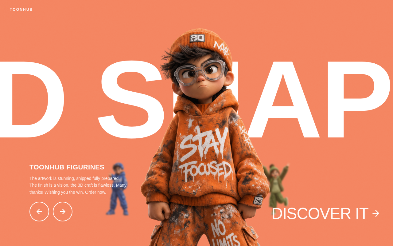
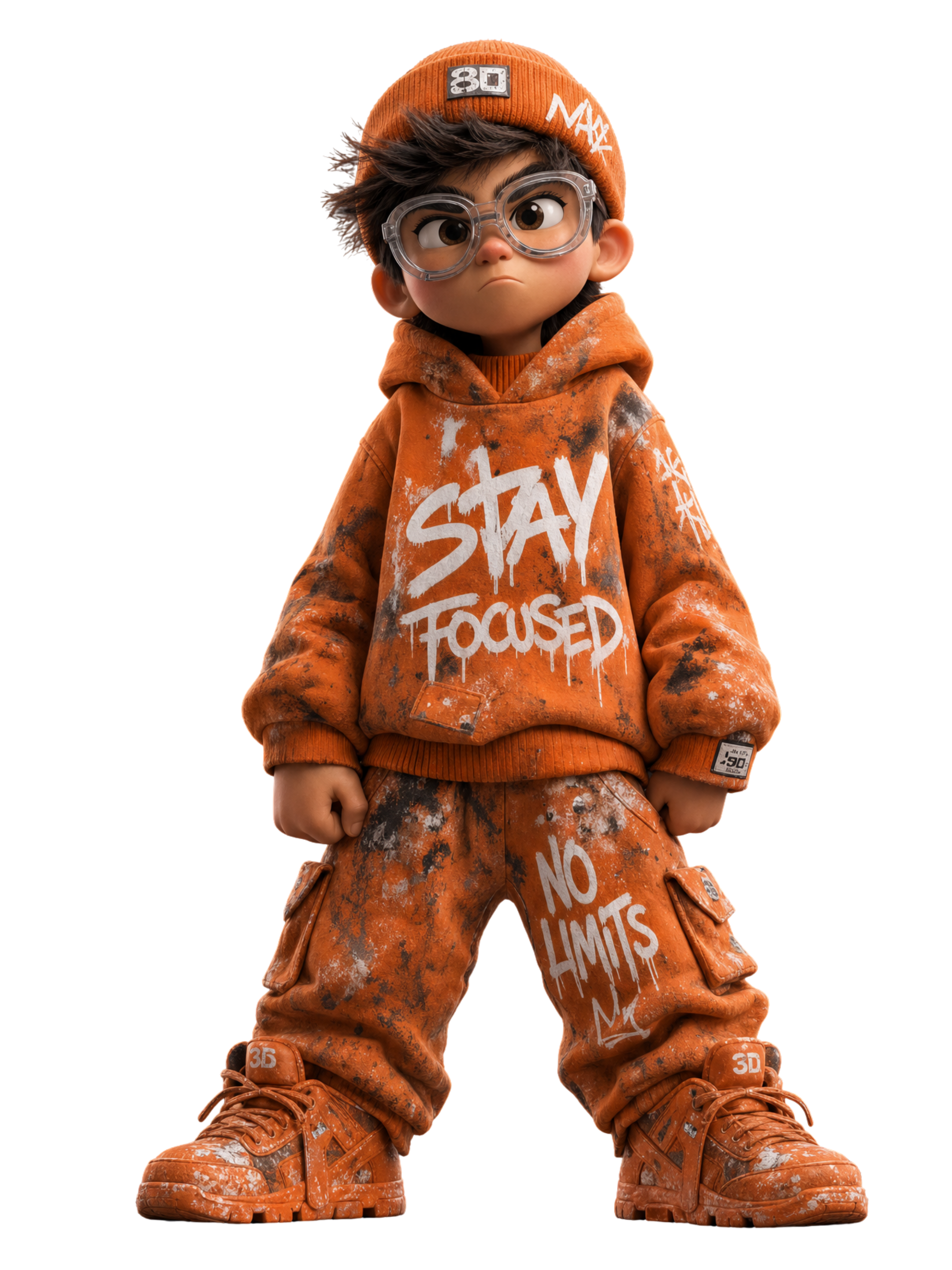
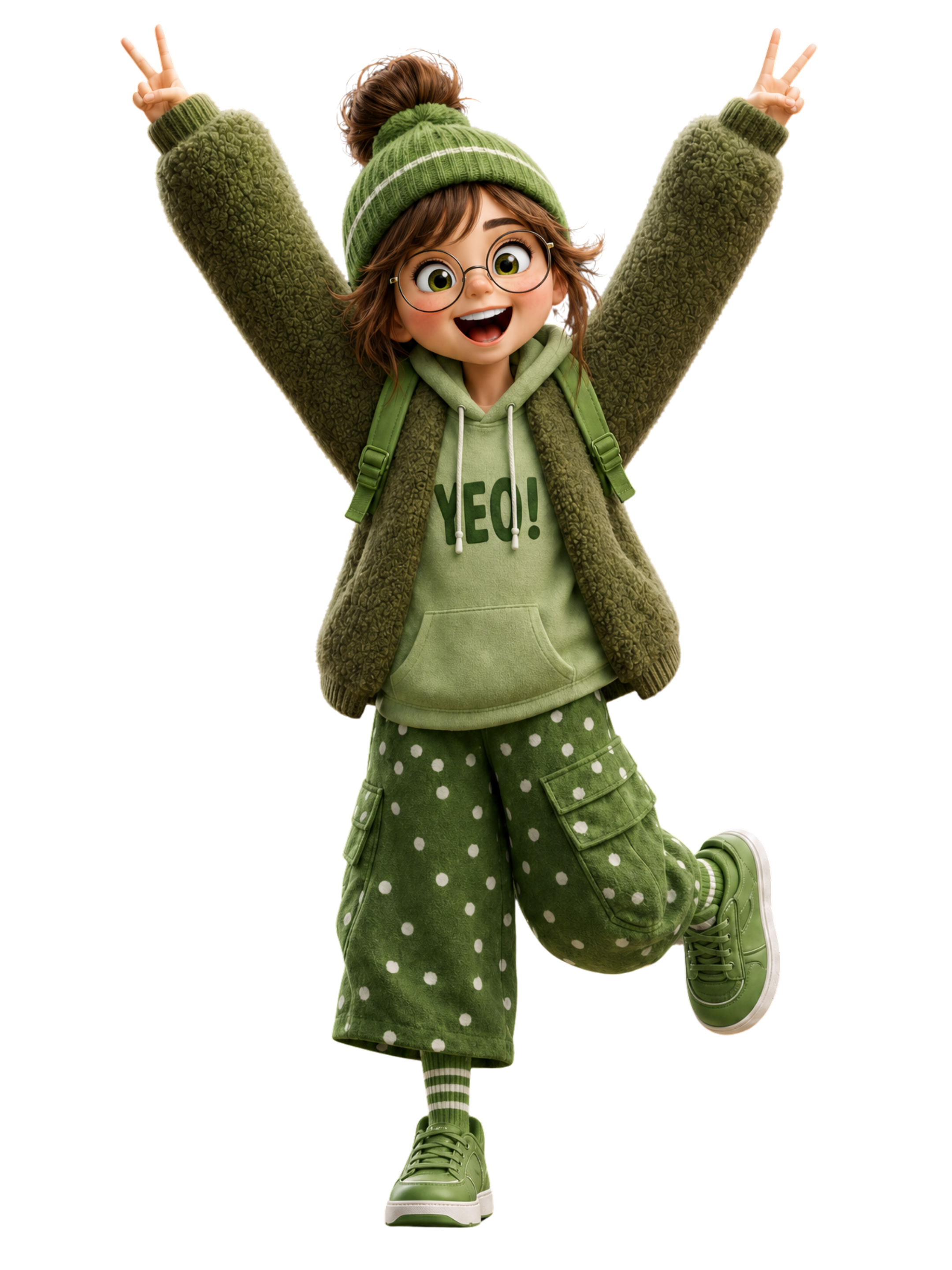
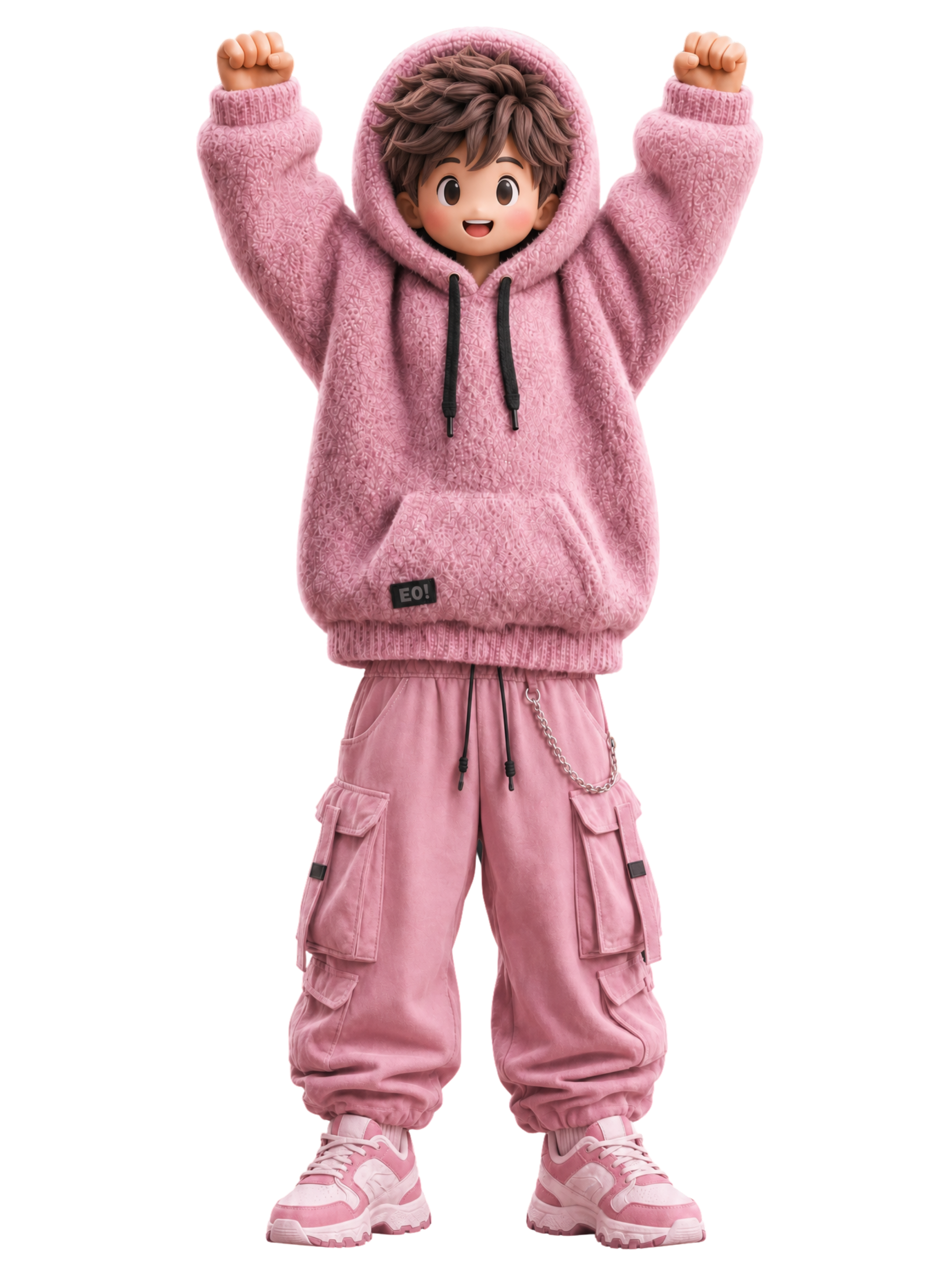
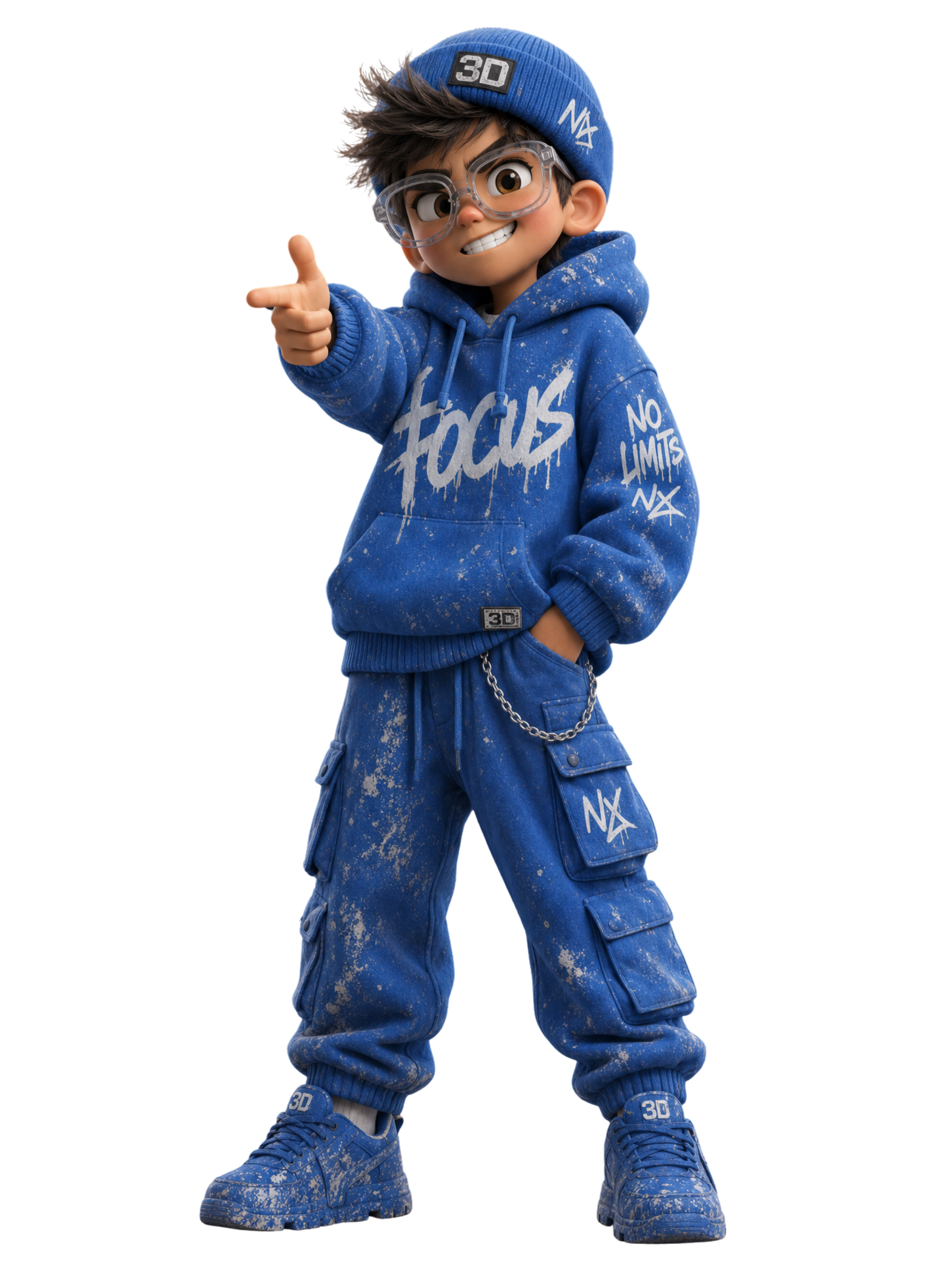
TOONHUB FIGURINES
The artwork is stunning, shipped fully prepared. The finish is a vision, the 3D craft is flawless. Many thanks! Wishing you the win. Order now.
TOONHUB FIGURINES
The artwork is stunning, shipped fully prepared. The finish is a vision, the 3D craft is flawless. Many thanks! Wishing you the win. Order now.
No comments yet. Be the first!