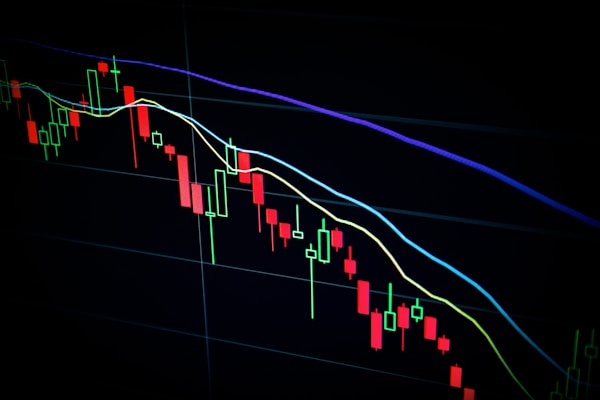
Market Analysis
Understanding Bull Markets: A Guide for New Investors
Learn the key indicators that signal a bull market and how to position your portfolio to maximize returns during upward trends.
Build a website givein in this prompt

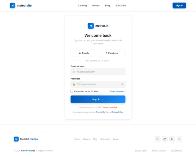
Sign in to leave a comment
The meteor-website project aims to deliver a high-quality UI/UX landing page design for a financial blog website, now expanded to include functionality for showcasing movie photos and providing download links. The website will combine minimalist aesthetics with professional design elements to ensure a seamless user experience. This document outlines the system requirements for the project, incorporating the latest updates requested by the user.
The meteor-website will serve as a dual-purpose platform:
The website will prioritize responsiveness, ensuring optimal performance across desktop and mobile devices. It will feature intuitive navigation, interactive elements like subscription forms, social media links, and search functionality, along with the newly added movie showcase functionality.
The meteor-website will feature a unique color palette that balances professionalism with visual appeal:
The homepage will feature a dual-section layout:
This bold design concept ensures the website is visually captivating while maintaining functionality and ease of use.

Explore expert financial insights alongside a curated movie gallery. Read in-depth articles, discover trending films, and download high-quality content — all in one place.
A dual-purpose platform combining professional financial content with a curated movie showcase experience.
Access expert-curated financial articles, market analysis, and investment strategies to make informed decisions and grow your portfolio.
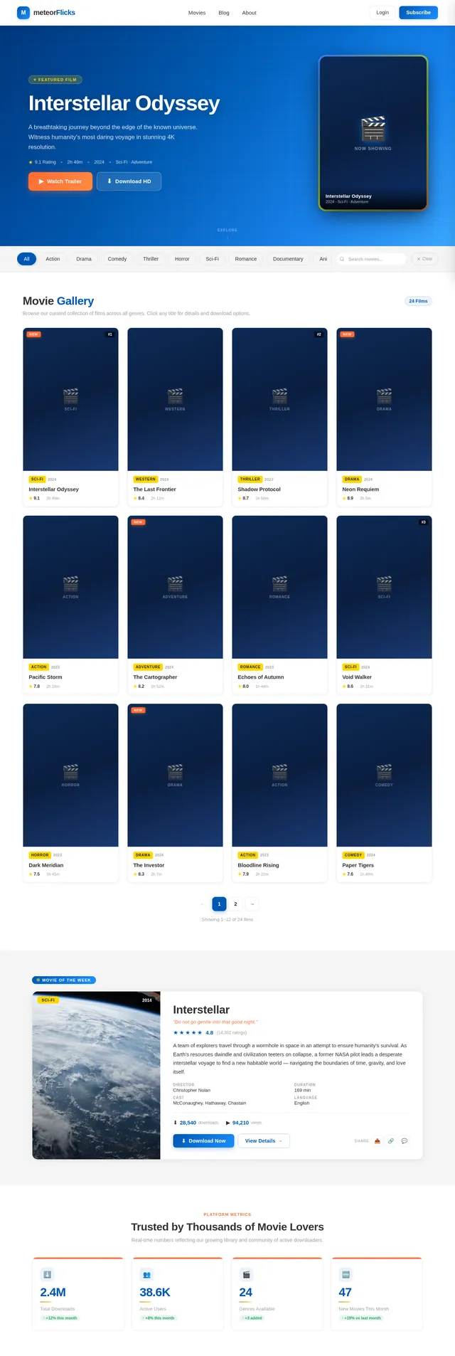
Browse our dynamic gallery of high-resolution movie photos, organized by genre with detailed descriptions and easy download options.
Join a vibrant community of readers and movie enthusiasts. Subscribe for weekly updates, share insights, and stay connected.
Learn the key indicators that signal a bull market and how to position your portfolio to maximize returns during upward trends.

Discover the updated strategies for building a resilient emergency fund that accounts for inflation and changing economic conditions.

Explore real estate, commodities, and digital assets as part of a well-rounded investment portfolio for long-term growth.
Discover a dynamic gallery of curated movie photos with powerful filtering by genre, category, and release year. Browse high-resolution thumbnails, explore detailed movie information, and download your favorites with a single click.
Browse Movies →Browse our curated collection of movies spanning finance, technology, and human drama. Filter by genre to discover your next favorite film.
Everything you need to discover, explore, and download movie content — all in one beautifully designed experience.
Browse stunning, high-resolution movie stills and promotional photos perfect for wallpapers, collections, or creative projects.
Download your favorite movie photos instantly with a single click. No sign-ups or redirects — just fast, direct access.
Quickly find what you are looking for with genre-based filters. Sort by action, drama, sci-fi, comedy, and more.
Every movie comes with rich descriptions, cast info, and behind-the-scenes context to enhance your browsing experience.
Get weekly articles and movie recommendations delivered straight to your inbox.
No spam, ever. Unsubscribe anytime. We respect your privacy.
Trusted by readers, movie enthusiasts, and content creators across India.
Meteor has completely transformed how I keep up with market trends. The articles are concise, well-researched, and the clean layout makes reading on my commute a breeze.
The movie gallery is phenomenal. High-resolution photos, easy downloads, and the genre filtering helps me find exactly what I need for my reviews. Highly recommended!
I subscribed six months ago and the weekly financial insights have genuinely improved my investment decisions. The newsletter curation is top-notch.
As someone who needs quick access to movie stills for my content, Meteor is a lifesaver. The download links are fast and the image quality is unmatched.
The articles break down complex financial concepts into digestible pieces. The mobile experience is flawless and the typography is so easy on the eyes.
Finally a platform that combines quality movie galleries with reliable downloads. The category organization makes browsing through hundreds of titles effortless.
Everything you need to know about Meteor, from browsing articles to downloading movies.
Still have questions? We are happy to help you out.
Get in Touch →Dive into our curated movie gallery for stunning visuals and download links, or explore expert financial articles to stay ahead of the market. Your journey starts here.
No comments yet. Be the first!