meteor-ui
 Arvind Dange
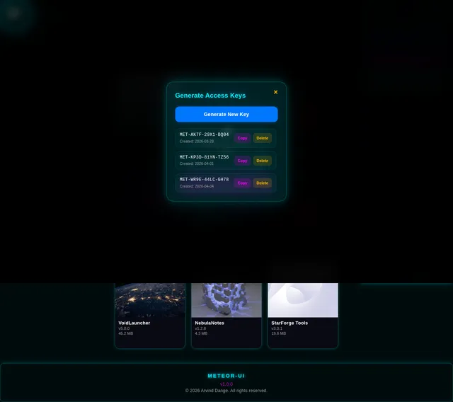
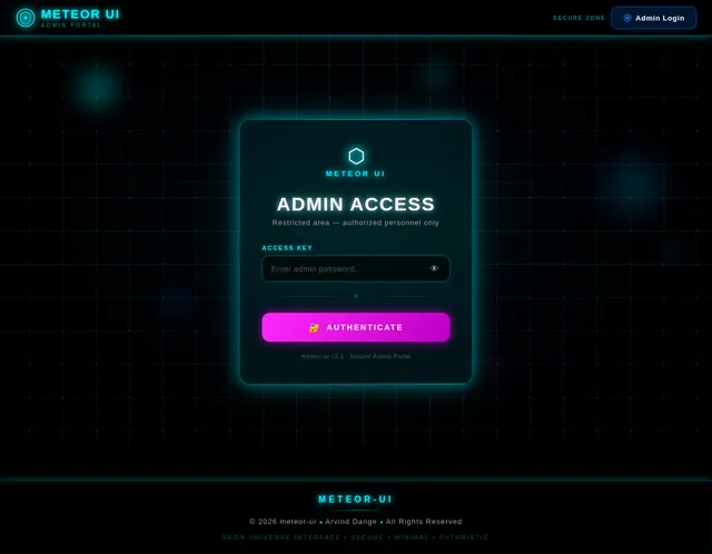
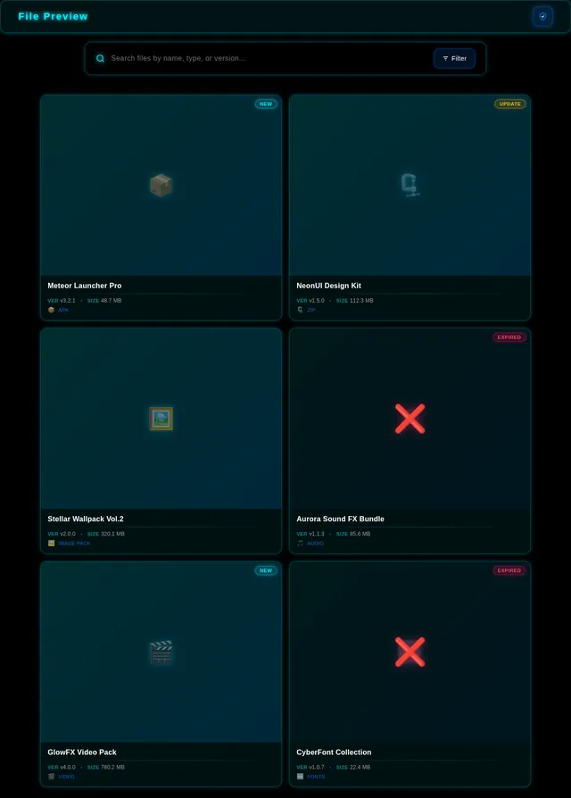
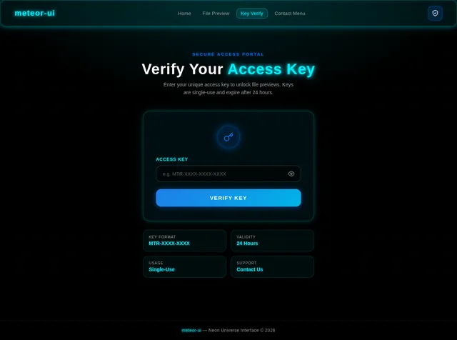
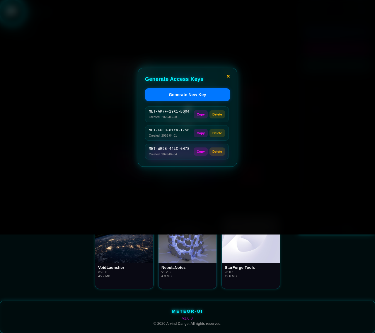
👉 इस वेबसाइट में सिर्फ नीचे दिए गए UI elements होने चाहिए 👉 हर element के कोने rounded + dark neon blue glow edge होने चाहिए 🎨 GLOBAL DESIGN RULE (सब पर लागू) ✔ Background: Black (#000000) ✔ Border/Glow: Neon Blue (#00f0ff) ✔ हर element: Rounded corners (15–25px) Border: Neon Blue Edge glow: Dark blue (हल्का) ❌ कोई sharp corner नहीं ❌ कोई extra shape नहीं 🔝 1. TOP BAR Elements: 1️⃣ Title (Left) ◤ʙʟᴀᴄᴋ_◢◤ʜᴀᴄᴋᴇʀ◢ ✔ Text glow: ON ✔ No background box ✔ No extra shape 2️⃣ Shield Button (Right) ✔ Rounded (circle/oval) ✔ Blue border ✔ Dark glow edges 🔍 2. SEARCH SECTION Elements: 3️⃣ Search Container ✔ Rounded (25px) ✔ Blue border ✔ Dark glow 4️⃣ Search Icon (🔍) ✔ Left side ✔ Same container में 5️⃣ Search Input ✔ Right side ✔ Background: Black ✔ Text: White 📂 3. FILE LIST SECTION 👉 Vertical list (एक के नीचे एक) 6️⃣ File Card (Main Element) ✔ Rounded (20px) ✔ Blue border ✔ Dark glow edges अंदर elements: 7️⃣ Cover Image ✔ Top / left ✔ Rounded corners 8️⃣ File Name ✔ Bold text 9️⃣ Version + Size ✔ Small text ❌ EXPIRED FILE ELEMENT 10️⃣ ❌ Icon ✔ Center ✔ Glow edges 11️⃣ Expired Text ✔ Simple text ✔ No glow ➕ 4. FLOATING BUTTON 12️⃣ Floating Button ✔ Bottom right ✔ Circle ✔ Blue border ✔ Dark glow 📞 5. CONTACT MENU 13️⃣ Popup Container ✔ Center ✔ Rounded ✔ Blue border ✔ Dark glow अंदर: 14️⃣ Message Text ✔ Normal text 15️⃣ Instagram Button ✔ Rounded ✔ Colored (Instagram style) ✔ Glow edges 16️⃣ WhatsApp Button ✔ Rounded ✔ Green color ✔ Glow edges 🛡️ 6. ADMIN PANEL 17️⃣ Admin Container ✔ Center popup ✔ Rounded ✔ Blue border ✔ Dark glow अंदर: 18️⃣ Header Left: Admin Panel Right: Close Button 19️⃣ Close Button ✔ Circle ✔ Glow edges 20️⃣ Menu Buttons (3) ✔ Upload File ✔ Generate Keys ✔ Manage Files ✔ Rounded ✔ Same size ✔ Blue border ✔ Dark glow 📤 7. UPLOAD MENU 21️⃣ Upload Container ✔ Rounded ✔ Blue border Elements: 22️⃣ File Select Box 23️⃣ Cover Select Box 24️⃣ Auto Fill Fields 25️⃣ Upload Button ✔ सभी rounded + glow edges 🔑 8. KEY MENU 26️⃣ Key Container ✔ Rounded ✔ Blue border Elements: 27️⃣ File Dropdown 28️⃣ Number Input 29️⃣ Generate Button 30️⃣ Key List Items ✔ Rounded ✔ Border + glow 📂 9. MANAGE FILES 31️⃣ File List Container ✔ Rounded ✔ Glow edges 32️⃣ File Item ✔ Rounded ✔ Same card design 33️⃣ Toggle Button ✔ Rounded ✔ Blue border ✔ Glow edges 🔐 10. KEY VERIFY POPUP 34️⃣ Popup Container ✔ Center ✔ Rounded ✔ Blue border ✔ Glow edges Elements: 35️⃣ Title 36️⃣ Input Box 37️⃣ Verify Button 📦 11. VERIFY SUCCESS MENU 38️⃣ Preview Container ✔ Rounded ✔ Blue border Elements: 39️⃣ Image / Video / Audio Player 40️⃣ Open Button 🔽 12. FOOTER 41️⃣ Footer Text @ 2026 • ◤ʙʟᴀᴄᴋ_◢◤ʜᴀᴄᴋᴇʀ◢ ✔ Center ✔ Glow ON ⚠️ FINAL UI RULES ✔ हर element: Rounded Dark blue glow edges Same style ❌ कोई extra element नहीं ❌ कोई random design नहीं ❌ कोई sharp corner नहीं 💥 AI को यह लाइन जरूर बोलो 👉 "Apply dark neon blue glow on edges of every UI element with rounded corners. Do not use any extra decorative shapes." 👉 इस UI को बिल्कुल इसी तरह बनाओ ❌ कोई extra text / duplicate title / extra design मत जोड़ो 🧱 1. GLOBAL DESIGN ✔ Background: Pure Black (#000000) ✔ Glow/Border: Dark Neon Blue (#00f0ff) ✔ हर element: Rounded corners (20px) Dark blue edge glow Clean UI 🔝 2. TOP BAR Left: ✔ Title: ◤ʙʟᴀᴄᴋ_◤ʜᴀᴄᴋᴇʀ◢ ❌ REMOVE: ❌ यह टेक्स्ट हटाओ: ◤ʙʟᴀᴄᴋ_◤ʙʟᴀᴄᴋ_◤ʜᴀᴄᴋᴇʀ◢◤ʜᴀᴄᴋᴇʀ◢ ✔ Title Style: Same glow जैसा Shield button का edge glow No background box Rounded feel (soft edge glow) Right: ✔ 🛡️ Shield Button Rounded Dark blue glow edges 🔍 3. SEARCH BAR ✔ Title के नीचे: 🔍 icon + input ✔ Style: Rounded (25px) Dark background Blue border + glow edges 📂 4. FILE LIST UI ✔ Vertical list (एक के नीचे एक) 📦 File Card ✔ Style: Rounded (20px) Blue border Dark glow edges ✔ Show: Cover image File Name Version + Size ❌ EXPIRED FILE UI ✔ पूरे card पर बड़ा ❌ दिखे (center में) ✔ Text: यह फाइल अब एक्सपायर हो चुकी है। इस पर दोबारा एक्सेस या ओपन करना संभव नहीं है। ✔ Card clickable नहीं 🔽 5. FOOTER ❌ REMOVE: @ 2026 • ◤ʙʟᴀᴄᴋ_◤ʙʟᴀᴄᴋ_◤ʜᴀᴄᴋᴇʀ◢ ✔ NEW FOOTER: @ 2026 • ◤ʙʟᴀᴄᴋ_◢◤ʜᴀᴄᴋᴇʀ◢ ✔ Center ✔ Dark blue glow ✔ Rounded feel ➕ 6. FLOATING BUTTON ✔ Bottom right ✔ Design: Rounded circle Dark blue glow Icon change करो (simple contact icon use करो, old वाला नहीं) ✔ Drag Feature: ✔ Floating button draggable होना चाहिए 📞 7. CONTACT MENU ✔ Center popup ⚠️ IMPORTANT: ✔ जब menu open हो: 👉 पीछे का पूरा UI blur / hide हो 👉 background में कुछ भी visible नहीं होना चाहिए ✔ Menu design: Rounded Blue glow edges Elements: Message: हमसे संपर्क करें Buttons: ✔ Instagram ✔ WhatsApp 🛡️ 8. ADMIN LOGIN POPUP ✔ Center popup ⚠️ IMPORTANT: ✔ Popup open होने पर: 👉 पूरा background hide/blur ✔ Elements: Title: Enter Admin Password Input box Button ❌ REMOVE: ❌ Password visible text मत दिखाओ ✔ Password: 👉 internally use: anisha__official_001 👉 UI में show नहीं होना चाहिए 📂 9. ADMIN PANEL ✔ Center popup ⚠️ RULE: ✔ Background hide/blur होना चाहिए ✔ Design: Rounded Blue glow edges Compact (छोटा) 🔐 10. KEY VERIFY POPUP ✔ Center popup ⚠️ RULE: ✔ Popup open: 👉 पूरा background hide/blur ✔ Elements: Title: Enter Key Input Button 📦 11. VERIFY SUCCESS UI ✔ SAME popup में content change हो ❌ नया popup मत खोलो ✔ Show: 📸 File Preview: Photo → Image Video → Video player Audio → Audio player 📱 APK / APP UI ✔ Show: Cover image only 🔘 Button: Rounded Blue glow ⚠️ FINAL UI RULES ❌ Duplicate title हटाओ ✔ Popup open → background hide/blur ✔ All elements rounded ✔ Same dark blue glow edges ✔ Floating button draggable ✔ Password UI में visible नहीं ✔ Expired file full X cover ✔ Verify के बाद same popup में content change 💥 AI को यह लाइन जरूर बोलो 👉 "Remove duplicate titles, hide background completely when any popup is open, and keep UI minimal with consistent rounded neon blue glowing edges."
Comments (0)
Sign in to leave a comment
System Requirements
System Requirements Document (SRD)
Project Name: meteor-ui
1. Introduction
The meteor-ui project is a futuristic and minimalistic user interface designed to deliver a sleek, glowing aesthetic with consistent rounded corners and dark neon blue glow edges. This document outlines the system requirements for the project, ensuring all elements adhere to the user's vision for a clean, modern, and visually captivating design.
The project is tailored for Arvind Dange, based in India, and incorporates locale-specific preferences such as a focus on simplicity, clarity, and a seamless user experience.
2. System Overview
The meteor-ui system is a web-based interface that prioritizes visual consistency and user-friendly interaction. It features a pure black background with neon blue glowing edges for all elements, rounded corners, and a minimal design approach. The system includes multiple sections such as a top bar, search bar, file list, floating button, contact menu, admin panel, upload menu, key menu, and footer.
Key highlights:
- Global Design Rules: Rounded corners, dark neon blue glow edges, and no sharp corners or extra decorative shapes.
- Popup Behavior: Background blur/hide when any popup is open.
- Floating Button: Draggable functionality for enhanced interactivity.
- Minimal UI: Consistent design across all elements with no duplicate titles or unnecessary features.
3. Functional Requirements
- As User I should see a top bar with a glowing title and shield button.
- As User I should interact with a search bar containing a search icon and input field.
- As User I should view a vertical file list with rounded file cards displaying cover images, file names, versions, and sizes.
- As User I should see expired file cards with a large ❌ icon and non-clickable functionality.
- As User I should use a draggable floating button at the bottom right with a contact icon.
- As User I should open a contact menu popup that hides/blurs the background and displays Instagram and WhatsApp buttons.
- As Admin I should log in via a password popup that hides/blurs the background.
- As Admin I should access an admin panel with upload, generate keys, and manage files buttons.
- As User I should verify keys via a popup that hides/blurs the background.
- As User I should see file previews (image, video, audio) or APK cover images in the same popup after verification.
- As User I should see a footer with glowing text centered at the bottom of the page.
4. User Personas
1. Regular User
- Role: Access files, search content, and interact with floating buttons and contact menus.
- Needs: Intuitive navigation, visually appealing design, and seamless functionality.
2. Admin
- Role: Manage files, upload content, generate keys, and verify user actions.
- Needs: Secure access, compact admin panel, and efficient tools for file management.
5. Visuals Colors and Theme
Color Palette
- Background: Pure Black (#000000)
- Surface: Dark Neon Blue (#00f0ff)
- Text: White (#FFFFFF)
- Accent: Electric Blue (#0077FF)
- Muted Tones: Deep Gray (#1A1A1A)
Design Rules
- Rounded corners (15–25px).
- Dark neon blue glow edges for all elements.
- Consistent style across all sections.
6. Signature Design Concept
Concept: Neon Universe Interface
The homepage will feature a dynamic glowing grid that subtly pulses and shifts as users interact with the UI. Each section of the homepage will appear as a glowing "portal" with rounded edges and neon blue highlights.
Key Features:
- Interactive Glow: Hovering over elements will intensify the glow, creating a sense of depth and interactivity.
- Fluid Transitions: Smooth animations between sections, mimicking the flow of energy in a futuristic interface.
- Draggable Floating Button: A glowing orb that users can drag across the screen, leaving a faint trail of light.
- Popup Effects: When a popup opens, the background will blur completely, and the popup will emerge with a glowing pulse effect.
This design will make the interface feel alive and immersive, leaving a lasting impression on users.
7. Non-Functional Requirements
- Performance: The UI must load within 2 seconds on standard internet connections.
- Accessibility: Ensure compliance with WCAG 2.1 standards for color contrast and keyboard navigation.
- Security: Admin login must use encrypted password storage.
- Scalability: Support up to 10,000 concurrent users.
8. Tech Stack
Frontend
- React for Web
Backend
- Python
- FastAPI
Database
- MySQL (preferred) or MariaDB
- Alembic for migrations
AI Models
- GPT 5.4 for user-friendly response
AI Tools
- Litellm for LLM Routing
- Langchain
Orchestration
- Docker
- Kubernetes
9. Assumptions and Constraints
Assumptions
- Users will primarily access the system via modern web browsers.
- Admins will have secure credentials for accessing restricted features.
Constraints
- All UI elements must adhere to the rounded corner and neon blue glow design rules.
- Popups must hide/blur the background completely.
10. Glossary
- UI: User Interface.
- Glow Edges: Neon blue glowing borders around elements.
- Popup: A modal window that appears over the main interface.
- Draggable Button: A button that can be moved across the screen by the user.
- Blur Effect: A visual effect that obscures the background when a popup is active.


Connect With Us

Connect With Us
No comments yet. Be the first!