mars-template
 jeison javier Marin Guerrero
create template for portfolio designer

Comments (0)
Sign in to leave a comment
System Requirements
System Requirements Document (SRD)
Project Name: mars-template
1. Introduction
The mars-template project is a portfolio template designed specifically for graphic designers, with a focus on showcasing diverse design capabilities across social media, editorial, web design, and poster creation. This document outlines the system requirements to ensure the template meets the needs of creative professionals like Jeison Javier Marin Guerrero, enabling them to present their work effectively and attract potential clients or employers.
The template will cater to a Colombian audience, incorporating locale-specific defaults such as language (Spanish), currency (COP), and timezone (GMT-5).
2. System Overview
The mars-template portfolio system will provide graphic designers with a visually stunning and highly functional platform to showcase their work. It will include sections for project galleries, a professional summary, client testimonials, and a contact form. The design will emphasize versatility, allowing users to categorize their work into areas such as social media, editorial, web design, and posters.
The system will be responsive, ensuring optimal performance across devices (desktop, tablet, and mobile). It will also integrate modern design aesthetics and interactive elements to captivate visitors and highlight the designer's creativity.
3. Functional Requirements
As story points:
- As a Designer, I should be able to showcase my work in categories like social media, editorial, web design, and posters.
- As a Designer, I should be able to customize the hero section with an impactful image and a personal tagline.
- As a Designer, I should be able to upload and organize projects into a visually appealing gallery.
- As a Designer, I should be able to include a professional summary in the "About Me" section.
- As a Designer, I should be able to display client testimonials or collaborations.
- As a Designer, I should be able to integrate a simple and accessible contact form.
- As a Designer, I should be able to add animations to enhance the user experience.
- As a Designer, I should be able to include a blog section to share creative processes or insights.
4. User Personas
Designer
- Description: The primary user of the mars-template. A creative professional specializing in graphic design across social media, editorial, web design, and posters.
- Goals: Showcase their portfolio, attract clients, and establish credibility.
- Needs: A visually appealing, customizable, and easy-to-use template that highlights their versatility.
Visitor
- Description: Potential clients, employers, or collaborators browsing the designer's portfolio.
- Goals: Evaluate the designer's skills and creativity, and establish contact for potential projects.
- Needs: A seamless browsing experience with clear navigation and engaging visuals.
5. Visuals Colors and Theme
Color Palette:
The mars-template will feature a bold and modern color palette inspired by creativity and professionalism:
- Background: #F4F1E9 (Soft Cream)
- Surface: #FFFFFF (Pure White)
- Text: #333333 (Charcoal Gray)
- Accent: #FF5733 (Vivid Coral)
- Muted Tones: #C7C7C7 (Light Gray)
This palette balances warmth and vibrancy, reflecting the energy and creativity of graphic design while maintaining a professional tone.
6. Signature Design Concept
The mars-template will feature a Dynamic Canvas Homepage that immerses visitors in the designer's world.
Concept Details:
- Interactive Hero Section: The homepage will open with a full-screen hero banner featuring a rotating carousel of the designer's best works. Each image will subtly animate (e.g., zoom-in effect) as the user hovers over it, accompanied by a short tagline.
- Gallery as a Scrollable Timeline: Projects will be displayed in a horizontal scrollable timeline, where each category (social media, editorial, web design, posters) is represented by a unique visual style. Clicking on a category will expand it into a detailed view with animations like flipping cards or sliding panels.
- Micro-Interactions: Buttons and links will have hover effects, such as color shifts or subtle vibrations, adding a tactile feel to the interface.
- Background Animation: A living watercolor background will subtly morph colors based on the time of day, creating a dynamic and personalized experience for visitors.
- Blog Section: The blog will feature a "sketchbook" aesthetic, with handwritten fonts and paper-texture backgrounds, giving it a creative and personal touch.
This design concept ensures the mars-template stands out as an unforgettable and engaging portfolio experience.
7. Non-Functional Requirements
- The system must be responsive and optimized for desktop, tablet, and mobile devices.
- The system must support localization for Spanish (default language) and allow easy translation to other languages.
- The system must load within 3 seconds on standard internet connections.
- The system must adhere to accessibility standards (WCAG 2.1).
- The system must support secure data handling for contact form submissions.
8. Tech Stack
Frontend:
- React for Web
Backend:
- Python
- FastAPI
Database:
- MySQL (preferred for structured data like user profiles and project details)
AI Tools:
- Google Nano Banana for image generation (optional for creating placeholder visuals)
Local Orchestration:
- Docker
- docker-compose
Server-Side Orchestration:
- Kubernetes
9. Assumptions and Constraints
Assumptions:
- The primary audience is Spanish-speaking users in Colombia.
- Designers will have basic technical knowledge to customize the template.
- The system will be hosted on a cloud platform with scalable resources.
Constraints:
- The design must adhere to Colombian cultural and aesthetic preferences.
- The system must operate within the limitations of standard web browsers and devices.
10. Glossary
- Hero Section: The prominent area at the top of a webpage, typically featuring an image and a tagline.
- Responsive Design: A design approach ensuring optimal viewing across various devices and screen sizes.
- WCAG: Web Content Accessibility Guidelines, standards for making web content accessible to all users.
- Docker: A tool for creating and managing containers for software applications.
- Kubernetes: A system for automating deployment, scaling, and management of containerized applications.

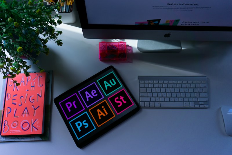
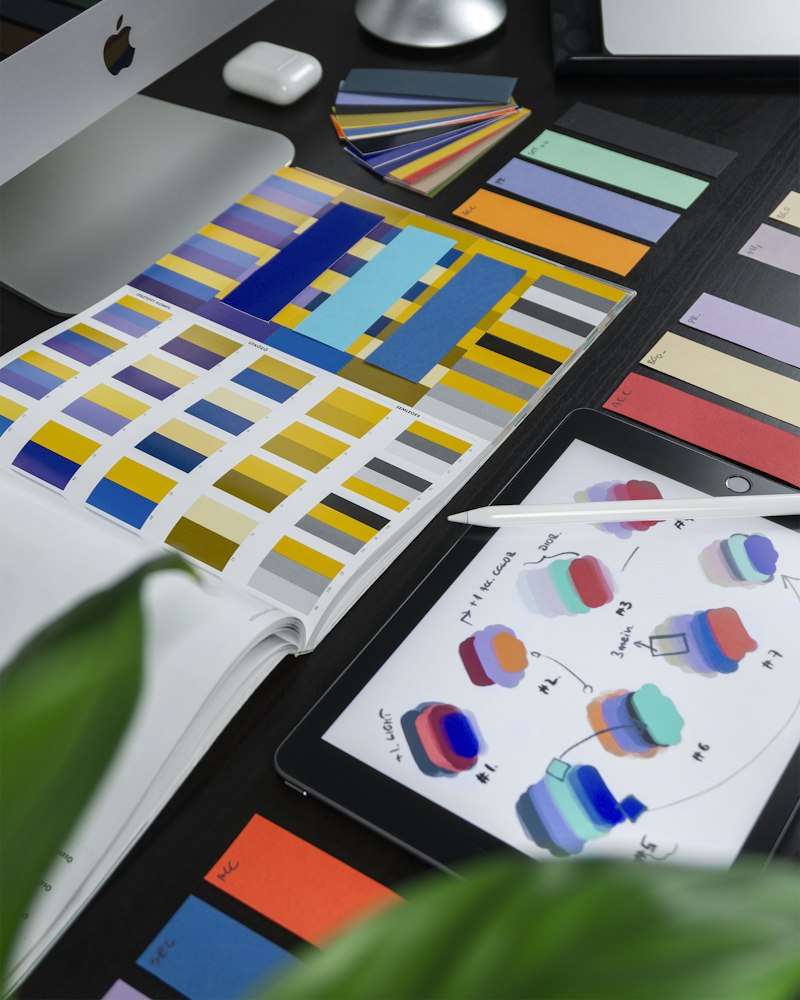
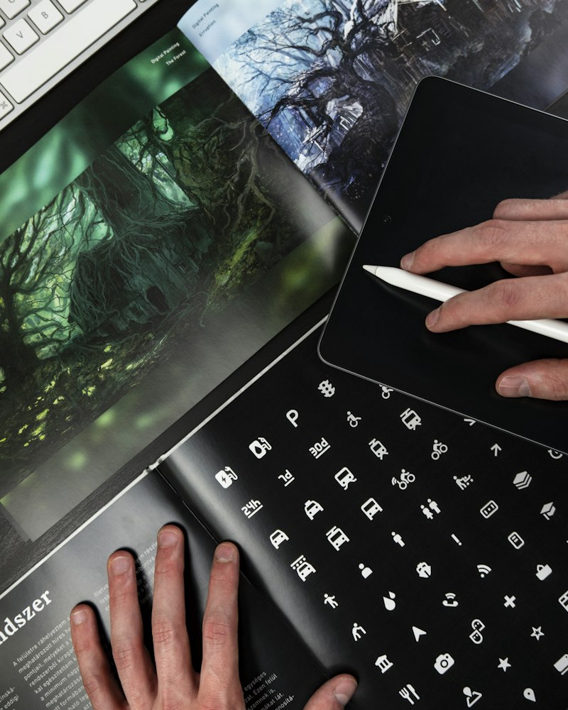

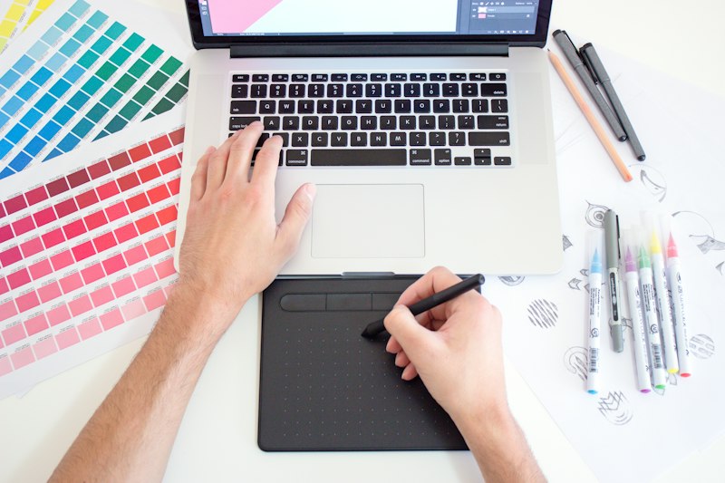 Social Media Campaign
Diseño que transforma ideas en experiencias
Social Media · Editorial · Web Design · Posters
Explora Mi Trabajo
Navega por categorías y descubre proyectos que combinan creatividad, estrategia y diseño impactante.
Explore My Work
Select a category to discover projects across disciplines
Café Colombia Campaign
Social Media
Social Media
Café Colombia Campaign
March 2026
Social media campaign for a specialty coffee brand featuring vibrant visuals and storytelling across Instagram and TikTok.
View Project→
Festival de Flores
Social Media
Social Media
Festival de Flores
January 2026
Visual identity and content series for Medellín flower festival social channels with botanical illustrations.
View Project→
Bogotá Street Art Series
Social Media
Social Media
Bogotá Street Art Series
November 2025
Instagram carousel series documenting and reimagining urban art across Bogotá neighborhoods.
View Project→
EcoVida Brand Launch
Social Media
Social Media
EcoVida Brand Launch
September 2025
Full social media kit for sustainable lifestyle brand including templates, stories, and highlight covers.
View Project→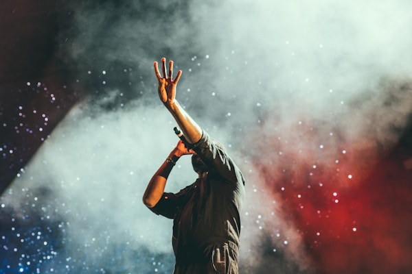
Ritmo Latino Playlist Art
Social Media
Social Media
Ritmo Latino Playlist Art
July 2025
Series of dynamic cover art pieces for Latin music playlists on streaming platforms.
View Project→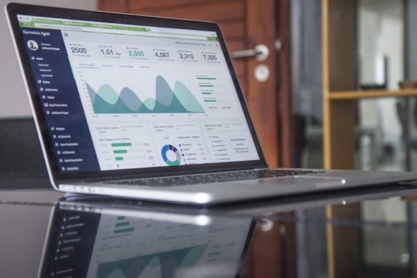
TechStart Reels
Social Media
Social Media
TechStart Reels
May 2025
Animated social media reels and motion graphics for a Colombian tech startup accelerator.
View Project→
Soy Jeison Javier, Diseñador Gráfico
Con más de una década creando experiencias visuales impactantes desde Colombia, me especializo en transformar ideas abstractas en narrativas visuales poderosas. Mi trabajo abarca desde campañas de redes sociales para marcas emergentes hasta diseño editorial para publicaciones reconocidas.
Cada proyecto es una oportunidad para fusionar creatividad estratégica con estética contemporánea, asegurando que cada pieza no solo sea visualmente atractiva, sino que comunique el mensaje correcto al público adecuado.
“Mi filosofía de diseño es simple: cada píxel tiene un propósito. No diseño para decorar, diseño para comunicar, conectar y transformar. El mejor diseño es aquel que el usuario siente pero no necesita analizar.”
Creando mundos visuales, un proyecto a la vez.
Lo que dicen mis clientes
Cada proyecto es una colaboración única. Estas son las experiencias de quienes han confiado en mi trabajo creativo.
Su trabajo en nuestra campaña de redes sociales superó todas las expectativas. La atención al detalle y la creatividad en cada pieza fueron excepcionales.
Rediseñó completamente nuestra identidad visual web y los resultados hablan por sí solos. Profesional, puntual y con una visión única para el diseño digital.
Los diseños editoriales que creó para nuestra revista elevaron la publicación a otro nivel. Cada página era una obra de arte que complementaba perfectamente el contenido.
Los pósters promocionales para nuestros eventos se convirtieron en piezas de colección. Capturó la esencia de la marca con un estilo fresco y memorable.
Colaborar fue una experiencia increíble. Entiende las necesidades del cliente y las traduce en diseños que generan impacto real en audiencias digitales.
Desde la identidad visual hasta las piezas impresas, todo el paquete creativo fue impecable. Nuestro festival nunca se había visto tan profesional.
Su trabajo en nuestra campaña de redes sociales superó todas las expectativas. La atención al detalle y la creatividad en cada pieza fueron excepcionales.
Rediseñó completamente nuestra identidad visual web y los resultados hablan por sí solos. Profesional, puntual y con una visión única para el diseño digital.
Los diseños editoriales que creó para nuestra revista elevaron la publicación a otro nivel. Cada página era una obra de arte que complementaba perfectamente el contenido.
Los pósters promocionales para nuestros eventos se convirtieron en piezas de colección. Capturó la esencia de la marca con un estilo fresco y memorable.
Colaborar fue una experiencia increíble. Entiende las necesidades del cliente y las traduce en diseños que generan impacto real en audiencias digitales.
Desde la identidad visual hasta las piezas impresas, todo el paquete creativo fue impecable. Nuestro festival nunca se había visto tan profesional.
Mi Cuaderno Creativo
Reflexiones, procesos y tendencias desde el estudio de diseño
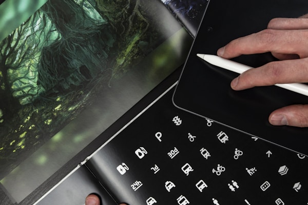
18 Abril, 2026
El Arte del Cartel: Tendencias 2026
Exploramos las tendencias más impactantes en diseño de carteles este año, desde la tipografía experimental hasta las paletas vibrantes.
Leer más→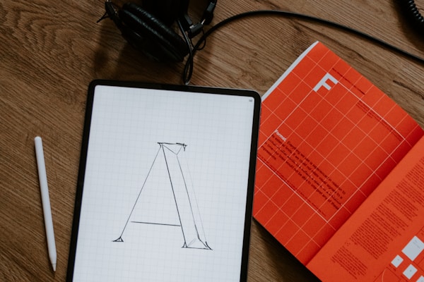
10 Abril, 2026
Diseño Editorial: Del Papel a lo Digital
Cómo adaptar los principios clásicos del diseño editorial al mundo digital sin perder la esencia.
Leer más→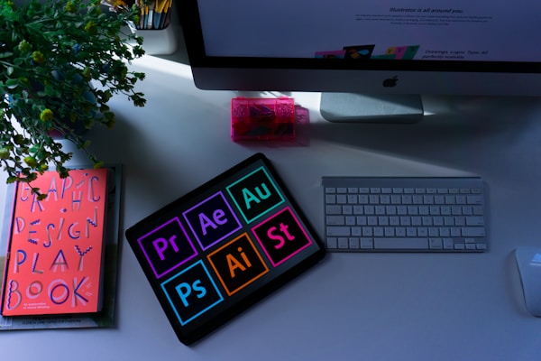
2 Abril, 2026
Social Media: Contenido que Conecta
Estrategias visuales para crear contenido en redes sociales que genera engagement real con tu audiencia.
Leer más→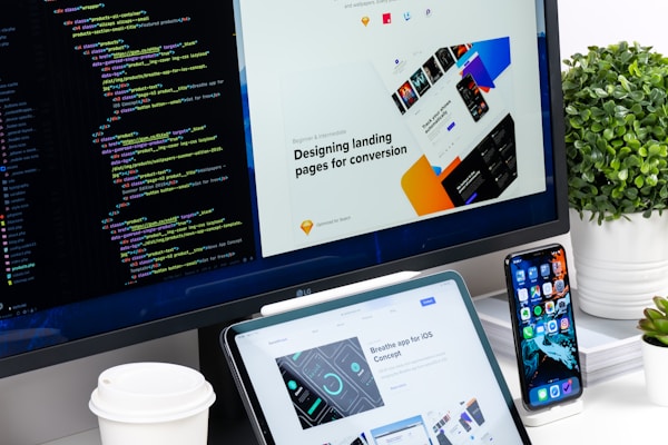
25 Marzo, 2026
UI/UX: Diseño Web con Propósito
Mi proceso creativo para diseñar interfaces web que equilibran estética y funcionalidad.
Leer más→Hagamos realidad tu próximo proyecto creativo
Desde redes sociales hasta diseño editorial, web y pósters — cada proyecto es una oportunidad para crear algo extraordinario. Trabajemos juntos para dar vida a tu visión.
Hablemos de tu próximo proyecto
¿Tienes una idea en mente? Me encantaría ayudarte a darle vida. Completa el formulario y te responderé en menos de 24 horas.
Correo electrónico
Teléfono
Ubicación
Bogotá, Colombia (GMT-5)
No comments yet. Be the first!