main-page-website
 Ronak Limbashiya
Here You can see This is my main page of my website....this is amazing no doubt but i need to some premium design and look and slide and scrolling animations.....also that's the reason i give you already one premium website as per i need....you can see so make this all section to with background set-up image....and change this look also

Comments (0)
Sign in to leave a comment
System Requirements
System Requirements Document for main-page-website
1. Introduction
This System Requirements Document specifies the redesign of the existing main page of a career-learning website. The current page is to receive a more premium visual style, slide and scrolling animations, and background images across all its sections. The supplied screenshots are visual and structural context for the redesign; they do not authorize copying their exact page structure or adding capabilities shown only in the screenshots.
The audience for the current scope is website visitors viewing the public landing page. The page should communicate the career-learning platform and its existing sections while presenting them in a polished, readable, responsive design.
2. System Overview
The system is a React website with one current custom page: Landing. It presents the existing main-page content in a premium visual style, with career-learning background imagery across all sections and slide and scroll animations. The supplied infrastructure also includes a shared FastAPI backend and MariaDB database; this redesign does not establish a need for new APIs, domain data, or database behavior.
The only accepted active-human persona is the Website visitor. The current scope does not add a learning workflow, account creation, personalized dashboard, or other destinations. The screenshots may inform visual treatment and the kinds of existing content to preserve, but do not independently establish product capabilities or exact copy.
2a. Product Interpretation and Delivery Boundary
Landing is the public entry surface for the existing website main page. It is application-owned and has no access requirement; visitors can view it without establishing an account. Its accepted responsibility is to present the existing page and its sections with the requested visual redesign, background images, and slide and scrolling animations.
The screenshots are optional visual context, not exact-copy instructions. Preserve the existing page’s content and section structure rather than inferring unseen content or reproducing the screenshots’ section order. Calls to action or other controls may be retained only to the extent they already exist on the main page; this redesign does not define their destinations or add a downstream learning journey.
The provisioned services are the React frontend, shared FastAPI backend, and MariaDB database. The redesign uses the existing frontend and does not require additional services. No future product capabilities are specified.
2c. Page Content and Component Coverage
Landing
- Information and state: Present the existing main-page content and sections. Preserve their established meaning and content; do not invent new sections, claims, or learning functionality. Apply a premium visual redesign and a distinct career-learning background image to every section, with dark overlays where needed to keep text legible.
- Primary and supporting actions: Retain existing page controls and calls to action without changing their meaning or inventing destinations. Visitors can view and scroll through the page. No new form, account, or learning action is in scope.
- Domain entities: Existing main-page content and its sections; section background imagery; existing controls. No new persistent domain entities are introduced.
- Component responsibilities: Use a full-width sequence of sections, with asymmetric editorial layouts where appropriate. Keep text and controls inside their containers and fully readable. Use relevant career-learning photography as full-bleed section backgrounds, cropped without obscuring content. Use charcoal overlays for contrast and restrained violet and cyan accents.
- Loading and success: Show the page content and section imagery when available; successful rendering leaves the visitor able to read and scroll through the existing sections.
- Empty, error, and recovery: If a section image cannot load, retain readable section content and controls against the dark page surface rather than hiding or blocking them. No other failure or recovery workflow is specified.
- Responsive and motion states: At 375px, 768px, and 1280px viewport widths, headlines, labels, and controls must wrap or scale to remain fully within the viewport and their containers. Use restrained slide-in section reveals and slow image parallax during scrolling. Keep controls steady. When reduced motion is enabled, provide a usable static layout with no animated content.
3. Functional Requirements
-
As a Website visitor, I should see the existing main page redesigned with a premium visual style, so that the page presents its existing content in the requested updated look.
Provenance: explicit.
Lifecycle and access: The visitor opens the public Landing page without signing in. The page renders the existing content and sections. If rendering or an image fails, readable content remains available; the visitor can continue viewing and scrolling.
Observable acceptance: The existing main-page content is presented on Landing with a premium visual treatment, without adding unsupported content or destinations. -
As a Website visitor, I should see a background image set up for every existing section, so that the page’s sections receive the requested image treatment.
Provenance: explicit.
Lifecycle and access: Images are presented as section backgrounds on the public Landing page. If an image fails to load, the section’s text and controls remain visible against the dark surface. The visitor can continue to other sections.
Observable acceptance: Every existing section has a career-learning background image, with contrast treatment that keeps readable content unobscured.
- As a Website visitor, I should experience slide and scrolling animations while viewing the page, so that the redesigned page has the requested motion.
Provenance: explicit.
Lifecycle and access: On the public Landing page, section content uses restrained slide-in reveals and background imagery uses slow scroll-linked parallax. Controls remain steady. When reduced motion is enabled, the visitor receives a usable static arrangement.
Observable acceptance: Motion is limited to the specified section reveals and image parallax; readable text and controls remain within their containers and are not covered or moved out of view.
4. User Personas
Website visitor
Provenance: required_inference from Planning Scope.
The Website visitor arrives at the public main page to view the career-learning website and its existing sections. Their accepted responsibility is to read and scroll through that content in the redesigned presentation. They need section imagery and motion to support the visual experience without compromising readability or access to existing controls. Their observable success is being able to view the existing page content across the page, including when reduced motion is enabled or an image fails to load. No additional participant or account requirement is established.
5. Core User Flows
View and scroll through the redesigned main page
- The Website visitor opens Landing as a public visitor; no account or sign-in is required.
- The page presents the existing main-page content in the premium redesign, with a career-learning background image for each existing section.
- The visitor reads the visible content and scrolls through the sections. Section text reveals with restrained upward slide motion, while background imagery uses slow parallax; controls remain steady.
- If an image fails to load, the affected section remains readable against the dark surface, and the visitor can continue scrolling.
- If reduced motion is enabled, the visitor sees the same usable content in a static arrangement.
- The visitor continues viewing the existing page and may use existing controls as already defined by the website. This redesign does not specify or add their destinations.
6. Visuals Colors and Theme
Muse: Tobias van Schneider
Headline: Career learning with an editorial edge
Use a focused, ambitious, premium visual language for a career-learning website. The supplied screenshots provide optional context for dark surfaces, confident contrast, and restrained violet and cyan accents; do not copy their exact section structure or page composition.
- Background:
#0B0B10— near-black page and section base. - Surface:
#12131A— charcoal surfaces and image overlays. - Text:
#F4F2F7— primary readable text. - Primary:
#8B5CF6— violet emphasis and small visual signals. - Accent:
#27B8E8— cyan accents and existing primary-action emphasis where applicable. - Muted:
#9293A5— supporting text. - Typography: Space Grotesk for headings and DM Sans for body text. Use a 1.25 type scale. Display headings range from 40px on mobile to 96px on desktop, wrapping or scaling to fit.
- Shape and layout: Sharp editorial frames, fine borders, restrained corner curves, full-width sections, and asymmetric editorial grids. Keep labels, headlines, and controls inside the viewport.
- Imagery: Relevant career-learning photographs as full-bleed backgrounds for every existing section. Crop imagery without covering readable content; use charcoal overlays where needed for contrast.
- Motion: Restrained slide-in section reveals and slow image parallax. Keep controls steady and disable animated content in the reduced-motion arrangement.
At 375px, 768px, and 1280px, all readable text and controls must remain fully within the viewport and their containers. Imagery may crop or bleed as needed, provided it does not obscure readable content.
7. Signature Design Concept
Build the Landing page as an editorial sequence of the existing sections on a near-black canvas. Give each section its own full-bleed career-learning photograph and charcoal overlay, with the existing content arranged in asymmetric grids where suitable. Use bold Space Grotesk headlines, selective violet emphasis, and restrained cyan accents for existing controls. As visitors scroll, reveal section text with a short upward slide while the background image shifts slowly; keep all text and controls steady, legible, and inside their containers. In reduced-motion mode, show the same composition without animation.
8. Interaction Model & Motion Direction
Interaction Model: Parallax
Motion Tempo: restrained
Hero Dimensionality: flat
Landing Hero Motion Brief
- Focal subject: The existing main-page hero content, paired with a relevant career-learning photograph on the right where consistent with the existing page.
- Input → transformation → outcome: The visitor scrolls the page → section content reveals with a restrained upward slide and background imagery shifts slowly → the visitor can follow the existing page content through its sections.
- Motion vocabulary: Short upward section reveals and slow image parallax; controls remain steady.
- First frame: Near-black field, left-aligned existing headline, violet emphasis, and the existing call to action if present; career-learning imagery occupies the adjacent visual area where the existing hero layout supports it.
- Reduced-motion state: Present the same content and imagery in a static, usable layout with no animated content.
9. Non-Functional Requirements
- Responsive readability — explicit design constraint: At 375px, 768px, and 1280px viewport widths, headlines, wordmarks, labels, numbers, and controls must remain fully inside the viewport and their containers. Text may wrap or scale to fit. No element may cover readable text or controls.
- Image contrast — explicit design direction: Use dark overlays behind text on section background images so content remains readable.
- Reduced motion — explicit design direction: Do not animate content when reduced motion is enabled; provide a usable static arrangement.
- Motion stability — explicit design direction: Keep controls steady during slide and scrolling animations.
- Image failure resilience — required_inference: If a section background image fails to load, retain that section’s readable content and controls on the dark surface so the visitor can continue.
10. Tech Stack
The provisioned stack is authoritative for this project:
- Frontend: React application UI; implement the Landing redesign in the existing frontend.
- Backend: Shared FastAPI process for application APIs and domain modules. No new API behavior is required by this redesign.
- Database: MariaDB for application-owned persistent data. This redesign does not establish new persistence requirements.
- Additional services: None required for the accepted page redesign.
11. Assumptions and Constraints
- The existing website main page and its content are the source of truth for which sections and controls are present; the screenshots do not authorize adding or removing product capabilities.
- The screenshots are visual and structural context only, not exact-copy references. Preserve the existing page’s section structure and content rather than copying the screenshots’ composition.
- Career-learning background images are required for all existing sections. The specific image assets are not identified in the supplied material; use suitable available assets without inventing image URLs or photo IDs.
- Existing calls to action may remain, but their destinations and downstream behavior are outside this redesign’s requirements.
- The current page is public and requires no account or sign-in.
- No future requirements are specified.
12. Glossary
- Landing: The public main page being redesigned.
- Section background image: A photograph used behind the content of an existing page section.
- Parallax: A scroll-linked visual effect in which background imagery moves more slowly than the page content.
- Reduced motion: A user or device preference requesting a static presentation instead of animated content.
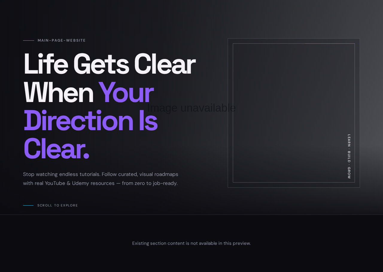

main-page-website
Life Gets Clear When Your Direction Is Clear.
Stop watching endless tutorials. Follow curated, visual roadmaps with real YouTube & Udemy resources — from zero to job-ready.
Existing section content is not available in this preview.
main-page-website
Life Gets Clear When Your Direction Is Clear.
Stop watching endless tutorials. Follow curated, visual roadmaps with real YouTube & Udemy resources — from zero to job-ready.
Existing section content is not available in this preview.
No comments yet. Be the first!