lunar-landing
 ajnalkar ismail sab
give me the best landing page

Comments (0)
Sign in to leave a comment
System Requirements
System Requirements Document for lunar-landing
1. Introduction
This document specifies lunar-landing, a public landing page for local service business owners. Its current product commitment is to build a landing page that clearly presents the product and lets an owner choose whether to get started or sign in. The page should make the product understandable and reassuring without asserting capabilities, prices, or claims that have not been established.
The accepted audience is the Local service business owner. The landing page is the current product scope; no additional product workflows are established.
Success criteria
The landing page succeeds when a local service business owner can understand the stated product proposition, view the product preview, and find the available “Get started” and “Sign in” choices. The page must remain readable and usable across the specified viewport widths and with reduced motion enabled.
2. System Overview
lunar-landing is a React landing page served as a public entry surface. It presents the product proposition and a focused product-interface preview to local service business owners. The page offers “Get started” and “Sign in” choices; their destinations and downstream workflows are not specified in the current scope.
The provisioned infrastructure consists of a React frontend, a shared FastAPI backend, and a MariaDB database. The landing-page commitment does not establish a need for application APIs, persistent domain data, authentication, or additional services.
2a. Product Interpretation and Delivery Boundary
The Landing page is publicly accessible and does not require application identity to view. It is the sole accepted page and the owner of the landing-page experience. The page’s “Get started” and “Sign in” actions are choices presented to the visitor; no trial, sign-in, account, or post-click workflow is specified, so this document does not define their destinations or behavior beyond presenting them as actions.
The uploaded screenshot is optional visual context only. It does not authorize copying its section structure, claims, navigation, pricing, or product features. The current page follows the supplied creative direction and uses only the accepted product proposition and preview.
2c. Page Content and Component Coverage
Landing
-
Information and state
- Public entry page for local service business owners.
- Hero headline: “A better way to manage reviews”.
- Hero subline: “Give local customers a clear path to share feedback, and see the product before you decide.”
- A custom product-interface preview is the primary visual. It must not imply unaccepted product capabilities or claims.
- The page presents “Get started” as the primary action and “Sign in” as the secondary action.
- No user-specific or persistent page state is required.
-
Primary and supporting actions
- Visitors can select “Get started” or “Sign in”. The destination and resulting workflow for either action are unspecified; do not imply a completed trial or authenticated session.
- The page supports ordinary scrolling if its content exceeds the viewport.
-
Components and responsibilities
- Compact public-entry header with the product wordmark and the two accepted choices.
- Hero content with the specified headline and subline.
- Warm-cream product-preview panel against the deep-green hero, with lime highlights and small, readable status labels. Preview details must remain illustrative and must not introduce product claims or capabilities.
- Responsive layout that keeps all readable text and controls within the viewport and their containers at widths of 375px, 768px, and 1280px.
- Loading, empty, success, error, and recovery states
- The page is informational and has no specified data-loading or empty state.
- Successful rendering presents the hero, preview, and choices.
- If the preview asset or rendering fails, retain the headline, subline, and choices; show a non-misleading fallback that does not invent product functionality.
- If a choice cannot be followed because its destination is not configured, keep the page usable and do not represent the action as completed. Destination behavior is outside current scope.
3. Functional Requirements
- As a Local service business owner, I should be able to view the public landing page, so that I can understand the product proposition and see a product preview before deciding what to do.
- Provenance: The landing-page commitment is
explicit; the audience and page ownership arerequired_inference. - Lifecycle and access: The owner opens the publicly accessible Landing page without establishing application identity. The page displays the specified headline and subline, product preview, and “Get started” and “Sign in” choices.
- Observable acceptance: The page renders its accepted content and choices at 375px, 768px, and 1280px without readable text or controls being clipped, covered, or outside their containers.
- Failure and recovery: If preview rendering fails, the page retains its core text and choices and uses a non-misleading fallback. The visitor can continue to either displayed choice; no downstream outcome is asserted.
- Continuation: The visitor may select “Get started” or “Sign in”. Their destinations and subsequent workflows are unspecified.
- Provenance: The landing-page commitment is
4. User Personas
Local service business owner
- Product context: A local service business owner evaluating the product through its public landing page.
- Primary goal: Understand the stated proposition and see the product before deciding whether to proceed.
- Accepted responsibilities: Review the landing-page content and choose “Get started” or “Sign in” if desired.
- Relevant inputs and decisions: The owner decides whether either displayed choice is relevant. No business details, credentials, or other inputs are specified.
- Interactions with other participants: No other accepted human participant is involved in the current landing-page scope.
- Observable success: The owner can read the proposition, view the preview, and identify the two choices without encountering unsupported claims or inaccessible content.
- Provenance:
required_inferencefrom the Planning Scope persona contract.
5. Core User Flows
Review the landing page and choose a next action
- The Local service business owner opens Landing from a public entry context; no application identity is required to view it.
- The page presents “A better way to manage reviews” and the specified subline, along with the product preview.
- The owner reviews the content and preview. If the preview fails to render, the page retains its core text and choices and presents a non-misleading fallback.
- The owner may select Get started or Sign in. The current requirements do not specify either destination or a resulting trial, sign-in, or account workflow; the page must not claim that such an outcome has occurred.
6. Visuals Colors and Theme
The visual direction is Humane technology for local service businesses, with Yves Béhar as its named muse. The design should feel clear, reassuring, warm, and practical. Use the supplied direction’s palette, typography, layout, shape language, and restrained motion.
-
Color tokens
- Deep-green hero/background:
#123C35 - Warm-cream surface:
#F5F2EA - Primary text:
#F8F7F2 - Primary action and purposeful highlight:
#C9F778 - Small status accent only:
#E8A842 - Muted text:
#AFC8BC - Do not use blue or violet as the primary accent.
- Deep-green hero/background:
-
Typography
- Headings: Sora, bold with tight, sentence-case headlines and clear weight contrast.
- Body: Karla, open and easy to read.
- Type scale: 1.2.
- Hero headline: 48px on mobile through 88px on desktop, followed by 32px, 24px, 18px, and 16px levels. Scale or wrap the headline so every line remains within the viewport.
-
Shape and layout
- Use soft, rounded panels with clear edges and warm surfaces.
- Keep lime accents small and purposeful.
- Place the headline and actions above a wide product preview. Use a deep-green hero, with the preview framed in a warm-cream panel below.
- Keep navigation compact and stack content within the viewport on mobile.
- Use a lime primary action and a quiet outlined secondary action.
- Place small, readable status labels beside the preview, not over its text.
- Do not use gradient blobs, stock people, unrelated photography, or decorative interface tiles.
-
Responsive readability
- At 375px, 768px, and 1280px, keep headlines, wordmarks, labels, numbers, cards, and controls fully inside the viewport and their containers. Wrap or scale content as needed. No element may cover readable text or controls.
- Imagery and decoration may be cropped or overlapped only where they do not obscure readable content or controls.
7. Signature Design Concept
Build the Landing hero as a deep-green field with the large, left-aligned headline and two choices above a wide, warm-cream product preview. The preview is the visual anchor: use lime highlights and small status labels beside its content to make the interface legible without implying unaccepted functionality. Keep the primary action lime and the secondary action quietly outlined. The composition uses only the accepted proposition, preview, and choices; it adds no new behavior or destination.
8. Interaction Model & Motion Direction
Interaction Model: Animated
Motion Tempo: restrained
Hero Dimensionality: layered_2d
Landing Hero Motion Brief
- Focal subject: The custom product-interface preview beneath the landing-page headline.
- Input → transformation → outcome: The visitor opens the public page → the preview and its small status details reveal gently → the visitor can inspect the product presentation and choose “Get started” or “Sign in”.
- Motion vocabulary: Slow, restrained reveals for the preview and gentle feedback on controls. Avoid motion that competes with the headline or preview content.
- Composed first frame: Show the deep-green hero, headline, subline, and both choices clearly; the warm-cream preview follows below. Keep all text and controls unobstructed.
- Reduced-motion state: Provide a usable static arrangement with the same content and choices. Disable nonessential reveal and feedback motion when reduced motion is preferred.
9. Non-Functional Requirements
-
Responsive readability
- Provenance: Explicit creative-direction constraint.
- Readable text and controls must remain whole and within the viewport and their containers at 375px, 768px, and 1280px. Wrapping or scaling is acceptable. No other element may cover them.
-
Reduced-motion usability
- Provenance: Explicit creative-direction constraint.
- With reduced motion enabled, the page must remain usable in a static arrangement with its content and choices available.
-
Visual restraint
- Provenance: Explicit creative direction.
- Use the specified palette and typography, avoid blue or violet as the primary accent, and do not add stock people, unrelated photography, gradient blobs, or decorative interface tiles.
10. Tech Stack
- Frontend: React application UI, as provisioned.
- Backend: Shared FastAPI process, as provisioned. No landing-page API behavior is established by current requirements.
- Database: MariaDB for application-owned persistent data, as provisioned. The landing-page requirements do not establish domain data or persistence needs.
- No additional service or infrastructure is specified.
11. Assumptions and Constraints
- The project name is lunar-landing.
- The current page contract contains exactly one page: Landing, publicly accessible.
- “Get started” and “Sign in” are required as visible choices, but their destinations and downstream behavior are unspecified.
- The product preview is illustrative; it must not introduce unsupported product capabilities, claims, or prices.
- The screenshot is optional visual context, not an instruction to reproduce its page structure or content.
- No authentication, trial workflow, pricing, review-management workflow, or persistent landing-page state is established by the current requirements.
12. Glossary
- Public entry page: A page that visitors can view without establishing application identity.
- Product preview: A visual presentation of the product interface; in this scope it does not establish additional product functionality.
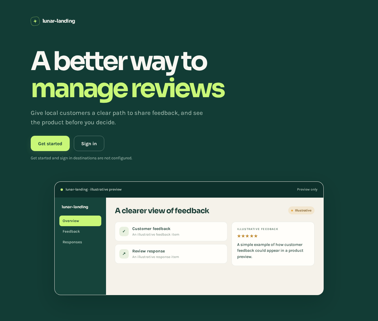
A better way to manage reviews
Give local customers a clear path to share feedback, and see the product before you decide.
Get started and sign in destinations are not configured.
A clearer view of feedback
IllustrativeCustomer feedback
Review response
Illustrative feedback
★★★★★
A simple example of how customer feedback could appear in a product preview.
A better way to manage reviews
Give local customers a clear path to share feedback, and see the product before you decide.
Get started and sign in destinations are not configured.
A clearer view of feedback
IllustrativeCustomer feedback
Review response
Illustrative feedback
★★★★★
A simple example of how customer feedback could appear in a product preview.
No comments yet. Be the first!