indigo-recreate
 Sandeep Jhabakh
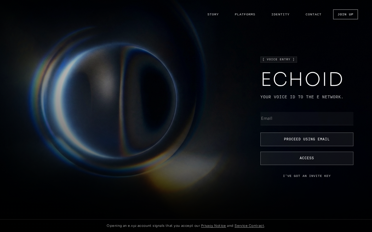
Recreate the ECHOID landing page as a **single full-screen React + CSS website**. Match the reference design precisely. The aesthetic must feel futuristic, premium, cinematic, minimal, and technology-focused. Do NOT add extra sections, cards, stats, badges, floating elements, purple colors, glow effects, or unnecessary decorations. ## CORE DESIGN * Full viewport: 100vh / 100svh * Background: pure black `#000` * White typography with subtle translucent white secondary text * Sharp rectangular UI elements; no rounded pills * Smooth premium transitions * Fully responsive desktop/tablet/mobile * Antialiased typography * No scrolling on desktop unless necessary ## CINEMATIC BACKGROUND Use the supplied video as a full-bleed background covering the entire screen. Video: `https://d8j0ntlcm91z4.cloudfront.net/user_38xzZboKViGWJOttwIXH07lWA1P/hf_20260806_133255_956f653f-5d80-4b06-abd5-0f46c98b60fa.mp4` Poster/fallback: `https://d8j0ntlcm91z4.cloudfront.net/user_38xzZboKViGWJOttwIXH07lWA1P/hf_20260806_132328_5f9029c8-218f-4489-82b6-29ff2849920e.png` Video settings: * autoplay * muted * loop * playsInline * preload="auto" * width/height 100% * object-fit: cover * object-position: center The video should feel like a dark cinematic AI/surreal face sequence. Keep it edge-to-edge, never inside a card. Add dark gradient overlays: * Desktop: darken the right side and bottom so the signup panel remains readable. * Mobile: use a stronger bottom gradient. For `prefers-reduced-motion`, hide the video and use the poster as the background. ## FONTS Load Google Fonts: * Sora: 200, 300, 400 * JetBrains Mono: 300, 400, 500 Use: * Sora 200 → logo and main ECHOID heading * Sora 300 → email input and footer * JetBrains Mono → navigation, buttons, labels, tagline and links ## NAVIGATION Place navigation at the top with horizontal spacing. Left: **ECHOID** Use thin Sora typography, large letter spacing. Desktop navigation: * STORY * PLATFORMS * IDENTITY * CONTACT * JOIN UP Navigation links use uppercase JetBrains Mono with generous letter spacing. JOIN UP is a transparent bordered rectangular button. Hover: * Slightly brighten/dim text * Subtle background/border transition ### MOBILE NAVIGATION Below 900px: * Hide desktop navigation * Show a 44×44 hamburger button * Three thin horizontal bars * Animate hamburger into X Clicking it opens a fullscreen menu: * Dark translucent background * Strong backdrop blur * STORY * PLATFORMS * IDENTITY * CONTACT * JOIN UP Menu items should fade and slide upward with a staggered animation. Close menu when: * hamburger/X is clicked * backdrop is clicked * Escape is pressed Lock body scrolling while menu is open. ## MAIN HERO / SIGNUP PANEL Place the main content on the **right side of the screen** on desktop. On mobile, center it and make it full width with appropriate padding. Content order: ### Label `[ VOICE ENTRY ]` Small uppercase JetBrains Mono text with a subtle translucent white background. Sharp rectangular shape. ### Main Heading `ECHOID` This must be the dominant text element. Use: * Sora 200 * Very large responsive font * Thin elegant appearance * Tight line height * Slight letter spacing ### Tagline `YOUR VOICE ID TO THE E NETWORK.` Use JetBrains Mono 300, uppercase, subtle white opacity and generous letter spacing. ### EMAIL FORM Large spacing between tagline and form. Email field: * Placeholder: `Email` * Transparent background * Bottom border only * No rounded corners * White text * Subtle border on normal state * Brighter border on focus Buttons: `PROCEED USING EMAIL` `ACCESS` Both should: * Be full width * Have sharp corners * Use JetBrains Mono * Be uppercase * Have generous vertical padding * Use translucent white backgrounds * Brighten subtly on hover Below the buttons, centered: `I'VE GOT AN INVITE KEY` Make it a small uppercase JetBrains Mono link with hover underline. The form should prevent default submission and remain visually functional. ## FOOTER Place a thin horizontal border above the footer. Center this exact text: `Opening an e.xyz account signals that you accept our Privacy Notice and Service Contract.` Use Sora 300 with subtle white opacity. Make: * Privacy Notice * Service Contract white and underlined. ## RESPONSIVE BEHAVIOR ### Desktop ≥901px * Full cinematic background * Logo top-left * Navigation top-right * Signup panel aligned to the right * Legal footer at bottom ### Tablet 721–900px * Reduce panel width * Use mobile hamburger navigation * Maintain cinematic background ### Mobile ≤720px * Signup panel becomes full width * Center content * Smaller heading * Stronger bottom gradient * Mobile navigation overlay * Maintain comfortable safe-area padding ### Short screens ≤640px Reduce: * navigation padding * heading size * form spacing * button height * footer font size ## ACCESSIBILITY Implement: * visible keyboard focus states * semantic buttons and links * proper input label (visually hidden if necessary) * `aria-expanded` and `aria-controls` on menu toggle * mobile menu `role="dialog"` * `aria-modal="true"` * `aria-hidden` when closed * restore focus when menu closes ## ANIMATIONS Use subtle premium animations only: * background video continuously loops * hover transitions around 0.25s * hamburger → X around 0.45s * mobile menu circular clip-path expansion * mobile menu staggered fade/slide animation Do NOT add desktop entrance animations. ## FINAL VISUAL RULE The final website must look like a **high-end futuristic AI identity brand**, combining: **black + white + translucent UI + cinematic AI face video + elegant typography + minimal futuristic interface.** Do not make it look like a generic SaaS template. Do not add anything that is not specified above. Build it cleanly in React with custom CSS and reusable components. Keep the entire experience focused on this single hero screen.

Comments (0)
Sign in to leave a comment
Architecture
No Services Diagrams Yet
ECHOID
Your Voice Id To The E Network.
ECHOID
Your Voice Id To The E Network.
No comments yet. Be the first!