Figma · Design tokenSynced
CheckoutForm.figma
--checkout-width280px
--surface-raisedrgba(18,18,22,.8)
 Abdullah Alhuwaidi
[PRODUCT TITLE] GRID: The Unified Product Handoff and Autonomous State Graph Engine [SYSTEM ROLE & ARCHITECTURAL MANIFESTO] You are generating a complete, production-grade B2B platform using an independent Kubernetes stack. Every feature must be realized with absolute functional completeness, highly accessible user mechanics, and a luxury developer interface system. Discard all generic chatbot blocks, rounded card shapes, bright primary gradients, and messy layouts. Rebuild the application to feel like an premium engineering command center modeled after Apple Pro utilities and Vercel. --- ### MODULE 1: CONSUMER-GRADE CORE DESIGN SYSTEM - Surface Elevation & Backgrounds: * Master Layer Workspace: `#0A0A0C` (Absolute Obsidian Charcoal). * Component Cards & Dynamic Panels: `rgba(18, 18, 22, 0.8)` with a strict `backdrop-blur-xl` filter modifier. * Border Specifications: Sharp 1px stroke lines using high-transparency definitions (`rgba(255, 255, 255, 0.06)`). * Ambient Gradients: Embed a highly muted, soft background lighting layout (`radial-gradient(ellipse at top, rgba(115, 115, 115, 0.05), transparent)`) to add visual depth to the infinite field. - Typography & Layout Systems: * Strict layout spacing limits (`h-14` header frames, `w-80` detail panels) to prevent layout crowding. * Text scales must use high contrast definitions: Active titles in bright `#F3F4F6` (Zinc-100), auxiliary technical logs in mono-spaced slate labels (`#94A3B8`). --- ### MODULE 2: ZERO-FRICTION USER INTERACTION MECHANICS To ensure the platform is highly usable and intuitive out of the box, implement the following direct behavioral controls: - Fluid Segment Controls: Clicking between the view tabs must trigger an instantaneous active layout change without refreshing the browser window or dropping background state cache logs. - Interactive Node Handles: The product block cards inside the Canvas workspace must feature distinct, visual grab handles. Include active state tracking triggers (`cursor-grab` on hover, changing to `cursor-grabbing` on active press). - Keyboard Shortcut Matrix: Implement a clean global command palette bar shortcut indicator (e.g., displaying `⌘ K` or `Ctrl K`). Buttons must use clear scale adjustments (`active:scale-[0.98] transition-all`) to provide immediate mechanical user feedback. --- ### MODULE 3: THE THREE RE-CONCILED INTERFACE VIEWS 1. VIEW 1: THE DRAG-AND-DROP CANVAS WORKSPACE - Background Canvas: An infinite 2D canvas displaying a crisp, highly legible white micro-dot tracking network grid (`background-size: 24px 24px` at `12% opacity`). - Programmatic Connector Strings: Render thin, animated directional edge connecting paths (`stroke: rgba(255, 255, 255, 0.12)`, `strokeDasharray: "4"`) that directly connect the blocks together to visually map out the team workflow. - Live Spatial Workspace Cards (Fully Realized Mock Blocks): * Card A (Figma Design Token Node): Left anchored. Contains an absolute metadata indicator tracking `CheckoutForm.figma`, an embedded compass spinner graphic asset placeholder, and a glowing green synchronization status dot indicator token. * Card B (Relational Jira Backlog Node): Centered position. Tracks system ticket key `PROD-804: Refactor Payment State Hooks`. Displays crisp labels tracking high-priority flags and team assignee identifiers. * Card C (Production Source Code Node): Right anchored. Houses an immersive code box block displaying real syntax-highlighted React execution modules. Features a primary highlight action execution button labeled: "Sync to Upstream Repository". 2. VIEW 2: THE HIGH-DENSITY RELATIONAL MATRIX - Layout Blueprint: A clean, structured, full-bleed data spreadsheet view that flattens and parses the unconstrained coordinates of the canvas blocks into searchable columns. - Table Fields: Build columns mapping Asset Identifier Name, Linked Infrastructure Context, and Environment Sync Badges (using custom-styled status modifiers for 'Active' and 'Layout Drifted'). Every row must change color smoothly when hovered. 3. VIEW 3: THE COMPILATION TERMINAL CONSOLE - Workspace View: A split-pane immersive utility interface container. - Upper Half (Terminal Logs): A dark code editor console tracking system processing strings line-by-line (e.g., `[SYSTEM] Vite Dev Server initialized on port 3000...`, `[SYNC] Database edge paths verified`). - Lower Half (Automated Reconciliation Engine): Renders an explicit system alignment callout warning block: *"CRITICAL VISUAL DRIFT: The layout variable bounds inside CheckoutForm.tsx (220px) do not match the visual width modifications updated on the Infinite Canvas (280px)."* Append an adjacent, primary high-contrast command trigger: "[Reconcile Codebase & Patch AST]". On hover, the button must transition into an emerald-500 highlighting container to signal click readiness.


Sign in to leave a comment
GRID (The Unified Product Handoff and Autonomous State Graph Engine) is a B2B platform for design and engineering teams that unifies product handoff across design tokens, backlog tickets, and production source code into one connected state graph. The product is delivered as a premium engineering command center — an obsidian, Apple Pro / Vercel-grade developer utility — in which a team's design, ticket, and code artifacts are spatially mapped, flattened into a searchable relational matrix, and reconciled through a compilation terminal.
The audience is power users: product engineers who move connected design, ticket, and source nodes and sync code upstream, and design systems leads who own Figma design token nodes and verify that design and code agree. GRID is delivered as an independent Kubernetes stack with a React frontend, a shared FastAPI backend, and MariaDB persistence.
This document is the System Requirements Document requested by Abdullah Alhuwaidi for the grid-app project.
GRID is a single-page, authenticated B2B workspace with three reconciled interface views over one shared state graph:
A fixed h-14 header holds the GRID wordmark, a segmented view-tab control, and a\x20\xe2\x8c\x98K / Ctrl K command palette bar. A w-80 detail panel anchors the right edge. The workspace ground is #0A0A0C with a muted radial ambient light.
Actors. Two active human personas — Product Engineer and Design Systems Lead — both self-enroll and sign in, and both operate all three views. The application backend executes durable workspace actions and code sync operations; MariaDB stores workspace state.
Delivery. React frontend, shared FastAPI backend, MariaDB, deployed as an independent Kubernetes stack.
Removed from scope
GRID is a first-party, application-owned product. All three interface views, the landing page, and self-service identity (Sign Up, Login) are owned and rendered by the GRID application. There is no provider-owned or external-only surface in the current scope; the Figma, Jira, and upstream-repository references are content shown inside GRID's own node cards and actions, not embedded third-party surfaces.
Access boundary: Landing is publicly reachable. Sign Up and Login are anonymously reachable identity surfaces. The three workspace views require a signed-in session, because canvas positions, matrix state, and terminal logs are durable, actor-specific state that must be resumed on return. Identity is application-owned and established through self-service enrollment; there is no invitation, provisioning, or role-based permission model in the current scope — both personas share the same workspace capabilities.
Current vs. future: everything specified in this document is current. No future-horizon capabilities are accepted.
Not applicable — no reference directive declares content_source.
h-14 header with wordmark and auth links; hero block on the #0A0A0C ground with the muted radial ambient gradient; a static preview of the canvas node cards and dashed connectors as imagery (not interactive).active:scale-[0.98] transition-all; error region.active:scale-[0.98] transition-all; error region.background-size: 24px 24px, 12% opacity); three anchored node cards; animated dashed directional connectors (stroke: rgba(255,255,255,0.12), strokeDasharray: "4"); w-80 right detail panel; h-14 header with GRID wordmark, segmented view tabs, and\x20\xe2\x8c\x98K / Ctrl K palette bar. Requires login.CheckoutForm.figma; embedded compass spinner graphic asset placeholder; glowing green synchronization status dot.PROD-804: Refactor Payment State Hooks; high-priority flag label; team assignee identifier label.w-80) showing the selected node's metadata.Active and Layout Drifted). Requires login.w-80 detail panel.Active and Layout Drifted modifiers; detail panel.[SYSTEM] Vite Dev Server initialized on port 3000..., [SYNC] Database edge paths verified). Lower half: automated reconciliation engine showing the CRITICAL VISUAL DRIFT callout and the reconcile trigger. Requires login.#94A3B8); drift callout block with exact text "CRITICAL VISUAL DRIFT: The layout variable bounds inside CheckoutForm.tsx (220px) do not match the visual width modifications updated on the Infinite Canvas (280px)."; reconcile button that transitions to an emerald-500 highlight container on hover and uses active:scale-[0.98] transition-all.FR-1 — Dark luxury command center shell. As a Product Engineer or Design Systems Lead, I should see the workspace on a #0A0A0C ground with rgba(18,18,22,0.8) cards using backdrop-blur-xl, 1px rgba(255,255,255,0.06) borders, and a muted radial ambient gradient, so the tool reads as a premium engineering command center. Provenance: explicit. Acceptance: computed styles match the specified values; no rounded card shapes, bright primary gradients, or chatbot blocks appear.
FR-2 — Typography and layout limits. As a user, I should see h-14 header frames, w-80 detail panels, titles in #F3F4F6, and technical logs in mono-spaced #94A3B8, so layout stays uncrowded and legible. Provenance: explicit. Acceptance: header height and panel width match; title and log colors match.
FR-3 — Fluid segment controls. As a user, I should switch between the three views by clicking the segmented tabs, with an instantaneous active layout change and no browser refresh, and background state cache logs must not be dropped. Provenance: explicit. Acceptance: tab click swaps the active view within the motion budget; no full page reload; cached logs remain present after switching back.
FR-4 — Interactive node handles. As a user, I should see a distinct grab handle on each canvas node card, with cursor-grab on hover changing to cursor-grabbing on active press. Provenance: explicit. Acceptance: cursor changes on hover and press; dragging moves the card.
FR-5 — Keyboard shortcut matrix. As a user, I should see a global command palette bar shortcut indicator showing \xe2\x8c\x98 K or Ctrl K, and buttons should use active:scale-[0.98] transition-all for immediate mechanical feedback. Provenance: explicit. Acceptance: indicator renders the platform-appropriate shortcut; buttons scale on press.
FR-6 — Infinite micro-dot canvas. As a user, I should see an infinite 2D canvas with a crisp white micro-dot grid at background-size: 24px 24px and 12% opacity. Provenance: explicit. Acceptance: grid renders at the specified size and opacity and extends as the canvas pans.
FR-7 — Animated directional connectors. As a user, I should see thin animated directional edge paths (stroke: rgba(255,255,255,0.12), strokeDasharray: "4") connecting the blocks to map the team workflow. Provenance: explicit. Acceptance: connectors render between cards with dash animation and directional indication.
FR-8 — Card A Figma design token node. As a Design Systems Lead, I should see a left-anchored Figma design token node containing the absolute metadata indicator CheckoutForm.figma, an embedded compass spinner graphic asset placeholder, and a glowing green synchronization status dot. Provenance: explicit. Acceptance: all three elements render on Card A at its left anchor.
FR-9 — Card B Jira backlog node. As a Product Engineer, I should see a centered Jira backlog node tracking PROD-804: Refactor Payment State Hooks with high-priority flag and team assignee labels. Provenance: explicit. Acceptance: ticket key, priority flag, and assignee label render on Card B.
FR-10 — Card C source code node and sync. As a Product Engineer, I should see a right-anchored production source code node with a code box of real syntax-highlighted React execution modules and a primary button "Sync to Upstream Repository"; clicking it should sync the code upstream and show an observable result. Provenance: explicit. Acceptance: syntax highlighting renders; button triggers a backend sync; success or failure is shown on the card; failure offers retry.
FR-11 — Relational matrix. As a user, I should see a full-bleed spreadsheet that flattens canvas node coordinates into searchable columns: Asset Identifier Name, Linked Infrastructure Context, and Environment Sync Badges. Provenance: explicit. Acceptance: rows derive from canvas nodes; search filters rows; all three columns render.
FR-12 — Sync badges and row hover. As a user, I should see custom status modifiers Active and Layout Drifted on environment sync badges, and every row should change color smoothly on hover. Provenance: explicit. Acceptance: both badge variants render; row hover transitions ground color smoothly.
FR-13 — Split-pane terminal. As a user, I should see a split-pane console with terminal logs in the upper half streaming processing strings line-by-line (e.g., [SYSTEM] Vite Dev Server initialized on port 3000..., [SYNC] Database edge paths verified). Provenance: explicit. Acceptance: logs append line-by-line in the upper pane.
FR-14 — Reconciliation engine and drift callout. As a user, I should see, in the lower half, the exact callout "CRITICAL VISUAL DRIFT: The layout variable bounds inside CheckoutForm.tsx (220px) do not match the visual width modifications updated on the Infinite Canvas (280px)." with an adjacent primary trigger "[Reconcile Codebase & Patch AST]". Provenance: explicit. Acceptance: callout text matches exactly; button is adjacent.
FR-15 — Reconcile hover and action. As a user, I should see the reconcile button transition into an emerald-500 highlight container on hover, and clicking it should reconcile the codebase and patch the AST, producing an observable result. Provenance: explicit. Acceptance: hover applies emerald-500 container; click triggers backend reconciliation; result or failure is logged in the terminal; failure offers retry.
FR-16 — Self-service enrollment. As a new user, I should complete self-service enrollment on Sign Up before first use, so I own durable workspace state. Provenance: required_inference. Acceptance: valid submission creates identity and enters the workspace; invalid/duplicate shows inline error.
FR-17 — Returning verification. As a returning user, I should complete verification on Login before reopening protected workspace state. Provenance: required_inference. Acceptance: valid credentials restore the session and prior workspace state; invalid shows inline error.
FR-18 — Durable workspace state. As a user, I should have canvas node positions, matrix state, and terminal logs stored so they are available on return. Provenance: required_inference. Acceptance: after sign-out and sign-in, node positions and logs are restored.
FR-19 — Backend execution. As the system, I should execute durable workspace actions and code sync operations on the shared backend. Provenance: required_inference. Acceptance: sync and reconcile requests are served by the FastAPI backend and persisted in MariaDB.
PROD-804: Refactor Payment State Hooks with its priority and assignee; triggers "Sync to Upstream Repository" on Card C; searches the matrix for drifted assets; runs "[Reconcile Codebase & Patch AST]" in the terminal.CheckoutForm.figma metadata and green sync dot; checks the matrix for Layout Drifted badges; reads the CRITICAL VISUAL DRIFT callout comparing 220px code bounds to 280px canvas bounds; authorizes reconciliation.cursor-grab), presses (cursor-grabbing), and drags it to a new position; the card and its connectors follow.Active.w-80 detail panel. Empty search results show an empty-state message.Muse: Rasmus Andersson. Headline: Systematic product craft on an obsidian ground.
Palette (dark mode):
#0A0A0C#121216 at 80% opacity with backdrop-blur-xl#F3F4F6#34D399#E8FF5A#94A3B8rgba(255,255,255,0.06)#10B981radial-gradient(ellipse at top, rgba(115,115,115,0.05), transparent)Typography: Headings Space Grotesk, 500 weight, -0.02em tracking. Body Inter Tight. Micro-labels uppercase 11px, 0.12em tracking. Modular scale 1.25: 72/56/40/28/20/16/14/12; display 40px mobile → 72px desktop.
Shape: Sharp 1px rules, 4/8-pt grid, corners 4px or square. No rounded cards, no gradients except the muted radial ambient.
Layout: Fixed h-14 header (wordmark, tab segment,\x20\xe2\x8c\x98K palette bar); w-80 right detail panel; canvas/matrix/console fill the rest.
The first screen is the live canvas view. A 56–72px Space Grotesk GRID wordmark sits at the left of the h-14 header, beside a segmented tab control and a\x20\xe2\x8c\x98K palette bar with a hairline top rule. Below, on the #0A0A0C ground with a soft radial light at the top, three node cards span the field left-to-right on the 24px white dot grid at 12% opacity, linked by dashed rgba(255,255,255,0.12) connectors. A w-80 detail panel anchors the right edge. The interface is the image: no marketing hero, no gradient blobs — just the working command center.
Interaction Model: Animated Motion Tempo: restrained Hero Dimensionality: flat
Landing Hero Motion Brief: Focal subject is the canvas node field (three cards + dashed connectors on the dot grid). Input→transformation→outcome: on load, connectors draw in with their dash animation and cards settle into their anchors; on tab switch, the active view swaps instantly (120–200ms) without reload. Motion vocabulary: fast, functional, 120–200ms transitions; grab handles show cursor-grab → cursor-grabbing; buttons use active:scale-[0.98]; reconcile button fills emerald on hover. Composed first frame: wordmark, tabs, palette bar, three anchored cards, dashed connectors, right detail panel. Reduced-motion state: connectors render static (no dash animation), cards appear in place, view switches remain instant with no transition.
h-14 header frames and w-80 detail panels.active:scale-[0.98] transition-all.clamp()) to fit; nothing covers them.prefers-reduced-motion yields a usable static arrangement.backdrop-blur-xl, active:scale-[0.98]).Active or Layout Drifted) on a matrix row.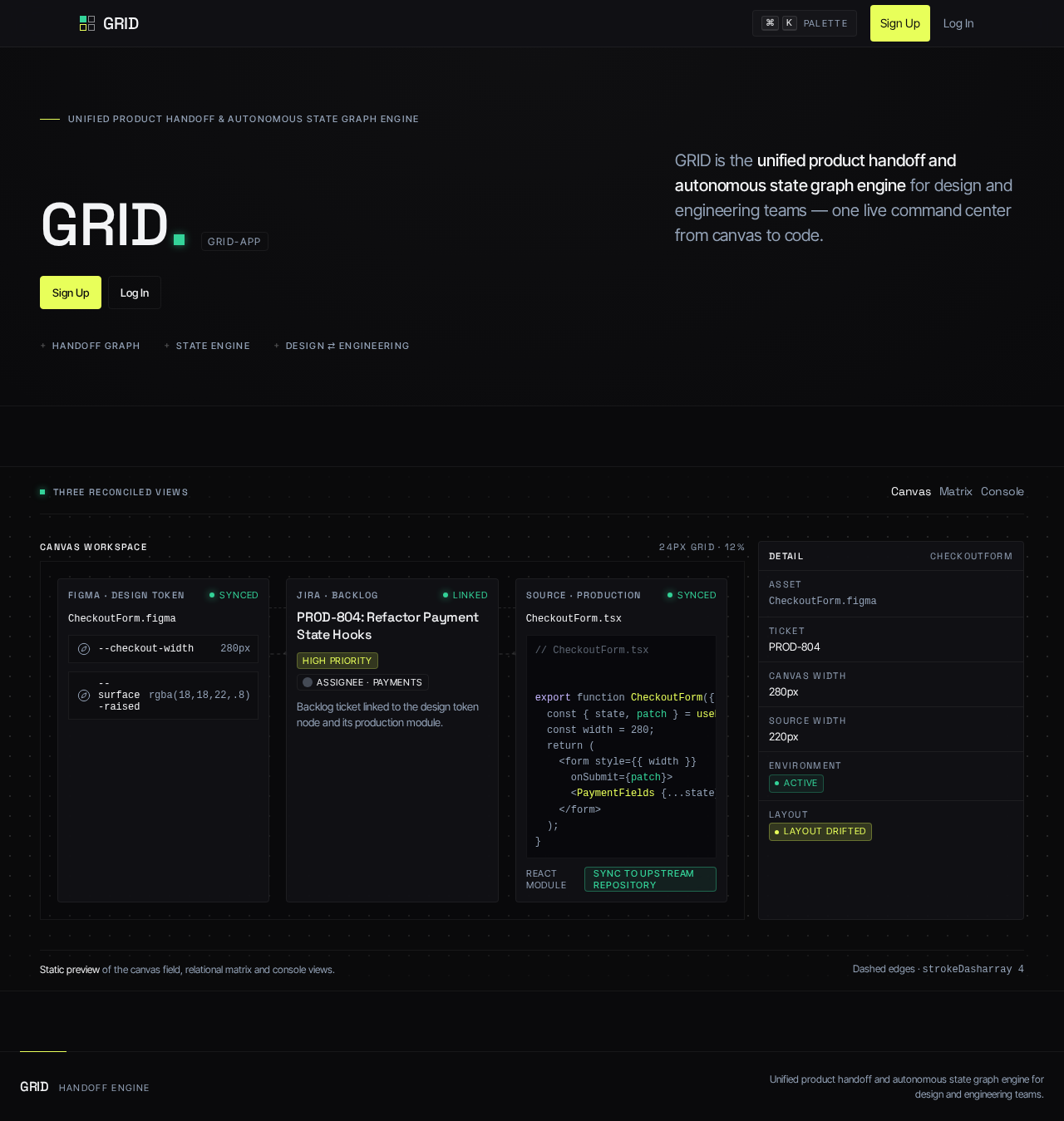
Unified product handoff & autonomous state graph engine
GRID is the unified product handoff and autonomous state graph engine for design and engineering teams — one live command center from canvas to code.
Three reconciled views
CheckoutForm.figmaBacklog ticket linked to the design token node and its production module.
CheckoutForm.tsx// CheckoutForm.tsx export function CheckoutForm({ order }) { const { state, patch } = usePaymentState(order); const width = 280; return ( <form style={{ width }} onSubmit={patch}> <PaymentFields {...state} /> </form> ); }
strokeDasharray 4Unified product handoff & autonomous state graph engine
GRID is the unified product handoff and autonomous state graph engine for design and engineering teams — one live command center from canvas to code.
Three reconciled views
CheckoutForm.figmaBacklog ticket linked to the design token node and its production module.
CheckoutForm.tsx// CheckoutForm.tsx export function CheckoutForm({ order }) { const { state, patch } = usePaymentState(order); const width = 280; return ( <form style={{ width }} onSubmit={patch}> <PaymentFields {...state} /> </form> ); }
strokeDasharray 4
No comments yet. Be the first!