ever-design
 Israel Ayomide
want to build a desihning app


Comments (0)
Sign in to leave a comment
System Requirements
System Requirements Document for ever-design
1. Introduction
The ever-design project aims to develop a designing application that is both inspiring and approachable, targeting creatives who value playfulness and approachability. The app is intended for designers to create and work with AI-assisted video designs, providing a warm and human interface that encourages creativity.
2. System Overview
The ever-design application is a design tool for creators, offering a playful and approachable interface. It supports designers in creating, editing, and managing their AI-assisted video design work. The system includes a public entry point, identity verification for returning users, and a workspace for design creation and editing. The application is custom-built with app-owned identity management to ensure continuity and security of design work.
2a. Product Interpretation and Delivery Boundary
The ever-design app is delivered as a custom UI application with app-owned identity management. It includes four main pages: Landing, Login, Designs, and Design Editor. The app is designed to be accessed anonymously at first, with identity verification required for accessing saved designs. The system does not include external or provider-owned components, and all interactions are managed within the application.
2b. Source Content Inventory
Not applicable as no content source directive was provided.
2c. Page Content and Component Coverage
Landing
- Information/State: Introduction to the app, its purpose, and target audience.
- Primary Actions: Explore the app, learn about features.
- Supporting Actions: Navigate to Login or Design Editor.
- Components: Hero illustration, CTA button, introductory text.
- States: Loading, success, error.
Login
- Information/State: User authentication interface.
- Primary Actions: Log in, recover password.
- Supporting Actions: Navigate back to Landing.
- Components: Login form, password recovery link.
- States: Loading, success, error, recovery.
Designs
- Information/State: Library of saved video designs.
- Primary Actions: Browse designs, open design.
- Supporting Actions: Delete design, navigate to Design Editor.
- Components: Design thumbnails, action buttons.
- States: Loading, empty, success, error.
Design Editor
- Information/State: Workspace for creating and editing AI-assisted video designs.
- Primary Actions: Create new video design, edit existing design.
- Supporting Actions: Save design, export design.
- Components: Canvas, tool palette, save/export buttons.
- States: Loading, success, error, unsaved changes warning.
3. Functional Requirements
-
As a Designer, I should be able to self-enroll before creating durable video design work.
- Provenance: Required inference
- Lifecycle Facts: Initiate self-enrollment, complete enrollment, access design tools.
- Observable Acceptance: Successful enrollment allows access to design tools.
-
As a Designer, I should be able to verify my identity when returning to saved designs and videos.
- Provenance: Required inference
- Lifecycle Facts: Initiate login, verify identity, access saved designs.
- Observable Acceptance: Successful login grants access to saved designs.
-
As a Designer, I should be able to create and work with AI-assisted video designs.
- Provenance: Explicit
- Lifecycle Facts: Start new video design, edit design, save design.
- Observable Acceptance: Video design is created, edited, and saved successfully.
4. User Personas
- Designer: The primary user of the app, responsible for creating and managing AI-assisted video design work. The Designer can self-enroll, verify identity, and utilize the design tools provided by the app.
5. Core User Flows
-
Designer Enrollment and Access Flow:
- Start: Designer accesses the Landing page.
- Action: Navigates to Login, completes self-enrollment.
- Outcome: Gains access to the Design Editor.
-
Returning Designer Verification Flow:
- Start: Designer accesses the Login page.
- Action: Verifies identity through login.
- Outcome: Accesses saved designs in the Designs page.
-
Design Creation and Editing Flow:
- Start: Designer accesses the Design Editor.
- Action: Creates or edits a video design, saves changes.
- Outcome: Video design is saved and accessible in the Designs page.
6. Visuals Colors and Theme
- Muse: Pablo Stanley
- Palette:
- Background: #FFFAF0
- Surface: #FFFFFF
- Text: #333333
- Primary: #FF7043
- Accent: #FFC107
- Muted: #E0E0E0
- Typography:
- Headings: Nunito — Bold
- Body: Manrope
- Scale: 1.5 modular (48/32/24/18/14)
- Shape Language: Big radii, pill buttons, blob and sticker shapes
- Layout: Generous whitespace, card-based sections, rounded corners
- Imagery: Modular vector people and objects, hand-drawn accents
7. Signature Design Concept
The Landing page features a large, friendly illustration of a designer at work, set against a soft cream background. The headline is bold in Nunito, with a warm orange pill button as the call to action. This design embodies the playful and approachable nature of the app.
8. Interaction Model & Motion Direction
- Interaction Model: Animated
- Motion Tempo: Expressive
- Hero Dimensionality: Layered_2d
- Landing Hero Motion Brief:
- Focal Subject: Designer at work illustration
- Thesis: User hovers over elements, triggering playful animations that guide them through the app's features.
- First Frame: Designer desk scene with interactive elements highlighted.
- Reduced Motion State: Static illustration with clear navigation cues.
9. Non-Functional Requirements
- Performance: The app should load within 3 seconds on standard broadband connections.
- Security: User data must be encrypted in transit and at rest.
- Usability: The interface should be intuitive and accessible, adhering to WCAG 2.1 standards.
10. Tech Stack
- Frontend: React
- Backend: Python/FastAPI
- Storage: PostgreSQL
- Containerization: Docker
- Orchestration: Kubernetes (if required for deployment)
11. Assumptions and Constraints
- Assumptions:
- Users have access to a modern web browser.
- The app will be used primarily by designers familiar with digital design tools.
- Constraints:
- The app must adhere to the provided creative direction and visual theme.
- Identity management is app-owned and must ensure secure access to user data.
12. Glossary
- Designer: A user who creates and manages AI-assisted video design work within the app.
- Design Editor: The workspace within the app where video designs are created and edited.
- Landing Page: The initial page users see when accessing the app, providing an overview and entry point.
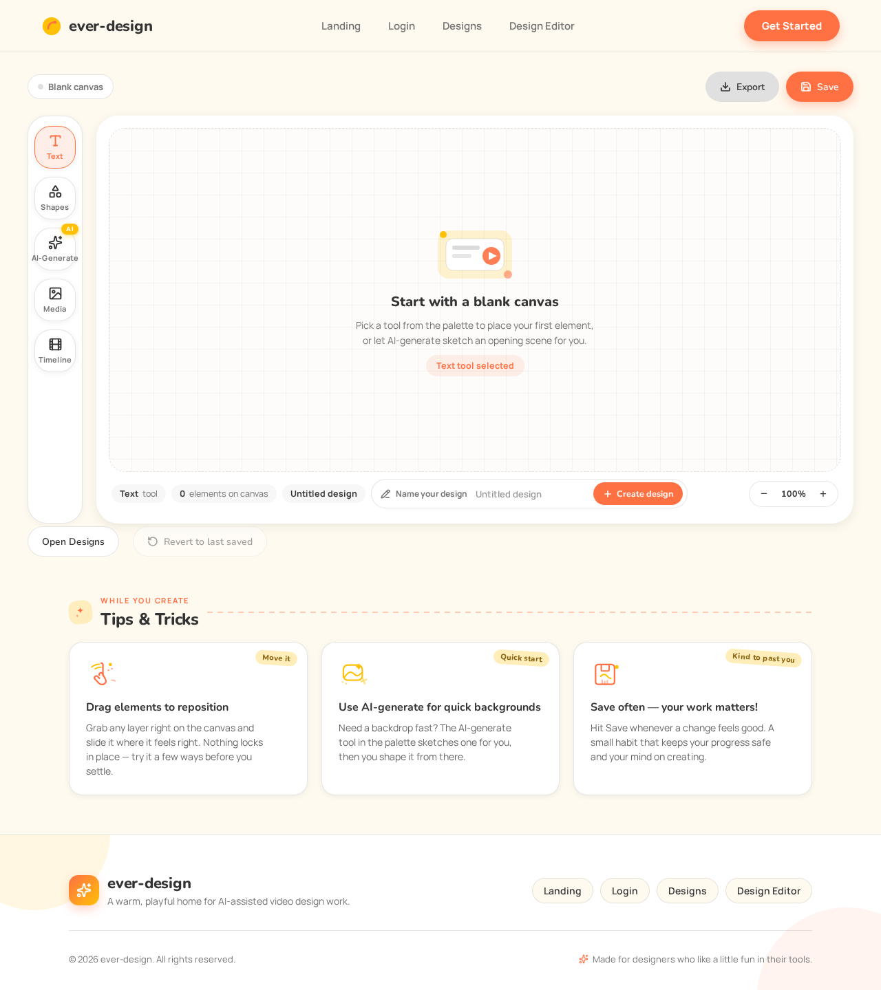
Start with a blank canvas
Pick a tool from the palette to place your first element, or let AI-generate sketch an opening scene for you.
Text tool selectedTips & Tricks
Drag elements to reposition
Grab any layer right on the canvas and slide it where it feels right. Nothing locks in place — try it a few ways before you settle.
Use AI-generate for quick backgrounds
Need a backdrop fast? The AI-generate tool in the palette sketches one for you, then you shape it from there.
Save often — your work matters!
Hit Save whenever a change feels good. A small habit that keeps your progress safe and your mind on creating.
Start with a blank canvas
Pick a tool from the palette to place your first element, or let AI-generate sketch an opening scene for you.
Text tool selectedTips & Tricks
Drag elements to reposition
Grab any layer right on the canvas and slide it where it feels right. Nothing locks in place — try it a few ways before you settle.
Use AI-generate for quick backgrounds
Need a backdrop fast? The AI-generate tool in the palette sketches one for you, then you shape it from there.
Save often — your work matters!
Hit Save whenever a change feels good. A small habit that keeps your progress safe and your mind on creating.
No comments yet. Be the first!