earthy-testing
 Vijay D
I wanted to do a visual testing and reply for our website
Comments (0)
Sign in to leave a comment
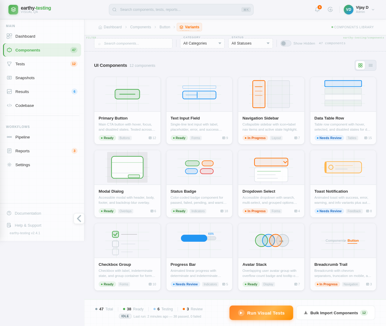
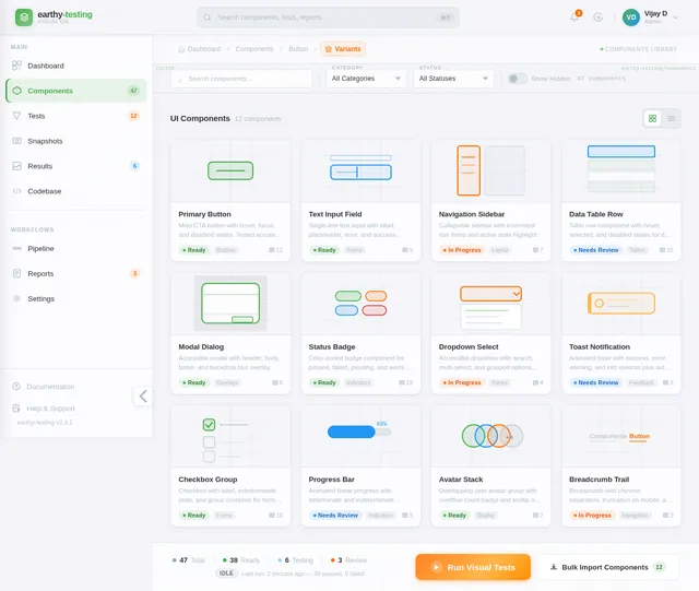
Primary Button
Main CTA button with hover, focus, and disabled states. Tested across all viewports.
Text Input Field
Single-line text input with label, placeholder, error, and success states.
Navigation Sidebar
Collapsible sidebar with icon+label nav items and active state highlight.
Data Table Row
Table row component with hover, selected, and disabled states for data grids.
Modal Dialog
Accessible modal with header, body, footer, and backdrop blur overlay.
Status Badge
Color-coded badge component for passed, failed, pending, and warning states.
Dropdown Select
Accessible dropdown with search, multi-select, and grouped options support.
Toast Notification
Animated toast with success, error, warning, and info variants plus auto-dismiss.
Checkbox Group
Checkbox with label, indeterminate state, and group container for form usage.
Progress Bar
Animated linear progress with determinate and indeterminate modes and color variants.
Avatar Stack
Overlapping user avatar group with overflow count badge and tooltip on hover.
Breadcrumb Trail
Breadcrumb with chevron separators, truncation on mobile, and active item highlight.
No comments yet. Be the first!