Mobile App
Nova Banking App
A reimagined mobile banking experience focused on clarity, trust, and delightful micro-interactions.
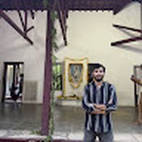 Shivam Chandravanshi
Design a premium, modern, single-page portfolio landing page for a UI/UX Designer. The design should feel clean, futuristic, creative, and visually impressive while maintaining excellent usability. Use a dark theme with subtle glassmorphism, soft gradients, and premium spacing. The layout should be fully responsive and follow a 12-column grid with a desktop width of 1440px. Design Style: - Modern SaaS + Creative Portfolio - Minimal but visually rich - Premium glassmorphism - Soft glowing effects - Smooth gradients - Rounded corners (20–24px) - Spacious layout with strong visual hierarchy - Clean micro-interactions and hover states Color Palette: - Background: #0B0F19 - Surface: #131A26 - Primary: #5B8CFF - Secondary: #8B5CF6 - Accent: #22D3EE - Highlight: #F59E0B - Text Primary: #FFFFFF - Text Secondary: #A8B3CF - Border: rgba(255,255,255,0.08) Typography: - Heading: Sora - Body: Inter - H1: 72px / Bold - H2: 48px / SemiBold - H3: 32px - Body: 18px - Small Text: 16px - Line height: 150% Hero Section: - Large bold headline: "Designing Digital Experiences That People Love." - Short description introducing the designer. - Primary CTA: View Projects - Secondary CTA: Download Resume - Professional profile image with floating UI cards. - Animated gradient background with abstract blurred shapes. - Floating statistics cards: - 50+ Projects - 3+ Years Experience - 20+ Happy Clients Navigation: - Logo - Home - About - Skills - Projects - Experience - Testimonials - Contact - Rounded "Let's Talk" button. About Section: - Professional introduction - Experience summary - Design philosophy - Timeline cards - Small personal illustration or image Skills Section: Display premium glass cards with icons for: - UI Design - UX Research - Design Systems - Wireframing - Prototyping - Mobile Design - Web Design - Figma - Adobe Creative Suite - AI Design Tools Projects Section: Modern portfolio cards featuring: - Large project thumbnail - Category - Project title - Short description - Technology tags - View Case Study button - Live Preview button Hover effect with smooth image zoom and glow. Experience Timeline: Interactive vertical timeline showing: - Company - Role - Duration - Responsibilities - Achievement badges Process Section: Display a modern 5-step workflow: 1. Research 2. Wireframe 3. Visual Design 4. Prototype 5. Testing Each step should include an icon and short description connected with animated lines. Testimonials: Large modern testimonial cards featuring: - Client photo - Name - Company - Rating - Review - Glassmorphism card style Achievements: Highlight numbers with animated counters: - Projects Completed - Years Experience - Clients - Design Systems - Satisfaction Rate Tools Section: Show premium logo cards for: - Figma - Photoshop - Illustrator - Framer - Webflow - ChatGPT - Midjourney - Adobe XD Contact Section: Modern contact card including: - Email - Phone - Location - Social icons - Contact form - Large CTA: "Let's Build Something Amazing Together" Footer: - Logo - Quick Links - Social Media - Copyright - Back to Top button Background: - Mesh gradients - Aurora lighting - Abstract 3D blurred circles - Soft glowing lines - Glassmorphism panels - Subtle noise texture - Floating geometric shapes Animations: - Smooth fade-in - Scroll reveal - Floating cards - Magnetic buttons - Hover elevation - Gradient movement - Counter animations - Smooth scrolling - Premium page transitions Overall Feel: Create a world-class portfolio that feels premium, futuristic, elegant, creative, and modern, inspired by the quality of Awwwards, Framer, Linear, Apple, Stripe, and leading design agencies. Prioritize exceptional spacing, typography, visual hierarchy, accessibility, and a polished user experience.


Sign in to leave a comment
The project "divine-design" aims to create a premium, modern, single-page portfolio landing page for a UI/UX Designer. The design will be clean, futuristic, and visually impressive, maintaining excellent usability. It will feature a dark theme with subtle glassmorphism, soft gradients, and premium spacing, ensuring a responsive layout that follows a 12-column grid with a desktop width of 1440px. The target audience includes tech-savvy individuals who appreciate modern, visually rich presentations.
This document outlines the requirements for the "divine-design" project, focusing on delivering a single-page portfolio landing page. The page will include various sections such as Home, About, Skills, Projects, Experience, Testimonials, and Contact, each with specific content and functionality. The design will incorporate a dark theme with glassmorphism, soft gradients, and premium spacing, ensuring a visually impressive and usable layout. The project will adhere to the specified color palette, typography, and design style, inspired by leading design agencies.
The product is a single-page portfolio landing page, with all sections embedded within a cohesive design. The page will be publicly accessible, with no identity or session continuity required for access. The design will prioritize exceptional spacing, typography, visual hierarchy, accessibility, and polished user experience. The project will not include additional capabilities beyond those explicitly stated in the requirements.
Not applicable as no content_source directive is provided.
Viewing the Hero Section
Navigating the Portfolio
Exploring the About Section
Viewing Skills
Exploring Projects
Interacting with Experience Timeline
Reading Testimonials
Contacting the Designer
Downloading the Resume
The hero section will feature a large headline with an animated gradient background, floating UI cards, and glowing statistics cards. This will create a dynamic visual entry point, emphasizing the designer's digital and futuristic theme.

I’m a product designer crafting immersive, research-driven interfaces — blending clean systems thinking with bold visual craft to help ambitious teams ship experiences people remember.
A little about how I think, work, and design.
I’m a UI/UX designer with a passion for crafting digital experiences that feel effortless, alive, and unmistakably premium. I blend research-driven decisions with a strong visual language to build products people genuinely enjoy using.
Over the past several years I’ve partnered with startups and established teams across fintech, healthtech, and SaaS, taking products from early concepts to polished, production-ready interfaces.
Great design disappears — it just feels right.
A toolkit built for designing end-to-end digital products.
A few recent projects that showcase range and craft.
A reimagined mobile banking experience focused on clarity, trust, and delightful micro-interactions.
A scalable component library and design system used across a suite of enterprise products.
A data-dense analytics dashboard turned intuitive through thoughtful information hierarchy.
A timeline of roles that shaped my design practice.
Nimbus Studio
Leading end-to-end design for flagship SaaS products, mentoring junior designers, and shaping design systems strategy.
Shipped 12+ FeaturesFluxwave Digital
Designed mobile and web experiences for fintech and healthtech clients from discovery through delivery.
Design Systems LeadFreelance
Partnered with early-stage startups to define product vision, wireframes, and high-fidelity prototypes.
20+ Happy ClientsFeedback from clients and teams I’ve collaborated with.
Working with this designer transformed our product. Every interaction feels intentional and premium.
An exceptional eye for detail and a rare ability to balance beauty with usability.
The design systems work alone saved our team hundreds of hours. Truly world-class craft.
Have a project in mind? I’d love to hear about it.
I’m a product designer crafting immersive, research-driven interfaces — blending clean systems thinking with bold visual craft to help ambitious teams ship experiences people remember.
A little about how I think, work, and design.
I’m a UI/UX designer with a passion for crafting digital experiences that feel effortless, alive, and unmistakably premium. I blend research-driven decisions with a strong visual language to build products people genuinely enjoy using.
Over the past several years I’ve partnered with startups and established teams across fintech, healthtech, and SaaS, taking products from early concepts to polished, production-ready interfaces.
Great design disappears — it just feels right.
A toolkit built for designing end-to-end digital products.
A few recent projects that showcase range and craft.
A reimagined mobile banking experience focused on clarity, trust, and delightful micro-interactions.
A scalable component library and design system used across a suite of enterprise products.
A data-dense analytics dashboard turned intuitive through thoughtful information hierarchy.
A timeline of roles that shaped my design practice.
Nimbus Studio
Leading end-to-end design for flagship SaaS products, mentoring junior designers, and shaping design systems strategy.
Shipped 12+ FeaturesFluxwave Digital
Designed mobile and web experiences for fintech and healthtech clients from discovery through delivery.
Design Systems LeadFreelance
Partnered with early-stage startups to define product vision, wireframes, and high-fidelity prototypes.
20+ Happy ClientsFeedback from clients and teams I’ve collaborated with.
Working with this designer transformed our product. Every interaction feels intentional and premium.
An exceptional eye for detail and a rare ability to balance beauty with usability.
The design systems work alone saved our team hundreds of hours. Truly world-class craft.
Have a project in mind? I’d love to hear about it.
No comments yet. Be the first!