business-website
 Het Patel
Create a modern, responsive business website with pages: 1. **Home Page** * Hero section with a strong headline, short description, and CTA button * About/intro section * Clean footer with navigation and contact information 2. **About Page** * Company introduction * Mission and vision * Team or company highlights * CTA to contact the company Use a clean, professional, modern UI with good typography, consistent spacing, subtle animations, mobile responsiveness, and a clear navigation bar. Use realistic placeholder content and images where necessary. Make sure all pages are connected through the navigation and the design is consistent across the entire website.


Comments (0)
Sign in to leave a comment
System Requirements
System Requirements Document for business-website
1. Introduction
business-website is a modern, responsive marketing website for a general business / consultancy firm. Its purpose is to present the company credibly to prospective clients and to give the company's own staff a consistent, professional surface on which to present the firm's identity, offering, mission, vision, and people.
The site consists of exactly two pages — a Home Page and an About Page — connected by a clear, persistent navigation bar and a shared footer. The audience is twofold: prospective clients evaluating whether the firm fits their needs, and the company's own representatives who rely on the site as the firm's public face. The site is a public, no-account, content-and-presentation experience: there is no login, no dashboard, and no transactional workflow. Its success is measured by clarity of message, consistency of design, and the visitor's ability to understand the firm and initiate contact.
2. System Overview
The delivered product is a two-page public business website:
- Home Page — a full-viewport hero with a strong headline, a short description, and a call-to-action button; an about/intro section; and a clean footer carrying navigation and contact information.
- About Page — a company introduction, a mission and vision presentation, team or company highlights, and a call-to-action to contact the company.
Both pages share one navigation bar, one footer treatment, one typographic system, one colour system, and one motion language, so the site reads as a single consistent publication rather than two unrelated screens. Content and imagery are realistic placeholders where the firm has not supplied final copy or photography.
Actors. The site serves two accepted human personas: the Prospective Client (a visitor evaluating the firm and initiating contact) and the Company Representative (the owner or staff member responsible for the firm's public presentation). Both are public visitors to the same two pages; neither has an account, and neither has differentiated permissions over shared product state.
Ownership. Both pages are first-party application surfaces, publicly reachable with no access requirement. There is no provider-owned surface, no external destination, and no headless delivery in the current scope.
Narrow exclusions. The current scope contains no third page, no blog, no services detail page, no contact form page, no careers page, no e-commerce, no user accounts, no authentication, no CMS administration interface, and no analytics dashboard. Contact is initiated through the contact information and contact call-to-action presented on the pages themselves.
2a. Product Interpretation and Delivery Boundary
The brief asks for a clean, professional, modern business website and names exactly two pages. That is the whole current product: a public, two-page marketing site. Everything the visitor does happens on those two pages, and everything the company presents is presented on those two pages.
Delivery and access. The site is delivered as a first-party, publicly reachable web experience. No page requires an account, a sign-in, an invitation, or a provisioning step, and no page establishes identity. Because no accepted journey requires a visitor to privately own or resume durable state, and no commitment, decision, entitlement, or value transfer must remain bound to a particular participant, application-owned identity is neither required nor inferred. Contact with the firm is initiated through the contact information and contact call-to-action surfaced on the pages; the site itself does not own a contact-management or messaging workflow.
Current versus future. The current horizon covers the Home Page and the About Page with their stated sections, the shared navigation, the shared footer, the visual and motion system, and responsive behaviour. Anything beyond that — additional pages, a contact form with submission handling, a CMS, or a blog — is out of current scope and is not built, not implied, and not acceptance-tested here.
2b. Source Content Inventory
Not applicable. No reference directive in this project declares a content_source, so no verified external content inventory is carried into this document. All copy and imagery are realistic placeholders per the explicit user instruction.
2c. Page Content and Component Coverage
Home Page
Purpose and information/state. The public entry surface of the site. It presents the firm's headline proposition, a short supporting description, a primary call to action, an introductory statement about the company, and a footer with navigation and contact information. It is statically rendered content with no user-owned state.
Primary actions.
- Activate the hero call-to-action button to initiate contact with the company.
- Activate the hero secondary action to move to the About Page / company work context.
- Navigate to the About Page via the navigation bar or the footer navigation.
- Read the about/intro section and continue to the About Page for the full company story.
- Use the footer contact information to reach the company.
Supporting actions.
- Follow footer navigation links back to Home or across to About.
- Read the footer legal/metadata line.
Domain entities. Company (name, wordmark, establishment metadata), Hero Proposition (headline, short description, CTA label), Introduction Summary (short company statement), Navigation Item (label, target page, active state), Contact Detail (channel label and value), Footer Link Group.
Component responsibilities.
- Navigation Bar — thin sticky top bar, wordmark left, page links right, active page marked with a red underline; collapses to a mobile-appropriate arrangement at narrow viewports.
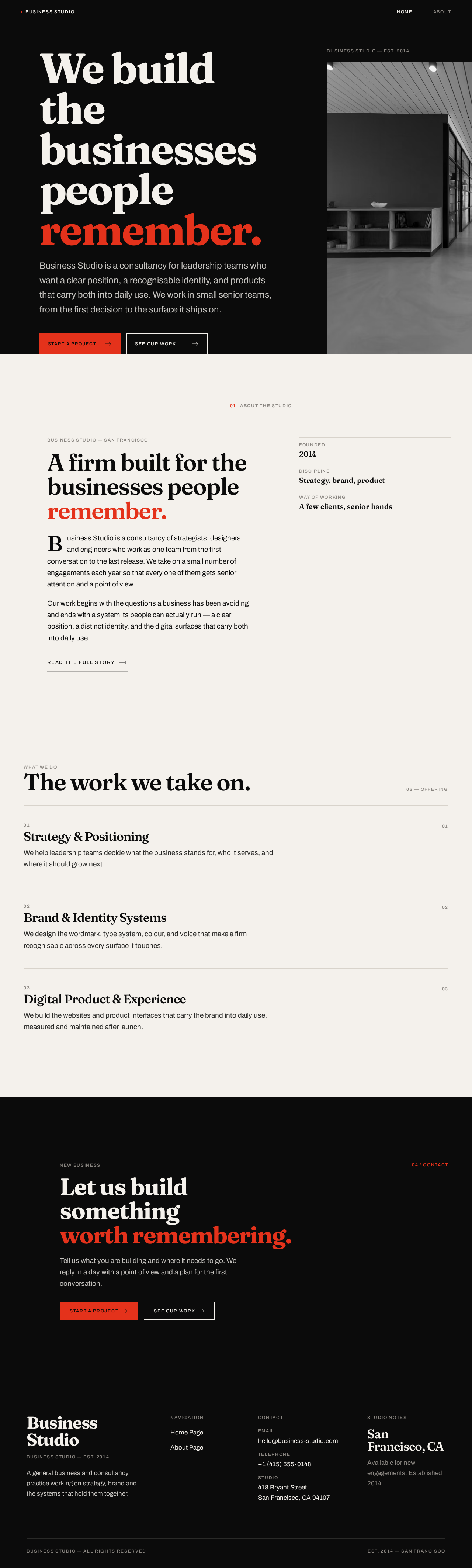
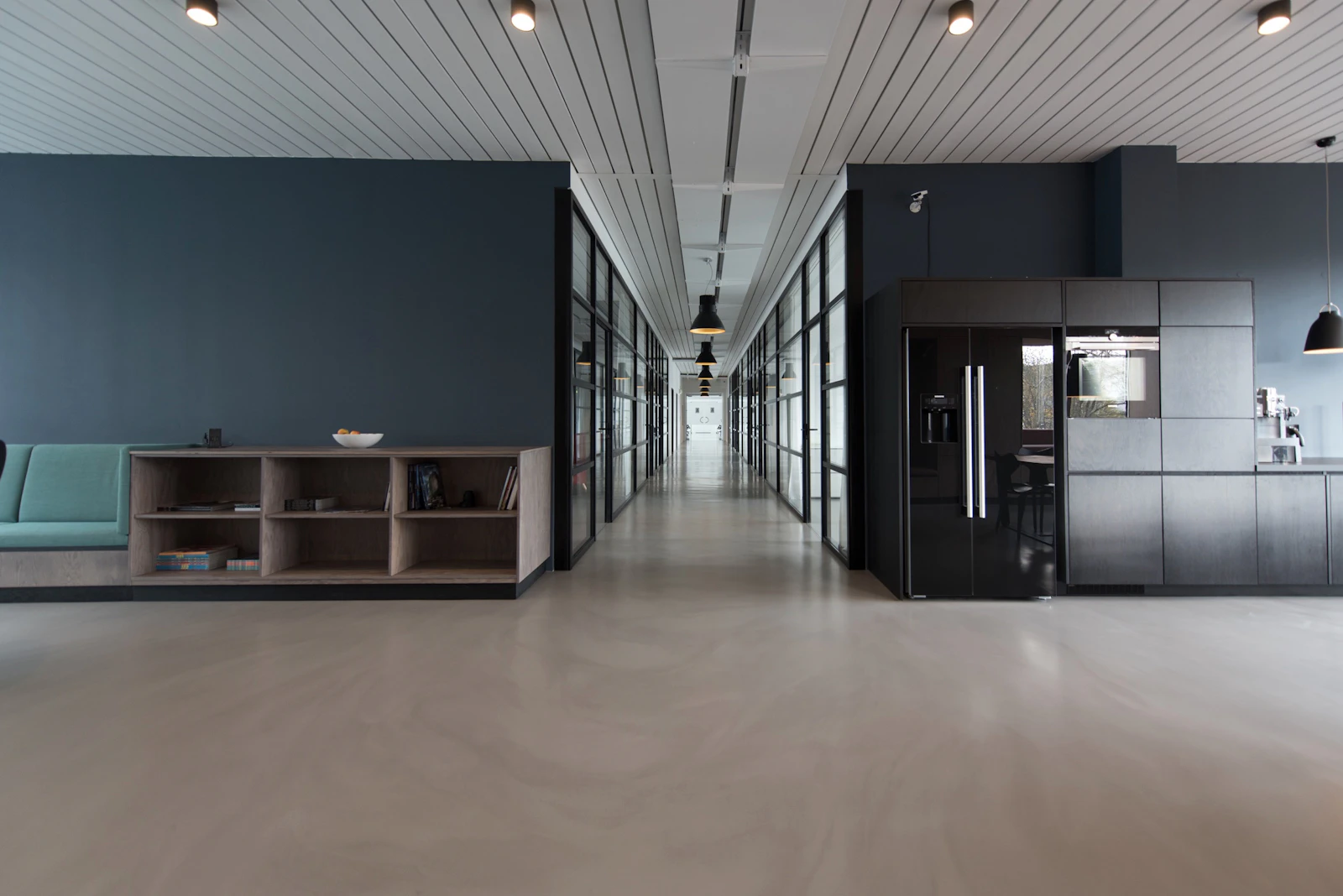
- Hero Section — full-viewport composition: stacked display headline, short lead description, primary CTA button, secondary ghost action, and a single full-height monochrome photograph bled off the right edge over a full-height hairline rule with a small uppercase studio label.
- About/Intro Section — light-ground editorial band carrying a short company introduction and a continuation link to the About Page.
- What We Do Ruled List — three-item ruled list of the firm's offering areas, each with a section index numeral.
- Closing CTA Band — a repeated contact call-to-action band, identical in treatment to the one on the About Page.
- Footer — dark-ground footer with a four-column link grid, navigation links, contact information, and a metadata/legal line.
States.
- Loading — static content; no loading state is required beyond standard asset loading of the hero photograph.
- Empty — not applicable; all sections carry placeholder content.
- Success — the page renders fully with hero, intro band, ruled list, CTA band, and footer visible and navigable.
- Error / recovery — if the hero photograph fails to load, the hero retains its headline, description, and CTA on the dark ground with the hairline rule intact, so the composition and all readable content remain whole and usable.
- Responsive — at 375px the hero photograph moves below the copy as a short full-bleed band, the headline drops to its mobile clamp size, and the CTA stack becomes full-width; at 768px and 1280px the asymmetric editorial grid is restored.
About Page
Purpose and information/state. The public company-information surface. It presents the company introduction, the mission and vision, team or company highlights, and a contact call to action. It is statically rendered content with no user-owned state.
Primary actions.
- Read the company introduction.
- Read the mission and vision statements.
- Browse the team or company highlights.
- Activate the contact call-to-action to initiate contact with the company.
- Navigate back to the Home Page via the navigation bar or footer navigation.
Supporting actions.
- Use the footer contact information to reach the company.
- Follow footer navigation links across the site.
Domain entities. Company Introduction (narrative copy), Mission Statement, Vision Statement, Team Member / Highlight (portrait image, name, role), Contact CTA (label, target), Navigation Item, Contact Detail, Footer Link Group.
Component responsibilities.
- Navigation Bar — the same shared bar as the Home Page, with the About Page marked active.
- Full-Bleed Intro Image — a single full-bleed monochrome photograph with the company introduction overlaid at the bottom-left.
- Mission and Vision Spread — a two-column ruled spread with oversized numerals, presenting mission and vision as parallel statements.
- Team / Highlights Grid — square-cropped monochrome portraits with names set in small uppercase under a hairline, with roles in muted tone; a ruled index rather than hover-lift cards.
- Contact CTA Band — the contact call-to-action band, repeated identically from the Home Page.
- Footer — the same dark-ground footer with navigation and contact information.
States.
- Loading — static content; no loading state is required beyond standard asset loading of the intro image and portraits.
- Empty — not applicable; all sections carry placeholder content.
- Success — the page renders fully with intro image, mission/vision spread, highlights grid, CTA band, and footer visible and navigable.
- Error / recovery — if the intro image or a portrait fails to load, the surrounding text, names, roles, and hairlines remain intact and readable; the layout does not collapse and the CTA band remains reachable.
- Responsive — at 375px the mission/vision spread stacks to a single column, the highlights grid reduces to a single-column ruled index, and the intro overlay text reflows below or over a shorter image band without covering any readable text or control.
3. Functional Requirements
Each requirement is stated as a story point with provenance, lifecycle facts, and observable acceptance.
FR-1 — Two-page business website As a Company Representative, I should have a modern, responsive business website consisting of exactly a Home Page and an About Page, so that the firm has a complete public presence.
- Provenance:
explicit - Lifecycle: initiator — Company Representative (presentation ownership); participants — Prospective Client (reader); trigger — site is published; observable result — both pages are reachable and render their stated content; failure/recovery — if a page fails to render, the shared navigation still allows reaching the other page; continuation — visitor moves between the two pages via navigation.
- Acceptance: exactly two pages exist, named Home Page and About Page, each reachable from the other through the navigation bar and footer.
FR-2 — Home Page hero section As a Prospective Client, I should see a hero section on the Home Page with a strong headline, a short description, and a CTA button, so that I immediately understand what the firm offers and how to act.
- Provenance:
explicit - Lifecycle: initiator — Prospective Client (arrives on the page); trigger — Home Page loads; observable result — a prominent headline, a short supporting description, and a visible call-to-action button are presented together in the hero; failure/recovery — if the hero image fails, headline, description, and CTA remain visible and usable; continuation — activating the CTA initiates contact with the company.
- Acceptance: the hero contains a headline, a short description, and at least one CTA button, all fully readable and inside the viewport at 375px, 768px, and 1280px.
FR-3 — Home Page about/intro section As a Prospective Client, I should see an about/intro section on the Home Page, so that I get a short introduction to the company before deciding to read more.
- Provenance:
explicit - Lifecycle: initiator — Prospective Client (scans the page); trigger — scrolling past the hero; observable result — a distinct introductory section presenting the company in brief; failure/recovery — the section remains readable as text if any accompanying imagery fails; continuation — the visitor proceeds to the About Page for the full company story.
- Acceptance: the Home Page contains a visually distinct about/intro section separate from the hero.
FR-4 — Home Page footer with navigation and contact information As a Prospective Client, I should see a clean footer on the Home Page containing navigation and contact information, so that I can move around the site or reach the company from anywhere on the page.
- Provenance:
explicit - Lifecycle: initiator — Prospective Client (reaches the end of the page or looks for contact details); trigger — footer is in view; observable result — navigation links and contact information are presented; failure/recovery — contact information remains readable as text if any footer decoration fails; continuation — the visitor navigates to the About Page or uses the contact information.
- Acceptance: the footer contains navigation links to both pages and at least one contact information item.
FR-5 — About Page company introduction As a Prospective Client, I should read a company introduction on the About Page, so that I understand who the firm is.
- Provenance:
explicit - Lifecycle: initiator — Prospective Client (opens About Page); trigger — About Page loads; observable result — a company introduction is presented; failure/recovery — the introduction text remains readable if the accompanying full-bleed image fails; continuation — the visitor continues to mission and vision.
- Acceptance: the About Page contains a distinct company introduction section.
FR-6 — About Page mission and vision As a Prospective Client, I should read the company's mission and vision on the About Page, so that I understand what the firm stands for and where it is going.
- Provenance:
explicit - Lifecycle: initiator — Prospective Client (reads the page); trigger — scrolling to the mission/vision spread; observable result — mission and vision are presented as distinct, clearly labelled statements; failure/recovery — both statements remain readable as text under any rendering condition; continuation — the visitor continues to the team/highlights section.
- Acceptance: the About Page presents both a mission statement and a vision statement, each clearly identifiable.
FR-7 — About Page team or company highlights As a Prospective Client, I should see team or company highlights on the About Page, so that I can judge the firm's people and credibility.
- Provenance:
explicit - Lifecycle: initiator — Prospective Client (scans the page); trigger — scrolling to the highlights section; observable result — team members or company highlights are presented with identifying information; failure/recovery — names and roles remain readable if a portrait image fails to load; continuation — the visitor continues to the contact CTA.
- Acceptance: the About Page contains a team or company highlights section with at least one identifiable entry.
FR-8 — About Page CTA to contact the company As a Prospective Client, I should find a call-to-action to contact the company on the About Page, so that I can initiate contact after learning about the firm.
- Provenance:
explicit - Lifecycle: initiator — Prospective Client (decides to reach out); trigger — activating the contact CTA; observable result — the contact action is presented and reachable; failure/recovery — the CTA remains visible and activatable if surrounding imagery fails; continuation — the visitor initiates contact with the company.
- Acceptance: the About Page contains a clearly labelled contact call-to-action.
FR-9 — Clean, professional, modern UI As a Company Representative, I should have a clean, professional, modern UI with good typography, consistent spacing, and subtle animations, so that the firm is presented credibly.
- Provenance:
explicit - Lifecycle: initiator — Company Representative (presentation ownership); participants — Prospective Client (perceiver); trigger — any page renders; observable result — typography, spacing, and motion follow one consistent system across both pages; failure/recovery — if motion is unavailable or reduced, the layout and readability are unaffected; continuation — the visitor reads the page without distraction.
- Acceptance: both pages use the same type scale, spacing rhythm, and motion language; no page introduces a divergent visual treatment.
FR-10 — Clear navigation bar As a Prospective Client, I should have a clear navigation bar, so that I always know where I am and can move between pages.
- Provenance:
explicit - Lifecycle: initiator — Prospective Client (navigates); trigger — any page loads; observable result — a persistent navigation bar presents links to both pages and marks the active page; failure/recovery — navigation links remain readable and activatable at every viewport; continuation — the visitor moves to the other page.
- Acceptance: a navigation bar is present on both pages, links to both pages, and visibly indicates the current page.
FR-11 — Mobile responsiveness As a Prospective Client, I should be able to use the site comfortably on a mobile device, so that the experience is not degraded on a small screen.
- Provenance:
explicit - Lifecycle: initiator — Prospective Client (visits on a narrow viewport); trigger — viewport at mobile width; observable result — layout, typography, and controls adapt so that all readable text and controls remain whole and inside the viewport; failure/recovery — no readable text or control is cropped, clipped, or covered at 375px; continuation — the visitor reads and navigates normally.
- Acceptance: at 375px, 768px, and 1280px, all headlines, labels, numbers, and controls remain entirely inside the viewport and their containers.
FR-12 — Realistic placeholder content and images As a Company Representative, I should have realistic placeholder content and images where necessary, so that the site looks complete and credible before final copy and photography are supplied.
- Provenance:
explicit - Lifecycle: initiator — Company Representative (presentation ownership); trigger — page renders; observable result — every section carries plausible placeholder copy and imagery rather than empty or lorem-style gaps; failure/recovery — placeholder imagery failure leaves the surrounding text intact; continuation — final content can replace placeholders without structural change.
- Acceptance: no section renders empty; all placeholder copy is plausible business content and all imagery is a realistic placeholder.
FR-13 — Pages connected through navigation and consistent design As a Prospective Client, I should find all pages connected through the navigation with a consistent design across the entire website, so that the site feels like one coherent firm.
- Provenance:
explicit - Lifecycle: initiator — Prospective Client (moves between pages); trigger — navigating from one page to the other; observable result — the destination page shares the same navigation, footer, typography, colour system, and motion language; failure/recovery — if a link target is unavailable, the visitor can still return via the shared navigation; continuation — the visitor continues browsing either page.
- Acceptance: both pages are mutually reachable through the navigation bar and footer, and share identical navigation, footer, and visual system.
4. User Personas
Prospective Client
Product context. A visitor who has arrived at the site — typically from a search, a referral, or a direct link — and is evaluating whether this firm is the right fit for their needs. They have no account, no prior relationship with the site, and no obligation to stay. They are reading, not operating.
Primary goal. Understand what the firm does, who it is, and whether it is credible — then initiate contact if it is.
Distinct accepted responsibilities. The Prospective Client is the reader and the initiator of contact. They read the hero headline and short description to form a first impression, scan the about/intro section for a quick company summary, move to the About Page to read the company introduction, mission and vision, and team or company highlights, and then act on the contact call-to-action. Their work is evaluation and decision, not configuration or management.
Relevant inputs or decisions. They decide whether the headline and description are clear enough to continue; whether the intro section warrants a deeper read; whether the mission, vision, and highlights establish credibility; and whether to initiate contact. Their inputs are simply their attention and their reading.
Interactions with other accepted participants. The Prospective Client is the audience for everything the Company Representative publishes. Every section the representative presents is something the client reads, and the contact call-to-action is the handoff point between them.
Observable success. The client can state what the firm does, has read the company story, and has a clear, reachable way to contact the firm from both pages.
Company Representative
Product context. The business owner or staff member responsible for how the firm appears in public. They are not a site administrator in the technical sense — there is no admin interface in this scope — but they are the owner of the site's content, structure, and presentation quality.
Primary goal. Present the firm consistently and professionally across the entire site, so that prospective clients form an accurate and credible impression.
Distinct accepted responsibilities. The Company Representative owns the public presentation: the hero headline and description, the about/intro section, the company introduction, the mission and vision statements, the team or company highlights, the contact information in the footer, and the contact call-to-action on the About Page. They also own the consistency of the design across both pages — the same navigation, footer, typography, spacing, and motion everywhere.
Relevant inputs or decisions. They decide what the firm's headline proposition is, how the company is introduced, how mission and vision are worded, which team members or highlights are shown, and what contact information is surfaced. They decide when placeholder content is good enough and when final copy and photography replace it.
Interactions with other accepted participants. The Company Representative presents to the Prospective Client. Every section they own is read by the client, and the contact call-to-action they surface is the point at which the client may initiate contact.
Observable success. Both pages render with complete, plausible content; the navigation and footer are identical across pages; the design reads as one consistent publication; and a visitor can reach the contact call-to-action from either page.
5. Core User Flows
Flow 1 — Prospective Client evaluates the firm from the Home Page
- The Prospective Client arrives at the Home Page with no account and no prior state.
- The Home Page hero renders: a strong stacked headline, a short description beneath it, and a call-to-action button. The client reads the headline and description to form a first impression.
- The client scrolls into the about/intro section, which presents a short introduction to the company on the light editorial band.
- The client continues to the What We Do ruled list, reading the three offering areas and their section index numerals.
- The client reaches the closing CTA band and the footer, where navigation links and contact information are presented.
- Observable result: the client understands the firm's proposition and has a reachable way to contact it.
- Continuation: the client either activates the contact call-to-action to initiate contact, or navigates to the About Page for the full company story.
Flow 2 — Prospective Client reads the company story on the About Page
- The Prospective Client activates the About link in the navigation bar (or the footer navigation) from the Home Page.
- The About Page loads with the navigation bar present and the About link marked active.
- The client reads the company introduction, presented over the full-bleed monochrome intro image.
- The client scrolls to the mission and vision spread, reading both statements as distinct, clearly labelled parallel columns with oversized numerals.
- The client continues to the team / highlights grid, reading names and roles beneath each square-cropped portrait.
- The client reaches the contact CTA band, repeated identically from the Home Page.
- Observable result: the client has read the company introduction, mission, vision, and highlights, and has a clear contact call-to-action.
- Continuation: the client activates the contact call-to-action to initiate contact, or returns to the Home Page via the navigation bar or footer.
Flow 3 — Prospective Client initiates contact
- From either the Home Page hero CTA or the contact CTA band on either page, the Prospective Client activates the contact call-to-action.
- The contact action is presented and reachable; the client uses the contact information surfaced by the site to reach the company.
- Observable result: the client has initiated contact with the firm.
- Failure/recovery: if the contact action cannot complete, the client can still read the contact information in the footer on either page and reach the company directly.
- Continuation: the client may continue browsing either page.
Flow 4 — Prospective Client browses on a mobile device
- The Prospective Client opens either page on a narrow viewport (375px).
- The navigation bar presents the wordmark and page links in a mobile-appropriate arrangement; the active page remains marked.
- On the Home Page, the hero photograph moves below the copy as a short full-bleed band, the headline drops to its mobile size, and the CTA stack becomes full-width.
- On the About Page, the mission and vision spread stacks to a single column and the highlights grid reduces to a single-column ruled index.
- Observable result: all headlines, labels, numbers, and controls remain whole and entirely inside the viewport; nothing readable is cropped, clipped, or covered.
- Continuation: the client reads and navigates normally, moving between pages via the navigation bar or footer.
Flow 5 — Company Representative presents the firm consistently
- The Company Representative supplies or approves the placeholder content: the hero headline and description, the about/intro copy, the company introduction, the mission and vision statements, the team or company highlights, and the contact information.
- The representative reviews the Home Page and the About Page in sequence.
- Observable result: both pages render with complete, plausible content; the navigation bar, footer, typography, spacing, and motion language are identical across both pages; the active page is marked in the navigation on each.
- Failure/recovery: if a section renders with missing imagery, the surrounding text, names, roles, and controls remain intact and readable, and the representative can identify the gap without the layout collapsing.
- Continuation: the representative replaces placeholder content with final copy and photography without changing the structure, and the site continues to present consistently.
6. Visuals Colors and Theme
The creative direction is authoritative for this section. The muse is Tobias van Schneider, and the headline of the direction is editorial swagger for a business that refuses to look like a template — clean by subtraction, unmistakably designed, confident and crafted rather than merely utilitarian.
Colour tokens
Dark mode (hero, footer, and dark-ground bands)
| Role | Hex | Usage |
|---|---|---|
| Background | #0B0B0B | Hero ground, footer ground, dark bands |
| Surface | #161615 | Raised dark surfaces within dark bands |
| Text | #F4F1EC | Body and headline text on dark (~17:1 contrast) |
| Primary | #F4F1EC | Primary text/foreground on dark |
| Accent | #E4321B | Signal red — primary CTA fill, active nav underline, section index numerals, one hairline rule per page |
| Muted | #8A8681 | Metadata, captions, footer legal text (~5.2:1 on #0B0B0B) |
| Hairline (dark) | #2A2A28 | 1px rules on dark grounds |
Light mode (about/intro band and About Page body)
| Role | Hex | Usage |
|---|---|---|
| Background | #F4F1EC | Warm off-white ground for editorial light spreads |
| Text | #0B0B0B | Text on light grounds |
| Accent | #E4321B | Same signal red, rationed identically |
| Muted | #8A8681 | Metadata and captions on light |
| Hairline (light) | #D8D3CB | 1px rules on light grounds |
Colour rules. No gradients anywhere; colour is applied as flat fields. #E4321B is rationed to the primary CTA fill, the active nav underline, the section index numerals, and one hairline rule per page. The site flips ground colour exactly twice — hero and footer are #0B0B0B, the about/intro band and the About Page body are #F4F1EC — so the site reads as two alternating editorial spreads. No blue or indigo primary is used anywhere.
Typography
- Headings:
Fraunces— display serif, weight 600–700, optical size set high, tracking-0.03em, leading0.92–0.98for stacked headline lines. Sentence case, never all-caps. Headlines are set as 2–4 word lines broken deliberately so the type itself becomes the composition. - Body:
Archivo400/500 at 17–19px with1.65leading. - Nav and labels:
Archivo500 at 12–13px with0.14emletterspacing, uppercase — the only place caps appear.
Type scale (1.5 ratio editorial scale):
| Token | Size |
|---|---|
| Display | clamp(44px, 9vw, 132px) |
| H2 | clamp(32px, 5vw, 72px) |
| H3 | clamp(22px, 2.6vw, 34px) |
| Lead | clamp(18px, 2vw, 24px) |
| Body | 17–19px |
| Label | 12px uppercase |
Line heights: display 0.95, h2 1.02, body 1.65.
Shape language
Sharp corners everywhere — 0px radius on cards, buttons, inputs, and image frames. Structure comes from hairline rules (1px, #2A2A28 on dark / #D8D3CB on light) and from hard-edged full-bleed image blocks, not from rounded containers or shadows. Buttons are flat rectangles with a 1px border, no shadow, no pill. The only soft thing on the page is the photography.
Layout
Asymmetric 12-column editorial grid with a deliberate 2-column offset: content sits in columns 2–8, with columns 9–12 reserved for captions, metadata, section numerals, and wide image bleed. Generous 96–140px vertical section rhythm on desktop, 56–72px on mobile. Sticky top navigation is a thin 64px bar with the wordmark left, links right, and the active page marked by a 2px red underline.
Imagery style
Large-scale editorial photography, treated monochrome with a cold, slightly desaturated grade, cropped hard and bled off the grid edge. Subjects are people at work and architectural interiors — never stock handshakes or smiling call-centre headshots. Team portraits are square, high-contrast black and white, shot tight, with the face pushed to one third. One full-bleed image per page maximum, so the type stays the hero. No illustration, no 3D blobs, no icon set beyond a single 1px-stroke arrow used in CTAs.
7. Signature Design Concept
The Home Page hero as an editorial spread.
The public entry is a full-viewport #0B0B0B composition, not a centred stack. The left two-thirds carries a four-line stacked display headline in Fraunces at clamp(44px, 9vw, 132px) — "We build / the businesses / people / remember." — set flush left, with the final line in signal red #E4321B. Beneath it, after a 24px gap, sits the short lead description in Archivo at clamp(18px, 2vw, 24px), max-width 46ch, in #F4F1EC at 80% opacity. Below that, the primary CTA — a flat rectangular button labelled "Start a project", filled #E4321B with #0B0B0B text — sits beside a 1px-stroke ghost button labelled "See our work".
The right third is a single full-height monochrome photograph of a studio interior, cropped hard at the viewport's right edge and bled off-screen, sitting on top of a 1px vertical hairline that runs the full hero height in column 9. A tiny uppercase label — "Business Studio — Est. 2014" — sits at the top of the hairline column.
The composition is the drama: the headline's scale and the bled image do the work that a gradient blob or a centred stack would otherwise fake. On mobile the photograph moves below the copy as a 220px-tall full-bleed band, the headline drops to 44px, and the CTA stack becomes full-width. No gradient, no blob, no centred layout.
This concept recomposes only accepted content — the headline, the short description, the CTA button, the navigation, and the placeholder photography — into the direction's signature composition. It introduces no new behaviour, page, or destination.
8. Interaction Model & Motion Direction
Interaction Model: Static Motion Tempo: restrained Hero Dimensionality: flat
Landing Hero Motion Brief
Focal subject. The stacked Fraunces headline with its signal-red final line, set flush left against the full-height hairline rule, with the monochrome studio photograph bled off the right edge.
Input → transformation → outcome thesis. As the Home Page loads and the visitor scrolls, each section enters once — a 600ms opacity plus 24px translate-up reveal on scroll-in, staggered 80ms across list items, on cubic-bezier(0.16, 1, 0.3, 1). The hero itself composes on first paint: the headline, lead, and CTA settle into place, and the bled photograph holds still. The outcome is a page that feels composed rather than animated — the visitor's attention lands on the headline and the CTA, not on the motion.
Motion vocabulary. One reveal per section. Nav links get a 200ms red underline that wipes in from the left. Image hover swaps are a 400ms crossfade between a monochrome and a slightly warmer duotone version of the same photograph. No bounce, no parallax, no particles, no cursor followers.
Composed first frame. Dark #0B0B0B ground. Flush-left stacked headline with the last line in #E4321B. Lead paragraph at 80% opacity beneath it. Flat red CTA beside a 1px-stroke ghost button. Full-height hairline in column 9 with the small uppercase studio label at its top. Monochrome photograph bled off the right edge. Thin 64px navigation bar above, wordmark left, links right.
Reduced-motion state. prefers-reduced-motion removes all translation and crossfade, leaving instant state changes. The hero renders fully composed on first paint with no reveal animation, the nav underline appears instantly on hover, and image hover swaps become instant state changes. All readable text and controls remain whole and inside the viewport.
9. Non-Functional Requirements
NFR-1 — Responsiveness. The site must be modern and responsive, rendering correctly at 375px, 768px, and 1280px. All headlines, wordmarks, labels, numbers, card text, and controls must remain entirely inside the viewport and their containers at every one of those widths, wrapping or scaling to fit. No other element may cover any part of them. Provenance: explicit.
NFR-2 — Visual consistency. Typography, spacing, colour, and motion must follow one system across both pages. No page may introduce a divergent visual treatment. Provenance: explicit.
NFR-3 — Typography quality. Headings use Fraunces at the specified weights, tracking, and leading; body copy uses Archivo at 17–19px with 1.65 leading; nav and labels use Archivo 500 at 12–13px with 0.14em letterspacing in uppercase. Provenance: explicit (good typography) with direction-specified families.
NFR-4 — Consistent spacing. Vertical section rhythm of 96–140px on desktop and 56–72px on mobile, applied consistently across both pages. Provenance: explicit (consistent spacing) with direction-specified values.
NFR-5 — Subtle animation. Motion is restrained: one 600ms reveal per section, 80ms stagger across list items, 200ms nav underline wipe, 400ms image crossfade. No bounce, parallax, particles, or cursor followers. Provenance: explicit (subtle animations) with direction-specified tempo.
NFR-6 — Reduced motion. prefers-reduced-motion removes all translation and crossfade, leaving instant state changes. Provenance: required_inference — necessary so that the explicit subtle-animation requirement does not degrade accessibility.
NFR-7 — Navigation clarity. A persistent navigation bar is present on both pages, links to both pages, and visibly marks the active page. Provenance: explicit.
NFR-8 — Placeholder realism. All content and imagery are realistic placeholders where final assets are not supplied; no section renders empty. Provenance: explicit.
NFR-9 — No blue/indigo template look. No blue or indigo primary colour, no blue-on-white hero, and no gradient-blob, glassmorphism, or rounded-pill template treatment. Provenance: explicit (creative direction, authoritative for section 6).
NFR-10 — Readable text and controls stay whole. At every viewport, readable text and controls stay entirely inside the viewport and their containers. Where the direction asks for a gesture that would crop or cover readable content, the gesture is carried by imagery or decoration instead. Provenance: explicit (creative direction readability rule).
10. Tech Stack
The user did not specify a technology stack. The following are coherent defaults for a two-page static marketing site, labelled as defaults.
- Frontend: React with a modern build tool (Vite), rendering two routes — Home Page and About Page — with a shared layout providing the navigation bar and footer.
[Default — not specified by user] - Styling: Plain CSS or CSS modules with custom properties for the colour, type, and spacing tokens defined in section 6. No CSS framework that would impose a rounded, shadowed, blue-on-white default look.
[Default — not specified by user] - Fonts: Fraunces and Archivo, self-hosted or loaded from a font service, with the specified weights and optical size settings.
[Default — not specified by user] - Imagery: Static placeholder photography assets, treated monochrome at build or via CSS filters.
[Default — not specified by user] - Hosting: Static hosting of the built site.
[Default — not specified by user]
No backend, database, authentication service, container orchestration, or API layer is required by the current scope. Python/FastAPI, Docker, and Kubernetes are not included because no accepted requirement needs them.
11. Assumptions and Constraints
Assumptions.
- A1. The firm's final copy and photography are not yet available, so realistic placeholder content and images are used throughout, per the explicit user instruction.
[Assumption — explicit] - A2. The site is a public, no-account experience. No page requires sign-in, and no application-owned identity is established, because no accepted journey requires a visitor to privately own or resume durable state.
[Assumption — required_inference] - A3. Contact is initiated through the contact information and contact call-to-action surfaced on the pages; the site does not own a contact-management or messaging workflow.
[Assumption — required_inference] - A4. The two pages are the complete current information architecture; no third page is implied by the brief.
[Assumption — explicit] - A5. The creative direction in section 6 is authoritative for palette, typography, shape, layout, imagery, and motion, and does not conflict with any explicit user instruction.
[Assumption — explicit]
Constraints.
- C1. The website must be modern and responsive.
[Constraint — explicit] - C2. The UI must be clean, professional, and modern, with good typography, consistent spacing, and subtle animations.
[Constraint — explicit] - C3. The design must be consistent across the entire website.
[Constraint — explicit] - C4. All pages must be connected through the navigation.
[Constraint — explicit] - C5. Content and images may be realistic placeholders where necessary.
[Constraint — explicit] - C6. The generic indigo/blue-on-white SaaS template look is forbidden for this project.
[Constraint — explicit, creative direction] - C7. Readable text and controls stay whole at every viewport; imagery and decoration may be cropped or bled, but readable text and controls may not.
[Constraint — explicit, creative direction]
12. Glossary
- Home Page — the public entry surface of the site, containing the hero section, the about/intro section, and the footer with navigation and contact information.
- About Page — the public company-information surface, containing the company introduction, mission and vision, team or company highlights, and a contact call-to-action.
- Hero Section — the full-viewport opening composition on the Home Page, containing the strong headline, short description, and CTA button.
- About/Intro Section — the light-ground editorial band on the Home Page presenting a short introduction to the company.
- CTA (Call to Action) — a clearly labelled control that initiates contact with the company; present in the Home Page hero, the closing CTA band, and the About Page.
- Contact CTA Band — the repeated contact call-to-action band, identical on both pages.
- Navigation Bar — the persistent 64px top bar with the wordmark left and page links right, marking the active page with a red underline.
- Footer — the dark-ground closing region carrying navigation links, contact information, and a metadata/legal line.
- Section Index Numeral — the small uppercase numeral (01 / 02 / 03) set in the far-right grid column beside a section heading.
- Hairline Rule — a 1px rule used to structure the layout in place of rounded containers or shadows.
- Signal Red — the single hot accent colour
#E4321B, rationed to the primary CTA fill, the active nav underline, the section index numerals, and one hairline rule per page. - Editorial Spread — the alternating ground-colour treatment in which the hero and footer are near-black and the about/intro band and About Page body are warm off-white.
- Prospective Client — the accepted persona who visits the site to evaluate the firm and initiate contact.
- Company Representative — the accepted persona who owns the firm's public presentation across both pages.
We buildthe businessespeopleremember.
Business Studio is a consultancy for leadership teams who want a clear position, a recognisable identity, and products that carry both into daily use. We work in small senior teams, from the first decision to the surface it ships on.
Business Studio — San Francisco
A firm built for the
businesses people
remember.
Business Studio is a consultancy of strategists, designers and engineers who work as one team from the first conversation to the last release. We take on a small number of engagements each year so that every one of them gets senior attention and a point of view.
Our work begins with the questions a business has been avoiding and ends with a system its people can actually run — a clear position, a distinct identity, and the digital surfaces that carry both into daily use.
The work we take on.
02 — OfferingStrategy & Positioning
We help leadership teams decide what the business stands for, who it serves, and where it should grow next.
Brand & Identity Systems
We design the wordmark, type system, colour, and voice that make a firm recognisable across every surface it touches.
Digital Product & Experience
We build the websites and product interfaces that carry the brand into daily use, measured and maintained after launch.
Let us buildsomethingworth remembering.
Tell us what you are building and where it needs to go. We reply in a day with a point of view and a plan for the first conversation.
We buildthe businessespeopleremember.
Business Studio is a consultancy for leadership teams who want a clear position, a recognisable identity, and products that carry both into daily use. We work in small senior teams, from the first decision to the surface it ships on.
Business Studio — San Francisco
A firm built for the
businesses people
remember.
Business Studio is a consultancy of strategists, designers and engineers who work as one team from the first conversation to the last release. We take on a small number of engagements each year so that every one of them gets senior attention and a point of view.
Our work begins with the questions a business has been avoiding and ends with a system its people can actually run — a clear position, a distinct identity, and the digital surfaces that carry both into daily use.
The work we take on.
02 — OfferingStrategy & Positioning
We help leadership teams decide what the business stands for, who it serves, and where it should grow next.
Brand & Identity Systems
We design the wordmark, type system, colour, and voice that make a firm recognisable across every surface it touches.
Digital Product & Experience
We build the websites and product interfaces that carry the brand into daily use, measured and maintained after launch.
Let us buildsomethingworth remembering.
Tell us what you are building and where it needs to go. We reply in a day with a point of view and a plan for the first conversation.
No comments yet. Be the first!