brew-bean

byHarshil Vaja

# Project: Brew & Bean – Premium Coffee Shop Website Create a premium, modern, visually attractive, fully responsive coffee shop website named "Brew & Bean". Focus exclusively on UI/UX design. ## Design Requirements 1. Use an elegant coffee-inspired theme with espresso brown, beige, cream, caramel, and white colors. 2. Use premium typography, realistic coffee photography, beautiful layouts, and consistent visual styling. ## Website Pages 3. **Home:** Hero banner, coffee imagery, brand introduction, featured collections, bestsellers, testimonials, and promotional banners. 4. **Shop:** Product grid, coffee categories, search, filters, sorting, product ratings, prices, and Add to Cart buttons. 5. **Product Details:** Large product images, thumbnails, descriptions, prices, size selection, quantity selector, tasting notes, and related products. 6. **About Us:** Brand story, coffee sourcing, roasting process, quality commitment, and team introduction. 7. **Our Menu:** Espresso, Cappuccino, Latte, Americano, Mocha, Cold Brew, and specialty drinks with images and prices. 8. **Our Locations:** Cafe branches, attractive location cards, addresses, opening hours, and map placeholders. 9. **Contact Us:** Contact information, business hours, social media links, and an elegant inquiry form. 10. **Shopping Cart:** Product images, quantities, prices, remove options, subtotal, total, and checkout button. ## Shared Components 11. Create a consistent header with logo, navigation, search, account, and shopping cart icons. 12. Design a premium footer with navigation links, contact details, social media, and newsletter subscription. 13. Use attractive buttons, product cards, badges, icons, and consistent spacing. 14. Connect all 8 pages through intuitive and consistent navigation. ## Visual Experience 15. Use high-quality, realistic coffee, cafe, and product photography. 16. Add subtle hover effects, smooth transitions, and elegant scrolling animations. 17. Maintain excellent typography, alignment, visual hierarchy, and whitespace. 18. Ensure responsive layouts for desktop, tablet, and mobile screens. 19. Avoid generic templates, cluttered layouts, excessive gradients, and inconsistent designs. 20. Deliver a polished, cohesive, premium coffee shop website with all 8 pages and a professional user experience.

HomeShopProduct DetailsContact UsOur LocationsAbout UsShopping CartOur Menu
Home

Comments (0)

No comments yet. Be the first!

System Requirements

System Requirements Document for Brew & Bean

1. Introduction

Brew & Bean is a premium, modern, visually attractive, fully responsive coffee shop website. The product intent is a polished, cohesive, eight-page brand and shopping experience that presents Brew & Bean's coffee, cafe rooms, sourcing story, menu, locations, and contact details through an elegant coffee-inspired visual identity. The project focuses exclusively on UI/UX design: the deliverable is the designed and implemented website experience itself, not a back-office commerce platform.

The audience is city customers who want craft and calm — visitors discovering the brand, browsing coffee and cafe offerings, comparing products, and assembling a cart of beans and drinks before starting checkout. The design language is warm modernism after Charles & Ray Eames: honest materials, joyful colour inside order, cream grounds, espresso-brown type, caramel accents, and warm natural-light photography.

Page 1 of 32

The most recent refinement is a complete website theme redesign: the entire site — Home, Shop, Product Details, About Us, Our Menu, Our Locations, Contact Us, and Shopping Cart — is restyled with a premium, modern, elegant, and sophisticated coffee-shop aesthetic. The redesign uses a rich espresso-brown, warm beige, creamy white, and caramel coffee-inspired palette; updates backgrounds, typography, buttons, navigation bars, product cards, banners, icons, borders, and visual elements; introduces elegant typography with bold headings and clean, readable body text; uses premium coffee photography, attractive product images, and beautiful cafe lifestyle visuals; keeps colours, spacing, alignment, typography, and component styling consistent across all pages; improves visual hierarchy, whitespace, section layouts, and overall user experience; adds subtle hover effects, smooth transitions, and elegant visual interactions; keeps every page polished and responsive on desktop, tablet, and mobile; and gives the site a distinctive premium coffee brand identity rather than a generic e-commerce appearance. The redesign is visual only: existing page content, features, functionality, navigation, and business logic are not modified.

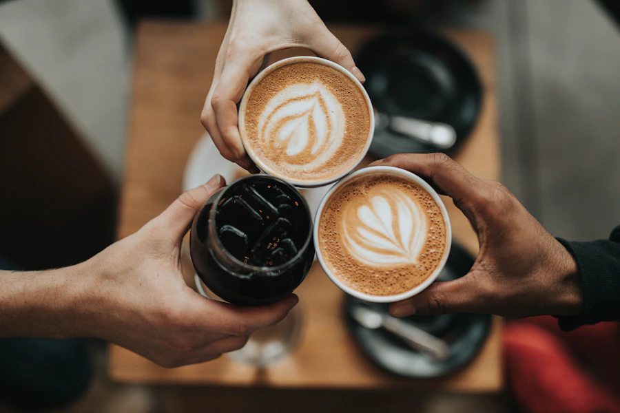
The most recent refinement replaces the homepage hero image with a high-quality, realistic, premium coffee photograph — a beautifully presented cup of freshly brewed coffee with latte art, coffee beans, and a warm, elegant cafe atmosphere — shot in natural lighting with rich espresso-brown and creamy beige tones as professional commercial photography. The new image must fit the existing hero layout, keep its proper aspect ratio, leave sufficient negative space for the headline and CTA buttons, and remain visually appealing on desktop, tablet, and mobile. All existing text, buttons, layout, spacing, navigation, and other website sections stay unchanged; only the homepage hero image changes.

Page 2 of 32

Success Criteria

  • All eight pages — Home, Shop, Product Details, About Us, Our Menu, Our Locations, Contact Us, and Shopping Cart — are present, reachable through one consistent header and footer navigation, and visually cohesive.
  • The palette is drawn only from espresso brown, beige, cream, caramel, and white, with premium typography and realistic coffee, cafe, and product photography throughout.
  • The homepage hero shows the new premium coffee photograph — latte art, coffee beans, warm cafe atmosphere, natural light, espresso-brown and creamy beige tones — fitted to the existing hero layout with correct aspect ratio and clear negative space for the headline and CTA, and it reads well at desktop, tablet, and mobile widths.
  • Every page renders correctly and readably at desktop, tablet, and mobile widths, with no clipped or overlapping readable text or controls.
  • The redesigned theme is applied consistently across all eight pages: rich espresso-brown, warm beige, creamy white, and caramel palette; updated backgrounds, typography, buttons, navigation bars, product cards, banners, icons, and borders; bold headings with clean, readable body text; and premium coffee photography and cafe lifestyle visuals.
  • Visual hierarchy, whitespace, and section layouts are improved on every page, and the site reads as a distinctive premium coffee brand rather than a generic e-commerce store.
  • Hover effects, smooth transitions, and elegant scroll animations are present but subtle, and the site avoids generic templates, cluttered layouts, excessive gradients, and inconsistent styling.
  • A visitor can browse products, open a product, choose a size and quantity, add it to the cart, adjust or remove cart lines, and see an accurate subtotal and total — all without creating an account.
Page 3 of 32

2. System Overview

Brew & Bean is delivered as a React front-end application backed by a shared FastAPI service and a MariaDB database, provisioned through docker-compose. The front end owns the entire designed experience: the eight pages, the shared header and footer, the product and menu presentation, the cart interaction, and all motion and responsive behavior. The backend serves the catalogue and content data the pages render and receives inquiry and newsletter submissions. There is no customer account system, no payment processing, and no order fulfilment in the current scope.

The active human actors are the Coffee shop visitor and the Coffee buyer. Both browse the site anonymously; no page requires an account. The cart is held on the visitor's local device so selections, sizes, and quantities survive navigation between pages and return visits.

Removed from scope

  • Customer accounts and sign-in (the header account icon is a visual affordance only; no account lifecycle is accepted)
  • Payment processing and order fulfilment behind the checkout button
  • Inventory management, order history, and administrative back office
  • Real interactive maps (Our Locations uses map placeholders only)
Page 4 of 32

2a. Product Interpretation and Delivery Boundary

Brew & Bean is a first-party, publicly accessible website. Every page is reachable without identity establishment, and no protected destination exists. The header's account icon is part of the required shared header composition but does not open an account journey, because the source accepts no account capability; it is presented as a consistent brand affordance alongside search and cart.

The cart is the one piece of durable actor-specific state. Because the accepted journey requires a visitor to add products on Shop or Product Details and then review them on Shopping Cart, the cart persists on the local device (browser storage) rather than in an application account. This is a required inference to make the accepted cart lifecycle usable; it adds no account, no server-side profile, and no cross-device continuity.

The checkout button on Shopping Cart is a designed call to action that completes the accepted cart review experience. No payment, order submission, or fulfilment flow is accepted, so the button does not lead to a checkout destination.

Content that the pages display — product catalogue, menu items, locations, team, testimonials, and brand copy — is served by the shared backend from MariaDB. Inquiry form and newsletter submissions are received by the backend. These are supporting data services for the designed pages, not additional product surfaces.

The current delivery horizon is the eight-page site as described, including the updated homepage hero image. No future-horizon capabilities are accepted; the exclusions above remain binding.

Page 5 of 32

2b. Source Content Inventory

Not applicable — no reference directive with content_source was supplied.

2c. Page Content and Component Coverage

Page 6 of 32

Home

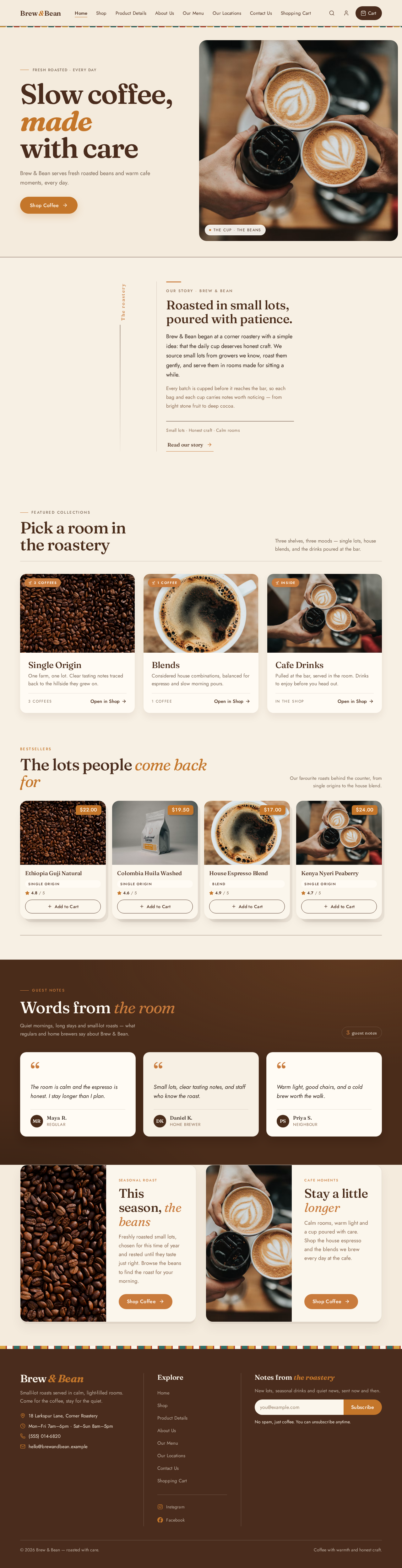
  • Information and state: Public entry page. Hero banner with the entry copy headline "Slow coffee, made with care", subline "Brew & Bean serves fresh roasted beans and warm cafe moments, every day.", and call to action "Shop Coffee". The hero image is the updated premium coffee photograph: a beautifully presented cup of freshly brewed coffee with latte art, coffee beans, and a warm, elegant cafe atmosphere, in natural lighting with rich espresso-brown and creamy beige tones, composed as professional commercial photography. Brand introduction, featured collections, bestsellers, testimonials, and promotional banners.
  • Primary actions: Follow the hero call to action to Shop; open a featured collection or bestseller product; open a promotional banner destination.
  • Supporting actions: Navigate to any page via header or footer; subscribe to the newsletter in the footer.
  • Domain entities: Product (bestsellers, featured collections), Testimonial, Promotion, Brand story excerpt, Hero image.
  • Component responsibilities: Full-width cream hero with the coffee photograph on the right at 55% width and the headline stack on the cream ground at left; the photograph keeps its proper aspect ratio and leaves sufficient negative space for the headline and CTA; caramel capsule CTA under the headline; thin walnut rule separating the hero from the next band; featured-collection cards; bestseller product cards with rating, price, and Add to Cart; testimonial cards; promotional banner blocks; walnut-brown band sections and pattern accents.
Page 7 of 32
  • States: Loading — skeleton panels for collections, bestsellers, and testimonials; the hero photograph reserves its frame so the headline and CTA never shift or overlap. Empty — a section with no current items collapses gracefully or shows a quiet "coming soon" note without breaking the page rhythm. Success — all sections render with imagery and copy; the hero photograph displays at correct aspect ratio with the headline and CTA fully readable on desktop, tablet, and mobile. Error — a failed section shows a restrained inline message and the rest of the page remains usable; if the hero photograph fails to load, the cream hero ground, headline, and CTA remain fully readable and usable. Recovery — retry control on the failed section.

Shop

  • Information and state: Product grid with coffee categories, search field, filters, sorting control, product ratings, prices, and Add to Cart buttons on each card.
  • Primary actions: Search products; select a category; apply filters; change sort order; add a product to the cart; open a product's details.
  • Supporting actions: Adjust cart from the header cart icon; clear search or filters.
  • Domain entities: Product, Category, Rating, Price, Cart line.
  • Component responsibilities: Category chip row; search input; filter panel; sort dropdown; responsive product grid of cards in 2, 3, and 4 columns with soft offset shadow and a caramel price tag in the corner; Add to Cart button per card; result count.
  • States: Loading — grid skeleton cards. Empty — no products match the search/filter combination, with a clear message and a reset-filters action. Success — matching products render with ratings and prices. Error — catalogue fetch failure shows an inline message with retry. Recovery — reset filters or retry restores a usable grid.
Page 8 of 32

Product Details

  • Information and state: Large product image with thumbnail strip, description, price, size selection, quantity selector, tasting notes, and related products.
  • Primary actions: Select a thumbnail to change the large image; choose a size; set quantity; add to cart; open a related product.
  • Supporting actions: Return to Shop; open the cart from the header.
  • Domain entities: Product, Product image, Size option, Tasting note, Related product, Cart line.
  • Component responsibilities: Image gallery with thumbnails; description block; price display; size selector; quantity stepper; tasting-notes panel; related-products row of cards.
  • States: Loading — gallery and detail skeleton. Empty — a product with no related items hides the related section. Success — full detail renders and Add to Cart confirms with visible feedback. Error — unknown or unavailable product shows a clear message with a link back to Shop. Recovery — retry or return to Shop.
Page 9 of 32

About Us

  • Information and state: Brand story, coffee sourcing, roasting process, quality commitment, and team introduction.
  • Primary actions: Read the narrative sections; navigate onward via header or footer.
  • Supporting actions: Newsletter subscription in the footer.
  • Domain entities: Brand story, Sourcing detail, Roasting process step, Quality commitment, Team member.
  • Component responsibilities: Editorial full-width panels each pairing one material colour block with one photograph; roasting-process sequence; team member cards with portrait and role.
  • States: Loading — editorial skeleton. Empty — a missing team or process block is omitted without leaving a broken layout. Success — all editorial sections render. Error — inline message with retry. Recovery — retry.

Our Menu

  • Information and state: Espresso, Cappuccino, Latte, Americano, Mocha, Cold Brew, and specialty drinks, each with an image and price, presented as a ruled price list with Jost item names and tabular numerals.
  • Primary actions: Browse drink categories and items; read prices.
  • Supporting actions: Navigate to Our Locations or Contact Us from the menu page context.
  • Domain entities: Menu item, Drink category, Price, Menu image.
  • Component responsibilities: Ruled price list with hairline rules; item image thumbnails; category groupings; tabular numeral price column.
  • States: Loading — list skeleton. Empty — a category with no items is omitted. Success — full menu renders. Error — inline message with retry. Recovery — retry.
Page 10 of 32

Our Locations

  • Information and state: Cafe branches as attractive location cards, each with address, opening hours, and a map placeholder.
  • Primary actions: Browse branches; read address and opening hours.
  • Supporting actions: Navigate to Contact Us; newsletter subscription in the footer.
  • Domain entities: Location, Address, Opening hours, Map placeholder.
  • Component responsibilities: Location card grid; address block; opening-hours block; styled map placeholder panel.
  • States: Loading — card skeleton. Empty — no branches configured shows a quiet message. Success — all location cards render. Error — inline message with retry. Recovery — retry.

Contact Us

  • Information and state: Contact information, business hours, social media links, and an elegant inquiry form.
  • Primary actions: Submit the inquiry form; follow social media links.
  • Supporting actions: Read contact details and business hours; newsletter subscription in the footer.
  • Domain entities: Contact detail, Business hours, Social link, Inquiry submission.
  • Component responsibilities: Contact detail block; business-hours block; social link row; inquiry form with name, email, and message fields and a submit button; inline validation and confirmation messaging.
  • States: Loading — page shell renders immediately; form is interactive. Empty — untouched form shows no errors. Success — valid submission shows a confirmation message and the form resets. Error — invalid fields show inline messages; a failed submission shows a retry message preserving entered values. Recovery — correct fields and resubmit.
Page 11 of 32

Shopping Cart

  • Information and state: Cart lines with product image, quantity, price, and remove option; subtotal, total, and checkout button.
  • Primary actions: Change quantity; remove a line; review subtotal and total; activate the checkout button.
  • Supporting actions: Continue shopping back to Shop; open product details from a cart line.
  • Domain entities: Cart line, Product, Quantity, Price, Subtotal, Total.
  • Component responsibilities: Cart line list with image, name, size, quantity stepper, line price, and remove control; order summary panel with subtotal, total, and checkout button; empty-cart state.
  • States: Loading — cart summary skeleton while stored cart resolves. Empty — no items shows a clear empty message with a "continue shopping" action. Success — lines and totals render and update immediately on quantity change or removal. Error — a stored line whose product is no longer available is flagged and removable. Recovery — remove the unavailable line or continue shopping.
Page 12 of 32

3. Functional Requirements

FR-1 — Brand and theme. As a Coffee shop visitor, I should see a premium, modern, visually attractive, fully responsive coffee shop website named "Brew & Bean" using an elegant coffee-inspired theme of espresso brown, beige, cream, caramel, and white, so that the brand feels premium and cohesive. (explicit)

  • Trigger: any page load. Observable result: consistent palette, typography, and styling across all pages. Failure/recovery: none applicable — presentation is always rendered.

FR-2 — Premium visual styling. As a Coffee shop visitor, I should see premium typography, realistic coffee photography, beautiful layouts, and consistent visual styling, so that the site never feels like a generic template. (explicit)

  • Observable result: Jost headings and Lora body type, warm natural-light photography, gallery-like full-width panels, and consistent spacing on every page.

FR-3 — Home page composition. As a Coffee shop visitor, I should see a hero banner, coffee imagery, brand introduction, featured collections, bestsellers, testimonials, and promotional banners on Home, so that I understand the brand and find entry points to products. (explicit)

  • Trigger: opening Home. Observable result: all listed sections render in the gallery-like sequence. Failure/recovery: a failed section shows an inline message with retry while the rest of the page remains usable. Continuation: hero call to action leads to Shop; bestsellers and collections lead to products.
Page 13 of 32

FR-4 — Homepage hero image. As a Coffee shop visitor, I should see a high-quality, realistic, premium coffee photograph in the homepage hero — a beautifully presented cup of freshly brewed coffee with latte art, coffee beans, and a warm, elegant cafe atmosphere, in natural lighting with rich espresso-brown and creamy beige tones and professional commercial photography — so that the entry feels appetising and premium. (explicit)

  • Trigger: opening Home. Observable result: the new hero photograph replaces the previous hero image, fits the existing hero layout, keeps its proper aspect ratio, and leaves sufficient negative space for the headline and CTA buttons. Access state: public, no identity. Failure/recovery: if the photograph fails to load, the cream hero ground, headline, and CTA remain fully readable and usable. Continuation: the visitor reads the headline and activates "Shop Coffee".

FR-5 — Hero image responsive fit. As a Coffee shop visitor, I should see the new hero photograph look visually appealing and correctly framed on desktop, tablet, and mobile screens, so that the entry is premium on any device. (explicit)

  • Trigger: opening Home at desktop, tablet, or mobile width. Observable result: the photograph keeps its aspect ratio and negative space for the headline and CTA at every breakpoint; no readable text or control is covered or cropped. Failure/recovery: at narrow widths the composition reflows so the headline and CTA stay whole.

FR-6 — Hero update preserves everything else. As a Coffee shop visitor, I should find all existing text, buttons, layout, spacing, navigation, and other website sections unchanged after the hero image update, so that the site I know stays intact. (explicit)

  • Observable result: only the homepage hero image changes; the headline "Slow coffee, made with care", subline, "Shop Coffee" CTA, header, footer, and every other page and section remain as before.
Page 14 of 32

FR-7 — Shop browsing. As a Coffee buyer, I should see a product grid with coffee categories, search, filters, sorting, product ratings, prices, and Add to Cart buttons on Shop, so that I can find the coffee I want. (explicit)

  • Trigger: opening Shop or entering a search term, selecting a category, applying a filter, or changing sort. Observable result: the grid updates to matching products with ratings and prices. Failure/recovery: no matches shows an empty message with a reset-filters action; a fetch failure shows an inline retry. Continuation: Add to Cart adds the product; clicking a card opens Product Details.

FR-8 — Product Details composition. As a Coffee buyer, I should see large product images, thumbnails, descriptions, prices, size selection, quantity selector, tasting notes, and related products on Product Details, so that I can evaluate a product before buying. (explicit)

  • Trigger: opening a product from Shop, Home, or a related-products row. Observable result: full detail renders; selecting a thumbnail changes the large image; size and quantity selections are reflected. Failure/recovery: unknown product shows a message with a link back to Shop. Continuation: Add to Cart adds the configured line; related products open their own details.

FR-9 — About Us composition. As a Coffee shop visitor, I should see the brand story, coffee sourcing, roasting process, quality commitment, and team introduction on About Us, so that I trust the brand. (explicit)

  • Trigger: opening About Us. Observable result: all editorial sections render as full-width panels. Failure/recovery: inline retry on a failed section.
Page 15 of 32

FR-10 — Our Menu composition. As a Coffee shop visitor, I should see Espresso, Cappuccino, Latte, Americano, Mocha, Cold Brew, and specialty drinks with images and prices on Our Menu, so that I know what the cafe serves and at what price. (explicit)

  • Trigger: opening Our Menu. Observable result: ruled price list with item names, images, and tabular-numeral prices. Failure/recovery: inline retry.

FR-11 — Our Locations composition. As a Coffee shop visitor, I should see cafe branches as attractive location cards with addresses, opening hours, and map placeholders on Our Locations, so that I can plan a visit. (explicit)

  • Trigger: opening Our Locations. Observable result: location cards render with address, hours, and map placeholder. Failure/recovery: inline retry.

FR-12 — Contact Us composition. As a Coffee shop visitor, I should see contact information, business hours, social media links, and an elegant inquiry form on Contact Us, so that I can reach the brand. (explicit)

  • Trigger: opening Contact Us. Observable result: contact details, hours, social links, and form render. Failure/recovery: inline retry for content; form validation errors shown inline.

FR-13 — Inquiry submission. As a Coffee shop visitor, I should submit the inquiry form with my name, email, and message and receive a confirmation, so that my question reaches Brew & Bean. (explicit — form; required_inference — submission handling and confirmation)

  • Trigger: completing the form and submitting. Observable result: confirmation message shown and form reset. Failure/recovery: invalid fields show inline messages; a failed submission shows a retry message preserving entered values. Continuation: the visitor may submit another inquiry or continue browsing.
Page 16 of 32

FR-14 — Shopping Cart composition. As a Coffee buyer, I should see product images, quantities, prices, remove options, subtotal, total, and a checkout button on Shopping Cart, so that I can review my selection before checkout. (explicit)

  • Trigger: opening Shopping Cart with items. Observable result: cart lines and totals render. Failure/recovery: empty cart shows a message with a continue-shopping action; an unavailable stored line is flagged and removable. Continuation: the checkout button is available as the designed call to action.

FR-15 — Cart quantity and removal. As a Coffee buyer, I should change quantities and remove lines in the cart and see subtotal and total update immediately, so that my order reflects what I want. (required_inference — makes the accepted cart review usable)

  • Trigger: changing a quantity or activating remove. Observable result: line price, subtotal, and total recalculate immediately; removing the last line shows the empty state. Failure/recovery: invalid quantity is clamped to a valid minimum of one.

FR-16 — Add to Cart. As a Coffee buyer, I should add a product to the cart from Shop cards and from Product Details with my chosen size and quantity, so that my selection is ready for review. (explicit — Add to Cart buttons; required_inference — size/quantity carried into the cart line)

  • Trigger: activating Add to Cart. Observable result: visible confirmation and an updated cart count in the header. Continuation: the visitor may continue browsing or open Shopping Cart.
Page 17 of 32

FR-17 — Local cart persistence. As a Coffee buyer, I should find my cart items, sizes, and quantities still present after navigating between pages or returning to the site on the same device, so that I do not lose my selection. (required_inference)

  • Trigger: navigating between pages or revisiting the site. Observable result: cart contents restored from local device storage. Failure/recovery: if stored data is unreadable, the cart starts empty without breaking the page.

FR-18 — Shared header. As a Coffee shop visitor, I should see a consistent header with logo, navigation, search, account, and shopping cart icons on every page, so that I can move around the site easily. (explicit)

  • Observable result: identical header on all eight pages; navigation reaches every page; search opens the Shop search; cart icon opens Shopping Cart with a count. The account icon is a visual affordance only — no account journey exists.

FR-19 — Shared footer. As a Coffee shop visitor, I should see a premium footer with navigation links, contact details, social media, and newsletter subscription on every page, so that I can find secondary links and stay in touch. (explicit)

  • Observable result: espresso-brown footer with cream newsletter field and caramel submit button on all pages. Failure/recovery: newsletter submission shows inline success or error messaging.

FR-20 — Newsletter subscription. As a Coffee shop visitor, I should submit my email to the newsletter from the footer and receive confirmation, so that I can hear from Brew & Bean. (explicit — newsletter subscription; required_inference — submission handling and confirmation)

  • Trigger: entering an email and submitting. Observable result: confirmation message; invalid email shows an inline error. Failure/recovery: failed submission shows a retry message preserving the entered email.
Page 18 of 32

FR-21 — Shared visual components. As a Coffee shop visitor, I should see attractive buttons, product cards, badges, icons, and consistent spacing throughout, so that the site feels designed as one system. (explicit)

  • Observable result: capsule buttons, cream product cards with soft offset shadow and caramel price tag, badges, and a consistent spacing rhythm across all pages.

FR-22 — Consistent navigation. As a Coffee shop visitor, I should move between all eight pages through intuitive and consistent navigation, so that I never feel lost. (explicit)

  • Observable result: header and footer navigation reach every page from every page; current page is indicated.

FR-23 — Photography. As a Coffee shop visitor, I should see high-quality, realistic coffee, cafe, and product photography throughout, so that the brand feels authentic and appetising. (explicit)

  • Observable result: warm natural-light photography on Home, Shop, Product Details, About Us, Our Menu, and Our Locations, with mustard and teal appearing only as small props.

FR-24 — Motion and hover. As a Coffee shop visitor, I should experience subtle hover effects, smooth transitions, and elegant scrolling animations, so that the site feels alive but calm. (explicit)

  • Observable result: gentle film-like fades, slow pans, small soft hover lifts, and one scroll reveal per section; no bounce. Failure/recovery: with reduced-motion preference, a static arrangement remains fully usable.

FR-25 — Typography and layout craft. As a Coffee shop visitor, I should see excellent typography, alignment, visual hierarchy, and whitespace on every page, so that content is easy and pleasant to read. (explicit)

  • Observable result: Jost headings at 500–600 weight with tight tracking and sentence case, Lora body, 1.333 modular scale, wide margins, and generous whitespace.
Page 19 of 32

FR-26 — Responsive layouts. As a Coffee shop visitor, I should use the site comfortably on desktop, tablet, and mobile screens, so that the experience is equally premium on any device. (explicit)

  • Observable result: layouts reflow at 375px, 768px, and 1280px; readable text and controls stay whole inside the viewport and their containers.

FR-27 — Anti-template discipline. As a Coffee shop visitor, I should never encounter generic templates, cluttered layouts, excessive gradients, or inconsistent designs, so that the site feels bespoke. (explicit)

  • Observable result: no gradient blobs, glass panels, blue/indigo accents, identical hover-lift card grids, sharp neon edges, heavy shadows, or cold grey surfaces.

FR-28 — Anonymous browsing. As a Coffee shop visitor, I should browse all eight pages without an account, so that nothing stands between me and the coffee. (required_inference)

  • Observable result: every page loads without sign-in; no protected destination exists.

4. User Personas

Page 20 of 32

Coffee shop visitor

The Coffee shop visitor is a city customer discovering Brew & Bean — someone who wants craft and calm, and who arrives at the site to understand who the brand is before committing to anything. Their product context is the public, editorial side of the site: Home, About Us, Our Menu, Our Locations, and Contact Us. Their primary goal is to form a confident impression of the brand and find the information they need — what the cafe serves, where it is, when it is open, and how to reach it.

Their distinct accepted responsibilities are reading the brand story, sourcing, roasting process, quality commitment, and team on About Us; scanning the ruled menu price list for drinks and prices; reviewing location cards for addresses, opening hours, and map placeholders; and using the contact information, business hours, social links, and inquiry form on Contact Us. They also encounter the shared header and footer on every page and may subscribe to the newsletter. On Home they meet the new hero photograph — a cup with latte art, coffee beans, and a warm cafe atmosphere — and read the headline "Slow coffee, made with care" and the "Shop Coffee" call to action over its negative space.

Their relevant inputs and decisions are which page to open next, whether a branch is convenient, and whether to send an inquiry. They interact with the Coffee buyer only indirectly — both share the same header, footer, and public pages — and with Brew & Bean as the recipient of their inquiry and newsletter email. Their observable success is finding the information they sought, submitting an inquiry and seeing confirmation, and leaving with a clear sense of the brand.

Page 21 of 32

Coffee buyer

The Coffee buyer is the shopping-oriented visitor whose goal is to select coffee and drinks and assemble a cart. Their product context is Shop, Product Details, and Shopping Cart, reached through the shared header, Home bestsellers and featured collections, and the hero call to action "Shop Coffee".

Their distinct accepted responsibilities are searching, filtering by category, and sorting the Shop grid; comparing products by rating and price; opening Product Details to inspect large images and thumbnails, read the description and tasting notes, choose a size, and set a quantity; adding items to the cart from either Shop cards or Product Details; and reviewing the cart's product images, quantities, prices, remove options, subtotal, total, and checkout button.

Their relevant inputs and decisions are search terms, category and filter choices, sort order, size selection, quantity, and which lines to keep or remove. They interact with the Coffee shop visitor through shared navigation and with Brew & Bean as the recipient of the cart selection. Their observable success is a cart that accurately reflects their chosen products, sizes, and quantities with correct subtotal and total, and a checkout button ready to activate.

5. Core User Flows

Page 22 of 32

Flow A — Coffee shop visitor discovers the brand and plans a visit

  1. The Coffee shop visitor opens Home. The hero renders with the new premium coffee photograph — a cup with latte art, coffee beans, and a warm cafe atmosphere in natural light — on the right at 55% width, and the headline "Slow coffee, made with care", the subline, and the "Shop Coffee" call to action on the cream ground at left, with clear negative space around the text.
  2. The visitor selects About Us from the header. The brand story, coffee sourcing, roasting process, quality commitment, and team introduction render as full-width editorial panels.
  3. The visitor selects Our Menu. The ruled price list shows Espresso, Cappuccino, Latte, Americano, Mocha, Cold Brew, and specialty drinks with images and tabular-numeral prices.
  4. The visitor selects Our Locations. Location cards render with branch names, addresses, opening hours, and map placeholders. The visitor reads the hours of a convenient branch.
  5. The visitor selects Contact Us. Contact information, business hours, and social media links render. The visitor completes the inquiry form with name, email, and message and submits.
  6. Observable result: a confirmation message appears and the form resets. Continuation: the visitor may follow a social link, subscribe to the newsletter in the footer, or return to any page via the header.
  7. Failure/recovery: if a section fails to load, an inline message with retry appears while the rest of the page stays usable; if the hero photograph fails to load, the cream hero ground, headline, and CTA remain readable and usable; if the form has invalid fields, inline messages identify them and the visitor corrects and resubmits.
Page 23 of 32

Flow B — Coffee buyer searches and adds a product from Shop

  1. The Coffee buyer opens Shop from the header or from the Home hero call to action "Shop Coffee".
  2. The buyer enters a search term, selects a coffee category, applies filters, and changes the sort order. The product grid updates to matching products showing ratings and prices.
  3. The buyer activates Add to Cart on a product card. Observable result: visible confirmation appears and the header cart count increments.
  4. Continuation: the buyer continues browsing or opens Shopping Cart from the header cart icon.
  5. Failure/recovery: if no products match, an empty message with a reset-filters action appears; if the catalogue fails to load, an inline retry restores the grid.

Flow C — Coffee buyer configures a product on Product Details

  1. The Coffee buyer opens a product from Shop, a Home bestseller, or a related-products row. Product Details renders the large product image, thumbnail strip, description, price, size selection, quantity selector, tasting notes, and related products.
  2. The buyer selects a thumbnail; the large image changes to that view.
  3. The buyer reads the description and tasting notes, selects a size, and sets a quantity with the quantity selector.
  4. The buyer activates Add to Cart. Observable result: the configured line — product, chosen size, and quantity — is added, confirmation is shown, and the header cart count updates.
  5. Continuation: the buyer opens a related product to continue, or opens Shopping Cart.
  6. Failure/recovery: an unknown or unavailable product shows a clear message with a link back to Shop.
Page 24 of 32

Flow D — Coffee buyer reviews and adjusts the cart

  1. The Coffee buyer opens Shopping Cart from the header cart icon. Cart lines render with product images, quantities, prices, and remove options, alongside subtotal, total, and the checkout button.
  2. The buyer changes a quantity. Observable result: the line price, subtotal, and total recalculate immediately.
  3. The buyer activates Remove on a line. Observable result: the line disappears and totals recalculate; removing the last line shows the empty-cart message with a continue-shopping action.
  4. The buyer reviews the final subtotal and total and activates the checkout button as the designed call to action.
  5. Continuation: the buyer may return to Shop to add more items; the cart persists on the device across navigation and return visits.
  6. Failure/recovery: if a stored line's product is no longer available, the line is flagged and can be removed; if stored cart data is unreadable, the cart starts empty without breaking the page.

Flow E — Coffee shop visitor subscribes to the newsletter

  1. From any page, the Coffee shop visitor scrolls to the espresso-brown footer and enters an email in the cream newsletter field.
  2. The visitor activates the caramel submit button. Observable result: a confirmation message appears.
  3. Failure/recovery: an invalid email shows an inline error; a failed submission shows a retry message preserving the entered email.
Page 25 of 32

6. Visuals Colors and Theme

The visual direction is warm modernism, poured slow, after Charles & Ray Eames — warm, human, and quietly confident, with honest materials and joyful colour inside order.

Palette (light mode)

RoleHexUsage
Background#F7F0E4Cream page ground
Surface#FFFBF4Cards and panels
Text#2B1D14Espresso-brown body and headers
Primary#4A2C1AEspresso brown headers, footer, primary buttons, walnut rules
Accent#C97B3CCaramel capsule CTAs, badges, links, price tags
Muted#8A6A52Secondary text and captions
White#FFFBF4Card grounds

Walnut-brown band sections break the cream page into gallery rooms. Mustard and teal appear only as small props in photography.

Typography

  • Headings: Jost, 500–600 weight, tight tracking, sentence case. Large and calm, never shouty.
  • Body: Lora.
  • Scale: 1.333 modular — 96 / 64 / 40 / 28 / 18 / 16. Mobile headline 44px, desktop 96px, implemented with clamp().

Shape language: soft organic corners and capsule buttons; panels sit like mid-century trays. No hard neon edges and no blobs.

Page 26 of 32

Layout: a warm modular grid of cream panels with walnut-brown section bands, wide margins, and gallery-like sequences. Product cards use 2, 3, and 4 columns.

Imagery: realistic warm coffee photography in natural light — latte art, beans, and cafe scenes with soft shadows. The homepage hero uses the updated premium photograph: a beautifully presented cup of freshly brewed coffee with latte art, coffee beans, and a warm, elegant cafe atmosphere, in rich espresso-brown and creamy beige tones.

Avoid: blue or indigo accents on white; gradient blobs or glass panels; grids of identical cards with hover-lift on every tile; cold grey neutrals; neon or candy colours.

7. Signature Design Concept

The Home entry is a full-width cream hero with the new premium coffee photograph — a cup of freshly brewed coffee with latte art, coffee beans, and a warm, elegant cafe atmosphere in natural light — occupying the right 55% of the hero at its proper aspect ratio. On the left, the cream ground holds the oversized Jost headline "Slow coffee, made with care" at 96px on desktop, the subline "Brew & Bean serves fresh roasted beans and warm cafe moments, every day." beneath it, and a caramel capsule call to action "Shop Coffee" under the headline. The photograph is composed with sufficient negative space so the headline stack and CTA sit clear of the cup and beans. A thin walnut rule separates the hero from the next walnut-brown band. The composition recomposes only accepted Home content — the hero copy, the call to action, and the photography — and introduces no new behaviour.

Page 27 of 32

8. Interaction Model & Motion Direction

Interaction Model: Animated Motion Tempo: restrained Hero Dimensionality: layered_2d

Landing Hero Motion Brief

  • Focal subject: the new premium coffee photograph on the right 55% of the cream hero — a cup with latte art, coffee beans, and a warm cafe atmosphere — with the headline stack and caramel capsule CTA on the cream ground at left.
  • Input → transformation → outcome thesis: as the visitor arrives, the hero photograph fades in gently (film-like) while the headline stack and CTA settle into place; the photograph then performs a slow pan inside its fixed frame, and a slow crossfade may move between cafe, cup, and bean views. The outcome is a calm, composed first frame that settles rather than bounces.
  • Motion vocabulary: gentle film-like fades, slow pans, small soft hover lifts, one scroll reveal per section. No bounce.
  • Composed first frame: cream ground, right-55% coffee photograph at correct aspect ratio, left headline stack with 96px Jost headline, subline, caramel capsule CTA, and the thin walnut rule along the bottom edge.
  • Reduced-motion state: with prefers-reduced-motion, the hero renders in its final composed position with no fade, pan, or crossfade; the photograph, headline, and CTA remain fully readable and usable.
Page 28 of 32

9. Non-Functional Requirements

  • UI/UX focus. The project focuses exclusively on UI/UX design; the deliverable is the designed website experience. (explicit)
  • Palette constraint. Only espresso brown, beige, cream, caramel, and white are used as the theme colours. (explicit)
  • Anti-template constraint. The design avoids generic templates, cluttered layouts, excessive gradients, and inconsistent designs. (explicit)
  • Responsive constraint. Layouts are responsive for desktop, tablet, and mobile screens; readable text and controls stay whole inside the viewport and their containers at 375px, 768px, and 1280px. (explicit)
  • Hero image constraint. The homepage hero photograph fits the existing hero layout, keeps its proper aspect ratio, leaves sufficient negative space for the headline and CTA buttons, and is visually appealing on desktop, tablet, and mobile. (explicit)
  • Hero-only change constraint. All existing text, buttons, layout, spacing, navigation, and other website sections stay unchanged; only the homepage hero image changes. (explicit)
  • Navigation constraint. All eight pages connect through intuitive and consistent navigation. (explicit)
  • Cohesion constraint. The delivered site is polished and cohesive with all eight pages and a professional user experience. (explicit)
  • Accessibility of motion. With prefers-reduced-motion, a usable static arrangement is provided; moving or scrollable content wraps or scrolls so every item can be brought fully into view. (required_inference — makes the accepted motion requirement usable)
  • Performance. Photography, including the new hero image, is served at appropriate sizes so pages remain responsive on mobile connections. (required_inference — supports the accepted responsive and photography requirements)
Page 29 of 32

10. Tech Stack

  • Frontend: React application UI — the eight pages, shared header and footer, cart interaction, motion, and responsive layouts.
  • Backend: shared FastAPI process for application APIs and domain modules — serves catalogue and content data and receives inquiry and newsletter submissions.
  • Database: MariaDB for application-owned persistent data — products, categories, menu items, locations, team, testimonials, and submissions.
  • Orchestration: docker-compose with the frontend, backend, and database services.
Page 30 of 32

11. Assumptions and Constraints

  • Assumption: The cart is stored on the local device (browser storage) because no account system is accepted and the cart must survive navigation. (required_inference)
  • Assumption: The header account icon is a visual affordance only; no account journey is accepted. (explicit exclusion of accounts)
  • Assumption: The checkout button is a designed call to action; no payment or order flow is accepted. (explicit scope boundary)
  • Assumption: Map placeholders are styled panels, not interactive maps. (explicit)
  • Assumption: The new hero photograph is supplied as a realistic commercial coffee image matching the described subject and tones; if it fails to load, the cream hero ground keeps the headline and CTA readable. (required_inference)
  • Constraint: The site has exactly eight pages; no additional pages are added. (explicit page-count constraint)
  • Constraint: The project focuses exclusively on UI/UX design. (explicit)
  • Constraint: The homepage hero image update changes only the hero image; all existing text, buttons, layout, spacing, navigation, and other sections remain unchanged. (explicit)
Page 31 of 32

12. Glossary

  • Brew & Bean — the premium coffee shop brand and website.
  • Coffee shop visitor — the persona who browses editorial and informational pages and may submit an inquiry or newsletter email.
  • Coffee buyer — the persona who searches, filters, sorts, configures products, and assembles a cart.
  • Cart line — one product in the cart with its chosen size and quantity.
  • Tasting notes — the flavour description shown on Product Details.
  • Hero image — the premium coffee photograph in the Home hero: a cup with latte art, coffee beans, and a warm cafe atmosphere in natural light.
  • Walnut band — the walnut-brown section band that breaks the cream page into gallery rooms.
  • Capsule button — the rounded pill-shaped button style used for primary actions.
Page 32 of 32
Live
Home design preview

Home: Open site and view hero

Shop: Follow Shop Coffee

Shop: 1. Search products

Shop: 2. Select category and filters

Shop: 3. Change sort order

Shop: 4. Reset filters for no matches

Shop: 5. Retry failed catalogue load

Shop: 6. Add product to cart

Product Details: 7. Open product details

Product Details: 8. Select thumbnail image

Product Details: 9. Read description and tasting notes

Product Details: 10. Choose size and quantity

Product Details: 11. Add configured line to cart

Product Details: 12. Open related product

Shop: 13. Return to Shop from unavailable product

Shopping Cart: 14. Open cart from header

Shopping Cart: 15. Change line quantity

Shopping Cart: 16. Remove cart line

Shopping Cart: 17. Review subtotal and total

Shopping Cart: Activate checkout button

Shopping Cart: 18. Remove unavailable flagged line

Shop: 19. Continue shopping from empty cart

Live
Home design preview

Home: Open site and view hero

Shop: Follow Shop Coffee

Shop: 1. Search products

Shop: 2. Select category and filters

Shop: 3. Change sort order

Shop: 4. Reset filters for no matches

Shop: 5. Retry failed catalogue load

Shop: 6. Add product to cart

Product Details: 7. Open product details

Product Details: 8. Select thumbnail image

Product Details: 9. Read description and tasting notes

Product Details: 10. Choose size and quantity

Product Details: 11. Add configured line to cart

Product Details: 12. Open related product

Shop: 13. Return to Shop from unavailable product

Shopping Cart: 14. Open cart from header

Shopping Cart: 15. Change line quantity

Shopping Cart: 16. Remove cart line

Shopping Cart: 17. Review subtotal and total

Shopping Cart: Activate checkout button

Shopping Cart: 18. Remove unavailable flagged line

Shop: 19. Continue shopping from empty cart