amber-animations
 Rohit Raj
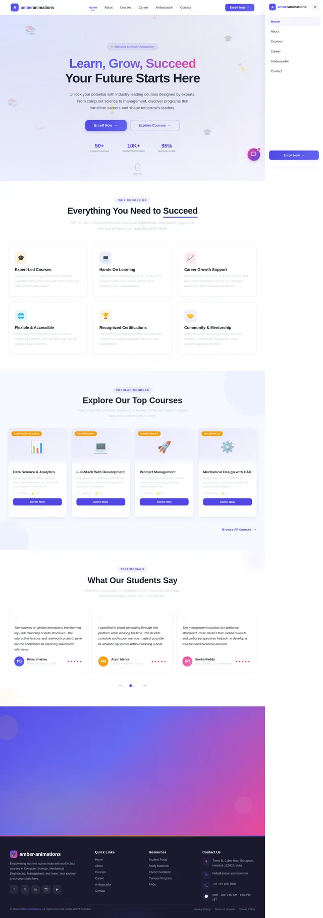
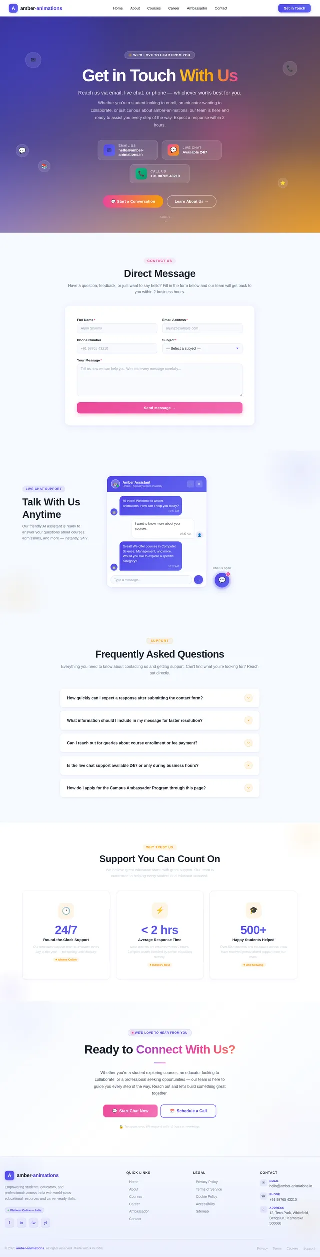
Create a modern, professional front-end website for an EdTech company. Tech Stack: - HTML5, CSS3, JavaScript - Use Tailwind CSS for styling - Use simple animations (hover effects, transitions, scroll animations using AOS or GSAP) Design Requirements: - Clean, modern UI/UX similar to top EdTech platforms - Responsive design (mobile + desktop) - Smooth scrolling and subtle animations - Use a professional color palette (blue, white, gradients) Pages/Sections Required: 1. Home Page: - Hero section with headline, subheading, CTA button (Enroll Now) - Animated background or gradient - Features section (Why choose us) - Popular courses preview - Testimonials - Footer 2. About Us: - Company mission and vision - Team section with cards - Timeline or journey section 3. Courses Page: - Categories: - Computer Science (CSE) - Mechanical Engineering - Management - Each course card should include: - Title - Description - Duration - Enroll button - Add hover animations on cards 4. Career Page: - Job openings list - Apply button - Simple form UI 5. Campus Ambassador Page: - Program details - Benefits section - Apply form 6. Contact / Chat Section: - “Talk with us” chatbot UI (front-end only, no backend required) - Floating chat button (bottom right) - Contact form (name, email, message) UI/UX Features: - Sticky navbar with smooth scroll - Mobile hamburger menu - Card-based layout - Glassmorphism or soft shadows - Micro-interactions (button hover, scaling cards) Extras: - Add icons (use Heroicons or FontAwesome) - Include a loading animation - Use clean, readable fonts (Poppins or Inter) Output: - Provide complete code (HTML, CSS, JS) - Organize code cleanly - Add comments for each section

Comments (0)
Sign in to leave a comment
System Requirements
System Requirements Document (SRD)
amber-animations
1. Introduction
The purpose of this document is to define the system requirements for amber-animations, a modern, professional front-end website for an EdTech company. The platform aims to provide a seamless and engaging user experience for students, educators, and professionals seeking educational resources and opportunities. This document outlines the functional and non-functional requirements, design concepts, and technical specifications necessary to develop the platform.
The project is tailored to meet the needs of users in India (IN), ensuring locale-specific defaults such as time zones, currency, and cultural preferences are considered.
2. System Overview
amber-animations will be a responsive, visually appealing, and user-friendly website designed to cater to the needs of an EdTech audience. The platform will feature:
- A clean and modern UI/UX inspired by top EdTech platforms.
- Smooth animations and transitions to enhance interactivity.
- Responsive design optimized for both mobile and desktop devices.
- Key sections such as Home, About Us, Courses, Careers, Campus Ambassador Program, and Contact/Chat.
The website will utilize Tailwind CSS for styling, AOS/GSAP for animations, and a professional color palette to create a cohesive and polished look.
3. Functional Requirements
-
Home Page:
- As a User, I should see a hero section with a headline, subheading, and a CTA button (Enroll Now).
- As a User, I should see an animated background or gradient.
- As a User, I should see a features section (Why choose us).
- As a User, I should see a preview of popular courses.
- As a User, I should see testimonials from other users.
- As a User, I should see a footer with links and contact information.
-
About Us Page:
- As a User, I should see the company’s mission and vision.
- As a User, I should see a team section with cards for each member.
- As a User, I should see a timeline or journey section.
-
Courses Page:
- As a User, I should see categories for courses (e.g., Computer Science, Mechanical Engineering, Management).
- As a User, I should see course cards with a title, description, duration, and an Enroll button.
- As a User, I should see hover animations on course cards.
-
Career Page:
- As a User, I should see a list of job openings.
- As a User, I should see an Apply button for each job.
- As a User, I should see a simple form UI for job applications.
-
Campus Ambassador Page:
- As a User, I should see details about the Campus Ambassador Program.
- As a User, I should see a benefits section.
- As a User, I should see an Apply form for the program.
-
Contact / Chat Section:
- As a User, I should see a “Talk with us” chatbot UI (front-end only).
- As a User, I should see a floating chat button at the bottom right.
- As a User, I should see a contact form with fields for name, email, and message.
-
UI/UX Features:
- As a User, I should experience a sticky navbar with smooth scrolling.
- As a User, I should see a mobile hamburger menu for navigation.
- As a User, I should see a card-based layout with glassmorphism or soft shadows.
- As a User, I should experience micro-interactions (e.g., button hover effects, scaling cards).
4. User Personas
-
Student:
- Primary user of the platform.
- Interested in enrolling in courses and exploring educational resources.
-
Educator:
- Secondary user of the platform.
- Interested in contributing content or collaborating with the EdTech company.
-
Job Seeker:
- Interested in exploring career opportunities within the company.
-
Campus Ambassador:
- Interested in joining the Campus Ambassador Program to promote the platform.
-
Guest:
- Casual visitor exploring the platform without logging in.
5. Visuals Colors and Theme
Unique Color Palette:
- Background: #F5F9FF (Soft Sky Blue)
- Surface: #FFFFFF (Pure White)
- Text: #1A202C (Dark Charcoal)
- Accent: #4F46E5 (Royal Indigo)
- Muted: #CBD5E0 (Cool Gray)
This palette reflects a professional and modern aesthetic, with a focus on clarity and readability.
6. Signature Design Concept
The amber-animations homepage will feature a dynamic animated gradient background that subtly shifts colors as the user scrolls. The hero section will include a 3D parallax effect, where layers of the background move at different speeds, creating depth and interactivity.
Key elements of the homepage:
- Interactive Course Cards: Cards will "flip" on hover, revealing additional details about the course.
- Testimonials Carousel: A rotating carousel with user testimonials, featuring smooth fade-in and slide transitions.
- Floating Icons: Subtle, animated icons (e.g., books, graduation caps) that float across the screen, reinforcing the educational theme.
Micro-interactions will be incorporated throughout, such as buttons that "pulse" on hover and sections that animate into view as the user scrolls.
7. Non-Functional Requirements
- The website must load within 2 seconds on a 4G connection.
- The website must be fully responsive and compatible with all major browsers (Chrome, Firefox, Safari, Edge).
- The website must adhere to accessibility standards (WCAG 2.1).
- The website must support both light and dark modes.
8. Tech Stack
-
Frontend:
- React for Web
- Tailwind CSS for styling
- AOS/GSAP for animations
-
Backend:
- Python
- FastAPI
-
Database:
- MySQL (with Alembic for migrations)
-
AI Tools:
- Google Nano Banana for image generation
-
Orchestration:
- Docker
- Kubernetes
9. Assumptions and Constraints
- The chatbot UI will be front-end only, with no backend integration at this stage.
- The platform will primarily target users in India, with English as the default language.
- The website will not include payment gateway integration in the initial phase.
10. Glossary
- CTA: Call to Action
- UI/UX: User Interface / User Experience
- WCAG: Web Content Accessibility Guidelines
- AOS: Animate on Scroll
- GSAP: GreenSock Animation Platform
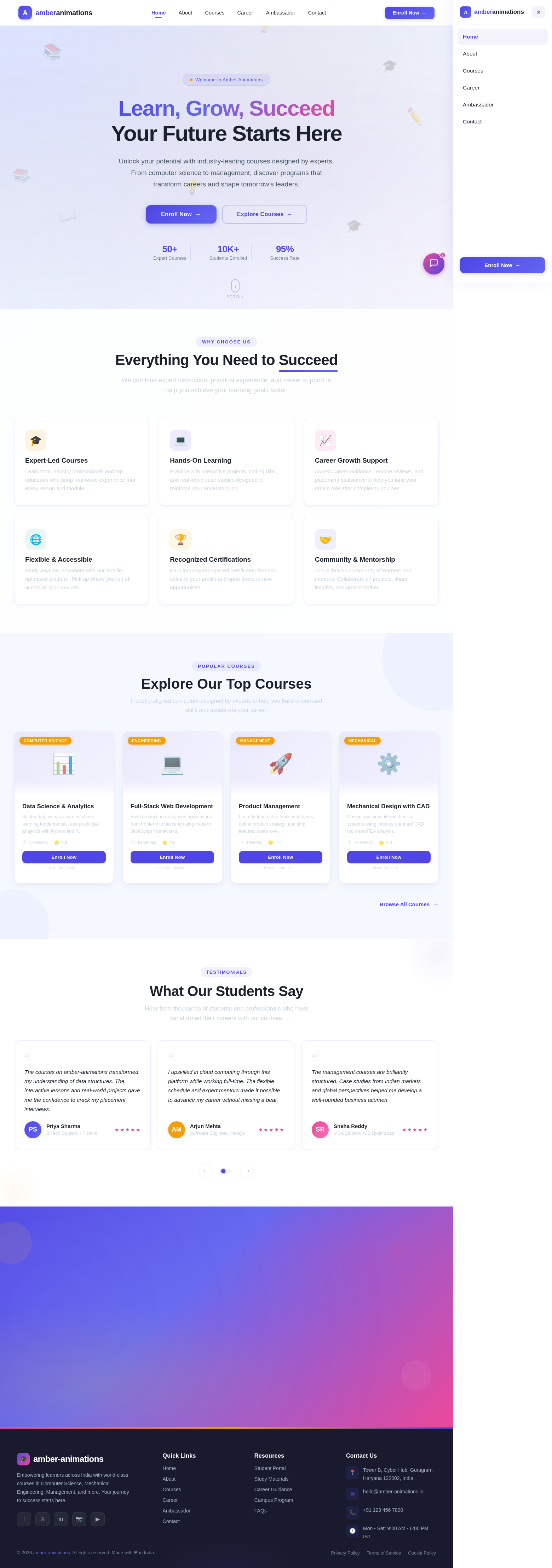
Learn, Grow, Succeed
Your Future Starts Here
Unlock your potential with industry-leading courses designed by experts. From computer science to management, discover programs that transform careers and shape tomorrow’s leaders.
Everything You Need to Succeed
We combine expert instruction, practical experience, and career support to help you achieve your learning goals faster.
Expert-Led Courses
Learn from industry professionals and top educators who bring real-world experience into every lesson and module.
Hands-On Learning
Practice with interactive projects, coding labs, and real-world case studies designed to reinforce your understanding.
Career Growth Support
Access career guidance, resume reviews, and placement assistance to help you land your dream role after completing courses.
Flexible & Accessible
Study anytime, anywhere with our mobile-optimized platform. Pick up where you left off across all your devices.
Recognized Certifications
Earn industry-recognized certificates that add value to your profile and open doors to new opportunities.
Community & Mentorship
Join a thriving community of learners and mentors. Collaborate on projects, share insights, and grow together.
Explore Our Top Courses
Industry-aligned curriculum designed by experts to help you build in-demand skills and accelerate your career.
Tap a card to see more details
Data Science & Analytics
Master data visualization, machine learning fundamentals, and predictive analytics with Python and R.
Hover for details →Data Science & Analytics
- Hands-on projects with real-world datasets
- Python, Pandas, Scikit-learn & TensorFlow
- Capstone project with industry mentors
- Career placement assistance included
Full-Stack Web Development
Build production-ready web applications from frontend to backend using modern JavaScript frameworks.
Hover for details →Full-Stack Web Development
- React, Node.js, Express & MongoDB stack
- REST APIs and GraphQL integration
- CI/CD pipelines and cloud deployment
- Portfolio-ready projects at each milestone
Product Management
Learn to lead cross-functional teams, define product strategy, and ship features users love.
Hover for details →Product Management
- Agile & Scrum methodology deep dive
- User research and A/B testing frameworks
- Roadmapping and stakeholder communication
- Case studies from top Indian startups
Mechanical Design with CAD
Design and simulate mechanical systems using industry-standard CAD tools and FEA analysis.
Hover for details →Mechanical Design with CAD
- SolidWorks & AutoCAD certification prep
- Finite Element Analysis fundamentals
- 3D printing and rapid prototyping labs
- Industry-partnered design challenges
What Our Students Say
Hear from thousands of students and professionals who have transformed their careers with our courses.
The courses on amber-animations transformed my understanding of data structures. The interactive lessons and real-world projects gave me the confidence to crack my placement interviews.
Ready to Transform Your Future?
Join thousands of learners who have accelerated their careers with our expert-led courses. Enroll today and gain access to industry-relevant skills, mentorship, and a thriving community of professionals.
No comments yet. Be the first!