Newway Aqua Tech
 Yuva Raj
Give me a app that i have to able to monitor attendance, salary, working days, Flow meter readings, hypo chemical usage for my water treatment plant employees and operational metrics.


Comments (0)
Sign in to leave a comment
Project Tasks87
Implement Navbar for Landing
As a frontend developer, implement the Navbar section for the Landing page. Build the `Navbar` component using `useState` for mobile menu toggle (`isOpen`). Render an animated SVG logo via `framer-motion` with two `motion.path` elements — the outer droplet shape and inner wave line — each using `pathLength` draw-on animation with a 1.4s `easeInOut` transition (second path delayed 0.5s). Implement the hamburger-to-X animated button using three `motion.div` lines with `topLine`, `midLine`, `botLine` variants (rotate+translate for top/bottom, opacity+scale for middle). Implement mobile dropdown using `AnimatePresence` with `menuVariants` (height 0→auto, staggerChildren 0.06s) and `itemVariants` for each nav link. `NAV_LINKS` array contains Features, How It Works, Pricing, About — all pointing to `/Landing`. Apply `Navbar.css` styles with `nv-root`, `nv-bar`, `nv-inner`, `nv-brand`, `nv-logo-svg`, `nv-brand-text`, `nv-brand-name`, `nv-brand-tag`, `nv-links`, `nv-link` class structure. Note: this component may already exist from a previous page — check before recreating.
Build Auth API Endpoints
As a Backend Developer, implement FastAPI authentication endpoints: POST /api/auth/login (JWT token generation with role-based claims for Admin/Employee), POST /api/auth/logout (token invalidation), POST /api/auth/refresh (token refresh), GET /api/auth/me (current user profile). Include JWT middleware, password hashing with bcrypt, and role-based access control decorators. Support for 'remember me' extended token TTL. These endpoints are required by the LoginContent frontend task (3f7cfd09).
Setup Database Models Migrations
As a Backend Developer, define SQLAlchemy ORM models and Alembic migrations for all entities: User (id, email, password_hash, role, employee_id, is_active, created_at), Employee (id, user_id FK, name, department, position, contact, status, plant_location, shift_preference, reporting_manager), AttendanceRecord (id, employee_id FK, punch_in_time, punch_in_lat, punch_in_lng, punch_out_time, punch_out_lat, punch_out_lng, status, hours_worked, notes), SalaryRecord (id, employee_id FK, month, year, base_salary, hra, da, conveyance, medical, special_allowance, pf, professional_tax, tds, esi, working_days, net_salary), FlowMeterReading (id, meter_id, location, pipe_id, value, status, trend_direction, trend_percent, timestamp), HypoUsageRecord (id, date, time, tank_id, location, usage_liters, operator_id FK, purpose, status, notes), NotificationPreference (employee_id FK, attendance_alerts, shift_reminders, system_notifications, sms_alerts, email_digest), UserSession (id, user_id FK, device, ip, last_active, is_current). Run initial Alembic migration and seed data scripts.
Setup Design System Theme
As a Frontend Developer, establish the global design system and theme configuration. Create a CSS variables file with all SRD color tokens: --primary: #1A73E8, --primary-light: #4D90FE, --secondary: #FF7043, --accent: #FFC107, --highlight: #FFB300, --bg: #F5F5F5, --surface: rgba(255,255,255,0.9), --text: #212121, --text-muted: #757575, --border: rgba(0,0,0,0.1). Create a shared typography scale, spacing system, and breakpoints. Set up framer-motion shared animation presets (fadeUp, cardVariants, staggerContainer) as a reusable animations.js module. Configure GSAP default easing and ScrollTrigger defaults. Set up shared component library stubs: Button, Badge, Modal, Toast, Spinner, Avatar components. Ensure India locale defaults: Asia/Kolkata timezone, en-IN number/currency formatting, INR currency symbol (₹).
Setup CI/CD Pipeline
As a DevOps Engineer, configure a GitHub Actions (or equivalent) CI/CD pipeline with the following jobs: (1) lint-and-test: run ESLint + Pytest on PR; (2) build: Docker build for frontend (React) and backend (FastAPI) images, tag with git SHA; (3) integration-test: spin up docker-compose test stack and run API integration tests; (4) deploy-staging: push images to container registry and update Kubernetes staging namespace via kubectl/helm; (5) deploy-production: gated deployment to production namespace on main branch merge. Include environment variable injection from GitHub Secrets for DB credentials, JWT secret, and registry credentials. Note: docker-compose and k8s chart are already done — build on top of existing configurations.
Implement LandingHero for Landing
As a frontend developer, implement the `LandingHero` section using React Three Fiber (`@react-three/fiber`) and a custom GLSL-style vertex shader plane. Build `RippleSurface` — a `PlaneGeometry` mesh with a custom `ShaderMaterial` using `useMemo` uniforms: `uTime`, `uOrigins` (array of 12 `THREE.Vector2`), `uStarts` (Float32Array), `uStrengths` (Float32Array), `uColorA` (#1A73E8), `uColorB` (#4D90FE), `uBase` (#F5F5F5), `uAspect`. Manage a ring buffer of `MAX_RIPPLES=12` ripple objects (origin, start, strength) via `useRef`. In `useEffect`, attach `pointermove` (seeds ripple at strength 0.55 every 0.07s), `pointerdown` (strength 1.6), and `touchmove` (strength 1.1) listeners to `gl.domElement`. Use `useFrame` to advance `uTime`, sync uniform arrays, and auto-seed ambient ripples. Convert client coordinates to plane-space via `toPlane()` using `viewport` and `gl.domElement.getBoundingClientRect()`. Overlay headline and CTA content using `framer-motion` `motion` elements with GSAP-driven entrance animations. Wrap canvas in a `<Canvas>` component. Apply `LandingHero.css` styles.
Implement LandingOperationalMetrics for Landing
As a frontend developer, implement the `LandingOperationalMetrics` section with a D3-force-directed network graph. Define `METRICS` array (4 nodes: attendance, salary, flowmeter, hypo) and `LINKS` array (5 edges). Use `forceSimulation` with `forceManyBody`, `forceLink`, `forceCenter`, and `forceCollide` from `d3-force` to position nodes. Render the graph on a `<canvas>` or SVG via `useRef` and `useEffect`/`useCallback`. Implement `Icon` component rendering clock, wallet, gauge, and flask SVG icons. On node hover/click, display an `AnimatePresence`-wrapped detail panel showing `desc`, `stats` (3 stat pills per metric: val + lbl), and color-coded accent per metric (`#FFC107` for attendance/flowmeter, `#FF7043` for salary/hypo). Use `framer-motion` for panel enter/exit transitions. Each metric card links to its respective route (`/Attendance`, `/Salary`, `/FlowMeter`, `/HypoUsage`). Track `useState` for active metric selection. Apply `LandingOperationalMetrics.css`.
Implement LandingUseCases for Landing
As a frontend developer, implement the `LandingUseCases` section with three scenario tabs: Real-Time Monitoring, Payroll Automation, and Operational Analytics. Define `USE_CASES` array with id, tag (Scenario 01–03), title, Icon component, desc, `sceneColor`, SVG `morph` path string, and `stats` array (3 counters each). Use `useState` for active tab selection. Render `MonitorIcon`, `PayrollIcon`, `AnalyticsIcon` as inline SVG functional components plus a `Droplet` decorative SVG. Animate animated counter values using `framer-motion` `useMotionValue` + `animate` function (e.g., value 24 with suffix '/7', 1.2s, 312 sensors). Use `useInView` from framer-motion to trigger counter animations on scroll. Integrate GSAP `ScrollTrigger` (registered via `gsap.registerPlugin`) to morph the background SVG wave path between tab-specific `morph` strings on scroll progress. Stats include live coverage, latency, sensor counts, accuracy percentages, hours saved. Apply `LandingUseCases.css`.
Implement LandingTrustIndicators for Landing
As a frontend developer, implement the `LandingTrustIndicators` section with animated stat counters and trust badges. Define `stats` array with keys: plants (480+), employees (12500+), uptime, compliance — each with icon component, tone, value, suffix, decimals, label, and desc. Render `PlantIcon`, `UsersIcon`, `UptimeIcon`, `ShieldIcon`, `DropletIcon`, `CertIcon`, `LockIcon`, `CheckIcon` as inline SVG functional components. Use `framer-motion` `useMotionValue`, `useTransform`, and `animate` to drive animated number counting from 0 to target value when section enters viewport, triggered via `useInView` with `once: true`. Use `useRef` for the section container. Implement trust badge row with certification/compliance indicators using `CertIcon`, `LockIcon`, `CheckIcon`. Apply decorative `DropletIcon` elements with CSS animation. Apply `LandingTrustIndicators.css` with tone-based color variants.
Implement LandingCTA for Landing
As a frontend developer, implement the `LandingCTA` section with a GSAP ScrollTrigger-driven multi-layer wave morph. Register `ScrollTrigger` plugin. Create three SVG `<path>` refs (`frontRef`, `midRef`, `backRef`) rendered inside a fixed-height (`WAVE_H=360`) SVG. Implement `buildWavePath(amp, phase, height)` that generates a bezier wave path with 6 steps using quadratic curves. In `useEffect`, initialize layers at flat state (amp 0.15) then animate amplitude 0→1 as scroll progress advances using `ScrollTrigger` — each layer has distinct phase (0, 1.6, 3.0) and amplitude multiplier (1, 0.8, 0.6). Render 6 floating `DropletShape` SVG elements (lcta-droplet-1 through 6) animated via `floatVariants` custom `i`-indexed variants (y: 0→-14→0, alternating rotate ±6°, duration 4–7.4s infinite). Implement email capture form with `useState` for `email` and `submitted` states — on submit set `submitted=true` and show confirmation. Implement magnetic hover effect on CTA button using `useState` for `magnet` {x,y} tracking. Use `framer-motion` `useInView` on `contentRef` to trigger `contentVariants` stagger (0.13s, `itemVariants` y:26→0). Respect `prefers-reduced-motion`. Apply `LandingCTA.css`.
Implement Footer for Landing
As a frontend developer, implement the `Footer` component with three link columns and an animated social orbit. Define `productLinks` (Flow Meter Monitoring→/FlowMeter, Hypo Usage Tracking→/HypoUsage, Operational Metrics→/AdminDashboard, Employee Portal→/EmployeeDashboard), `supportLinks` (Attendance, Salary Management, Employees, My Profile), and `legalLinks` (Sign In, Get Started, Privacy Policy, Terms of Service). Render `LinkedInIcon`, `TwitterIcon`, `GitHubIcon` as inline SVG functional components in `socials` array. Use `useState` for `hovered` social icon state. Animate social icons in an orbital layout using `RADIUS=56` with `orbitContainer` stagger variant (`staggerChildren: 0.18, delayChildren: 0.2`) and `itemVariant` (opacity+y slide-in). Animate link columns using `colContainer` with `staggerChildren: 0.08` and `itemVariant`. Use `AnimatePresence` for hover state transitions on social links. Render three `linkColumns` (Product, Support, Legal) each with title and mapped `<a>` tags. Note: this component may already exist from a previous page — check before recreating. Apply `Footer.css`.
Implement Navbar for Login
As a frontend developer, implement the Navbar section for the Login page. This component may already exist from the Landing page (task 03e60a1f-b544-45cc-94c0-3a6b12fd9235) and can be reused directly. The Navbar uses React useState for mobile menu toggle (isOpen), framer-motion AnimatePresence for animated mobile dropdown (menuVariants with height/opacity transitions, staggerChildren 0.06s), and animated SVG hamburger-to-X icon (topLine/midLine/botLine variants with rotate and y transforms). The animated logo SVG uses pathLength draw animation (drawTransition duration 1.4s easeInOut) for the water droplet outline and inner wave path (delayed 0.5s). NAV_LINKS array maps to /Landing anchors for Features, How It Works, Pricing, About. Desktop links render via nv-links class; mobile menu items use itemVariants (opacity/y) with staggered entry. Imports Navbar.css.
Build Employee CRUD API
As a Backend Developer, implement FastAPI endpoints for employee management: GET /api/employees (list with pagination, filtering by department/status/role, search), POST /api/employees (create), GET /api/employees/{id} (detail), PUT /api/employees/{id} (update), DELETE /api/employees/{id} (soft delete/deactivate). Include employee model with fields: id, name, department, position, contact, status (Active/On Leave/Inactive/Suspended), attendance_percentage, base_salary, allowances, deductions, working_days, employee_id_code, email, phone, location, designation, shift_preference, reporting_manager. Required by EmployeesTable (06a45045), EmployeesFilterBar (4a372c04), EmployeesPagination (4c9cc868).
Build Flow Meter Readings API
As a Backend Developer, implement FastAPI endpoints for flow meter data: GET /api/flowmeter/readings (list with filters: time_range, location, reading_type/status), GET /api/flowmeter/readings/{id} (detail with history, statistics, alerts), GET /api/flowmeter/trends (time-series data for chart: 24h/7d/30d/90d ranges), GET /api/flowmeter/stats (current flow rate, daily average, peak reading), GET /api/flowmeter/locations (list of monitoring locations/pipes). Flow meter model: id, location, pipe_id, value (m³/h), status (normal/caution/critical), trend_direction, trend_percent, timestamp, meter_model, serial_number, installation_date, gps_coordinates. Required by FlowMeterReadingsGrid (d279e21d), FlowMeterTrendsChart (afd6290b), FlowMeterHeader (ba6545c9), FlowMeterDetailsPanel (947ceed4), FlowMeterFiltersBar (26667f93).
Build Hypo Chemical Usage API
As a Backend Developer, implement FastAPI endpoints for hypo chemical usage: GET /api/hypo/records (list with pagination, search by operator/tank/location, filters), GET /api/hypo/overview (total consumption, daily/weekly/monthly averages, trend, compliance rate), GET /api/hypo/chart-data (time-series data by period: daily/weekly/monthly), GET /api/hypo/reports (report types: daily/weekly/compliance/custom with data rows), POST /api/hypo/reports/generate (generate new report), GET /api/hypo/metrics (metric cards data with sparkline arrays). Hypo record model: id, date, time, tank_id, location, usage_liters, operator, employee_id, purpose, status (Approved/Pending/Rejected), notes. Required by HypoUsageTable (33d48e5a), HypoUsageChart (1ec35f12), HypoUsageOverview (5204a6c1), HypoUsageMetrics (84c20fbc), HypoUsageReports (2169342a), HypoUsageHeader (749655ac).
Setup Global State Management
As a Frontend Developer, configure global state management for the React frontend. Implement React Context or Zustand store for: AuthContext (current user, role, JWT token, isAuthenticated, login/logout actions), AttendanceContext (current punch status, today's records), NotificationContext (unread count, toast queue). Implement an API client utility (axios instance) with JWT interceptor for automatic Bearer token injection, 401 redirect to /Login, and request/response error handling. Create typed API hook wrappers (useAuth, useAttendance, useEmployee, useSalary, useFlowMeter, useHypo) that wrap fetch calls with loading/error states. Configure React Router with protected route guards that check AuthContext role (Admin/Employee) and redirect unauthorized access.
Implement LoginContent for Login
As a frontend developer, implement the LoginContent section for the Login page. This is the primary authentication form component. It uses React useState for email, password, showPassword (toggle via EyeIcon/EyeOffIcon SVG components), rememberMe checkbox, isLoading, and error state. Social login buttons are rendered from a socialBtns array containing GoogleIcon (multi-color path SVG), LinkedInIcon (blue SVG), and a third social option. Form fields use MailIcon and LockIcon inline SVG icons as input prefix decorators. framer-motion is used for entrance animations on the card/form container. AlertIcon SVG renders inline validation/error messages. Includes 'Forgot password?' link, a 'Remember me' checkbox, and a sign-up redirect link. Imports LoginContent.css. This section involves authentication flow and potential API calls for credential validation.
Implement Footer for Login
As a frontend developer, implement the Footer section for the Login page. This component may already exist from the Landing page (task da417f46-53bb-4c5d-a319-04408620e7aa) and can be reused directly. The Footer uses React useState for hovered social icon tracking. It renders three link columns (Product, Support, Legal) using productLinks, supportLinks, and legalLinks arrays linking to internal routes (/FlowMeter, /HypoUsage, /AdminDashboard, /EmployeeDashboard, /Attendance, /Salary, /Employees, /Profile, /Login, /Landing). Social icons include LinkedInIcon, TwitterIcon (X logo path), and GitHubIcon SVGs. framer-motion is used with orbitContainer and colContainer variants for staggered column/item entrance animations (itemVariant opacity/y, duration 0.4s). A RADIUS=56 constant suggests an orbital animation element. AnimatePresence handles social hover state. Imports Footer.css.
Implement Navbar for AdminDashboard
As a frontend developer, implement the Navbar section for the AdminDashboard page. This component may already exist from the Landing and Login pages — reuse or extend it if possible. The Navbar uses framer-motion with animated SVG logo (pathLength draw animation over 1.4s easeInOut), `useState` for mobile menu toggle (`isOpen`), `AnimatePresence` for menu mount/unmount, `menuVariants` (height 0→auto, opacity, staggerChildren 0.06s), `itemVariants` for each nav link, and hamburger icon with `topLine`/`midLine`/`botLine` motion variants (rotate + scaleX transforms). NAV_LINKS point to /Landing routes. CSS from Navbar.css (4589 chars).
Implement DashboardSidebar for EmployeeDashboard
As a frontend developer, implement the DashboardSidebar section for the EmployeeDashboard page. Build a collapsible sidebar using useState and useEffect with framer-motion AnimatePresence for expand/collapse transitions. Render NAV_SECTIONS data structure containing two groups — 'Actions' (Punch In/Out linking to /EmployeeDashboard) and 'Records' (Attendance Records linking to /Attendance, FlowMeter, HypoChemical, and Profile) — each with inline SVG icons: PunchIcon, AttendanceIcon, FlowMeterIcon, HypoIcon, ProfileIcon. Include ChevronLeftIcon/ChevronRightIcon toggle button for collapse state, LogoutIcon in footer area, and active route highlighting. Sidebar should animate between expanded and collapsed states. Note: a Navbar component may already exist from Landing/Login pages — check before creating. Apply DashboardSidebar.css styles (8625 chars). Depends on Login page Navbar task to establish page chain.
Build Attendance API Endpoints
As a Backend Developer, implement FastAPI endpoints for attendance management: POST /api/attendance/punch-in (record punch-in with lat/lng location, timestamp, employee_id), POST /api/attendance/punch-out (record punch-out with location), GET /api/attendance (list records with filters: employee_id, date range, status), GET /api/attendance/{employee_id}/today (current day punch status), GET /api/attendance/live-locations (admin endpoint returning all currently punched-in employees with latest coordinates), GET /api/attendance/stats (aggregated stats: present_days, hours_worked, attendance_pct). Required by AttendancePunchClock (0ad18eb5), AttendanceHistory (a47d2195), AttendanceStats (5b5a81f7), AttendanceLocation (7cb627e1).
Build Salary Management API
As a Backend Developer, implement FastAPI endpoints for salary management: GET /api/salary (list with pagination, filtering by department/status, search, sort), GET /api/salary/{employee_id} (detail with allowances/deductions breakdown), PUT /api/salary/{employee_id} (update working_days, allowances, deductions), POST /api/salary/bulk-approve (bulk approve payroll), GET /api/salary/summary (monthly totals, employee count on payroll, avg working days), GET /api/salary/export (CSV export). Salary model includes: base_salary, HRA, DA, conveyance, medical, special allowances, PF, professional_tax, TDS, ESI deductions, working_days, net_salary (computed). Required by SalaryTable (cbb89338), SalaryDetailPanel (56ab2dab), SalaryHeader (55515e5d), SalaryFiltersAndActions (5b7fa6cf).
Build User Profile API
As a Backend Developer, implement FastAPI endpoints for user profile management: GET /api/profile/me (current user full profile), PUT /api/profile/me (update personal info: fullName, email, phone, location, designation), PUT /api/profile/work-settings (update department, plant_location, shift_preference, reporting_manager), PUT /api/profile/notifications (update notification preferences: attendance_alerts, shift_reminders, system_notifications, sms_alerts, email_digest), PUT /api/profile/security/password (change password with old/new validation), GET /api/profile/security/sessions (active sessions list), DELETE /api/profile/security/sessions/{session_id} (revoke session), GET /api/profile/security/login-activity (login history). Required by ProfilePersonalInfo (ea4ad3d7), ProfileWorkSettings (080f4219), ProfileNotifications (d00f9486), ProfileSecurity (17a20960), ProfileDangerZone (0cfd4a03).
Implement AdminDashboardHeader for AdminDashboard
As a frontend developer, implement the AdminDashboardHeader section for the AdminDashboard page. Uses `useState` for `currentTime` (updated every 1000ms via `setInterval` in `useEffect`) and `useRef` for `timeRef`. On each time tick, a GSAP `fromTo` animation runs on `timeRef.current` (scale 1.04→1, opacity 0.7→1, 0.3s power2.out). Displays a breadcrumb nav (Home → Admin Dashboard) with `ChevronRight` from lucide-react, a live date/time display using `formatDate` and `formatTime` helpers, a `motion.div` greeting section (opacity/y entrance, 0.5s easeOut), two `quickStats` cards (Total Employees: 47 with TrendingUp badge, Active Shifts: 12 with Activity badge) using `statVariants` with custom stagger delay, and quick-action buttons using `actionVariants` with `Download`, `Settings` icons. CSS from AdminDashboardHeader.css (6244 chars).
Implement AdminDashboardKPIs for AdminDashboard
As a frontend developer, implement the AdminDashboardKPIs section for the AdminDashboard page. Renders 5 KPI cards from `kpiData` array: Employee Attendance Rate (94.2%), Active Employees (142), Flow Meter Average (1840 L/h), Hypo Chemical Usage (68.5%, amber/warn variant), and System Health (99.8%, green). Each card uses framer-motion entrance animations and GSAP for counter number roll-up via `useRef` and `useEffect`. Includes a `TrendIcon` component rendering up/down/warn SVG polyline icons conditionally. Icon variants use color tokens: blue, teal, amber, green mapped via `iconVariant` prop. Each card displays value + suffix, trendLabel badge, and compare sub-text. CSS from AdminDashboardKPIs.css (5624 chars).
Implement AdminDashboardOperational for AdminDashboard
As a frontend developer, implement the AdminDashboardOperational section for the AdminDashboard page. Integrates `react-chartjs-2` `Line` chart with full `Chart.js` registration (CategoryScale, LinearScale, PointElement, LineElement, Filler, Tooltip, Legend). `flowMeterData` dataset renders hourly flow rate (06:00–12:00, values 1820–2410 m³/h) with blue borderColor, fill gradient, tension 0.35, custom tooltip (white bg, blue body, rounded corners). Chart options include custom y-axis tick formatter (÷1000 + 'k'), no legend, index interaction mode, y-range 1600–2600. Also renders `attendanceStats` row (Punched In: 18, Punched Out: 24, Total On Shift: 42) with colored icons and sub-labels. Renders a geo-map panel with 7 `mapMarkers` positioned absolutely (top/left %) labeled Zone A/B/C using framer-motion. Renders `hypoBars` array as animated horizontal progress bars for Calcium Hypochlorite (78 kg/100) and Sodium Hypochlorite (54 L/max). CSS from AdminDashboardOperational.css (12514 chars).
Implement AdminDashboardModules for AdminDashboard
As a frontend developer, implement the AdminDashboardModules section for the AdminDashboard page. Renders a 'Quick Actions' grid of 6 module cards from the `MODULES` array: Attendance Management (/Attendance), Salary Management (/Salary), Employee Records (/Employees), Flow Meter Monitoring (/FlowMeter), Hypo Usage Tracking (/HypoUsage), and Reports (/AdminDashboard). Each card is a `motion.a` using `cardVariants` with custom stagger (i * 0.08s delay, cubic-bezier [0.22,0.61,0.36,1], 0.45s duration). Cards display lucide-react icons (Clock, DollarSign, Users, Gauge, Droplets, BarChart3) with `iconClass` color variants, title, description, and an `ArrowRight` icon. Decorative SVG wave background (`adm-deco-wave`) with two layered paths using rgba blue fills. CSS from AdminDashboardModules.css (4620 chars).
Implement Footer for AdminDashboard
As a frontend developer, implement the Footer section for the AdminDashboard page. This component may already exist from the Landing and Login pages — reuse or extend if possible. Uses `useState` for `hovered` social icon state. Renders three link columns (Product: FlowMeter/HypoUsage/AdminDashboard/EmployeeDashboard; Support: Attendance/Salary/Employees/Profile; Legal: Login/Landing/Privacy/Terms) using `colContainer` + `itemVariant` framer-motion stagger (0.08s). Renders three social icons via inline SVG components (`LinkedInIcon`, `TwitterIcon`, `GitHubIcon`) with hover state. Includes an orbit/logo animation section using `orbitContainer` variants (staggerChildren 0.18s, delayChildren 0.2s) with `RADIUS = 56` for orbital positioning. Animated SVG brand logo with water-drop path (same draw animation as Navbar). CSS from Footer.css (4452 chars).
Implement EmployeeDashboardWelcome for EmployeeDashboard
As a frontend developer, implement the EmployeeDashboardWelcome section for the EmployeeDashboard page. Build a welcome panel using useState and useEffect with a live clock ticker (setInterval via tick callback) that formats time via FORMATTERS.time() and date via FORMATTERS.date() using en-IN locale and Asia/Kolkata timezone. Display EMPLOYEE constant data (name: 'Rajesh Kumar', location: 'Nariman Point Plant 2, Mumbai') with LocationIcon SVG. Render inline SVG icons: ClockIcon, CalendarIcon, LocationIcon, PunchIcon, PowerIcon, and a decorative WaterDroplet SVG (path fill rgba(26,115,232,0.5)). Implement punch in/out toggle using punchState ('IN'/'OUT') and isLoading state, with STATUS map rendering 'Punched In'/'Punched Out' badge with CSS classes 'active'/'alert'. Apply EmployeeDashboardWelcome.css styles (7911 chars).
Implement EmployeeDashboardQuickActions for EmployeeDashboard
As a frontend developer, implement the EmployeeDashboardQuickActions section for the EmployeeDashboard page. Build a quick-actions grid using useCallback, useRef, and useState with both framer-motion AnimatePresence and GSAP for animations. Render the QUICK_ACTIONS array (4 items: Punch In → /Attendance, Punch Out → /Attendance, View Attendance → /Attendance, Report Issue → /FlowMeter) each with inline SVG icons (PunchInIcon, PunchOutIcon, AttendanceIcon, ReportIcon, ChevronIcon) and color-coded iconClass CSS modifiers ('eqa-icon-wrap--punch-in', '--punch-out', '--attendance', '--report'). Implement WaterRipple overlay component using framer-motion AnimatePresence that triggers per-card ripple animation with configurable rippleColor (blue #1A73E8, orange #FF7043, amber #FFC107, blue #4D90FE). Apply EmployeeDashboardQuickActions.css styles (4085 chars).
Implement EmployeeDashboardMetrics for EmployeeDashboard
As a frontend developer, implement the EmployeeDashboardMetrics section for the EmployeeDashboard page. Build a staggered metrics card grid using useState, useRef, useCallback, useEffect with framer-motion motion and GSAP for hover interactions. Render 4 MetricCard components from METRICS array: Hours Worked Today (7.5 hrs, trend up, ClockIcon, 'emm-card--hours'), Flow Meter Readings (4,280 m³, trend up, ActivityIcon, 'emm-card--flow'), Hypo Chemical Used (18.6 L, trend down, FlaskIcon, 'emm-card--hypo'), Attendance Streak (12 days, trend up, StarIcon, 'emm-card--streak'). Implement containerVariants with staggerChildren: 0.1 and cardVariants with spring physics (stiffness: 260, damping: 24, mass: 0.8). Each MetricCard has ripple click effect via useState ripples array, UpArrow/DownArrow SVG trend indicators. Apply EmployeeDashboardMetrics.css styles (5137 chars).
Implement EmployeeDashboardRecentActivity for EmployeeDashboard
As a frontend developer, implement the EmployeeDashboardRecentActivity section for the EmployeeDashboard page. Build a timeline activity feed using useRef and useEffect with framer-motion motion for staggered list animation and GSAP ScrollTrigger (registered via gsap.registerPlugin(ScrollTrigger)) for scroll-driven reveals. Render ACTIVITY_DATA array (5 items: Punched In × 2, Location Recorded × 2, Punched Out × 1) as timeline rows with type-based icon mapping (ClockIcon for 'in', ArrowRightIcon for 'location', LogOutIcon for 'out') and MapPinIcon/PinIconSmall for location sub-text. Apply itemVariants with opacity/x animation (hidden: opacity 0, x -18; visible: opacity 1, x 0, delay i*0.08) and accent boolean for highlighted first entry. Apply EmployeeDashboardRecentActivity.css styles (6771 chars).
Implement EmployeeDashboardOperationalData for EmployeeDashboard
As a frontend developer, implement the EmployeeDashboardOperationalData section for the EmployeeDashboard page. Build an operational data panel using useState with framer-motion motion and AnimatePresence for tab/panel transitions. Implement sparkline SVG chart utilities: sparklinePath(), sparklineArea(), and sparklineDots() functions that compute coordinates from FLOW_DATA ([1420,1450,1410,1470,1435,1485,1492]) and HYPO_DATA ([28,30,27,32,29,31,33]) arrays with DAY_LABELS. Render two data cards with FlowIcon and HypoIcon SVGs, TrendUp/TrendDown/TrendFlat indicator SVGs, ChevronRight navigation icon, and SVG sparkline paths with area fill and last-point dot ('od-sparkline-dot' class). All layout computed from w/h/pad parameters. Apply EmployeeDashboardOperationalData.css styles (5323 chars).
Implement Navbar for Attendance
As a frontend developer, implement the Navbar section for the Attendance page. This component (Navbar.css) is shared across pages and may already exist from AdminDashboard. It includes animated SVG logo with framer-motion pathLength draw animations (drawTransition duration 1.4s), NAV_LINKS array with Attendance/Salary/FlowMeter/HypoUsage routes, hamburger menu with GSAP-driven topLine/midLine/botLine variants for open/close state, AnimatePresence-powered mobile menu with menuVariants (staggerChildren 0.06s) and itemVariants for link entries, and isOpen useState toggle. Verify the component renders correctly in the Attendance page context.
Implement SalaryHeader for Salary
As a frontend developer, implement the SalaryHeader section for the Salary page. This section renders a full-width decorative accent bar (`slh-accent-bar`) followed by a title row with 'Salary Management' heading and subtitle. Below the title, render three static Quick Stats Pills using the STATS array: 'Total Monthly Payroll' (₹4,81,200 with rupee SVG icon), 'Employees on Payroll' (12 with users SVG icon), and 'Working Days Average' (22.5 days with calendar SVG icon). Each pill uses icon variant classes `slh-stat-icon--payroll/employees/days`. Use `useState` for `selectedMonth` (default 'June 2026') with a `<select>` dropdown populated from the MONTH_OPTIONS array (12 months). Include `handleBulkApprove` and `handleExportCSV` action callbacks via `useCallback` (stubs for now). Import `SalaryHeader.css`. Note: the Navbar component may already exist from AdminDashboard page.
Implement SalaryFiltersAndActions for Salary
As a frontend developer, implement the SalaryFiltersAndActions section for the Salary page. This section includes: a mobile toggle button (`sfa-mobile-toggle`) using `ChevronDown` from lucide-react that controls `mobileOpen` state to show/hide a collapsible `sfa-collapse` container. Inside the collapse: a Status filter rendered as pill buttons from STATUS_OPTIONS array (all/active/on_leave/inactive) with `aria-pressed` and active class `sfa-active` managed via `status` state; a Department `<select>` dropdown from DEPARTMENTS array (7 options including Water Treatment, Quality Control, Maintenance etc.) managed via `department` state; a Sort By `<select>` from SORT_OPTIONS (name/salary/last_updated) managed via `sortBy` state; a search input with `Search` icon from lucide-react managed via `searchQuery` state. Action buttons: 'Add Component' with `Plus` icon, 'Bulk Edit' with `Edit3` icon, 'View Reports' with `BarChart3` icon — all stub handlers. Import `SalaryFiltersAndActions.css`.
Implement SalaryTable for Salary
As a frontend developer, implement the SalaryTable section for the Salary page. Render a data table for 12 EMPLOYEES (EMP-1001 to EMP-1012) with columns: Employee ID, Name (with avatar initials badge), Department, Base Salary, Allowances, Deductions, Net Salary (computed as baseSalary + allowances - deductions), Working Days, and an Actions column. Use `useMemo` to compute `netSalary` and handle sorting/filtering. Implement multi-column sorting via `SORT_KEYS` object and a `SortArrow` SVG component that toggles `asc`/`desc` direction with active class. Include a search bar with inline `SearchIcon` SVG. Paginate results at `ROWS_PER_PAGE = 8` with previous/next controls. Format all currency values using `formatCurrency` via `Intl.NumberFormat` with `en-IN` locale and INR currency. Include an `EyeIcon` action button per row to open the detail panel. Use `useState` for sort key, sort direction, current page, and search query. Import `SalaryTable.css`.
Implement Navbar for FlowMeter
As a frontend developer, implement the Navbar section for the FlowMeter page. This component may already exist from the Attendance page (task 04f4ab52). It uses React useState for mobile menu toggle (isOpen), framer-motion AnimatePresence and motion variants for animated SVG logo (pathLength draw animation with drawTransition duration 1.4s), hamburger-to-X icon morphing (topLine, midLine, botLine variants), and staggered mobile menu (menuVariants with staggerChildren 0.06, itemVariants). Renders NAV_LINKS array including 'Flow Meter' href='/FlowMeter' as active link. Brand links to /AdminDashboard with animated water-drop SVG logo using two motion.path elements with easeInOut stroke draw transitions.
Implement Navbar for HypoUsage
As a frontend developer, implement the Navbar section for the HypoUsage page. This component may already exist from previous pages (Attendance, FlowMeter, etc.). It uses React useState for isOpen mobile menu toggle, framer-motion AnimatePresence and motion for animated SVG logo (pathLength draw animation with drawTransition duration 1.4s), hamburger-to-X button with topLine/midLine/botLine variants, and menuVariants/itemVariants for staggered mobile dropdown (staggerChildren: 0.06). NAV_LINKS array maps to /Landing routes. CSS class prefix: nv-. Reuse existing Navbar component if already implemented.
Implement Navbar for Employees
As a frontend developer, implement the Navbar section for the Employees page. This component may already exist from FlowMeter, HypoUsage, or other pages — reuse if available. The Navbar uses framer-motion with animated SVG logo paths (water drop outline and wave) using pathLength draw transitions (duration 1.4s, easeInOut). Includes NAV_LINKS array pointing to /Landing, a hamburger menu toggle with animated topLine/midLine/botLine variants (rotate 45deg, opacity 0, rotate -45deg), and AnimatePresence-driven mobile menu with menuVariants (height 0→auto, staggerChildren 0.06s) and itemVariants (opacity+y). Uses useState(false) for isOpen, closeMenu helper, and nv-* CSS class namespace. Depends on AdminDashboard page tasks to establish page-level chain.
Build Admin Dashboard API
As a Backend Developer, implement FastAPI endpoints for admin dashboard: GET /api/dashboard/admin/kpis (attendance rate, active employee count, flow meter average, hypo chemical usage pct, system health), GET /api/dashboard/admin/operational (flow meter hourly chart data, attendance stats: punched_in/punched_out/total_on_shift, map markers for zone locations, hypo bar progress data), GET /api/dashboard/admin/summary (quick stats: total employees, active shifts). These aggregate endpoints support AdminDashboardKPIs (2fe8b6cf), AdminDashboardOperational (e8dc8395), AdminDashboardHeader (9dcd78e8).
Build Employee Dashboard API
As a Backend Developer, implement FastAPI endpoints for employee dashboard: GET /api/dashboard/employee/metrics (hours_worked_today, flow_meter_readings, hypo_chemical_used, attendance_streak), GET /api/dashboard/employee/operational-data (FLOW_DATA and HYPO_DATA sparkline arrays with day labels, latest values, trends), GET /api/dashboard/employee/recent-activity (last 5 activity events: punch_in, location_recorded, punch_out with timestamps). These support EmployeeDashboardMetrics (a3243e7b), EmployeeDashboardOperationalData (f26521a7), EmployeeDashboardRecentActivity (f7d618a0), EmployeeDashboardWelcome (ece10bd5).
Integrate Login Auth Flow
As a Tech Lead, verify the end-to-end integration between the Login frontend implementation and the Auth backend API. Ensure the LoginContent form submits credentials to POST /api/auth/login, JWT token is stored in AuthContext, role-based redirect routes Admin to /AdminDashboard and Employee to /EmployeeDashboard, 'Remember me' sets extended token TTL, error states render correctly for invalid credentials, and logout clears token and redirects to /Login. Confirm protected routes block unauthorized access.
Implement AttendanceHeader for Attendance
As a frontend developer, implement the AttendanceHeader section for the Attendance page. This component includes a live clock using useState/useEffect with formatDate and formatTime helpers (en-IN locale), an employee dropdown with search (SearchIcon, ChevronDownIcon, CheckIcon inline SVGs) filtering the EMPLOYEES array (8 employees with id, name, role, avatarColor), animated dropdown via AnimatePresence with dropdownVariants (height 0 to auto, duration 0.28s), avatar initials computed by getInitials(), and useMemo for filtered employee list. The header renders the selected employee's name, role, and current date/time.
Implement AttendanceToggle for Attendance
As a frontend developer, implement the AttendanceToggle section for the Attendance page. This tab-bar component uses GSAP to glide a sliding indicator (indicatorRef) to the active tab by computing left/width from getBoundingClientRect relative to barRef, with gsap.to duration 0.45s ease power2.out. Three TABS (punch, history, analytics) each with inline SVG icons stored in tabRefs via useCallback setTabRef. Includes a cursor-reactive water-ripple effect via handleBarMove/handleBarLeave that tracks mousemove position and animates rippleRef with GSAP opacity/size. Accepts activeTab prop (default 'punch') and onTabChange callback.
Implement Footer for Attendance
As a frontend developer, implement the Footer section for the Attendance page. This shared Footer component (Footer.css) may already exist from Landing/Login/AdminDashboard pages. It includes four link columns: Product (FlowMeter, HypoUsage, AdminDashboard, EmployeeDashboard), Support (Attendance, Salary, Employees, Profile), Legal (Login, Landing, Privacy, Terms). Social icons (LinkedInIcon, TwitterIcon, GitHubIcon as inline SVGs) with hovered state. Animated SVG orbit using RADIUS=56 with orbitContainer/colContainer/itemVariant framer-motion variants (staggerChildren 0.18s, delayChildren 0.2s). AnimatePresence manages hover tooltip states.
Implement SalaryDetailPanel for Salary
As a frontend developer, implement the SalaryDetailPanel section for the Salary page. This is a Framer Motion animated slide-in drawer using `AnimatePresence` with `panelVariants` (x: 420→0, opacity 0→1, duration 0.22s easeOut) and `overlayVariants` (opacity fade, 0.18s). The panel displays MOCK_EMPLOYEE details: id, name, department, email using lucide-react icons (User, Building, Mail, Hash). Shows computed salary breakdown: `baseSalary`, `totalAllowances` (sum of 5 allowance line items: HRA, DA, Conveyance, Medical, Special), `totalDeductions` (sum of 4 deductions: PF, Professional Tax, TDS, ESI), `grossSalary`, and `netSalary`. Includes YTD stats (ytdGross, ytdNet, ytdDeductions) with TrendingUp icon. Features edit mode via `isEditing` state toggled by Pencil/Save/RotateCcw buttons — in edit mode, `workingDays` becomes an editable number input (0 to totalWorkingDays=31) with validation in `handleDaysChange`. Tracks `daysChanged` boolean. Actions: `handleSave` (useCallback, sets isEditing false), `handleCancel` (resets workingDays to initialDays), `handleDelete` (closes panel), `handleClose` with X icon. Uses `useState` for `isOpen`, `isEditing`, `workingDays`. Format currency with en-IN Intl.NumberFormat INR. Import `SalaryDetailPanel.css`. Depends on SalaryTable which triggers panel open via EyeIcon.
Implement FlowMeterHeader for FlowMeter
As a frontend developer, implement the FlowMeterHeader section for the FlowMeter page. Renders three StatCard components driven by a STATS array: 'Current Flow Rate' (2,847 m³/h, blue icon, TrendUp +4.2%), 'Average Daily Flow' (61,340 m³, coral icon, TrendStable 'On target'), and 'Peak Reading' (3,912 m³/h, amber icon, 'Today at 14:32'). Uses a custom useAnimatedCounter hook that leverages GSAP gsap.to() to tween a numeric object and update React state via setDisplay, producing animated number roll-up on mount. Inline SVG icons: FlowIcon (waveform path), AvgIcon (clock circle), PeakIcon (pulse polyline), TrendUp and TrendStable indicator SVGs. Each StatCard uses framer-motion for entrance animation. Imports FlowMeterHeader.css and GSAP.
Implement FlowMeterFiltersBar for FlowMeter
As a frontend developer, implement the FlowMeterFiltersBar section for the FlowMeter page. Manages filter state via React useState and useCallback: TIME_RANGES (today/week/month/custom), READING_TYPES (all/normal/alert/critical with isAlert flag), and LOCATIONS (8 pipe location options). Renders a responsive filter bar with a mobile toggle button (SlidersIcon SVG) that shows/hides filters via AnimatePresence. Includes a custom date picker revealed when 'custom' time range is selected. Contains a location dropdown with ChevronDown arrow icon. Displays active filter chips with CloseIcon (×) removal buttons. Action buttons: Download (DownloadIcon SVG) and Reset (ResetIcon SVG). Uses framer-motion AnimatePresence for mobile panel slide and filter chip entrance/exit animations. Imports FlowMeterFiltersBar.css.
Implement FlowMeterReadingsGrid for FlowMeter
As a frontend developer, implement the FlowMeterReadingsGrid section for the FlowMeter page. Renders a grid of 8 static reading cards from the readings array, each with: id (fm-001 to fm-008), location name, pipeId (e.g. PIPE-IA-42A), numeric value in m³/h, status badge (normal/caution/critical mapped via statusLabel object), trend direction with inline SVG arrows (TrendArrowUp, TrendArrowDown, TrendArrowStable), trendPercent, and timestamp with ClockIcon SVG. Uses React useState for selected card tracking, useCallback for click handlers, and useRef for DOM references. Uses framer-motion AnimatePresence for card entrance/exit animations. Critical status (fm-005 Sludge Return at -12.4%) and caution statuses (fm-003, fm-008) visually differentiated. Imports FlowMeterReadingsGrid.css.
Implement FlowMeterTrendsChart for FlowMeter
As a frontend developer, implement the FlowMeterTrendsChart section for the FlowMeter page. Registers Chart.js modules (CategoryScale, LinearScale, PointElement, LineElement, Filler, Tooltip, Legend) and renders a react-chartjs-2 Line chart. Uses useState for: range (24h/7d/30d/90d via TIME_RANGES), chartData (labels + readings generated by generateDataset() with sinusoidal noise), activeLegend (trend/alert/critical toggles), and custom tooltip state (visible, x, y, time, value). Uses GSAP for mount animation: gsap.fromTo on cardRef (opacity 0→1, y 28→0) and staggered statsRef children (opacity/y/scale). On range change, re-runs generateDataset and triggers GSAP opacity flash. toggleLegend useCallback updates activeLegend. Computes latestValue and minValue from chartData.readings. Custom tooltip overlay positioned absolutely. Imports FlowMeterTrendsChart.css and GSAP.
Implement Footer for FlowMeter
As a frontend developer, implement the Footer section for the FlowMeter page. This component may already exist from the Attendance page (task 1be9ade5). Uses React useState for hovered social icon tracking. Renders three link columns: Product (productLinks: Flow Meter Monitoring, Hypo Usage Tracking, Operational Metrics, Employee Portal), Support (supportLinks: Attendance, Salary Management, Employees, My Profile), Legal (legalLinks: Sign In, Get Started, Privacy Policy, Terms of Service). Renders three social icon buttons (LinkedInIcon → /AdminDashboard, TwitterIcon → /FlowMeter, GitHubIcon → /Attendance) with RADIUS=56 orbital layout. Uses framer-motion motion variants: orbitContainer (staggerChildren 0.18, delayChildren 0.2), colContainer (staggerChildren 0.08), itemVariant (opacity/y transition 0.4s). AnimatePresence handles hover tooltip. Imports Footer.css.
Implement HypoUsageHeader for HypoUsage
As a frontend developer, implement the HypoUsageHeader section for the HypoUsage page. Uses React useState, useEffect, useRef, useCallback plus framer-motion AnimatePresence and gsap for animations. Features a title scramble effect using SCRAMBLE_CHARS string cycling through random characters. Includes three STATS cards (consumption: 4875L, average: 162.5L/day, compliance: 98.4%) rendered with AnimatedNumber component that uses gsap.to() counter animation (duration 1.8s, power2.out ease, delay 0.6s). Inline SVG icons: ClockIcon, DropletIcon, BarChartIcon, CheckShieldIcon. CSS class prefix: huh-. Stat icon wrappers use per-stat color classes (huh-stat-icon-wrap--consumption, --average, --compliance).
Implement HypoUsageSidebar for HypoUsage
As a frontend developer, implement the HypoUsageSidebar section for the HypoUsage page. Uses React useState and framer-motion AnimatePresence for collapsible filter panel. Contains datePresets array (7D, 30D, 90D, 1Y) as quick-select buttons, a locations dropdown (All Locations, Tank A-1 Main, Tank A-2 Aux), and multiple filter sections with ChevronDownIcon expand/collapse animations. Inline SVG icons: FilterIcon, CalendarIcon, MapPinIcon, LayersIcon, EyeIcon, DownloadIcon, ChevronDownIcon, BarChartIcon, GridIcon. CSS class prefix: hus- (from HypoUsageSidebar.css). Provides filter controls for date range, location, and view options consumed by other sections.
Implement HypoUsageOverview for HypoUsage
As a frontend developer, implement the HypoUsageOverview section for the HypoUsage page. Uses React useState initialized with a hardcoded Date (2026-06-09 14:32:45) for lastUpdated timestamp. Displays totalConsumption '12,847 Liters' with status='acceptable' and trend='down' (-3.2%). Features statusClasses/statusLabels maps (acceptable/warning/critical) and trendClasses/trendIcons maps with ArrowUpIcon, ArrowDownIcon, FlatIcon inline SVGs. Renders three averages: Daily 428L, Weekly 2,996L, Monthly 12,840L. handleRefresh() updates lastUpdated to new Date(). formatTimestamp() formats date as 'Jun 9, 2026 at 14:32:45'. Uses framer-motion motion for card entrance animations. Inline SVGs: ClockIcon, RefreshIcon, BeakerIcon. CSS class prefix: huo-.
Implement HypoUsageMetrics for HypoUsage
As a frontend developer, implement the HypoUsageMetrics section for the HypoUsage page. Uses React and framer-motion motion for staggered card entrance animations. Renders metricCards array with a SparkLine SVG component that plots data[] arrays using calculated stepX/range scaling into polyline paths with spark-fill area and spark-line stroke. Inline SVG icons: WaterDropIcon, GaugeIcon, TrendIcon, CheckIcon, ArrowUpIcon, ArrowDownIcon, BadgeCheckIcon. Each metric card shows title, icon, current value, trend indicator (ArrowUp/Down with percentage), and SparkLine with colorClass variant. CSS class prefix: hm-. SparkLine viewBox is 0 0 200 36 with preserveAspectRatio='none'.
Implement HypoUsageChart for HypoUsage
As a frontend developer, implement the HypoUsageChart section for the HypoUsage page. Uses React useState/useRef/useEffect/useCallback, framer-motion motion, gsap with ScrollTrigger plugin (registered via gsap.registerPlugin), and react-chartjs-2 Line/Bar components with full ChartJS registration (CategoryScale, LinearScale, PointElement, LineElement, BarElement, Title, Tooltip, Legend, Filler). PERIODS toggle (daily/weekly/monthly) with LABEL_MAP and DATA_MAP for dataset switching. Chart type toggle between 'line' and 'bar' using lucide-react icons (TrendingUp, BarChart3, LineChartIcon, ZoomIn, ZoomOut). getColorForValue() applies zone colors: safe (green <200), caution (amber <260), alert (red ≥260). buildChartData() constructs Chart.js dataset with borderColor '#1A73E8', gradient fill for line, per-bar segment colors. CustomTooltip component renders zone labels. CSS class prefix: huc-.
Implement HypoUsageTable for HypoUsage
As a frontend developer, implement the HypoUsageTable section for the HypoUsage page. Uses React useState and useMemo, framer-motion AnimatePresence/motion for row entrance animations, and lucide-react icons (Search, ChevronLeft, ChevronRight, X, FileText). HYPO_RECORDS array contains 8+ detailed records with fields: id, date, time, tankId, location, usage (L), operator, employeeId, purpose, status (Approved/Pending/Rejected), notes. Features: search input filtering across operator/tankId/location/purpose fields, pagination with ChevronLeft/ChevronRight controls, status badge color variants, expandable row detail panel with notes/employeeId revealed on click (AnimatePresence exit animation), and a FileText export button. useMemo filters records on search query. CSS class prefix: hut-.
Implement HypoUsageReports for HypoUsage
As a frontend developer, implement the HypoUsageReports section for the HypoUsage page. Uses React useState/useRef/useCallback and framer-motion AnimatePresence/motion. reportTypes array provides four report tabs: daily, weekly, compliance, custom. sampleData object contains per-type rows with fields: time, tank, consumption, target, status (over/warn/ok). statusBadge map applies badge classes (hrpt-badge--comp, hrpt-badge--warn, hrpt-badge--ok). historyItems array lists previously generated reports (PDF type with date/time). Features: report type tab switcher with animated active indicator, data table rendering rows from selected sampleData type, status badge coloring, download button per history item, and a generate-new-report action with AnimatePresence transition between report views. CSS class prefix: hrpt-.
Implement Footer for HypoUsage
As a frontend developer, implement the Footer section for the HypoUsage page. This component may already exist from previous pages (Attendance, FlowMeter). Uses React useState for hovered social icon state, framer-motion AnimatePresence/motion with orbitContainer (staggerChildren: 0.18, delayChildren: 0.2), colContainer, and itemVariant (opacity 0→1, y 12→0, duration 0.4s) variants. Three link columns: Product (FlowMeter, HypoUsage, AdminDashboard, EmployeeDashboard), Support (Attendance, Salary, Employees, Profile), Legal (Login, Landing routes). Social icons: LinkedInIcon, TwitterIcon, GitHubIcon inline SVGs in socials array. RADIUS constant 56 used for orbit layout. CSS class prefix from Footer.css. Reuse existing Footer component if already implemented.
Implement EmployeesHeader for Employees
As a frontend developer, implement the EmployeesHeader section for the Employees page. Renders a section.eh-root with two decorative WaterDropSvg accent silhouettes (eh-accent-1, eh-accent-2) using fill var(--primary) at 0.35 opacity. Inner div contains a stagger-animated motion.div (eh-text) using fadeUp variant (opacity 0→1, y 16→0, duration 0.5s) with staggerChildren 0.12s applied to motion.h1 (eh-headline: 'Employees') and motion.p (eh-subtitle describing workforce management). Separate eh-actions div animates in with delay 0.35s containing an anchor eh-btn-add with PlusIcon SVG and an eh-count-badge showing a colored dot, hardcoded count '24', and 'active staff' label. Uses eh-* CSS namespace.
Implement EmployeesFilterBar for Employees
As a frontend developer, implement the EmployeesFilterBar section for the Employees page. Uses useState for four controlled fields: search (text), department (select from DEPARTMENTS array with 6 options), status (select from STATUSES array with 5 options including on_leave/suspended), and role (select from ROLES array with 7 options). Derives activeFilters array from non-empty state values and renders animated chips using AnimatePresence with chipVariants (scale 0.85↔1, opacity). Each chip includes an XIcon SVG button to clear that filter. Includes SearchIcon SVG in search input, ChevronDown SVG in each select wrapper, RotateCcw SVG reset button, and Download SVG export button. Uses efb-* CSS namespace.
Implement EmployeesTable for Employees
As a frontend developer, implement the EmployeesTable section for the Employees page. Renders a table with 10 hardcoded EMPLOYEES records (EMP-001 through EMP-010) with fields: id, name, dept, position, contact, status (Active/On Leave/Inactive), and attendance percentage. Desktop table rows use rowVariants with custom delay (i * 0.04s, duration 0.28s). Mobile cards use mobileCardVariants (scale 0.97→1, y 16→0, delay i*0.06s). Each row has three action icon buttons: EyeIcon (view), EditIcon (edit), TrashIcon (delete) — all SVG inline components. Status rendered as colored badge chips. Uses AnimatePresence for row transitions. useState manages selected row or expand state. Uses et-* CSS namespace with responsive layout switching between table and card views.
Implement EmployeesPagination for Employees
As a frontend developer, implement the EmployeesPagination section for the Employees page. Uses useState for currentPage (default 1) and rowsPerPage (default 10), with ROWS_PER_PAGE_OPTIONS [10, 25, 50, 100]. useMemo computes totalPages from hardcoded totalEmployees=847, safePage (clamped to valid range), startEntry, endEntry, and a pageNumbers array with ellipsis logic (maxVisible=5, inserts '...' strings when gaps exist). Renders epg-info-row showing 'Showing X – Y of 847 employees' with highlighted spans. Controls include a labeled epg-rpp-select dropdown, a divider, and an epg-nav-group with framer-motion animated Previous/Next buttons and numbered page buttons. handleRowsPerPageChange resets currentPage to 1. Uses epg-* CSS namespace.
Implement Footer for Employees
As a frontend developer, implement the Footer section for the Employees page. This component may already exist from FlowMeter or HypoUsage — reuse if available. Renders three link columns: Product (productLinks to /FlowMeter, /HypoUsage, /AdminDashboard, /EmployeeDashboard), Support (supportLinks to /Attendance, /Salary, /Employees, /Profile), and Legal (legalLinks to /Login, /Landing). Social icons row includes LinkedInIcon, TwitterIcon, and GitHubIcon SVG components. Uses useState(null) for hovered social link. Animated with framer-motion: orbitContainer staggerChildren 0.18s delayChildren 0.2s, colContainer staggerChildren 0.08s, itemVariant (opacity+y, duration 0.4s). RADIUS=56 constant defined for orbit layout. Uses ft-* or footer-specific CSS namespace.
Implement Navbar for Profile
As a frontend developer, implement the Navbar section for the Profile page. Note: this component likely already exists from previous pages (FlowMeter, HypoUsage, Employees). Reuse the existing Navbar component which includes: animated SVG logo with framer-motion pathLength draw animation (drawTransition duration 1.4s), NAV_LINKS array pointing to /Landing routes (Features, How It Works, Pricing, About), animated hamburger menu with topLine/midLine/botLine framer-motion variants for open/close transitions, mobile drawer with menuVariants (staggerChildren 0.06s) and itemVariants for each nav link, useState(false) for isOpen toggle, and closeMenu handler. Verify the component renders correctly in the Profile page context.
Integrate Admin Dashboard Feature
As a Tech Lead, verify the end-to-end integration between the AdminDashboard frontend sections and the Admin Dashboard backend API. Ensure AdminDashboardKPIs fetches live KPI data from GET /api/dashboard/admin/kpis with GSAP counter animations driven by real values, AdminDashboardOperational loads flow meter hourly chart, attendance stats, zone map markers, and hypo bars from GET /api/dashboard/admin/operational, AdminDashboardHeader quick stats reflect real employee/shift counts from GET /api/dashboard/admin/summary. Validate data refresh behavior and loading skeletons render correctly before data arrives.
Integrate Employee Dashboard Feature
As a Tech Lead, verify the end-to-end integration between the EmployeeDashboard frontend sections and the Employee Dashboard backend API. Ensure EmployeeDashboardMetrics loads real metric values from GET /api/dashboard/employee/metrics, EmployeeDashboardWelcome punch toggle calls POST /api/attendance/punch-in or /punch-out and reflects updated punchState, EmployeeDashboardOperationalData fetches sparkline arrays from GET /api/dashboard/employee/operational-data, EmployeeDashboardRecentActivity loads timeline from GET /api/dashboard/employee/recent-activity, EmployeeDashboardQuickActions navigate correctly with auth context preserved. Validate GSAP/framer-motion animations fire after data loads (not on empty/loading state).
Implement AttendancePunchClock for Attendance
As a frontend developer, implement the AttendancePunchClock section for the Attendance page. This component features a live clock (setInterval every 1000ms) displaying hms and seconds separately, a punchedIn boolean state toggled by handlePunch which records timeStr/dateStr and updates lastAction string. The punch button (btnRef) uses a requestAnimationFrame loop with GSAP magnetic tilt effect — tracking mousemove via mouseRef, computing distance from button center, and applying rotateX/rotateY up to 0.08 influence factor within 220px maxDist. Ripple effects are spawned on punch via ripples state array with rippleIdRef counter. SHIFT object displays 'Upcoming Shift' label. AnimatePresence handles ripple mount/unmount.
Implement AttendanceLocation for Attendance
As a frontend developer, implement the AttendanceLocation section for the Attendance page. This component displays static LOCATION_COORDS (lat: 22.3072, lng: 73.1812) for 'Main Treatment Plant' in Vadodara with formatCoord helper formatting degrees with N/S/E/W suffix. Inline SVG icons: LocationIcon, CoordinatesIcon, ClockIcon, AlertIcon, CheckMark, RefreshIcon, MapPinIcon. Includes badgeVariants (spring stiffness 280, damping 18) and checkVariants (pathLength draw animation) via framer-motion. Features a verification/refresh state with AnimatePresence transitions, GSAP-animated elements, and a geolocation status badge. Uses useState/useCallback/useRef/useEffect for location verification flow.
Implement AttendanceHistory for Attendance
As a frontend developer, implement the AttendanceHistory section for the Attendance page. This component uses GSAP ScrollTrigger (registered via gsap.registerPlugin) for scroll-driven row animations. RECORDS array contains 14+ entries with date, punchIn, punchOut, hours, status (Present/Absent/Late), notes, and employee fields. EMPLOYEES array (8 names) and STATUS_OPTIONS for filter dropdowns. useMemo filters/sorts records by selected employee and status. Pagination via useState (ChevronLeft/ChevronRight from lucide-react). Row expand/collapse with AnimatePresence for notes display. Filter toolbar uses Clock, Calendar, Filter, RotateCcw, FileText from lucide-react. gsap ref animations on mount for staggered row entrance.
Implement AttendanceStats for Attendance
As a frontend developer, implement the AttendanceStats section for the Attendance page. This component renders four STATS_DATA cards: present_days (22 days, trend up +3), hours_worked (174.5/184 hrs target), average_hours (8.3 hrs, range 7.2–9.5, indicator 'high'), and attendance_pct (94.7%, present/absent/late breakdown). SVG ring chart uses RING_RADIUS=42 and RING_CIRCUMFERENCE=2πr for stroke-dasharray animation. DEPT_DATA bar charts for Operations (97.2%), Maintenance (93.5%), Quality Control (95.8%) with color variants blue/coral/green. GSAP animates counter values on mount via useRef/useEffect. Inline icons: CalendarIcon, ClockIcon, BarChartIcon, CheckmarkIcon, TrendUp. framer-motion used for card entrance animations.
Implement FlowMeterDetailsPanel for FlowMeter
As a frontend developer, implement the FlowMeterDetailsPanel section for the FlowMeter page. Renders a tabbed detail panel with 5 TABS: Location (📍), History (📋), Statistics (📊), Alerts (⚠️), Actions (🔧). Uses React useState for activeTab, useEffect for GSAP entrance animations on panel mount, and useRef for panel DOM reference. Location tab renders LOCATION_DETAILS array (9 fields: Facility, Pipe Section, GPS Coordinates, Meter Model 'Siemens SITRANS FM MAG 5100W', Serial Number, Installation Date, Last Calibration, Pipe Diameter DN 300, Flow Direction). History tab renders HISTORICAL_DATA (20 timestamped readings with normal/high/critical status badges). Statistics tab renders STATISTICS array (4 cards: Minimum 1,240.6, Maximum 1,305.4, Average 1,249.8, Total Volume 29,995 m³). Alerts and Actions tabs with relevant content. Uses framer-motion AnimatePresence for tab content transitions. GSAP animates panel entrance on mount. Imports FlowMeterDetailsPanel.css.
Implement ProfileHeader for Profile
As a frontend developer, implement the ProfileHeader section for the Profile page. This section renders a framer-motion animated card (cardVariants: opacity 0→1, y 24→0, duration 0.5s) with four inline SVG icon components: ShieldIcon (prh-role-badge-icon), UserIcon, CameraIcon (prh-btn-edit-pic-icon), and ExternalLinkIcon (prh-btn-view-profile-icon). The user object is hardcoded with fields: fullName 'Rajesh Kumar', role 'Admin', employeeId 'NWAT-EMP-0421', initials 'RK', isActive true. Avatar block uses avatarVariants (scale 0.8→1, delay 0.1s) showing initials 'RK' inside prh-avatar div and a conditional prh-status-dot for isActive. Info block uses infoVariants (x -12→0, delay 0.2s) for name/role/employeeId display. Actions block uses actionsVariants (x 12→0, delay 0.3s) for the camera and external-link CTA buttons.
Implement ProfileSidebar for Profile
As a frontend developer, implement the ProfileSidebar section for the Profile page. This sidebar uses useState for activeId (default 'personal-info') and drawerOpen (default false) to manage navigation state. MENU_ITEMS array contains 4 items: Personal Info (ProfileUserIcon), Work Settings (BriefcaseIcon), Notifications (BellIcon), Security (ShieldIcon). DANGER_ITEM is a separate entry with AlertTriangleIcon. Sidebar includes a mobile drawer toggle using ChevronDownIcon with AnimatePresence and drawerVariants (height 0→auto, staggerChildren 0.04s) for animated mobile menu expansion. Each item uses drawerItemVariants (opacity/y). handleItemClick sets activeId and scrolls to the href anchor. Desktop layout shows all items inline; mobile collapses into an animated drawer. Active item styling is applied via activeId comparison.
Implement ProfilePersonalInfo for Profile
As a frontend developer, implement the ProfilePersonalInfo section for the Profile page. Uses useState and useCallback. initialData object contains: fullName, email, phone, location, designation fields with hardcoded values for Rajesh Kumar. validate() function checks required fields and regex patterns for email (standard email regex) and phone (8-16 digit pattern with optional +/spaces/hyphens). Five SVG icon components: EditIcon (ppi-edit-icon), CheckIcon, AlertIcon, SuccessCircleIcon (stroke #34A853), CloseIcon. fields array defines 5 form fields with key, label, placeholder, and fullWidth properties. Form renders in edit/view mode toggled by an edit button; inline field-level error display uses AnimatePresence with toastVariants for animated error messages. On successful save, a SuccessCircleIcon toast appears. Full-width fields (fullName) span two columns in the CSS grid layout.
Implement ProfileWorkSettings for Profile
As a frontend developer, implement the ProfileWorkSettings section for the Profile page. This is the most complex profile form section. Uses useState to manage selected values for department, plant location, shift preference, and reporting manager. Contains 7 SVG icon components: ChevronDown, BuildingIcon (office building), UsersIcon (team/hierarchy), ClockIcon (shift), MapPinIcon (location), HierarchyIcon (reporting), SaveIcon, CheckIcon. DEPARTMENTS array has 7 water-treatment department options. PLANT_LOCATIONS array has 6 plant facility options. SHIFT_PREFERENCES array includes morning/afternoon/night shift options. Each field renders as a custom styled dropdown with ChevronDown indicator and framer-motion animated save feedback (CheckIcon appears post-save using motion variants). SaveIcon button triggers save state. Role-based data populates default values. Layout uses CSS grid for the multi-column settings form.
Implement ProfileNotifications for Profile
As a frontend developer, implement the ProfileNotifications section for the Profile page. Uses useState for prefs object (attendance_alerts: true, shift_reminders: true, system_notifications: true, sms_alerts: false) and emailDigest state (default 'daily'). useEffect auto-dismisses saved confirmation after 2600ms timeout. ChevronDownIcon (pn-select-chevron) and CheckIcon (stroke #212121, strokeWidth 2.6) SVG components. toggles array defines 3 notification channels: Attendance Alerts, Shift Reminders, System Notifications — each with a label and multi-line description string. digestOptions array: daily/weekly/never values. Renders toggle rows (pn-toggle-row) with pn-toggle-track div that conditionally adds pn-toggle-on class. Email digest uses a custom select with ChevronDownIcon. AnimatePresence wraps the saved confirmation banner. handleSave sets saved to true triggering the auto-dismiss effect.
Implement ProfileSecurity for Profile
As a frontend developer, implement the ProfileSecurity section for the Profile page. Contains two static data arrays: loginActivity (5 entries with date, time, device, location, status fields — one 'failed' entry for 2026-06-07 iOS Safari) and activeSessions (3 entries with device, ip, lastActive, current flag). Four SVG icon components: ShieldIcon, AlertTriangleIcon, MonitorIcon (desktop), SmartphoneIcon (mobile), TabletIcon (tablet). deviceIcons object maps 'desktop'/'mobile'/'tablet' keys to JSX. getDeviceIcon() function parses device name string to return correct icon. cardVariants animate opacity/y (duration 0.4s) for the main card. sessionVariants animate opacity/x (x -12→0, duration 0.35s) for each session row. Login activity table renders status badges (success=green, failed=red). Active sessions list shows current session badge and a 'Revoke' button for non-current sessions. Change password form section included.
Implement ProfileDangerZone for Profile
As a frontend developer, implement the ProfileDangerZone section for the Profile page. Uses useState for activeModal (null | 'deactivate' | 'delete') and useCallback for openDeactivate, openDelete, closeModal, handleDeactivateConfirm, handleDeleteConfirm handlers. Three SVG icon components: WarningIcon (triangle), DangerIcon (circle with exclamation), TrashIcon (delete bin with lid). overlayVariants animate backdrop opacity (duration 0.2s/0.15s). modalVariants animate opacity + scale (0.92→1) + y (20→0, duration 0.25s easeOut; exit 0.18s easeIn). Two destructive action items in pdz-actions: 'Deactivate Account' (opens deactivate modal) and 'Delete Account' (opens delete modal with TrashIcon). AnimatePresence wraps both modal overlays. Each modal is a confirmation dialog with warning copy about irreversible actions, a cancel button (closeModal), and a confirm button (handleDeactivateConfirm / handleDeleteConfirm). pdz-header shows WarningIcon + 'Danger Zone' title. Subtitle warns about contacting plant administrator.
Implement Footer for Profile
As a frontend developer, implement the Footer section for the Profile page. Note: this component likely already exists from previous pages (FlowMeter, HypoUsage, Employees). Reuse the existing Footer component which features: useState for hovered (null) social icon state, three link column arrays — productLinks (/FlowMeter, /HypoUsage, /AdminDashboard, /EmployeeDashboard), supportLinks (/Attendance, /Salary, /Employees, /Profile), legalLinks (/Login, /Landing). Three inline SVG social icons: LinkedInIcon, TwitterIcon (X), GitHubIcon — all fill='currentColor'. RADIUS constant (56) for orbit animation. orbitContainer with staggerChildren 0.18s and delayChildren 0.2s for social icons orbit. colContainer with staggerChildren 0.08s for link columns. itemVariant (opacity/y, duration 0.4s) for individual links. hovered state drives social icon hover highlight. Verify the /Profile link in supportLinks is active/highlighted in this page context.
Integrate Salary Management Feature
As a Tech Lead, verify the end-to-end integration between the Salary frontend sections and the Salary backend API. Ensure SalaryTable loads paginated employee salary records from GET /api/salary with search/filter/sort, SalaryDetailPanel fetches full breakdown from GET /api/salary/{employee_id} and PUTs updated working_days, SalaryFiltersAndActions filters trigger correct API query params, SalaryHeader bulk approve calls POST /api/salary/bulk-approve and CSV export calls GET /api/salary/export. Validate INR currency formatting (en-IN/INR) is consistent between backend response and frontend display.
Integrate Employees Management Feature
As a Tech Lead, verify the end-to-end integration between the Employees frontend sections and the Employee CRUD backend API. Ensure EmployeesTable loads real employee records from GET /api/employees with pagination, EmployeesFilterBar search/department/status/role filters map to correct API query parameters, EmployeesPagination totalEmployees reflects real count from API response, and row action buttons (view/edit/delete) call the correct GET/PUT/DELETE endpoints. Validate status badges and attendance percentage display correctly from API data.
Integrate Hypo Usage Feature
As a Tech Lead, verify the end-to-end integration between the HypoUsage frontend sections and the Hypo Chemical Usage backend API. Ensure HypoUsageOverview fetches total consumption/averages/trend from GET /api/hypo/overview, HypoUsageMetrics loads metric cards with sparkline data from GET /api/hypo/metrics, HypoUsageChart fetches period-specific time-series from GET /api/hypo/chart-data switching between daily/weekly/monthly, HypoUsageTable loads paginated searchable records from GET /api/hypo/records, HypoUsageReports fetches report types and generates via POST /api/hypo/reports/generate. Validate zone color coding (safe <200L, caution <260L, alert ≥260L) maps correctly to API data.
Integrate Attendance Feature
As a Tech Lead, verify the end-to-end integration between the Attendance frontend sections and the Attendance backend API. Ensure AttendancePunchClock submits punch-in/out with geolocation coordinates to POST /api/attendance/punch-in and /punch-out, AttendanceHistory loads paginated records from GET /api/attendance with correct employee/status filters, AttendanceStats fetches aggregated data from GET /api/attendance/stats, AttendanceHeader employee dropdown populates from employee API, and AttendanceLocation verifies coordinates are stored and retrievable by admin via GET /api/attendance/live-locations. Validate all loading/error states render correctly.
Integrate Flow Meter Feature
As a Tech Lead, verify the end-to-end integration between the FlowMeter frontend sections and the Flow Meter backend API. Ensure FlowMeterReadingsGrid loads real readings from GET /api/flowmeter/readings, FlowMeterTrendsChart fetches time-series data from GET /api/flowmeter/trends for selected range (24h/7d/30d/90d), FlowMeterHeader stats come from GET /api/flowmeter/stats, FlowMeterDetailsPanel loads location/history/statistics from GET /api/flowmeter/readings/{id}, FlowMeterFiltersBar applies time_range/reading_type/location query params correctly. Validate status badge color coding (normal/caution/critical) is consistent with API status field.
Integrate Profile Management Feature
As a Tech Lead, verify the end-to-end integration between the Profile frontend sections and the Profile backend API. Ensure ProfileHeader displays real user data from AuthContext/GET /api/profile/me, ProfilePersonalInfo submits updates to PUT /api/profile/me with field validation, ProfileWorkSettings saves to PUT /api/profile/work-settings, ProfileNotifications persists preferences via PUT /api/profile/notifications with 2600ms auto-dismiss on save confirmation, ProfileSecurity loads sessions from GET /api/profile/security/sessions and revokes via DELETE, login activity from GET /api/profile/security/login-activity, ProfileDangerZone deactivate/delete handlers call appropriate API endpoints. Verify all modal confirmation flows work end-to-end.
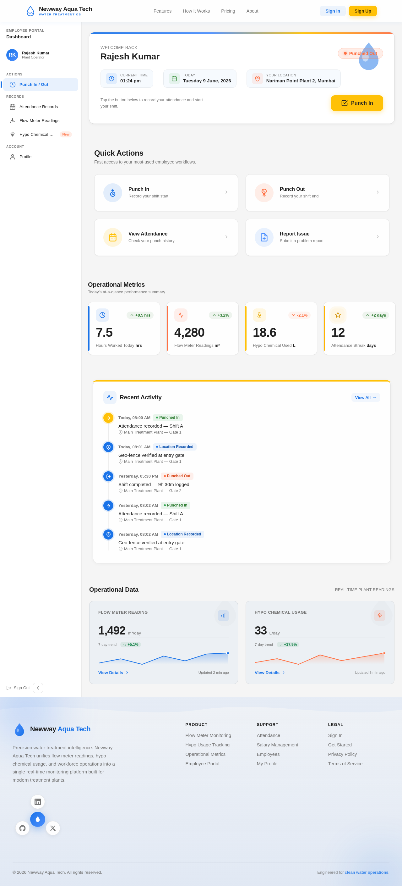
Rajesh Kumar
Quick Actions
Fast access to your most-used employee workflows.
Operational Metrics
Today's at-a-glance performance summary
Recent Activity
Attendance recorded — Shift A
Geo-fence verified at entry gate
Shift completed — 9h 30m logged
Attendance recorded — Shift A
Geo-fence verified at entry gate
No comments yet. Be the first!